Posts Tagged ‘photography’

John Pfahl (1939-2020)

Monday, May 25th, 2020

I was interested to read the appreciation of the work of John Pfahl by photographer, photo critic and historian Bruno Chalifour published by A D Coleman as a guest post on his Photocritic International web site, not just for the information it gives about Pfahl who died in April, a victim of Covid-19, and his work but also for its insight into some of the political aspects of photography and photographic history.

Although I’ve been aware of the work of John Pfahl more or less since I first started my serious interest in photography in the 1970s when I think I first came across his work in the pages of one of the US magazines, probably Popular Photography, he wasn’t a photographer who particularly inspired me, perhaps because I found his work a little academic. So although I have books with his pictures in, particularly Sally Euclaire’s ‘ The New Color Photography’ (1981). I didn’t buy a copy of his Altered Landscapes also published that same year by The Friends of Photography, and have failed to acquire any of his later publications.

Chalifour talks about the “Rochester camp of photography“, to which Pfahl belonged, being in opposition to the MoMa school around its curator from 1962-91 John Szarkowski: “Szarkowski — still echoed nowadays by non-rigorous if not lazy art critics, curators, photo historians and researchers — did not consider that there was any serious color fine-art photography before the William Eggleston show he mounted there in 1976.” But Pfahl studied on the “first graduate-level program in color photography in America” gaining his MA at Syracuse University in 1968.

Of course there was serious colour photography even before that, including by a number of European photographers (who certainly didn’t count either in New York or Rochester.) But it was still true for most of us at the time that real photography was black and white, and while there were books largely for amateurs on colour photography, my own real training in the medium came from Johannes Itten‘s The Art of Color, published in 1961 based on his teaching at the Bauhaus, a copy of which I found in the 70s in my local library (many years before the cuts.)

Chalifour also mentions another Rochester linked problem, in that “Most of Pfahl’s work until the 1990s was printed on Ektacolor paper” and is thus showing signs of fading. The George Eastman Museum apparently has two sets of his major series, one for display, research and exhibition, and the other kept in the dark in cold storage. Kodak’s colour materials were notoriously fugitive, and having read the research many of us switched to Fuji in the 1980s. Some of his work was printed by the expensive but much more stable dye-transfer process. Pfahl was also an early adopter of digital printing, using the Iris/Giclée process for projects in the 1990s.


As I go through my own old slides, produced from around 1970 to 1985, I’m painfully aware of the limitations of older colour processes, with many images faded beyond repair and others requiring time-consuming restoration and much digital tidying to remove ingrained spots and mould. Fortunately images taken on Kodachrome have survived well, but Kodak’s card mounts are a problem, producing stray fibres and dust around the edges as well as masking too much of the image. I should put them in proper mounts before re-photographing them but it takes too long. Fortunately much of the pictures towards the end of this period before I switched to colour negative were made on Fuji films.
FotoNostrum

Monday, April 20th, 2020

Welcome to a new free online photography magazine, FotoNostrum, published by FotoNostrum Gallery in Barcelona and their parent company The Worldwide Photography Gala Awards.

This is to be published fortnightly:

“The issue zero of this magazine that we’re presenting to you today is proof of what can and should be done to keep our social contact alive, to work for the future, to be able to improve our skills and showcase the work of our fellow photographers. When it seems that we’re lost in confinement, we propose to find each other in our magazine.”

The magazine is to be supported by advertising and donations which are solicited.

The first issue, Issue 0, is certainly well-produced and I wish it well, though I have to say it’s contents don’t particularly appeal to me, with a lead feature on Helmut Newton, a photographer whose work I’ve always found problematic. If you like his certainly very professional but extremely mannered highly commercial soft porn, you will probably also find some other work in the issue of interest. But it isn’t my thing. I’ve nothing against pictures of the nude, male or female, but other photographers, including some in this issue, have done it so much better. There is an element of falsity and sadism that doesn’t attract me and certainly fails to excite.

The only portfolio I found of interest was by Michael Knapstein, an American documentary photographer something in the tradition of Walker Evans. But I hope that having got Newton and some of the others off their chest they will find more interesting work for their next fortnightly issue.


Making Money

Wednesday, February 12th, 2020

I’ve just had a quick read of a post on the LightRocket Photography Blog entitled ‘9 Most Profitable Photography Genres‘, which aims to give guidelines based on broad international standards about “the value of your work, what sectors you want to work in and how much you should charge.”

Value of course is a rather wider concept than simply what someone will pay you for photography, and certainly some of the most valuable photography so far as I’m concerned both by myself and by others has been produced without any real commercial intent or support. Relatively few of the great photographers whose work I admire and which fills the histories of photography were actually making much of a living from those pictures at the time they made them. Some had other sources of income outside of photography, others produced routine and largely uninspired photography to fund their personal projects.

Many photographers whose work now commands high prices in the art market sold pictures for peanuts during their lifetimes or even gave them away. Few became rich from their photography and largely it was driven by motives other than financial. Even now for many – as one photographer jokes to me occasionally – the best career move would be to die.

But of course we do need money to pay our bills, to eat, to keep a roof over our heads, and to buy cameras and computers etc. So getting paid for our work is important, and some may find this guide useful, though it has few surprises, though by UK standards I think some of the prices mentioned are extremely optimistic.

The artilce is entitled ‘9 Most Profitable Photography Genres’ and it’s perhaps not surprising that it begins at number 10 with the area I sell work in, Editorial News. As they say, it “is one of the most popular areas of work for photographers but it is, sadly, one of the least profitable“, thanks to intense competition, particularly from the large agencies. They have driven fees down and negotiate licencing deals with major image users that make it very difficult for freelancers to sell work at prices that make any real profits.

In the UK the market for editorial pictures has shrunk considerably, with many newspapers and magazines largely relying on images, often of poor quality supplied free by readers and with press releases.

It remains possible and almost certainly easier to make a living at the other 9 types of work mentioned, though in many sectors things are getting tougher, with jobs once done by a photographer now being handled by anyone who can hold a smartphone and produce a picture – if not a very good one.

Smartphones have also made it very much easier to produce videos, and in the right hands (or on the right monopod or tripod) the results can be surprisingly good. Certainly the much wider use of smartphones for making pictures and videos has led to the skills of photographers becoming much less valued – and for most people expecting to pay less for them.

It comes as no surprise to find Wedding Photography still fairly high on the list at No 4. It has long been a useful way to make some money, and when I taught I used to suggest it particularly to some of the more reliable students as a way of earning at least a part of a living. While most wedding work is routine and uninspired and not particularly well-paid, it is an area where it is still possible to develop individual approaches and find clients willing to pay high prices for something a little different.

And equally predictable at the top of the list is Fashion Photography, though as the article says it is an area which isn’t easy to get into “small, highly selective and sensitive to trends” and where success depends very much on networking skills.

I am however rather unsympathetic to the underlying idea behind this post, that that people will chose an area of work on the basis of the financial rewards that are possible. Chose to try and work in fashion if you have a passion for it and are not worried by the ethical considerations (the fashion industry is one of the major drivers of climate change, second only to fossil fuels) not because it may make you rich; chose to be a wedding photographer if you love working with people (and if you want to make a lot of money, with wealthy people) and so on. We each only have one life and it would be a shame to waste it in the pursuit of riches.

Bruno Barbey

Friday, February 7th, 2020

Bruno Barbey, a French photographer born in Morocco in 1941, has photographed around the world over the years, and is one of the few Magnum photographers who deserve to be better known. Not that the others are bad photographers, but rather that they are everyday names, at least in the world of photography.

I was reminded of Barbey by a Facebook post by photographer Antonio Olmos (who also deserves to be better known) of a group of pictures taken in Poland in the early 1980s, when Barbey spent 8 months living in a camper van and working there despite strict surveillance by the communist state, because “Poland was the page in history that was being written and it was the memory of an ancestral society on the verge of disappearing”.

Barbey studied photogrpahy in Switzerland in 1959-60 and first went to Magnum in 1964. He served as their vice president for Europe in 1978/1979 and as President of Magnum International from 1992 to 1995. He is now a contributor and you can see a great deal of his work on their site.

In an excellent short video made for Paris Photo he talks about his life and work and some of his pictures.

I hadn’t been aware until I watched this of the various similarities between his views on photography and mine, though in other respects we are so different (for one thing I hate travel and he has spent his life going around the world.) In part it is a generational thing, though I only really got started in photography around fifteen years later than he did.

He speaks of beginning photography with a Leica M2, a camera I bought back in my early years in photography in 1977, though by then my copy was something of an antique, and of course he was working as we almost alll did, in black and white. He learnt to work quickly and unobtrusively, moving close into situations with a 21mm lens, and saying “I never ask permission to take photographs … except for portraits”, using the depth of field of the ultra-wide angle to avoid the need to focus.

In that early work – like most photojournalists of the era – he worked entirely by natural light, and says at the time he really didn’t understand flash, when for example he was covering the events in Paris in ’68. Of course then flash outside the studio was crude and somewhat unpredictable, usually with flash bulbs, though electronic flashes were coming into wider use and largely replacing these. I still remember the first occasion on which I spent several minutes working out how to use fill-flash back in the 1980s, something modern cameras and flashes perform automatically (and at much faster shutter speeds.) And if he was then still using that Leica M2, it’s X-sync speed of 1/50th was more than a little limiting.

On the video he also talks about the difference between working with film for magazines in colour – that meant Kodachrome, a film I could seldom afford – in the old days, when after taking pictures you had to send off the film for processing and while travelling he might not see the images until weeks or months later, and today’s immediate digital photography, when instead of having a good dinner in the evening you might be up to the early hours working in front of a computer. It’s something I find it hard to adapt to, refusing to file without properly editing my pictures on a large screen, though often having that good dinner and a glass or two before finishing the edit.


London 1980 (13)

Sunday, January 5th, 2020

The 13th of the series of posts of selected black and white pictures I made in 1980 with the comments I posted more recently daily on Facebook. Larger versions of the pictures are now available on Flickr.


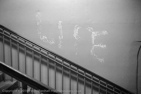
LIFE, Waterloo Station. 1980
26a-12: stairs, graffiti

http://londonphotographs.co.uk/london/1980/26a-12.htm

I used often to walk past this scrawled message on my way into Waterloo Station, though I can’t remember exactly where it was, but these stairs are long since demolished or hidden away from the public. The area was dimly lit and I think I photographed it on several occasions before getting a satisfactory result.

There was a certain desperation about the lettering which looked as if it had been made quickly by someone who dipped a hand into white paint to make these marks. And I pondered on what message was intended, as I stopped to photograph it in the rather dim light.


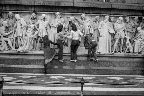
Albert Memorial, Kensington. 1980
26i-62: monument, girls

http://londonphotographs.co.uk/london/1980/26i-62.htm

Back in 1980 on my way to the Serpentine Galley I stopped to look at the Albert Memorial, then open to the public in much the same way at Nelson’s column still is, with tourists and their children climbing on the lower levels to have their photographs taken with the sculptures at its four corners and surrounding it.

As I was photographing a group of four girls came and climbed up on the low ledge to put their hands on the figures of the great artists – including Masaccio, Raphael, Michael Angelo and others – along the base of the memorial. This was the second of two frames I took of them.


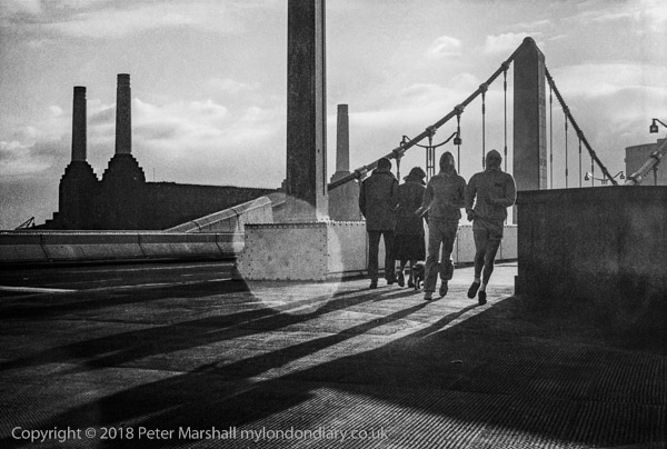
Chelsea Bridge, Chelsea. 1980
2l-55: power station, bridge, runners, people

http://londonphotographs.co.uk/london/1980/26l-55.htm

In December 1980 it was my turn to organise the month’s photographic outing for the small group of photographers I was involved in. Somehow my plan for a walk from Victoria to Battersea and Wandworth lacked appeal and I was the only person who turned up for it.

Taken with the Leitz 35mm f1.4 Summilux, the large circular flare patch is something of an enigma. I think it likely that the lens was well-stopped down, since I was working on ISO400 film (Ilford XP1) and the negative is quite underexposed. The low December sun has resulted in long shadows and a dramatic image, with Battersea Power Station and the people in near silhouette.

The sun was just out of picture at top right, and this negative was virtually unprintable in the darkroom


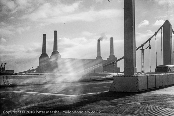
Chelsea Bridge, Chelsea. 1980
26l-56: power station, bridge,

http://londonphotographs.co.uk/london/1980/26l-56.htm

Another picture from almost the same place, but without people and with different flare. As well as a couple of large ellipses there are also some rather vague ‘rays’ and a small black spot… The specks in the sky are birds.

One of Battersea Power Stations four chimneys was hidden behind a part of the bridge in the previous picture, but here we can see it clearly with smoke emerging. The western half of the power station was closed in 1975, but the eastern half, where smoke is emerging from the rear chimney remained in operation until 1983.

Earlier in 1980 the whole power station had been listed Grade II as there were grave concerns for the future of the building. Unfortunately listing failed to save more than the shell of the building and its roof was removed in the late 1980s. Various development schemes fell through and the building was left to rot. The listing was revised to Grade II* in 2007, and the redevelopment of the whole area began in 2012.

The four chimneys were removed by the Malaysian-owned developers in 2014 because they were heavily corroded, but have now been replaced by near identical replicas. The power station development is due for completion in 2019, providing 254 homes along with offices and retail space, with the whole 42 acre redevelopment being completed by 2025. It is part of the huge 561 acres Nine Elms development – almost 0.9 square miles.


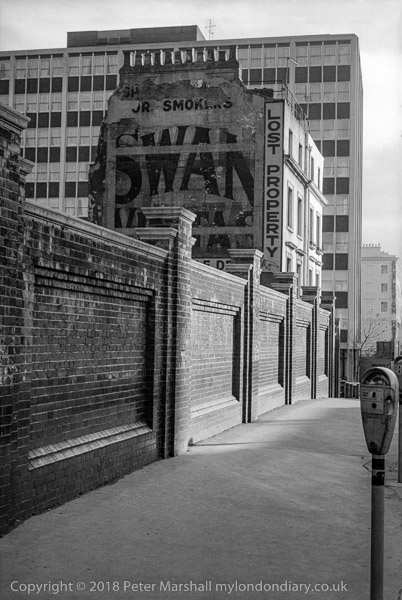
Swan Matches, Victoria. 1980
26l-63: advert, building, street,

http://londonphotographs.co.uk/london/1980/26l-63.htm

The Lost Property office was on Eccleston Bridge, on the corner of Bridge Place; the building is still there but the Swan Vestas advert has long been painted over and the building passed to other uses.

The foreground wall and the office building in the background are still there though the offices have been slightly updated.


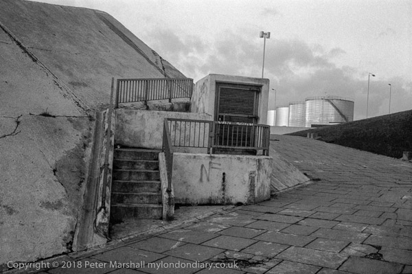
Roundabout, Wandsworth. 1980
26p-32: roundabout, storage tanks,

http://londonphotographs.co.uk/london/1980/26p-32.htm

I pass this roundabout every time I take the train into Waterloo. It was the location where Alex and his Droogs attack a tramp in Stanley Kubrick’s A Clockwork Orange. The roundabout links Trinity Road with Wandsworth Bridge.

Back in 1980 all of the riverside around here was industrial. NF graffiti were common over London. I think the tilt in this picture was deliberate, perhaps to increase a sense of unease in the scene.


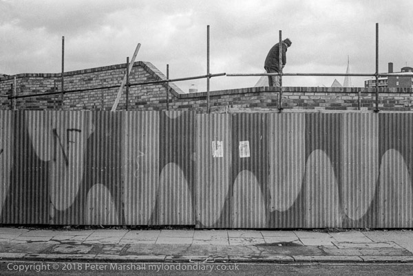
Fence with NF graffiti, Wandsworth. 1980
26r-21 fence graffiti, worker

http://londonphotographs.co.uk/london/1980/26r-21.htm

Some effort has been made to make the corrugated iron fencing more attractive by painting it in two colours. I can’t read the flyposted notices, which do appear to have a radioactive hazard symbol on them but the National Front graffiti is clear and was unfortunately common across London at this time.

I’m not sure exactly where this was taken, although the wall behind the fence is fairly distinctive, as are the steeple and flats at right. It was probably on or close to Vicarage Crescent or Lombard Rd.


All photographs on this and my other sites, unless otherwise stated, are taken by and copyright of Peter Marshall, and are available for reproduction or can be bought as prints.

There are no adverts on this site and it receives no sponsorship, and I like to keep it that way. But it does take a considerable amount of my time and thought, and if you enjoy reading it, please share on social media.
And small donations via Paypal – perhaps the cost of a beer – would be appreciated.


Danny Lyon on Frank the man

Sunday, September 29th, 2019

” For all artists, there is a difference between the person and their work. “

Thus states Danny Lyon in the article ‘When Fathers Die: Remembering Robert Frank‘ on The New York Review of Books site. His piece is a very personal story of the man he lived with and worked with and who he says “brought integrity to an art riddled with compromise.”

I don’t think it makes me see any more – or less – in Frank’s pictures but I found it a fascinating read, a reminder of the very different times and lifestyle in which that work was produced.

Colour or B/W?

Wednesday, June 12th, 2019

I’m trying hard to remember when I last took a black and white picture, and I think it must be more than ten years ago, though I do still have a few rolls waiting to be processed.

I spent around thirty years taking most of my pictures in black and white (though I often also worked in colour) . Many if not most of my favourite images, both my own work and that of other photographers is in black and white, but somehow I no longer feel any urge to work in black and white.

It would of course be easy to do so. A simple click of a mouse would convert the images taken in any of my digital cameras from colour to monochrome, but it’s something I dislike doing. Occasionally I’ve carried out this conversion, in the past using specialised Photoshop plugins (though now Lightroom has some good monochrome profiles built in) but generally only when my colour pictures are going to be reproduced in black and white – when I prefer to make my own conversions rather than leave it to others.

When I made the mistake of buying a Leica M8, there were some occasions where the colour was simply so wrong as to be unusable (though I spent hours trying to put it right with various software programs) and the only way to use pictures were as black and white. And while it was a lousy colour camera, it was actually pretty good as a black and white camera and perhaps I should have kept it for that. Later of course Leica did produce a monochrome model.

With mirrorless cameras you can even view the world in black and white, which might be an interesting way to work, though I’ve yet to try it for more than one or two test exposures. But generally I’m rather averse to converting images taken in colour into black and white and think most people who do so produce work that is unconvincing. You have to think differently to make good monochrome images, try to think tone instead of colour, and pay greater attention to shape, line and form.

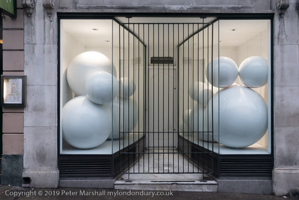
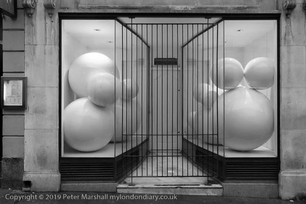
I just spent ten minutes or so looking through some of the more interesting pictures I took earlier this year, looking for images that might possibly have worked in black and white, and coming to the conclusion that colour was essential for almost all. For this post I’ve picked a couple that I thought might work as well or better in black and white and made the conversion. I’ll let you judge – and please feel free to comment if you have a strong preference.

I was prompted to write this post by reading one on PetaPixel, What Shooting Film Taught Me About Black-and-White Photos by Ellie Cotton – I think it looks better on her own web site. I actually think all of the pictures in that article look better in colour, though a couple convert reasonably to black and white.


There are no adverts on this site and it receives no sponsorship, and I like to keep it that way. But it does take a considerable amount of my time and thought, and if you enjoy reading it, please share on social media.
And small donations via Paypal – perhaps the cost of a beer – would be appreciated.

All photographs on this and my other sites, unless otherwise stated, are taken by and copyright of Peter Marshall, and are available for reproduction or can be bought as prints.

To order prints or reproduce images

Steiglitz Key Set

Saturday, June 8th, 2019

NGA ONLINE EDITIONS ::  ALFRED STIEGLITZ KEY SET

Back in 2002, the US National Gallery of Art published the massive two-volume ‘Alfred Stieglitz: The Key Set – Volume I & II: The Alfred Stieglitz Collection of Photographs‘ by Sarah Greenough, 1012 pages lavishly printed and weighing over 18 lbs, presenting the complete set of 1,642 photographs of his work, selected after his death in 1946 by his wife, the painter Georgia O’Keeffe who devoted three years of her life to sorting out the best examples of each of the finished and mounted prints in his possession when he died.

O’Keeffe presented the bulk of this work to the NGA in 1949, adding most of the rest, including well over 300 portraits of herself in 1980 which had previously only been on loan. There are several versions of many of the works, sometimes in different media and in some cases quite differently cropped and sometimes made over many years.

The book was a truly fine publication, heavily subsidised by generous donors, but in many respects the recent online presentation is preferable. Certainly the search facility is a great addition, as is the ability to zoom in on pictures, particularly for those of us whose eyesight is a little less sharp than it once was. And you can mark several pictures to compare them together on screen.

Those large and heavy paper volumes are also just a little difficult to handle, while the on-line presentation is excellent, enabling you to page easily through the pictures in order should you wish to, zooming in to them or scrolling down on the page to read more about them (they make use of the open source IIPMooViewer – you can read more about this should you be interested in a case study about the NGA on the IIPImage site.) The site seems to work remarkable quickly on my internet connection and you can also download the pages as PDFs should you wish to do so.

Of course the quality of reproduction of the online version will depend on the device you view this on, and your phone may not display them quite as well as a large calibrated monitor. But even more than the book, this is an enormous and fascinating work of scholarship.

Stieglitz remains one of the most important figures in the history of our medium, a major player as a photographer both in pictorialism and the move away from this to modernism and straight photography, as a photographer and also as an editor and curator. He was a prime mover in establishing photography as art and promoted the work of a number of photographers and painters through Camera Work magazine and his galleries, though it was only quite a few years after his death that an art market for photography came into being. He sold very few of his own images, and most of those in museum collections came like those at the NGA, from donations either by himself orafter his death by O’Keefe.

Despite the superiority of the online version, there is still something about the print version which I prefer, and it can still be bought on Amazon and elsewhere, with both new and secondhand copies on offer, but at a price. The cheapest I found in a very brief search, including shipping to the UK is around £170, though some dealers are asking up to £600. When I bought my copy I think I paid less than some are now charging for shipping.

Lens Ends

Wednesday, May 15th, 2019

Sad news to hear that the New York Times Lens blog is to end at the end of this month, May 2019. You can read more about it on PDN News. The closure, described by the NYT as a “hiatus” for an indefinite period means the end of one of the more thoughtful and innovative blogs about our medium after around ten years, with a number of posts by James Estrin and his co-editors that I’ve mentioned here – though not as many as I might.

Meaghan Looram, NYT director of photography, says it is time to rethink and “give serious thought to how to better position Lens for the future.” I suspect that means a dumbing down and an end to contributions by people with any great love or knowledge of photography, though I sincerely hope I’m wrong.

Lens has been more than just another photography blog. As PDN points out it has promoted many emerging photographers as well as highlighting work from earlier eras that has often been overlooked or under-appreciated. And importantly, as it states “Lens is one of the few photo blogs to pay the photographers whose work it features.”

That’s an important point, not just because many photographers need the money – it’s very tough for many, particularly young photographers to make a living, but because so many others seem to assume that photographers can live on ‘exposure’. But exposure won’t pay the bills. Are the journalists, the printers and others involved in publications and campaigns working for free? When anyone asks me if they can use my pictures without payment I have a simple question to whoever is asking – ‘Are you being paid for your work? ‘

Of course my suspicions about Lens are based on my own experience with the NYT, who bought a company I worked for and ruined it because the bean counters were determined to aim at the lowest common denominator and forced out those of us who wanted to write intelligently. By the time they sold it on it had lost most of its financial value and virtually all of its credibility.