Archive for January, 2010

Right Up My Street but

Sunday, January 31st, 2010

Unfortunately I’m more than unlikely to be in Milwaukee in the next couple of months (I’m not sure they’d let me in to the USA, and with the current fuss over “security” I think all those of us who need to travel with syringes are likely to have a hard time of it.)   But for those that are, the show Street Seen: The Psychological Gesture in AmericanPhotography, 1940–1959, which features the work of Lisette Model, Louis Faurer, Ted Croner, Saul Leiter, William Klein, and Robert Frank, continues at the Milwaukee Art Museum until April 25, 2010.

You can read a little more about the show (including that it also has work by Robert Capa, Henri Cartier-Bresson, Walker Evans, W. Eugene Smith, Helen Levitt and Weegee, among others) and that it claims to be the first major examination of street photography of the 1940s and ‘50s in nearly 20 years on Art Knowledge News.

While its hard to disagree with the statement that the six featured photographers “embraced photography as an ‘act of living‘”, it is perhaps harder to accept the opposition between this and telling a story, particularly with the work of photographers such as Cartier-Bresson and particularly Smith in mind who did pretty well at both.  But like many shows it sounds as if it would be good to view whatever caveats you might have about some of the curatorial texts.

There is a short review of the catalogue on the NY Times and a little more about the show here.

Where Three Dreams Cross

Saturday, January 30th, 2010

Where Three Dreams Cross, continuing at the Whitechapel Art Gallery in London (Aldgate East or Aldgate tube) until 11 April 2010 is an important show although it perhaps does not live up to its subtitle, 150 Years of Photography from India, Pakistan and Bangladesh. It is worth going to see mainly because of the broad cross-section of contemporary work it displays from the sub-continent, but perhaps fails to deal adequately with the earlier history of photography there.

I say perhaps, because I don’t know in detail what history exists, though I feel sure there must be considerably more than this exhibition reveals. One indication that this is so is the very poor showing given to the work of India’s first great indigenous photographer, Lala Deen Dayal (1844-1905), whose work I wrote about at some length a few years ago. There are eight pictures by him on display in the ‘Street‘ section of the show, four of them interiors. None really fits this section of the show, and only one is a good example of his work.

Although my piece on Lala Deen Dayal is no longer on line, you can find more about this remarkable photographer on the Lala Deen Dayal web site. He gained international recognition with his work being exhibited in the photographic shows in London and Chicago as well as India, gaining over 25 gold medals between 1875 and 1905. The problem perhaps for the organisers of this show is that Deen Dayal was very much a photographer of the Raj, and honoured by the Nizam of Hyderabad who appointed him Court Photographer and gave him the title of ‘Raja’. In November 2006, one of his images appeared in an edition of 0.4 million on an Indian 500 Rupee stamp.

Deen Dayal was certainly the leading Indian portrait photographer of the nineteenth century, but unless I missed them (and it is large show in a gallery where the layout is always misleading to simple guys like me) this work was missing from that section of the show.

The work in the first gallery of the show deals with the two themes of ‘The Portrait‘ and ‘The Performance‘ with the historical material in the second containing considerably too much routine cinema publicity work.

Raghu Rai is I think still the only Indian photographer (born in what is now Pakistan in 1942) to have made it to Magnum, and his work certainly stood out in this show. You can also read about him on Global Adjustments.

Most of the nineteenth century work on display in the portrait section appeared to be studio portraits by unknown photographers, and much of it was pretty ordinary stuff. It’s hard too to believe that the first half of the twentieth century has so little to offer from India, and although there was some exciting material from the second half, most of it came from names that will already be well-known to many, though it was still welcome to see it being given greater exposure here.

Perhaps the  most intriguing work in this gallery was that of Umrao Singh Sher-Gil (1870-1954.) I actually find his work rather more interesting in itself than in the more widely known works based on them by his daughter Amrita Sher-Gil. Umrao Singh began taking photos in 1889 and continued for over 60 years, during which time he married a Hungarian opera singer in 1912 and was a political exile in Hungary for the next 9 years. The family returned to Europe for five years in 1929 so Amrita and her sister could study at the the Ecole des Beaux Arts in Paris. His best-known work is probably an extensive series of self-portraits.  Another member of this artistic dynasty also has work in the show, Vivan Sundaram, the nephew of Amrita Sher-Gil, whose work in ‘The Family‘ section consisted of montages of Umrao Singh’s pictures. I’d  rather have seen the original photographs on which these works were based.

The Family gallery also contained perhaps the most traditionally Indian of the works on show, large hand coloured rather symmetric tableaux that could almost have been embroidery. Here photography was being forced into a very non-photographic mould and retaining little of its inherent magic, although the results do have a certain charm.

The final gallery of the show contains work on the two themes ‘The Body Politic’ and ‘The Street‘, and although there was a great deal of fine work it was dominated by the large colour photographs of Raghubir Singh, (1942-99) arguably the greatest Indian photographer and photographer of India of the twentieth century and one of the first to work seriously with colour in the early 1970s.

But there is plenty more fine work, particularly some pictures by Rashid Talukder (you can see more of his fine pictures on the Majority World site.) Talukder’s powerful images of the liberation struggle in Bangladesh were the outstanding work in the Bangladesh 1971 show at Autograph in Shoreditch, and the co-curator of that show, Shahidul Alam, also has an interesting set of pictures (and a letter) ‘A struggle for Democracy 1967-70′ on view here. As well as being a fine photographer, Alam is the founder chair of Majority World, and also founded the Drik picture library, the South Asian Institute of Photography and much more.

Sunil Janah, born in 1918, photographed much of the history of India from around 1940 on, including the Independence movement and partition. You see his work and learn more about him on his Historical Photographs of India (and they truly are) which also contains a virtual version of his 2000 San Francisco show,  Inside India, 1940-1975. The site are rather dated and the reproduction of images is often not up to current standards.  You can also watch him talking about some of his work on YouTube. It was disappointing not to see more of his work here.

Apart from the work that I’ve mentioned, the strength of this exhibition lies in the survey of contemporary work it shows. It does exhibit a wide range of work, some from well-known artists (Saatchi has bought Pushpamala N‘s work for example) and others from photographers unknown here. I found it hard to find anything much peculiarly Indian in the best of this work, but there is certainly much of interest. But I think the best is probably the least known here. There really is too much worth looking at for me to list. Go and see it and make up your own mind.

Postscripts

  • The show is free for under 18s & Sundays 11am–1pm, otherwise £8.50/£6.50 concessions.  It was well attended but not crowded when I visited on a Saturday afternoon.
  • I’m still often asked if inkjet prints can match the quality of conventional silver or dye coupler prints. Reading the labels here, almost all the modern prints are inkjet of one kind or another, though some make a great effort to hide it, with such descriptions as “archival pigment print.”

Scanning 35mm – Will a Flatbed do?

Thursday, January 28th, 2010

Recently I’ve gone back to scanning quite a lot of my older negatives and, as I’ve mentioned in previous posts, have been using the Epson V750, simply for its speed, rather than the Minolta Dimage Scan MultiPro.

Although the scans have been good enough for my needs at the time, I’ve always felt that for the optimum quality I would need to go to the dedicated film scanner. But I wanted to find out exactly what the difference was and so to decide when to use a film scanner.

© Peter Marshall
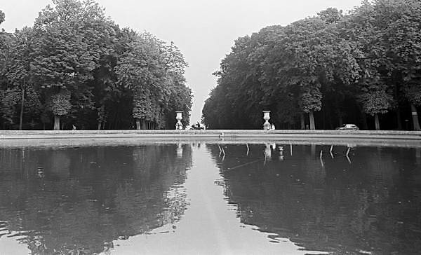
Brixton, 1980, taken on a Minox EL 35mm camera

I chose this negative simply because it was one I wanted to print, having spent some time searching for it in my archive.

Minolta are no longer with us, and the MultiPro scanner which was the best of its type is no longer made. The scans made with it are of similar quality to the best scanners still available, including some considerably more expensive models.

All images in this post are unretouched scans, though I’ve adjusted contrast a little to give a better match than in the actual scans – though they are still not quite the same.

Minolta Dimage Scan MultiPro

I put the negative into the universal carrier with a specially made full frame 35mm mask that ensures film flatness and set the software to 4x sampling to get every last ounce out of the negative, scanning at 4800dpi.

Then I went and had a cup of tea while the scanner got on with the job – which I think took around 15 minutes – and produced a 58Mb 16 bit grayscale TIFF file.

© Peter Marshall
a 600×400 section from the 6829×4541 scan, displayed at 2/3 size on this blog

Viewed at 1:1 on the screen (the full 6829 pixels would actually produce a picture 73 inches wide if my screen was large enough – although nominal screen resolution is 72 dpi, actual screens invariably differ from this) the image is pin sharp and shows a fine granular pattern which I think is the actual film grain. The grain is as sharp at the edges as it is at the corners, and it is a pretty impressive performance.

© Peter Marshall
An area where the white threads are more visible

Unfortunately it also shows something else, with large areas of the image being marred by fine white thread-like lines. I’ve tried to remove these by various Photoshop filters, but doing so also blurs some of the fine detail (and the grain.) Retouching using clone and healing brush tools also loses a little of the detail and is extremely difficult and tedious – and would involve several hours of work.

Minolta Dimage Scan MultiPro and Scanhancer

I’d made this first scan without the http://www.scanhancer.com/ Scanhancer which radically improves its performance in place, so the next job was obviously to try it with this.  So it was time for a coffee as I let it do its work.

The Scanhancer is a simple plastic diffuser that sits on top of the negative, and it was developed by Erik de Goederen and others on the MultiPro user group. Minolta (and some other scanner manufacturers) liked the idea so much that they incorporated the idea into later scanners.

Although most diffusing materials make a difference, the choice of the right material is crucial. But as the site says, it allows the Multipro to rival “drum scan quality by mimicking the effect of wet mounting.”

© Peter Marshall
a 600×400 section from the 6821×4568 scan MultiPro + Scanhancer

And, somewhat to my surprise it solved the problem – those white threads simply disappeared. It also slightly reduced the rather aggresive grain in the image.

Epson V750

Using the V750 with the film in the standard film holder did the scan at the same nominal resolution, 4800 in around 2 minutes – about a tenth of the time. It isn’t as sharp when viewed 1:1, and the grain is more a texture than the discrete pattern of the MultiPro scan, making some surfaces noticeably smoother. In fact it makes me begin to wonder if the ‘grain’ in the MultiPro scan is actually some kind of scanner artefact. The negative clearly isn’t flat, but the scan doesn’t show any really noticeable loss on this account. Because of the design of the holder it isn’t quite possible to scan quite the entire negative (more of a camera fault in the very slight skew of the frame on the film) but the difference is very small.

© Peter Marshall
a 600×400 section from the 6792×4419 scan, Epson V750

But although it clearly is slightly less sharp, there is more or less the same amount of detail on the scan (though differences in contrast and brightness may mean this isn’t clear)  and, as with the Scanhancer, those little white threads have simply disappeared. Flatbed scanners have more diffuse light sources than most film scanners.

© Peter Marshall
a 600×400 section from the 6792×4419 scan, Epson V750, after sharpening

A little sharpening using a tool such as the FocalBlade plugin can bring the sharpness at the maximum print size (33.3% on Photoshop gives a display on my monitor corresponding to a print at around 280 dpi, and an image size around 24×16 inches) to a similar level as the Multipro scans. At this size the main difference is actually the grain apparent on the Multipro scan, and I can get a better visual match in Photoshop by adding a little noise to the V750 scan should I want to!

It did occur to me to wonder if I could get a sharper scan direct from the V750. I tried the unsharp masking in the scanning software but decided the sharpening in Photoshop was better.

I also tried using the V750 with the same Vuescan Pro software that I use with the MultiPro (one of Vuescan’s big advantages is that it will work with almost any scanner ever made.) The scans produced were pretty similar with those from the Epson software – and using the 4x sampling didn’t seem to make any difference, except to speed. So as the Epson software did the job faster I’ll stick with that in future for this scanner.

The main problem with flatbed scanners such as the V750 is the lack of focussing. All you do is adjust the feet on the negative carrier to move it up and down slightly. I’d previously tested the carrier to arrive at the current setting of the feet, so felt fairly sure altering them wouldn’t help.

Although I couldn’t see much effect on sharpness, the curving of the film in the negative carrier did actually result in a very slight distortion of the image around the edges. It was only noticeable by comparison with the Minolta scans, but I still don’t like it.

I’m told that wet mounting does improve the performance of the scanner significantly, but have yet to try it. But there have been some reports that the Scanhancer can work a little of its magic with flat beds too, and it is a lot easier than wet mounting, so I thought it was worth a try. There was perhaps a very slight improvement in sharpness, but it was hardly significant.

Conclusions

Although there is a small difference in sharpness – particularly of the grain – when viewed at 1:1, both scanners give files entirely usable results at normal print sizes – up to perhaps 24×16 inches.

Some viewers actually prefer the look of the Epson V750 scans because they reduce the effect of film grain, giving a slightly smoother look to some surfaces.

If you are intending to print to very large sizes – perhaps A0 or larger –  then the slightly increased sharpness of the MultiPro would almost certainly be preferable. The Scanhancer is essential for removing some imperfections when scanning old negatives like these, and slightly reduces the aggressive grain.

The question that really persuaded me to carry out these tests was whether the V750 scans would pass the quality control tests imposed by Alamy. Frankly I can’t guess at the answer, but as usable files for almost any purpose they should do.

London Photographers Branch

Wednesday, January 27th, 2010

If you work as a photojournalist or editorial photographer in London for at least part of the time, I’d urge you to join the newly formed London Photographers’ Branch of the National Union of Journalists. I was at the inaugural meeting last night at the union headquarters although I kept my head pretty low, there were others who volunteered to join the committee, and I left feeling fairly confident that they had a wide range of experience between them and would do a good job.

Although the start of this group has been attended by a similar “reds under the beds” scare as marred lost year’s NUJ election for the editor of ‘The Journalist’, members at the meeting last night showed little appetite to continue this divisive bickering, though it is a shame that it has meant that a couple of the strongest advocates of a photographers’ branch in London have decided not to join the committee.

NUJ Left is an important and influential force in the union, and although I’ve never felt it necessary to join it, I do occasionally read the web site and have belonged to the Facebook group. It’s an open group that anyone in or employed by the union can join and its aims seem to me to be to promote the kind of active trade unionism that I’ve always felt was necessary for the union to be successful.

So it doesn’t worry me that some of the people on the committee (though not all) are in NUJ Left. I don’t think they have made any secret of it and we talk enough about politics when we meet on the job or in the pub for me to be aware of their views and for me to trust them to work through the branch for photographers and photographers rights.

To run an effective union branch you need activists willing to give up their time to work for the union. If there is some kind of association for activists in the union they are quite likely to belong to it.  So what’s the problem? And if anyone does think it is a problem, then surely the best response is to take a part in the running of the branch yourself.

You can find more details about joining the NUJ on their web site. If you work in the UK and make more than 50% of your income from photography/journalism it is in your interest to join the union and an appropriate branch.  If you are a photographer working in London and already an NUJ member, I understand that members can belong to both a chapel and a branch, but not to two branches and it tells you here how to transfer to the new branch (of course you will have missed the deadline for the meeting on the 26th – and one day the NUJ will update its web site.) The London Photographers Branch will shortly launch its own web site and branch meetings will be held monthly on the last Tuesday of each month at 6.00pm at Headland House. The next meeting is on Tuesday 23 Feb 2010, which I see is also Shrove Tuesday, so if I can get time off from tossing pancakes I’ll be there.

Photographers are only too aware of the growing problems we face, particularly over matters such as jobs, contracts, copyright and licences and new technology, relations with the police and more. Being a union member won’t solve all your problems but it does provide some very much needed advice and support.

Life’s Too Short

Wednesday, January 27th, 2010

The second demonstration I photographed last Saturday was much smaller than the 1500 or so photographers in Trafalgar Square, and I could actually count the number taking part. So when I wrote in my account that “more than 150 people” were in the march from St Pancras to Piccadilly Circus there isn’t much room for argument. Of course, it’s still deliberately a little vague, both because the actual number isn’t of any interest and that it is pretty well impossible to get an exact count.

In some ways it’s much easier to cover small events – and not a great deal is likely to happen without you noticing it, whereas your view of a large event can be quite different to that of someone working on the far side away from you.

NoBorders, whose London group organised the demonstration, would like people to be allowed to move freely around the world without the kind of border controls that most states now impose. Seeing the problems that the attempts by the UK to restrict migration to this country have caused, with thousands locked up inside our immigration prisons and so many cases of injustice and inhumanity I feel they have a very strong case; whatever problems free movement might cause I think they would be less.

At the very least we should set up a humane system that recognises our historic liabilities and our obligations under international agreements and human rights declarations, and gives those seeking asylum proper access to our legal system with similar rights to our citizens. What we have are prisons run for private profit, hired thugs and fast-track procedures that deny justice. And an immigration minister who thinks it appropriate to say “The UK Border Agency vigorously opposes any appeal against deportation” rather than feeling it is the duty of the Asylum and Immigration Tribunal to come to a decision on the facts of the case.

© 2010, Peter Marshall
Sometimes you can go too wide on the 12-24mm

I was without the Sigma 24-70mm f/2.8 EX DG MACRO which has become my favourite lens, as I finally had to send it back to Sigma for repair. Something came a little loose inside a few months ago and it has clearly been getting worse.  So I was working with my old Sigma 12-24mm EX on the D700 full frame and a Nikon 18-200mm on the DX D300 (equivalent to 27-300mm.)

© 2010, Peter Marshall
But at times it’s rather fun to do so

The 12-24 is a great lens (and the current version is better still), but considerably more useful on the DX format, where it becomes an ’18-36 equivalent’. On full frame it not surprisingly gives some considerable vignetting at the wide end, and 12mm is really just too wide for any rectilinear lens. There is an unavoidable wide-angle distortion – a matter of geometry rather than lens design. On DX format it gives the same view as an 18mm on full frame which is much more usable, and also has better sharpness and less chromatic aberration because it avoids the extreme corners of the lens.  At ’18-36′ it covers the whole of the usable rectilinear wide-angle range. Should you need a wider view (and I sometimes do) the answer is a fisheye – such as the 10.5mm Nikon.

On the FX camera, the 12-24 also abandons you at the longer end, bang in the middle of the useful wide-angle range at 24mm.  This is a pain if you only have a single camera, but less so if you can simply pick up your second body. The 18-200 on the DX300 starts at a 27mm equivalent, giving you an almost seamless range of focal lengths.

This is a sort of reversal of my normal practice, where I rely on the DX300 for the wider stuff (with both the 10.5 fisheye and either the Sigma 12-24 or the smaller DX format only 10-20mm.) Then the DX700 with the 24-70mm covers the whole of the middle range (and often it is everything I need),  switching back to a cheap and light Sigma 55-200 DX lens on the D300 for any long stuff.

If Sigma made a decent full frame 50-200mm I would probably buy one; the old DX version more or less covers full frame – at least after I took a hacksaw to the lenshood – as I mentioned in an earlier post.

The closest match they have in is 70-300mm, with 3 versions available. The extra focal length does make them a little heavier and bulkier than a 50-200 would be. Having the 70-300mm f/4-5.6 DG MACRO, 70-300mm f/4-5.6 APO DG MACRO and the 70-300mm f/4-5.6 DG OS does seem a little overkill. The OS is an optically stabilised lens, but the APO offers better quality if you can hold it still, while the first mentioned is cheaper.

None of these three are in their professional EX range with “superior build and optical quality”, which does offer the large and heavy 70-200mm f/2.8 EX DG MACRO HSM II, doubtless an excellent lens but too large and heavy for me.

© 2010, Peter Marshall
’89’ was the year the Soviet bloc crumbled

More from Life is too short to be controlled.

Change We See?

Tuesday, January 26th, 2010

The Labour Party has a Flickr pool entitled “Change we see”, which asks people to share photographs which show the government’s achievements since they came to power.

“Upload a photo of a local hospital we’ve rebuilt, a local Sure Start centre we’ve opened or a local school we’ve invested in and, together, we can show everyone the importance of the Change We See.”

Kate Day in The Daily Telegraph rather gleefully points out that people have been uploading images that were not quite what the party had hoped for, and in particular photographers have been uploading stop and search forms provided for them by the police when they tried to photograph buildings.

When I visited the site a few minutes ago it looked like this:

Flickr

And the third item in the lower row – the long pink form – is Grant Smith‘s Stop and Search form from the City of London Police.

The first item in the top row is a picture of heavily contaminated land on which the government has overruled a local council and given permission for new homes to be built. To the right of Grant’s stop and search is Mark Thomas’s ‘Stop and Search Card‘ and to the right of that, after the couple of ‘Rage Against New Labour‘ posters under ‘Waitrose Essentials’, a spoof of one of the Met’s anti-terrorist and anti-photography posters – the caption under it reads ‘My take on the Met’s misguided, paranoia-inducing “Seems Odd” campaign.’

Perhaps you have some pictures you could upload to the pool?

NOT Terrorists

Tuesday, January 26th, 2010

Trafalgar Square got pretty full of photographers at lunchtime last Saturday, and the event gained a useful amount of publicity, and I hope will have done a little to make it easier for people to use cameras on the street. We need to remember that the law is on our side even if some of the police are not, and to get that over to the general public.

© 2010, Peter Marshall
There were many more photographers on all sides of me

It wasn’t exactly by choice that I photographed the event entirely with a 12-24mm lens on the full-frame D700, though a wide angle was a good lens most of the time as things got pretty crowded. I did try to take a few pictures with an 18-200 on my D300 (27-300mm equivalent) but it took me rather a long time to realise I hadn’t put a card in the camera!  I always work with the camera on a setting that refuses to let you release the shutter without a card there, but Nikon in their near-infinite stupidity made the default for the Custom Setting that controls this not only to let you release the shutter without a card, but also to display the pictures you haven’t recorded on the back of the camera as usual.

A little while ago I had to perform a full reset on this camera, and I must have forgotten the need to alter this setting. The default does seem crazy to me, and the only possible reason I can think of is that it is for the convenience of dealers when demonstrating the camera before sale.  If so it seems a very curious priority for a company making tools for photographers to use.

© 2010, Peter Marshall
Should the BBC employ guys who have absolutely no idea of numbers?

At times it wasn’t easy taking photographs with so many photographers all trying to do the same thing, but mostly we managed without coming to blows. The only real example of unprofessional behaviour I came across came from BBC TV, whose reporter speaking to camera proved himself to be totally incapable of estimating the size of the crowd, reporting that there were 300 of us.  My own rough estimate was at least 1500, while other experienced journalists put it at 2-3000.

It’s often hard to be sure about numbers on demonstrations, but an error of this magnitude suggests an agenda rather than simply incompetence, and the numbers reported by the BBC are often on the very low side.

For events with fewer than around 500 people I have a simple approach – I count them. You can seldom get an exact count, but fairly close, though usually it will be an underestimate as some people leave early and others arrive late. For larger events it is a matter of estimation, though again I’ll often count a section of an event and then try to base an estimate on that.

Sometimes differences in numbers can be because people count at different times. The local paper reporter at the Harrow Mosque demonstration – whose figure was widely quoted by other news media – had clearly made his count fairly early on in the event, and numbers opposing the EDL had roughly doubled by the time I went  home.  But here there was no such excuse; it was either incompetence or the deliberate misleading of the public.

If I was shooting simply for the web, I wouldn’t have needed a longer lens than 24mm for this demonstration, but could simply crop pictures. After all I’m taking images 4256 pixels wide and web images on this blog have a maximum of 450 pixel width. (Most of them I use are actually 600 pixels wide but scaled down by the browser – and you should be able to see them at full size if you want – in Firefox, simply Right Click, select ‘View Image.’ Probably you can do something similar in other browsers, though perhaps the best advice would be download Firefox.

But virtually everything here (and on My London Diary) is essentially un-cropped, as I like to work with the frame that I can see in the camera.  The viewfinder doesn’t quite show the edges of the image and sometimes I’ll remove a thin sliver from two or four edges if it contains anything obtrusive, and I’m using a telephoto zoom designed for the DX format that I know vignettes a little at its shortest focal lengths when used on full-frame and work with a little crop in mind. But I only crop significantly on fairly rare occasions – as even Henri Cartier Bresson did, for example with his jumping man in the Place de l’Europe (though probably the other 49 in this set are not cropped.) In general I hold to the view that cropping encourages sloppy thinking when you are taking pictures, though the master expressed it more philosophically.

It was an event that reminded me once more of my age. The mother of one of the young photographers I photographed in the square was once one of my best students.

Lost London

Tuesday, January 26th, 2010

One show just opened in London that I intend to see is Lost London, on show at Kenwood House in Hampstead  until 5 April 2010. Hampstead is an area of London I seldom visit, though it’s not a long journey, just that there are seldom things that happen there I want to go to.

The show, put on by English Heritage, is of phtoographs that came to them from the former London County Council, who got photographers to document the areas that were about to be demolished.

Years ago I used to make frequent visits to the Saville Row offices of the National Building record (long moved to Swindon) and often had some time to wait for my appointment which I spent in their picture library. There I used to take down the files of pictures from the various London boroughs and leaf through them. A very large proportion of the pictures were of churches, apparently because most of the work on record had been donated by keen amateur photographers in the late nineteenth and early twentieth century, and many of these were clergymen who, having preached their sermons on a Sunday were not frightfully busy the rest of the week.

But these pictures, which cover the years from 1870-1945, are rather different and with a hundred pictures illustrating the themes ‘Work, Poverty, Wealth and Change‘ it promises to be an interesting show.

You can see some more recent pictures of London on my site ‘The Buildings of London‘ and in particular the section of tha, a now antique web site, London Buildings.

© Peter Marshall

This one – the Hoover Building in  Perivale – is preserved, but quite a few of those that I photographed in the 1970s and 1980s, here and on London’s Industrial Heritage have been demolished or radically refurbished.

Paris Revisited 1984 – Set 2

Monday, January 25th, 2010

The  28 pictures that make up ‘Set 1’ of Paris Revisited included many of the favourite pictures that I took there in 1984, but there are also quite a few others that appeal to me, or that I found of particular interest for various reasons. It was good, for example, to find that Eugene Atget had a street named after him:

© 1984, Peter Marshall

though I’m fairly sure he would not have appreciated the architecture. Almost certainly the buildings that were demolished to make way for it were more to his taste – and probably among the many in the area that he photographed. This picture and the others in this post are in Paris Revisited – Set 2

One scene that was virtually unchanged since he photographed it was in rue Berton in the  16th arrondissement, and it is one of the few pictures where I consciously copied one of his works.

© 1984, Peter Marshall

Of course there are differences. One is in the aspect ratio – his pictures are much more square than the 1.5:1 of 35mm cameras. Using the V750 scanner with the supplied film holder and Epson software which auto-detects the frame actually crops the 35mm neg to higher aspect ratio of around 1.63:1 making the difference more pronounced.

© 1984, Peter Marshall

Most of these images from Paris were taken using an Olympus OM4 camera which had come out in 1983, and using the Olympus 35mm shift lens. This gave some of the control over perspective that is available using the rising and falling front and left-right movement available in many large format cameras, but lacked the tilt and swing of some of them.  The greater depth of field on the smaller format largely made this unnecessary so far as getting sufficient depth of field was concerned if  your aim was to achieve overall sharpness in a image.

It was quite a bulky lens compared with  the non-shift 35mm lens, partly because of the mechanism allowing the lens to shift around 10mm left or right and 12mm up and down between the lens and the camera.  But it is also larger to give a wider image circle at the film plane. A normal 35mm lens has to produce a sharp image across the diagonal of the format – around 43 mm. To allow the lens to move 10mm to left or right, the PC lens needs to have an image circle of around 61mm, which also allowed a maximum rise of 12mm and fall of 13mm. You could also combine smaller amounts of sideways and up and down movement – and the lens design ensured that these kept within that image circle.

The larger image circle meant that if you didn’t use the shifts you were working in the central area of the lens, and gave the lens a really excellent performance – and it remained pretty good even a maximum shift.

As with the movements on large format cameras, perhaps the most common and certainly the most obvious use is in photographing buildings. To avoid converging verticals you need to keep the camera level and not to tilt it, but to do this from ground level without a rising front, you have to move back so that the  base of the building is at the middle of the frame. With a rising front or a shift lens you can move in closer and eliminate all or most of the foreground.

Of course now that images are digital (or scanned) you can tilt the camera and then straighten up the image in Photoshop but this does involve some extrapolation and thus loss of quality in the result and is best kept to a minimum.

But the shift lens really introduces a different dimension to photographic composition, meaning you can to some extent separate perspective from viewpoint. Although text-books draw diagrams and show example photographs I think it really is something you can only really appreciate by working with it day in and day out.

There were some downsides the the lens. Firstly it was rather expensive,  even like mine when bought second-hand. But because of the sliding mechanism it was a purely manual lens without the automatic stopping down of the iris we usually take for granted. So when using it the first thing was to stand in the place you wanted to take the picture from, then point the camera and push the lens across or up or down as required to adjust the perspective.  As usual you would do this with the lens wide open, and it would stay wide open whatever aperture you set on the aperture ring. For metering and taking the picture you then held down a small button on the lens which stopped it down to the value set by the aperture ring, and when you had set the shutter speed (or viewed that chosen by the camera on an auto setting) you kept holding that button down while making the exposure.

It soon became second nature, particularly since for some years I probably took around 90% of my pictures  with this lens. So much so that even now I sometimes find myself trying to slide the lens on my Nikon across or feeling for that button to hold down when I’m taking pictures. And I’m sometimes more than a little disappointed to find that these lenses just won’t shift!

[Nikon do make PC lenses, including the wide angle 24mm f/3.5D ED PC-E Nikkor as well as a 45mm and 85mm, none of which I’d really find suitable for general photography. Unlike the Olympus lens they only shift in one dimension – you can have  rise/fall or, by rotating the lens by 90 degrees left/right but not a combination of both. They do however have a tilt, making them more versatile for specialised use.]

Apology

Attentive readers of this blog may have noticed that my previous post, Parc de St Cloud 1984 was about the same set of pictures as an earlier post with the same title, Parc de St Cloud 1984 but at least I wrote something a little different about them second time!

Parc de St Cloud 1984

Sunday, January 24th, 2010

© 1984, Peter Marshall

One of the places on the edge of Paris that I visited in 1984 was the Parc de St Cloud. Since then I’ve had a print of the picture above on my wall and I still like it. The print is just a little darker and more luminous than the web image, which is from a scan made using the Epson V750 Pro flatbed scanner.

The scans aren’t quite as good as those I can get from my dedicated neg scanner (a Minolta Dimage Scan Multi Pro) which, with an added Scanhancer diffuser, a specially made negative holder and multi-scanning with Vuescan software rivals the best a drum scanner can produce, but they are not too far short. The V750 has a big advantage for things like making a web site as the scans are about ten times as fast.

Of course many other photographers have taken pictures of St Cloud, and I went there in particular because Eugene Atget had worked there. You can see several of his pictures from there in a set of 58 on-line from the large collection at MoMA.

Unlike a number of other photographers, I didn’t try to “re-photograph” the works of Atget, but I was interested in seeing the places where he had worked and making my own pictures there, and I spent a couple of weeks exploring “his” Paris and produced a set of work that I called ‘Paris Revisited‘ and subtitled ‘A Homage to Atget‘, and showed a set of around 40 pictures in 1985.

You can see more of my pictures from St Cloud on my Paris Photos site, where I’ve recently added a large selection of the pictures from ‘Paris Revisted‘ and I’ll write about some of the other sections in later posts. The images on the web site are almost all un-retouched scans, though I have made some minor adjustments to contrast on some.