Archive for January, 2016

Woolwich to Darent

Tuesday, January 26th, 2016

I’ve been taking something of a rest from photography for a few days, partly on health grounds, with some minor issues meaning I don’t feel up to carrying a heavy camera bag around or standing around for hours, and that’s given me a chance to get a few projects finished.  Included among this are three books, the first of which, German Indications, I posted about  a few days ago.

Also now completed is Woolwich to the Darent, the first of three books on an extensive project which I mainly worked on in 1985-6 in Greater London and North Kent in the industrial areas along the shore of the River Thames and the estuary. You can see a limited preview above which shows around half the book.

As usual I recommend the PDF version, both for its better reproduction and rather more sensible price. You can also download and view it more or less instantly, while print orders take a week or two to be produced and dispatched by Blurb.

When I talked with some of the management of Blurb a few years back, I suggested they should look up more cost-effective delivery for their books, particularly for small orders, but they don’t seem to have done so. I don’t yet have any print copies, but I will be selling them later for those in the UK at £25 plus £2.00 for postage.

Those with long memories may remember some posts here where I shared a few of the pictures from this back in 2014, Around Erith, 1985South of the Thames, North Kent 1985: Rosherville, and Gravesend & Rosherville 1985.

The title has turned out to be a little misleading. There are no pictures actually taken in the town of Woolwich, though there were a couple in the original set, which got eliminated from the final version. Back when I took the pictures a large area of the riverside east of the town centre was still occupied by the Ministry of Defence and not accessible to the public – and I think there were still notices prohibiting photography around it.

But Woolwich – since 1965 a part of the London Borough of Greenwich – used to include the whole of the Royal Arsenal site, the eastern part of which by the time I went there was Thamesmead, already a large estate for London’s overspill. On some of the older maps that I looked at, the whole area was still left blank in a rather pointless attempt at official secrecy as  German maps in WW2 and cold war Russian maps showed considerable detail! But even the modern maps for parts of the area open to the public were not too reliable, with some paths not shown and others on the maps fenced off.

Today things are different, with the Thames Path Extension now going all the way to Crayford Ness. It makes a pleasant walk or cycle in good weather, although there have been quite a few changes, and I’ve been back a few times taking pictures – including some in my Thamesgate Panoramas, which really does start at Woolwich, but goes on rather further east to Gravesend.
(more…)

Transparency Woes

Saturday, January 23rd, 2016

My trans-hate is directed solely at colour transparencies – such as this one which I took – I think – in 1984. I’ve almost always hated colour reversal film, though my earliest experiences with it, photographing an attractive young lady in a blossom-filled peach tree in my back garden were positive (though I rather hope none of the images survives) but, like that early romance, my romance with Agfachrome and Kodachrome was brief.

I wasn’t then a photographer. I had a camera and could afford to put perhaps one or at most two films a year through it – enough for a few holiday snaps, though sometimes one film would stretch to a couple of years. I didn’t have a projector, but my stepmother did and produced various out of focus and arbitrarily framed images largely of ageing relatives in their back gardens as well as a few or my father in the middle distance in front of a beach or cliffs (and he was handed the camera for a few similar if slightly sharper images of her) which would be projected as ‘entertainment’ at some family events.

The technical quality of the images wasn’t entirely her fault, as the Boot’s camera she used wasn’t the most capable of instruments. My own, a Halina 35X, long admired nose to glass at the local pawnbrokers (it made it there a year or two  before the 1959 given as the date of introduction in the web article),  and which had been bought with several years of saved pennies from my inadequate pocket money, was far more advanced, and did quite well until I dropped it in the lake at Versailles.


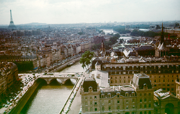
Paris image after pre-soak in the lake at Versailles before processing

Ten years later, when I finally dragged myself away from being an impecunious student and got a full-time job, one of my early purchases was a cheap Russian camera, a Zenith B. The B I think stood for ‘brick’, but while it was crude and chunky, at least (unlike their rangefinder I also tried) it had a reasonably accurate viewfinder, and most of the Russian lenses were decent copies of the German lenses whose designs had been a part of post-war reparations. Along with the camera I also bought a cheap Russian enlarger that folded up into a large box, some black plastic sheeting, plastic seed trays without holes in the bottom and a Paterson developing tank and converted first our spare bedroom and later the kitchen into a makeshift darkroom.

Black and white was then what serious photographers used and I spent much of my non-working time immersed in its chemistry, mainly keeping the colour transparencies for my holiday snaps. Before I set up my own darkroom, black and white had been an expensive option, but with 100 ft rolls of bulk film and box upon box of outdated paper it was now almost free (if not always in perfect condition.)

I’d retained an interest in colour, but now that seemed rather expensive although I fortunately won a decent-size block of Kodachrome in a competition – and that included processing. But otherwise the costs seemed high. I flirted briefly with Orwo – East German colour film based on the 1930s Afga patents at its orginal Wolfen plant, but found its strange purplish shadows and uncontrollable repulsive.

Also rather cheaper than Agfa or Kodak films were those produced in Italy by 3M/Ferrania and sold under various other names as well as the makers. When this also became available in bulk lengths I found that Paterson tank could process it (if not always quite perfectly with the aid of cheap third-party chemicals) and began to take more colour transparencies.

But apart from the vagaries of processing (and cheap commercial processing wasn’t always too reliable either) the limited ability of the transparency film to cope with anything other than flat lighting often disappointed. By then I’d move onto and Olympus OM1 and that had reliable through the lens metering, but it was still too easy to get over or under exposure, and with high contrast subjects empty black shadows were inevitable.

Colour print film was more forgiving in terms of exposure, but the cost of printing was high and it was considered unsuitable for reproduction. Outside of social photography, few serious photographers used it – clients demanded transparencies. It was largely an amateur medium for snaps of family and friends (though too expensive for cats and meals to feature much at that time – they had to wait for digital to take over) and the products available reflected this, not least in their relatively rapid fading and discolouration.

It was Fuji who changed this – at least so far as I was concerned. Their research led to longer-lasting dyes and purer colour in their negative films, which Kodak had rather neglected. Perhaps because they failed to give me a job when I went to Harrow for an interview when I first graduated as a chemist. They told me it was because they didn’t think I was interested enough in photography, but I felt it was more my working class background – photography back in the mid-1960s was still largely a middle-class hobby and Kodak management in the UK certainly reflected that.

Photographers of some note in the 1980s began to produce colour prints that excited me, and I found many were working with colour negative film. So in October 1985 I changed to Fuji colour negative films and paper for my personal colour work. After that date if I took a colour transparency it was because I was paid specifically to do so. Fuji’s lead also prodded Kodak into action, and later I found Kodak negative films I could use, though mainly I stayed with Fuji, and when I set up a colour paper processor in my darkroom it fed exclusively on their paper.

A little over 10 years later came another development that changed things for me, when I bought my first film scanner. With the possibility of supplying digital images from colour neg there seemed to be no reason ever to use transparency film again.

My problems with slides don’t stop there. Good filing systems for slides were expensive to set up, and whereas with negative materials you could label them on the negative filing sheet or contact sheet, slides required individual labelling. For projection they had to be in slide mounts (and at best in behind glass) but the mounts covered the edges of the images and usually they had to be removed for printing.

I never had the space, the money or the time to set up a good filing system for my slides. Only a minority ever got labelled, and over time some of that labelling on the slide mount got lost as slides were unmounted and remounted – sometimes in the wrong mount. Slides removed for projection didn’t always get back into the right filing pages. Although not completely chaotic, my slide filing system is certainly a mess.

In making German Indications I spent several days searching through for one particular image of a German factory building, but without success. I made a low-res black and white scan of it from the print (which is also now missing) in 1997 but that print was made in 1986 and I think the slide has been lost since then.


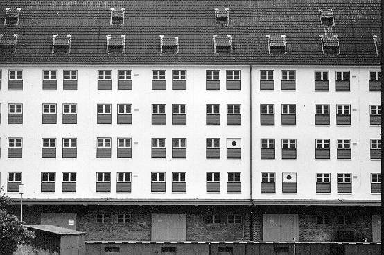
You’ll have to imagine the colour as I only owned a black and white scanner in 1997

Having to send slides – the original image – out to clients or for processing was always a slightly risky business. If they were to be reproduced in print they were often returned with fingerprints across them – print technicians were often rather careless especially I think with 35mm transparencies which they rather looked down on. Sometimes slides did get lost or badly damaged, and although I did get some compensation it was never more than nominal.

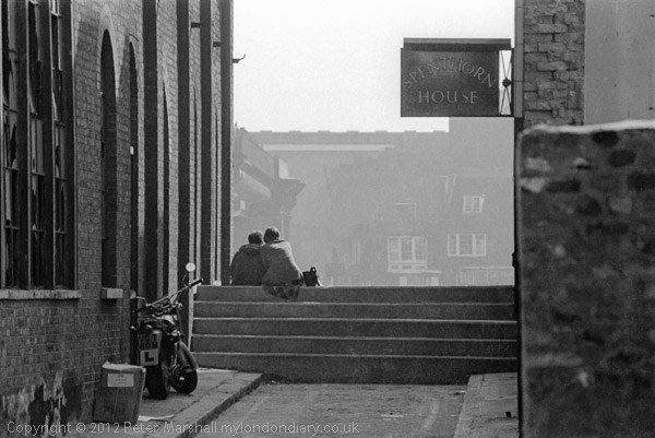
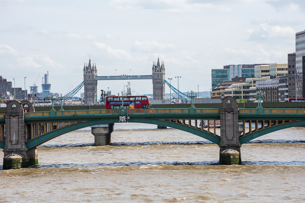
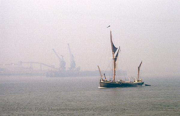
The image at the top of this piece certainly shows a barge in sail on the River Thames, but where or when I can’t now be sure. The folder the slide was in says 1984 and that seems likely, but the background could be a sand and gravel wharf almost anywhere on the lower Thames. I suspect from the width of the river (I think I was probably standing on the riverbank rather than in a boat) it may be at Greenwich, but despite this I’ve used it as the frontispiece – and the only colour image – in my other new book completed this week, Woolwich to the Darent – more about which in another post. It just seemed a picture that seemed to fit with the atmosphere and mood of the river and the book.

German Indications

Friday, January 22nd, 2016

One of the reasons I’ve not posted here for a few days is that I’ve been busy finishing a couple of books, though there have been other issues. But the preview above shows you about half of one of the new books, best viewed at full screen by clicking the symbol, so that you can actually read the several pages of text.

When I showed this work in 1986 it had around 30 images, 11 in colour, and the same set of nine texts that are now in the finished work. In 1997 I posted a version of it on the web, but as I only had a black and white scanner, the images were all black and white, though some I later replaced with colour versions.

The book now has 29 images in black and white and 39 in colour, and contains all except one of the original set – one transparency has been lost. The images were a similar size to that at which they appear in the printed book, and those in colour were made on an Agfa direct reversal paper which I used to try and match what I saw as the Germanic mood of the original scenes. All have been re-scanned for the current publication and are closer to the original transparencies.

Like much of what I photographed, that paper was past its best-before date and gave the images a rather gloomy and melodramatic character. The black and white images were also printed on a German paper, Agfa Record Rapid, then my favourite black and white paper, though in later years after it was reformulated to remove Cadmium it was never the same.

Now it would be easy to print out the texts in high quality at a suitable size, but back then home computers only knew dot-matrix printers. I typed out the stories using an electric typewriter for clarity, but they were really a little small for the exhibition wall. I found a few typing errors and other minor errors when getting them ready for this version.

As usual, I recommend the PDF version of German Indications, ISBN 978-1-909363-16-8, which you can download from Blurb immediately for £4.99. There is also a print version available from Blurb – and I will shortly have copies available for UK addresses at a little less than the Blurb prices, probably at £27 inc postage.

Take a walk with me

Sunday, January 17th, 2016

Take a walk with me through a London, much of which has disappeared or changed dramatically” it says in the introduction to my set of pictures in the web site London Dérives, and the walk starts at Cousin Lane in the City of London in 1974 with an L plate and a couple snuggling together on the steps overlooking the Thames, and ends around 190 pictures later in Rectory Gardens, Clapham in 1983.

Some of the images from this set were published in my book, London Dérives – London 1975-83 and still available on Blurb (or direct from me to UK addresses only.)  On Blurb can also download a PDF of the book, which has the advantage of being considerably cheaper at £4.50 and having better quality images and being on your computer within minutes.

The blurb on Blurb states:

London Dérives
ISBN 978-1-909363-08-3

“People well know that there are gloomy quarters and others that are pleasant. But they generally convince themselves that the smart streets give a sense of pleasure and that the poor streets depress, without any nuance. In fact, the the variety of possible combinations of ambiances, like the solution of chemical substances into an infinite number of mixtures leads to feelings as different and as complex as arise from any other form of spectacle. “

Pictures from numerous walks “without goal” through London in the mid 1970s and early 1980s which aimed to capture some of the nuances of that city.

Mario Cravo Neto

Friday, January 15th, 2016

One of the minor disadvantages of living just outside London is the time and expense of getting to events taking place there. I have to make an effort to go to events such as tonight’s opening at Autograph of photographs by the late Brazilian photographer Mario Cravo Neto (1947-2009), and I just don’t have the time – and unless I’m up in London for other reasons its often hard to persuade myself to do so for openings. But I will certainly find time when I’m in London before the show ends on 2nd April 2016 to pay a visit to Rivington Place in Shoreditch, London.

One of the things I most enjoyed doing and which I thought was most important when I was employed to write about photography on the web was a series of articles of photography in various countries around the world, in part to get away from what appeared to be the assumption of many that the only important things happening in photography – at least since the start of the 20th century – were made in the USA. (Not that I neglected the USA, and I also wrote extensively about American photographers, particularly those involved in the New York Photo League, some of whom I felt were being forgotten.)

And although I wrote about photography in various countries around the world, in Europe, Asia, Africa and Australasia, the backbone of my series was the countries of Central and Southern America, which I tackled in alphabetical order. Brazil thus came fairly early in the series, which followed a fairly standard pattern, beginning with and introduction to the country and what I could glean about the early history of photography there (French-born inventor Hercules Florence living in the Sao Paulo region was apparently using a camera before that Mr Talbot at Lacock) and continuing on into the 20th century and ending with a short text about post-war and contemporary photographers. I wrote about around a dozen from Brazil, including this paragraph:

Mário Cravo Neto comes from Bahia, and his work incorporates references to the voodoo religion of that region, using indigenous people as actors holding objects often of ritual significance. He trained a sculptor like his father before turning to photography and his work shows a strong, tactile appreciation of texture.

It’s rather brief but to the point, though I might also have commented on the richness of both his black and white and colour work, but I did also make links to any web sites where his work could be seen, though in 2000 these were few. Things are rather easier now. There is a set on  Lensculture for the Autograph show, and an extensive web site on the Project ‘Black Gods in Exile’ with work by him and Pierre Verger, another photographer who featured in my article.

D5 or not D5?

Thursday, January 14th, 2016

We can get some idea of the quality of the extreme ISO pictures on the new Nikon D5 from some sample image by Leon Ostrom of Randorn in a post on PetaPixel.

Not able to take away any images on a memory card, he photographed a series of test shots on the Nikon stand at CES 2016, then photographed the results displayed on the LCD screen on the back of the camera, both showing the full frame and a magnified detail, at Hi-1 (ISO 204,800) to Hi-5 (ISO 3,280,000).

Although these are only pictures of the image on the LCD screen.they give a very good impression of the possibilities of the camera, although the actual images could be greatly improved by appropriate noise reduction in post. Most impressive is the quality at Hi-1, which of course drops off as amplification increases. Hi-2 (IS0 409,600) looks to be usable for many purposes after noise reduction, while higher ISOs are distinctly emergency only.

Its a remarkable achievement, and one that makes me lust after the D5, though it isn’t a feeling I can sustain for long given the price and weight of the camera. But certainly it does make me hope for better high ISO and more affordable and lighter new models from Nikon. Even going back to DX with the D500 might be an option.

It also is a stark reminder of the ridiculous nature of the arithmetic ASA system. which was incorporated into ISO along with the much more sensible logarithmic DIN scale, where a one stop difference is an increase in 3, which makes it much easier especially when the ASA numbers get astronomical.

Back in the days of Tri-X, it was a 400/27 film (though we actually often rated it differently depending on which developer we were using and how we liked our negatives.) But its a good starting point for thinking about film speeds, and my starting point for this little table (more about film speeds for geeks on Wikipedia):

ASA	Din
400	27
800	30
1600	33
3200	36
6400	39
12800	42
25600	45
51200	48
102400	51
204800	54
409600	57
819200	60
1638400	63
3280000	66

Either using this little table (or being able to divide by three) you can see that Hi-2 gives us a 10 stop advantage over Tri-X (or 8 stops over Tri-X pushed a couple of stops) which is certainly not to be sneezed at.

With the D700 and D810 I’m now working with, the practical limit I find is around ISO 6400 – so the D5 is performing at around 5 or 6 stops down the scale better. The D4 and Sony A7SII both claimed 409600 in 2014, so the D5 claims 3 stops more than them. It does seem pretty remarkable.

Vivian Maier – Digging Deeper

Wednesday, January 13th, 2016

I was about to post this as a comment to my post last week, Vivian Maier Still in Hiding, but then I thought people often miss the comments, so instead this short post.

On yesterday’s Lens Blog I read a summary the first part of Digging Deeper Into Vivian Maier’s Past with the second instalment promised for today and probably there by now. Its a summary of a longer feature on the Vivian Maier Developed blog, where you can also read Part 2 – A Life in Pictures.

The researcher, Ann Markswho has no background in photography and started researching Maier only after seeing a documentary about her life — has learned a great deal about Maier’s family history“, some of which had also been uncovered by the sources in my previous piece.

It amplifies what was already known about her background, and the confirms the speculations about the closeness of her link with a photographer: “From early childhood, Maier spent a significant amount of time with a woman named Jeanne Bertrand, who worked as a professional photographer, as well as other positive female role models” and throws a great deal of light on what was a rather disturbed life. And I await today’s second part with interest.

What it won’t do is tell us any more about her as a photographer, and for that we will have to await detailed studies of the whole of her work – which appears to have been kept together by her tenaciously while she was able to do so – rather than the selected examples that we have so far seen. The second part does give some insight into how her photography developed, although unfortunately at least some of the illustrations there appear to be reproduced at the incorrect aspect ratio.

So far I remain unconvinced that she was anything more than a very capable and talented photographer able to imitate the styles of others. My question if there was a real photographic ‘Vivian Maier’ who had something distinctive to say remains unanswered.

Mendelsohn’s Balsall Heath

Tuesday, January 12th, 2016

An article in The Guardian brought to my attention the work of American photographer Janet Mendelsohn, a Harvard graduate who in 1967 came to study with Stuart Hall and Richard Hoggart at the ground-breaking Birmingham Centre for Contemporary Cultural Studies. Forgotten for years, her work which she made use of photography as “a tool for cultural analysis” in a multi-racial area undergoing a radical transformation through immigration and dire poverty, was rediscovered when Kieran Connell, who was curating a show for the 50th anniversary of the centre, became obsessed by a photograph of hers on the cover of its 1969 annual report.

It took considerable detective work by Connell to find out more about the photographer, but when he finally managed to contact her sent back the request “Please take these photographs off my hands” and sent him a large box with several hundred prints and 3,000 negatives.

Some of these were from a project in the red-light area of Varna Road in Balsall Heath, and it is this series which is the basis of the newspaper article, as well as a forthcoming show at the Ikon Gallery in Birmingham (PDF press release here) and a free symposium at the end of January at Birmingham University with speakers including Magnum photographer Susan Meiselas, artist Mishka Henner, UCL History Professor Catherine Hall and curator and photographic historian Pete James.

One classmate of Mendelsohn’s at Harvard was film-maker Dick Rogers, (1944-2002) who also went to study in Birmingham with Hall and Hoggart for two years, after which he returned to Harvard to study on a Visual Education programme where he met his future wife Susan Meiselas.

Mendelsohn worked with Rogers on his first film, Quarry (1970). His best-known work, Pictures from a Revolution (1991) retraces Meiselas’s work on her photo essay ‘Nicaragua: June 1978-July 1979‘. In an earlier film, 226-1690 (1994) he used recordings left on his phone answering machine from her when there including one with a gunshot in the background.

Some of Mendelsohn’s work was shown last July in ‘The Ghost Streets of Balsall Heath‘ at The Old Print Works, Moseley Road, Balsall Heath as a part of the Flat Pack Festival.

Marathon Day

Sunday, January 10th, 2016

Saturday August 15th last year was something of a marathon day for me, with nine of the roughly 20 stories from the month. I’d left home that morning with a fairly ambitious schedule, five events spread out across the day from 10am until around 8pm, and came across a few more things to add as I travelled around.

My day started outside the National Gallery where there was a rally by the PCS strikers at the end of the morning picket on the 61st day of their strike against privatisation and calling for the reinstatement of victimised union rep Candy Udwin.

Joining in the protest there had been people from the Tate Gallery, where some privatisation has already taken place, with privatised gallery assistants getting paid £3 an hour less than their directly employed colleagues doing the same job, as well as minimal conditions of employment and zero hours contracts that fail to give them predictable hours or income.

I went on to photograph their protest outside of Tate Modern, where Equalitate were handing out leaflets to the busy crowds walking past there, before leaving and taking the bus back to Aldwych and the Indian embassy.

I’d come here for a protest by Sikhs on Indian Independence Day supporting the call by hunger striker Bapu Surat Singh for the release of Sikh political prisoners, but found that there was also a protest by Kashmiris.

Kashmir is a disputed territory with areas occupied by India, Pakistan and China., and Independence Day is observed as ‘black day’ in Indian military occupied Kashmir. The Kashmiris want freedom for their country and the protest became quite heated at times.

Back in Trafalgar Square there were also two events taking place. The  Party of Free Life of Kurdistan (PJAK),  an Iranian Kurdish group formed to fight against the Iranian regime for self-determination for Kurds in Iran and based close to the Iranian border in Iraq were celebrating their martyrs with flags, banners and posters showing their faces.

A short distance away was the regular monthly protest mainly by Koreans over the Sewol Ferry disaster, calling for changes in the Korean law and a full inquiry into the disaster which killed so many schoolchildren who were told to ‘stay put’ on the lower decks as the ship went down.

Next was another in the series of protests by United Voices of the World at Sothebys in New Bond St, where two workers remained sacked following an earlier protest calling for better conditions of service – sick pay, holidays and pensions – for the outsourced workers who clean Sothebys.  As usual there was a certain amount of friction between the protesters and police who tried to limit their protest.

But on this occasion there were fewer police than previously, and they were less forceful in their intervention, largely trying to persuade rather than using force. By the time this protest ended I was tired and ready for home, but there was one last event I wanted to cover.

BlackoutLDN solidarity with Black US victims took place not as I had expected outside the US Embassy, but a short distance away inside the garden in Grosvenor Square, where there is a statue commemoration President Franklin D Roosevelt. It was an unusual event with contributions from a number of individuals and groups including BARAC and the Nation of Islam, and as well as speeches there were songs and poems. But I was getting tired and had to leave before the final lighting of the candles as it began to get dark.

I had been on my feet too long, and my legs were suffering. I had to rest for a few days after this to get fit for the week’s holiday that was coming up.  During the day I’d also taken a few pictures as I travelled around London, which are in London Views. Altogether I’d taken a ridiculous number of pictures – after deleting those which were obviously unusable I was still left with around 1,600 – around 25Gb of RAW files. Far too many!

It’s good to be able to report that all three of the industrial disputes that I photographed on that day have since then been successfully resolved.
(more…)

As Drik as Possible

Friday, January 8th, 2016

I’ve written on a number of occasions here and elsewhere about Shaidul Alam and Drik, most recently on the agency’s 25th anniversary. The idea of people in the majority world telling their own stories is one which has always seemed important to me, and I have a healthy distrust of some of the efforts of celebrity western journalists and photographers who  sometimes work with little real idea of the society and background to the events they are covering. It’s great to read a truly inspirational success story about Bangladesh, and how they have overcome so many problems. Optimism, a strong belief in what they are doing, the willingness to take serious risks and continuing hard work have been rewarded.

It goes a little deeper than that. Even when I look at how life in my own country and city gets represented though the media I’m often aware of a concentration on the froth and the failure to really understand or show the realities of life for the majority of our citizens. Of course there are some notable exceptions, but we really need a grass-roots photography movement too, as well as publishing on-line and in print that supports it.

The story of Drik, told in Alam’s blog post As Drik as Possible, is an introduction to the 2016 Drik Calendar, and tells a little of the storyand there is a little more about it on Flickr. You can also see a larger album of over 600 of Alam’s pictures of Bangladesh.