Archive for May, 2008

No Third Runway

Saturday, May 31st, 2008

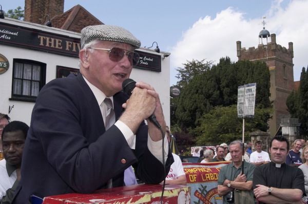
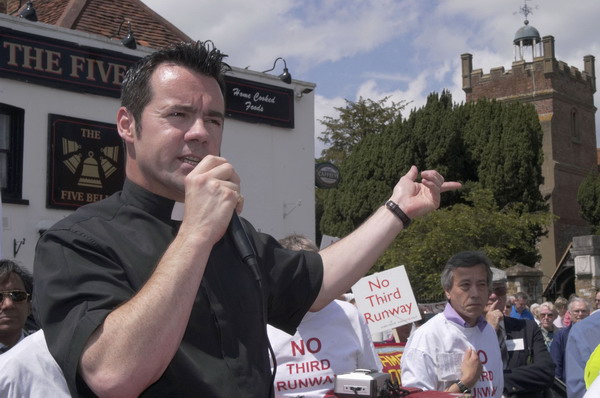
Today I photographed a demonstration against the continuing expansion of London Heathrow, certainly one of the worst located airports in the developed world.

I grew up under its flightpath. In my back garden in Hounslow I would imagine myself reaching up and touching the planes as they passed overhead. It wouldn’t have needed very long arms. I dreamed (or nightmared) of them passing over in flames (though sometime it was true) and jumping across the sky as flaming fragments.

Heathrow was established by deception – as a miltary airstrip for which there was no military purpose. It has grown by lies. The third terminal was all the airport would ever want, but as soon as planning permission was obtained, in went the application for a fourth. Of course that would be enough. But somehow we have a fifth, and the sixth will soon be with us unless we stop the madness.

The quiet Middlesex villages I cycled through as a child – and by the time I was ten I was roaming through them all on my bicycle and further afield – are either already gone or under threat. Longford, Sipson, Harlington, Harmondsworth and more.

Harmondsworth, 2003
Harmondsworth, 2003

Harmondsworth, 2003

Look at the placard at the right of the picture. Here is a detail from another frame that states clearly what the BAA, responsible for Heathrow, promised about the possibility of a third runway there:

Detail of BAA's view of a third runway at Heathrow
Rule out third runway say BAA

I hope today’s demonstration – in which over 3000 people gave a resounding ‘No’ to the idea of a third runway will cause even our un-green government to think again. It has been clear to anyone who took a careful and balanced view that Heathrow was in the wrong place since the 1950s – if not before. Government after government has refused to grasp the nettle and start to develop another London airport on a more suitable site. We now have a different situation, with increasing oil prices as we go past ‘peak oil’ as well as an much greater appreciation of the catastrophe approaching through climate change. From every point of view – even a strict economic one that ignores environmental issues – Heathrow needs to shrink rather than expand.

I’ll post some of my own pictures of today’s demonstration shortly. For the moment you can see a few my pictures from the march from Sipson to Harmondsworth in June 2003, and you can also see the BBC’s video coverage of the event, in which I appear rather too prominently, immediately after the huge ‘NO’, taken from a cherry picker, as a photographer in a blue check shirt, first walking towards the camera and then walking back into the frame to take another picture.

Pagan Pride

Saturday, May 31st, 2008

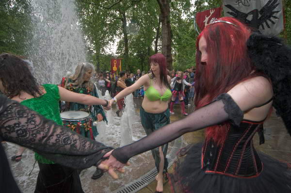
Pagan Pride, a procession of pagans (or neo-pagans) around London’s Bloomsbury has a certain colour and charm. It’s a celebration of spring, the public part of an annual ‘Beltane Bash‘ event, with elements that come from our Celtic past.

Pagan Pride (C) 2008, Peter Marshall
Dancing around the fountain in Russell Square

Efforts have been made to restore the garden in Russell Square to its original plan. It was laid out by Humphry Repton in 1805-6, although his original planting of lime trees were fortunately replaced by J C Loudon with London planes in the 1860s – so they are now fine, mature specimens. Camden council added a central feature of three ‘modern’ fountains in 1960, which were certainly not to everyone’s (or possibly anyone except the Borough architect’s) taste. Fortunately funding from the Urban Parks Programme in 1996 enabled these to be removed (and the original garden layout to be restored) and the park reopened in 2002 with a modern computer controlled fountain designed by Land Use Consultants (LUC).

This fountain could hardly have been designed more appropriately for the Pagan Pride parade – which I think began shortly afterwards, with phallic water jets emerging, rising and falling from a number holes in the York stone paving creating a truly organic (or orgasmic?) effect. When I first photographed the event, the jets were following the normal erratic (if not random) pattern, but this year the gardeners appear to have been persuaded to turn them on more or less full for the duration of the event.

You can see the effect on My London Diary. And yes, I did get wet, both from the fountains and the rain.

Better Digital 2

Thursday, May 29th, 2008

The second instalment of a short series of tips on digital images – see also Better Digital 1

Image size and Resolution

Image size is measured in pixels. When supplying images you will seldom if ever be told what size is needed. A rough guide:

· Full page 3000×2000 px or larger
· Half page 2400x1800px or larger
· Quarter page 1800x1200px or larger

Always set the resolution of images at 300 dpi unless specifically asked to use another figure. Most editors etc have no idea what resolution means, and few seem to know it can readily be changed. Much of the confusion comes about because in Photoshop the ‘Image Size’ dialogue box can be used to do two rather different things. It can change the image resolution and it can ‘resample’ your images. Resampling alters the number of pixels in the image, making it larger or smaller (with photographs you will always want to use either ‘bicubic’ or ‘smooth bicubic’ resampling in Photoshop, although other software offers algorithms that may at times give better results.)

Changing resolution doesn’t actually alter your images, but simply changes a few bytes in the file that contain the resolution figure, which is an instruction to the output device about how to work out the size to make a print. Make sure you un-check the resample box in Photoshop when changing resolution – or you will also resample and thus alter your image size.

Various programs claim to work magic when resizing your images, and over the years I’ve tested and reviewed most of them, usually getting a free copy. My conclusion was that for any normal purposes you don’t need them, but that some, particularly SizeFixer will give a better result if you need to blow up a small image for a giant print – and have a very long time to wait for the result.

Image Quality and Format

Unless specifically asked for TIFF files you can supply JPEG. If awkward customers particularly want TIFFs you will find no problem in converting high quality jpegs to tiff format in Photoshop and sending these!

For supply on CD I would normally use Jpeg quality 11 in Photoshop or 92% in Lightroom
For e-mail, I cut down the file size depending on the page size requested as above and supply at quality 9 or 10.

TIFFs should be supplied uncompressed, in PC byte order. All files should have the appropriate colour profile, sRGB or Adobe RGB, embedded in the file.

Sharpening
Images for reproduction should normally be supplied unsharpened, or only with very slight sharpening (use ‘unsharp mask’ or ‘smart sharpening’ or a specialised sharpening plug-in – my favourite is Focalblade. In Lightroom I always apply ) There should be no visible sharpening artefacts.

You should leave it to the printer (or whoever is preparing work for the press) to apply appropriate sharpening for the printer and output size.

If supplying images for presentations or web use, sharpen these appropriately for use on screen. Again there should be no visible artefacts.

Black and White images
Black and white images are also usually best supplied as RGB files, using the appropriate colour profile, sRGB or Adobe RGB, embedded in the file.

If you know your colour images are going to be used as black and white, it is best to do the conversion yourself. Photoshop offers various ways to do this, and one of the simplest that gives you decent control is the ‘Channel Mixer.’ Lightroom and CS3 have a superior ‘Grayscale Mixer’ and plugins such as B/W Styler give ease of use and special effects as well as similar control for users of earlier versions of Photoshop.

If your black and white images are to be printed as colour, you can produce richer results by the use of small amounts of colour in highlights and shadows – as we used to produce by selenium and other toning methods.

CMYK
Normal colour printing uses the 4 inks Cyan, Magenta, Yellow and blacK, and the printer needs images that are separated into these four colours. However this is a highly technical process and depends on the inks, printer and paper, and it it usually best to supply files as Adobe RGB (or possibly ECI-RGB for European printers.)

If you have to convert to CMYK, you should try to find out from the printer the appropriate CMYK colour space to use, such as SWOP Coated V2 CMYK.

Metadata
Never let any file leave your hands without appropriate metadata. The proposed ‘orphan works’ legislation makes it even more essential to ensure as a minimum that your name, copyright details and contact details are included.

Metadata includes both EXIF data and IPTC data. Cameras write EXIF data into the file on every image that you take, but scanned images don’t have it. Some cameras enable you to write a comment into every file – and mine is my copyright notice. However most software seems unable to read it.

IPTC stands for International Press Telecommunications Council. IPTC data is written into the image file, either as an IPTC header, or using the Adobe XMP format. You can download an IPTC metadata panel to add to recent versions of Photoshop (CS and later.) Some older software cannot read the XMP data, but this is now the standard format.

The uploading module in Lightroom and similar software makes it very easy to set up presets for regularly used metadata (such as photographer, copyright, contact details etc) and also add keywords during the uploading of batches of images from memory cards. You can also easily add headline, caption, country code, date etc.

Workflow
Workflow is a consistent series of steps that you carry out on each image. Mine relies on Adobe Lightroom and can be summarised:

  • Import – copies to hard disk, makes backup, adds keywords and other metadata, adds to image catalogue
  • Selection – deletes unwanted images, gives others a rating (keep, process, etc)
  • Processing of selected images – adjusts exposure, brightness, curve, removes dust, red-eye etc,contrast, reduces noise, sharpens, chromatic aberration, vignetting etc (some handled by presets, some automatic, other image specific)
  • Output – writes files of preset size, quality, colour space etc for particular usage to selected locations

Recommended Software

PC Users: Adobe Lightroom
MAC Users: Adobe Lightroom or Apple Aperture

A very few selected images will need local manipulation in a program such as Photoshop. A good cheaper alternative that can do virtually everything most of us need is Photoshop Elements. There are other programs, but these are so commonly used by photographers that they are usually the best choice.

Other RAW conversion software may sometimes give better results than these, although the differences are generally not great. But none offer the ease of use and in particular the ability to catalogue your images. For Nikon cameras, the ultimate results seem to come from the Nikon Capture NX software, but its a pig to use compared to Lightroom.

I routinely process everything in Lightroom, writing full-size jpegs at quality 92 of selected images – that can be resampled if necessary if I need larger files for a particular purpose – or even converted to TIFF if necessary.

I run a second selection on these results and resize and convert to sRGB for web use, using ACDSee Pro (I got a free copy of this, but had previously bought it as my general purpose image viewer.)

Those few images when I want a high quality print – perhaps for exhibition use – I’ll try using Capture NX, and see if I can get a better result. Then I’ll do a little tweaking in Photoshop before either printing or sending out for printing.

Some free/cheap software for PC:

Raw Therapee
This looks excellent for converting RAW files to jpeg, giving results on the few images I’ve tried as good as the most expensive software. Where it seems to miss out is in workflow and speed.

PTLens
A dirt cheap plug-in for Photoshop (it can alsobe run standalone) that, when I tested it, out-performed a commercial program costing over ten times as much. It automatically corrects pincushion or barrel distortion and has the great advantage that it can work for any lens on your camera. If you have a lens that isn’t already covered you can take some suitable pictures and get it added.

Irfanview
This is a good file viewing program that also allows you to do some basic image correction, as well as allowing you to use some Photoshop plugins. It is free for private, non-commercial use and very cheap for business use.

There may at some point be a Better Digital 3 in this series – but don’t hold your breath!
Justice for Darfur

Thursday, May 29th, 2008

(C) 2008, Peter Marshall

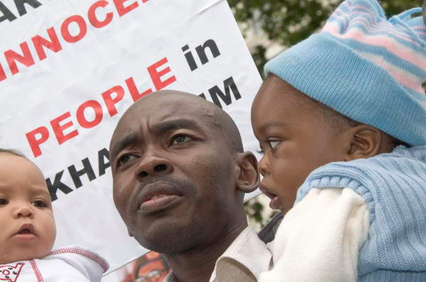
The genocide in Darfur has being going on for so long that it seldom makes the news, which is perhaps why none of the newspapers could be bothered to send anyone to cover the demonstration in London calling for ‘Justice for Darfur’ and for those accused of war crimes there to be sent for trial at the International Criminal Court.

Although over 50 people haven been listed for investigation, so far as I am aware only two arrest warrants have been issued. Ahmad Haroun is a minister in the Sudanese government, and rather than send him for trial, the government response has been to promote him. Janjaweed leader Ali Kushayb was actually being held by the police in Sudan on other charges when the warrant was issued, but they have since released him without charge.

As I said to one of those on the demonstration and march, it is hard to see why an event like this isn’t news when celebrities only need to sneeze to make the front page. As so often to find out what is really going on you have to look on the Internet rather than rely on what the commercial press thinks we want to know – or wants to tell us. I’m a great supporter of press freedom, but at the moment most of the press is hardly worth fighting for, and we often have to rely on non-commercial news media such as Indymedia for news.

More about the event and more pictures on My London Diary

Cornell Capa, 1918-2008

Sunday, May 25th, 2008

Cornell Capa, one of the last remaining of the classic generation of photojournalists who came out of Europe in the 1930s died in New York last Friday, May 23, 2008, aged 90.

Cornell was perhaps always overshadowed by his more flamboyant brother Andre, who re-invented himself in Paris in the mid 1930s as the ‘famous American photographer Robert Capa‘. When Cornell joined his brother in Paris in 1936, hoping to study medicine, he started working as a printer for Robert, and also for two of his brother’s friends, Henri Cartier-Bresson and David Seymour (Chim).

In 1937 Cornell moved to New York, and Robert helped him find a job in the darkroom of the Pix agency, and, in the following year, in the darkroom at Life magazine. He also had started taking pictures, and his first picture story was published in Picture Post in 1938. During the war he worked for the USAF in photographic intelligence and in 1946 joined Life as a junior photographer.

Cornell Capa joined Magnum in 1954, shortly after his elder brother was killed in Vietnam (another early Magnum member, Werner Bischof died on more or less the same day) remaining a member until his death and serving as president for four years.

After his brother’s died, Cornell was determined to keep the memory of his work alive and to continue to promote the kind of photography he had stood for, which valued human feelings and was dedicated to improving the human situation. He set up the International Fund for Concerned Photography, Inc.

The book and exhibition ‘The Concerned Photographer‘ which he edited in 1968 for the fund included work by Robert Capa and Werner Bischof, as well as Chim, Andre Kertesz, Leonard Freed, as well as by Dan Weiner who had been killed in a plane crash in 1959.

In 1974, Cornell foiunded the International Center of Photography in New York as a permanent home for the International Fund for Concerned Photography.

You can hear the voice of Cornell Capa in a short interview on NPR with Jacki Lyden, recorded in 1994. Much of his contribution to the interview is transcribed on the web page, but there is just a little extra about hearing it in his own voice.

You can also find an obituary in the New York Times and on the Magnum blog.

Because of the fame of his brother, it’s perhaps easy to overlook the fact that Cornell was himself a very fine photographer. While Robert Capa was certainly one of the best war photographers of his era, with iconic images such as that of the falling soldier from the Spanish Civil War and his grainy and distressed work on the beach on D-Day, a living testimony to his dictum “if you pictures aren’t good enough, you’re not close enough“, his younger sibling had a true gift for finding a different way to view things, something that stood out from the obvious.

Journey to Justice

Thursday, May 22nd, 2008

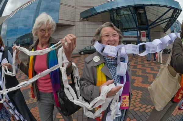
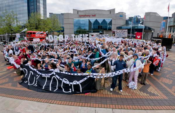
Sunday I was a demonstrator with a camera rather than a reporter, going with a coachload of others from a church a few miles away to Birmingham. Ten years ago I’d made a similar journey to form a human chain around the conference centre where heads of government from around the world were meeting; I think the 70,000 of us were the first major demonstration at a G8 meeting, and we put Debt Relief very firmly on the political agenda.


Methodists from Worcester caught in the chains of debt, Birmingham, 2008

Digital showed its strength again, when we went into the rally in the same conference centre that the G8 had used. The lighting in the hall wasn’t bright, but I was still able to take some nice sharp images with the 20mm from my seat, although it was a pity that the 18-200mm VR lens had jammed the previous day. The picture below, taken without VR, was at 1/125th on a Sigma 55-200mm lens at 200mm (300mm equiv) full aperture, ISO 1600, and is sharp and relatively noise-free.


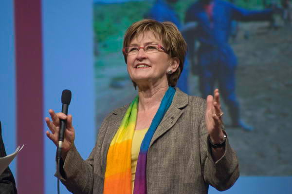
Ann Pettifor (Advocacy International and Operation Noah, previously of Jubilee 2000)

It was a long day – but interesting, although the final demonstration proved a bit of a challenge – a human pie chart to illustrate that 20% of debt has been dropped but 80% still remains. Here’s my best effort.

Pratt’s Bottom

Thursday, May 22nd, 2008

It’s hard to resist a name like Pratt’s Bottom and I have to confess I didn’t try hard, and as soon as I heard the details it was etched in my diary. Pratt’s Bottom (or rather Pratts Bottom, as I notice they like to omit the apostrophe these days) is a village on the south-east outskirts of London, and notable particularly for its annual village fete held each year in May.

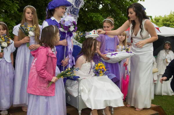
Pratts Bottom May Queen
Last year’s May Queen crowns the Pratt’s Bottom May Queen for 2008
Part of the reason for its continuing vitality as a village is the Village Hall, where you can act, sing opera, play short mat bowls, train your dog, play badminton or with model trains as well as be a Brownie or join the WI, though if you get your nights mixed up the results could be surreal. It also has a very nice pub, the Bull’s Head, its very own village school with 47 pupils (a pre-school group also meets in the Village Hall) and – the real reason for my visit (although the pint of Theakstons was very welcome) its own May Queen.

There are some drawbacks. Pratt’s Bottom is a longish journey from where I live and the nearest station only gets one train in each direction per hour. Due to a misunderstanding about the times I arrived rather late to find the procession had already left and found myself running over half a mile up a hill to catch up with it, getting to the village green where the fete was taking place more or less as it arrived.

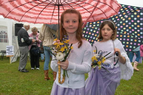
It was also raining. Not particularly heavily, but steadily. Enough to sneak the odd drop onto the filter I’d just wiped and spoil the picture, though I’d tried hard to keep a cloth over it when not in use.

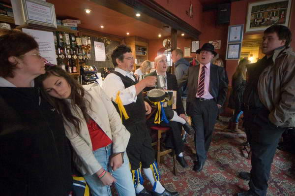
So when I’d taken the pictures of the May Queen crowning, had a walk round all the stalls, had a couple of goes on Pratt’s Bottom’s Human Fruit machine and taken a look inside the Village Hall at the drive-it-yourself model railway (I resisted) there really wasn’t a lot to do other than join the Morris Men having a bit of a sing-song in the pub.

Bull Head

It is, after all, traditional.

Better Digital 1

Thursday, May 22nd, 2008

The first in a short series on getting the most out of digital images

I went to a photographers meeting a couple of weeks ago where pictures taken by around 20 different photographers (including myself) were all projected. Virtually all of them were good pictures – and most of the photographers were managing to make a living from photography, but technically I felt a number were letting the people who took them down in various fairly simple ways.

Back in the darkroom age, most photographers either learnt to make at least halfway decent black and whites or, more often once they started to make some money, had their work printed for them by a decent printer. With colour, for publication we largely shot on slide film and accepted the results from the lab on our Ektachrome or whatever, handing the trannies in for publication.

Now, most publications will no longer accept prints or slides and expect digital, but there are still quite a few photographers who haven’t yet really learnt how to get the most of of what they shoot on digital.

In most respects, digital has had the result of increasing technical standards compared to film. Certainly in low light we can produce pictures with a technical quality that is way better than film. But where we used to rely on labs to get things right, we now have to do it ourselves. So here is the first part in a series with some simple advice for photographers.

Monitor

Probably you’ve stood at some time in an electrical shop looking at the same programme displayed on a whole range of different TV screens and noticed the differences in colour, brightness and contrast between them. All of them are getting the same input signal, but may produce very different pictures. Computer screens are not a lot different (especially as we move to digital TV) and your image file may display very differently on your own screen to than when viewed by an editor or projected onto a screen. Those pictures with a nasty yellow cast may have looked perfect on someone’s notebook screen.

If you work with images it is worth buying a good screen to display your pictures. Unfortunately few if any notebooks come with particularly good screens – and a really decent screen for editing your pictures can easily cost as much as a notebook.

At home I use an Eizo monitor. It cost about as much as the large box by my feet that sends it a signal, but was worth every penny. Away from home I use an Acer notebook, and the images don’t quite look the same.

Hardware Calibration

Although the notebook screen hasn’t got anything like the picture quality of the expensive Eizo (or the remarkably good ancient but fairly massive Iiyama cathode ray screen I still also use) my pictures display in a reasonably similar fashion on all three screens. And I can be confident that any editor etc who knows what they are doing will also see something pretty similar. My confidence comes from regular calibration with a suitable hardware device, in my case a Pantone (GretagMacbeth) eye-one (i1), now replaced by an improved model.
You can get by without such a device – just as you can get by on a laptop screen – and your results may well be ok, but they will not be optimum. Particularly if you want to make your own prints, the better monitor will make it easier to get predictable results.

If you can’t afford a hardware calibration device, there are some web sites that have useful pages to make a rough check on some aspects of your monitor, and you may well be able to set up your monitor roughly using these and the controls on your monitor. Usually you should set the colour temperature to 6500K and use Gamma 2.2 (both on Mac and PC.)

Camera

If you are serious about photography then you will normally be shooting on a DSLR camera with at least a “4/3” sensor, more probably one roughly half the size of a normal 35mm film frame or roughly the same size. Compact cameras (except the latest Sigma DP1) have smaller sensors, usually smaller than a fingernail. Although some of these perform near miracles, they still cannot compare for resolution and image quality with the larger sensors, and at higher ISO the noise becomes excessive.

RAW vs Jpeg

As well as a decent camera – and of course a decent lens – you also need to learn how to use it. Test after test has shown that every camera that has both RAW and Jpeg modes can produce better images when shooting RAW. Almost always there is greater dynamic range but even more important is the flexibility to alter and enhance images that RAW processing provides. The difference is in some ways similar to the difference between using colour neg and tranny, where the printing process gives you a degree of control over how your images look, while the slide you just accept and put on the light box. You can do some post-processing with jpeg, but it is sometimes at the expense of visible image degradation, while RAW allows much great control without any quality sacrifice.

Sometimes of course speed is essential, and the ability to use jpeg files straight out of the camera is vital. If possible it is a good idea to shoot both RAW – to get the best out of when you have time – and jpeg for immediate use.

Colour Depth

Digital cameras transform the minute analogue electrical signals recorded by sensor cells into digital signals. Most cameras work using 12 or 14 bits for each cell to store the value, enabling them to distinguish either roughly 4,000 or 16,000 levels. In most cameras, each cell is behind a colour filter and these are levels of either red, green or blue light, depending on the filter.

The jpeg format only allows 8 bits for each colour – 256 levels, and when your camera writes a jpeg file it has to decide how to scale the data down to fit into this smaller number of levels. Exactly how it does this will depend on various camera settings for the colour space, contrast, colour temperature etc. Once this process has been carried out, and data discarded it cannot be retrieved. The 8 bits in each of the red, green and blue channels of the image make this ’24 bit colour’, also sometimes called ‘Truecolor’

RAW files – or at least most of them – actually contain a jpeg file. In the Nikon NEF format it is a jpeg using ‘basic’ compression, and some software will quickly extract these for you. The jpg is used for the image you see on the screen on the back of the camera. The file also contains the full 12 or 14 bits of data corresponding the the sensor cells, along with information about the camera settings, including the white balance etc. One difference between different software for processing RAW files is sometimes in how much of this information is used automatically, with the camera maker’s own software sometimes understanding more than other software.

You may also have the option of outputting 16 bit TIFF files, particularly from RAW processing software. These files can essentially contain all of the image data from the raw file, but are padded out to occupy greater space. However unlike RAW files they are understood as image files by a wide range of display software.

Colour Spaces

Cameras can only record a fairly limited part of the visual range, with many colours being out of gamut. Different sensors have their own characteristics, producing different electrical values from the cells from the same scene.

The values for pixels need to be connected in some way to actual colours and two ways of doing this are in common use for camera images, sRGB and AdobeRGB (1998) ICC colour profiles, each covering a different range of the visible colours.

AdobeRGB covers a wider range of colours, and is thus usually the better choice for camera images, but the sRGB range is actually a better match to the colours that most monitors can display, and is thus the normal choice for compact cameras.

· sRGB for web use and on-screen presentations
· AdobeRGB for reproduction

It is generally more sensible to set AdobeRGB as your camera profile and to make this the basis of your workflow, converting files to sRGB if you need these for screen use. The Adobe RGB space has a wider colour range.

When supplying files for any purpose always ensure they are tagged appropriately. Unfortunately much software – including almost all web browsers – doesn’t understand ICC colour profiles and will display Adobe RGB files wrongly.

Print services for amateur use always expect sRGB. For professional printing you should consult the lab, which should also be able to supply you a printer profile you can use for ‘soft-proofing’ your images on screen in Photoshop.

Continued in ‘Better Imaging 2″

New York in London

Thursday, May 22nd, 2008

There is of course a sense in which a show like ‘The New York School‘, currently at the Michael Hoppen Gallery in London’s Chelsea, is bound to disappoint, and it is one that is heightened by the hype in the listings which describe it as “An overview of a period of intense photographic creativity from the Big Apple featuring the likes of Diane Arbus, Robert Frank and William Klein” (BJP)

It certainly isn’t an overview. Michael Hoppen is a commercial gallery and the contents of their show is determined by what can be found currently on the market and so offered for sale – only a couple of the works were without prices. It would be impossible to mount a real overview without the collaboration of various museums and collectors in lending work, and would require a considerably larger space. London saw a much better overview as the first half of the major Barbican show ‘American Images‘ in 1985 – and that just isn’t the kind of thing a commercial gallery can hope to match.

We can perhaps take “the likes of Diane Arbus, Robert Frank and William Klein” simply as sloppy journalism, in that the very point about these photographers was that they stood out as each having a particular view. There is a decent print of one of Klein’s better pictures in the show, but Frank and Arbus are poorly served by the couple of examples on offer, at least one of which should clearly have gone direct into the darkroom waste bin.

I went to the gallery not expecting a great deal, and in that respect I wasn’t really disappointed. There were however at least a couple of prints that interested, even moved me, including a fine photogravure of four men from the mid 1950s by Roy DeCarava (surprisingly not included in his fine volume ‘the sound I saw‘ although his second picture in the show, to me less interesting image of dancers is – and I think looks better in the book.) Unfortunately the lighting in the gallery gave maddening reflections – if you want to see the richly stygian ‘Four Men‘ at its best you should take a large black card along with you. I could only really make out two of them in the show.

One of a few Leon Levinstein pictures also caught my attention, although it perhaps lacked the kind of shock of his best work it did have a little of his characteristic directness.

Overall, by the time I’d been round the show – which does include some other pictures, particularly by Weegee and Louis Faurer, of at least some interest – I was beginning to think a more accurate title might have been ‘New York on a Bad Day’. Most of the photographers in it are deservedly well-known, but not on the basis of what was on show here. (I’ve never quite understood why people rate Ted Croner (1922–2005), an early Brodovitch student who he sent to photograph the city at night, and certainly what I saw here didn’t help.)

But as an overview, it simply omitted so many photographers whose work seems so central to the creative ferment stirred up by the New York Photo League and by Brodovitch in the period around and after the war. It was also perhaps rather defocussed by the inclusion of work from the city by two visiting British photographers, David Bailey and Neil Libbert.

Perhaps the good prints from the ‘New York School’ are all elsewhere, in galleries on on people’s walls, or, hideous thought, stashed in vaults by ‘investors’. Fortunately we are talking photography, and it is often best seen in books. One of the best overviews of what this show purports is still the catalogue of the Barbican show, ‘American Images‘ still readily available secondhand at a very reasonable price (ranging from 74p from one US bookseller, up to £65 elsewhere.)

Dumbo Brooklyn?

Wednesday, May 21st, 2008

I didn’t get to New York for the New York Photo Festival , although rather a lot of others seem to have done. Held in Dumbo, Brooklyn and billed by its organisers as “the future of contemporary photography” the event on May 14-18 attracted many visitors, though not all were entirely complimentary about what they found.

You can view some videos about it on PDN Online and read a rather short note in the New York Times. The future would appear to be dominated by curators rather than photographers, with Kathy Ryan of the NY Times, Martin Parr of Magnum, Lesley A Martin of Aperture and Tim Barber of Vice curating the four major shows.

But to get a real feeling of what it was like from someone who was in the thick of it, take a look at photographer Andrew Hetherington’s ‘Whats the Jackanory‘ blog reports from New York, perhaps starting with ‘Lets Get the Party Started‘ on May 9 and then going on to the You know it’s a really good photo festival: 1 and following the ‘newer post’ link at the bottom to read the rest. He was also one of the contributors to Foto8’s coverage of the event, and you can read more there from him and other contributors.

In case anyone is still wondering, Dumbo is Down Under the Manhattan Bridge Overpass.