Archive for January, 2011

BBC’s World to Shrink?

Monday, January 31st, 2011

I suppose it was inevitable that there would be considerable media interest in a story about our major broadcaster planning sweeping cuts to what many of us feel is one of the most vital and nationally important  aspects of its services – though to the people that run the BBC it seems to be regarded as a loss-making nuisance.

I’ve long felt that the BBC wastes most of the licence fees it collects and making TV programmes that may have high audience figures but that basically are little different to the offerings from commercial stations, including some which seem little more than thinly disguised promotionals for some industries. And we don’t even have a car manufacturing industry to speak of.

You can read more about it and see more pictures from the demonstration in Save the BBC World Service on My London Diary.
© 2011, Peter Marshall
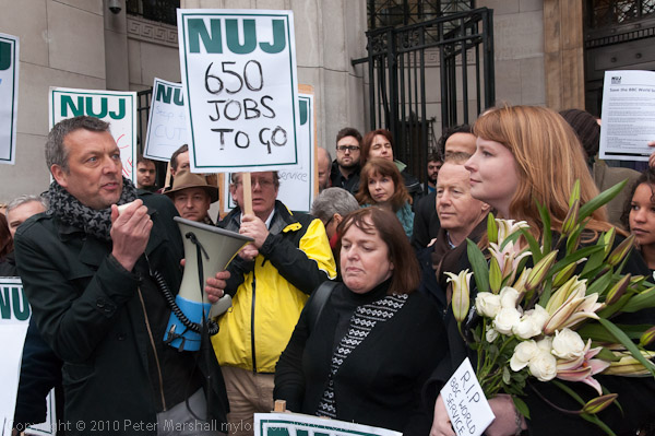
NUJ General Secretary Jeremy Dear speaking at the demonstration

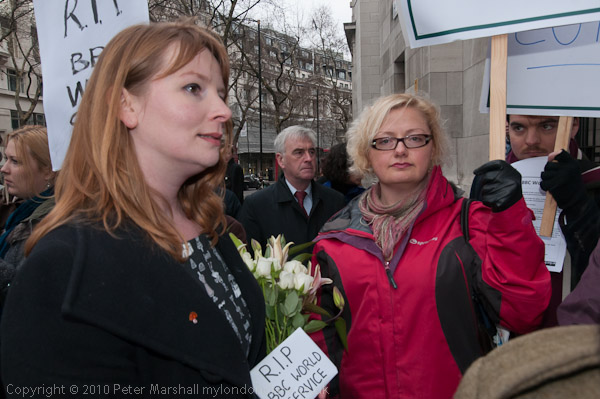
Photographically the biggest problem was that there were too many of us trying to take pictures and film in too small a space.  I was lucky to be in the right place at least some of the time, although of course you largely make your luck by reading the situation and spotting opportunities that others have yet to see. So when Jeremy Dear, the NUJ’s General Secretary came to make his speech, I’d moved into what I thought would be a good position around half a minute earlier when I noticed it looked as if this was about to happen.

I’d chosen to stand where I could get Jeremy in a crowd with NUJ placards, and at the right of frame, Michelle with the flowers. Fortunately she was holding the caption ‘RIP BBC World Service’  so I could read it, and this particular frame appealed to me because of the expressions of those in it. In the picture it looks like a pretty decent little crowd (though most of it was out of frame) and there is enough of Bush House in the background to be recognisable to those who know it.

As I took my pictures, there were cameras to the left of me, cameras to the right of me, on top of me and I think shooting through my legs, and I was having to lean back with a little weight to stop myself being pushed forward by the crush. Of course I don’t complain about this, we all need to get pictures, and if I hadn’t been at the front I’d be doing exactly what these guys were doing in order to do so.

Most of us stick by the unwritten rules that come from having to work together, not deliberately getting in each other’s shot and if at times it happens and we point it out, mostly people apologise and try to move away. Because I normally shoot with a very wide angle, a lot of people do wander into my pictures unintentionally, and there are often other lenses poking into the corners or bottom of my images. Occasionally it improves the picture, but more often I just zoom to a longer focal length.

While we were there taking pictures, we were all rather astonished to see a reporter with a compact camera just walk in front of us all so that she could take some pictures.  I was slightly less amazed, as this particular person had walked in front of me when I was photographing at an earlier event, and when I politely told her that I was taking pictures and she had just stood in my way she told me that she needed to get her pictures and refused to budge. If you read of a journalist being lynched by photographers it will be her.

Another rather annoying habit that is growing among photographers is that you suddenly see a camera in your viewfinder, held out in front of you at arm’s length by someone leaning over your shoulder.  If this habit continues to increase perhaps we will all have to switch to ‘live view’ and photograph in this way to keep ahead of the people behind. It used to be just camera phones that appeared like this, but lately it has been pro DSLRs as well.

Before Jeremy had finished speaking, I decided I had more than enough pictures of him and the other protesters from that viewpoint, and made my way out (it wasn’t easy) to give other photographers a better view.
© 2011, Peter Marshall
John McDonnell in the background of this picture

I would have liked to have photographed MP John McDonnell speaking a couple of minutes later, but this time I hadn’t got in the right place, and could find no way to get a decent view. Of course I’ve photographed him on many occasions and it would not have been a problem getting him to pose later, but I don’t like posed pictures.

At times like this there would be a definite advantage in being a foot – or even six inches – taller. Sometimes you can make up for it by holding the camera up above your head for a ‘Hail Mary’ shot, and some photographers now carry a monopod or tripod to enable rather more height. If I could fit one in my bag I probably would, but so far I’ve only done this for one or two panoramas where it enabled me to take pictures over fences such as that fortified Olympic fence.

The missing link in making this a more usable technique with pro cameras is a rear view screen that folds out and swivels. But such a device might well be rather fragile in the day to day knockabout our equipment gets.

You can actually buy wireless transmitters or plug in monitors for DSLRs with an A/V output, though they tend to be rather large and rather pricey (though photographer Robert Benson makes one – almost certainly illegal to use in the UK – in his garage for around $200), though good for those who want to use the video possibilities of the more recent DSLRs, though not those I use.  But a fairly basic device of this type using a cable from the camera on top of the monopod would make such overhead pictures controllable.

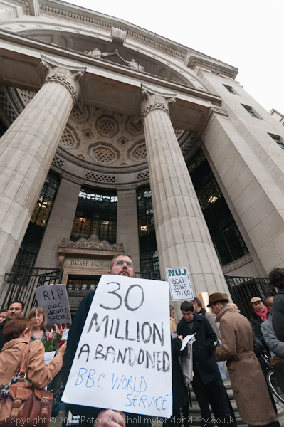
Back to Bush House, here’s an image that shows more of the building:
© 2011, Peter Marshall
16mm rectilinear view

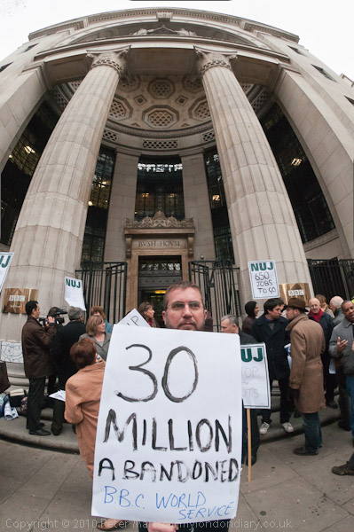
I took it first with the 10.5mm fisheye, but those pillars don’t work quite as well with a curve in them, even partly corrected:
© 2011, Peter Marshall
10.5mm fisheye, slight correction in Lightroom

The Lightroom profile for this lens makes the mistake of trying to correct all of the distortion, resulting in a totally unusable image.  Just for fun, I tried looking at this image in the Panini Viewer, which implements a rediscovered long forgotten projection used by Italian painters long ago, sometimes called Vedutismo, which has been available for some while for panoramas. The viewer software uses a low quality jpeg, but gives a better idea of the building.

© 2011, Peter Marshall
Fisheye mage saved from Panini Viewer and cropped in Photoshop
Later I’ll download other software that will let me do a better job, as the projection, which I’ve been using for around a year for panoramas, really does look to be a promising approach to “de-fishing” images.

Save the BBC World Service on My London Diary.
Sharpness is a Bourgeois Concept

Friday, January 28th, 2011

Right on Henri! It’s something he said to that fashion photographer who did the huge ugly nudes, and I got a certain amount of hate mail after writing about him in less than glowing terms a few years back and I still don’t like to write his name. But I still think he made attractive women pretty ugly, and that giant quartet certainly look much better in the picture with their clothes on. It perhaps takes some kind of rare talent to make me think that.

I’m not sure that M Cartier-Bresson ever really joked, and he certainly wasn’t too bothered about his pictures being particularly sharp. They were sharp enough even when they weren’t very sharp, his seeing was a razor.  Or perhaps better a scalpel, and I’ve often thought that using a Leica is rather like using a scalpel, while today we work with power tools; they can do so much more but lack the precision.

Anyway probably a dozen people have already told you about the ‘Shit Photojournalist Like‘ blog as they have me. Which is where I was reminded of the quote in the title of this piece.  Things are perhaps a little different here to the USA, but not much.

Atos Don’t Give A Toss

Friday, January 28th, 2011

Last Monday was a day of action against benefit cuts, and in particular targeted the company that runs the tests  that people who want to claim the new Employment and Support Allowance (ESA)  have to take (and retake at intervals.)  The tests are an attempt to test their ability to work and are carried out by “trained healthcare professionals” employed by a private company, Atos Origin. As several of the placards said, ‘Atos Don’t Give A Toss.’

Although the amounts individual benefit claimants get are not generous they are essential for those concerned, and losing some or all of their benefit can be a personal catastrophe.  Those who are assessed as able to work get benefit at a lower rate on the Job Seekers Allowance (JSA) and to get it have to keep showing evidence of looking for work, and may be refused all benefits if they are judged not to be doing so. Atos of course does rather better out of it, and despite a large volume of criticism about how poorly they do the job has just been awarded another £300 million contract.

Previously, doctors certified people as unfit to work, and there was occasionally a certain amount of unfairness involved – my own doctor was very loath to provide certificates while others were certainly over-generous. But the decisions were always based on a knowledge of the claimant and their circumstances and their medical conditions. Under the system used by Atos,  an interview with set questions based on a computer system means that the needs and problems of the individuals are often neglected in reaching a decision.

Part of the problem has always been that there isn’t a simple division of people into those who are and those who are not fit for work, and of course that different types of work and different jobs within the same type of work place very different demands and stresses on workers.  Add to that the problem of the availability of jobs in particular areas and we have a problem that is undeniably complex, and not one that the simplistic approach ofAtos’s ”work capability assessments’ can properly address. But they are happy just to take the money – and have just been given another £300 million despite a very critical report by an independent inspector appointed by the government and bodies such as Citizen’s Advice.

© 2011, Peter Marshall
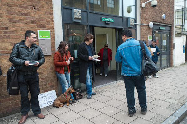
A man in a black mask comes out of the job centre!

The first photographs that I took were of a small protest, with I think eleven people handing out leaflets to people going in and out of a local job centre, one of many where these tests are carried out.  There really wasn’t a great deal of action to photograph, and doing so was made a little more complex by my own decision not to identify the users of the job centre in my picture. I don’t think anyone has an expectation of privacy when going in or out of a job centre, but do feel that I might not like to be photographed in such a situation. I was happy to photograph both the protesters and any job centre staff who might be visible, but tried hard to make images in which the clients were only shown partially or from the back. In the end there were one or two pictures where there were identifiable people, mainly in the background of pictures, and there I either darkened the whole face or drew a black bar to obscure their eyes.

At that place I was working on the public street, but in the afternoon ‘party of protest’ I knew that I would be working in a ‘private place’, one of those increasing number of areas of the city open to the public but under private ownership. I was a little worried because the security staff there – as in many places around London – enforce a fairly strict ‘no photography’ policy.

I kept my cameras under my coat or in my bag until I was in the middle of the group of demonstrators, and then took them out and started pictures. At least I would be able, I thought, to get some pictures before I was approached and asked to stop – and of course I knew that neither the security men or the police had any power to ask me to delete them.

© 2011, Peter Marshall
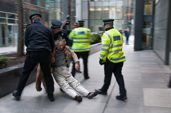
Security man and Police officer briefly stop a protester but ignore me

But there were no problems, at least not about taking pictures. Neither the police nor the private security men attempted to stop me, nor as far as I am aware anyone else taking pictures.  Except when one elderly man walked through the police line and was pushed to the ground and then examined and dragged away by police. Then I had two problems.

First was the deliberate obstruction of my line of sight by two police officers. It seems to be deeply ingrained in many police that if they see a photographer taking pictures of an incident they should move to stand between them and it.

This seems to be the standard police interpretation of the paragraph from the ACPO Police-Media Guidelines (introduced by the Metropolitan Police in March 2006 and by other forces in 2007  following two years of negotiations with the BPPA, the NUJ and CIJ):

Members of the media have a duty to report from the scene of many of the incidents we have to deal with. We should actively help them carry out their responsibilities provided they do not interfere with ours.

The second problem that I faced was the D700, which chose this moment to have another of its hissy fits, and refuse to take pictures. I didn’t have time to argue with it, and picked up the D300 to shoot with that.  It was set to a stop or two slower ISO and there wasn’t time for me to move the SB800 from the other camera to it, so I was working at a rather slower shutter speed than I would have liked. The blur really works quite well on one or two pictures, but there were others that were just blurred.

© 2011, Peter Marshall
I’ve moved to one side of the officer in my way, while behind the incident
another officer moves to block a colleague

I’d already decided the D700 had to go in for repair, but just hadn’t had the time to take it in, but I did so the next day.

When I got back I wrote a fairly lengthy piece about the problems that disabled people are facing with ending of disability benefit and its partial replacement with the ESA to go with the pictures for Demotix. A few days later, with rather more pictures, this went onto My London Diary as Atos Tests Unfair to Disabled.

Students March Over EMA

Thursday, January 27th, 2011

Yesterday I went to photograph students demonstrating and there were very few to be found, at least in Trafalgar Square where we expected some to meet at noon, and what they were doing wasn’t very interesting. It didn’t worry me greatly as I had a couple of other events to photograph (and ended up finding a third, as well as wasting some good drinking time over a false chemical incident emergency at the British Museum which got major emergency treatment, closing the place down for over an hour.)

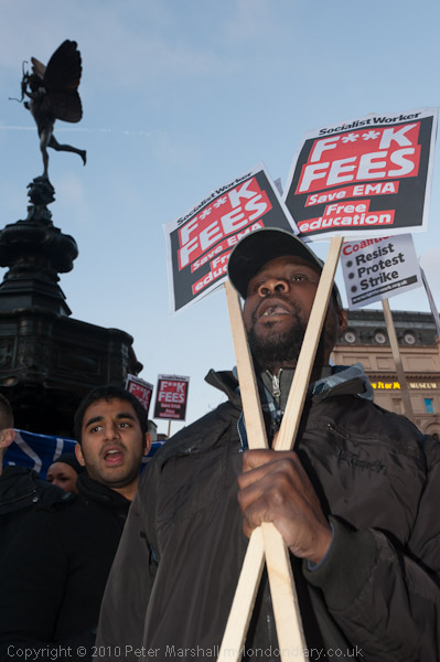
But the previous Wednesday, students were marching and I got a few decent pictures. They met at what I’ve always found to be one of London’s more curious tourist attractions, Piccadilly Circus. You see them all going there and wandering around trying to find out why they had bothered to come to a not that impressive statue with a bow and arrow at a busy traffic junction with an awful lot of neon advertising.

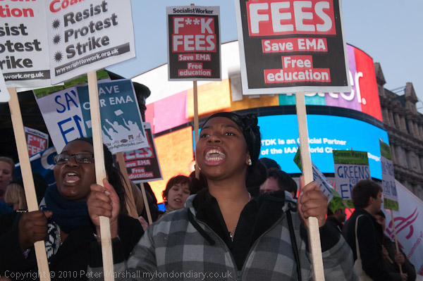
But still all the world comes there, and on this occasion that included around 500 students (and a few more joined later.)  We were there around half an hour as dusk fell and I and almost as many photographers struggled to photograph them, balancing flash and daylight to take advantage of the background features.

© 2011, Peter Marshall

So here was one using those adverts, though the screens really were rather blank at that particular instant.  At one time a major on-line agency culled all of the pictures it could find with logos on them from its collection and this would have probably have been one of the few pictures of Piccadilly Circus that would have been left standing. Of course they were wrong to do so, as there would only be real problems with a logo appearing in the picture if that was the point of the image, not for the ‘incidental inclusion’ that arises if logos happen to have been left around the street where you are taking pictures. It isn’t your fault if the copyright holders are so careless!  But I seldom see any reason to give them extra free advertising if I can avoid it.

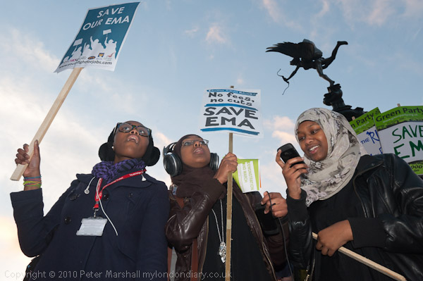
© 2011, Peter Marshall

And this is one of many I took including Eros, (who isn’t really Eros, but his brother) a memorial to Lord Shaftesbury, a noted 19th century philanthropist who would I think have been right behind the campaign to keep the EMA, which enables many from poorer homes to stay in education.

© 2011, Peter Marshall

The bronze base of the fountain was designed as a drinking fountain, with cups ” giving water to rich and poor alike at all times of day and night” but these did not last long as the site was too windswept and the water went everywhere.  Eros, unvieled in 1893 a short distance away from where it now stands, was probably the first free-standing sculpture to be made from what was then a very expensive metal, aluminium. The supporting leg is solid but the rest is hollow.

© 2011, Peter Marshall

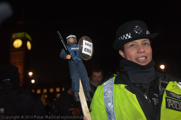
The march itself to Parliament Square was uneventful. The organisers seemed to have gone out of their way to cooperate with the police and the police made an rather greater than usual attempt to cooperate with the marchers, handing out a leaflet telling them about the march and how they hoped to police it. Everything went more or less according to plan.

© 2011, Peter Marshall

In Parliament Square (cue for photograph with Big Ben) there was really very little to do, other than stand around and wait for the result of the vote at 7pm. Most of the marchers had gone home by then, and so had I.

Photographically most things worked, but I was having quite a few problems with the D700, now almost two years old.  Occasionally in the past I’ve pushed the shutter release to take a picture and absolutely nothing has happened. Often this can be because the camera has been unable to focus, but in the last couple of months it has happened occasionally for no obvious reason, and at the same time the viewfinder and top panel displays have lost some of the characters. I first really noticed it happening more frequently just before Christmas, and found the problem usually cleared if I turned the camera off and on – and if not if I took out the battery for a couple of seconds.  During this event it happened more than ever and I missed quite a few pictures because of it.

There are some pictures where you get a second chance – and most of those above were like that, where I have several similar frames from which I could select the best. But other things, if you miss them are gone. You can’t afford equipment that is not reliable.  So the D700 is going in for repair. Intermittent faults like this can be hard to trace and soemtimes it is even hard to convince people that there is anything wrong.

And of course sometimes there really isn’t a camera fault. I had some great exposure problems with the Hexar Konica F, sent in in several times for service, only to finally realise the problem was just the second finger of my right hand, which would rather conveniently rest over the light sensor on the front to the body when my finger was on the shutter release.  I guess it could be called a design fault, either of the camera or hand.

My London Diary –  Students March Against EMA Vote – for more pictures and text about the event.

Vodaphone Uncut

Wednesday, January 26th, 2011

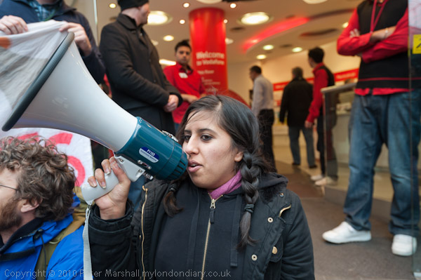
Quite often there doesn’t seem to be a lot to photograph at demonstrations, and the UKUncut demonstration outside Vodaphone in Oxford St over their avoidance of UK Tax was one case.  At the time it was due to start there were more photographers than protesters, with a few police standing around and a couple of security men in the shop doorway, with some slightly anxious-looking shop staff. It really was not promising.

Fortunately some more protesters arrived, and they sat down on the pavement in front of the shop, but it was still rather hard going to find anything other than the obvious.

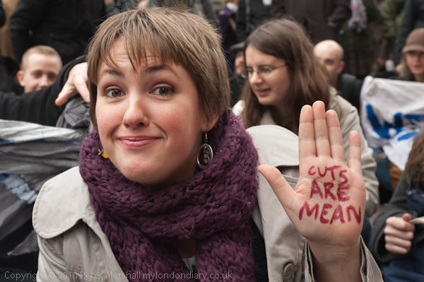
© 2011, Peter Marshall

I saw (and photographed) this woman writing on her hand and then moved closer and photographed her. I took two frames without flash, but although they were ok, felt I needed to make her stand out a little more – so this has just a little flash to help.

© 2011, Peter Marshall

This was another picture that almost worked, but I find the hands at top left and the head at bottom right too distracting. But it was the best I could manage, although I took quite a few frames trying to get what I wanted.

Of course I always try to take some images that give a more overall view of the situation, even though these are often rather ordinary pictures.

© 2011, Peter Marshall

At one point on the D300 I switched to manual to get more precise control over a particular image, and then forgot to switch back. It probably wouldn’t have mattered much, but I think sometimes cameras have minds of their own, and the D300 decided that since I’ve never taken a picture at its fastest shutter speed of 1/8000 it would take this as an opportunity to try.

I don’t like to ‘chimp’ while I’m working unless I have a very specific need to do so, as otherwise it interrupts my flow, so by the time I noticed what the wretched camera had been up to I had probably around 30 images taken at about 5 stops under. Or to put it another way, exposed for something like ISO12,800 or 25,600. Most had just a very dim image and I deleted them immediately, but there were one or two I decided might be worth keeping and trying to rescue in Lightroom. Here is one of them:

© 2011, Peter Marshall

Even with fairly heavy noise reduction quite a lot of colour noise remains and it has a very washed out look – which might go down well in a fashion magazine but isn’t really my kind of thing. But the surprising thing is that it exists at all.

It wasn’t a great calamity, as I was mainly working on the D700, using the 16-35mm lens, and just taking a few images – such as this one – with the D300 and the 18-125mm. I found something was severely wrong when I tried to take a few pictures with an even longer lens and couldn’t get anything to work, though it took me a little while to work out why.

You can read more about the protest and see more pictures in UK Uncut Protest VAT Rise at Vodaphone on My London Diary.

A Trip to Kingston: Muybridge Misappropriated?

Sunday, January 23rd, 2011

I think I first became aware of the work of Eadweard Muybridge while I was  in short trousers, on one of the visits we were treated to by two of our maiden aunts to London’s Museums. The Science Museum was only a short trip on the District line away from where I grew up, but London was another world, and one to which my own parents seldom if ever ventured. Back in the 1950s I’m not sure what kind of display the Science Museum in South Kensington had, and my memory of seeing the images of a jerkily flapping bird in flight may well be a later back-projection.

But when I read what is apparently the first published book on him, Kevin MacDonnell‘s ‘Eadweard Muybridge – The Man Who Invented the Moving Picture’ (ISBN: 0 297 99538 3) in 1972, a book whose photographic enthusiasm made up for its many errors,  much of what it contained on his pictures of movement was already known to me from the history books, but the book did fill in many details on his photography as well as more about his extraordinary life. But the real revelation was to see his photographs of Yosemite, Alaska and Central America and to realise what a fine photographer he was.

It was perhaps shortly after that I first visited the display of his work in his home town of Kingston, a few miles from where I live on the edge of London, and was rather disappointed. Some years later we took students to see it at the Kingston Museum and it had I think improved, and as a part of the current interest in his work aroused by the Corcoran Museum show which closed recently at Tate Britain and will be on show again in San Francisco from 26 February to 7 June 2011, Kingston Museum has benefited from a Heritage Lottery grant of almost £50,000 for its own Muybridge exhibition.

Web sites worth looking at  on Muybridge include Stephen Herbert’s encyclopaedic The Compleat Muybridge and the Muybridge Collection on the Royal Borough of Kingston upon Thames web site. But unfortunately although this latter contains much important material, particularly related to his movement work, there is little about his other photography. Their current exhibition (until 19 March 2011) concentrates on his hand-painted glass Zoöpraxiscope discs used in his lecture presentations. Based on his photographs, these are certainly unique artefacts but seem very much a sideshow compared to the actual images published in Animal Locomotion and the Human Figure in Motion (and now animated on screen by almost everyone, including in the past a number of my students.)

You can however view some of the photographically more interesting aspects of his photography from the Kingston collection in the ‘Image and Context‘ section of the Eadweard Muybridge: Defining Modernities site.

© 2011, Peter Marshall
The Stanley Picker Gallery at the University of Kingston

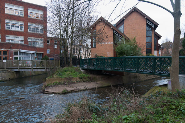
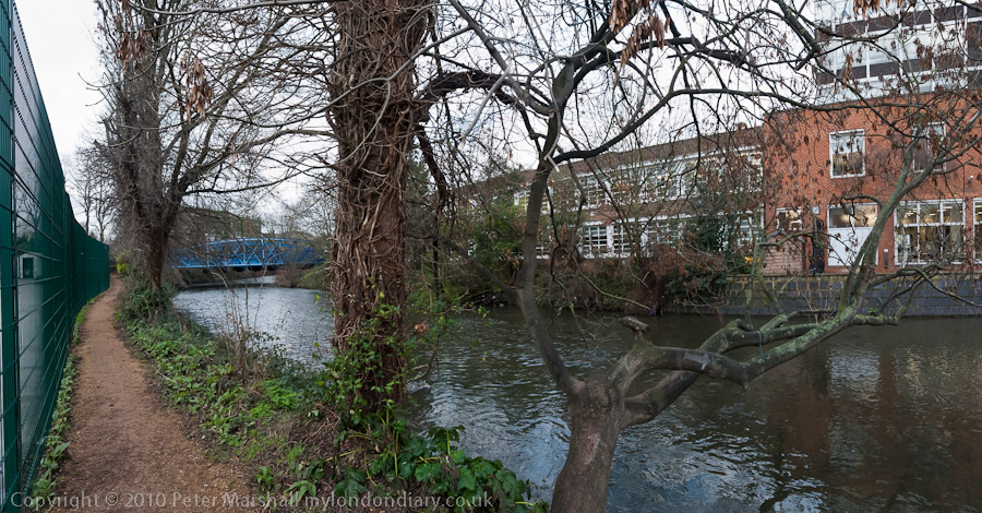
Also taking part in the Kingston celebrations is the Stanley Picker Gallery at the University of Kingston. I have to say that the most interesting part of my visit there was the walk to and from the site, through the streets of Kingston and then back along by the Hogsmill River, one of London’s lesser known streams.

© 2011, Peter Marshall
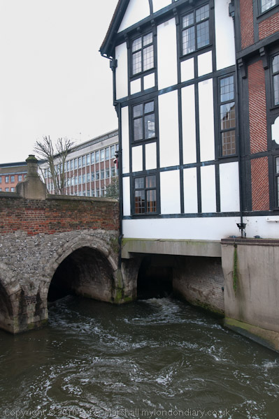
Hogsmill River in Kingston – perhaps London’s oldest bridge, though much widened

© 2011, Peter Marshall
Visitors to the Swan pub on the Hogsmill Walk may be disappointed

The gallery currently contains two works by an artist which are based loosely on Muybridge’s work. One references his 1877 panorama of San Francisco – which can be viewed online in some detail elsewhere (and on the same site there is also an 1851 daguerreotype panorama of the Bay.) Muybridge’s work is remarkable for it’s detail and clarity, thanks in part to the large (indeed ‘mammoth’) plates on which he photographed it, but also to his careful choice of the day when the air was particularly clear. Perhaps too he had learnt something from his previous attempts the preceding year on a smaller – which had been destroyed in a fire. The 13 plates together produce a 17 foot long image covering a full 360 degrees and showing a remarkable precision in alignment.

It did occur to me that a more fitting tribute to Muybridge would have been to host a show of rather more interesting panoramic photography than the two works on show in postcard racks here, which were I think taken in the garden of 2 Liverpool Road, the house where he spent his final years in Kingston, though I think it has changed rather since he was there.

© 2011, Peter Marshall
Hogsmill River at Kingston University – right click and select ‘View Image’  to see larger

The single thing I found most interesting about the work on show in the gallery was the letter reproduced on the final page of the leaflet from David Leigh in California to Borough Librarian Mr Cross on Jan 24th 1949, sending him some information about Muybridge and which in a postscript says “I have read, somewhere, that he was drawing to scale, a replica of our Great Lakes, at the time of his passing.”  This was presumably the inspiration for the work based on the Great Lakes which apparently made use of linoleum, which I also found of little interest.

I can’t however let pass the following error in the introduction to this work:

LINOLEUM Linoleum was invented by Frederick Walton in Staines, England in 1855.

Much though as a resident of Staines I might want to claim any honour it deserves, unfortunately this is just factually incorrect. Staines did have a long connection with lino, and in my youth this was certainly clear to one’s nostrils as you drew near the town, perpetually reeking of linseed oil. But Walton himself wrote to the Technical Director of the first Austrian linoleum company Felix Fritz, the author of ‘Das Linoleum und Seine Fabrikation‘ that he invented linoleum in 1861 (and it is described but not given that name in a British patent of the same year.) At that time Walton was still working in Chiswick, and had no connection with Staines;  it was only in 1864 that together with some new partners he purchased the land on the banks of the Colne there to set up a larger factory to manufacture lino.

Should you wish to read Fritz’s extremely turgid tome there is a copy in the library of the Royal Society of Chemistry at Burlington House, but one of the two existing copies of an edited English edition is on a shelf downstairs, severely abridged and translated pro bono for Staines Musuem by Linda Marshall with considerable (uncredited) technical assistance from myself.

The lino in Staines, long the town’s major employer, celebrated its centenary by closing down around 1964. When we moved to Staines ten years later you could still sometimes smell the linseed oil around the old buildings, then a thriving nest of small workshops and warehouses. Now virtually no trace remains and all we have is a large car park and a bleak boring shopping centre.

This error may not be of great importance, but for me it was symptomatic of a lack of rigour in the work – and was just one of a number of statments that made me think “that’s not quite so.” And a quick check in Google or reference to Wikipedia would have corrected this particular error.

Kington Museum curator Peta Cook told the BBC that she was keen to change the fact that Muybridge although well known in America is not more widely recognised in Britain. They quote her as saying:

“He is London born, and he came back and died here, and this is an amazing collection in Kingston. I would like London to have as much pride in Muybridge as the Americans seem to have.”

I can only agree.

The BBC article suggests the reason for our relative neglect of him is “perhaps because he did the bulk of his work in America.” I have a rather different view. He is neglected here because he was a photographer. And I left Kingston feeling that this very British cultural refusal to acknowledge photography in its own right is very much reflected in the way this current opportunity has been at least in part wasted. Muybridge was a photographer, and a part of a photographic tradition; it’s a pity we can’t celebrate him as such.

Penny Tweedie (1940-2011)

Friday, January 21st, 2011

News of the death of Penny Tweedie came as a shock to me, when I read her Guardian obituary which reports that she died on January 14 at the age of 70. I didn’t know her well, but he seemed in rude good health when I last talked to her when she gave a presentation at the  NUJ Photographers Conference in May 2009, and was still very much taking an interest in photography and still taking pictures.  She didn’t at all seem an old woman, but a very lively person of my own generation, still young in spirit. We looked together at a few of the pictures in the NUJ exhibition, and she complimented me on my work in it.

Tweedie came into the profession from Guildford School of Art at a time when women were widely patronised and discriminated against. She had to fight against prejudice – even from the NUJ, and succeeded because  of her determination and talent – she showed she could cover all aspects of the job at least as well as the men.

You can see much of her work on her web site, including some of her better known portraits and some fairly recent pictures, such as those she supplied for the ‘Hospice in the Weald: Celebrating 30 Years Cookbook’ published last November. But her best work was made in the era when magazines published real photography and she worked for some of the best – National Geographic, Sunday Times, Observer, Independent and Telegraph magazines, using the money she made from them to finance less lucrative work, particularly for aid agencies including Oxfam. As  for the Hospice book, she often gave her work for good causes unpaid.

In 1975 the BBC sent her to Australia where she photographed a series they were making about Explorers, but it was the Australian Aborigines she met there that became her great preoccupation, and produced some of her best work and her books This, My Country  and Spirit of Arnhem Land as well as earning her a Walkley Award, Australia’s leading photographic award.

The Guardian article gives more details of her life and career, and includes near the end the chilling statement:  “it seems despair at the world’s lack of use for her craft finally induced her to take her own life.”

Inscape 81: The Urban Scene

Friday, January 21st, 2011

I’ve written previously about Inscape, the ‘small magazine’ of ‘Personal Work in Photography‘ edited by William Bishop, which included a small portfolio of my work from Hull in Issue 80, ‘An Architectural Theme’.

The latest issue, No 81, includes work from a dozen or so photographers on ‘The Urban Scene‘ but more interesting to me was the written content, including two articles that make a call for further discussion.

Carol Hudson tells of her experience of using an iphone and asks “is photography, as we know it, now dead (or at the very least in retirement)?” and wants to hear what others “think about the rise and fall of the photographic document.”

A longer piece by Andy Biggs, headed by one of the more interesting images in the magazine, his photograph of the lower half of a rambler and a dog on a concrete pillar (a trig point?) at ‘The Wrekin’ that reminds me of an early Martin Parr, has the title ‘Is contemporary photography for constructed images only?’ and takes a look at some of the trends in photography over recent years away from the “desire by photographers to take their cameras out and record the world around” which he thinks photography should return to (and it’s a position I share) and ends with the short sentence: “Please discuss.” You can read a version of this article (without that final sentence) on his web site.

A quarterly magazine such as Inscape is not perhaps the most appropriate place for a discussion, which would inevitably proceed at a very slow pace. Perhaps the editor of Inscape should consider adding a blog to the Inscape web site, on which you can take out a subscription to this publication, which is also available at some select gallery shops.

When Inscape started, the Internet was in its infancy, and the only way to produce a magazine such as this was in print, but although the quality of that print has greatly improved, it could now be produced more easily and gain a greater readership and a wider group of contributors on the web. And if you have a copy of the magazine, and compare this image with the version of it on page 35, unless your monitor is badly in need of replacement, you will see that even though the reproduction in Inscape is pretty good for a magazine, the web can beat it hands down.


From ‘1989’ – you can see the web version & book online.

I’ve been a subscriber more or less since issue 1 and helped in the production of some of the early issues and also have a personal interest in this particular one, as one of the three book reviews in it is of my own book, 1989. The other two are ‘Intimations‘, Poems by Veronica More with photographs by Tom and Cordelia Weedon, and Gerry Badger‘s ‘The Pleasures of Good Photographs‘.

Also in Inscape 81 is a review of ‘Paris – New York – London‘ the show I organised in October including pictures by Paul Baldesare, John Benton-Harris and myself.  (The link above is to what Bishop refers to as my “learned and informative introductory talk” in his piece at the “wine-sodden celebratory evening.”) It certainly was a good night.

It’s encouraging to read anything about events such as this, and apart from in blogs (or at least this blog) there is little if any coverage of photographic events outside the few major galleries. Even though, as for example I said in my reports from Paris Photo, these are where the most interesting work is usually to be found (and of course plenty of the dire.)

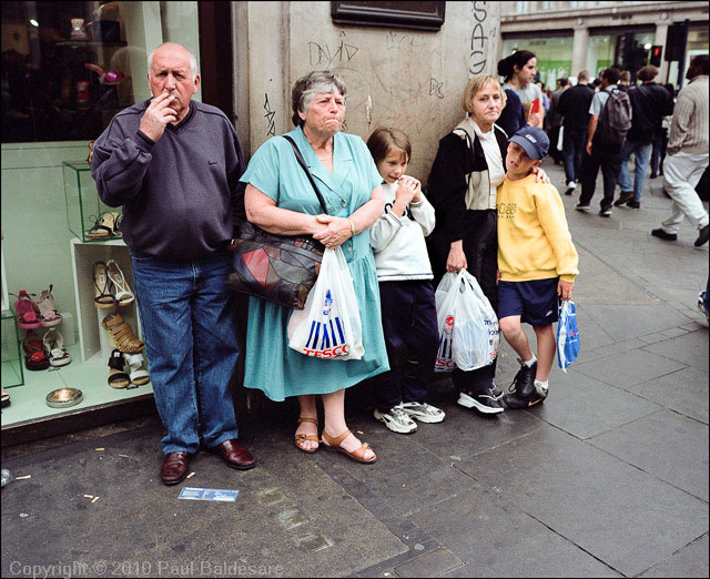
The two pictures reproduced with the review are both in black and white in Inscape, so here they are in colour:

© Paul BaldesarePaul Baldesare: A family group, Oxford Circus
© 1988, Peter MarshallPeter Marshall: Paris 1988.

You can see more of the work from the show on the Paris – New York – London website, including some pictures by John Benton-Harris.

Contributions to the next issue of Inscape, on the theme ‘Work‘ are invited on the back page of the magazine, with a copy date of 21 March 2011.

Leave Counting Teaspoons to the Academics

Thursday, January 20th, 2011

It’s a while since I mentioned the online magazine Visura, which is now at issue 11. The highlight for me is a portfolio of the work of Elinor Carucci, pictures of her and her family. At the age of 21 she decided to “shoot things as they were happening. I returned to color film which is, for me, warmer, more vivid.”

The result over the years is a very intimate body of work, with pictures of her mother, self-portraits related to her own marriage and its problems, her back pain and her work for 10 years as a “professional Middle Eastern dancer, or as it is called in the West, a belly dancer.”

The work is very much a collaboration between her and her family, but particularly with her husband Eran: “Some of the photographs in this collection are a collaboration between us, a few of them are Eran’s own take on the situation, his own work.”

Other portfolios in the issue also have a very personal, intimate theme, and although I find some of them of interest they move me less, and at times some I think go over a difficult to define line of using people and some simply fail to engage me.

Stephen Crowley‘s images of men and boys from Afghanistan were made using the cameras and equipment of street photographers still working in old-fashioned ways there. It isn’t of course the calotype process as he states, but uses commercially produced photographic paper. There are some interesting images by Yannis Kontos (Kabul Photographers, under Features) of these photographers at work and some are also in Issue #8 of Daylight Magazine (it costs $5 to download) with a rather longer text. As one of them, Mia Mohammed, bemoans in a short article on CBSNews, his business is about to come to an end because his supplier no longer stocks the kind of photographic paper he needs. Despite the competition from digital there is still demand for these services which can be carried on in the absence of any electrical supply.

Looking at the pictures and text by Stephen Crowley, I can’t help thinking that this is a piece of work more about the story than about the pictures and that I would very much have preferred him to have made his pictures on large format film – still essentially nineteenth century technology. Or even on digital.

The teaspoons come in Visura columnist Charles Harbutt‘s account of how he became a photographer (Harbutt is one of several distinguished columnists and his Reflections on Kertesz appear in the current issue.)  When around 18 and taking pictures for a college newspaper Harbutt managed to attend a workshop run by two major figures in documentary photography, Roy Stryker and photographer Russell Lee.  Stryker picked on one of Harbutt’s pictures, a back view of a girl working in her family kitchen, and told him he should have used flash “so that future researchers could count the silverware and identify the dress pattern and get other significant facts about the family“.  Lee disagreed, as using flash would have lost the mood and made it impossible to take more than a single image of the situation. He said that “preserving the actual experience was what photography could do best. Leave counting teaspoons to the academics.”

Milton Rogovin Dies – His Work Endures

Wednesday, January 19th, 2011

I was saddened to hear of the death of Milton Rogovin, although since he was 101 it was hardly a great surprise to hear the news that he died on Tuesday (18 Jan 2011.) The NY Times Lens blog has an illustrated feature with links to various aspects of his work (and to his obit in the paper), though perhaps his own web site is the best place to see his work. And he was perhaps the first centenarian photographer to start blogging. There are also some good links in the comments on the Lens blog.

I’ve written several times about Rogovin, and the most recent was on this site in August 2009. I think his work is important in particular for his recognition and celebration of the ‘ordinary’ working man, and occupies as important a place in the history of photography as other fine documentary photographers such as Jacob Riis and Lewis Hine.

One small but important technical point I picked up on from his work was about shutter speeds. When photographing people he liked to work on the edge where some slight movement might occur rather than us a fast speed that would be guaranteed to freeze any movement. For him and later for me it was something about showing living breathing people in his pictures, rather than butterfly specimens pinned to the board.