Archive for February, 2015

2015 PDN Top 30

Saturday, February 28th, 2015

If you want to be featured in PDN’s Top 30 your best bet is either to be born in the USA or to go and live there, as do I think all but about six of this year’s crop (and two of that six are in Vancouver, which only around 30 miles over the border.) Having said that, there is still much interesting photography, and, perhaps unsurprisingly some of the more interesting is from those four more distant. Give yourself plenty of time and go and enjoy.

Rather than otherwise influence you on the work of this years pick I thought it would be interesting to revisit the Top 30 of ten years ago, 2005, and begin by asking how many of those featured you have heard of. It’s hard to be entirely sure, but for me I think the answer perhaps five or six, but most seem to be having succesful careers if not becoming household names:

Kevin Cooley
Cig Harvey
Mark Zibert
Andrew Zuckerman
Christa Renee
Matt Stuart
Jesse Chehak
Eri Morita
Farah Nosh
Chris Mueller
Eric Ogden
Joao Canziani
Colby Katz
Dave Anderson
Jehad Nga
Erik Almas
Jessica Todd Harper
Hayley Harrison
Karine Laval
Steve Giralt
Casper Dalhoff
Emily Nathan
Carlos Rios
Matthew Pillsbury
William Mebane
Masood Kamandy
Kareem Black
William Lamson
Gina Levay
Karim Ben Khelifa

I’ve also tried to link them to their current web sites, though there may in some cases be confusion with other photographers of the same name. Two presented a problem – I couldn’t find a site for Hayley Harrison and although there are many links to work by Khalim Ben Khelifa I could not find an actual web site. And be warned that even on a high-speed broadband connection some of these sites are slow to load. Too many still have huge flash downloads.

This year’s crop give a little advice to others on the web site, and I’d like to add another small piece of possible wisdom. If you want to be remembered as a photographer, choose a good and memorable name. If like me you have a very common name it will not help in your career. And simply because you were blessed by your parents with something simple shared by thousands of others there is no reason to use that as your professional name.

I share my name with at least three other photographers (a confusion that has led to me being refused credit by one photography retailer and threats of bodily harm by an extremist right-wing organisation – I’m not sure what it has done for the other guys), a very well known preacher and his son, various sporting heroes (I don’t even swim or squash and gave up footy long since), the author of some great books, a journalist and  acouple of radio and TV personalities, a police chief, several professors, a breeder of ferrets and thousands more.

Somewhat surprisingly if I put my name into Google (I don’t make a habit of vanity searching, but have just done so as ‘research’ for this post) I find I come up in 14th, 17th and 24th position underneath two featured posts and some images, none of which are of me. On going to Google Images and searching well down the page I do find myself twice, as well as 38 taken by me, among the seven or eight hundred featured. They seem to include a couple of copyright violations, though I think neither worth chasing.

Je Suis Chaleroi?

Friday, February 27th, 2015

A new controversy has emerged from the latest World Press Photo, with exception being taken to the winning entry, The Dark Heart of Europe, by Italian photographer Giovanni Troilo in Contemporary Issues Stories. There are 10 images from the story at the WPP and a dozen on the photographer’s own web site, under the title Charleroi, La Ville Noire – The Dark Heart of Europe, which omits several in the WPP selection.

In this case the complaint is not about the processing of the images, though some might feel this is at least a touch over-dramatised, but about staging and the false image they give of the city, whose mayor Paul Magnette, while professing not to be and expert in photography complains that the story is anything but photojournalism, hiding aspects and distorting reality through staged images.

In his letter the mayor goes on to repeat some of the criticisms of the work raised immediately after the award by Belgian photographer Thomas Vanden Driessche who is quoted on the web site OAI13 (Our Age is 13):

L’utilisation de la mise en scène, l’éclairage artificiel mais surtout le caractère falsifié et mensonger des légendes participe à la construction de cette fiction prenant les apparences d’un reportage. Cela ne me causerait aucun souci si cet ensemble était le résultat d’une œuvre artistique très personnelle. Mais le photographe ne présente pas son travail comme tel. Au contraire, il donne manifestement une réelle dimension journalistique/documentaire à son approche. Le simple fait que cette série a été soumise au World Press Photo et surtout le fait qu’elle ait été primée lui confère une crédibilité journalistique.

Driessche is saying that staging, the artificial lighting and above all the false and lying captions result in the making of a fictional story in what appears to be reportage. This would not worry him in a personal artistic work, but this is not how the photographer has presented it. On the contrary he clearly presents it as a journalistic/documentary story and submitted it as such to World Press Photo who have given it credibility as journalism by giving it the prize.

The mayor’s letter, reproduced in part on the same site gives some details about who and what appear in some of the images, arguing that the reality they show is very different to the story implied by the photographer through the highly stylised images and deceptive captioning, ending his letter by stating that the photographer has deformed reality for the sake of a story which discriminates against the city of Charleroi, its people and the profession of photojournalism. He says that you will not find a single person living in the city who would recognise it from the story, and that is seems to be more a settling of grudges than investigative reporting.

Time Lightbox’s report of the story includes some translations of the comments in the mayor’s letter and includes a statement from WPP:

“We are currently verifying the facts behind the photo story, as we do with all the prizewinning pictures, and we are in touch with the photographer Giovanni Troilo.”

Of course, if photographers and journalists are doing their job properly they will often offend some people. Few organisations welcome any critical investigation, as many people, particularly whistleblowers, have found to their cost. For those of us who have no knowledge of Charleroi (and I imagine few of us have heard of it before this, let alone been there) we have only the opposing views and the nature of the photographs to inform us.

Photography cannot exist without a point of view, though in much we see that may well be a rather confused one. The strength of Troilo’s work which led to its success is in the clarity of his view and the dramatic way he has presented it. We all have to dramatise the situations we photograph, to give them some form in order to communicate with an audience.

For many photographers, the guiding principle was stated clearly by one of the legends, W Eugene Smith in his credo “Let truth be the prejudice”. Perhaps in this case truth may have given way to prejudice. It will be interesting to see what WPP responds.

Flashing Flashers

Thursday, February 26th, 2015

I’d missed the post on PetaPixel in January on the development of a novel range of ‘Anti- Papparazzi’ Clothing, but apparently some items – a scarf and a hoodie – will shortly be available.

The idea of highly reflective clothing that will reflect the flash back and thus trick cameras into severely underexposing will perhaps foil a few less experienced photographers, but it is hardly a novel concept, as many of us have been photographing police and others wearing fluorescent jackets with reflective strips for many years.  They are often a pain, but they don’t usually make photography impossible. In most cases you can tame those highlights enough with a little work in Lightroom. And if you do work on auto-exposure the reduction in exposure from the light reflected back is a good thing, as it helps to prevent burnt-out highlights. With cameras like the D800E (or the Fuji XT-1) you can pull an awful lot out of the shadows without problems.

I’m not a ‘pap’, but DJ Chris Holmes’s introductions would probably have little effect on my pictures. Apart from often shooting flash on manual to get more consistent exposures, I’m also using flash less and less for working at night.

Firstly because digital cameras are getting so much better at high ISO, and I often work at ISO3200, but also because to avoid black backgrounds and the flattened look of direct flash I usually work at and aperture and shutter speed where pictures get considerable exposure from ambient light, with flash mainly helping to bring out the subject a little.

But it is perhaps also an idea that has come too late with the increasing use of bright LED light sources. While still more commonly used for movies, increasingly still photographers are making use of them. Tonight – like last night – I’ll be working with one on the D700 and keeping the flash on the D800E. Partly this is because the flash has a longer range, and I’ll be using the 18-105mm on the D800E, often from a longer distance. but its also because my ageing D700 has become rather unreliable with flash.

The Neewer CN 216 LED unit I’m using isn’t perfect, and even though it has a diffuser, doesn’t cover a particularly wide angle of view, and is not really quite as bright as I would like. I could I suppose write a proper review, but if anyone is interested they are cheap enough for you to buy one on eBay and play with it yourself.

Salted Paper Prints

Wednesday, February 25th, 2015


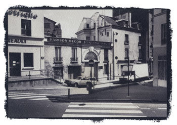
Paris Xe, 1988 Salt Print – Peter Marshall

To coincide with the opening of Salt and Silver: Early Photography 1840 – 1860  at Tate Britain, here is a slightly updated version of a piece I wrote some years ago on salt prints, including step-by-step instructions on making them and four examples of my own efforts from the late 1980s.

Key Facts

  • ‘Photogenic drawing’ used ordinary paper which had been given a coating of silver chloride or similar light-sensitive silver salt.
  • Prints were made by placing objects on this paper and exposing to light. In the 20th century this way of working was named as a ‘photogram’.
  • Photogenic drawing was a printing out process – the image actually appeared during the exposure to light.
  • Photogenic drawing can also be used as a method for contact printing from negatives – prints made in this way are known as salted paper prints or salt prints.
  • Contact printing requires the negative to be held in close contact with the printing paper, usually in a special printing frame, while being exposed to light through the negative.
  • Exposure times in salt printing vary from around 10 minutes to 8 hours depending on the strength of the light source and how transparent (or translucent) the negative material is.
  • As with all contact processes, the print is obviously the same size as the negative.
  • Talbot fixed his images by using strong salt (sodium chloride) solution, or a weak potassium iodide solution. Neither was totally effective.
  • Later, Herschel’s suggestion of hypo (sodium thiosulphate) as fixer was adopted. This was fast and totally effective.
  • By repeating the sensitising process several times, Talbot found he could increase the speed of the salted paper sufficiently to use in a camera obscura.
  • Typical exposure times in the ‘camera obscura’ were around 30 minutes, with apertures probably around f8 in modern terms.
  • The paper negatives were fixed and then often made translucent by treatment with wax or oil before being placed on top of a fresh sheet of sensitised paper and contact printed using sunlight as the light source. Typical printing times would be around 30 minutes to an hour.
  • Although rapidly superseded for use in the camera by the Calotype process, the basic salted paper print was the normal process for photographic prints on paper until replaced by the albumen print around 1850.
  • After 1855, salted paper remained in use mainly as a proofing medium and by a few who preferred its matte image. It saw a revival in the 1980s and 1990s as a part of a growing interest in historical and alternative processes

Talbot’s method

  1. Talbot started with a sheet of best quality writing paper ‘with a good firm quality and smooth surface’.
  2. This was dipped it into a weak solution of common salt and then wiped dry
  3. The sheet was then coated on one side with a weak solution of silver nitrate (a saturated solution diluted with six to eight times the amount of water) and dried in front of a fire.

The paper was then ready for use for making photogenic drawings or as Talbot more poetically wrote ‘nothing can be more perfect than the images it gives of leaves and flowers, especially with a summer sun : the light passing through the leaves delineates every ramification of their nerves.’

A more modern version of this procedure is still used by those photographers today who wish to make salted paper prints – also known as salt prints – see below for directions.

For use in the camera, the speed of the material needed to be increased. Talbot found he could do this basically by repeating the treatment. He first washed the prepared paper with a saturated solution of salt, and dried it. Tested at this stage it was more or less insensitive to light, but if re-brushed with ‘a liberal quantity of the solution of silver’, it became more sensitive than before.

By repeating the coating several times, it would become fast enough for use in the camera (though his exposures might be 30 minutes.) Talbot obviously found the process rather unpredictable, noting that sometimes the paper would begin to darken without any exposure to light, showing the process had been taken too far.

After each coating with silver, he clipped a small part from each of the sheets he was working with, numbering them carefully to correspond to the sheet, and ‘placed (them) side by side in a very weak diffused light for about a quarter of an hour.’ If one of them darkened considerably, the corresponding sheet was ready to be exposed in the camera obscura. It was a crude but effective system of control for a process where there were too many variables to guarantee success by simply following a given procedure.

Talbot’s results

Looking at Talbot’s early results from the camera – or rather at reproductions of them – it is not surprising that they were generally not regarded highly compared to the splendidly sharp and detailed daguerreotypes. In some cases it is hard to see any image at all, others are more weak splodges than detailed pictures. His first existing negative shows a window made of small panes, and on the back he notes that it was possible to count them all when it was first made. Presumably it was no longer possible when he made the note. The image is certainly not now highly detailed and the shadows in particular are completely empty.

Although the photogenic drawings – made as what we now call ‘photograms’, by placing objects such as leaves and lace on the paper – have considerable elegance and are finely delineated, his early camera attempts can only be seen as suggestions that it might be possible to get the process to work rather than as a successful solution. It was a problem that Talbot was to solve himself in the following years with the Calotype process.

The major problem was of inadequate sensitivity to light. These first photographic materials relied entirely on the printing out of the image, which is slow. In the Calotype, Talbot made use of what became to be called a developer to amplify the effect of the light, bringing out the ‘latent image’ from the apparently unchanged paper. It was this discovery that was really to lead to the domination of the next 160 years of photography by silver based materials.

Another aspect of the problem that Talbot faced was inadequate fixation. After exposure he either washed the paper with a dilute solution of potassium iodide or a strong solution of common salt before ‘wiping off the superfluous moisture, and drying it.’ The potassium iodide solution formed silver iodide that was largely insensitive to light, but too strong a solution would dissolve parts of the image. As he had found in his repeated coating, using a large excess of salt solution produces a very low light sensitivity. However images fixed in these ways still faded in light – and certainly the bright sun needed to expose through the paper negative will have also caused fading of the negative.

When Talbot visited Herschel at Slough on 1 February 1839, he received a solution to the problem. Herschel’s wife, Margaret, noted in a letter to a friend that ‘when something was said about the difficulty of fixing the pictures, Herschel said “Let me have this one for a few minutes” and after a short time he returned and gave the picture to Mr Fox Talbot saying “I think you’ll find that fixed” – this was the beginning of the hyposulphite plan of fixing.’

It was also Herschel who provided a clue – in the shape of gallic acid – that was to be the key to Talbot’s discovery of the latent image and development in the Calotype. There are many of us who have made prints using salted paper and even a handful of photographers currently using the Calotype process – some have used actors to recreate Talbot’s later pictures at Lacock Abbey. The recreation of images in camera obscura using his methods, and making prints from these again following his directions would perhaps be an interesting project. It is the only way any of us can possibly see these kind of images in the same condition as when Talbot made them.

Make your own Salt Prints
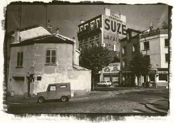

Montreuil, Paris, 1988 © Peter Marshall, 1988.
Gold toned salt print on Georgian Watercolor Paper.

Ordinary writing paper is now factory produced and no longer of suitable quality for any of the alternative processes. Machine made papers generally have shorter fibres and fall to pieces readily when wet, and you need to use a suitable hand or mould-made paper, usually sold for use in watercolour painting.

Silver nitrate needs to be handled with care – you should use gloves and wear safety glasses. When handling any finely ground chemical powder a mask should be worn. Silver nitrate is a poison that can build up in the body and it can both burn and stain skin. It produces stains and marks that are often very difficult to remove from some surfaces.

Like all chemicals, both solid and solutions should be kept in a secure place, locked away from possible reach of children. Silver nitrate solutions are sensitive to light and are normally stored in brown bottles, but it also helps to keep them in a cupboard.

Procedures normally give precise quantities required for solutions measured in grams. However, there is seldom any real need for great accuracy, and many people have made salt prints without using any weighing equipment. Chemicals such as silver nitrate will generally be bought in fairly small quantities and you can make up the full amount into an appropriate solution.

  • You can use ordinary table salt or sea salt, making up a solution of roughly 1-2 ounces (25-50g) per litre of water.

Other salts, which some people prefer, include ammonium chloride, potassium citrate, potassium tartrate and potassium bromide. You will often get small differences in image colour and paper speed using the different salts or mixtures of them.

  • The silver nitrate solution is generally around 10-12% by weight – so you can dissolve 7g (1/4 oz) in around 60ml of water.

I’ve used a range of watercolour papers, including Waterford Hot Pressed which was possibly my favourite, along with Rowney’s Georgian. Some other papers give better results if coated with a dilute gelatin solution and left to dry before use – this is called ‘sizing’ – but Waterford works well without. Most watercolour papers are already sized when you buy them, and extra sizing is often not needed. You will get good results with most papers.

You also need a brush to coat the paper with – a wide, thin brush is best. Japanese hake brushes which do not have metal ferrules are probably the best, as the silver solution corrodes metal.

Salt printing is a contact printing process and you need a negative the same size as your print is to be. Unless you have a large format camera you may like to follow Talbot’s examples and start work with photograms, using materials such as leaves or lace etc. If you do have a large format camera, take a picture specially and try doubling your normal development time as you need a much higher maximum density than normal for salt prints. You can also work by printing large negatives with an inkjet printer, preferably on to acetate film designed for inkjet use. Prints on paper do work – better on thin paper – but exposure times are much longer. You can also work with negative prints made on photographic paper.

Talbot used the sun for his exposures, which meant the times he could work in England were limited. Unless you are blessed with a sunnier climate you may want to find another light source. You need something which is strong in ultraviolet, such as a tanning bed – or you can buy or make special light sources using mercury lamps or UV fluorescent tubes similar to those in sunbeds.

A printing frame is needed to hold the negative in contact with the paper. You can buy or make these, but a sheet of plate glass and a card or ply backing board with some rubber bands round will do (for large prints the weight of the glass is enough to ensure contact.) These were once cheap photo accessories, and small sizes (such as 5″x4″) can still be found cheap in junk shops. I had a good look at an expensive hand-made version, particularly the price-tag, took out a pencil and designed my own, which took about an hour to make. Precision freaks will want a vacuum frame!
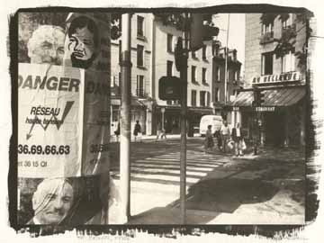

St Denis, 1988, © Peter Marshall, 1988. Gold toned salted paper print.

Step by Step Instructions

Making a salt print

      1. Tear or cut the sheets of paper to the size required – you need at least a one-inch margin around your negative. Mark the top side of the paper on each piece.
      2. Make up the salt solution, soak the paper in it for 2-3 minutes at room temperature or slightly above, gently brushing each side while under the solution to remove any air bubbles. Lift out, drain and hang to dry, putting down newspaper if necessary to catch the drips. Paper treated in this way can be used as soon as it has stopped dripping or dried and used weeks or months later.
      3. Tape the salted paper top side up to a board. Put the negative on top and mark the position of its corners lightly with pencil.
      4. In dim room lighting (away from sun and fluorescent lights), pour a few ml of silver nitrate into a small beaker or dish. Dip the tip of the brush in, and spread left to right across the paper making sure to cover the marked area. Keep the brush wet. Repeat using a series of top to bottom strokes. Try to get the surface of the paper evenly wet all over, but without any pools of solution. Don’t return any excess the solution to the bottle; add a little more to it to coat the next sheet. Leave horizontal until any liquid on the surface has been absorbed, then hang to dry in a dark place. Use gentle heat from a hair-dryer if you are in a hurry to get on.
      5. Put your negative on top of the dry prepared paper, matching its corners to your pencil marks. Unless you have a proper hinged-back printing frame, secure it to the paper down one edge using crystal clear transparent tape, making sure this does not go over any of the image area. Check you have the negative the correct way up. Put under the glass or in your printing frame.
      6. Typical exposure time needed is 10 minutes in bright sun, but you can remove it from the light and peel back the negative slightly to inspect the image. Take care not to move the negative – this is where a proper hinged-back printing frame is a great advantage. Expose until the highlight detail is slightly darker than you want it – the shadow areas will normally seem too dark, but will lose some density on processing. Paper negatives may take several hours, particularly in winter.
      7. In dim light, remove the paper from the printing frame and put into a tray of water – preferably use distilled or purified water for the first rinse. Use gloves and be careful how you dispose of this first rinse in particular as it will contain most of the silver nitrate. If possible it should be added to your normal waste fixer for recycling. Later rinses will have much lower silver content. Agitate for about a minute before pouring off, and repeat several times (using tap water for these later rinses.)
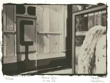

Paris XIIe, © Peter Marshall, 1988. Gold toned salt print.

      1. If your image is successful, you may wish to gold tone at this stage. Prints with developed edges are often trimmed to avoid waste of gold toner. You will find instructions for gold toning in books dealing with alternative photographic processes. As you may expect, it adds considerable expense. Gold toning was a later development not use by Talbot. I’d suggest you leave it until you have gained some experience in the process. Gold toning changes the image colour (not always for the better) and improves image stability.
      2. For prints that can be displayed and last, you should fix using hypo.If you are interested in following Talbot’s methods, you will find his instructions in various sources, including Beaumont Newhall’s ‘Photography: Essays and Images‘. Talbot does not appear to have washed his early prints either before or after ‘fixing’. For prints that will last longer, fix using a solution of 25 gm (1 ounce) of hypo crystals in 500ml of water with a pinch of soda (sodium carbonate) added. You can also use normal print fixer, diluted perhaps twice as much as usual, but this will alter image colour more and also remove more of the highlights. Fix for up to 5 minutes, keeping a careful watch on the highlights and remove the print and wash immediately if these start to disappear.
      3. Wash for around an hour in occasional changes of water and then hang to dry.

Resources

Various books have been written with methods for making salted paper prints in the more than one hundred and sixty years since they were introduced.

Henry H. Snelling‘s 1849 volume ‘The History And Practice Of The Art Of Photography‘ is subtitled ‘The Production Of Pictures Through The Agency Of Light’ and claims to contain ‘all the instructions necessary for the complete practice of the Daguerrean and Photogenic Art, both on metalic, plates and on paper’ (sic), and is well worth downloading from the web if you want to experiment further. Snelling more or less copies the details given by Talbot for making salted paper, but does add a number of further details.

The year after this was published saw the publication by Louis Desire Blanquart-Evrard of his work using albumen. This was an idea first proposed by an anonymous contributor to ‘The Athenaeum’ in May 1839 but Blanquart-Evrard was the first to put forward a practical method that contained the chlorides in the albumen. Albumen rapidly replaced salt printing as the normal photographic print because of its greater brilliance and depth of tone, and remained the dominant print medium until 1895 (finally going out of production in 1929.)

All paper prints in the first ten years of photography were salted paper prints, but after around 1855 it was probably mainly used for proofing. However, modern salted paper prints that I have made are a good match in terms of colour and tonal range to many matte prints from the 1850s (and later) identified in collections as ‘albumen prints’ and although it is possible to make matte albumen prints I suspect these are relatively scarce. If a print is matte, made before 1885, and does not have yellowed highlights it is highly probably that it is a salted paper print, whatever the curator’s label.

Many later photographic books also had instructions for salt printing and other early printing methods, but they were dropped out of most photographic textbooks by the 1930s. One of the best known from this period, ‘Photography, Theory and Practice‘ the English edition of ‘La Technique Photographique’ by L P Clerc, contains details of this and other by then obsolete processes such as albumen printing.

If you are interested in older processes and practices, you will find books such as the 1911 ‘Cassell’s Cyclopaedia of Photography‘ enthralling. I find it a useful source of information particularly for its many line drawings and learn something new every time I pick it up. However the older chemical nomenclature and weights and measures do make life a little trying at times, and there are some procedures suggested which bear no relation to common sense let alone health and safety procedures. Almost every page deserves a health warning. It lists salted paper under one of its alternative names, Plain Paper.

The best modern source of information on the whole area is ‘The Albumen & Salted Paper Book’ by James M Reilly mentioned above. First published in 1979 and long out of print it is now available in full on line – a generous gesture from the author. It really tells you everything you could wish to know.

The same year saw the publication of William Morgan’s ‘The Keepers of Light’, which remains a key text for those interested in older processes and is available secondhand. Since then a number of other books have also appeared which cover alternative processes in detail. Although some of these have excellent articles and illustrations on salt printing, there is nothing essential in them that is not available in the earlier works.

There are also a number of on-line resources, including the alternative processes mailing list and a number of fine web sites – too many for me to list or spend the time reviewing – just search on Google.

Materials for the processes can be hard to come by in but can be found online at specialist dealers, including Bostick & Sullivan and Photographers Formulary in the USA and Silverprint in the UK. Many articles on alternative processes have appeared over the years in various photographic magazines, and there have been independently produced magazines dedicated to alternative processes in both the UK (now defunct) and the USA.

Salt Prints

Tuesday, February 24th, 2015


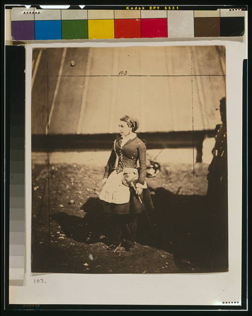
Vivandière (French cantinière)  Library of Congress Prints and Photographs Division Washington, D.C. with Fenton’s crop marks

It was back in the 1980s that I got briefly into salt printing (more on that here), around 140 years after W H F Talbot showed us the way (possibly picking up the idea from Sir Humprey Davy) in 1839, and with his ‘The Pencil of Nature‘ (1844 to 1846) published the first major printed work incorporating a number of them with his ideas.  I wrote briefly about the salt print process back in the 1990s, and published a revised version in the following decade with my own illustrations. I’ll try and find it and republish, but the truly definitive work on the process, Reilly, James M. The Albumen & Salted Paper Book: The history and practice of photographic printing, 1840-1895. Light Impressions Corporation. Rochester, 1980, is available free on-line for those who want full details.

Its a process you can read about in most if not all the histories of photography, and there are many manuals available in print and on-line to tell you how to do it apart from the Reilly book mentioned.  In some it will be called ‘plain paper’ printing or just ‘silver’ printing and it was performed in the 1840s and 50s making use of ordinary writing or drawing paper of the age, which was first coated or soaked in a salt solution (sometime common cooking salt, sodium chloride, though other salts were also used) and then after having been dried, made light sensitive by floating on a bath of silver nitrate solution (or this could be brushed on.) The paper then had to be dried in dim light and exposed with as little delay as possible in contact with the negative in a printing frame in sunlight.

The papers used were only lightly ‘sized’ or coated with a material – usually gelatine or starch – and the solutions soaked into the paper, with the light sensitive silver chloride (or other silver salts) being embedded into the paper. Later photographers began to use more sizing or other materials to keep these salts on the surface which enabled a better tonal range. The most successful of these was albumen (egg white) and as well as making matt surface prints this also enabled prints to be given a glossy finish. It used to be a standard museum practice to label all early matt prints as salted paper and early glossy prints as albumen.

Many photographers continued to make their own salted paper into the early years of the twentieth century, with directions still being published in various manuals of the times, although by then there were many commercial alternatives. You could also buy papers that were ready salted and only needed the photographer to sensitise them, but there were also other alternatives for the photographer. In a 1910 issue of ‘The Photo-Miniature, the author writes “Twenty years ago, when photography was not a popular pastime but a mysterious hobby, a photograph could be only one definite thing, namely – a so-called silver or albumen print.” (This refers to albumen prints only, not to salted paper prints.) The title of the article ‘The Six Printing Processes‘ gives us some idea of how much things had then changed since 1890, although there were many other processes also in use by then, some dating back to the beginnings of photography such as the blueprint (aka cyanotype.)

I was reminded of all this while eating breakfast this morning by the Today programme which featured two people talking about Salt and Silver: Early Photography 1840 – 1860 which opens to the public at Tate Britain tomorrow (25 February – 7 June 2015) with a claim to be the first exhibition in Britain devoted to salted paper prints. While this may be strictly true, many shows have included works from this period, many of which will have been salt prints, and other shows focussing on particular photographers or groups have been entirely of salt prints. But this is the first to be actually built around the process and while the show appears to include some well known works, it also brings out some less familiar.

The text also states “The few salt prints that survive are seldom seen due to their fragility, and so this exhibition, a collaboration with the Wilson Centre for Photography, is a singular opportunity to see the rarest and best early photographs of this type in the world.”  Silver is a fairly reactive metal and much of the early research into different printing methods was aimed at ways to prevent the fading of images, particularly from an age where the necessity for thorough washing of prints was not fully appreciated. I don’t think salt prints are rare, but examples from this early period, and particularly ones in good condition perhaps are. But prints by WHF Talbot regularly appear in auctions and even in recent years some have sold for well under £5000.  My own salt prints, now around 20 years old, are still looking much the same as when I made them, but may well not last 170 years. As to whether these are the best, you will perhaps have to visit the show to find out, although the works selected to display on the web site by Hill & Adamson, Talbot and Fenton are certainly not those I would have chosen.


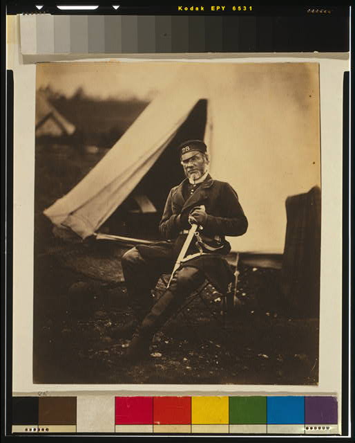
Captain Andrews, 28th Regiment

There are two included in the  on the Tate web site by Talbot, and also two by Roger Fenton, who made both albumen and salted paper prints. There is a marvellous collection of 263 of his Crimean War pictures at the US Library of Congress,  which includes prints of the same two reproduced here. You can if you wish download high resolution TIFF files of these (Vivandière is called Cantiniére on the Tate page) and print out your own copies, either on an inkjet or, if you really wanted, convert to a negative to make your own real salt prints. It really isn’t too difficult!

Prince of Pilfering

Sunday, February 22nd, 2015

I’ve never had a positive response to ‘appropriation art’. It’s always seemed to me parasitic rather than in any way symbiotic. A total lack of respect of the authorship of the work being appropriated combined with a false assertion of authorship by the appropriator.

Of course it’s OK to use work by other people, though if you do so in a direct and recognisable way you should clearly attribute this – and where appropriate pay for a licence for its use. I was quite happy recently when an artist wanted to use some of my pictures on some cushions she was making – and supplied her with files for the purpose. We came to an agreement and my contribution to the work is acknowledge; that’s how it should be, and others who have wanted to use my work in their own paintings and illustrations have made similar agreements over the years.

As for ‘appropriation‘ I think what has to say about it and about Prince’s ‘Instagram’ works is worth reading. Here’s just a couple of sentences from it:

Seen as most people access art today, in their social media feeds, Prince’s appropriations are visually indistinguishable from the original sources. The thing that separates them is celebrity and recognition within the contemporary art world/business framework.

One way that Prince went wrong was to pick as one of his steals from Instagram a work by photographer Donald Graham.  Obviously a very succesful and accomplished photographer (if not particularly to my taste), on his ‘Fine Art’ web site it tells us: “Donald Graham is an internationally recognized photographer with work in the Metropolitan Museum of Art in New York and the International Center of Photography.”

While your average Instagram user might be flattered that Prince would re-use one of their images, someone who is already showing work in a museum context it likely to see it just as a rip-off. Unsurprisingly, as you can read in Hyperallergic‘s Photographer Sends Cease and Desist Letters to Richard Prince and Gagosian, Graham’s response is to go to law.

As the article states, Graham’s picture had been uploaded to Instagram not by the photographer himself, but by a third party,  Jay Kirton, who uploaded it without accreditation (and presumably without permission.) I presume that neither Prince nor his gallery, Gagosian bothered to check – by Google Image Search or other software – on the copyright status and ownership of the image. It appeared Hyperallergic‘s review of the show last October with the name of the poster rather than the photographer “appropriated from @rastajay92.

As I’ve pointed out before, (for example in it just isn’t practicable to prevent the unauthorised use of images on the web. It would take up the whole of any photographer’s life to police the usage of their images, and in most cases prove impossible to acheive any recompense. But where anyone is making large sums of money from your work, things are different.

Graham in October posted to Instagram about it (as you can read on Hyperallergic), and I imagine he may also have contacted the gallery without any satisfaction, but now his lawyer has sent “cease and desist” letters to Prince and the Gagosian Gallery. Perhaps it will go to court.

It isn’t the first time Prince has been taken to court, (and not even the first about images of Rastas) and although in at least one previous case an out of court settlement was finally reached with a photographer, generally Prince has been treated with inappropriate leniency by the courts. If there are people ignorant enough to pay over $40,000 for very large but rather dull reproductions from Instagram, the photographers who produced the original works on which Prince imprinted his own lack of originality deserve at least as much as him from them.

January 2015

Saturday, February 21st, 2015


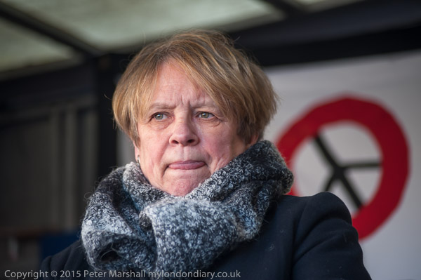
Green MP Caroline Lucas speaking at ‘No Fracking Anywhere!’ rally on Jan 26

It was a New Year’s resolution. Among other things, I was going to keep up to date with My London Diary. And it lasted all of two weeks, probably longer than average for such things.

It might well have lasted longer if my computer system hadn’t decided to take a long rest in mid-January, leaving me working from my notebook. Even after I got it back working there was still a lot of catching up to do. So it isn’t surprising that I finished the month 20 days late.

It isn’t the only thing I’m behind on. I needed just another couple of days to finish my next book, and now its over a month since I did any work on that. Quite a few other little jobs too that haven’t got done yet. But at least now January is over.

Jan 2015

March for Homes: After the Rally
March for Homes: City Hall Rally


March for Homes: Poor Doors
March for Homes: Shoreditch to City Hall
March for Homes: Shoreditch Rally
‘Tin Pan Alley’ 12 Bar club faces eviction
SOAS Cleaners demand Dignity & Respect
Cleaners protest at Royal College of Surgeons
No Fracking Anywhere!
Gambians protest brutal repression


Occupy defy GLA ban on Democracy


CND Scrap Trident rally at Parliament
‘Wrap Up Trident’ surrounds Defence Ministry
Christian CND against Trident Replacement


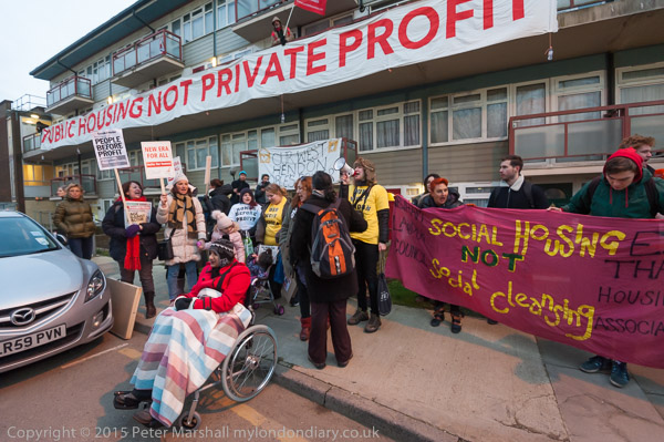
West Hendon march for Social Housing
Class War visit ‘Rich London’
City Island – Lower Lea Crossing


Stop Arming Israel picket HP at BETT
What Are You Afraid of Boys?
Irish Famine is no laughing matter
Carnival March to End Taiji Dolphin Massacre
Solidarity with German anti-Pegida


‘Je Suis Charlie’ rally
13th Year of Guantanamo Shame
Free Shawki Ahmed Omar
Cirque du Soleil – Say No To Apartheid!
Oh! Mother Against Knife Crime


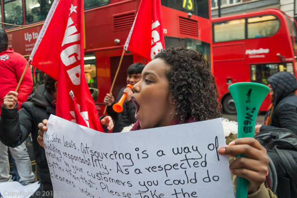
Pay John Lewis Cleaners a Living Wage
Vigil for Leelah Alcorn
New Year’s Day Walk (more…)

Hope for Linux Users

Friday, February 20th, 2015

I’ve always wanted to stop using Windows. Well at least since I first installed it many years ago. At the time, back in the 1980s, Gem seemed to be a rather better system. But by the time Windows 3 came along, around 1990, Windows seemed more or less the only game except for the uber-rich fuelled by advertising who could afford to go the Mac route.

For those with computer science degrees there was of course UNIX, which became affordable in the form of Linux. Over the years I’ve installed Suse and Red Hat on quite a few computers, and my wife’s computer is now running happily on Ubuntu. Or mainly happily, but after it crashed while running an update I had to do a complete reinstall. Which worked fine, but had problems finding the parallel port printer. Not that it couldn’t find it at all, just that it seemed to insist on sending data a bit or two at a time, so it might take half an hour before a page would emerge.

There was a lot of advice on the various support forums, and I tried it, but nothing worked. Clearly too, a lot of other people were having similar problems from all the messages that were posted – and a few did find that the solutions posted worked. Most I think finally gave up and brought a USB printer instead.

Fortunately both my sons are computer science graduates, and when the elder came home he soon solved the problem, editing a few files here and there on the system – and posted his fix on a support forum too, so others may benefit. But if you don’t have a first in Comp Sci, and don’t want to devote most of your life to learning Linux there are still rather a lot of possible hurdles.  We’ll probably have to call Sam in again after the next OS upgrade too.

But if you are running some flavour of Linux, you might be able to install Darktable.  If you are running a Mac, it’s also possible, though looking at the instructions not entirely straightforward. If you are using Windows, you could run it in a virtual machine (likely to be slow)  or should you be a true geek you might just be able to get it to run natively if you have most of your life to spare.

Why should you want to? Well it does seem as if it is almost a alternative to Lightroom for the Linux user.  Here is the start of the description from the web site:

darktable is an open source photography workflow application and RAW developer. A virtual lighttable and darkroom for photographers. It manages your digital negatives in a database, lets you view them through a zoomable lighttable and enables you to develop raw images and enhance them.

And here is most of what the FAQ says about a Windows version:

  • What about a Windows port?

None of the developers use Windows, so a port of darktable to that operating system is very, very unlikely to happen.

That being said, many things should already work, so the actual porting should be relatively straight forward. It’s just that we won’t do it. However, there is the “win” branch which kind of cross compiles using MinGW to generate a Windows version. It’s still really buggy and might crash, kill kittens and eat your baby. You have been warned.

Like much Linux software, Darktable comes free. Of course it isn’t the only alternative, and there are a couple of review articles I quickly found that briefly compare some of them. Best Linux photo editors looks at half a dozen of them, including two I’ve tried, Gimp and Corel’s AfterShot Pro, but this review is a couple of years out of date (and the versions I tried and found a little wanting were older still – when the Corel software was called Bibble.) Top 15 Photo Editors for Linux Distributions is more recent, but also rather less informative.

AfterShotPro (now AftershotPro2) isn’t free, but commercial software, though reasonably priced, and were I seriously going the Linux route would probably be my choice.  But as the writer of the ‘Top 15’ article says at the end of his roundup:

I’m quite happy with how the list turned out, and it also made realize that there is still a quite big gap in the photo editing software market when it comes to Linux. A ton of people I know, and even those that I encountered during my research – still prefer to work with Photoshop through Wine.

For the moment, rather than tangling with Wine (a Windows-like environment which allows some Windows programmes to run in Linux) I’ll continue to whine about Windows, and when necessary drown my sorrows with a glass or two of a decent red. Oh dear!


The Integrity of the Image

Wednesday, February 18th, 2015

With the continuing debate over the disqualification of around 20% of the entries that reached the later stages of World Press Photo for excessive manipulation I think it is well worth reading the WPP’s Photo Research Project ‘The Integrity of the Image‘ by Dr David Campbell.

It’s a subject I’ve written about myself on various occasions, and tried to do so from the perspective of a working photographer, someone who does their own image processing in Lightroom and Photoshop.

I’ve always felt it’s basically a straightforward issue. The key concepts are integrity and intention, and my view can be summed up very briefly:

Correction – Fine; Emphasis – within limits; Alteration – Never.

Of course its a statement that requires interpretation, and back in 2010 I published my views on what was and wasn’t acceptable when processing an image. I think it bears repetition (with some minor changes and additions to clarify) :


Always appropriate (as necessary)

  • dust removal (scratch etc removal from film
  • level correction
  • colour temperature correction
  • exposure correction
  • brightness correction
  • minor contrast correction
  • marginal cropping
  • image rotation
  • highlight removal
  • image resizing
  • image sharpening
  • lens distortion and aberration correction
  • image noise reduction
  • Vignetting reduction/removal

Often appropriate (within limits)

  • Curve adjustment
  • Local dodging
  • Local burning
  • flare removal
  • local contrast adjustment
  • perspective correction
  • saturation / vibrancy adjustment (including conversion to black and white)

Sometimes appropriate

  • Deliberate blurring/pixellation of detail (eg where necessary to hide identity)

Seldom appropriate

  • radical cropping
  • excessive vignetting
  • colour toning
  • graphic effects

Never appropriate

  • Content sensitive fill
  • Removal or addition of important image elements

Of course many of these require judgement as to what level of use is allowable. While it may be appropriate to emphasize some elements of an image and de-emphasize others, dodging or burning certainly shouldn’t eliminate them.

Some photographers attempt to justify excessive manipulation (or colour casts etc) by saying that it was how they saw the image when they made it; its seldom an argument that convinces me; images have to be believable to the audience, and the techniques we use appropriate to the purpose.

One aspect I’m pleased to see included in Campbell’s report, in his list he describes as a  ‘general consensus’:

  • Photos cannot be staged, posed or re-enacted.

As the report states:

“This consensus applies most directly to news and documentary images. Our respondents noted that they generally regarded nature and sports images in the same way as news and documentary images. Fashion and staged portraits were a different matter altogether. In those genres, there were no policies, and in fashion especially the prevailing attitude was that anything goes and all is permitted.”

I’m all in favour of keeping ‘news’ news, of keeping sports real and stuffed squirrels out of nature photography.

Pancake Day

Tuesday, February 17th, 2015

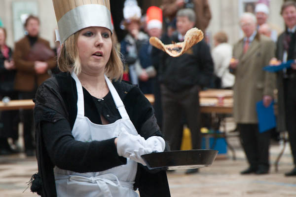
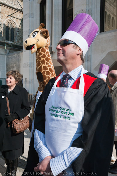
This year I just don’t have the energy for pancake races. Not that I ever took part in them, but since I first photographed the Worshipful Company of Poulters Pancake Race in 2007 I’ve returned most years, as well as photographing other races in Spitalfields and elsewhere.


Pancake Day 2011

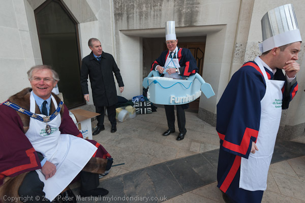
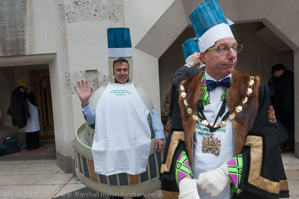
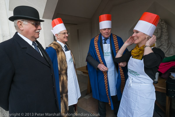
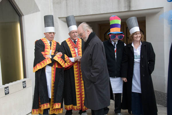
The race in Guildhall Yard has become something of a tradition for those taking part, particularly for a few of my photographer friends, and is certainly one of the odder events in the city. Hardly an ancient tradition (it began in 2005, a couple of years before I first went) but as I noted in 2007 is:

organised by The Worshipful Company Of Poulters which got its charter to regulate the sale of poultry and small game in 1368, and run, by permission of the Chief Commoner, in the yard fronting the Guildhall building, which got a controversial new gothic facade in 1788 thanks to George Dance the Younger. It was first run in 2005*, but as befits the city it has a serious set of classes and rules, music from the Worshipful Company of Musicians (1500), time-keeping by the Worshipful Company of Clockmakers (1631) and a starting cannon for each of the many races provided and fired by the Worshipful Company of Gunmakers (1637.)


Pancake Day 2012


Pancake Day 2013


Pancake Day 2014

Like most of the other pancake races, this is a charity event, and one thing the City is not short of is money. And while I suspect that many of those taking part will be up to all sorts of dodges to (mainly legally) avoid paying tax they will at least be giving some of their ill-gotten gains to good causes.


2008 Poulters’ Company Shrove Tuesday Pancake Race

Its an event that often amuses me, with some very serious people trying hard to let their hair down and wearing very silly hats, but also one that shows how competitive the City can be – and with sometimes a certain amount of sharp practice despite elaborate rules and a large number of people observing compliance.


Great Spitalfields Pancake Race winners 2007

My own athletic ability has some years been taxed by jogging with a heavy camera bag from the Guildhall Yard to The Great Spitalfields Pancake Race across the border in Tower Hamlets. Taking place in what was a part of the Brewery site off Brick Lane, the shortest route is just over a mile, and the only sensible way to make the journey fast is on foot or bicycle. But taking a bicycle to events like this involves an unacceptably high risk of not having a bicycle for the journey home. So I walk and run and walk and run…

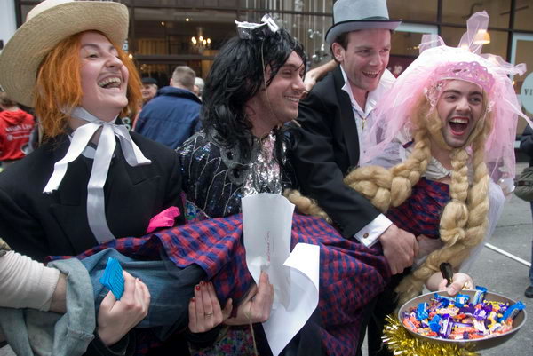
Unlike the Guildhall race, this and three others are included in the Official Tourist Guide to London. It takes place in a rather more confined space making it difficult to take pictures for the crowds of others taking pictures. It starts a little later than the Guildhall event, but they overlap in time and it isn’t really sensible to try and cover both – so most years I’ve done so. The contestants here are teams, mainly from local businesses and there is rather more fancy dress, and rather fewer rules, most of which are broken. It’s much more straightforward fun than with the Livery Companies.


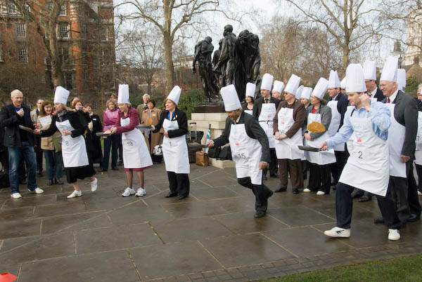
The start of the 2008 Parliamentary pancake race

Another that I’ve photographed in the past – and is starting as I write now – is the annual race between media and parliamentarians in the Victoria Tower Gardens, which takes place too early to draw a very large crowd and is a rather more serious event. This is a highly organised and tightly fought race to raise funds for the charity Rehab – complete with a 32 page brochure for various sponsors to advertise in.

There are also an increasing number of other pancake races, mainly charity events around London, now including many suburban centres. I could even go and photograph one ten minutes walk away from where I live in Staines this lunchtime, and I may just stroll down there later, but I doubt it.  I’m not a great fan of pancakes (and crepes really give me the creeps – such a food rip-off) and I feel I’ve photographed enough.


* or 2004 according to the Clockmakers who ought to know.
(more…)