Archive for January, 2012

Wet Hole

Tuesday, January 31st, 2012

Another image from 1978 which I scanned yesterday, ‘Wet Hole‘ seemed to me then to sum up my feelings about Bracknell, the by then not so New Town where I was working, and where I’d lived for three years earlier in the decade, although by this time I was enjoying a pleasant commute of a dozen miles with a colleague, or occasionally by a convenient train service.

© 1978, Peter Marshall

I was finding my teaching job hard work, with long hours needed to make the necessary preparation and marking was a real bind. It was a badly managed school and much of what should have been preparation time was lost to supervise classes for absent colleagues, much of the absence stress-related.

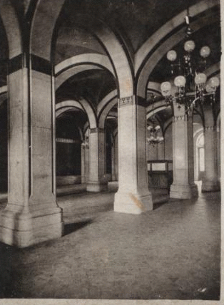
Bracknell was still a large building site, with large new estates being added around its fringes and the centre, where this picture was made, continually being redeveloped.

It wasn’t really a modern town, which much of the housing perhaps tediously old-fashioned domestic, developed with the car in mind and separating traffic from pedestrians, which almost always seemed to mean doubling the distance from A to B on foot – so most of us walked along the edges of the roads, particularly at the more dangerous junctions. The town centre was always just a mess, but what depressed me most about the place was a lack of vision, of style. Being the most boring of the New Towns wouldn’t perhaps have been a bad thing if it worked well, but it didn’t.

Even the train service, one of its best aspects, was ridiculously slow – and got even slower while I was there. 28 miles from London in a direct line, the 32 mile rail journey now takes slightly over an hour, an average speed of 31.5 mph on trains which the operating company laughably calls ‘fast.’

But the picture wasn’t just about my feelings about Bracknell, it was also a comment on the often dreary depths of architectural modernism here in the sixties and seventies. If anything the temporary structures at the bottom of the image are visually more interesting than the buildings behind. Again it perhaps wouldn’t have been too bad a thing if it worked well, but too often it didn’t.

At the time I took this picture, I was working on my first major project on Hull, and in particular the vast redevelopment that was taking place there, much of which is now in my book ‘Still Occupied.’

© 1980, Peter Marshall

My work there had partly been spurred on by my experiences in the previous decade as a grass-roots activist on housing and redevelopment issues in Hulme and Moss Side, Manchester. So although I’ve never thought of myself as an architectural photographer I did have a keen interest in urban planning and urban landscape, which more recently was reflected in the Urban Landscapes web site I set up with Mike Seaborne around ten years ago. But in Hull I was largely concerned with what was being lost rather than the new.

© 2007 Peter Marshall

Almost 30 years later I got to visit Brasilia, where modernism essentially ended – and incredibly its architect Oscar Niemeyer is still alive at 104. I arrived there the day after his 100th birthday, and was shown around much of the city by the daughter of one of the planning team who worked with Lucio Costa (1902-98 – who incidentally went to secondary school in Newcastle upon Tyne.) It was of course a prestige project and its signature buildings still lift the spirit despite the city’s faults.

© 2007 Peter Marshall

On a smaller scale, Costa’s “superquadras“, the neighbourhoods which repeat across the city, seem so much more lively and human than anything our own New Towns have to offer.  Simone de Beauvoir wrote of their “air of elegant monotony”, but perhaps they have matured with age, and certainly some of the elegance is still there, along with a vibrancy we can’t match.

Harmondsworth Great Barn Saved

Monday, January 30th, 2012

Half-awake in bed this morning I was lifted out of my dreams by an item on the Radio 4 Today programme, about Harmondsworth Great Barn, which has apparently been bought for the nation for a knock-down £20,000. It’s a sum that would hardly buy a garage or a garden shed out here in West London, and the barn is notable among other respects in its size. I think the BBC reporter said it was 20 metres long, which she helpfully added is almost 60 feet. Or as we say in the real world, just over 65 ft. But it was early morning and I could be wrong. On the ground the barn is over 60 metres long – 192 ft – and 11 metres high (37 ft) really giving the impression of a vast wooden cathedral (John Betjeman called it ‘The Cathedral of Middlesex‘, with a central nave and two side aisles giving a total width of around 12 metres (38 ft.) Its 12 bays are supported by giant oak columns, whole trees selected and cut to shape, with a tremendous amount of woodwork, of which over 95% is thought to date from 1426 when the barn was built by Winchester College to house the vast yield of wheat from its lands.

© 2003 Peter Marshall
The people give a good indication of the size of the Great Barn

It was a typical BBC report, sprinkled with such inaccuracies – she spent some time telling us we might have flown over it on our way in or out of Heathrow, and about the planes flying overhead. Unless they take a sharp left or right halfway down the runway they don’t – the Great Barn is 1.3 km directly north of the northern runway. You can hear the planes, see them shortly after they leave or reach the ground, but they don’t go overhead either on take-off or landing. That treat is reserved mainly for the residents of Hounslow and London to the east and Poyle and other places to the west.

© 2003 Peter Marshall
Splendid oak beams, cut in 1426 support the tiled roof.

In truth English Heritage paid £199,999 more of our money than they needed to, as they were offered the Great Barn for £1 in 2003, but amazingly declined to buy. The Guardian quotes Simon Thurley, chief executive of EH as saying “Harmondsworth Barn is one of the greatest medieval buildings in Britain, built by the same skilled carpenters who worked on our magnificent medieval cathedrals. Its rescue is at the heart of what English Heritage does.” You would have thought it would have been worth a quid – particularly before the recession and the cuts! Three years later the owners were bankrupt and it was bought by a trust who paid a pound for it, and more or less left it to rot, presumably hoping to make money from the sale of the site for the airport extension.

The site, as the Society for the Protection of Ancient Buildings, (better known as SPAB) explains, is both a Grade One listed building and a Scheduled Ancient Monument (SAM). Unfortunately the SAM listing means that enforcement powers which can be used against owners of listed buildings to force repairs do not apply. Bizarrely there are no comparable powers for SAMs, which have to rely on the slow process of English Heritage getting permission from the Department for Culture, Media and Sport to get things done. Although it had been well-maintained until around 2003, since then it has been neglected, falling to pieces over the past 8 or 9 years and costing us more to put right.

© 2003 Peter Marshall
Protesters march from Harlington to a rally at Harmondsworth in 2003

The most significant omission from the BBC report was any mention of the fight to stop the third runway at Heathrow – its western end would have been just a few metres from the barn and the church a few yards away. As well as the runway, the plans also included the building of a new and busy road past the site. At the moment it’s just off a quiet (apart from the planes three-quarters of a mile away) triangular village green with pub, church and cottages on a road that leads to nowhere – on a bike you can continue to Harmondsworth Moor and walk or ride along by the River Colne or the Wraysbury River, an area of grass and woodland away from anywhere except aurally, with the noise of the planes largely drowned by the continual rumble of the M25 and M4!

I visited the barn and took pictures inside it on the day of the first large protest march against the third runway. We held the rally on the green outside the pub, and there was a specially brewed beer for the campaign. Despite the closeness of the airport, the area retains something of the character of the Middlesex villages I rode through on my bike as a boy in the 1950s.

© 2003 Peter Marshall
The rally on Harmondsworth’s village green, outside the Five Bells – the barn is just a few yards down past the right of the pub

Even in the fifties, we knew that Heathrow Airport was in the wrong place for London’s major airport as the planes thundered over shaking our Hounslow house just two and a half miles from touchdown. The aviation industry who planned it in the 1940s knew that they could only get it there by stealth, under the pretence it was needed for military purposes, a deliberate deception which has since been acknowledged. By the 1980s and 90s the need to build a new airport was so clear that it seems criminal that successive governments ignored it. Then as now, the obvious site was not ‘Boris island‘ but somewhere to the north-west of London, close to the M1 and the west coast mainline, perhaps in an area already despoiled by abandoned brick workings, and with flight paths that avoid our major centres of population.  But government after government fudged the issue and instead gave way to pressure from the aviation industry to expand Heathrow, terminal by terminal, each one promised to be the final expansion. It’s long past time we got a vision for the future of Heathrow that looks at the site as an opportunity for a future new town rather than as an airport.

© 2009 Peter Marshall
Climate Rush scrumping at the nearby Heathrow Airplot, September 2009

The Great Barn has for some years only been open on special occasions – mainly the annual Open House Day. According to The Guardian report cited above, it will be open two Sundays a month from April, free to the public, thanks to volunteers from the local Friends of Harmondsworth Barn, and it is well worth a visit, though I hope there will not be too many cars blocking the local lane’. There is a car park for the Colne Valley park a fairly short walk away which I hope visitors will be encouraged to use. I hope too you will be able to enjoy fruit from the adjoining orchard, seldom harvested in recent years, which Grow Heathrow paid a visit last October. Before the airport, this was an area famed for its market gardens and orchards, one of the agriculturally most productive areas of the country (and the home of the ultimate apple, Cox’s Orange Pippin – and Richard Cox was buried in the churchyard) – which is why Winchester needed such a huge barn.

There Be Dragons (and Lions)

Sunday, January 29th, 2012

 © 2000 Peter Marshall
Chinese New Year, Soho, London, Feb 2000

2012 sees the Year of the Dragon, just as it did in 2000, but this year it is the water dragon and then was the metal. But London’s Chinatown will be full to bursting again today as the Chinese New Year is celebrated, though this year I won’t be going to join the crowds.

© 2000 Peter Marshall
Chinese New Year, Soho, London, Feb 2000

I’ve photographed the Chinese New Year on quite a few occasions, and it was one of those events that even before everyone was a digital photographer was decidedly over-saturated with photographers. All of the amateur photographic magazines listed it in their ‘events to photograph’ and clubs organised day trips to the event.

© 2000 Peter Marshall
Chinese New Year, Soho, London, Feb 2000

It can still be enjoyable to be there, though perhaps Chinatown is better almost any day of the year if you want to eat there or take pictures of anything other than the lions or dragons. I quite like photographing in crowds, but today it will just be too full of people. If I went I might not even bother to take a camera, though actually I’d take one – perhaps just the Fuji X100 – just in case something came up.

© 2000 Peter Marshall
Chinese New Year, Soho, London, Feb 2000

In 2000 I took three cameras, and one was the Konica Hexar, the film equivalent of that Fuji, with a fixed 35mm f2 lens, which achieved cult status as the ultimate available light fixed lens camera and in ‘stealth mode’ had the quietest shutter and motorised film advance ever made for 35mm, although this was hardly needed at such a noisy event. Using it I took around 20 frames on Ilford XP2 black and white chromogenic film.

© 2000 Peter Marshall
Chinese New Year, Soho, London, Feb 2000

My second camera was also a Konica, the then very new Hexar RF, a camera that was everything the Leica M7 a couple of years later should have been and wasn’t, surely the ultimate film Leica, though like the later Leica models not engineered as well as the M2. It could have been one of the two other Leica fitting bodies I owned. I took around a dozen frames and then obviously gave up, and went to do a little urban landscape elsewhere in London away from the crowds. All the pictures I took with the camera that day were with a very wide angle lens, the 15mm Voigtlander which had come out the previous year, and seems to have been the only lens I took with me.

© 2000 Peter Marshall
Chinese New Year, Soho, London, Feb 2000

But this was also the first time that I tried working with a digital camera, although one that was fairly primitive by today’s standards, a FujiFilm MX-2700 which was one of the first 2.3 megapixel cameras available in mid-1999, with a fixed 7.6mm (equiv to 35mm) F3.25 lens. The pictures – up with the best at least in consumer digitals of the time – as you can see here are a little crude, with rather garish colour and a distinct lack of detail in the skin tones, and I struggled to get a decent 6×9 inch print from the 1800×1200 pixel jpegs even when taken at the finest quality. But they do give some idea of what it was like, and it probably won’t be very much different this year.

Some years I stuck it out longer in Chinatown and took rather more and better pictures – including one that has made me a decent amount of money over the years in a few books, although I don’t think it was anything very special. But today I think I’m going to stay at home and rest my aching knee, still recovering from a minor slip getting down from a fence a couple of weeks ago.

Stereo With One Eye

Friday, January 27th, 2012

One of several presents I gave my wife for Christmas was a book of old stereo views of London which came with a built-in viewer to see them. It wasn’t a great publication, though there were a few interesting pictures, it didn’t really give a very good overview of the city.

Back in Victorian times, no parlour was complete without a stereo viewer, usually wooden with two lenses to hold at your eyes and a slot the correct distance away to hold the stereo cards, which enabled you to view all the wonder of the world in your own home.

We passed the book around on Christmas afternoon and everybody had a look. Some people found it difficult to see the pictures in stereo, there is a slight knack to it and it gets much easier with a little practice. At least for most people it does, but there are some who just can’t do it, and my elder son is one of them. Born with a squint that was cured by an operation when he was small, although his sight is fine his two eyes just don’t work together.

So I’ll be interested in how he gets on with the Stereogranimator from the New York Public Library, which they developed to let people look at around 40,000 stereo views from their collection, either as  “wiggle stereographs” or ‘anaglyphs’. Anaglyphs are the familiar two-colour views that you need special two colour glasses to view, but the ‘wiggles’ were new to me. They make seeing the images in stereo without glasses very easy, almost impossible not to see, by displaying the two images in the same frame as two images in an animated gif, wobbling rapidly between the two. It’s a bit annoying but definitely 3D.

GIF made with the NYPL Labs Stereogranimator - view more at http://stereo.nypl.org/gallery/index
GIF made with the NYPL Labs Stereogranimator

Of course if you have your red/cyan glasses handy it will look a lot better as an anaglyph – I just made this one on the NYPL site:

ANAGLYPH made with the NYPL Labs Stereogranimator - view more at http://stereo.nypl.org/gallery/index
ANAGLYPH made with the NYPL Labs Stereogranimator

Years ago I made some high quality anaglyphs using a pair of Olympus OM4 cameras joined together at the base by a short length of screw thread which fitted both tripod threads, letting you screw the two cameras, each fitted with a 50mm f1.8 lens into a nicely solid lump with the two lenses pointed in the same direction.  The lens centres were at roughly the same distance apart as my eyes which gives a nicely natural stereo effect.

The rig was completed with two cable releases tied together and the two plungers joined (I think I could have bought a double release, but that would have cost money) and it was possible to use handheld, taking pictures onto black and white film. The lack of the normal orange mask caused some problems when printing onto normal colour paper  (later Kodak produced an orange-masked black and white chromogenic film to make printing on colour paper easier, but what I needed were not neutral exposures, but a red and cyan exposure, one from each neg, made one after the other vaguely in register on one sheet of paper, adjusted so that where both where the same the print was roughly neutral. It took a little trial and error to get the best effect.

Thanks to PetaPixel for the information about the NYPL site, and there are a few good examples on their site, but you can go to the NYPL and select from their huge collection, or make a new one from their images as I did for the anaglyph.  It wouldn’t be too difficult to make some from your own pictures with Photoshop either – just take a couple of pictures from a short distance apart – perhaps 3 or 4 inches –  as  your starting point

Ansel Adams on Film

Thursday, January 26th, 2012

Ansel Adams is not one of my real favourite photographers, perhaps because his view is both very American and also from an earlier era*; it’s fine to admire what he did (and in many ways I do) but it has inspired too many to try and do the same, and the results are almost always uninspiring and insipid.

I did learn a lot from him, and his ‘Basic Photo‘ series in particular, teaching myself to print from an old copy of one of the volumes that I came across by accident in our local library when I moved to a new home in 1974. I ended up buying my own copy of ‘The Print’ and the other volumes in the series. But Ansel taught me how to print, and it was then a true master-class, though later editions of the work did get somewhat dumbed down.

I sat down at the computer today to write about something completely different, then spent the best part of 80 minutes (I did fast-forward a little) watching  the PBS documentary on Adams that I found on the Peta-Pixel site. As it says, “an elegant, moving, and lyrical portrait” though perhaps sometimes lacking in critical bite about his photography.

After watching it, I went to take another look at some of his photographs, which he also deserves to be remembered for and are too often forgotten, on the Library of Congress site, Ansel Adams’s Photographs of Japanese-American Internment at Manzanar.

Ten years ago, at the time of the centenary show of his work, I wrote about Ansel Adams at some length as well as reviewing the show, but those features are no longer available. Written at the same time and published in The Atlantic Monthly was a long piece by Kenneth Brower, still available on-line and worth reading.   Among many other things he tells how MoMA in New York censored the show of his Manzanar work, insisting on the removal of a panel by Nancy Newhall referring to a letter written by Lincoln and including the words:

As a nation we began by declaring that “all men are created equal.” We now practically read it as “all men are created equal except Negroes.” 

MoMA insisted on the removal of this panel and that the original title of the show be changed from “Born Free and Equal” to “Manzanar: Photographs by Ansel Adams of Loyal Japanese American Relocation Center.

_____________________________________________

*But that doesn’t stop me liking Walker Evans.  I think there is a line between creating creative landscape images and pretty pictures that just sometimes Ansel Adams got the wrong side of. Or perhaps I just prefer the classical to the romantic. Or think it wrong that there were people who failed to realise that Edward Weston was so much a better photographer!

The Near and Elsewhere

Wednesday, January 25th, 2012

Although The Near and  The Elsewhere, showing at the PM Gallery in Ealing was in various ways a disappointment to me, I was still pleased that I had gone to see it (and it remains on show until 17 March, Tue-Fri 1-5pm, Sat 11-5pm) and would recommend a visit if you are in London – it’s a short walk from Ealing Broadway tube.  Firstly because of the setting, in a 20th century extension of Pitzhanger Manor-House, once the country home of Sir John Soane who rebuilt most of it between 1800 and 1810. It’s a splendid building and well restored, owned by the London Borough of Ealing, and looking quite dramatic when I arrived there in the dark for the opening. Just along the road from Ealing Studios, it has its own film history having starred as the Tate Gallery and Kensington Palace among other places, even appearing in Doctor Who.

Inside, the gallery is a fine large space and perhaps demands some at least of the large images that are on display, although for me most of them were rather lacking in interest. My first disappointment – a minor one – on hearing about the show was to find that it had no connection with the blog of the same name. The second, on reading that it “shows the physical growth and loss of urban architecture in cities across the world” was to find that photographers who would have been at the top of my list for addressing such issues were almost entirely absent. And thirdly, on looking around, I found that much of the space was taken up with frankly boring art works many on a very large scale. But fortunately there were still some things worth looking at, and others will have different interests to me. I’m a photographer after all.

My favourite picture was one of Ferit Kuyas‘s images from his ‘City of Ambition‘, a project taken in Chongqing, the largest city agglomeration in the world with a population in the city of around 32 million. It is a view looking down from a height on a construction site, taken in 2005 with the slight mist seen in many of his images of the city which he tells me is not pollution but the fog that the city is famed for. It’s a wide angle view and the site is packed with small details; as you look at it gradually you realise more and more men are working on the site. Although it is quite a large print, 100x125mm, I found myself walking right up to it so I could see details with my reading glasses, then moving back to take in the whole picture. This is an image you can look at for a long time and still find new things in.

His other work in the show, Jialing River Shore, a diptych of a vast concrete space, reminded me of some images taken underground in vast reservoirs and comes from a couple of years later, when he was deliberately avoiding including a horizon in his images. The two pictures are views made from the same place but looking in different directions, with a part of the subject repeated on both (they are mounted together as a diptych in the opposite way round to the view.)  There is a pleasing subtletly about the printing that was absent in some of the other works on display. Both of these works are in his book ‘City of Ambition‘ but neither seem to be on his web site, which does however have a fine selection of his work from the project.

One of Michael Wolf‘s distant views of Hong Kong’s blocks of housing was another impressive image, and I quite liked his 100×100, a set of 100 pictures of the residents of cramped 100 square feet single room homes in Hong Kong, a contrast to most of his images which are devoid of people. The relatively small images from this project are shown displayed as a tower block in a corner of the gallery, which works as an idea but does make actually viewing the upper images rather tricky.

Another interesting set of work was One million $ houses by Noel Jabour, showing buildings “turned into redundant monuments to greed” through the failed US mortage economy. These structures, like many of Kuyas’s images of Chongqing, emerge from the Galveston, Texas sea mist, giving them an air of unreality that mirrors the financial unreality which created them.

The invitation carried a dramatic image of a Shanghai house by Canadian photographer Greg Girard, whose book Phantom Shanghai captured the ruins of the pre-war international city, and were taken in 2005 just before (or as) they were being demolished, with highly theatrical night lighting and garish colour that somehow works. This was a pretty vast print,  210 x 180cm, and one of very few very large photographs that really merits its scale (and certainly the only one in this show.) The images are well reproduced well in his book, but ‘Rags, One Room Apartment, Liyang Lu, 2005′ in the print on the wall had one of the worst colour casts – a strong cyan – I’ve ever seen in an exhibition; it is unrecognisable as the same image in the book (and may perhaps be from another exposure made with different lighting.)

Girard’s book has an foreword by William Gibson, but it was another book, J G Ballard’s Empire of the Sun, that came to mind, and these pictures can truly be described as Ballardian, and I’ve just bought a copy on-line. Incidentally you can see a good set of Girard’s pictures on today’s New York Times Lens blog of US bases in Japan, Korean and on Guam, taken in 2008 – and this and more work on his web site.

I think Gregor Graf‘s work looks better on the web than on the wall; by digitally removing all signage and people from his pictures of cities he creates strangely alien places. Linz, in his Hidden Town – Situation 2, 2004 could be London or Warsaw, but the lack of textures makes it more than anything else resemble a cardboard model of a city than the real thing. Its a curious but perhaps just slightly more interesting reversal of those artists who build elaborate models to photograph.

Also in the show is work by Francis Alÿs, Sarah Beddington, James Casebere, Thomas Demand, Edgar Martins, Gaia Persico (who curated it), Peter Piller, Sara Ramo, Rachel Whiteread, and Cino Zucchi Architetti.

The gallery also has an interesting complement to this show in the small and almost monochrome paintings based on her recent photographs of small town America by Marguerite Horner, ‘The Seen and Unseen’ (closes 25 Feb) which I enjoyed seeing. It very much reminded me of the work made in similar places that formed a bedrock for much American photography of the last century, through  Wright Morris, Walker Evans, David Plowden and others to Robert Adams.

Copying Clichés Can Infringe Copyright

Tuesday, January 24th, 2012

It would be hard to exaggerate the shock I feel at the ruling by Judge Birss at the Patents County Court in London on 12 January. There is a good account of the case on the Amateur Photographer site, and this links both to the full court ruling and the two pictures concerned.

The case concerned two pictures of a Routemaster Bus on Westminster Bridge, both of which had a bright red bus on a picture which had otherwise been converted to black and white. Both had the Houses of Parliament in the background. It would be hard to think of a more clichéd image of London and indeed that was in both cases the intention.

Although there were some common elements, as the defence tried to point out these are shared by many other pictures of London. In a quick search on Flickr I turned up around 20 similar images, and it would be hard to argue any real degree of originality in any of them (although in the judgement there is a discussion of this, which would seem to imply that almost any photograph is legally original, which is perhaps just as well for most of us photographers.)

The treatment converting the background to black and white is also surely a cliché. And despite the similarities of subject and treatment, the two pictures seem significantly different, for example in lighting, in viewpoint, in the angle of the bus to the camera and the angle of view (although the claimants apparently stated it was “at the same angle as the claimant’s work” but it clearly isn’t.)

The judge does go into his deliberation at great length but I find some of his statements rather odd. He writes “At the crudest level the two images in question simply look strikingly similar” and I just have to disagree. Given that both have a red bus and a black and white Houses of Parliament they look strikingly different.

It is actually a very interesting discussion about the originality and copyright of photographs but unfortunately one that I think has resulted in a fairly ludicrous judgement in this case.

In one of the many points the judge writes that the photograph claimed to be infringed is not what

I will call a mere photograph; by which I mean an image which is nothing more than the result of happening to click his camera in the right place at the right time. I do not need to grapple with the scope of copyright protection arising from such a photograph.

I think the corollary of this may be that those of us who are proud to be mere photographers have  little to worry about the outcome of this particular case.

Ponytail Pontifications

Tuesday, January 24th, 2012

Derek Ridgers was recently interviewed by Oomska on the future of photography, the fourth in (so far) a five part series so far includes Ed Swinden,, George Plemper, Steve Gullick and Philip Greenspun.  Derek, who I’ve known for years is always interesting to talk to, and clicking on the fine portrait of Willie Dixon at the head of his piece will take you to his web site.

When I taught photography it was always a great pleasure when Derek came to talk to the students, who recognised far more of the people in his portraits than I did. But even if my knowledge of the pop scene from the 70s on was abysmal I could see the quality of his work. Too many portraits get published simply because the person in them is well-known, even though the pictures may be poor (and the walls of our National Portrait Gallery have more than their share of such work) but Derek’s work stands out.

Even if you have little interest in such music, there are still some interesting stories on Derek’s blog,  The Ponytail Pontifications,  where among other things you can find why both he and one of his photographic heroes Garry Winogrand “both had deadbolts on the inside of our darkrooms”.

Derek used to come to Framework, one of the photographer’s groups I was involved with in the 1980s and showed work in a number of the shows we organised. We all used to bring work along and discuss it with the group, and he was in some respects our most useful member; when we often wasted too much time in trying to find redeeming features in some of the more vacuous work that some people brought, his comments were generally rather more forthright.  And usually spot on.

The answers to the set of questions posed by  Oomska, “a new, UK-based online arts and pop culture magazine” which began in 2010 tell you rather more about the people questioned than casting much light on the future of photography. Photographically, apart from Derek, the most interesting work they led me to was by George Plemper, who in the late 70s was (like me) teaching as Head of Chemistry in a large comprehensive school. While I took a few pictures (and started a photographic course) he produced a very much larger body of work both inside the school and in the local community which you can see on Flickr. Perhaps the most interesting set I investigated is One moment in time: England 1975-1982.

Yurian Quintanas Nobel: Transfiguration Day

Tuesday, January 24th, 2012

You may have to wait a day or two to access the web site of Yurian Quintanas Nobel which is currently getting rather a lot of traffic doubtless thanks to his essay Grabarka: Transfiguration Day which appeared on Burn on Friday. Burn “is an evolving journal for emerging photographers… curated by magnum photographer david alan harvey”  (and like My London Diary in its early days has a shortage of captial letters, although not it its articles) which publishes a great deal of good new work.

One of the things that drew my attention to Nobel’s feature was that it was in black and white, but also it was taken in Poland, a country I have fond memories of, and also looks at a religious event of which I have covered a few. It is a nicely structured set of 17 images, presented at high quality, almost good enough to be worth viewing at full screen on my largish display (most web displays aren’t, and look better small.)

Looking through the pictures, there are certainly some where black and white works well, particularly in making light coloured crosses stand out against a dark background. But there were a few others where I longed to see the picture in colour. Looking at it, the quality of some of the images in low light suggests to me it was actually taken on digital and then transfigured into colour.

But the use of black and white is appropriate for several reasons, not least that it fits with the ideas about darkness and light and the living and the dead that are at the heart of this mystical and spiritual location and the events there.

But – whether or not it would be appropriate here – I think that many photographic essays might benefit if photographers were to break what appears to be a taboo and mix colour and black and white images. It used to happen often somewhat randomly in the old days of magazines when only certain pages of publications were printed in colour, although too often it was the images that really needed colour were printed in black and white and vice-versa.

_______________________________________________

It still occasionally happens, though now it is largely a matter of designer whim as most printing is 4 colour, and there are several examples in my work in the Stop the War book.

© 2007, Peter Marshall

I obviously took this picture in colour, and for reasons best known to the editors it was used in the book as a black and white image. Not quite as well-converted as my black and white below, rather darker and duller, and of course cropped.

© 2007, Peter Marshall

In the black and white version, the placard at the bottom of the image pulls the eye far more strongly (perhaps why they printed it all darker) whereas in colour the focus is very much more on the warmly-lit faces of the two women clapping, and I think it works very much better.  I think I might have framed it rather differently if I had been thinking in black and white when I took the picture, although without being there it’s hard to decide. Obviously I was interested in the two prominent CND symbols as well as the group of people clapping.

It is only one of several pictures on a page, printed fairly small, and some of the others are in colour. It certainly doesn’t help the picture to be in black and white and I don’t think it makes for a better page either.

Magnum Advice For Young Photographers

Monday, January 23rd, 2012

Some years ago I was interviewed over the phone by one of the consumer digital photography magazines for a small feature on my work – I can’t immediately recall the details, except that I think it was one of the few occasions when I was stupid enough to decide that the publicity was worth letting them use a few pictures, all taken on film, without paying me – one of the questions was something like “what is the most important accessory for taking good photographs?” and my answer was “a really comfortable pair of shoes.” Though I can’t remember if that made it into print. But photography does often involve a lot of walking and a lot of standing around. And it’s no fun at all if your feet hurt or are wet and cold.

Shahidul News has just re-published some advice by 35 Magnum photographers, originally published in 2008 at the prompting of Alec Soth, and it still makes a lot of sense. The photographers were asked two questions, “When did you first get excited about photography?” and “What advice would you give young photographers?”

First to respond in the vaguely alphabetical listing in a Magnum document with the title ‘Wear Good Shoes: Advice to young photographers’ was Abbas, who made the doubtful claim to have have got excited about photography from birth and followed this with some sound advice “Get a good pair of walking shoes and… fall in love.