Archive for March, 2008

Rewriting Photo History?

Monday, March 31st, 2008

I like to have a browse through the on-line auction catalogues of photography sales at Sotheby’s from time to time, if only to laugh at the prices that some people seem prepared to pay for some often pretty terrible photographs. Although all the prices seem extremely high these days, some often seem anomalously so, but this at times reflects the scarcity of works by some photographers.

Before photography moved into the art market – which really began in the 1970s – few photographers made many prints of any particular picture. Usually they only needed one or two, and if they made more it was often because they weren’t quite satisfied with what they were making and were trying to improve on the image, perhaps by fairly subtle changes in the dodging and burning.

Many of us spent hours in the darkroom tweaking until we were happy with what we saw, then washed all of the prints, including those we thought hadn’t quite made it, and went to bed leaving them hanging to dry, finding in the morning that we couldn’t see much difference between the final two or three attempts we had made. And given the price of photographic paper we often didn’t like to throw away those that weren’t quite the best either.

Strangely enough, the one thing that has probably increased the average number of prints of any successful photograph more than anything else is the idea of the ‘limited edition’. Photographers who before would have perhaps made only two or three prints started making 20 or 30, and in almost all cases, buying from a limited edition was virtually to guarantee that your purchase was less unique.

Of course there were photographers who did produce and sell large numbers of prints of some images, for example Ansel Adams. If you want to buy one (or several) of his images there are plenty going in the New York sale on April 8, although despite his mass production they are not that cheap.

Sotheby’s is a site that requires free registration if you want to access details or enlarged images rather than just the thumbnails. I use a special e-mail account for such sites rather than my normal personal account and I’d recommend everyone to do the same.

The sale on the previous day, The Quillan Collection of Nineteenth and Twentieth Century Photographs is a more interesting collection, not least because of an anonymous photogenic drawing of a leaf which Larry Scharf speculates may have been made by Thomas Wedgewood in the 1790s (or by his friend Humphrey Davy or another member of their circle such as James Watt.) This speculation – and it seems to be little more than this – has raised the expected price from the rather unremarkable image (Scharf calls it “extraordinary”) from a mere $100,000 to considerably more. When sold as an anonymous work at Sotheby’s London in 1984 it went for less than £400.

As an image, it seems a typical result from the kind of exercise that many beginners in the medium make. They find the results of their ‘photograms’ extraordinary too (and often fail to fix them properly.)  Indeed many of us have taught courses where students make their own light-sensitive paper using silver nitrate as a part of their science or photography education, producing results little different from this.

Here what matters is not the image but the artifact, and the critical thing about it is it’s date and who produced it. Scharf’s speculation is obviously not idle, and the details he produces about its possible provenance are interesting, but appear to rely at the moment on rather flimsy evidence, unless there is more than appears in his note on Sotheby’s site. It certainly isn’t something I’d gamble a fortune on – even if I had one.

Also on the 8th is a sale of pictures by Edward Weston that he gave to his sister, Mary Weston Seaman, along with 10 pictures by Brett Weston. There are quite a few Weston images new to me as well – one is an early (1917) pictorial image of her daughter – as some of his better known works. Early works by Weston are fairly unusual as after he adopted a modernist style he destroyed much of his earlier work. Does this make the pictures more valuable or should we agree with his opinion and disregard them?

Peter Marshall

Photographers by the Yard

Friday, March 28th, 2008

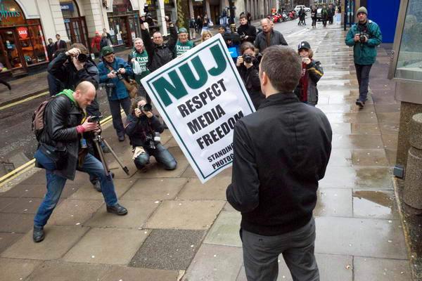
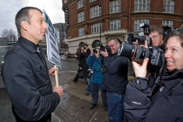
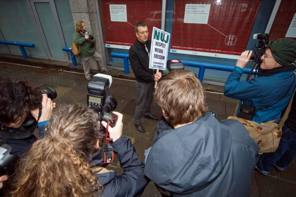
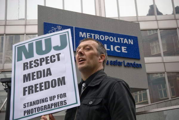
Along with 20 other photographers (dozens according to the NUJ site, but I made it exactly 1.67 dozens) I went along to New Scotland Yard this afternoon to photograph the one person protest by Jeremy Dear, NUJ General Secretary, to highlight the failure of law enforcement officers to protect media freedom.

If you are a regular reader of My London Diary and this blog you will know I often have reason to complain about the way some police officers impede the work of photographers covering protests on the streets. Sometimes its a matter of individual officers deciding that we shouldn’t be photographing particular events – as in the case of the officer who stood in my way while a young man was being stopped and searched in Whitehall, and when I attempted to move into a position that gave me a clear view while in no way interfering with the work of the police ordered me back. At other times its a failure by the officer in charge to realise that we need reasonably close access to events to photograph them adequately. Sometimes we are even denied access on spurious grounds of road safety – when police officers are standing further out in the road than photographers would.

There are agreed guidelines, but too often police simply ignore them. At times officers have even denied that my NUJ Press Card is a valid press card, and have treated me as a protester rather than a reporter, refusing for example to allow me to leave a protest when I have finished taking pictures.

In particular the SOCPA legislation which has made many demonstrations around Parliament illegal has soured relations between police and press – as well as those between police and protesters. So its good news to hear that the relevant aspects of this law are to be reviewed, although we may fear that a SOCPA Mark 2 will be no less inimical to the rights of citizens to protest.

SOCPA provided a limited right for one person demonstrations, which although they had to give notice, the police are not entitled to ban, although they can impose restrictions. So Jeremy had duly applied, filled in the forms and answered various questions about his demonstration (the police were apparently very exercised about the actual wording of his placard) and been granted permission, and photographer Marc Vallée had talked, texted, e-mailed and contacted through Facebook and other on-line sites with photographers to persuade them to come and photograph the event at New Scotland Yard, bribing us with the offer of a free drink to celebrate the out of court settlement his lawyers recently agreed with the Met for his injury during the ‘Sack Parliament’ demo in October 2006.

It was a fairly daunting group of photographers to be working with, including a few well-known names and as always we all wanted to take a better picture than the pack. There wasn’t really a lot to work with – just Jeremy with a placard, New Scotland Yard as a background, and of course the other photographers, so it was something of a challenge.

NUJ photo protest

I started with a straightforward picture of Jeremy with the placard and the New Scotland Yard (or Met Police) sign behind him. Not a bad snap, but nothing special.

But obviously it would be more interesting to have both him and the photographers. I tried a ‘Hail Mary‘ from behind with the 18(27)mm wide-angle end of the 18-200; perhaps a bit too prosaic, and of course you can’t see his face, nor the whole of the placard.
NUJ PHotographers protest

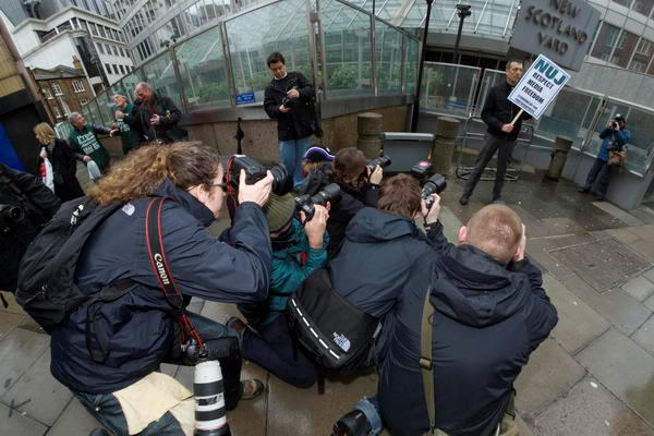
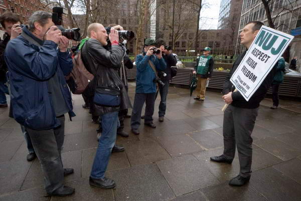
Unfortunately for once the police were simply ignoring us and standing some distance away. I tried a few shots including them, but the placard was just too small, so I came back to photograph the pack from close in using an extreme wide-angle.

NUJ Photographers protest

Several rather similar shots to choose of which I thing this is the best.

Taking a higher viewpoint gives a different view, but shows a line of photographers rather than a pack
NUJ Photographers protest
and coming down lower perhaps provides a more interesting shot.

Moving in close to Jeremy, still working with a very wide lens I could show him, the poster (though a rather oblique view) and the line of cameras pointing at him.
NUJ Photographers protest

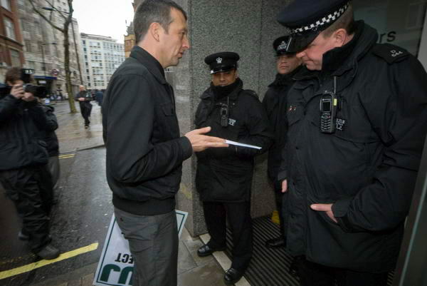
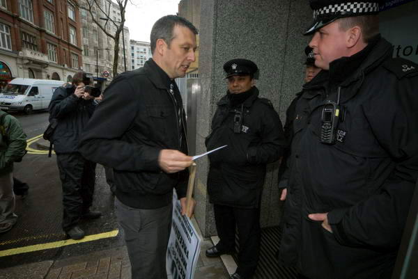
Jeremy then moved to hand in a letter to New Scotland Yard, but they refused to take it. I moved fast to be in the right place and shot from close with the 12-24mm, getting a couple of shots that aren’t bad.

NUJ Photographers protest

Finally we moved to the corner of the building where the windows were showing the infamous posters, including the anti-photographer poster:

THOUSANDS OF PEOPLE TAKE PHOTOS EVERY DAY. WHAT IF ONE OF THEM SEEMS ODD?

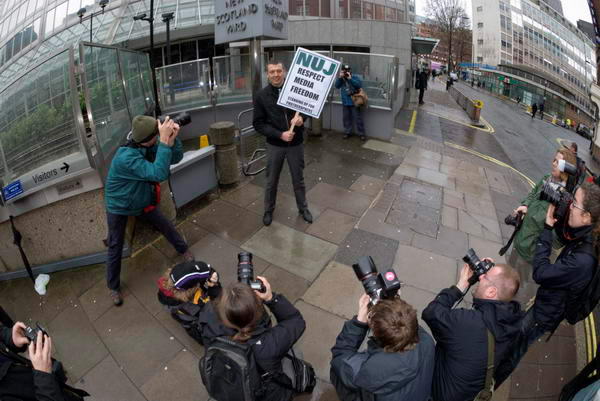
Again my starting point was a simple image of Jeremy with placard in front of this.
NUJ Photographers protest

Then I shot the pack facing him, but couldn’t include the poster in this.
NUJ Photographers protest
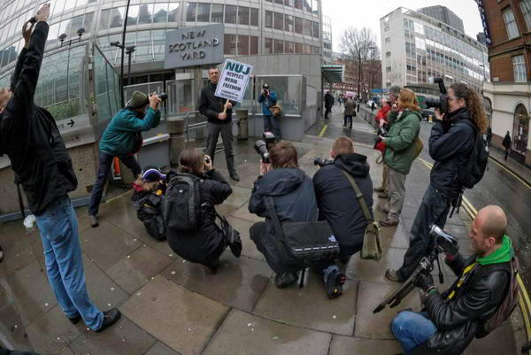
Shooting over their heads provides an image including the poster, but not I think a very strong one.
NUJ Photographers protest

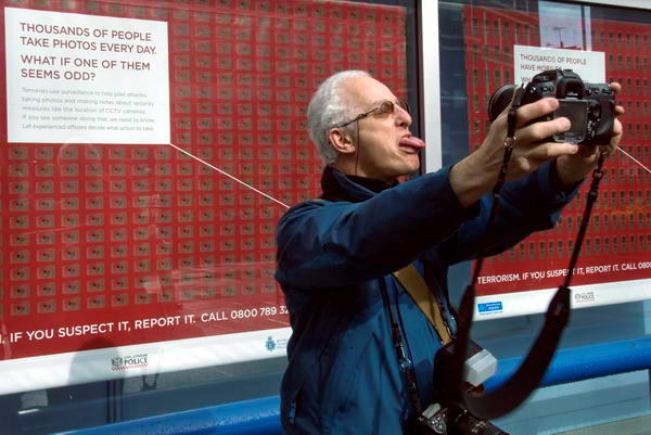
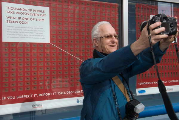
David Hoffman has produced one of many parodies of this poster available on the web – and you can buy his as T-shirts, mugs etc. He decided to photograph himself in front of it, and I caught him doing so, with tongue out

and looking rather more normal
David Hoffman

Finally came a few pictures of photographers standing in front of the poster and looking odd. If I post these here they might never speak to me again, so I’ll tuck them away in case I ever need them for blackmail.

Peter Marshall

Conscientious Interviews

Friday, March 28th, 2008

Talking of Jörg Colberg – as I was in my previous post on David Spero one of the best things about his Conscientious blog are the interviews with photographers.

I have an ambivalence about interviews, and I don’t think I’m very good at conducting them myself. It is too easy to be distracted by the personality of the photographer (and amusing incident) rather than really use them to gain a greater insight into the work. It is really difficult to engage with the person and at the same time to retain a kind of critical distance that enables you to view their work with real insight.

Although I’m a great believer in the ‘first hand’, interviews I find most useful at a second-hand distance, where you can assess question and response at leisure.

Fortunately the two photographers who Colberg had a ‘conversation’ with recently both talk interestingly about their work – and also their work is very much worth talking about. I think you will find his conversations with both Bert Teunissen and Miguel Rio Branco of interest. In the past I’ve written about both these photographers, but neither articles are currently available.

You can of course see more of Rio Branco’s work on the Magnum site (and the interview is also on the Magnum blog), and Teunissen has a good web site and you can also read his travel diaries.

David Spero – Urban Churches

Friday, March 28th, 2008

Taking one of my regular looks at the ‘Conscientious‘ blog I was interested to see a familiar building from Finsbury Park, London, the former cinema which became the ‘United Church of the Kingdom of God.’

This is one of a series of 15 churches in various odd buildings mainly around London photographed by David Spero, a photographer born in 1963 who studied at the Royal College of Art. Most of the locations in the series were familiar to me, although in one or two cases I’d photographed the same buildings before they were in use as churches.

Spero goes for the clear overall view, and does it well, and like
Jörg Colberg I find this the most impressive of his projects. Part of the reason for this is I think in the very variety of the buildings concerned as in some of his other projects (both when I’ve seen them on gallery walls and on his web site) I find the images too similar. Of course to Spero this was perhaps the point, but I find it a little tedious and long for a little more surprise in the next image in some of his work.

Some of projects in the ‘archive’ section of the site are represented by a very small number of images. ‘Interiors‘, ‘Boardrooms‘, ‘Control Towers‘ look like promising areas, but what he shows us is enough to tantalise but not to satisfy. It seems hardly worth putting only 4 or 5 images from each on the site – it isn’t as if the web was an expensive medium to use.

The churches project is a good example of how concentrating on a small subject and presenting it can work well. Although I’ve shown images of such urban buildings pressed into new use, and particularly images of black-led churches, I’ve never approached it as a discrete subject in this way.

Finsbury Park

One of my best-hidden web sites does however take a look at Finsbury Park and the surrounding area (although I’ve also photographed it on quite a few other occasions.) The pictures I put on those pages were made when I had just started to work seriously with a Hasselblad Xpan, and don’t actually include the church/cinema though I’ve photographed it on several occasions and probably while making these images.

Finsbury Park
Finsbury Park, London, 2002

A rather prettier picture of the New River in Finsbury Park from the series actually won a photo competition concerned with the regeneration of the area.

At the time I posted the images and wrote on-line that I had walked around the area carrying the Hasselblad I got several messages from people telling me I must be mad to go on the streets there with an expensive camera. One at least came from someone who had lived in a flat there for some years. But if you are sensible – and at least slightly street-wise, London remains a very safe city.

Getting Your Images Right with Lightroom

Thursday, March 27th, 2008

Although I’ve heard some unfavourable comments about its RAW conversion, particularly with some recent cameras such as the Nikon D300, I have to say that Adobe Lightroom is now the program I use for virtually all of my image handling. With the Nikon D200 I’ve generally found I’ve preferred the jpegs and tiffs I’ve produced using it over those from Capture One, the alternative software I have on my main computer, although both programs have their strengths.

Before Lightroom, I relied on Pixmantec’s software – and although I was very disappointed when Adobe bought out what was manifestly a superior product, it did get me a free cross-grade to LR, and I think some of the superior Pixmantec technology has been incorporated into LR.

LR’s big advantage is workflow and the way that it integrates the various stages in handling images, copying them from the card to appropriate locations (once you learn how to set these up,) making backups, adding copyright information, keywords and other metadata and the output of standard image sizes and quality for different purposes.

There are still things I’m sure I’m missing in some of these areas, and the software is perhaps still evolving. I’ve been particularly disappointed when I’ve actually paid money for tutorial material on LR to find it gives me no more clues about these aspects than the free and also fairly unhelpful material from Adobe and elsewhere.

Much of it is still dealing with earlier versions of the software and there are some very important differences. Although I don’t rush to install the very latest version immediately it appears (it makes sense to wait at least a few days while others suffer the bugs – as with the recent 1.4 release that Adobe had to recall within a few days), there is really no reason to be using anything other than version 1.3 at the moment.

Certainly there is no excuse for still selling books and downloads that still deal with earlier versions than 1.3, and even where information is free of charge it would be appropriate to update.

Many people find the development stage of LR confusing, and it took me quite a while to work out some of the important aspects. I hope you will find my approach of some use, though I’m sure others will have their own tweaks on the process. There are whole aspects of it I’ll omit, which I think are of rather specialised interest.

DEVELOPMENT USING LIGHTROOM 1.3

Development Presets and Panel Set-up

I set the following defaults in the ‘Detail’ section:
Noise Reduction: Luminance 2, Color 25
Sharpening: Amount 2, Radius 1.0, Detail 25, Masking 0

(One of the libraries I send pictures to states ‘no sharpening‘ and this is my ‘no sharpening’ setting. You may find different values for this and noise reduction better suit your needs. Serious noise reduction on high ISO images and also sharpening for particular output purposes are best performed by Photoshop plugins.)

Lightroom Develop panelThese and other default settings, including Autotone, Medium contrast curve and Presence settings can be saved in a development preset and automatically applied during image input. I find applying a suitable preset including autotone essential in allowing me to rate images from a shoot immediately after input, deleting any that are unusable, and deciding which are worth keeping and which of those I need to bother to process straight away.

LR makes this easy. The Delete key, then D gets rid of the unwanted, and number keys rate 1 for keep, 2 for process. When I’ve gone through the set I can then choose to display only those images with ratings of 2 or more and get down to development.

You can then keep most of the panels in the development panel closed. Those essential to have open are the Histogram, Basic and Lens Correction. You can Right Click on the panel and uncheck the others to save having to scroll on the Development panel, I also like to keep the Tone Curve in the panel but closed as I occasionally find I need to use it. So the right hand edge of my screen now looks like the image at right.

Development

If you haven’t got a good screen set up using a monitor calibration device such as the Pantone i1, rush out and buy one before you try to process another image. Without doing this, you are wasting your time trying to get images right as you have no way of knowing if they are correct or not.

1. Color Balance

Check visually for colour balance, and, if necessary adjust either using the two sliders or by using the eye-dropper on a neutral in the image. A lot of photographers bitch about colour balance (and this week’s BJP even suggests the problems they have are an important reason why it’s now trendy to have black and white weddings) but I think we’ve never had it so good. The D200 certainly gets it spot on using auto white balance about 98 pictures out of a 100 for me. Perhaps you other guys are using the wrong camera!

2. Remove Chromatic Aberration

Zoom to 3:1 (T toggles the Tool bar.) Look for a high contrast edge as close to the edge of the frame as you can find, and click to zoom in on it. Examine for any chromatic aberration – and most zoom lenses have plenty. Start by moving the slider which controls the most apparent colour – for example if you see red and green fringes use the red/cyan slider, shifting it until the fringing looks blue/yellow – then adjust the other. Generally you will see a distinct change in colour as you go through the correct point, but you may find that some compromise is needed, as vertical and horizontal edges may require different settings.

If you have significant colour fringing you can try the Defringe setting. This sometimes seems to work, but other times appears to have absolutely no effect.

3. Vignette
Click to go back to full image view and decide whether altering the vignetting will improve your picture. Use the J key to turn clipping on and off. (If your import preset didn’t include Auto Tone, use it now.)

Most lenses vignette to some extent naturally, but as in black and white printing, many colour images are improved by a little vignetting which helps to stop the eye wandering. But for most purposes it should not be obvious.

Reduce the Recovery level set by the auto tone to zero so you can see how vignetting can help with highlight clipping. It usually provides the best way to deal with over-bright skies (assuming you exposed so they didn’t entirely burn out.) Don’t worry too much if this makes the lower edge areas of the picture too dark, with some blue clipping. Usually its best to use relatively moderate negative amounts of vignetting and move the midpoint slider more to the left to avoid an obvious vignette. If any highlight clipping remains, click the auto tone button again.

4. Examine the histogram
Generally you want no gaps at either end of the histogram but the curve should slope down to zero exactly at each end. The example shown above is just about OK at the highlight (right end) but shows a little clipping at the shadow end. In practice a small empty gap at the highlight end isn’t a problem and is necessary with some images, but any gap at the shadow end will usually make images look ‘weak’.

5. Adjust Highlight end of Histogram

If there is any highlight clipping, reduce the exposure setting to remove it. Aim to get the curve just going down to zero at the extreme right. In general it seems best to use the lowest Recovery setting you can to get this, almost always less than the ‘auto’ result. Don’t worry if the image looks too dark, get the histogram right.

Don’t worry about small specular highlights – such as reflections of the sun or your flash on metal or glass surfaces. They may be vital to give your picture some ‘sparkle’ but otherwise if they need to be removed this is a matter for retouching rather than development.

6. Adjust Shadow end of Histogram

This step, which gets the blacks right, is generally simple. Change the black setting until the histogram appears to come down to zero at the left edge. There should still be some small areas of blue clipping shown on the image, and you can remove all except those for the deepest black shadows by increasing the fill (usually if not always left at 0 by Auto tone.) In my example this meant reducing Blacks to 4 and adding a Fill Light of 7.

7. Adjust the brightness and contrast

Aim simply to to get the image looking right – and this is a matter involving judgement and taste. If you have used large values of Fill or Recovery you are likely to need to increase contrast, but otherwise I find the values set automatically are often just a little high.

8. Fine Tuning
If you make large changes to Brightness in particular you may find you need to go back and change some of the other settings, basically another iteration of the process that started in step 4. Altering most of the ‘Basic’ settings can lead to changes that mean you need to do a little fine tuning on others, but the order I’ve listed them here seems to have a cetain logic that makes things easier to understand.

9. Dust and Red-Eye
Unless you have dust spots that need (N) removing or red-eye that needs correction, that’s it – your image is ready for output.

=====================

All that took quite a lot of writing, but it takes less than a minute to carry it out on a typical image. If you have a series of similar images, you can of course use the ‘Previous’ button to apply the same settings when you look at the next image, which is a good time-saver, even if the result is not exactly correct it is often simply a matter of altering the exposure.

Peter Marshall
Golden Full Moon in Soho

Wednesday, March 26th, 2008

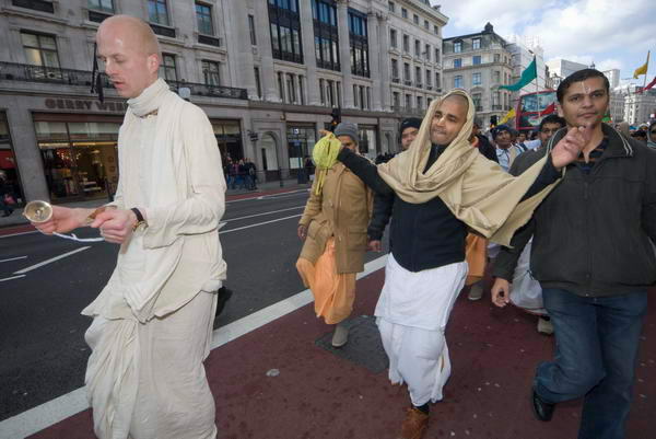
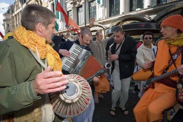
From Golders Green I travelled on to Soho and started to look and listen for the Hare Krishna procession to mark the Gaura Purnima festival. Around 500 years ago in West Bengal, Krishna put in an appearance as the Lord Caitanya, and encouraged everyone to chant and sing the name of Krishna. The practice came to London and other western cities in the 1960s with the International Society for Krishna Consciousness (ISKCON) and became a part of hippie culture (if not usually lifestyle.)

I finally heard the sounds as I walked up Regent Street close to Oxford Circus, and turned the corner to see the procession with dancers, musicians and a large chariot pulled by people on ropes coming along Oxford Street.

Regent St

Although you can’t normally photograph sounds, the noisiest parts of processions – and demonstrations – are often visually the more interesting too. People simply walking are less interesting than people dancing or playing musical instruments.

Musicians

I photographed the procession as it went down Regent Street and past Piccadilly Circus, where a clash of culture appeared between religion and the Mammon of the billboards , and on to Leicester Square.

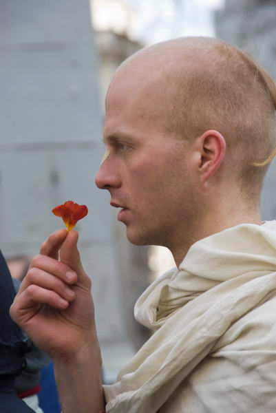
The procession stopped here for a little ceremony and a short sermon. I watched as incense was burned, and flowers passed reverently around and their fragrance savoured.

I left them still chanting in the square and went to the pub, despite an invitation to join them in the meal at which they would break their fast. I’d had my sandwiches on the underground on the way to the event, and didn’t feel too attracted to a lifestyle that means giving up on alcohol, caffeine, meat, fish, eggs, onions and garlic, mushrooms and sex (apparently allowed only for the purpose of procreation within marriage.)

More pictures 

Purim

Wednesday, March 26th, 2008

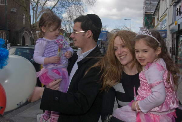
As well as being Good Friday, last Friday was also the Jewish festival of Purim, which celebrates the saving of the Jewish people while in exile in Persia by Esther. Orphaned as a child she was brought up by her older cousin Mordecai. When King Ahasuerus fell out with his Queen and organised a beauty contest to find a replacement, Mordecai encouraged Esther to enter, advising her to hide the fact that she was Jewish. She won and became Queen Esther, and Mordecai gained a minor position in court, where he did well.

Golders Green

Haman, the villain of the story, became chief minister, and fell out with Mordecai who refused to bow down before him as he expected. Haman decided to kill all the Jews, persuading the king that they were a people who obeyed different laws and should not be tolerated in his kingdom, and he made plans for them all to be killed.

Mordecai persuaded Esther she must see the king and plead for mercy – as she too would have been killed. It was tricky as anyone who went to see the king without his invitation – even a queen – was likely to be executed on the spot. She fasted three days before risking a visit, but fortunately he was pleased to see her. Later she told him about Haman’s plans and that she would be one of those killed; he was appalled and granted mercy. But he had already allowed Haman to make the orders in his name, and they could not be annulled. Instead he made a new decree, allowing the Jews to defend themselves against the killers – which they did with great effect, killing 70,00 and hanging Haman on the gallows that he had built for Mordechai.

Golders Green 2

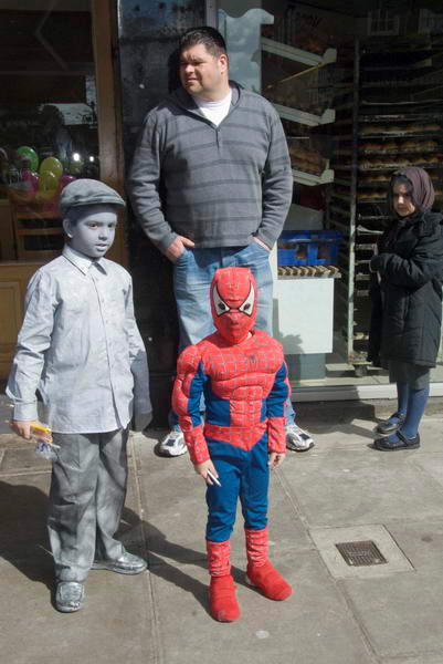
The Purim celebrations include wearing fancy dress, and I photographed the people at at Camp Simcha Purim fun bus in Golders Green for half and hour or so, and you can see more of the pictures on My London Diary.

Good Friday

Tuesday, March 25th, 2008

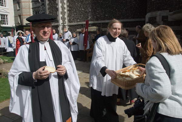
Last year I photographed four rather different events of Christian witness on Good Friday in different parts of London – including council estates, a main railway terminus, a shopping centre and a traditional ceremony at one of the oldest Anglican churches in London.

Butterworth Charity
Good Friday: Distribution of the Butterworth Charity, St Bartholemew the Great, Smithfield, London. April 6, 2007

This year I managed only one, the other half of the North Lambeth and District Good Friday Walk of Witness, which made its way around the area by Waterloo Road and The Cut to meet up with those coming from the Imperial War Museum to the service in Waterloo station.

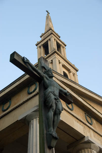
St John's Waterloo
St John’s, Waterloo
We started at St John’s Church on the Waterloo Road, a fine Greek Revival building, leaving by the gate at the back of the churchyard and walking to the modern St Andrew’s in Short Street and on to the square opposite the Old Vic theatre. After a short service there the procession led on to Waterloo Station and a longer service with the other group in the middle of the forecourt.

Druid Spring

Tuesday, March 25th, 2008

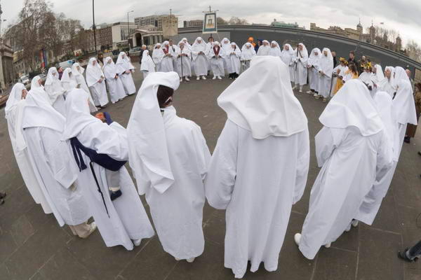
Tower Hill

Easter weekend has been long and busy for me and I’m only now beginning to catch up. Thursday was the start of Spring, marked this year with biting northerly winds, threats of snow and some bouts of cold driving rain.

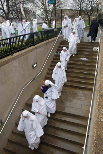
The Order of Druids were lucky that the rain held off until the end of their Spring Equinox celebration at Tower Hill, but their long file back to their starting place was through the rain.

Through the subway

As always when photographing in rain, it was hard to avoid the odd drop on the front of the lens, giving some diffusion – as you can see in a couple of areas of this picture. With a wide-angle lens, you can’t use a lens hood that will effectively protect against rain, and when the wind is sweeping the rain fairly close to horizontal umbrellas are tricky to hold and rather ineffectual. Working without an assistant they get rather in the way in any case.

Like most photojournalists in similar conditions I work with a microfibre cloth or chamois leather, wiping the front of the lens at frequent intervals and keeping the cloth balled in front of the lens with my hand in front of it when not taking pictures. But there is still the second or so when you actually frame the image for the rain to descend.

At such times I always think of the Martin Parr book, Bad Weather, in which he sought out the effects of water drops on the lens, flash bounce from rain and snow and more, often working with an underwater camera for the purpose. Interesting though the pictures are, I think few editors would have the vision to see it in his way. But perhaps the main thing that makes the pictures I took of the Spring Equinox this year differ from those I made last year is the weather. There is after all something timeless about the Druids, whose origins stretch back into the deepest ancient history even if the particular order I was photographing was only inaugurated for the Autumn Equinox at Primrose Hill in 1717!

Phillip Jones Griffiths 1936-2008

Wednesday, March 19th, 2008

Phillip Jones Griffiths died yesterday at his home in London, aged 72. 

You can read more about him on the Magnum Blog, in a short tribute by Stuart Franklin, which links to a number of his Magnum features, as well as to an obituary in the New York Times by Randy Kennedy. Franklyn quotes his former Magnum colleague of many years, Henri Cartier-Bresson, who was also one of his great photographic inspirations, as writing what is perhaps the best epitaph for him some years ago:

“not since Goya has anyone portrayed war like Philip Jones Griffiths”

Jones Griffiths had been suffering from cancer for some time, but had continued to organise his work and to lecture until very recently – including a talk in London a couple of months ago.

I posted only this morning about the new Magnum WARS set of four features inspired by his work and including him with four of Magnum’s best war photographers of the current generation, and a couple of weeks ago about an interview with him, and I’d previously written several times about his work, including a fairly lengthy section in a short online history of war photography.

He was a man whose photography – and life – always asked questions, didn’t accept the accepted wisdom, the status quo, but as Kennedy’s obit ends, always wanted his photography “to say to say ‘Why?’”