Lightroom Lens Profile Tip

I’ve just realised that I hid away a very useful tip in a rather long post the other day, one which its taken me rather a long time to realise. Which is:

With ultra wide-angle lenses, correcting distortion isn’t necessarily a good idea.

In particular, Lightroom’s default settings with the 10.5mm Nikon fisheye are quite unusable, and images taken at or near 16mm with the 16-35mm are often less pleasant.

The default profile with both lenses sets distortion correction to 100, but except in some special cases its best to set the default to 0.

Lightroom (and presumably ACR) lets you easily change the default. Here’s how to do it:

1. Go to the Lens Correction Panel, select the profile tab,
2. Make sure you have Enable Profile Corrections checked and the correct lens profile displayed.
3. Make the change you want – usually setting Distortion to zero.
4. Under the Enable Profile Correction line is the Setup, which will now be ‘Custom’.
5. Use the triangles to the right of ‘Custom’ to select ‘Save New Lens Profile Defaults.

The 10.5mm fisheye lens actually has very little distortion –  but it has a fisheye perspective (I think an equisolid angle projection), enabling it to have a pretty huge angle of view – around 180 degrees across the image diagonal and around 145 degrees horizontal. The profile assumes it ought to be rectilinear, and this really just isn’t possible for such a wide angle of view. Only about half the image is usable, and it simply negates the idea of using the lens.  You may occasionally want to use just a little distortion correction –  perhaps a value of 20 or 30, but generally its far better to leave it to zero. If you want at less ‘fishy’ result, try a plugin like Fisheye Hemi, which renders the verticals straight (though if the lens wasn’t level they will converge or diverge.) PT Lens will also ‘de-fish’ images but in a different manner which loses a little more of the image, or you could play with the free Hugin panoramic software. PTGui is rather more expensive and works very well too, giving a choice of projections and if you want to make panoramas is the software I’d recommend for that.

At 16mm the 16-35 has very noticeable barrel distortion. But it’s only really noticeable on buildings and similar subjects. But what we do get noticeably in any very wide angle rectilinear lens is a distortion that increases towards the edges and corners of the frame. It’s generally most noticeable in circular or spherical objects and you can easily see it by viewing a ball through the camera and moving the camera to put it in the centre and then the edges and corners of the frame. If you think of the circular object producing a circular ray of light that will look circular if it hits the sensor at right angles, but as you move it away from the centre of the image, the light ray is hitting the sensor at a more oblique angle, producing this ‘distortion’.

Barrel distortion actually makes this effect less obvious, stretching out the subject in the middle of the frame and compressing the edges. The 4% or so distortion the designers allowed in the Nikon is actually remarkably effective when applied to roughly spherical objects like heads, making them look more natural, and the little increase in size in the centre brings out that part of the image, making it seem closer – and the main subject of the picture is often fairly close to the centre.

It’s a distortion that I suspect Mr Nikon (or whoever designs their lenses) may well have deliberately allowed or even encouraged at the very wide end, knowing both that it would enhance many images, but also that because of its uniform nature it can easily be removed for subjects where accurate drawing becomes essential.

By the time the lens is at 21mm, distortion in the lens is generally pretty low, and at 24mm roughly zero, with a little pincushion distortion above that, seldom enough to be noticeable except in the most critical images.

Correction of distortion always comes with some loss of sharpness, though only generally noticeable at a pixel peeping level. It is seldom necessary to correct distortion for this lens, unless you are an architectural photographer, and for most of us the best default will be to set distortion to 0 and save this as the new default for the lens.
Marville’s Paris

I imagine that the US the National Gallery of Art  in Washington is currently closed (I’m writing this on 1 Oct 2013) courtesy of the US Republican Tea Party’s opposition to heath care. I can’t at all understand their opposition to what appears to be a very sensible if rather limited measure on public healthcare, any more than I can understand the current UK government’s push to privatise our NHS here – now well under way through various back doors. As a great supporter of our NHS I was sorry not to be at the march on Sunday when over 50,000 people went to Manchester to show their support. Or as one presenter on our BBC radio – once another great British institution but now sadly compromised in its coverage of UK events – put it ‘some people say as many as ten thousand‘.  If the police estimate was 50,000, you can be sure it was rather more.

Assuming at some point before January 5, 2014 US Republicans come to their senses and allow US Museums to reopen, those within travelling distance of Washington should make for the exhibition Charles Marville: Photographer of Paris which opened there on 29 September, the first major US showing of his work with a hundred photographs. The NGA page also has a link to a good set of 18 photographs, Paris in Transition, including work by Marville and others. It says the show is in association with The Metropolitan Museum of Art, New York, and a search on their site reveals around 20 works by Marville with images on line.

Back to public radio, NPR (it does photograph much better than the BBC) has a good report on the show by Susan Stamberg talking with curator Sarah Kennel, who has also produced what appears to be a very fine book, Charles Marville, Photographer of Paris, published by the University of Chicago Press (available in the UK in a couple of weeks.) The web site has a dozen large images from the book.

There is a good article about the book and the show by Luc Sante on The New York Review of Books, again with a gallery of images, and there are more pictures by Marville at MoMA and on Luminous Lint. Commercially many of his images are available in digital format through the Roger Viollet gallery, but I could only manage to see these as small thumbnails.

Also on line is a map of Paris with pins on it locating the sites where around 150 of his pictures were made, clicking on which gives a small version of both his image and a modern view from a similar position. There is also a PDF by Martin H. Krieger of the University of Southern California which explains the how and why this map was made.

[There may be collections of Marville’s work available on line from the large holdings of some Paris museums, but the French cultural establishment’s peculiar relationship with the Internet leads them to set up impenetrable web sites, perhaps stemming from their view of it as an ‘Anglo-Saxon’ institution and a devotion to a peculiar logic which requires a French education to understand – and certainly defeats Google.  Should anyone manage to find any, please post links in a comment below.]

Marville who became the official ‘Photographer of the City of Paris‘ is deservedly well-known for his roughly 500 images commissioned by the Commission Municipale des Travaux Historiques of Paris before and after the great programme of works before and after the ‘improvements’ made by Haussman. The great boulevards were pierced through the city, designed to allow free movement of troops  to put down the frequent insurrections by the people of Paris.  The narrow streets which they replaced were far too easily barricaded.

For many, including myself, this work has an added interest because of the work of a later photographer of Paris, Eugène Atget, for whom, despite my comments above, the BnF has a good web site, and even available in an English (US) version (and in French only, Regards sur la ville.).  Many of Marville’s better images are indeed hard to distinguish from the work of Atget, although as the latter site comments, while Atget shows only the ruins and destruction of a gutted city, Marville has an interest in its reconstruction.

Apart from some of those images of Paris, much of Marville’s work leaves me unmoved. The simple records of church doorways and statues fail to go beyond that, technically proficient but unless you have a particular interest in the thing photographed, rather boring.  I want more from photographs.

Improving Crappy Lenses

PetaPixel’s title Researchers Develop Method for Getting High-Quality Photos from Crappy Lenses is certainly more down to earth than the original High-Quality Computational Imaging Through Simple Lenses to which it refers, and unless you a more of a mathematician than me you will find parts of the latter hard going. But it is worth going to the original, if mainly for the short video and the roll-over images showing how well the method works.

I took one of the sample ‘before’ images from their simple lens into Photoshop and tried my best to improve it. With a couple of passes through my normal sharpening plug-in, FocalBlade I could make significant improvements to image sharpness (I have an old version of the plugin, and used first DeBlur Pro mode, then Selective Sharpen Pro) without gaining too much noise in smooth surfaces, but was very clearly left with considerable colour fringing when viewed at 1:1, and could think of no way to significantly reduce this in Photoshop. This is a problem that the researchers “novel cross-channel term ” is designed to resolve.

The paper seems to be another chapter in a story we have already seen beginning where lens designers can rely on software to minimise some lens defects. Many cameras already incorporate this, particularly for their jpeg images, which can be corrected for vignetting, distortion and chromatic aberrations, and ‘post’ software such as Lightroom can provide similar functions for interchangeable lenses, automatically if it has a lens profile. For most of us such profile corrections have become a part of our normal working practice, applied automatically by the software, both for cheap and expensive lenses.

It’s hard to know how much of a breakthrough the work of the team at British Columbia University is, particularly as the point spread functions they use differ at different subject distances. While this may not be too much of a problem with cheaper compact cameras (or phones) there may also be a problem in achieving the necessary computational power in these devices – though what looks like some pretty tricky maths to me may not be too difficult to a chip – who knows?

I’d certainly love to have simpler, lighter and cheaper lenses for the Nikon. Particularly with the lower back pain I’m suffering at the moment, lighter would be good! The 16-35mm f4 is a great lens, hard at times to believe how sharp it is (after a little help from Lightroom) but at around 680 g or 1.5 lbs it isn’t light hung on a camera body around the neck. And at around 5 inches long, plus a lens hood, with a 77mm filter, it is big.  Good though the performance is, it still improves in Lightroom, which does a great job of removing distortion, chromatic aberration and vignetting.

This doesn’t quite all come for free, as the distortion removal does inflict a slight crop around the edges of the image, particularly noticeable at 16mm. Sometimes too, 16mm images can look better with the distortion, as when corrected to pure rectilinear there is actually more stretching at those edges. Round objects are actually closer to round with the distortion, and at 16mm most images actually look more natural without distortion correction – by setting the slider in the Profile sub-panel to zero.  It would probably be a good idea to make this the default setting for this lens unless you are an architectural photographer. Correcting distortions isn’t always a good idea with wide angle lenses.

Lighter cheaper lenses don’t always mean poor quality. The Nikon 18-105 is a pretty snappy lens and a little under a pound in weight as well as smaller in very dimension than the 16-35. As Photozone remarks, it has rather high distortion and chromatic aberration, but again with a little help from Lightroom the results are generally hard to fault.  Around a quarter the price of the 16-35mm, the biggest difference from the professional lens is in build quality. I can’t remember if the current lens I’m using is my third or fourth, though I did drop one of them. The low price means that repairs are seldom economic.

Munem Wasif’s Old Dhaka

I think the first time I wrote about Bangladeshi photographer Munem Wasif was five years ago, when he was one of the five from PDN’s Top Thirty ‘New and Emerging Photographers to watch’. Later in the year I commented when the Prix Pictet bankers selected  him for the commission to document WaterAid’s Chittagong Hill Tracts Project in Bangladesh, and a couple of years later there was another short post here linking to an interview on Lensculture and his work at Agence Vu.

Although I don’t ever seem  to feel now that I want to work in black and white again, I still appreciate great black and white images like those of Wasif. What brought him back to mind was Chaos and Harmony in Old Dhaka on the New York Times Lens blog, which has an audio slideshow of work from his new book, “Belongings,”  which “explores the rhythms of daily life in Old Dhaka” in which the photographer talks about the old city and his work.

He works with a remarkable simplicity of equipment, one camera, a 28mm lens and a bottle of water.  28mm was for many years my favourite lens too, though I’ve long abandoned working with a single lens. Perhaps I should try it again – and at the moment my back certainly thinks it would be a good idea.

The bi-lingual French/English book, ISBN: 978-2-9542266-1-3, is available in France, but does not yet seem to be on sale in the UK.

August 2013 at last

At last all of my August events are on My London Diary – here is the list:

Counihans Celebrate Anniversary
Obama Don’t Attack Syria


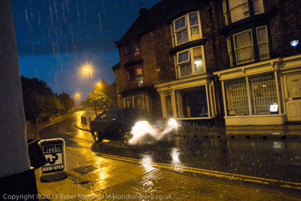
It rained very hard in Thirsk, though fortunately not all the time we where there!
More Holiday Snaps
SDL and UAF in Edinburgh


Theatre not protest – and I didn’t go to see the show

Edinburgh & the Festival
Sunday
Monday
Tuesday
Wednesday
Thursday
Friday
Saturday

Putin, ‘Hands Off Queers!’
Against Live Animal Exports
Also in Trafalgar Square
Frack Off


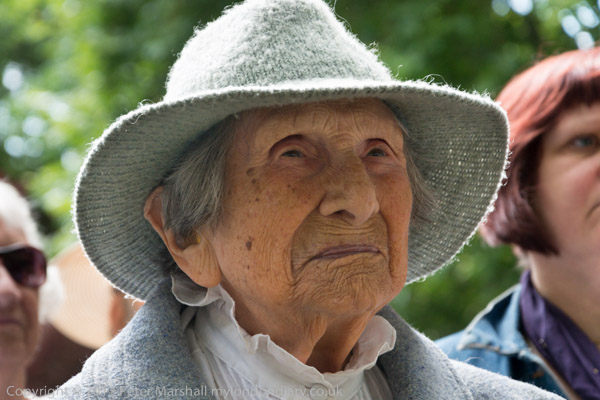
Hetty Bower, a remarkable woman born on October 3, 1905 spoke briefly at the event

Hiroshima Day
Stop MI6 Lies About Shaker Aamer


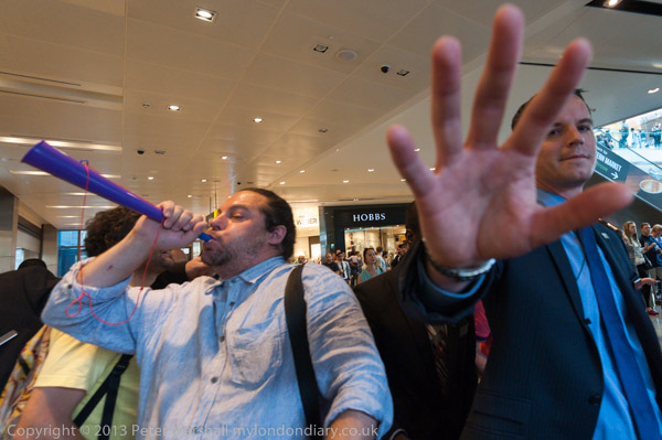
Westfield security tells me I’ve taken enough pictures. I couldn’t agree.

Cleaners in John Lewis Westfield
End Zero Hours Contracts – Sports Direct
Roma Genocide Commemorated


Al Quds Day March
Victory Celebration at Vedanta AGM

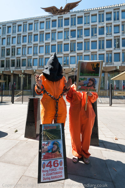
Shut Down Guantanamo

It seemed a busy month, and despite having a couple of weeks away I felt I still needed a holiday at the end of it.

It was also an opportunity to evaluate the Fuji EX-1 camera, but I ended still not convinced if it will really work for me. Perhaps I’ll try it again when the promised wide zoom finally appears.

Now its time to catch up with September, which is almost over.
Continue reading August 2013 at last

Counihans Fight for Housing for All


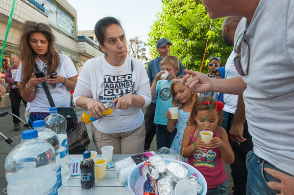
Isabel Counihan Sanchez pours out squash on the first ‘birthday’ of their campaign

There are just so many political campaigns in London that it’s often difficult for me to decide which to go and photograph. Although I support most of the campaigns that I photograph, there are some causes that are closer to my heart than others for various reasons, and that I’ll always try to photograph if I possibly can.

There is also sometimes a matter of news value, a rather subjective term, and one that I usually interpret rather differently from the commercial media, not least because I have a healthy disrespect for the kind of celebrity nonsense that sometimes seems to monopolise their pages. Sometimes I think it’s important to cover events particularly because I know that they are unlikely to. And personal factors come into it too, I am more likely to photograph events organised by people I know and warm too, though I do photograph some by people I actively dislike.

But it is also a matter of logistics and timing as well as priorities. Next Saturday I know of two protests which both start at noon in different parts of London, and I can’t easily photograph both. Had one started an hour earlier I might have tried, leaving one after around 40 minutes to jump on the tube to get to the second, but it depends on the protest whether I would want to leave after only 40 minutes, or risk missing the start of the other.

On the last day in August, there was a march and rally against military intervention in Syria that I wanted to attend, which met at noon at Temple station, and also a celebration of the first birthday of the Counihan Family Campaign starting at 3pm in Kilburn. I expected the Syria march to actually start at 1pm, so and had to work out how to cover that, and at least some of the rally afterwards in Trafalgar Square before getting to Kilburn for 3pm.

Normally in London I travel by bus – you get a better view than on the Underground and I get free bus travel, but that would be too slow for this, taking around an hour, perhaps longer as the protest and any others would disrupt bus services.

The fastest way to get across London is almost always on a bike, but unfortunately that is seldom practical when photographing protests. I would have to lock it at Temple, then go back to collect it, and the chances of finding it still there would be on the low side, as folding bikes like mine are highly prized by the thieves. Boris bikes don’t get out as far as Kilburn, and are in any case heavy and a slowish ride.

So it was the Underground, and while there are always some lines closed for maintenance at the weekend, my luck was in and on that day the Bakerloo line was working normally, taking me direct from Charing Cross to Kilburn Park station, a few minutes walk from Kilburn Square, perhaps a 25 minute journey.

There were two other protests in my diary for the day, but one clashed with the Syria march and I ruled out. The other was later in the day, but looking at who had called the protest I decided that it was quite likely not to happen, or if it did, not likely to be of great interest. There was also the fact it would mean staying in London after I was tired and wanting to be home and editing pictures and writing up the two stories from earlier – and also it would be nice to get home for some dinner!

Usually before I go out to take pictures, I’ve planned the activities for the day, looked up the travel possibilities on the Transport for London web site and made a note to remind me what I’m doing. If possible I’ll also have done some web research on the protests and started to write the articles, with possible headlines, summaries, keywords and some other information. Often I’ll write some more after the event on the train home in a paper notebook that I use at events to write down names and other key information.

It was a pleasant event at Kilburn, partly because the Counihans had something to celebrate, but also because of the solidarity shown by everyone present, many of whom I knew from there and other protests. But their story is I think an important one, and one that should encourage and inspire others to fight for justice.


Ian Hodson

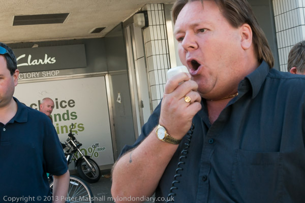
Another good reason for going was that one of the speakers was Ian Hodson, President of the BFAWU, one of the oldest trade unions around, the Bakers, Food and Allied Workers Union, which has taken a stand against zero hours contracts, bringing Hovis bakery workers in Wigan out on a series of strikes. It’s an issue that have come into the news recently, and for good reason, with these contracts being used increasingly to deny workers proper conditions of employment.

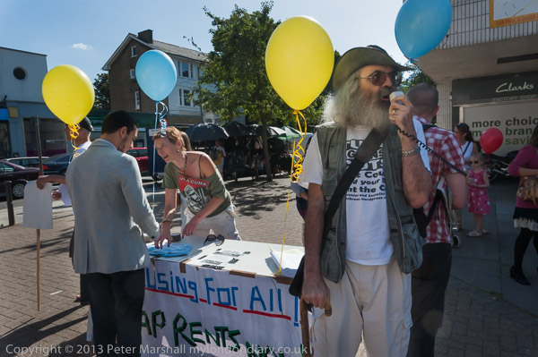
Photographically the only problems were high contrast lighting and messy backgrounds. Most but not quite all of the protest was in the shade – always good, as people screw up their eyes in the sun – but this meant that in pictures like that above, parts of the image  were very bright.  Areas like the table cloth would only too easily burn out, and the exposure needed to be set carefully to avoid this, leaving faces rather dark. In Lightroom I had to burn down the light areas and add a little brightness and contrast into the shadows.

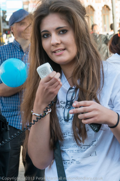
In this picture of Sarah Counihan speaking (and wearing the ‘You Can’t Keep the Counihans out of Brent’ song t-shirt) the background was just too bright, and although I’ve brought it down a lot, you can see there are some empty white (or near-white) areas. I’ve also slightly darkened her father at left, and the balloon he is holding, while adding contrast and lightening her face.

I could have used flash to get a better balance, but had decided against using it earlier as I think it would have altered the feeling of this relatively small event.  But although overall I think it was the correct decision, I think I could have used a little fill on this and some of the other portraits.

More about the Counihans and their struggle for housing against Brent Council in Counihans Celebrate Anniversary.
Continue reading Counihans Fight for Housing for All

Hands off Syria

Finally I was back in London on the last day of August, sorry that I’d missed several events, including an ’emergency’ protest called at short notice when US military action against Syria seemed imminent. But action in the UK parliament, or at least a misjudgement by the prime minister, had lost our government a vote on the issue, causing Obama to have to rethink.

Speakers at Saturday’s rally suggested it was a great victory for those who protested against military intervention, but the facts don’t bear that out. If Cameron had agreed to the Labour amendment, our parliament would have voted overwhelmingly in favour – if with a little more caution than the PM would have liked. But Cameron appears to have thought he had the chance of a Falklands moment and went for it, only to fall at the first fence.

It was perhaps the protests that made Milliband urge caution and to wait until the UN report was available – despite knowing that the UN report would throw little light on the matter, as it was not charged with determining who was responsible.

I’m not a supporter of the Syrian regime and Stop the War finds itself with some strange bed-fellows in its protests – as it did over Libya. But military intervention now would certainly not be right or useful.

Its also difficult for me to sort out some of the various groups involved. The Alevi are quite distinct from the Alawites though it it is easy to confuse the two, both sects of Shia Islam. But to find Alevis with a placard ‘Al-Qaeda is Murdering Alevis in Syria’ confuses me. Although Al-Qaeda doubtless would see Alevis as heretical and so to be killed, I understood few if any lived in Syria, though there are plenty of others who they are killing.

I try hard to show the different points of view at events such as this, taking care (usually) to frame at least some images so that placards and banners are legible. One problem at this protest was than the main banner was just too long, and very difficult to get it all in a single picture, even with the 16-35mm more or less as wide as it goes, and then only by going back so far that the composition became rather boring and the figures holding it too small.

It makes a better picture from rather closer – and the iron grip of more cooperative Stop the War Stewards relaxed just a little for a few seconds to let me take this – but you have to supply your own ‘NO’.  I was able to place the clock tower of Big Ben between the placard and the banner and the figures holding the banner are larger, and the whole image more dynamic. It was taken with the 10.5mm and verticals were straightened with the Fisheye-Hemi plugin.

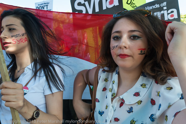
The attraction of the young women with Syrian flags and slogans on their faces was obvious from the start of the protest (not least by the crowd of photographers I found pressing on both my shoulders after I moved in close to photograph them) and I made a few attempts to take their pictures later in the event. My favourite image when I viewed them on the camera back turned out to me not quite sharp enough. Stupidly I was working at ISO 640 and the 1/125 second wasn’t fast enough as I was walking backwards close in front of her – taken with the lens at 38mm (57mm equiv.) It was a bright sunny day, but this image was taken in shadow, and I could well have given myself a couple of stops more to play with. But perhaps it wasn’t really the best picture – those little images on the back of the camera are usually misleading, but the fish that gets away is always larger.

There were plenty of other images of her and her friends that I took that were usable. Some at least are probably better. Others are certainly not so good, and at Downing St there was such a mob of photographers than it was impossible to get good pictures. I particularly like another of the same woman, taken a few seconds earlier. I like the tight framing of the second woman, and the kind of visual tension between the two. This is full frame as I took the picture, and possibly I might trim a fraction at the right, where the wide-angle (18/27mm) makes that hand close to the camera just a little too much.

Story and more pictures at Obama Don’t Attack Syria.

Continue reading Hands off Syria

Fuji on a Scottish Protest

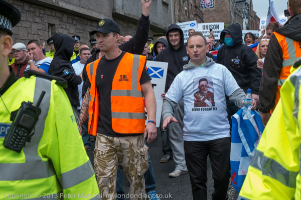
Among the hundreds or thousands handing out postcards on Edinburgh High St for their various performances, one small group stood out. They had a rather different demeanour and what they were promoting was not themselves as a part of the festival but a political demonstration, or rather a counter-demonstration.

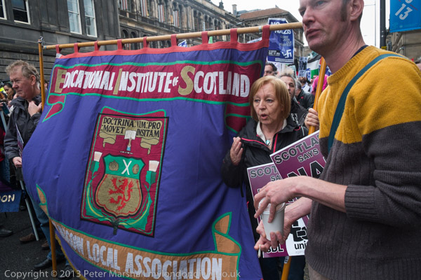
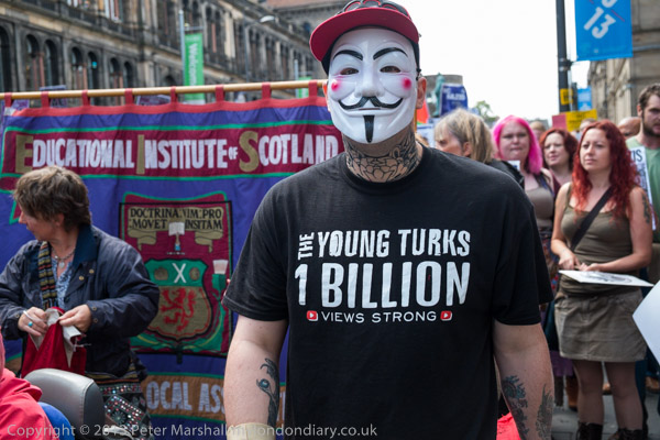
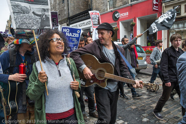
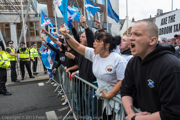
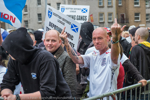
They were appalled that at a time when Edinburgh was bursting with people it had welcomed from all around the world, the ‘Scottish Defence League’ (SDL) had been given permission to march through its centre. Having photographed the EDL on many occasions I had no doubt about the kind of organisation and views that their Scots counterpart would have, and decided to cover the event.

Fortunately the play we had tickets for on Saturday morning was only a short walk from where the anti-racist counter-demonstration was forming up. It was a good performance, and one of the few we went to where every seat was occupied, and it took a little while to get out along a narrow corridor (I did worry about the fire risk at some of the venues we attended) but finally we got out and rushed to the protest.

It felt a little strange walking across the street to the front of the march. The policing seemed a little more vague at this point than it might have been in London (though later it became more impressive) but the big difference for me was that I saw no faces I recognised, either among the protesters or the few photographers around. And also that instead of having a heavy camera bag with a couple of Nikons, flash and several heavy lenses, all I had to cover the protest was the Fuji EX-1 with its 18-55mm zoom and the 15mm Voigtlander.

On holiday too I’d not managed to do the kind of research that is a part of my normal routine, looking up the planned routes of the two protests and working out where I might go to cover them. In London I would have normally tried to follow the EDL from their meet up point, but I’ve no idea even now where the SDL were marching from.  Later I did meet a few photographers I recognised by sight, who had doubtless been with the SDL at the start.

The counter-protest did seem a little less organised than I expected, and though there were a few speeches (I’d come late and probably missed more) the crowd seemed just to be standing around waiting for the march to start. I got down to taking a few pictures, and the slower focus of the Fuji with the zoom was very noticeable, and I very much missed the longer reach of the 18-105mm Nikon.

It was a dull morning with the occasional sunny spell and the odd spit of rain. There isn’t much reason to use low ISOs with the Fuji and I was working at ISO 1250.  There is a choice of Spot, Average and Multi metering modes on the Fuji, and I had the camera on spot for the first few frames, which predictably gave some exposure problems, and things got better when I changed to multi.

Spot is the best option when you have time to think carefully about what you are doing and place your exposure carefully, metering from a suitable mid-tone, but not when you have to grab pictures quickly. I don’t think Fuji’s Multi metering mode works as well as Nikon’s Matrix, but it does a reasonable job. I’m not sure when if ever I would want to use Average.

The slower reaction of the Fuji did mean I missed some pictures, and the lens perhaps showed a little more flare from bright skies than the Nikon, but I was reasonably happy with the pictures.

I left the march shortly before the end and went looking for the SDL, who hadn’t yet arrived. I found them coming down Canongate, surrounded by a fairly tight ring of police and was able to get a few pictures before they reached their pen. Again I missed a longer focal length, and it was rather trickier to get focus on the moving subjects.

At Hollyrood where the two marches both ended, police did a very good job and keeping the two sides apart, but it wasn’t too great for photography, as we were unable to work from the front for either group. I took a few pictures of the SDL (and there were quite a few EDL among them, a few whose faces I recognised.) With people penned in and relatively static the Fuji worked reasonably well, though I still missed the better optical viewfinders of the Nikons.  There were a few what seemed rather pointless arrests I could photograph, but access to the actual protest was poor (the 300mm would perhaps have helped.) Nothing much was happening and it started to rain a bit more and it seemed a good time to leave.

It wasn’t really a fair test of the Fuji – I had only one body and a limited lens range – and the results weren’t bad. But given the choice I’d still pick up the heavier bag.

You can see the story and the rest of the pictures at SDL and UAF in Edinburgh.

Continue reading Fuji on a Scottish Protest

Tony Ray-Jones Discovered Yet Again

Good though it is to see the attention currently being given to the work of Tony Ray-Jones with the show at the new at Media Space in London, it is perhaps surprising to see a video about him and the show that fails to mention Alexey Brodovitch, whose classes Ray-Jones attended and which were a key turning point in his development as a photographer. Wikipedia lists among the photographers who attended Brodovitch’s classes Diane Arbus, Eve Arnold, Richard Avedon, Lisette Model, and Garry Winogrand – and there were quite a few other well-known names.

Among the ‘Brodovitch boys’ (and most were male)  peculiarly relevant to us in Britain, two names stand out: Tony Ray-Jones and John Benton-Harris, both of whom came to the UK in the mid to late 1960s soon after their studies with Brodovitch, Ray Jones in New Haven and Benton-Harris in his native New York.

The two only met up after both came to the UK in the mid 1960s, Ray-Jones probably returning home because of visa problems, and Benton-Harris staying on after meeting his future wife at a party when he came here from Italy on his military discharge to photograph Churchill’s funeral. They found they had similar and strongly felt views on photography, and both became involved in bringing the ideas and photographic work they had got to know in the USA to this country.

The best place to find out more about Ray-Jones is on Weeping Ash, a photography web site run by Roy Hammans, which has a whole section about him, including the introduction from ‘A Day Off: an English Journal’, the book published in the year following his death, which reinforced his reputation among photographers. Also there are some other essays worth reading, and one by me, from a lecture delivered in Poland in 2005, where I found his work was previously almost completely unknown. Here is one paragraph from that lecture which I think captures something of his personality:

Ray-Jones did more than take photographs in England, he gave the whole of British photographic culture a much-needed boot up the backside. He brought back from New York a brashness and an enthusiasm for the photography that was unknown in England. In 1968, having completed much of the English project, he introduced himself to the editor of Britain’s only really serious photographic magazine by announcing “Your magazine’s shit, but I can see you are trying. You just don’t know enough, so I am here to help you.” But it was his photographs rather than what he said that convinced Bill Jay that he was worth listening to, and Creative Camera published them.

His enterprise, both behind the camera and in cultural terms, was shared by Benton-Harris, who printed many of Ray-Jones’s pictures both while he was alive and afterwards. Contrary to what has been written, Benton-Harris says he was not fond of the darkroom and never a a great printer, and he suggests few of the ‘vintage prints’ were actually made by the photographer. The one print I own that was unequivocally by him is adequate but not expired.  Unfortunately the prints for  ‘A Day Off‘, the posthumous publication that established his reputation more widely, were made from the negatives by a commercial darkroom, who produced images in a then fashionable heavy style: too contrasty with empty highlights and blocked shadows, giving a distorted view of how the photographer would have wanted and printed his work.

Bill Jay comments in an interview in Russell Roberts’ encyclopaedic book ‘Tony Ray-Jones’, published on the previous occasion when the photographer was re-discovered for the major show at the National Museum of Photography, Film and Television at Bradford in 2004, that the 120 pictures in ‘A Day Off‘ “had lots of photographs from the same shoot, and Tony would not have tolerated that...”, but it does contain those pictures which the photographer himself thought were his best work and were included in earlier book dummies he produced.  Jay’s criticism has some validity, but perhaps only for half a dozen or so of the 120 images.

It was a book that reflected the style in photographic publishing at the time, with rather heavy and contrasty images, which perhaps helped it make the impact it did on many young photographers, myself included. But it was never a look that I liked much, though it suited a few of the pictures well. But the print I have on my wall of the Bacup Coconut Dancers in 1968, made by Ray-Jones himself for his 1969 ICA show is far more subtle. Sadly it was omitted from the Roberts book, perhaps under the influence of Jay’s comments, for this was one day that the photographer made two fine images of the same group – and is perhaps the better of the two.

The printing for the NMPFT show (and the book) was I think state of the art, squeezing everything possible out of some often very difficult negatives and generally impeccable. Excellent inkjet prints, often rather superior to the original vintage prints, were also made available at very reasonable prices (I bought several), and every photographer could afford to have a Tony Ray-Jones on their wall.

Ray-Jones was, as Jay commented “a very, very, careful editor.” He looked very carefully at all of his images. I’m not yet convinced that having another photographer – Martin Parr – going through his contact sheets and apparently picking out another 55 images for the current show is a good idea. For better or worse, these previously unseen images (assuming they are so – and not as in some other shows just hyped as such) are ones that the photographer rejected.  I’ve yet to see the show, but those I’ve seen so far look to me more like near misses than more of his very best.  The show at the Media Space also includes work by Parr, black and white images made in the 1970s when he was very much influenced by Ray-Jones, and which for many photographers remains his best work.

There is also a new book published of colour work by Tony Ray-Jones, American Colour 1962–1965 . Again I’ve only seen what is available on the web, but on the basis of this, I think it does nothing to enhance his reputation. There is perhaps a reason why after he came back to England he used only black and white for his personal work, although commissioned work was often in colour.

Benton-Harris sometimes went out working with Ray-Jones, and they shared a similar point of view.  He printed much of the photographers work both before and after his death, and wrote the obituary which appeared in Creative Camera. His work too appeared in Creative Camera, with a fine portfolio in the final Creative Camera Annual (which also contained three of my pictures in a rather different style.) Later he was the main organiser behind American Images: Photography (1945-80) at the Barbican in 1985, a show which introduced many in the UK to a whole new world and also curated other shows.

His web site includes some of his better images, and includes work from recent years as well as his Looking at the English and St Patrick’s People.  He is currently working on a book containing some of his work on the English, Mad Hatters – a diary of a secret people.

Solomon-Godeau on Maier

Thanks to (Notes on) Politics, Theory & Photography for the post Abigail Solomon-Godeau on Vivian Maier which links to “Inventing Vivian Maier” by Abigail Solomon-Godeau on the Jeu du Paume ‘le magazine’ web site (also available in French.)

It is, as one would expect, a penetrating analysis of the Maier phenomenon,  and reflects on the whole ‘fabrication’ of an art-historical model of photographic history.  It contains a number of insights both into the industry around her work since its ‘discovery’ and into her motivations and practice, some of which I think are truly novel and others which although obvious have been deliberately obscured, for example the clear influences on her images of photographic work by many others, including contemporary imagery.

There are also some interesting comments about what she calls “the dubious generic category of “street photography,” a category so capacious as to be effectively meaningless” which I look forward to reading more about in her forthcoming book. I’ve long thought that it was a term that could only be rescued by some much tighter and less inclusive re-definition – and a concept that has led to much vacuous and shallow photography.

In her final section, Solomon-Godeau brings up the question that has recently emerged about the ownership of the copyright of Maier’s work. Since she died intestate, and without any known living relatives, the state of Illinois might have claims on the sale of her prints and reprints of her photographs.  The intellectual property of copyright in her images, the largest aspect of her estate was at the time unknown to the state and is not mentioned in the probate paperwork. But neither was it purchased by those people who bought her effects from the storage company before her death. It could be an interesting question for the lawyers, though it seems most likely to this layman that Illinois could make a valid claim for the copyright as the existence of this property was not known at the time of probate.