Web views

I’m never entirely sure what web statistics mean, but the web host that I use provides them, so here are some of my figures for 2014.

>Re:PHOTO

The total visits to this blog in 2014: 1,603,778

Total page impressions in 2014:  3,418,124

Of course some of these were visits by robots rather than people, and some may have taken a look at the site and immediately gone away (the average time spent here per visit was almost exactly one minute)  but I’m still a little surprised by the figure, which works out at almost 4,400 per day, while the number of page impressions is over 9000 a day. Well, thanks guys.

My London Diary etc

From My London Diary, Nov 2014

It’s hard to give an exact figure for My London Diary, as it can be accessed using several different domain addresses, including mylondondiary.co.uk and mylondondiary.com along with others, some of which are shared with other of my content. My web space also contains some other web sites with my work, as well as a couple of sites hosted for other groups with very low usage – perhaps hundreds or at most a few thousand visits per year. The only significant site which is not entirely my own pictures is the Urban Landscapes site, listed below.

Using the overall figures for the web space less those for >Re:PHOTO and Urban Landscapes gives the following traffic for my own web sites

Total visits in 2014:  1,208,489

Total page impressions in 2014: 2,365,442

Which works out to around 3,300 visitors a day and around 6,480 pages viewed per day. Again figures I find surprising.

Urban Landscapes

A site with work by around a dozen photographers which I curate together with Mike Seaborne.
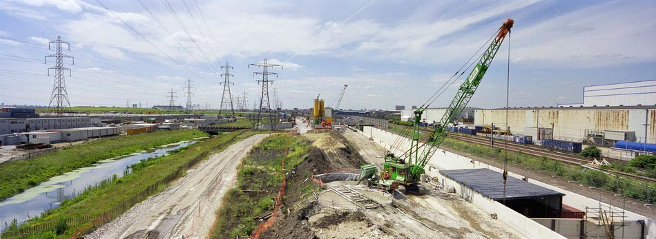

Dagenham #1, 2004 Peter Marshall
Tanya Ahmed  John Davies  Philip A Dente  Lorena Endara  Pablo Fernando  Bee Flowers  Nicola Hulett  Peter Marshall  
Paul Anthony Melhado
  Neal Oshima  Paul Raphaelson  Rabi Rashmi Roy  Herman Schartman  Mike Seaborne  Luca Tommasi

2014 :        71,310 visits
116,564 page impressions

Which works out at around 195 visits a day with 319 page views, a respectable but not high figure.
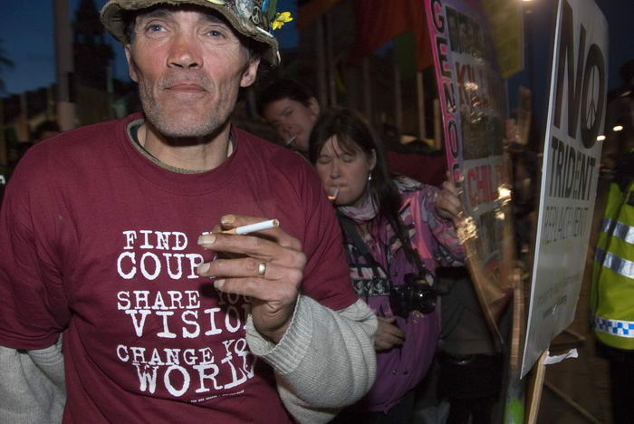

My favourite image of Brian Haw, with Babs Tucker at his right.  From Taken in London

It’s the figures for some of the less popular sites that I host that make these figures believable. Taken in London is a small site I set up for an exhibition with Paul Baldesare in 2009, and which I’ve left on line with no further publicity since then. I would not expect it to get a great deal of web traffic, and the figures of 10624 visits and 18898 page impressions for the year (29 and 52 per day) are around what I would expect.
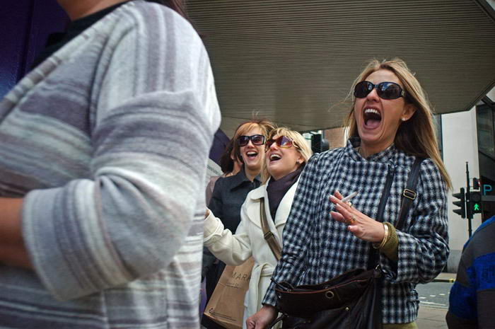

Paul Baldesare Laughing women Oxford St

Taken in London was a nice show with some fine street photography by Paul Baldesare, and some of my protest pictures that still don’t look bad, and the web site is well worth a look. Perhaps this mention will boost its figures for 2015!
Continue reading Web views
Looking Back on 2014 – Part1

I don’t usually go in for reviews of the year, but I got a message a few days ago asking if I wouldn’t mind sending a selection of my favourites from the pictures I’d taken in 2014 for use on a web site slide show, and I agreed to do so.

So last night I sat down and went through my work. Until some time this year I did actually keep every picture I took – except for those obvious errors, like the many I take by accident when one camera bumps on top of the shutter release of a second, or those when I grab a camera and hit the shutter release by mistake, or those that were clearly out of focus or ten stops over or under exposed…. But this was getting to be far too much as the times got busier, I got more trigger-happy and file sizes increased to the ridiculous when I used the D800E full frame. 32Mp is great for those pictures you really need to print large, but for sending to agencies is overkill. So usually I use the D800E as a DX camera, which gives much more sensible 16Mb files. But for some purposes I need the full 32Mb and then go on to produce a 16 bit tiff file. Each pixel then needs 6 bytes, ending with 192Mb, although lossless compression can reduce this somewhat.

But dealing with large numbers of large files was slowing me down too much, as well as eating up hard disk after hard disk, and finally in October I turned over to a policy of only loading the files from any set I would be happy to publish onto the computer, and where possible weeding out duplicates and near duplicate too. I still end up with more files than I want or need, but the numbers are certainly down, with perhaps typically only a quarter of what I take making it to hard disk.

I had several arguments against this kind of editing. First that I’d never done it with film, and often when I go back to old work find that I had failed to use some of the pictures I find more interesting in retrospect. Finally I decided that this was more an argument against too tight editing rather than against editing at all.

Perhaps more important was that editing was time-consuming. But as the number of exposures increased, so was importing them all. I turned over to using FastPictureViewer Pro, a piece of software that lives up to its name. I’d tried viewing and selecting pictures from the cards in my USB3 card reader in Lightroom’s import dialogue and found that although this worked for small groups of pictures, with larger groups it soon slowed to a standstill.

FastPictureViewer takes a few seconds to load, but then lets you go through them with never a hold up, pressing the ‘K’ key for those you wish to keep. It copies them to a folder I have set up on one hard disk as an ‘Input’ folder with no hold-up to the viewing process. When I’ve been through the card or cards and selected the files, Lightroom will quickly rename and copy them according to my preset to the correct folder (and make a backup on another hard disk), much faster than working from the card. Overall there is a time saving, and the only drawback is that I have to sit there selecting the files at that point, when I often want to eat dinner before working on them. But it’s a fast process and I can wait.

So far the savings in disk space and file numbers haven’t been quite as large as I had hoped, I still tend to press the ‘k’ key rather too frequently, but I’m working on it. Over the year as a whole I covered around 360 stories, with an average of around 250 images kept for each of them, making a total of around 90,000 image files on disk (next year I  hope the average will be rather smaller.) Far too many to look through individually in any sensible amount of time – even with FastPictureViewer, which says “4,000 images per hour is is realistic, with zero upfront time.” Incidentally I don’t get free copies of software, but $50 seemed reasonable for a licence to install and use on up to 3 computers, and it can do a few more things other than simply view images, without being in any way bloated.  When I get time I may well investigate it for keywording.

So I went to the lead images of the 360 stories on My London Diary, and selected my favourites mainly from these. In some cases when I saw these I remembered I’d taken other images that I might prefer and I went and looked through the story on My London Diary. I had two rules, firstly not to select more than one image from any story, and secondly to select only landscape format images, as this was for a slide show, and vertical images don’t really fit. This was a shame as some of my favourites would undoubtedly otherwise be portrait format. And the third, slightly vaguer rule, that I would only choose images from protests.

I ended up with 69 images, which seemed to be rather too many to send, though perhaps I’ll post all or most in a series of posts here. I sent off a dozen for the slide show, and received a request for another one, not on my list. Here are the first nine:


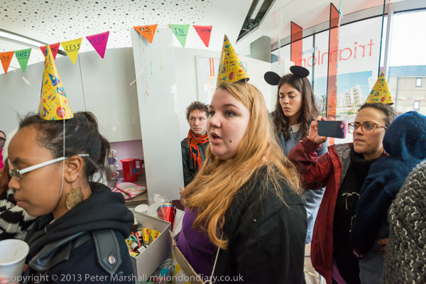
Focus E5 Mothers Party Against Eviction – East Thames Housing Assn, Stratford, London. Fri 17 Jan 2014


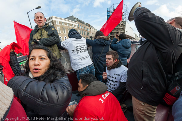
‘3 Cosas’ Strike Picket and Battle Bus– Senate House to Parliament Square, London. Tue 28 Jan 2014


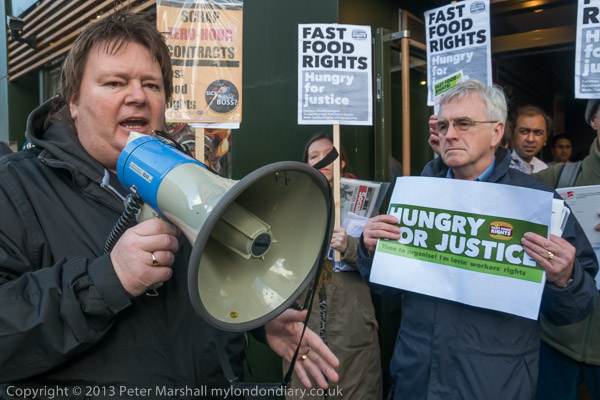
Hungry for Justice For Fast Food Workers – Oxford St, London. Sat 15 Feb 2014


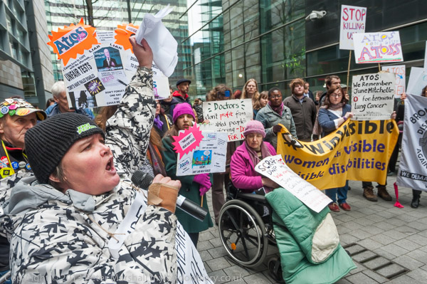
Atos National Day of Action, London. Wed 19 Feb 2014


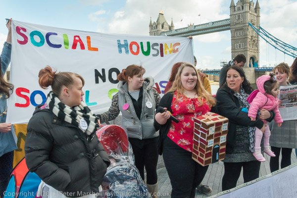
Focus E15 Mums at City Hall – City Hall, London. Fri 21 Feb 2014


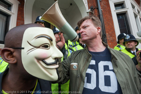
Against Worldwide Government Corruption – Trafalgar Square & Ecuadorian embassy. Sat 1 Mar 2014


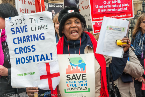
Stop Hospital Killer Clause 119 – Parliament, Westminster, London. Tue 11 Mar 2014


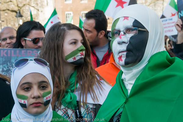
Syrians March for International Action – Hyde Park and Downing St, London. Sat 15 Mar 2014


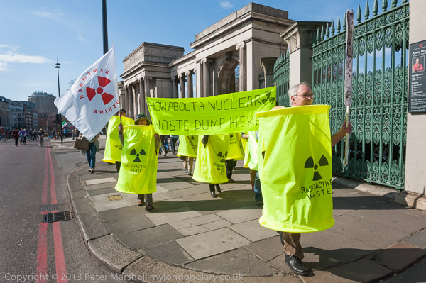
Fukushima Nuclear Melt-down Remembered – Hyde Park and Downing St, London. Sat 15 Mar 2014

Continue reading Looking Back on 2014 – Part1

Poor Doors Special

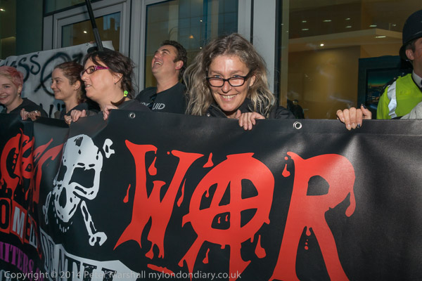
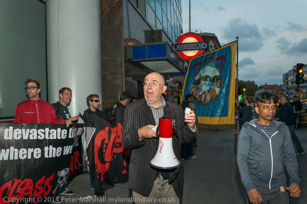
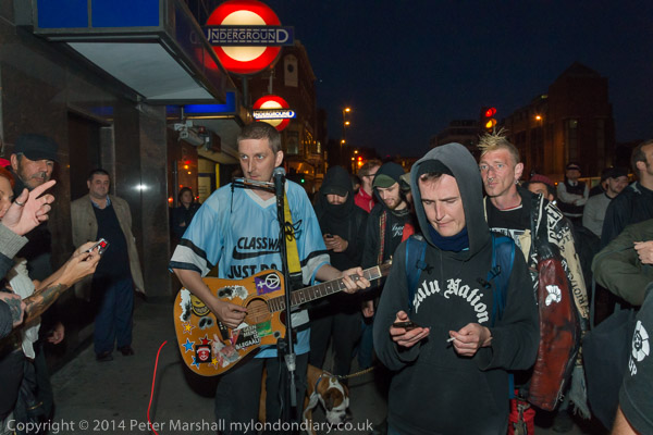
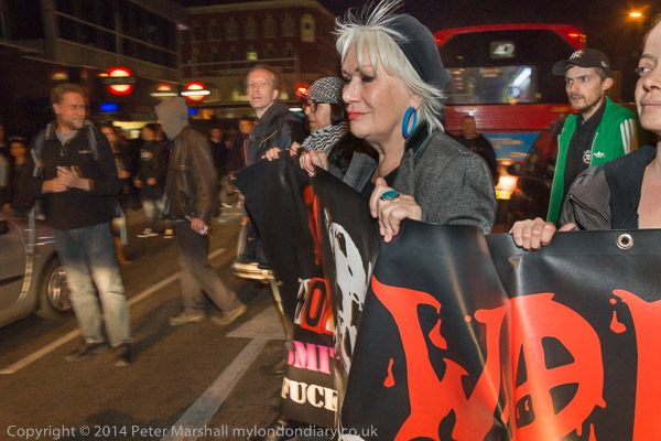
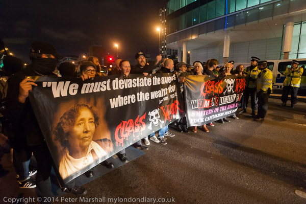
Saturday night was a special protest outside One Commercial Street against their separate doors for the rich and poor tenants of flats in the prestige block. A mile or so down the road there had been a large anarchist book fair taking place, and Class War had called on people to march from there to show their support for their campaign against ‘social apartheid’.

So this was expected to be a rather larger protest than before, and this turned out to be the case, with the wide pavement outside getting pretty crowded most of the time. It was also a more musical protest than most, with samba from Rhythms of Revolution and songs from Cosmo.

It wasn’t one of my best nights photographically. Some anarchists don’t much like being photographed, and it was dark, particularly when a group of those present went into the dark alley to look at the poor door. and I was having problems getting my SB800 flash to work consistently. I still don’t understand what the problem was, but flash often seems like that. Sometimes it works perfectly, other times you think you are doing exactly the same thing, but nothing goes right.

I’ve found over working with flash at these and other evening protests that the most reliable way with flash at protests is to use the Nikons on manual exposure, setting the aperture and shutter speed to get as much ambient exposure as possible. This generally means working at full aperture and speeds around 1/30s, or perhaps 1/60s for longer focal lengths with the 18-105mm. The flash seems then to work OK in TTL A mode. But there did seem to be intermittent problems in communication between camera and flash – and later I gave the hotshoe contacts a good clean which seemed to help a little. But whenever I test the flash at home it works, then when I’m out I have problems.

The crowding was also a problem, and when I green flare was set off, I was in the wrong place and couldn’t move to a better position quickly enough to get the pictures I would have liked.

You’ll see if you look at the pictures that some the flash has more or less worked, but quite a few exposures were either completely over or under-exposed and were deleted. Towards the end of the event, the protesters decided to block the road as a part of the protest, at which point the flash was so inconsistent that I soon gave it up and worked mainly by available light.

Most of that came from the headlights of the cars that were stopped by the protest, and car headlights work mainly at knee height or below. So quite a lot of dodging and burning was needed to even up the lighting.

I also found myself cursing my lack of fast lenses for the Nikons. Usually the f4 maximum aperture of the 16-35mm zoom isn’t a problem – just means using a higher ISO than a faster lens. But on this occasion it would have been nice to have a 35mm f1.4 on the camera.

The other problem with car headlights is that of colour temperature. Car headlights seem to vary somewhat from each other and this gave some problems colour balancing the images. But I was reasonably happy with some of the images despite the problems. You can see quite a few of them at Poor Doors Saturday Night Special.
Continue reading Poor Doors Special

Banner Drops

I’m never sure that ‘Banner Drops’ are ever really worth the effort. Used by protesters as a dramatic device, displaying a banner on some iconic building they may sometimes help to draw attention to a cause,and do seem to be reproduced far more often than they deserve. I suppose they are a simple idea and the editors who choose the images seem generally to be pretty simple.

I suppose the first essential is to choose an iconic location, either for the actual display of the banner or as a background. Tower Bridge yes, Chiswick Bridge probably not. Unless perhaps it is somewhere related to the protest; Trenton might have saved himself a few months in the Scrubs by doing a banner drop there rather than jumping in and swimming on boat race day. And while it certainly wouldn’t have got him quite as much press, there would have been fewer negative comments and no vindictive establishment judge.

Obviously the practicalities of actually displaying the banner are important, but also to be taken into account are the problems of photographing it. The event isn’t really the actual dropping of the banner, but the press pictures and TV footage of the banner in situ.
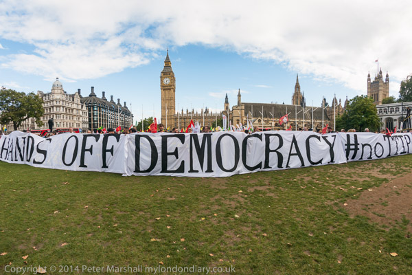
Nikon D800E, 16mm fisheye

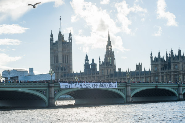
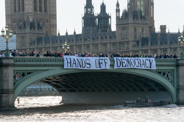
I’d photographed the three banners that made up the message ‘#noTTIP‘ ‘Hands Off‘ ‘Democracy‘ earlier on Parliament Square. They spread more or less across its full width and it was hard to get the whole message in, and even harder to get the whole area between camera and banners clear of people.

When they took the three banners onto Westminster Bridge, I realised I needed to run to get the picture I wanted. None of the photographers knew exactly where the message was going to end up (and certainly not the people taking it onto the bridge.) We ran across the bridge, and then through the crowds of tourists on the riverside walk in front of the former GLC building. I kept on until I was in a position I thought would work best, perhaps a couple of hundred yards downstream of the bridge.

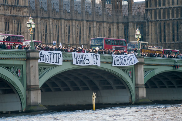
Nikon D700, 250mm

The first position was in some ways the best, with a long lens I was able to get the message clearly

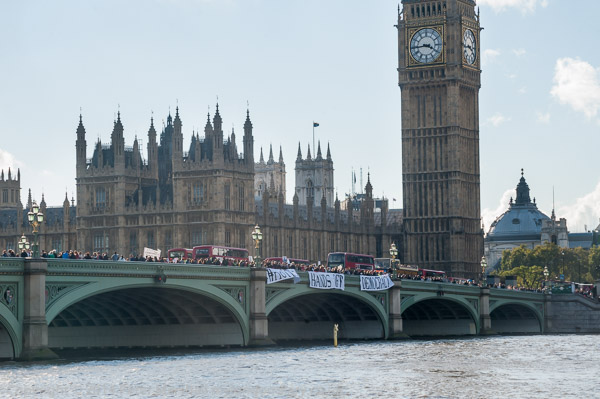
Nikon D700, 100mm

or take a wider view showing that very recognisable clock tower behind it. There were however two problems. Firstly the light, with the sun shining brightly just out of frame; flare and ghosting were hard to avoid, and because of the position of the sun it wasn’t really possible to get the wider view including the top of Big Ben’s tower. It didn’t help that I’d stupidly left the lens-hood of my 70-300 on the desk at home (the only time I’ve forgotten it), but I would still have needed to use my left hand to flag the sun and avoid excessive flare, while waiting for the moments when the wind eased off and the banners stopped fluttering up and came to rest going down from the parapet.

But the real problem was that some photographers hadn’t run far enough, and couldn’t really read the message, and were phoning for the banners to be moved further across the bridge. So before I really got the image I wanted, those banners were on the move.

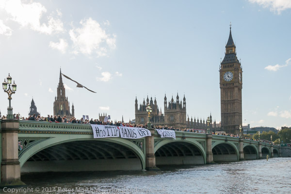
Nikon D700, 70mm

The glare from the river was really making things difficult, but I took another picture and liked the seagull at the top. But then they were on the move again.

Nikon D800E, 105mm – 157mm equiv
and the #noTTIP had disappeared….

Nikon D800E, 34mm – 51mm equiv

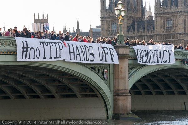
To reappear in yet another position, and again a gull made the picture more interesting for me. Possibly I might crop a little off the top and right of the image, but I like the lamps at the left and the string of people across the bridge. Again I couldn’t move the frame any more to the left as the sun was just out of picture at top left – and that area of sky needed quite a bit of burning to get any tone. The image is essentially uncropped, though I think I’ve probably corrected the verticals slightly. But the main problem with the picture is that the wind has blown the word ‘Democracy’ to make it more or less illegible.  So here’s a final image that puts across the message more clearly:

Nikon D800E, 105mm – 157mm equiv
And it is a vital message. TTIP is a commitment to a corporate future, one that gives free rein to the giant corporations to run the world their way and for the interests of the wealthy. Democracy may not be too healthy in this country, with the two major parties (an UKIP) largely supporting corporate interests, but at least there is some hope, with just a few of our politicians still championing the needs of the people as a whole.

You can see just a few more pictures of the banner drop at #NoTTIP – Banner Drop, and a few of the protest that led up to it in #NoTTIP – Hands off our democracy, though I was also busy with other events. There is more about TTIP (and its Canadian version CETA)  on My London Diary at CETA (TTIP) Trade Deal and CETA Trade Deal Threat to Democracy.

Continue reading Banner Drops

(Un)Limited Edition – Happy Christmas


Not a Christmas image – but the one I chose for my Christmas card. Candlelit vigil for Michael Brown, US Embassy, London. Nov 26, 2014

Those who know me will know that I abhor the idea of limited editions of photographs. It’s something that to me goes against the whole grain of our democratic medium, one that has reproducibility at its very heart.

When I made a few screen-prints, these were truly limited editions, starting with a pile of perhaps fifty blank sheets of paper. Usually rather  fewer as quality paper isn’t cheap and I was never rich. The first screen image went on every sheet, often just a background colour, but as the print was built up over a series of up to a dozen printings, registration errors and other printing faults reduced the number of usable sheets. At most I had two screens, although one was quite large and might have a couple of the images on it, but by the time I made the final printing, some of the earlier images had been scrubbed off, and there was no way I could print more without making a whole new set of screen images from the set of negatives.   These truly were limited editions, and the finished prints more or less identical. Those that were not were scrap.

There are a handful of negatives from which in the darkroom days I made more than a dozen or so prints. But I never went into the darkroom and made more than a handful at a time, and even those were never quite the same, as each involved an individual performance of the dodging and burning and other tweaks that led to a fine print.  The only real way to print a proper edition would have been to have made a corrected copy negative and print from that.  Which of course a few people did with processes such as dye transfer. When we moved to digital printing, making editions became easy, but of course any limit was purely artificial. Digital files don’t wear out.

Limited editions are simply a marketing device and my opposition to them is one reason my work isn’t available from a gallery, though you can buy images direct. Some of those images I have sold as numbered but unlimited ‘editions’ which I think more accurately reflects photographic practice. The numbers involved have so far largely been single figures.

But I have produced a few ‘limited editions’, but only as Christmas cards, and this year’s has been printed and sent out in an ‘edition’ of 24 roughly postcard size pigment inkjet prints on Epson Watercoloour Radiant White to photographer friends, (other people get cards from one of our favoured charities) with another ‘edition’ of 50 as commercially printed glossy postcards.  Some of those postcards remain, and if any UK readers would like a copy and e-mail me – my e-mail address is on this page  – I will send my postal address for you to send a stamped addressed envelope to. Alternatively you can download the postcard file and print your own copy – for personal use only.

Continue reading (Un)Limited Edition – Happy Christmas

Beauty, Form, Redemption?

Photography is democratic: it puts into the hand of everyman the means to be his own recorder. To defend its artistic pretensions is to make everyman an artist.
Roger Scruton, ‘The Photographic Surrogate’, 1989 p.178

This morning, after breakfast but before I was truly awake I heard the third of Roger Scruton‘s ‘Points of View’, talks available ‘indefinitely’ as podcasts, but I was listening to the Sunday repeat on Radio 4. It seemed to me an error in programming, with Scruton’s contributions lacking the humour that usually makes these short talks entertaining as well as interesting – as too were the weekly ‘Letters from America‘ by the late Alistair Cooke that had formerly created and occupied this slot for as long as anyone living can remember.

In these three talks Scruton was giving us his views on what is and isn’t real art, and deservedly knocking much of what currently is lauded and sells for high prices. The first talk, Faking It, was a nice sally against “Artists like Damien Hirst” who  “try so hard to be challenging, that causing shock or offence becomes their main motivation.” Then ‘Kitsch‘ looked more at the preoccupation among 20th century artists with “what they perceived as the need to avoid kitsch and sentimentality” which has led to “a different kind of fake: cliche” and the deliberate parody of “pre-emptive kitsch.

In the final piece, ‘The Real Thing‘, Scruton identified and explained the three attributes of ‘real art’: Beauty, Form and Redemption. We may have slightly different ideas than him as to the first of these but can certainly understand his thoughts on form, even if we might not accept that real art always should aim to “take modern life in all its disconnectedness and bring it to fullness and resolution“.

There seems equally a desire for rose-tinted glasses in his final idea of ‘Redemption’, with talk of “proof that life is meaningful“… “triumph of dignity” …  “restore moral equilibrium“….”the face of love shining in the midst of desolation...” and so on. Would I want to restrict art to what sometimes seems an overly positive view of the world and the human condition? He ends his piece with the comment: “Real art is a work of love; fake art is a work of deception.” I’m rather happier with the second phrase than the first.

But though much of this talk, what came to my mind was the work of Walker Evans, which seemed in many ways a perfect fit to his definition of ‘real art’, despite his views on photography. I thought perhaps I would write more about his views on photography, and began doing just a little research. But then I thought frankly I can’t be bothered.  It’s sometimes strange that philosophers can be so blinkered in particular ways, and I have more important things to do. Perhaps even in my own minute and very limited way to change the world.

But if you feel up to it, you might like to read Stefan Best’s review of his ‘Photography and Representation’ or the 2009 paper by Dawn M Phillips, Photography and Causation: Responding to Scruton’s Scepticism, or Siran Changchang’s Representation of Painting and Representation of Photography for a view from the  Central Academy of Fine Arts in Beijing, the first of two articles on the work of Gerhard Richter. And I’m sure you will find much else, but I feel a pressing need to get some real work done and leave the angels on pins to others.

Photobooks of the Year

I’m a great lover of photographic books. I’ve often said that for most photographs they are the place they work best. Or can work best – there are plenty of bad books as well as good books. But there are several things about photobooks that attract me.

First its the intimacy of the experience which I think is somehow so appropriate to our medium. Photographs are generally something to hold in you hands and look at – and you can do that in a book or with a box of prints in front of you. Its a much closer and more personal experience than viewing them on a gallery wall, and one that you can have without interruptions.

Important too that a book puts a photograph into the context of others. One of the things I often have said which has confused students is that “photography isn’t about making pictures.” We make pictures of course, but we – or at least I – don’t make them to make pictures. Photography for me is about telling stories, and the best place for a story is a presentation or a book. A gallery wall can sometimes do a half decent job, but often they leave me feeling something is missing.

But I do have a problem with books. I own far too many of them (and get told that frequently in-house.) Most of our rooms have walls lined with them – at least they are good insulation. It’s got to the stage where I have to smuggle new volumes in and find some place to hide them away, and that’s getting difficult as the gaps fill up.

So I’ve adopted a policy. I now only buy books by photographers I know – actually know personally. Of course I don’t quite keep to it, there are some I just have to buy. But most of what I buy now are by people I’ve actually met.  And one small tip to anyone in a similar position to myself – it’s easier to smuggle in books published years ago and bought secondhand; I don’t actually lie about it, but just let it be assumed that I’ve had them for years.

So you won’t find me writing a list of my top 10 photo books of the year as most people seem to be doing at the moment.  Instead I’ll refer you to the top 36 picked by Jim Casper and the editors of LensCulture, an interesting selection, though I’ve only bought one of them myself.  There is a preview for each on the books to give you a real idea of what you have missed.

The volume that I do have (and am still looking for a space large enough to keep it) is the big Winogrand book. I’m still not sure that I really like it, and certainly I prefer the books that Winogrand himself produced. I’m undecided too about the whole idea of posthumous editing and rather think that he might have been better served had all those undeveloped film and unprinted negatives had gone up in a fire.

And although I like the work of Robert Adams, I don’t feel I have to get yet another book of his work – and it seems from the Lensculture preview to be the same work that I already have in the dozen other of his books on my shelves.  I think too that I already have the best of Ralph Gibson and of Gene Smith. And thinking of Smiths, another book I didn’t buy this year was Evocations of Place: The Photography of Edwin Smith, because I already own the splendid 1984 monograph on him. But I think it would go on my list were I to make one.  As too would the very different Shoreditch Wild Life by Dougie Wallace, a small enough volume for me to make space for.  And… No, I said I wasn’t going to write a list!

Darkness and Rain

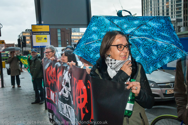
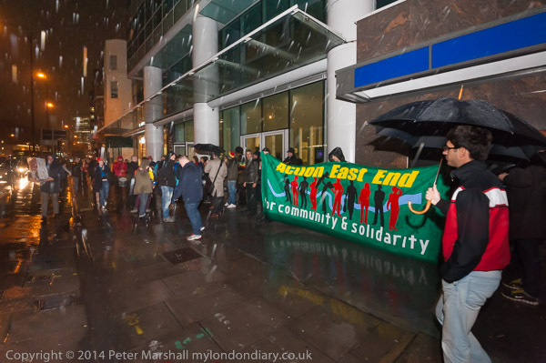
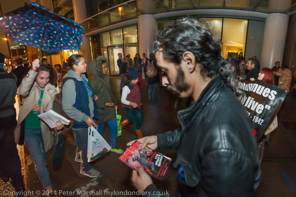
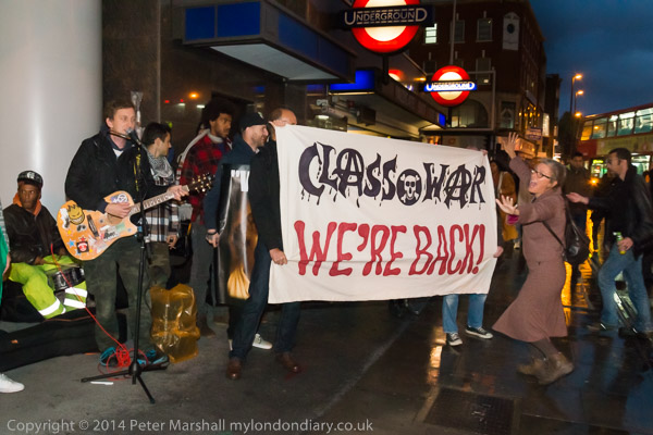
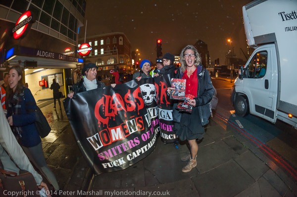
October I seemed to spend a long time struggling to make pictures in darkness and rain, particularly at several of what turned out to be a weekly fixture covering the Poor Doors protests outside the hugely expensive One Commercial Street flats in Whitechapel High St at Aldgate, just on the edge of the City of London.


It wasn’t really quite dark when I took this- and other pictures in Poor Doors Musical Protest

One solution (of sorts) to darkness is to use flash, and I’ve kind of got used to that, even if things go infuriatingly wrong at times. But using flash in rain is a problem, as all the raindrops glow in the flash, particularly those closer to the camera (as the light falls off with the square of the distance.) My flash units aren’t waterproof either, and using them in wet conditions without some kind of protection can lead to expensive repairs – and even the possibility of getting 400 volts when you least expect it.


A week later it was darker and raining rather more – Class War Poor Doors Week 12

Flash is often infuriating in any case, and there are some very good web sites about using it which suggest various creative set-ups, none of which are particularly appropriate to the kind of work that I do. For that you need quick and dirty flash, but there are a few things to bear in mind which can improve matters. I suspect I’ve mentioned all this before, but here goes with my 10 flash tips.

  1. Use high ISO to avoid blackness around the close bits your flash can light up. Mostly at night with flash I work at ISO1600 or ISO3200.
  2. If your flash has a diffuser built in, use it for wide-angles unless you want ‘creative’ vignetting. For longer lenses you can use it for close subjects. The little built-in white plastic bounce reflector helps too – but only at fairly short range, when you can then angle the flash head up at 45 degrees.
  3. Work with your camera in manual mode and your flash in auto TTL mode (assuming you can – it works with my SB800s)
  4.  Usually a shutter speed of 1/30 or 1/60 will do fine. Mostly I also work with my rather slow lenses more or less wide open too. Aim to get an exposure without flash that is perhaps 2-4 stops under.
  5. Try to underexpose with the flash too, but only by around 1 stop. If you give correct exposure you will get pictures that don’t look as if they were taken at night. If I’m working without flash I generally need to underexpose by 1-2 stops
  6. Most night scenes – at least in cities – will contain lots of light sources which seriously muck up your camera’s metering. Best work in manual and check the results, adjust as needed, then leave alone until you move into a differently lit area.
  7. When possible make use of the uneven light spread your flash will give by angling the flash head away from the closer parts of the subject.
  8. Sometimes it pays to use your left hand as a flag to shade parts of the subject.
  9. Work in RAW, as you are going to need considerable post-processing for best results.
  10. Never let people see your flash pictures until you’ve sorted them out in post-processing!


We did have one dry week, but then it rained again – another Wet night at Poor Doors

Nikon also have some kind of random fault generator, that will result in the occasional image being hopelessly over-exposed. It might help to make sure flash and hotshoe contacts are clean and that you have pushed the flash right on and locked it in position.  But you will still get the odd random white-out (or at least I do) and the occasional random non-flash image with burnt out highlights. Its just to keep you on your toes.

Of course there are some faults for which only the photographer is to blame. Like taking a second picture before the flash has had time to recycle, which I manage frequently. Or forgetting that any exposure compensation for flash set on the camera adds on to that set on an external flash unit…

And while flash actually built into the camera may sometimes be a good idea, it’s largely a marketing point. Of the five lenses that I normally use on the Nikons it actually only works sensibly with one of them (and the one I uses least)  the 20mm f2.8; with all the other lenses except the fisheye get a large shadow in the lower part of the frame from the lens. For the 16mm fisheye it’s also generally useless as it only illuminates a central oval in the frame.

I always thought that, as the SB800 manual says the flash diffuser is needed to provide proper illumination for 14mm and 17mm lenses, this meant that there was no way the flash would give a wide enough coverage with the 16mm fisheye. So I’d never tried it before these occasions. To my surprise it actually works quite well, and is slightly better still if you also use the bounce card. Used out of doors, recycling times will be around the maximum – and NiMH rechargeable batteries the only sensible choice. When I remember, adding the optional 5th battery really helps, bringing the recharge time down to under 3 seconds, almost as fast as the best external power supplies.

Having fitted an external flash into the hot-shoe, it becomes possible to only slightly raise the built-in flash. Just a little, so it is difficult to notice, but it is still enough to mess up flash exposures completely. So much so that I keep it permanently taped down, only for emergency use.


Uncorrected Fisheye and flash

But flash and rain is still a problem. As an alternative to flash I have a couple of cheap LED light sources, the more powerful with 9 rows of 16 LEDs, a total of 144 LEDs. It makes quite a good torch for looking underneath furniture, but as a light source for taking pictures it is far too weedy. There are more expensive units around, but I’ve yet to try them, though I have at times ‘borrowed’ the light from the larger units wielded by professional videographers.

But in the end I’ve often found myself trying to work just with available light, and wishing that I had lenses for the Nikons like some of those I used to use, particularly the 35mm f1.4 Summilux. Neither the 16-35mm f4 nor the 18-105mm f3.5-f5.6 is much of a lens in low light, and most of the time I find myself using the 16mm f2.8 fisheye, or, if I’ve remembered to put it in my camera bag, the 20mm f2.8. I’ve had most success with the 16mm (not least because I’ve almost always got it with me) but I’d still like a really fast wide lens for use on dirty nights. The only real choice I can see is the Nikon 20mm f1.8G AF-S but its a little on the expensive side.

Phantom

I’ll freely admit to never having heard before of Peter Lik, whose photograph “Phantom” has just sold for a world record $6.5 million. And when I went to his  web site to (as it says) ‘DISCOVER THE BEAUTY OF “PHANTOM” FOR YOURSELF‘, I have to say I was not overly impressed.

In the press release about the sale it states:

“Phantom” sold to a private collector for an unprecedented $6.5 million.  The purchase also included Lik’s masterworks “Illusion” for $2.4 million and “Eternal Moods” for $1.1 million.

“Phantom” and “Eternal Moods” are black and white representations of Lik’s iconic images “Ghost” and “Eternal Beauty.”  Lik is known for his artistic approach to landscape photography and capturing Mother Nature’s vibrant colors.  His use of black and white imagery is a rare and compelling departure from his normal style.

Looking at his site I was very much reminded of those many on-line shops I’ve browsed, perhaps in search of a new jacket or t-shirt, though there are t-shirt companies like Philosophy Football that I find rather more artistically interesting.

Of course Lik is a more than competent photographer (and has the certificates on-line to prove it), but frankly I think that anyone who pays more than two figures for one of his prints is lacking in judgement, and it is hard to disagree with anything that Jonathan Jones says in his Guardian article  “The $6.5m canyon: it’s the most expensive photograph ever – but it’s like a hackneyed poster in a posh hotel“. Where the frames are worth more than the image.

It’s interesting that Lik’s on-line biography (which fails to mention a single other photographer whose work might have inspired or influenced him) includes the following:

Peter’s images can be viewed in luxurious hotels, prominent estates, leading corporate offices and in all of his galleries around the United States.

So perhaps those ‘hackneyed posters’ were really clichéd Lik originals. And if you can read that ‘biography’ without reaching for a sick bag you have a stronger stomach than me.

In black and white, “Phantom” is perhaps slightly less tacky than “Ghost” which is the colour version, but Jones is spot on the ball when he comments ‘Today, this deliberate use of an outmoded style can only be nostalgic and affected, an “arty” special effect. We’ve all got that option in our photography software.’ Though I suspect Lik’s conversion to black and white, presumably with ‘PhaseOne‘ was a little more sophisticated than Instagram, it does I think emphasize a failure in his vision.

As Jones says “Someone has been very foolish with their money, mistaking the picturesque for high art“. It harks back an argument that was current in photography around a hundred years ago, and for most of us looking back was fairly convincingly brought to an end by the final  editions of Camera Work, begun at  devoted to the work of Paul Strand. Edward Weston struggled with the issues in his own work in the 1920s, (and wrote about them) as did others in that period, but the debate was essentially over. And of course since then we have had further movements away from the pictorial and “arty”, for example in the later work of Strand, as well as with Walker Evans, Robert Frank and more. We’ve moved too from Ansel Adams (who perhaps seldom entirely escaped the picturesque ) to Robert.

Where Jones misses the point is to condemn ‘fine art photography’ because of the foolishness of some US billionaire and the avarice of the art market. Of course this is not ‘the most valuable “fine art photograph” in history’, and an idiot or a business paying huge money for it or other pictures (whether painted or photographed) doesn’t make it anything more than the most expensive.

In a house spat, yesterday The Guardian published a riposte by Sean O’HaganPhotography is art and always will be’, which also says many things it is hard to disagree with, despite the silliness of its title. Most photography plainly isn’t art and never will be. And while not quite all the names given by O’Hagan to support his argument have a high rating in my personal Pantheon and we disagree about the dividing line between artists and photographers,  he is clearly right about the irrelevance of the debate which Jones brings up and right too in his agreement over the worth of that Lik image: “It’s global capitalism – obscenely rich people with more money than sense.”

What matters in the end is not whether anything is art or photography – or in the end whether people chose to work within the photographic tradition or a wider artistic one, but vision and the ability to communicate that vision. As O’Hagan says, work that “makes you look at the world differently“.

October 2014

October 2014 I think probably set several records for ‘My London Diary. At a month and 11 days it’s probably the most I’ve been late in updating a month after it has ended, and the reason for that, at least in part is the record number of sets of photographs – almost reaching 50.  Not all of protests, but it is the increasing storm of protest that is making me so busy, and seems unlikely to slacken for a while, as increasingly anger over the effects of government policies rises. Not that it is just the current government – the problems related to housing and the increasing gulf between rich and poor, the failure to subject the police to proper governance etc reflect the failures and priorities of previous governments – at least back to Thatcher – and an increasing dysfunction of democracy itself.

The protests also reflect increasing tensions around the world – Kobane, Hong Kong, Iran, Palestine  – and major global issues including climate change.  I’m pleased that I’ve also found a little time – often in the gaps between a couple of protests on the same day – to continue occasionally with some of my other photographic interests.

October 2014

Wet night at Poor Doors
Biofuel picket Green Investment Bank Birthday


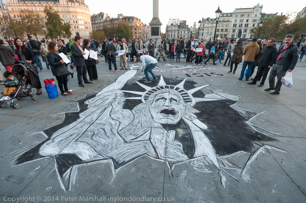
Kobane – Unite against Isis Drawing
Fair Fares Petition
Democracy Camp Saturday


EDL Visit Democracy Camp
Acid Attacks on Women in Iran


United Friends & Families March
Democracy Camp a Week Old


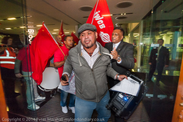
Cleaners protest at Bloomberg
Palestine – another HP protest
Musical Poor Doors


Democracy Camp – Poet Arrested
Canary Wharf & Westminster Tube
End UK shame over Shaker Aamer
DPAC High Court Vigil for ILF
Candlelit vigil for Justice for Ricky Reel
Democracy Camp Fenced Out
Staines march for flood victim Zane
Poor Doors Saturday Night Special
Procession of the Blessed Sacrament
Britain Needs A Pay Rise
Democracy Camp takes the Square
Democracy Camp starts with rally
Spoof shock U-turn by Boris on Housing
Ban on Family visits to Palestinian Prisoners
Art Not Oil Rembrandt Against Shell


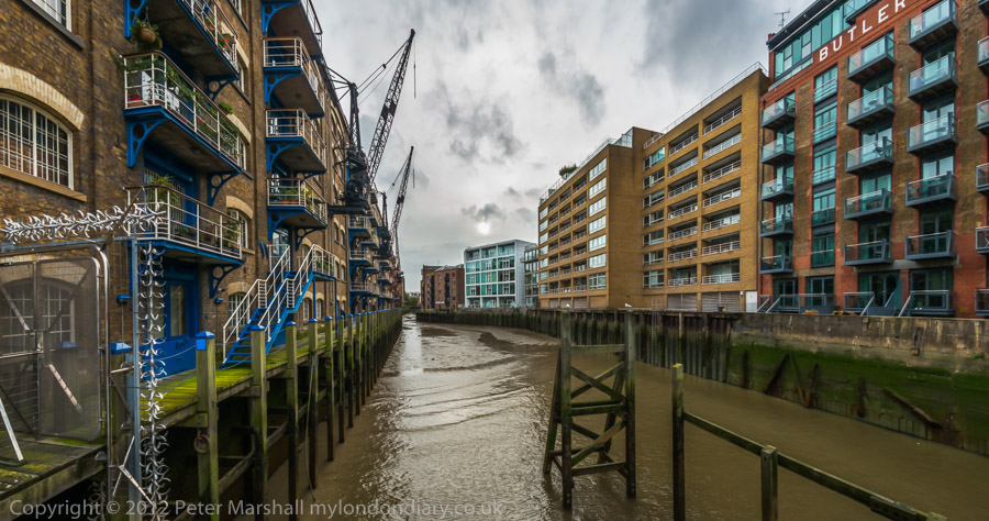
Bermondsey Thames Panoramas
CPOs for Southwark Councillors
Class War Poor Doors Week 12
London Transport Museum Arms Protest
Thorpe Walk
Support the Defenders of Kobane
#NoTTIP – Hands off our democracy
#NoTTIP – Banner Drop
Global Frackdown at HSBC


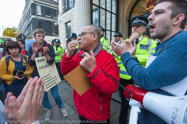
Solidarity with the Umbrella Revolution
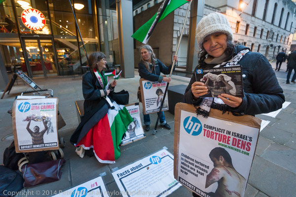
Palestine protest at Hewlett Packard
City Panoramas
Free Ghoncheh Ghavami – SOAS action
Solidarity for Care UK Strikers
Deptford to Greenwich
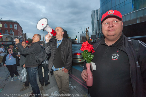
Poor Doors Musical Protest
Unstone Grange & Chesterfield
Hull and Hornsea
Hull at Night


Class War Poor Doors Week 10

Altogether I think there are over 1900 of my pictures on-line from October. Now to get to work on November