Truce Over – It’s War!

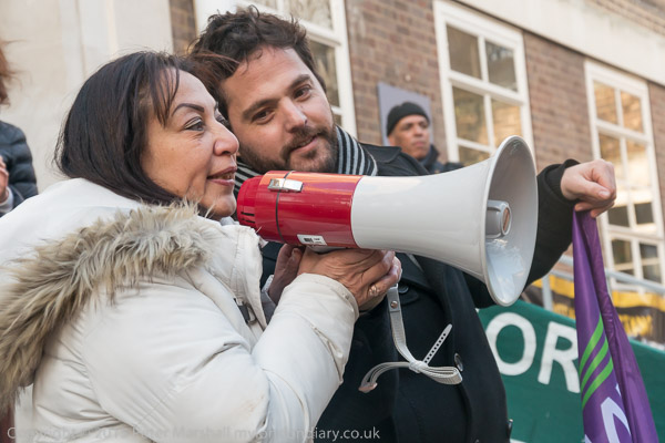
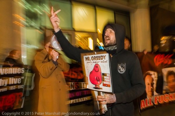
Last year I photographed around 20 protests by Class War outside a prestige block just to the east of the City of London, called One Commercial St. The recently built block contains a supermarket, a betting shop, a hotel, an entrance to Aldgate East Underground station and more, including car parking and both expensive private flats and some managed as social housing by a housing association.

Class War started their protests at the end of last July, and kept them up weekly – with the occasional extra special event until almost the end of November. Like many others they were appalled by finding out that while the residents in the privately owned flats had a posh entrance on the main street – Whitechapel High Street – into a comfortable lounge area with a 24 hour staffed reception desk, those in the social housing had to go down a dirty and dimly lit alley at one side of the block to a door with a card entry system into a long blank corridor with just a block of mail boxes. When I first went down it, the alley was strewn with rubbish and smelt strongly of urine. Because the entry system was broken, the door to the block was not locked and anyone could walk in off the street. Apparently too, there had been problems with getting repairs to the lift, and the flats are up on the 10th floor and above.

Increasingly this kind of social segregation is being built into new blocks where the developers are forced to include some element of social housing, and the protests by Class War are just one of several that have served to bring this to public attention and fairly wholesale public condemnation. It reeks of the separate entrances for servants and workmen that have now largely disappeared from houses and workplaces. Most feel there is no place for separate doors for rich and poor in our country today.
Its also a part of a larger movement over housing, particularly in London, where former working-class estates and areas are increasingly are subject to a so-called ‘regeneration’, which involves evicting the working class tenants and lease-holders, and either demolishing and rebuilding or refurbishing the properties for sale or letting at ‘market rents’. Many of those buying these properties are overseas investors who may not even live in them, instead seeing a good return on their investment as London house prices continue to rise – particularly in places such as One Commercial St, close to the Crossrail development. Investors are told they can expect a 35% price increase by the time Crossrail opens in around three years.
Local residents – both those whose families have lived in the area for generations and more recent migrants to the area – cannot afford either the market rents or the so-called ‘affordable rents’ which are often around 80% of the market rate.

The process of regeneration was started, perhaps with good intentions, by the Labour government in the 1990s, but was poorly thought out – and the developers have managed to run rings around even the best intentioned councils. But most London councils have colluded with the developers – and often led the process of getting rid of their less well-off residents.

In November, the flats were sold by developers Redrow to Taylor McWilliams, and the new owner contacted Class War and offered talks to try an solve the problem. It seemed to me that relatively minor interior building works could have allowed all tenants to use the front entrance. I’d walked inside the block between the two sides myself, between separate lifts on the ground floor of the building when I was given a tour by one of the owners of a flat on the rich side. Class War were hopeful of a satisfactory settlement.

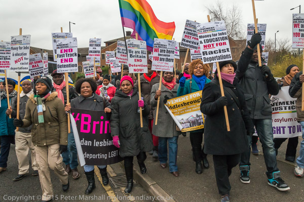
The meeting, when it came, was a shock. McWilliams told Class War he wasn’t prepared to make a single entrance so that everyone could enter from the front street. Complete intransigence. Class War told him what they thought and announced the protests would re-commence. They started with a short detour from the March for Homes at the end of January as it was going past the building, but the protests began again properly on 12th February, and are continuing every Thursday evening, from 6-7pm.
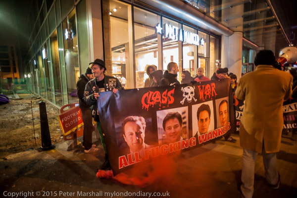
Like Class War, I was very disappointed by the response, and also as a photographer,  covering a regular protest like this presents problems. How do you keep going back to the same place  – and largely the same people – and making pictures that remain fresh?

There have been some minor changes. As you can see when the protesters returned there was building work taking place in the alley, and it is now rather more pleasant, and what was stygian is now well lit.
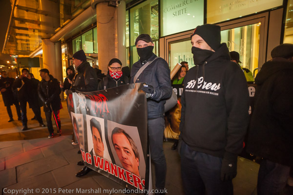
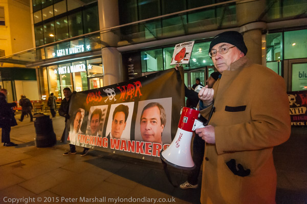
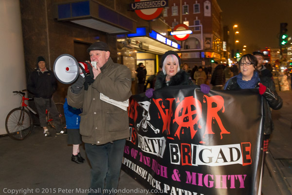
There are also some new protesters – with various groups including the 161 crew of Polish anti-fascists shown here holding what I euphemistically call Class War’s ‘Political Leaders‘ banner.  More about this banner in a later post, but while it is certainly in bad taste, most people seem to have a very positive reaction to it, often pointing and laughing. It’s certainly meant be and is provocative.

Class War does inject a certain amount of fun into politics, dealing with serious issues, but doing so in a theatrical way. But although I quite enjoy going to their protests, trying to cover them every week is sometimes difficult. I don’t really like working in the dark either, having to use flash or other artificial lighting much of the time. Even on a reasonably well-lit street parts of the pavement are pretty dark.  I’ve started using a LED light with the D700 (not least because it is now totally unpredictable with flash, suffering from old age) but that certainly has its limitations, and even at ISO3200 many images are blurred by subject movement. Again this is something I’m still not quite sure what I think about, but I will try and write more about later. Sometimes I seem to get some good results.

This is a project I’ve committed a great deal of time to and I hope to see it out.

More at Poor Doors Truce Over – It’s War! and of course in the following weeks.

Continue reading Truce Over – It’s War!

Definitely Not Cricket

To my surprise I find this is not the first post I’ve written about cricket.  I’ve never really been a cricketer, and when we had the choice at school in the summer term I always opted for athletics, though we did get a little compulsory  cricket training.  I learnt the forward defensive and backward defensive strokes, but for attacking was left using the playground wallop. I don’t think I ever really got into the swing of overarm bowling either, somehow my shoulder didn’t quite let my arm follow the necessary trajectory, and my deliveries ended as slow and guileless, occasionally getting a wicket when the batsman lost patience waiting for the ball to arrive and swung too early.

Of course being English I had to play the odd game, getting roped in for various school and college sides, and even for Air India when they were desperately short of players. They were a class side, but so much class that anyone below five in the batting order (and I was well below five) seldom got a knock, and it took only a fairly short wander around by the boundary untroubled by the proximity of that nasty hard ball watching the other side coming out and going back to the pavillion before we were all back in and at the bar too.

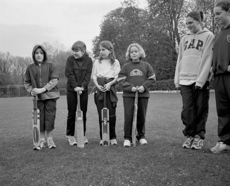
I find I’ve even written before about my cricket photography. Back in 2001 I got a commision from the local council under an Arts Council scheme to photograph Shepperton Ladies Cricket Club, and particularly the work they were doing with young girls.  It was an interesting assignment, and one I enjoyed doing, spending far more time on it than was sensible for the money.

I wasn’t really a sports photographer, and certainly didn’t then have the kind of equipment that proper cricket photographers would have, being seriously underpowered in the telephoto area.  The longest lens I owned was a 200mm, which hardly gets you into the league, as the boundary is a serious distance from the wicket at most grounds.  I had a 2x converter, but adding that made the 200mm f5 into a 400mm f10, which even on sunny days was a lttile slow for action especially as ISO 400 film was the fastest I could sensibly use. Even in bright sun I needed to work wide open to get a suitably fast shutter speed of 1/500th, and wide open with a 2x converter was never too sharp.

Without the converter, things were rather better, but few of the pictures I made were absolutely sharp, and even fewer managed to be from the right position at the right time. This didn’t worry me, because this wasn’t really what I was trying to do, and the real work I was making was in black and white, with a 65mm wideangle on 6×7, both of the ladies team but more importantly of the work they were doing with girls from a very young age.

Cricket wasn’t seen by those training the girls as just a game. It was about developing the character, encouraging independence and self-reliance.

I’ve written a little more about this project in a 2012 piece about my rather limited sports photography, Sports and Me, so I won’t repeat myself even more. I also wrote another post five years ago, Not Cricket.


Space Hijackers -an international band of anarchitects who battle to save our streets…

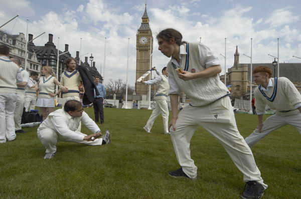
What got me thinking and writing about this again was a message from Suzy Gillett, who I met when she was making the short film Epiphany (and also, rather embarrasingly another post titled Epiphany, which should have been Epiphany 2.) She is now the producer for another film in the making, This is Not Cricket, on which director Jacopo de Bertoldi has been working on since meeting the Piazza Vittorio Cricket team in 2012. This is anarchist cricket of a very different stamp to that I photographed back in 2005. They hope to complete the 90 minute feature-length documentary by the end of 2015 and urgently need cash, and are seeking it from crowdfunding.

Here are the first two paragraphs of the Synopsis:

Immigrants in Italy are under siege from increasingly violent xenophobic demonstrations and punishing laws. European austerity measures hit society, fanning the fire of intolerance.

Two adolescents in Rome, Shince from India and Fernando from Italy set out to rebuild their cricket team with a singular political vision to combat fascism, to integrate young people, and to play cricket. Their team was the strongest under 18s club in Italy, until it was forced to disband by the same problems they are determined to overcome: religious and social discrimination.

The trailer, on the same page is also worth viewing. I’ve just made a small gesture of support at the ‘Daisy Cutter’ level which seemed appropriate for my level of cricketing prowess; so far the appeal for $15,000 for the next stage of the product has had just over a third pledged, and you can also follow the project on Facebook. Some of the ‘rewards’ offered for higher levels of contribution appeal rather less. What would I do with a cricket bat!


It Isn’t the Rules

Although I found much to agree with in the article by VII photographer Donald Weber on Vantage, The Rules of Photojournalism Are Keeping Us From the Truth, which I certainly recommend you read, I think both the title of the piece and his conclusion are wrong. It isn’t the ‘rules’ of photojournalism that are keeping us from the truth, but, as he correctly asserts, the role which photography has come to occupy in the media which largely provides the framework of financial support for photojournalism, and which agencies such as VII depend on.

Photography isn’t used for storytelling, but to decorate the story that has already been decided on by others. Sometimes by a journalist for the newspaper or magazine using a picture, but more often by a media consensus of what the story is about, to which the individual contributions of both writers and photographers are sacrificed.

I think too there is a good argument that competitions such as WPP encourage what might be called the entertainment aspect of photography, images that are used simply because they are dramatic, becoming disaster porn rather than a real attempt to address the issues.  I used to confuse students by telling them that “photography isn’t about making pictures”; important though form, framing, shape, line, texture etc are they are not the end in themselves, but tools we use to communicate clearly our stories.

Its certainly hard to argue with his thesis about the coverage of the events in Maidan Square, where virtually all content focussed on a small choreographed area, the frontline, for which “a media pass was needed. To get a media pass, you went to the Media HQ, showed your press credentials, signed and got your ticket. That day, I was ticket number 230. 229 accredited press before me.” And probably many more after.

Towards the end of the piece he writes:

“What makes photography faithful is not laborious inquisitions into levels of image-processing. Well, that is part of it, but mostly it is our collective faith in the intent of the story.
Eugene Smith once said: “The honesty lies in my?—?the photographer’s?—?ability to understand.” It has nothing to do with aesthetic and technical execution of the photograph, but in the author’s integrity in developing a story.”

In the first paragraph he admits that what he calls “labourious inquisitions” into the image-processing is “part of it.” I don’t feel that the kind of inquiries that the WPP and others make are particularly labourious, and more than being part of it, they are the very foundation on which all else rests.  His comment seems suspiciously like special pleading on behalf of those photographers who have been caught with their pants down.

He is totally right about integrity (as I’ve insisted time and time again), and that must have as its basis such things as not adding or subtracting objects from the image or altering it beyond recognition. As well as not setting up images and presenting them as if they were not set up or obviously misrepresenting them in captions.

Gene Smith would certainly have got himself disqualfied from the WPP for some of the things he did in the darkroom, but these were essentially a minor area of his work. It is certainly hard to draw clear guidelines as to exactly how much is allowable, and in the end it is intention and integrity that matters.

What also for me lets down his piece are the photographic examples, some of which at least I think involve unacceptable manipulation, but I leave it to you to judge on that.

Of course reporting from events such as those in Kiev shouldn’t be limited to a small ‘front-line’ controlled and choreographed for the media, and its always easy to find poor photography of events. But I suspect there were some of those 229 photographers who got their media pass before him on the day he attended will also have photographed elsewhere – and indeed may even have left before he turned up to do so.  Obviously Weber, photographer 230, was himself not having a good day.

I’ve seen good photojournalism from Kiev – and so I’m sure have you. But I also know that many photographers who tried to go outside the predictable failed to get their work published. To find much of the best work from many situations around the globe you will have to look at alternative media and photographers’ own web sites. And perhaps some of the more specialised agencies, and even occasionally on VII where photographers follow their own paths rather than provide media fodder.

My heart sinks when I turn up at any event and see a large crowd of photographers – I covered one such yesterday when there were, certainly at the start, more photographers than the 50 or so protesters. Had I known it would be like that in advance I would not have bothered. But among the protesters I recognised many from the group concerned I’ve photographed at various other of their protests, where often there were only one or two photographers present, that hadn’t attracted the media circus.

It was very much the kind of event where when you see an opportunity and start taking pictures you suddenly find people on both your shoulders and working over your head, with others standing further back asking you to move back… And where every other picture has someone else’s lens poking into the corner of your frame. Usually with one of those red rings round it.  I’ll confess to one of my photographic ‘sins’ here – in a few pictures taken in such circumstances I have occasionally rather desaturated one of those red rings, cursing Canon as I did so. It’s something I think should be written into the rules of what is allowable for photojournalists.

Surround Harmondsworth 6

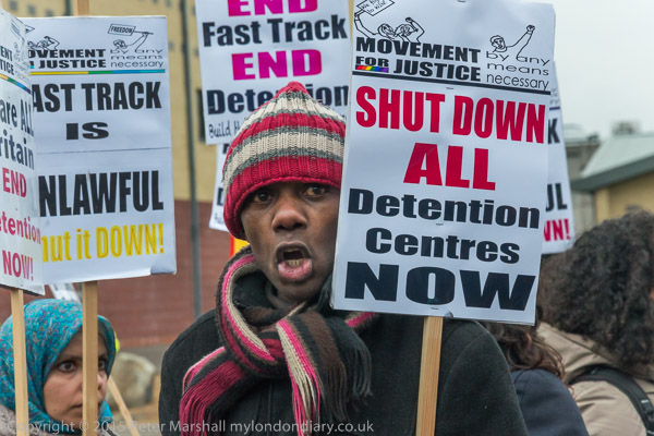
It was back in 2006 that I first went to photograph a protest outside the Harmondsworth and Colnbrook immigration detention centres, just to the north of London’s Heathrow airport.  It’s an occasion I remember for several reasons. Perhaps most strongly the intense shame that I felt listening to some of those held inside speaking about how badly they were being treated – they were able to speak from inside on mobile phones, with their voices then amplified by holding a microphone to a phone at the protest outside the prisons.  I was ashamed that my country, which often prides itself on democracy, freedom and the rule of law was clearly behaving in such a clearly racist and unlawful manner – and then it was under a government of a party I had voted for, the party I had until then supported all of my life.

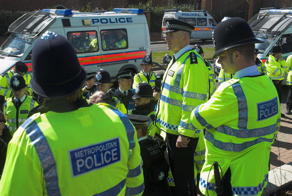
It was a protest with a strong police presence, with lots of barriers, and at one point a number of protesters who had walked down a public footpath to protest at one side of the site were surrounded by police and brought back to the main road outside. I stood on an earth bank with a couple of other photographers and photographed them, looking down.

One videographer was being held by the police inside the kettle (just visible between the uniforms above), and was showing his press card asking to be let out. But the police told him that it wasn’t a proper press card. Despite the statement on the back “The Association of Chief Police Officers of England, Wales and Northern Ireland and the Association of Chief Police Officers in Scotland recognise the holder of this card as a bona fide newsgatherer” and a verification phone number, the police simply refused to acknowledge it. This was not at the time unusual, and it still happens now despite a long campaign.

The videographer appealed to the three of us for help, asking us to show them what a press card looked like to verify that his was genuine. It left me in a slightly awkward position, as when I arrived at the protest I’d noticed that my own press card had expired at the end of the previous month, and had got through the police line to take pictures with my thumb holding it by the corner so it covered the expiry date. Fortunately one of those next to me went and showed his card, and eventually after some further persuasion the officers released the man from the kettle.  The protesters were less fortunate, and were held until the end of the protest before being forced to give their names and addresses or be arrested, and were then escorted to their coach.

UK Press cards are issued by a number of bodies, including my union, the NUJ, acting for the UK Press Card Authority and there are continuing arguments about exactly who should qualify for them. I seldom take mine out of my pocket when working, but there are a few occasions when I need it access press areas or leave events through police lines without one. That doesn’t always work, though usually when one officer refuses to let me through I’ve simply walked a few yards down the line and tried again with success, only occasionally having to appeal to a more senior officer. I also wear it visibily on a few occasions where I think it will reassure the people I’m photographing – particularly at events involving children. But for the great majority of events it stays in my pocket, tied in a holder with a cord around my belt for security.


Protesters march up the drive towards the detention centre

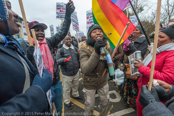
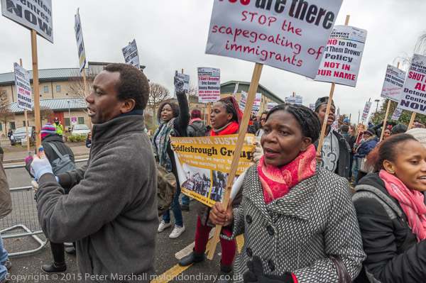
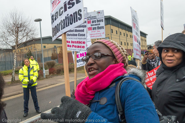
I had a little argument with the security guards at the start of the protest Surround Harmondsworth 6 the latest in a new series of protests at Harmondsworth & Colnbrook (this year brought together under new private management and renamed Heathrow) when they tried to push me inside the barriers with the protesters.  Eventually we came to an arrangement that suited me, but I wanted to make the point for myself and the other photographer and TV crew that enabled us to work as we wanted.  I did mainly want to photograph inside with the protesters, but I don’t like being pushed around and wanted to take some pictures of the banners draped in front of them on the barriers.

There were really few photographic problems, though some of the stories from protesters who had previously been held in Harmondsworth or other detention centres of their treatment were shameful, and at one point I was working through tears steaming up my glasses making using the viewfinder difficult. Fortunately autofocus works even if you can’t see the image clearly.  But this was an emotional protest for those taking part and for me. I hope it shows in some of the pictures.

As usual at these protests there was a great deal of noise, and also a lot of dancing and movement. Although security and police kept the protesters to the front of the site, well away from the detention blocks, those inside were able to hear us, letting people know by phone, and thanking the protesters for coming.


16-35mm, 16mm
Working in the middle of the protesters, wide-angle lenses were often needed, and many of the pictures were taken at the wider end of the 16-35mm, and some too with the 16mm fisheye. As usual these were later processed with the Fisheye-Hemi plugin to give the less distracting cylindrical perspective. For images of people it produces a more normal result than an extreme wide rectilinear lens, where the elongation at edges and corners can seem very odd. It often gets noticeable at 16mm, but really gets objectionable in many images if I use the even wider 12-24mm Sigma – which although it covers the full frame is better used as a DX lens. The Nikon 16-35mm, with a similar range of focal lengths on FX to the Sigma on DX is also a  sharper lens, so there is really little point in my ever using the Sigma.


16mm, Fisheye-Hemi

I prefer to use the 16mm fisheye on the D700, usually keeping the 18-105mm DX on the D800E. The reason is file size, as using the Fisheye-Hemi plug in generates a 16 bit ProPhoto RGB Tiff file with 6 bytes per pixel from the Nikon NEF file.  With the 12Mp D700 (typically giving NEF files compressed to around 12Mb) this ends up at around 70Mb.


16-35mm, 18mm
As I write this, a month after Surround Harmondsworth 6, protests are taking place inside this and other detention centres, and there are a number of more spontaneous protests with groups arriving unannounced to protest outside. A number of aspects of the treatment of asylum seekers have been found to be illegal, and a parliamentary has called for changes. Inside the centres, the legal niceties and human rights continue to be abused, but there is certainly now some hope of real change, thanks largely to the publicity generated by protests inside and outside these immigration prisons.
Continue reading Surround Harmondsworth 6

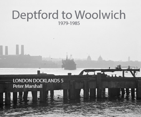
Deptford to Woolwich


Available soon

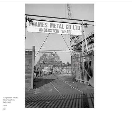
I’ve been busy the last few days, not just with taking pictures as usual, but getting my latest Blurb book ready for publication. You can see the cover of it above, and I’lll post more when its available on-line.

It’s taken me four or five months to select the images from the scans I made a year or two ago, and retouch them. There are around 80 images in the final selection, with around ten of those that I initially selected omitted for various reasons. On average each of those 80 images will have had about an hour’s work done on it.

The scans are large TIF files, typically 7250 x 4850 pixels and around 68Mb, large enough to make good prints (so long as the negatives are sharp) up to around 24″ wide, though I seldom print that big. Working on the full-size files takes longer but makes retouching less visible, though some have considerable damage, mainly from insect infestation, that needs repair.

Tiny bugs live on gelatin, making tracks, excreting and also leaving body parts embedded in the negatives. They are a variety of booklice or ‘psocids’ of which more than 5,500 species have been identified, though these are smaller than most – and could even be a previously unknown type.

I first encountered them years ago in my darkroom, when looking through the focussing microscope I found a small creature wandering around my image and looking back at me. At first I thought I was hallucinating, but was soon able to convince myself it was real. But it was some years before I realised the significance of what I had seen, and by the time I got around belatedly to treating the infestation it was far too late. The little bugs had wrought havoc and almost certainly left.

Rather annoyingly I also found some of the scans suffered from Newton’s Rings. It’s hard to get rid of these entirely, but I did work a little to reduce their impact.

Once the big files are ready and adjusted for contrast and brightness etc, a couple of Photoshop actions then produce files with the correct specifications for book production. The TIF files are 16 bit with Gray Gamma 2.2 profile, and I have a RIP which prints from these. For Blurb I want smaller files and I generate these as 8 bit CMYK jpegs with the Blurb ICC profile, adding a little slight warming on the way.

Absolutely neutral files printed through Blurb can sometimes end up with just a hint of green or blue in the blacks, just enough to annoy me, though most viewers would probably not notice. Adding just a little warmth should keep the prints neutral or slightly warm, which is far more to my taste. In the darkroom my favourite papers – in the old days Agfa Record Rapid – had slightly warm blacks.

With all the material – titles, text, captions, images – to hand, the actual putting the book together generally isn’t a very long process. Book design can take a while, and some photo books – particularly those that win prestigious prizes – are now more about the designer’s art than the photographers work.

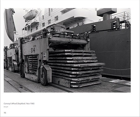
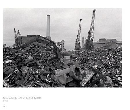
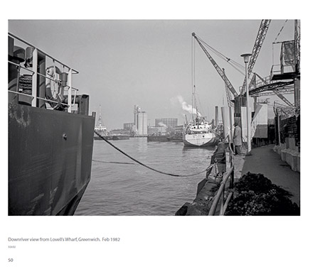
My books aren’t like this. I aim for a simple basic design that shows the pictures and presents essential information. In this book I wanted one image per page, along with the caption (place, date) and also my file reference and a page number. I dislike having to turn to a list at the back of the book to find out the basic details, but don’t want them to compete too much with the image. And I want to show the pictures as large as possible while still maintaining a decent border.

There is also the problem of using both landscape and portrait images. I’d like both to be the same size, but this is a problem with a 10×8″ book. Since most of the pictures are landscape format I’ve chosen to make a landscape format book. The landscape images are around 22x15cm and the portrait images 20x14cm, which gives them a similar weight.

This latest book is the fifth and last in my ‘London Docklands‘ series from the 1970s to the mid 80s and I’ve gradually evolved a format which I think works, and so most of the design is already there, with type styles and layouts that can be re-used. The next one with different material may need more design thinking. But I’ll probably still keep it simple.

Blurb actually have some fairly good software available for free download that I used for my first few books, but it’s a little difficult to get things exactly how you want them. So I decided to use Adobe InDesign, which I’d actually used the first version of years ago when I taught a little (very little) DTP, as I could get a fairly cheap upgrade to InDesign CS5.5, which would also enable me to edit my old Pagemaker files. Blurb supply a plugin which makes it easy to use for making their books. InDesign does also enable me to produce my own PDFs, though though the published one is made by Blurb and available on their web site.

As with other recent books, it will officially be published as a PDF (with an ISBN), but I will also make a printed version of this available, both through Blurb and also directly from me. It won’t become available on Blurb until I’ve seen the printed copy in around 10 days time – when I’ll post again. Proof-reading on screen is difficult – and I’ve spent around four hours making various minor corrections, but it wouldn’t surprise me to find more errors.
Continue reading Deptford to Woolwich

Scarcity and Waste opens


Part of the ‘thematic’ area of the exhibition

On Wednesday I went to see ‘Scarcity and Waste‘, an exhibition of the second Syngenta Photography Award, currently showing at Somerset House, London until 10 April 2015, free, and open daily from 10.00-18.00.


Rasel Chowdury and Karen Irvine

It’s an interesting show, and I was pleased to be taken with other bloggers on a tour of it by one of the jury, Karen Irvine, the Curator and Associate Director of the Museum of Contemporary Photography at Columbia College, Chicago, who also chaired a panel of four of the award-winning photographers. It was interesting to hear them talking about their work, and also to have the opportunity to talk with them and drink a glass or two of wine afterwards.


Rasel Chowdury talks with a man from Syngenta

I’ll come to the photography later, but first I want to say something about Syngenta. Although it isn’t a name that immediately meant much to me, I find it is the world’s second largest agro-company, and while walking around the show before the guided tour I began to feel just a few little seeds of doubt. And on coming home, my thoughts were confirmed when I googled ‘Seeds of Debt‘, made by Danish filmmaker Jens Pedersen, a film which blames Syngenta for suicides by Indian farmers unable to repay their debts. After threats of legal action by Syngenta, the film rights were purchased by DanWatch, “an independent media and research centre that investigates the impact of businesses on humans and the environment world-wide” whose Editor in Chief Louise Voller said they took full responsibility for its content, commenting: “We believe the message is too important. When companies like Syngenta try to threathen journalist, documentarists and vulnerable sources to silence them, we at DanWatch will take lead in making sure, that investigative journalism with documentation of human rights violations is published.”

You can watch the full 30 minute film online, or get a quick summary from the 47s trailer. Syngenta in January published a rebuttal, Looking after those who produce our seeds which you can also read, which elicited a replay by DanWatch the following day, standing by the allegations made in the film.

India isn’t the only place that Syngenta has hit the headlines, with at least two big stories from the USA. One, according to lawyers Wright & Schulte LLC is about the claims filed against them by “hundreds of U.S. farmers, corn growers, exporters and distributers…. after they allegedly incurred significant financial losses due to Syngenta, Inc.’s attempt to commercialize its Viptera GMO (genetically-modified) corn seed before the product was approved by Chinese regulators” and the other, perhaps more relevant to the exhibition, was settled in 2012, when Syngenta reached a $105 million settlement with over 1,000 MidWest community water suppliers over allegations in a class action pursued for over 8 years that  agricultural herbicide Atrazine had contaminated water supplies. A water supplier alleged in 2004  “that Syngenta knew atrazine would run off into surface water but decided to market the product with complete disregard for the expense water providers would ultimately pay to remove the chemical from the water before supplying it to consumers.

Having said that – and its information that you certainly won’t find in the material generously provided at the show or on the Sygenta Photo web site – the photography on display, whatever one may think of the corporate entity funding the show, certainly addresses fairly bluntly some of the major issues the world faces. Who too can argue with the premise of the show “In a world of limited resources, scarcity and waste have become fundamental social, political and environmental issues of our time“? Or with the conclusion “Something needs to change.” Though we might disagree rather fundamentally about the nature and direction of those changes. And perhaps shows like this may also lead at least some people to question the role of agribusiness generally – and Sygenta in particular – in actually creating some of the problems that we increasingly face.

Back to the photographs – and I deliberately haven’t included any of there here as they are shown better on the exhibition web site than I could. So I’ll include some appropriate links.


Mustafah Abdulaziz

Mustafah Abdulaziz, born in New York and based in Berlin, was certainly a worthy winner with the ten superb images you can see online. Although the top of the page has a slide show, it’s better to scroll down below to the grid of images and click on the grey rectangle, when the individual images then appear with their captions. Although these are powerful images, I think it devalues them to be seen without this essential context. Abdulaziz spoke eloquently about his work, and I was told that there will be video of the talk available on the site later.

Entrants for the Professional Commision are also required to submit a proposal for a further project related to the theme. At first I was a little surprised, even a little disappointed, that Abdulaziz’s proposal was “to look at California through the prism of water” (read more about it at the bottom of the web site page.) But on reflection it certainly makdes a lot of sense – the USA is of course the most profligate consumer of the world’s limited resources and will surely need to change more than the rest of the world.

Mustafah Abdulaziz, Richard Allenby-Pratt and Rasel Chowdhury talking

I found Rasel Chowdhury‘s work challenging. His chosen subject – the killing of Dhaka’s river by urbanisation and largely uncontrolled industrial activity – and in particular his treatment of it in dull, subdued and sombre tones is powerful, so much so that I found it hard to stay long in the room that houses it. In the leaflet and on the web site the images seem a little less extreme, perhaps rather warmer. But these are certainly not pictures I would want to hang on my wall.


Richard Allenby-Pratt

Third place went to UK photographer Richard Allenby-Pratt who has been based for some years in Dubai. Working as a commercial photographer, the landscape images from the UAE in his project ‘Consumption’ are a personal project  which  “explores aspects of the supply chain associated with the modern consumer; from the extraction of resources, to processing, manufacturing, energy production, construction, food production, logistics and retail, through to waste management and reuse.”

On the wall, I found these works rather cold, and I think they come over better on the web site (again better seen further down the page, where the captions also help to explain the inexplicable.) There is a surreal quality in thes images that appeals, particularly a half-built flyover, some pylons in the sea and trees left by gravel extraction), but on the wall I found the deliberate uniformity of approach which has very consciously been used for the project became just a little boring.  Some of the screen images seem just a little more definite than the prints and I think this is an improvement, though those pylons need to be viewed in the orginal.


Stefano De Luigi makes a point in the discussion

After the 3 rooms of the main prize-winners came the 3 winners of the Open Competition.  Benedikt Partenheimer‘s ‘Particulate Matter‘ with images through pollution with the location and air quality index as titles I think do need to be seen on the wall, and on the web lack the subtlety which is their major attraction. For me ShiziazHuang, AQI 360 was so much more impressive than the other two that I rather wish it had been the only one on show. Stefano De Luigi, winner of so many awards, including WPP in 1998, 2008 and 2010, had three great images, particularly one of a group of women attempting to get water from the bottom of a 20meter deep hole dug by villagers in Kenya, though his dead, twisted giraffe in a dried up riverbed is unforgettable.  Camille Michel’s pictures from Lapland of abandoned equipment on the fringes of Sami villages were certainly interesting. It was perhaps surprising that she was the only woman to feature in the prizewinners.

One of the questions raised at the talk concerned the tension between the aesthetic approach and the content of work addressing serious issues such as scarcity and waste.  It’s something I’ve sometimes felt difficult about in the work of photographers tackling environmental images which have produced beautiful images of hideeous pollution to be sold as high-priced art.  To a lesser extent it’s something we always face when making documentary images, the need to produce images which will interest people enough to get them looked at them while ‘telling it how it is’ and will also encouraging people to action.

The exhibition also includes several rooms of work by around 40 other photographers selected from the very large entry, which included quite a few images that intrigued or amused me, with a wide range of approaches. Although many were of interest, it seemed perhaps a little lacking in coherence. But certainly the show is worth a visit if you are in London.

Continue reading Scarcity and Waste opens

Unnecessary Replication

Although one can greatly admire the ingenuity and professionalism of both photographer Sandro Miller and “legendary Hollywood A-Lister John Malkovich” (I had to look him up, but that just shows how out of touch I am) and presumably also the makeup artists etc involved, the work in ‘Malkovich, Malkovich, Malkovich: Homage to photographic masters‘ recently shown at the Catherine Edelman Gallery and on sale as ‘pigment prints’ (which almost certainly means inkjet prints using pigment-based ‘inks’) in editions of 35 + 5 artists proofs at prices from $3,200 to $12,000, raises a number of questions.

In his discussion of the work in The Photographer and the Painting (5), A D Coleman looks mainly at the copyright angle, and whether the aping of famous images by well-known photographers, mainly still in copyright, could possibly constitute ‘fair use’ under US copyright law. Although careful to disclaim any legal expertise, he  details his thoughts on the subject using the University of Minnesota’s online ‘Thinking Through Fair Use‘ which appears to me to be very useful tool. Though again they add a clear disclaimer: “it does NOT tell you whether a proposed use is fair or not, and does NOT provide any kind of legal advice. It simply helps you structure your own reflections about the fair use factors, and provides a record that you did consider relevant issues.

Coleman also provides a link to Bored Panda which publishes 16 pairs of images, putting the remake by Miller/Malkovitch next to the original images which have been recreated, so you can judge how closely they have acheived the aim of reproducing the original works.

My initial reaction to these image pairs was “how very clever, but how entirely pointless“. And on further reflection, I think it was absolutely correct. What is the point? Other than of course to make money for Miller and the gallery (and perhaps Malkovich, who with more than 70 films under his belt, a video game and an Italian clothing line surely doesn’t need it?) And Coleman questions “The creative ethicality, if I may call it that, of generating such straightforwardly replicative ‘derivative works,’ even if legal questions don’t pertain.” Absolutely so.

What is perhaps most surprising is to learn from Coleman not only that Miller informed him that he took legal advice which told him thatthe work would be covered by “fair use”, but that the possible legal problems have not been mentioned in the many publications on the work which he lists in his post. I don’t expect it’s possible to sue lawyers for their advice, but if so I think it fairly likely that Miller may have to do so. But of course I’m not a lawyer either.

I imagine the images will sell, if only because a man who has been in over 70 films must surely have fans, some of whom are sure to have more money than sense. As a commercial proposition it would seem to make sense, but it is the commercial possibility that seems to this non-lawyer to be both something that makes ‘fair use’ far less likely to apply and also to greatly increase the chances that one of the rights-holders in the 40 out of the 42 images not in the public domain will sue.

When I taught photography, it wasn’t unusual for students to copy or attempt to copy works by well-known photographers, though usually their efforts were usually so different from the originals despite their intentions that there would have been zero danger of a law suit. But after they had done so, I would discuss with them what they had learnt from the exercise and tell them to go out and make their own work. We all learn by ‘beg, borrow and steal’, or to put it more positively, exploring the tradition and becoming a part of it, but our aim should surely be to contribute, rather than simply replicate the work of others.

I came across another case which is more debatable on Sunday, when a photographer pointed out in an online forum that a picture of sculptor Hans Haacke holding up his design for the new sculpture on Trafalgar Square’s fourth plinth published in The Guardian and attributed to “Hans Haacke/VG Bild-Kunst. Courtesy of the artist and Paula Cooper Gallery, New York” was rather similar to one he had made earlier and that was published in the New York Times last October.

There are of course similarities as you can see from the links above. It is the same man, and he is holding up the same drawing. And being known for his dislike of having his face photographed he is holding the drawing in front of most of his face.  But there are also clear differences. In the image in the Guardian the framing is portrait which I think better suits the subject, and Haacke holds the image up with two hands instead of one. He also carefully holds his drawing so that none of the horse is obscured, and the photographer has shown rather more of his black glasses, the arc of which at the left of the white print is important in the image.

There is a delicate line to be drawn. I’ve photographed Tower Bridge many times, but would not claim any breach of my rights in anyone else’s photograph of that building, even if taken from exactly the same position. For the photographer to have a valid claim I think he would have to persuade a court that Haacke had never ever held up a photograph or drawing in front of his face before, and that he was the first photographer ever to have got him to do that – or perhaps even to have got any other artist to do the same thing. It would be tough.

I’ve taken far too many pictures of people holding things in front of their faces, usually when I don’t want them to, but also on a few occasions when people haven’t wanted their face to be shown. Resemblance it seems to me isn’t enough, there has to be some real originality to claim infringement, and for me the idea isn’t orginal enough and the similarity perhaps not close enough. Of course a court might see it differently. Again, IANAL.

There was clearly an originality about Doisneau’s ‘Picasso and the Loaves‘, with two “main de Nice” replacing the painter’s hands, and it’s something that has been reused by some others, in a way that I think is fair use.  But I dimly recall a case where Doisneau’s estate prevented a rip-off of this image being used in an advertisement.

Nan Goldin

I’ve always beeen a little ambivalent about the work of Nan Goldin, and it seems a totally appropriate reaction.  A recently published feature on her on Dangerous Minds is labelled with the topics: Art; Drugs; Queer; Sex; Unorthodox; often I wonder if my own interest in the pictures might be labelled prurient. Not that I would consider them pornographic or abusive (unlike the Gateshead police). But I certainly find her work interesting.

The article, Being human: Sexuality, gender and belonging to family in Nan Goldin’s photography (NSFW) might not be safe for your work, but seems fairly tame for mine and includes a fairly short video of Goldin talking about her life and work. Although she speaks with great candour, and her work has made aspects of her life very public, I sometimes feel she does not entirely admit (perhaps even to herself) the control she exerts in making her images.

Commenting many years ago I wrote about her work “It only offers us glimpses, framed and caught with more or less skill by the person who directs it – and Goldin’s control as a director is remarkable.” Even when she is in bed and using a long cable release to a camera placed earlier on a tripod across the room.

One of the skills that distinguish good photographers of events develop is that of visualising a scene from a different viewpoint.  When you may see something happening while you may immediately make an exposure even though you are not in the right position just in case,  but the first reaction is to think where your camera should be to best photograph the scene, and to try to get there.  If the camera is fixed and you are in a different position, choosing the right moment to press the release is not largely a matter of chance but again of visualisation. And of course after the event editing, selecting the images that work best.

I first wrote about her after seeing her work in the book, The Ballad of Sexual Dependency, (you can see a 42 minute video version to a soundtrack by The Tiger Lilies on Vimeo, but it seems incredibly slow moving compared to her slide show which I saw – and there are various other shorter versions on YouTube) which she described as “the diary I let people read” and revised the piece as Nan Goldin’s Mirror on Life in 2002 after seeing her work at the Whitechapel Gallery, and again in 2007 to put on this site.

Still Life

I suppose like most photographers I’ve occasionally taken what might be labelled a ‘still life’ but it has never been a genre that has held my interest in photography. Some I’ve done because people have asked me for a particular purpose, like recording the flowers that my wife has been sent or a birthday cake she made, though these are perhaps not truly still life.

Here’s the start of what Wikipedia has to say:

A still life (plural still lifes) is a work of art depicting mostly inanimate subject matter, typically commonplace objects which may be either natural (food, flowers, dead animals, plants, rocks, or shells) or man-made (drinking glasses, books, vases, jewelry, coins, pipes, and so on).

The whole article is worth reading, and the Wikipedia MediaViewer shows images of some great examples, none of which is a photograph, though the last example is a computer generated image.

More often I’ve photographed inanimate objects as objets trouvés, and perhaps an important point that the definition above omits is the element of arrangement in creating still life compositions.  So looking at the Pencil of Nature,  Talbot’s image of a fruit bowl

A Fruit Piece LACMA M.2008.40.908

to my mind qualifies as a still life (if perhaps a rather poor one) while other images including ‘A Scene in a Library’ and ‘Articles of China’ are not, as although the photographer has carefully framed the pictures he has not (or not effectively) arranged the objects for the purpose of the photograph.

Licenced under Public Domain via Wikimedia Commons - http://commons.wikimedia.org wiki/File:Articles_of_China.jpg#mediaviewer/File:Articles_of_China.jpg
Articles of China” by William Fox Talbot – The Pencil of Nature, 1844.

There have been relatively few photographers who have made still life images that I find of much interest. Perhaps the best of these was Josef Sudek, who produced some truly fine examples. Of course many other photographers produced some fine still lifes, including Edward Weston (and many of his nudes were more still life than nude.)

What sent me thinking about this, and almost made me miss a train starting to write about it on Saturday morning, was a Facebook post about an article in Vice magazine, No More Lazy Still-Life Photography, Please , by Vice photo editor Matthew Leifheit, which includes illustrations by another phtoographer whose work in the genre I’ve also long admired, particularly for her colour work, Jan Groover. Again, Google Images is a good place to see a large selection of her work.

As Leifheit writes “any 13-year-old with a camera flash can throw some pineapples onto a brightly-colored backdrop and call it art. ” But making a really satisfying still life with a camera is I think something rather more difficult. Perhaps even more difficult than doing it with a paintbrush.

Dirty Weather

At lunchtime on Jan 28th I was with the cleaners, but it was certainly very dirty weather. Bouts of driving rain and gusts that blew umbrellas inside out if not out of your hands. I was in Lincoln’s Inn Fields, a large open area now a public park, in the centre of London.  Not as well known as some others, but it is the largest public square in central London, and was first laid out around 1630, and many of the buildings around date from the seventeenth and eighteenth centuries.

Dickins based his ‘Bleak House‘ on one of them, and the east side is formed by Lincoln’s Inn itself. For a long time filled with lawyers, the square is now being increasingly colonised by the London School of Economics, better known as the LSE. In the Thatcher era, when we first saw large numbers of people living on the streets in England, Lincoln’s Inn Fields became home to many of them, until in 1992 a tall fence was put around the grassed area of the square with gates that are locked at night to keep out the rough sleepers.

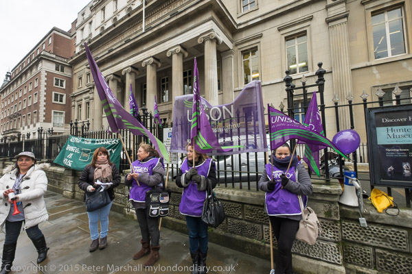
The Royal College of Surgeons of England moved here (as The Company of Surgeons) in 1797, though they built a new building in 1833 with a splendid portico, which still faces onto the square; most of the rest of the building was rebuilt after it was destroyed by a German incendiary bomb in 1941.

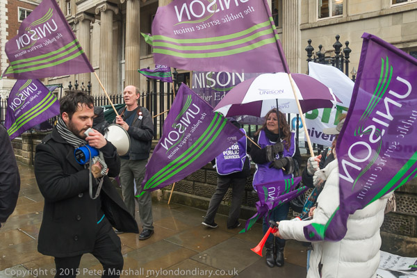
I was here because although the RCSE is “committed to enabling surgeons to achieve and maintain the highest standards of surgical practice and patient care” (according to its mission statement) it isn’t yet committed to paying its cleaners enough to live on.  Unison was here to protest for the London Living Wage, contractual sick pay and holidays for the people who clean the building, as well as for them to be treated with dignity and respect by their managers. Like many companies and organisations, the RCSE would almost certainly be ashamed of treating any of its own employees so shabbily, so they pay another company, Ocean, to do their dirty work for them.

Cleaners at the RCSE belong to Unison, and the protest was mainly by cleaners and supporters from other Unison branches, particularly in the University of London, including a number I’ve met and photographed before in Living Wage and  ‘3 Cosas’ campaigns.

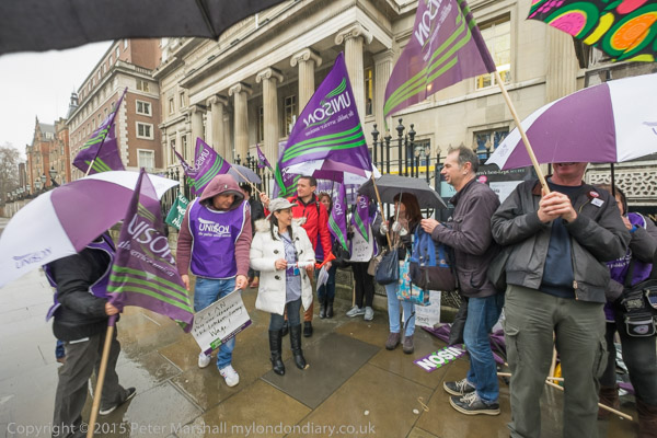
Although I always carry a small folding umbrella in my camera bag (weather in the UK is often changeable) I hate to use it while actually taking pictures. But soon after the protest started the rain came down so hard there was no real choice.

It’s hard to hold both an umbrella and a camera to photograph in a high wind, and it was tiring on my left wrist. I had to stop quite a few times to turn the umbrella around after it had blown inside out to get the wind to blow it back again, and I didn’t stay very dry underneath it, but without it I would have got soaked, and there was nowhere nearby to shelter. A few images were ruined by drops of rain on the lens filter, though yet another thing in my left had was my microfibre cloth to keep wiping the lens clear with.

At times too, the gusts pushed the umbrella down and into my field of view. But I kept on taking pictures, and there were some compensations. The union flags held by some of the protesters blew well in the strong wind, and otherwise rather dreary areas of pavement look much better when wet, and sometimes have good reflections. And the rain also brought out the umbrellas in Unison (and other) colours.

But I was pleased when I had to leave, shortly before the scheduled end of the protest, as I was cold and wet, and it was good to get to some more sheltered places away from that large fairly open square. And as I did so the sun came out.

I met some of the same cleaners (and Unison reps and organiser) the following lunchtime at SOAS, where campaigns over the years supported by students and SOAS staff have resulted in some successes, but the cleaners still want parity of treatment with staff directly employed by the University.  They say ‘One Workplace, One Workforce’. Outsourcing adds complexity and extra layers of management and can only cut costs by cutting the pay and conditions of workers. Time to get rid of it.

SOAS Cleaners demand Dignity & Respect
Cleaners protest at Royal College of Surgeons
Continue reading Dirty Weather