Terry King (1938-2015)

I was shocked last night to hear that an old friend of mine, well known to many photographers in the UK and around the world with an interest in alternative processes, had died yesterday afternoon of a heart attack.


Terry King reads one of his poems at his 70th birthday party

I wrote a post here in August 2008, Terry King at 70, which went into some of my personal involvement with him, and I won’t repeat those stories here. Terry was one of the first in the UK to kick-start interest in the potential of many historic processes with his lectures and workshops, and founded the international APIS (Alternative Processes International Symposium) meetings as well as paying an important role in keeping the Historical Group of the RPS going over the years when closure seemed inevitable.

When I first met him, I found his work using colour transparency film beautifully romantic, and a number of these images were later transformed into the fine gum bichromate images which gained his FRPS. His work and his approach were quite different to my more classical approach, but we shared many views about photography, not least about the dead end of academic theory that was beginning to blight photography – and particularly photographic education – at the time.

Terry’s was always a no-nonsense approach, seeking to cut through mystification. He read the historical accounts as well as the more recent publications, revelling in such details as the ‘raspberry syrup process’ and names like Mungo Ponton, with his magnificent beard,  the Scottish grandfather of the gum bichromate. And his sometimes chemically illiterate hands-on investigations of alternative methods led him to develop new and interesting variants on old processes such as the chrysotype rex and cyanotype rex. The latter provided a way of relieving what we both considered the great weakness of they cyanotype process, that the prints were always blue.

Terry’s company was always stimulating, and his Hands On Pictures web site is an good reflection of his character if a rather messy piece of web design.  One of the links on it is to his 2009 Blurb book, Beware of the Oxymoron, which the preview allows you to view in full with fine images matched by his sonnets and other poems.

My own photographic interests diverged fairly completely from Terry’s in the 1990s, and I saw him relatively infrequently after that time, but it was always a pleasure to meet him – as I last did in September last year, when he had a fine show of his work at the new studios he had just moved to in Kingston. And I have many happy memories of our outings together, sometimes with an 8×10″ camera lent to Terry by a photographer who lived down the road from me. It had it’s first outing with us at the bottom of my garden, photographing (badly) Sweeps Ditch with a lens that didn’t quite cover the format. Later I took pictures with it in Richmond, and helped Terry make some good exposures of the stones at Avebury. At the time I wrote one or two articles for Amateur Photographer about some of our outings along with other photographers to places like Bedlams Bottom. Perhaps one day I’ll dust off those memories and republish them.


Terry King with red umbrella at Pewsey, 1980
Continue reading Terry King (1938-2015)

In the Family Way

Most parents photograph their children. Or at least those of us fortunate enough to live at least reasonably comfortably and with our families do. Almost certainly now the great majority of those pictures will be taken on mobile phones, and many will be shared through social media. Some parents will share them privately, while others, either by accident or design will make them visible to the world. I’ve occasionally come across some which I would rather not have seen – usually on aesthetic grounds – on my Facebook feed, but usually I just hit the space bar to scroll down to the next post.

Occasionally I’ve told Facebook I don’t want to see any more posts like this (usually of cats or food) but it seems to have no real effect. A few people who only seem to post that kind of content I’ve blocked or unfriended, and some posts I’ve reported as spam.  If I saw anything that was clearly illegal I’d certainly report it to Facebook, but so far I haven’t had to do so.

Today on Facebook I read two different posts about people who have received an avalanche of negative comments after making photographic projects photographing their own children and publishing these images, prompting me to write this post, and I’ll mention both later.

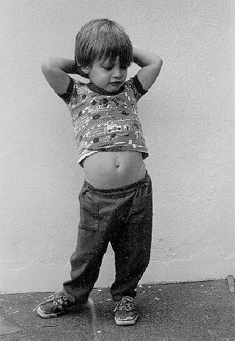
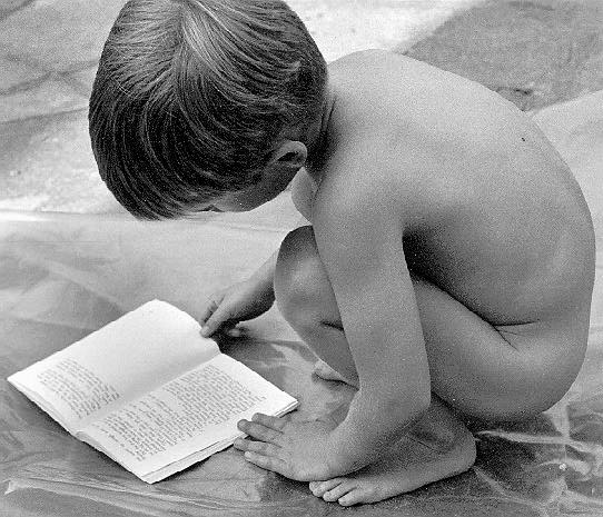
Firstly I was reminded that the first web site that used my own pictures was a small site with the title ‘Family Pictures‘, with images of my own two boys and some of their friends. I chose the images carefully as those which I felt would have an appeal outside my own family.  I was also careful to remove a few more revealing images of the children playing with friends in paddling pools and elsewhere on hot summer days that cause amusement in family circles but might have transgressed the ISP’s guidance on nudity.

By the time when these black and white images went live on the web in 1995, those two boys were in their late teens, and they helped me hand code the html for a rather basic web site and upload it to an ISP that was offering small amounts of free web space.

I updated the images a few months later to reduce image size, as some of the originals were around 100Kb and very slow to load on a dial-up connection, and got the whole site showing 16 jpeg images (and thumbnails of them) with 17 pages of html down to under 1Mb.

I transferred it to my own web space a few years later, and made a few changes to the code, removing the pre-loading of images we had thought up, which had appeared to speed up the site when going though the images in order. A full stop on each page of the site was actually the next image in the sequence resized down to a 1 or 2 pixel square. As modems got faster, such tricks became redundant, and just complicated matters. But visually the site is as it was almost 20 years ago – still the same scans, rather poor by modern standards and worsened by jpeg artifacts. You can still see all 16 images online.

Personally I find the pictures taken by photographer Wyatt Neumann during a trip with his 2-year-old daughter a charming record of childhood innocence and the relationship between father and daughter. What I find disturbing is the kind of comments that some have made about them – and also I dislike the way these images are introduced on the Upworthy site, alhtough the video is rather better than you might expect.  You can read the photographer’s own introduction to the work, which he has exhibited and published as I Feel Sorry For Your Children, on his own web site.  Those people who look at this work and see “sexual victimization and violence,” I feel sorry for their children too, and like Neumann would say “I choose life.”

Another photographer whose work has aroused similar controversy is Sally Mann, and in a long article in the New York Times, Sally Mann’s Exposure, she writes in great detail about the problems caused by such controversy, and the actions of some desperately sick people, one in particular that she goes into detail about. I’ve written before about my great admiration for Mann’s work, and a little about the misguided criticism of her for it, but had not realised the full extent of the persecution she and her family have had to suffer. It’s a moving article, and one that only strengthens my regard for her, and for the need to keep up the struggle for freedom of expression and the kind of positive family and societal values that underlie the work of these photographers and others.


Continue reading In the Family Way

Hoppé Birthday

Thanks to Luminous Lint, a great web site run by Alan Griffiths dedicated to “Building multiple Histories of Photography for those with passion…” for reminding me again on the site’s Facebook page of the work of Emil Otto Hoppé; yesterday, April 14th was the 137th anniversary of the birth in Munich of the man who became one of the best-known British photographers of the first half of the last century.

On Luminous Lint you can see a good selection of his later work, in the USA and Australia, together with examples of the kind of portraiture that made him become the most fashionable photographer in London, Mrs Lavery from 1914 and some examples from the 1920s. Perhaps surprisingly for a photographer who was probably the most prolific photographer of his age of London, there are no examples of this work.

Hoppé lived into his nineties, dying in 1972, so much of his work remains in copyright until 2042, seventy years from his death.  [Copyright law is complicated, and differs country to country; the photographer may not have retained copyright on some of his work, and some published work may by now be in the public domain.]  A great deal of previously unpublished work, along with better-known images was acquired in the 1990s by the Pasadena, California, based museum services company, Curatorial Assistance, Inc., who have invested a great deal of effort into publishing and promoting it throught the E O Hoppé Estate Collection., where you can see an interesting collection of his London images, as well as much else.

There is also an interesting page Hoppé’s Peers, which looks at some of his pictures beside some by Charles Sheeler, Edward Steichen, August Sander, Paul StrandAlbert Renger-Patzsch, Walker Evans and others.  It’s a page that confirms what I wrote in a post here, Hoppé Mad, about Hoppé and the Hoppé industry in 2009, and still worth reading in its entirety (I’ve here removed two now unnecessary links to Hoppé and Sheeler images  no longer active):

It is interesting that both Hoppé and Sheeler photographed the Ford plant in 1926/7, and you can compare the their images. Then go back and look at a similar subject photographed four years earlier by Edward Weston, Armco Steel, 1922.  If you can’t see the difference, then you certainly shouldn’t be writing about photography.

Ten years before that, in 1999, I had included a short section about the photographer in an article on War Photography, despite noting that “Hoppé, so far I know, never took a war photograph” but pointing out that he “was one of the pioneers of the ‘miniature’ cameras, taking his Leica, Contax and Super Ikonta around the world to photograph.”

Here is the rest of what I wrote about him in a very widely read piece 16 years ago:


E O Hoppé is one of those photographers whose name has almost been lost from view in the concentration on the development of the medium in the USA that has dominated photographic history in the last 60 years. His work and career can in some ways be compared to that of his contemporary Edward Steichen, (1879-1973). Both in earlier years were very much a part of the turn of the century pictorialism shown in such movements as the ‘Linked Ring‘. Hoppé became the best known portraitist of his time, photographing the rich and famous of the age, including many of the early stars of film, including Gladys Cooper, Mary Pickford and Marlene Dietrich.

Both Hoppé and Edward Steichen moved away from pictorialism and both turned commercial. Hoppé’s mastery of the new European modernism in photography was perhaps deeper in such works as his ‘Crane Land’ (1926) which frames one of London’s docks through a complex mesh of wires and rods of foreground cranes. Another interesting series was made from the top of a London bus – probably the first of projects of this type.

Hoppé became a photojournalist in the 1930s, travelling Europe and the World, although possibly his best known work is in his several books on London, including ‘The Image of London‘ (1935) and ‘A Camera on Unknown London‘ (1936). He also produced two books and the USA in the 1920s, one on Germany in 1930, ‘Round the World with a Camera‘, (1934), several books of portraits and his autobiography ‘Hundred Thousand Exposures: The Success of a Photographer‘ (1945) which remains an interesting read. It combines a great deal of advice – much of which is still apposite – including the advice ‘economy in films is unwise’ – and some interesting anecdotes, although sometimes its style grates.


Linnaeus Tripe

I can’t now remember when I first became interested in the history of photography in India, but it was something that fitted in with my desire when writing about photography to see the medium from a wider viewpoint than the typically European or US histories. And when looking at the photography of the Indian sub-continent I wanted also to place it in the context of colonialism.

Writing a dozen years ago in 2003, it was hard to find on-line resources to use to research the work of Linnaeus Tripe (1822-1902), and harder still to find well reproduced examples of his images.  The web has developed considerably since then.

I was reminded of this by a post on British photographic history by Michael Pritchard of a link to the US National Gallery of Art on-line resource Captain Linnaeus Tripe: Photographer of India and Burma, 1852–1860, on their exhibition which is coming to London later this year, at the V&A from 24 June to 11 October.

It seems to give an excellent account of  his life and the context of his pictures, but if the online exhibition is a proper representation of the actual show to have avoided the inclusion of many if not most of his best pictures. I hope this is not actually the case, but looking at it on-line it would appear to be rather disappointing in this respect.

Of course curators often have problems in loaning the material they would like to show, but with the backing of the NGA I would be surprised if this was the reason in this case.  Any summative exhibition about a photographer should start by trying to show his work at its best, not to illustrate a particular thesis.

Some of the details of what I wrote about Tripe back then are corrected and clarified by the research since 2003 and behind this show, and my article spent some time discussing published information that has been shown to be in error. Like most of my articles it incorporated little or no actual first hand research, though after publication I think I made a few changes from information supplied to me by descendents of the photographer who contacted me. Rather than rewrite it to bring it up to date, I present it here with only very minor corrections and omissions.


Linnaeus Tripe (1822-1902)

Photography in India 3

Biography

The Tripe Family

The Tripe family was apparently well known in Devon, particularly around Dawlish and Devonport, where Cornelius Tripe, Linnaeus’s father, was mayor in 1838/9. Cornelius was a surgeon, and his son Lorenzo went on to be a doctor in the area. Linnaeus was one of a large family, many of them with unusual names, some of which were handed down in the family, such as another Cornelius and Theophilus. That two of Linnaeus’s brothers were called Septimus and Octavius does however suggest a certain desperation in thinking as the family grew.

Linnaeus was probably named after the great eighteenth century Swedish scientist, Karl von Linne, better known by the Latinised name of Linnaeus (1707-1778), who first developed the modern hierarchical system of plant and animal classification.

Tripe in India

Tripe apparently first left for India in 1839 when he was only seventeen, but by the 1850s he was Captain Linnaeus Tripe, officer in charge of one of the battalions of the 12th Madras Native Infantry, a regiment founded in 1824 and stationed in Madras.

In 1854, the East India Company had suggested to the Bombay government that photography could help in the work of recording and cataloguing cave paintings and other antiquities, and offered to supply materials and equipment. Possibly at the request of the Governor General, Lord Canning, the British Army made available some of its officers in India. It is unclear if Tripe was selected because he had earlier learnt photography during one of his periods of extended leave in Britain in 1851-4, or if he was ‘volunteered’ in true army tradition and sent on a crash course. Certainly by the time he began work as an official photographer in 1855 he had gained an excellent command of the calotype process and the making of prints.

It was perhaps coincidence that the decision to appoint government photographers coincided with the setting up of the first photographic course in India by Dr. Alexander Hunter at the Madras Government School of Industrial Arts in 1855. Tripe’s later links with the school are well known, since C Iyahswamy, a photography instructor there, acted as his assistant, as is noted in the Frontline feature on Tripe.

First Photography in Burma

Tripe’s first assignment for the government was as official photographer to the British mission in the court at the city of Ava, where the Irrawaddy and the Myitnge rivers meet in upper Burma. In several months there he managed to take hundreds of large calotypes, roughly 14×10″ paper negatives, which were apparently the first photographs to be taken in Burma. They were mainly of temples, monasteries and views of city buildings. Two years later, in 1857, around three hundred of them were shown and published at the Madras Photographic Society, his first publication.

Work in India

Back in Madras later in 1855, Tripe was commissioned to take further photographs for the British East India Company and the Madras Presidency over the next few years, resulting in the publication of 6 albums of pictures entitled ‘Photographic Views of Indian Scenery: Madura, Tanjore and Trivady, Ryakotta, Seringham, Poodoocottah and Trichinopoly.’ Each contained around 50-70 pictures, together with a suitably scholarly introduction by a British expert on the area.

The scenes that he showed in the over 400 pictures he took were largely of temples, forts and other buildings, as well as images of sculptures and engravings, including a 21 print panorama of the engravings around the base of the 11th century Rajarajesvara temple in Thanjavur.

Later Life

Tripe, along with the other official photographers, was soon recalled to more military duties, taking his last official photographs in 1857 or 8. Possibly the end of the government project was connected with the Indian Mutiny of 1857-8, or simply reflected a desire to save money, perhaps because of the the short-term financial problems of the revolt. He continued a military career, taking photographs as an amateur, retiring to his home town of Devonport in 1875 having reached the rank of Major-General.

Part 2: Tripe’s Pictures

Architecture

Tripe had a very good eye for architectural form, and his pictures show a very careful choice of viewpoint so as to bring out the qualities of the buildings. He was careful to choose the time of day to give good, sometimes quite dramatic, lighting on them. Many of his pictures would serve as textbook examples of good architectural photography.

Equipment

Photography at that time involved a great deal of organisation. Tripe travelled with his assistant on horseback, with 4 bullock carts to carry the equipment needed, including tents and camping equipment so they could make themselves at home near to the monuments they were to photograph.

As well as the large 15×12″ camera he used for the main photographs, Tripe also made use of a smaller twin lens camera to take stereoscopic views. This produced two small images roughly the same distance apart as the human eyes on a single sheet of calotype paper. When viewed with the appropriate viewer it gave the impression of a three-dimensional view.

Invented just before the invention of photography, the stereoscope was a sensation in Victorian parlours once it was possible to publish relatively cheap stereo views on paper rather than the expensive daguerreotypes of early years.

Entrance to Temple of Minakshi in the Great Pagoda

In this picture, Tripe has taken the entrance from a rather more oblique viewpoint than normal. The reason for this is clear, enabling us to see past the imposing temple entrance to the giant structure in the background. The lighting is carefully chosen to bring out the details in the front of the gateway while obscuring as little as possible in the delicately handled shadows.

Madura. The Great Pagoda, Mootoo Alaghur and East Gopurum from Tank

This view across the water has been framed so as to make the most of the reflection of the arcade in the water, blurred perhaps by a little breeze to produce a simplified result. The angle of view is carefully chosen so that the effect of the angle of the two sides opposite is reduced.

The picture appears to have been taken from the same level as the bottom of the arcade, keeping the camera back level and using a rising front (or a cropped negative) to retain verticality in the towering structures in the background. The picture hints at symmetry, with the two rows of arches, the two towers and the two groups of trees, but avoids it.

Aisle on the South side of the Puthu Mundapum, Madura

This dramatic view along the aisle is dominated by what are apparently deep shadows of the row of pillars falling from the right across the stone flags of the floor. At the right are the pillars themselves, half burnt out by the strong light. It is a powerful effect, but also one that I find it impossible to understand.

Why are the top halves of the pillars and the wall at the left of the aisle apparently in shadow? Why do the shadows stop at they do, more or less at the base of the left-hand wall? Are the row of pillars to the right of the picture simply free-standing columns, with their tops disappearing in the darkness at the top of the picture? Why are the lower parts of the pillars on the right, so clearly in the shade from the direction of the shadows, so bright on the image? I keep looking at this picture and failing to understand how it could be produced.

Some of the effect might be explained by the use of two exposures, at different times of day or using different lighting, perhaps one during a period of cloud and the other in bright sun. Its also possible that some of the apparent exposure differences shown could be due to parts of the structure being painted in darker colour than the light stone. At this point I begin to wonder if the ‘shadows’ are really shadows at all.

Great Pagoda, Great Bull, Front View, Tanjore, India

Even in this small reproduction we get an powerful impression of the scale of this temple, bursting out of the very frame before our eyes. Taken from a low viewpoint, the camera kept vertical to keep the pillars upright, the roof is cut off by the edge of the frame at the top right, and we see clearly a view with the camera straining, looking up towards the ceiling. At the left, one of the pillars is mainly cropped away by the edge of the frame, and to its right another reaches up and beyond the top.

Careful camera placing gives a procession of vertical elements clearly separated across the frame, clear areas of sky between them. Again we can see how a careful choice of the time of day has created powerfully effective lighting.

Part 3: Tripe’s Techniques

Calotype or collodion?

There are differing reports of the technical basis of Tripe’s photography. Although his pictures are generally described as being made from waxed paper calotype negatives, there are some sources that suggest Tripe claimed to have used a dry collodion. Some of his negatives are in the collection of the Royal Photographic Society, and are definitely waxed paper, but later work, particularly as an amateur, could have used a dry collodion plate.

However a more likely explanation is simply that Tripe when asked if he used a wet plate stated that he used a dry process, and that this has been misunderstood. Although technically it is just possible, Tripe was recalled from his photographic duties to more military exploits around 1858, before dry collodion processes became widely established.

Taupenot Process

The earliest successful dry collodion process was the Taupenot process, details of which were first reported by Dr J M Taupenot in September 1855. This used a collodio-albumen plate.

The glass was first carefully cleaned, then coated with an iodised collodion solution thinned by the addition of more than the normal amount of ether, sensitised in the normal silver bath as soon as it has congealed sufficiently on the surface. After several minutes in the silver bath, it was washed with distilled water, and while still wet, treated with an iodised albumen solution containing sugar. This was made to flow across the surface in all directions before the plate was drained off and left to dry.

The plates were not very light sensitive following this treatment, but required a second immersion in a weak silver bath containing acetic acid. After this they could be dried and kept for weeks or even months before use, although they lost sensitivity on extended storage. Exposures needed to be several times those on normal wet plates, typically requiring perhaps 10-60 seconds in good light with a reasonably fast lens for the time with an aperture around f11. Processing after exposure was as normal.

Such collodio-albumen plates could give results with greater detail than a calotype negative, and greater delicacy of tone. There were later improvements of the basic Taupenot process – such as the Fothergill process – which made the preparation of plates easier, but did not alter the results obtained.

The results in a contact print from any of these dry processes would not be greatly different to those from the best waxed paper calotypes. Without access to Tripe’s negatives or a very detailed analysis of his prints, probably with a magnifier to look for the presence of residual paper texture, it would be difficult or impossible to decide.

His earliest pictures, dating from the middle of 1855 could not have made use the Taupenot process, but certainly the details would have reached India in time for some of his later work.

Albumen or Salt Prints?

Similarly, Tripe’s prints are sometimes stated to be albumen prints, sometimes salted paper prints, while some hedge their bets with statements such as ‘lightly albumenised salt prints’. The pictures are clearly not the high gloss double coated albumen prints that dominated photography in later years of the nineteenth century. They have the matt surface of a typical salt print, although some have a tonal richness that might suggest the presence of albumen.

Few people – curators, gallerists or photographers – have seen good modern salt prints, let alone made their own. There are many more examples, both contemporary and vintage, of poor quality salt prints, often flat and low density. Making good salt prints needs negatives with a full tonal range, high contrast and low fog levels; this combination, together with a well coated paper can give prints similar to those of Tripe.

From the early 1850s, photographers often added albumen to the salting solution used in making printing paper, giving what are sometimes known as matt albumen papers. Although we tend to think in terms of separate categories – salt prints and albumen prints – in reality there are a whole range of possibilities, and without detailed process notes from the photographer it is difficult or impossible to distinguish one from the other.

It’s a difference that is largely academic, although the presence of albumen results in a less stable print. James M Reilly in his classic work ‘The Albumen and Salted Paper Book’ (available on line) states “it is probably safe to say that not a single albumen print survives from the 19th century without some degree of staining in non-image areas.” The absence of this yellowing is probably the best simple test to distinguish albumen from salt prints.

Later Photography

Although Tripe’s work as a government photographer probably ended in 1857, he was still making portraits in 1858, including one of Sir Alexander Arbuthnot, founder of the Madras Cricket Club – as well as its university.

He continued to photograph as an amateur in later life, taking pictures around Devonport, possibly while on extended leave, as well as after his final return there on retirement in 1875.

Back in Devonport, Major-General Tripe, who was unmarried, took an active interest in local affairs, serving for example as secretary to the committee of management of Stoke Public School there, and living in the town until his death in 1902.

A ‘Catalogue Raisonné’ containing illustrations of all of Tripe’s work in India and Burma was published by the Art Gallery of Ontario in 2003.

 Peter Marshall 2003

Estates of Mind?

In 1951, a part of the Festival of Britain was the Live Architecture Exhibition, on what became knows as the Lansbury Estate in Poplar, and at its centre was Chrisp St Market, the work of architect Frederick Gibberd, the first purpose-built pedestrian shopping centre in the UK.

It wasn’t entirely succesful – and his iconic Clock Tower built as an observation tower soon had to be caged in against suicides, but it was an important statement of a new vision in housing, with huge programmes over the next thirty or so years to provide social housing for the mass of the population, replacing both the areas destroyed by bombing and the decaying streets of jerry-built Victorian slums. There was a national feeling, an urgency that something had to be done about the housing problem, and a consensus that a large part of the solution lay in providing social housing at resonable cost for the majority of the population at least in the major cities.

The problem was also addressed by the New Towns, such as Bracknell, where I myself lived in a Development Corporation flat for several years in the early 70s, but in London and other cities it was an era of large estates, often system-built and with much bare concrete surfaces.

The best of these were architectural gems and masterpieces of design, and while some may have looked they were often spacious and comfortable, offering many residents for the first time the kind of conveniences we now take for granted. But like all property they needed proper management, with regular repairs and maintenance, and in most cases local authorities failed to meet the challenges of ownership, allowing properties to run down. There were sometimes design faults, more often corners cut by the builders and, certainly in later years financial pressures on councils that made their job impossible.

Now the pressures on these estates come largely from the increase in land values and the greed of developers and councils. Many of these large estates are in highly desirable locations, and huge profits can be made by demolishing and rebuilding at a much higher density and to lower space standards for private sale. It’s a process part-fuelled by overseas investors buying properties not essentially to live in but for the capital gains from rapidly increasing house prices, particularly in London. Investment brochures for one block in Aldgate suggested that buyers would see a 35% rise in the value of their flats in around three years- and that prediction may well turn out to have been conservative. But can we afford to let London become simply a proiftable  safe deposit for foreign money rather than keeping it as a living city?

The name of this un-housing game for financiers is ‘regeneration’; a worthy aim announced in the early years of the last Labour government with probably the best intensions that has turned into a nightmare for Londoners on low or middle incomes. But while its first proponents may have been simply naive, it has turned London’s largely Labour councils into villains in league with property developers in boroughs including Labour strongholds such as Newham and Southwark as well as Tory boroughs including Brent and Wandsworth.

We’ve already lost much good, serviceable property, along with some of the best architecture of the era, such as the Heygate estate, where a long process of neglect, demonisation and PR enabled Southwark to sell off the now-demolished estate against the wishes of many of its residents, at a time when many of its buildings and landscape were just reaching maturity.

The Heygate too was one of the starting points for the now rapidly growing protests about housing across London – and which were certainly a part of the reason why Southwark has lost millions on that particular deal. Despite which, they are still going ahead with a similar scheme on the larger neighbouring Aylesbury Estate, currently the subject of occupations and battles between housing activists and security guards aided by police, and where some remaining residents now find themselves behind tall fences in what looks like some kind of prison, having to make lengthy detours and show documents to be let in or out – and to go to the security gates to meet any visitors.

Other protests too have made the news. Some appear to have met with some success – after Focus E15 mothers occupied an empty block on the Carpenters Estate, Newham has now moved a number of families back into properties they had left empty for ten years in their attempt to empty and demolish the estate. New Era tenants evaded eviction before Christmas (thanks to a little help from Russell Brand) with their block being sold to another housing association.

Other protests continue across London, including those over Sweets Way in Barnet, the West Hendon Estate, the West Ham football ground, Cressingham Gardens in Brixton, Fred Wigg and John Walsh Towers in Waltham Forest, the West Ken and Gibbs Green Estates in Hammersmith & Fulham, the Sutton Estate in Chelsea, Guiness Trust on the Loughborough Park Estate,  Northumberland Park and other estates in Haringey, and of course the ‘Poor Doors’ protests at One Commercial St, Aldgate.  Regular readers of this blog or visitors to My London Diary will be aware of some of these.

I began this post at Chrisp St, because I was there last night for the private view of  ‘Estates of Mind‘, a photographic show in which “Six photographers explore various social housing projects from the 1960s and 70s; an era of radical architectural determinism and social restructuring.” (Open between 12-6pm on 9-12 April and 15-19 April.)

The invitation continues with a question “What can we learn today, in a time of great uncertainty in social housing from their successes and failures.” Although there is some interesting photography on display, some of it taken on some of the key estates now under dispute, this is perhaps a question that the show largely fails to engage.

What I found most satisfying were the set of images by Mike Seaborne, who I’ve known and sometimes worked with for around 25 years (including on the Urban Landscapes web site), and in particular his combination of images that he took around the turn of the century with those from this year on the Isle of Dogs. It is perhaps the only part of the show which says something about what is happening through its use of these ‘then’ and ‘now’ views, as well as displaying a discerning choice of viewpoint and an admirable clarity of treatment.

Also of interest to me were pictures by Peter Kyte from Grahame Park in Colindale, North London, Barnet’s largest housing estate on the former Hendon Aerodrome developed in the 1970s and named for aviation pioneer Claude Grahame-White. The estate underwent some regeneration in the 1980s, removing some of the connecting walkways., but its major regenertion began with a demonstrtion phase in 2007, with the first major phase being completed in 2012 and is continuing. The original 18-year programme proposed the demolition of around 75% of the 1777 properties (including the long low-rise blocks of flats that give the estate its character) and their replacement by slightly over double that number of new properties, of which roughly 30% were to be social housing.

Unlike most other work in the show which is largely straightforwardly documentary, Kyte’s work is a very personal vision concentrating on the long dark passageways he saw there, emphasized by heavy printing and by the cropping to a tall narrow format in his 20×12″ prints. The work had a impressive coherency, though I think one that tells us more about the photographer than either that particular estate or the more general problems of housing in London.  I wondered particularly about how his view as a visitor might differ from that of someone for whom the estate was home.

There is also perhaps something of a contradiction in the location of the show, an empty shop made available for the show by the owner, Poplar HARCA (Poplar Housing and Regeneration Community Association) who a few years ago took over the regeneration of nearby Erno Goldfinger’s Balfron Tower (where this group held a show last year) from Tower Hamlets Council. As the Docklands and East London Advertiser reported earlier this month:

It appears that social landlord Poplar HARCA are preparing their tenants in Balfron Tower to leave the building so that the rich can purchase the newly refurbished flats. Another east end community is being destroyed for profit. A sad and insulting legacy to the values of its architect Erno Goldfinger, and that reminds us how little the voice of the powerless are heard, or acted on.

Rather earlier in 2010, Michael Newman had commented on an article in BDonline on the renovation of Balfron Tower:

This article is well written and informative but as a resident of Balfron Tower I want to point out that paragraph 3 is incorrect.

“Once refurbished, residents will have the choice of keeping their heads in the clouds or putting their feet back on the ground by moving into newly built homes elsewhere on the estate. “

At the moment HARCA has informed residents of its aim to refurbish and to empty the building to do so, but has failed to mention the choice of returning to their homes.

It appears that HARCA and those partners it is working with are forcing the present community in the Tower to leave their homes and never to return. So much for the values of social housing, for helping communities, and for a ‘Golden Future’ for the Tower and its inhabitants.

It looks like HARCA will refurbish the Tower, will sell off the flats and as usual the rich and so-called cultured will buy the right to ‘homes in the sky’.

I wonder what Goldfinger would think of HARCA’s guardianship of his building, and the council who historically were brave and fought for rights of its people.

Housing is a vital topic, particularly in London, and one which has, largely through the efforts of various protest groups, and marches such as January’s large ‘March For Homes‘ forced itself onto the news agenda. It’s good to see photographers and shows tackling it, but I would like to see ones that perhaps incorporated rather more thought and provoked it for those not already involved in the issues.

Lambeth Night

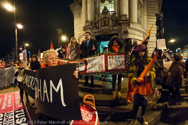
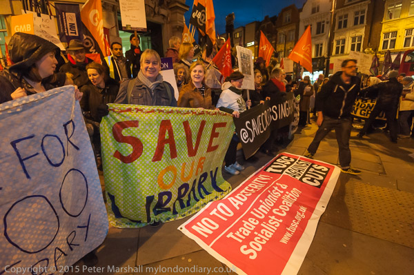
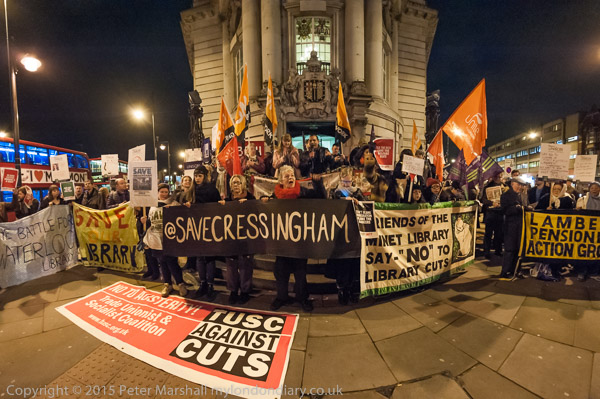
Covering the protesters outside Lambeth Town Hall on the evening that the borough council was voting on £90m cuts in local services provided some intensive testing for my Neewer 216 LED lighting panel and also for my flash technique. The Newwer perhaps did rather better.

The steps into the council offices on the corner of Acre Lane in Brixton should be a relatively well-lit area at night, on the junction of two major inner city roads, but it seemed surprisingly dark, and there were certainly some very gloomy areas in the crowd, both at the council policies and also in terms of luminance.

I started out working with the Neewer unit with both the D700 and D800E, holding the unit in my left hand and directing it appropriately. I’d decided to work with the orange 3200K filter, hoping it would work better with the ambient street lighting, and with that absorbing around a stop of light I was able to work at ISO3200 and shutter speeds around 1/30s with an aperture of f4 (the 16-35mm wide open.)

It was that slow shutter speed that caused most of my problems, with many images having the people blurred. But enough managed to catch them withoug subject movement for it to work well, at least until I wanted to photograph anything more than three or four metres away. Even then with some images, the extra light in the foreground was useful.

Working at f4, even with a wide angle, depth of field can be fairly limited, especially when working at close quarters, which is of course sometimes a good thing. But its better when you have enough light for this to be a choice rather than an imposition.

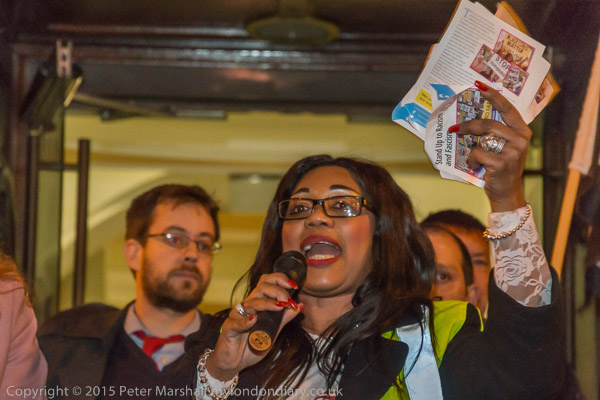
With the D800E and the 18-105mm lens I soon switched to using flash, particularly for the speakers, who were a little far away for the LED light, and where animated gestures would have otherwise been a blur.

I’m not sure why, but it was the flash images that gave me the most exposure problems; some days I just don’t seem to be able to get the flash to do what I want, and many were considerably underexposed. When you get it right, the Nikon flash system can work wonders, but there seem to be quite a few quirks that can easily fool the occasional user like me.  Lightroom was able to save the day on most of them.

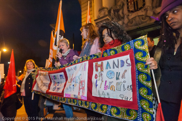
Towards the end of the event I switched to the 16mm fisheye on the D700 to photograph some wider views. Although the Neewer only gives even illumination over a fairly narrow angle, with fall-off becoming fairly noticeable at any focal length less than 35mm, it was still useful, enabling me to light the darkest parts of the 146 degree horizontal angle of view. There were some fairly wide variations in lighting across the whole of that scene, and angling the light into some of them gave me a usable result.

With many of these images, consderable post-processing was needed in Lightroom. The images needed rather more overall luminance noise reduction than my standard setting, along with quite a lot of dodging and burning to even out the lighting. Different light temperatures in different areas also got some attention. I can’t say that the colour is perfect, but technically – thanks to Nikon with some help from Lightroom I find the results impressive. Certainly nothing like this would have ever been possible with film. You can judge for yourself at Lambeth against £90m cuts.

Continue reading Lambeth Night

Firefighters on Strike


D700, 16-35mm, 16mm

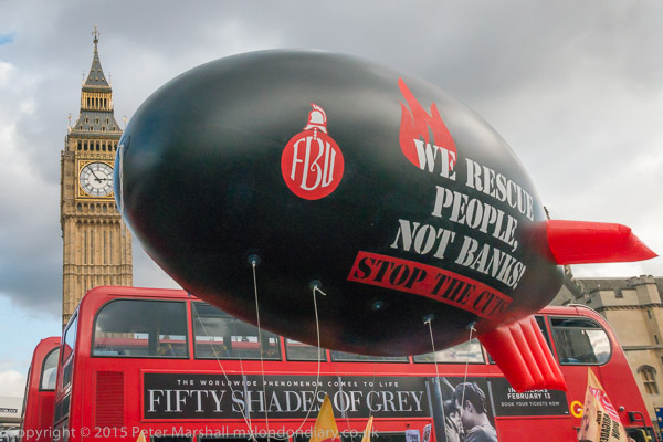
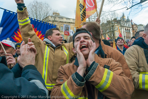
Although I’d known that the Fire Brigades Union were on strike and having a conference in Methodist Central Hall, just a couple of hundred yards from Parliament, I hadn’t come to Westminster to photograph them, but another protest taking place nearby. So it was something of a bonus to come across them sitting and standing in the roadway in front of Parliament. Apart from anything else it made it easier to cross the road!

I’ve long felt that Parliament Square should be improved, and one of the major improvements would be to take away the traffic, at least from the roads on two sides of the square, between it and Parliament and Westminster Abbey.  It just isn’t a good idea to have one of London’s major squares as a traffic island.

But the firefighters obviously have good reason to be upset, with promises clearly made to them having been broken, and I wasn’t surprised that they came to show their anger. Nor that police were treating their protest in an unusually relaxed fashion – they share a common bond with their fellow emergency workers and also many of them feel they too have been shafted by the government. And certainly it would be unwise to tangle with the firefighters, who are undoubtedly fitter and tougher than the average police officer.

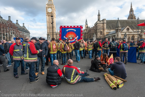
It was too and almost perfect winter day for photography, with great light and good clouds, with a literal grey cloud over Parliament as well as a metaphorical one in front of it. I’ve always liked open shadows in my images in both black and white and now in colour, and the combination of Nikon sensors  and lenses with Lightroom 5 perhaps sometimes tempts me to take this to extremes.  The 16-35mm, here used at 16mm, f10 with a shutter speed of 1/400 at ISO 640 is a very sharp lens. Every slate on the roof at right is clearly defined and at 100% on screen the 4256 x 2832 pixel original processed with my standard noise removal and sharpening defaults seems noise free.

I’d arrived at a point where the protesters were uncertain about their next move, had missed the excitement of the marching on to the road and occupying the space. The grey of the roadway is a great background on which the individuals sit or stand, setting off their colours, which are perhaps just a little more saturated than real, the yellows, browns and reds of the jackets, warm colours that cluminate in the flames of the banner, set against a blue background and the blues of the working jeans.


D800E, 18-105mm DX, 24mm (36mm eq)

I took more pictures – you can see some of them in Striking Firefighters block traffic – and then photographed them as they made their way up Parliament St to Whitehall, stopping outside Downing St.

Things were rather crowded and chaotic there, and it was difficult to make pictures as both firefighters and other photographers filled any empty space.


D700, 16-35mm, 16mm

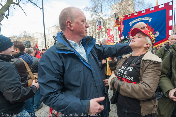
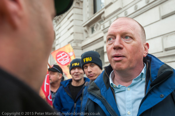
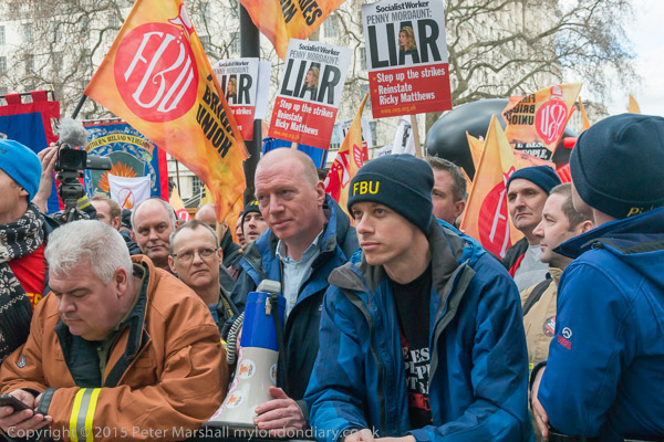
At Downing St I kept my eye on FBU leader Matt Wrack when he came to the gates, wondering what he would do next. As he moved around I tried to keep in a position where I could see his face, while also taking pictures of the firefighters who were crowding around him and shouting towards Downing St.


D800, 18mm (27mm eq)

When a police officer pushed his way through the crowd to speak with Wrack, I was at his side. Perhaps ideally I would have been a little further back, but I was wedged firmly in place, hardly able to move an inch in any direction, though just managing to have enough space in front of me to work with the 16-35mm.


D700, 35mm

I took what I thought was a rather nice series of photographs of the encounter, although all seen from that single viewpoint. It was as Wrack commented a surprisingly polite encounter with the officer asking what the firefighters wanted to do, taking down Wrack’s mobile number and then going away to see if he could arrange for someone from Downing St to come out and meet with the firefighters as requested.

By this time I was worried about missing the event I had actually come to Westminster to cover, and though I was in an interesting position I decided to leave. It wasn’t easy to make my way out through the dense crowd, but they were good-natured enough to squeeze out of my way.


D800E, 32mm (48mm equiv)

When I got as far as the gate leading into Downing St, a few yards down the road, I decided to go through it. I didn’t want to actually go inside as nothing seemed likely to happen there, and it involves and airport-style security check (those without a Press card have to apply days in advance and bring a passport) and I avoid it unless I really have to, but going just a little way down it did allow me to photograph the crowd from ‘inside’.

Had I stayed there any length of time, I think the police would have ordered me out, but I was able to take a few pictures and then move away without problems.

Striking Firefighters block traffic

Continue reading Firefighters on Strike

1000 Words

There are quite a number of things of interest in the current issue, No:19, of 1000 Words. Peggy Sue Amison‘s interview with Ken Schles about his Invisible City/Night Walk is certainly one, and certainly some will enjoy the rather curious work by Nobuyoshi Araki in his ‘Marvelous Tales of Black Ink‘, reviewed by Ivan Vartanian, though it and some of the other photography isn’t particularly to my taste.

There is also a review of a book that I’ve bought, Laura El-Tantawy‘s ‘In the Shadow of the Pyramids‘, an intensely personal view of Tahrir Square and the 18 days there in January and February 2011. It is an interesting book but perhaps one that is rather more personal than Gerry Badger’s review suggests. This isn’t as he says a photobook to do justice to ‘one of the most important manifestations of dissent within the Arab world, the ‘Tahir Square’ revolution‘ but a very personal document centred around this. It’s also a book where the design, sequence and layout play a vital point, something which is lost in the presentation here. It really needs a proper ‘book preview’ to do it justice rather than just a set of images.

But perhaps the most interesting article to me was an interview with Francis Hodgson, Photography Critic for the The Financial Times and much more, and in particular his discussion of how “we decide what is ‘good’ in photography“, or what matters, along with some interesting thoughts on photographic publishing.

Greek thoughts

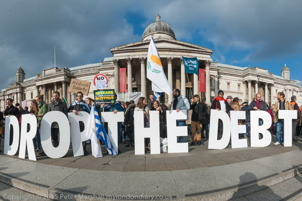
Let Greece Breathe! was a fairly busy event, with quite a few  photographers and videographers and fairly crowded, making it difficult to get exactly in the places I would like to have been.

Video and still photography have very different requirements, and sometimes this can be a problem. Video generally works best for most things when the camera is static for fairly long periods, at least much of the time, preferably on a tripod. In contrast, being in the same place for long as a still photographer is generally a bad thing, leading to too much repetition in your images. Even for simple things like photographing a speaker, its usually good to be able to vary the background. Composition is I think generally far more important in still images than in video.


At this event it was difficult for still photographers to move around without getting in the sight lines of a couple of video crews from foreign TV; it would have been easier had they set up closer to the tape separating the audience from the speaker. Though I tried hard not to get in the way I think that Greek TV viewers will have got the occasional view of my slightly bald patch on their screens.


To keep out of the way of the TV cameras I spent rather too much time close to one of the two speakers on stands at the front of the audience, and it was loud enough to probably damage my hearing and certainly to give me a headache – after a while I simply had to move away.

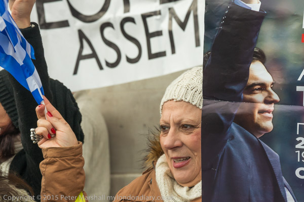
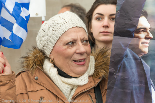
One of the things I try to do is to find an idea and then to pursue it until I’m happy that I have captured it (or sometimes simply have to give up.) One of the things that I noticed at this event was a Syriza poster of Alexis Tsipras with his head at roughly life size, and I tired to use this in pictures with the heads of real people, three of which you can see above.


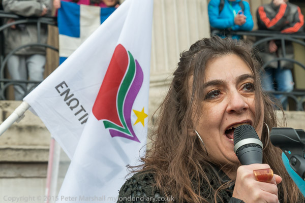
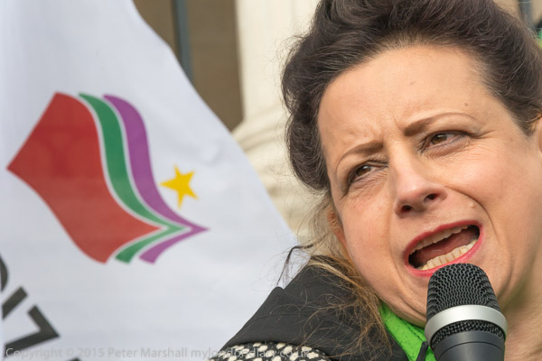
Another little series of images was of the various speakers with the Syriza symbol on a flag behind them. This was made a little tricker as the flag was being waved around, and flags are in any case often something of a challenge as they get blown around – or simply droop when you need them to fly. Add to that the need to catch the speakers in interesting or dramatic expression or gesture – and with their eyes open and you have a challenge.

There are a few more of these and some variations in Let Greece Breathe!

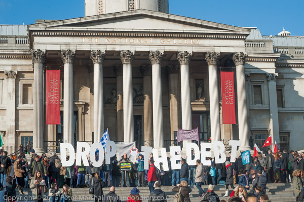
A different challenge was posed by a line of people on the steps leading down into the square from the North Terrace where the rally was held. If you approached too close it was difficult to get the whole message, while if you moved back, someone was almost certain to get between you and the message.

Often in situations like this the 16mm fisheye with its 146 degree horizontal angle of view solves the problem of getting close but getting everything in the view. But in this case I didn’t find it entirely satisfactory. Although the verticals are straight (thanks to the FIshEye Hemi plugin) I find the curvature of both the step at the bottom and the roofline a little distirbing. It is possible to remove these but only at the expense of some rather curious heights of the people across the central row who would get considerably taller towards the edges.

I tried with the 16-35mm, both from a fairly central position and also form one side of the othere, but was even less happy with the results and none of my attempts appear on line (though a long line of photographers was busily taken them from there.) But later I did go some way futher down into the square, far enough back to take a picture at the wide end of the full-frame 70-300mm. There are a lot of people in front of the message, but they appear less imporant from a distance. Possibly going even further away, particularly if I could have got a little height from climbing on to the plinth of Nelson’s column, would have given a better view, but the people put down their letters and dispersed before I had time to try it.

Continue reading Greek thoughts

Funny Valentine

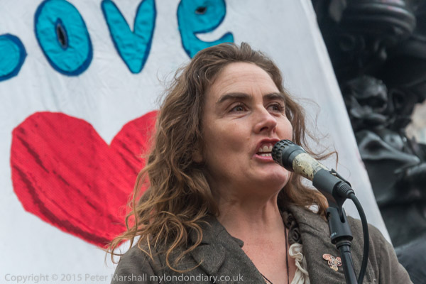
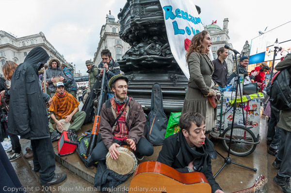
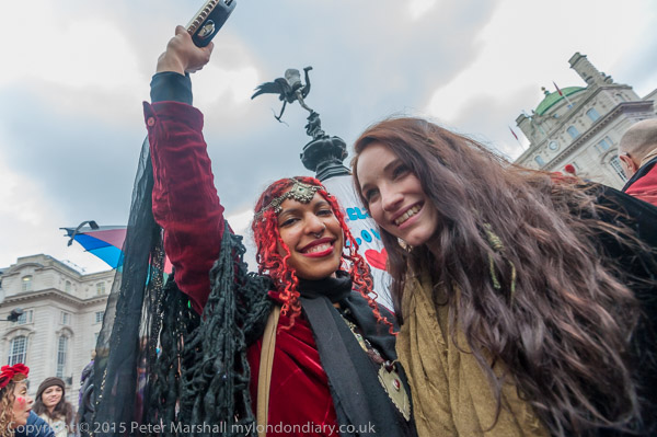
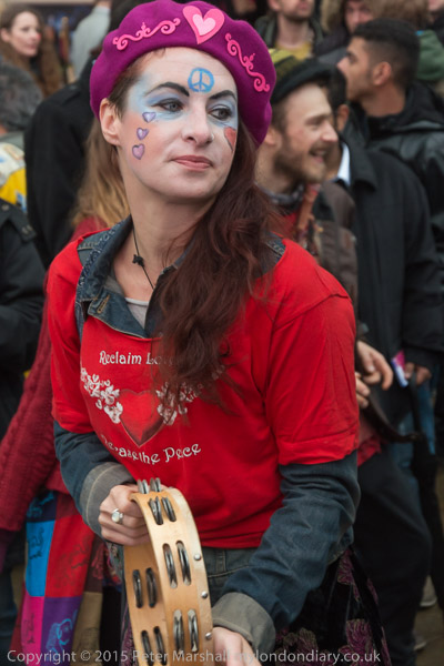
One annual event I always enjoy as well as photograph is the annual free Reclaim Love Valentine Party around the statue of Eros (well it isn’t really Eros) in Piccadilly Circus. Irish (or Irish/Indian) poet and love activist Venus CúMara (“nomadic lone wolf, poet, musician, songwriter, and storyteller“) began these events back in the early years of this Millennium and they have taken place every year since both here and elsewhere around the world.


Venus CúMara

I missed the first Reclaim Love event, which was in Trafalgar Square, as I spent Valentine’s Day in Paris in 2004, but was there for the first party at Eros in 2005, and have photographed the events every year since, including the one year that Venus was unable to attend and was organised by her friends. And it’s an event I have the t-shirt for, as in the early years they were given away free. One of my sons also has a pink one I gave him which he sometimes wears, with its winged heart on the chest and the message ‘May All The Beings In All The Worlds Be Happy And At Peace‘ on the back. I have a rather more tasteful pale blue version, though it is seldom seen in public.

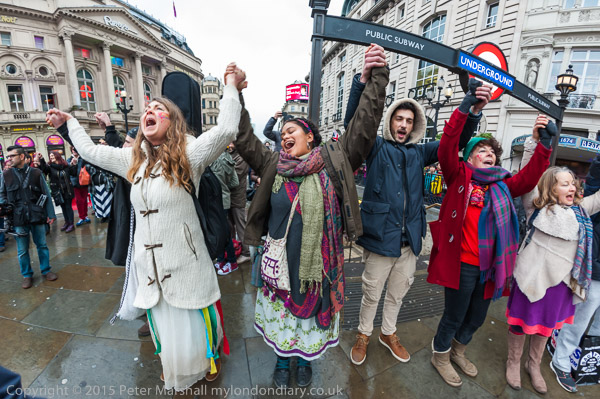
Every year is different, although they follow the same basic pattern, with samba and dancing, people dressed up and in the middle of the afternoon everyone linking hands in a giant circle to chant the mantra above. Everyone except a few photographers like me, who run about dementedly trying to photograph the event. And while I may have a certain sceptism about the “Massive Healing Reclaim Love Meditation Circle beaming Love and Happiness and our Vision for world peace out into the cosmos” it’s always an impressive event.

With all the commercial promotion of Valentine’s Day it would be hard to miss – though the party is on the nearest Saturday rather than the day itself. And the party is a reaction to that commercialisation, a celebration of love rather than money. Venus, when asked where she is from has said her place of origin is Love, and the Reclaim Lovemovement aims at restoring the true and infinite meaning of Love as a force for inner and outer change.”

This year was ‘Reclaim Love 13‘, though as the 2007 event was billed as Reclaim Love IV, I think it is only the 12th. The party is also an ‘unofficial’ event, and though Venus and friends certainly do some planning and reminding people to come and take part there is a great deal of spontaneity about the event, people coming and doing what they want to do. Some of those who take part know and some have come a long way across the country, but others come across it by accident, with tourists and shoppers joining in.

The police and security in the West End generally ignore it, or take a look to see what is happening and then go away -though obviously they keep an eye on it through CCTV – the party is after all more or less on top of London’s nerve centre for surveillance, the London main CCTV control room. They have intervened when people have climbed right up to Eros – it isn’t the most robust of sculptures, and there was a little trouble one year when the circle took place a short distance away in a ‘sacred circle’ of trees in Green Park – such things are not allowed in Royal Parks.

This year the weather was not too kind, and it was dull with the odd spot of rain in the air as people gathered for the party. I’d started working at ISO 800, but soon had to put that up to ISO 1600 and by the time I left, shortly after the big meditation circle around Piccadilly Circus I was needing ISO3200 to stop the action. Night was falling a little faster than normal with some large dark clouds, and when the rain began to fall I decided it was time for me to go.

I was a little disappointed with the pictures. Perhaps it wasn’t quite such a lively event as some earlier years – and poor weather has an effect on everbody, partygoers and photographers alike. I think it’s still a reasonable picture of an interesting event in the London calendar, certainly rather more interesting than many if not all that make either the tabloids or the Tatler. You can see my results from this year at Venus CuMara Reclaim Love 13 at Eros, as well as those from previous years (sometimes you will have to scroll down on the linked page to find the pictures.):

2005:  O-i-L, One in Love, Reclaim Love
2006:  One in Love, Reclaim Love
2007:  Reclaim Love IV
2008:  Reclaim Love
2009:  Reclaim Love
2010:  Reclaim Love
2011:  Reclaim Love
2012:  Reclaim Love
2013:  Reclaim Love
2014:  Reclaim Love

Continue reading Funny Valentine