Brian Griffin: Himmelstrasse

I don’t think I’ll be able to make the book launch of Himmelstrasse by Brian Griffin at the Photographers’ Gallery tonight, though the book with its images of the railway tracks in Poland which took around three million people to the death camps seems a powerful and impressive personal response to the Holocaust. And any opportunity to meet Brian is always rewarding.

I’ve twice been to the area of Poland close to Auschwitz, and never felt able to make the visit there, always telling myself “perhaps next time.” It would have been difficult to fit in to a busy schedule, but I think this was just an excuse.

The images of the rails, all single track, running through areas of forest have a desolation, seem all to be made in winter, a few with snow on the ground. Some are a little overgrown, but most seem still to be in use, with occasional track-side signs and still shining rails. The 15 images on Brian’s own web site are half in black and white and half in colour (as well as the Nazi-style design book cover with its title in ‘black type’ and simple graphic design in red and white.)

Although most publicity for the book seems to have chosen the black and white images – and particularly one with two sofas and a chair neatly at the side of the line – I think the colour images are perhaps more straightforwardly emotional, with their sombre browns and dull winter greens, with sometimes sparse patches of snow. A couple also have the blue sky of ‘Himmel‘ in the cynical Nazi joke which gives the book its title.

The single track in most images is an appropriate metaphor for what was for almost all a one way journey, although the death trains must of course have returned empty on the same rails before their next journey. Much of Poland’s rail system that I saw ten years ago seemed to be single track like these with only very occasional trains making their way slowly along them.

I’ve not seen a copy of the actual book, which looks excellently produced by Browns Editions, though the colour in the nine double page spreads  reproduced on their web site seems rather garish compared with that on the photographer’s own site.  At £50 it’s perhaps too expensive to add to my already rather large collection, though I’m tempted to do so.

The book will have a second launch at the New York Art Book Fair 2015.

Himmelstrasse
Brian Griffin
Published 2015
Designed by Browns
297mm x 232mm
Hardback
120 pages
69 black and white images
33 colour images
Edition of 500 hand numbered.
ISBN 9780992819415

Magnum’s Future?

2015 Magnum Nominees : The Future of Photojournalism is the title of a post by Laurence Cornet yesterday on L’Oeil de la Photographie (The Eye of Photography) which looks at the six new Magnum nominees for 2015, Max Pinckers, Lorenzo MeloniNewsha Tavakolian, Richard Mosse, Carolyn Drake and Matt Black.

It reminds me that I failed to mention the announcement by Magnum when I first read it at the end of June on PDN News. and PetaPixel.

There was a time when becoming part of Magnum was every young photographer’s dream, and though perhaps that has now passed, it remains a significant achievement.

It has been some years since Magnum was really about photojournalism, although it still has many fine photojournalists on its books, past and present. And certainly some of the current crop have proved themselves fir to join that elite. There are links to earlier features about four of them on L’Oeil  and I mention the other two below.  Some have work already on the Magnum site, and there are more links in the PDN and Petapixel articles.

My browser doesn’t seem able or willing to run the javascript on  Lorenzo Meloni’s own web site, but you may be luckier. All I see is a single image, but there are plenty of his images elsewhere, such as the 20 images in A Dark Descent: The Streets of Yemen at Night on Time Lightbox from 2011.

Richard Mosse also has a web site where my browser appears to be unable to find more than a single image.  You can watch the film Richard Mosse: The Impossible Image and read more on his Wikipedia entry, which describes him as “an Irish conceptual documentary photographer.”  I’ve never been able to feel any interest in this work, perhaps because in the past I played with infra-red film and it failed to arouse much interest in me. Far from showing the ‘future of photojournalism‘ it seems to me a rather trivial and annoying dead end, but others obviously see something in it which I don’t.

Holiday Pictures

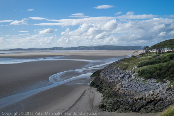
As regular readers may have noticed I didn’t post much last week. I was away from home staying together with a group of friends in a large house overlooking Morecambe Bay, and although I did take a notebook computer with me as well as a smartphone so I could check e-mail etc, neither is really comfortable for writing. Anything more than a dozen or so words on the virtual keyboard is a trial, and although my notebook has a half-decent keyboard, its smaller screen makes putting together pictures and text tedious. Coupled with a rather flaky WiFi signal at the residence posting would have been difficult.

But I was in any case on holiday, getting very tired with a lot of walking and largely thinking about other things for a week, though of course I did take some pictures. I’d not taken the Nikons – too heavy to carry around, but I did have a fairly useful kit, with the Fuji X-T1 and X-E1 bodies, 10-24mm, 18mm, 18-55mm Fuji lenses, the Samyang fisheye and a Leitz 90mm f2.8 short telephoto. Along of course with half a dozen batteries, the whole lot weighs around a third of my normal Nikon kit.

Two batteries per camera body per day seems to be the absolute minimum for the Fuji cameras, even if you take few pictures. I was glad that I’d taken along my ExPro dual channel charger too, as those batteries are slow to charge. I still think there is some kind of power fault in my X-T1, though it’s been back for servicing at Fuji twice. Sometimes batteries seem to run down very quickly and the body gets rather warm.

The only lens I didn’t use at all on the trip was the fisheye, though I wish I had. There were many truly panoramic views that it would have done justice to, where I used the rather less wide sweep of the 10mm end of the wide zoom. Nothing wrong with the pictures, but looking at some of them I feel a truly wide view might have been an improvement. I need to be in the right mood to use the fisheye, and somehow that didn’t happen.

Perhaps its just that I’m not really a landscape photographer, and just didn’t get sufficiently involved with my subjects in the AONB (Area of Outstanding Natural Beauty) we were staying in and walking around, Arnside & Silverdale. Or perhaps I was simply too exhausted; the web site says it has “almost 100km of well-maintained footpaths and narrow lanes and byways” and we seem to have walked along most of them at least once in our week there. Certainly we walked well over a 100km in the week, though there were some paths we took numerous times; my legs are still recovering.

When I started using digital seriously at the end of 2002, working away from home for any length of time always involved the problem of how to store the images that you were producing. Then we worked with Compact Flash cards, and back then a 1Gb card was  large, though if like me you worked with RAW images, still only large enough to store a few hundred compressed images. Since then, images have increased from 5 or 6 Mp to two or three times this size, 16 Mp on the Fuji X-T1, but 32 Gb cards now cost less than half the cost of much slower 1 Gb cards then.

So now there is no need for portable hard-disk based storage devices like the ‘Image Tank‘ I had to use back then, with its slow copying from cards to tank every evening. I took with me two 32 Gb SDHC cards and several 16 Gb spare in case I should fill these.

I take relatively few pictures when on holiday compared to working, and when I got home and sorted through eliminating the obviously worthless and some at least of the duplicates, the total for a week was just over a thousand images – 29Gb. I’m now slowly working through these, selecting the best and processing them to write them out from Lightroom.

Processing images from Fuji cameras takes rather longer than from Nikon RAW files. Using the Nikon cameras – particularly the D700, D800E and D810 – working with automatic white balance (AWB) in most cases gives an excellent colour balance, but all my files from the Fuji cameras, also taken with AWB, are off balance.

Yesterday I posted about this on a Fuji Facebook group and found other photographers have a similar problem. Their best advice seems to be to always work at a fixed colour temperature – such as 5000K – and then batch correct for images taken under the same lighting conditions using Lightroom.

I poked around in the camera manuals and menus and found that under the Auto white balance setting there is a WB Shift option. (I think there is the same facility on the Nikons, but I’ve never needed to use it.) I’d assumed that the default 0,0 setting on this would always give correct AWB, but it turns out that this is not so.

Soon I found myself facing a white wall and making a series of exposures with the X-T1 at different settings to find a proper white by adjusting the AWB setting, settling on R2, B-5. I just hope now that the same setting will actually give a true AWB under different lighting conditions. It’s a shame I hadn’t realised this before, though I think the X-T1 when I first used it gave better results with AWB and suspect it changed with one of the various firmware upgrades.

I also found that the X-T1 enables you to measure and store three custom white balance settings by photographing a suitable white object, though it isn’t possible to alter the names of these from Custom 1, 2 and 3. The X-E1 has only one custom setting. You can also alter the built-in settings (Fine, Shade etc) to your taste, and also the Kelvin colour temperature settings. This seems a little odd; 5000K should mean 5000K, and perhaps it does, and the adjustment is simply intended to enable you to chose colour temperatures between those offered on the menu.

I file all my images on the computer in folders by date of taking, which I find the easiest way to locate files. You can also set up virtual collections in Lightroom under various subjects or search on keywords to locate images on the same subject etc. The web site ‘My London Diary’ also acts as a useful index to my work, with its site search. It includes a representative selection of virtually all my digital work, with captions and other text allowing searching even if images are not key-worded. LR searches are fine, but are restricted to a single catalogue. LR can’t really cope with huge catalogues, and I have now decided to start a new one every year for my digital work.

Working through the holiday images, I have the additional task of selecting them on metadata into groups taken with each camera. I work through these correcting colour balance – often being able to apply the same correction to a large batch of them and then perhaps a little minor fiddling on a few. Then I need to do the same to those taken with the other camera. It isn’t a huge problem, but it does add to the processing time.

I also took a few jpegs. Not on purpose, but when without thinking I altered the ISO dial on the X-T1 to ISO 100 when I decided I needed the highest quality to enable some giant enlargements. It had the opposite effect, degrading the image quality  from that at the base ISO of 200.

Fuji do mark the setting on the dial as ‘L’ rather than 100 as a warning (and small symbols in the viewfinder do tell you that you have changed from RAW to jpeg) but it is surely a design flaw that Fuji allow users working on RAW to choose ISO settings that don’t give RAW images. It’s certainly a real pain both with the low and high ISO settings when it happens. With the low ISO setting I lost essential highlight detail, giving some odd effects in skies and a coarser feel to the images.

Is there really any point in having an ‘L’ setting like this on any camera (and it isn’t just Fuji who do so?)  Does it even produce better results for those using jpegs? Or is it just another of those stupid features driven by marketing people? Whatever, if you have told the camera you want to work in RAW it shouldn’t sneakily change to jpeg.

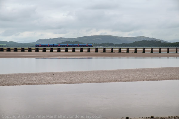
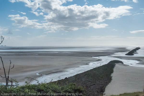
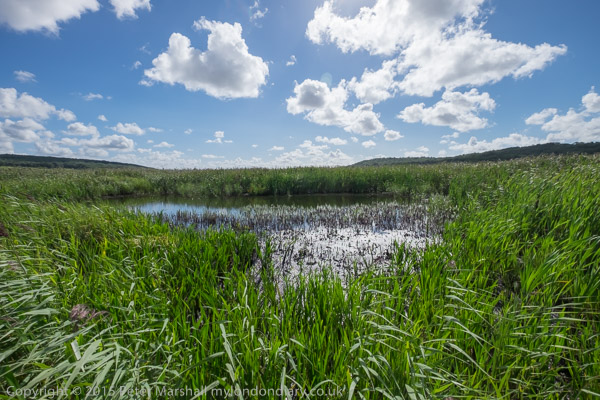
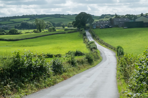
We chose a good week to go away, with heavy rain and some local flooding at home. There was rain where we were staying, but almost all at night, and plenty of blue sky along with clouds during daytime as you can see from these pictures.

Continue reading Holiday Pictures

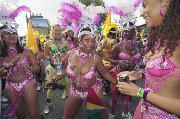
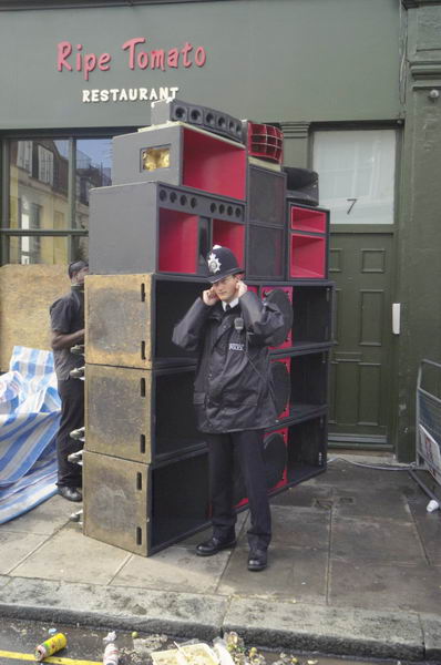
Carnival Time


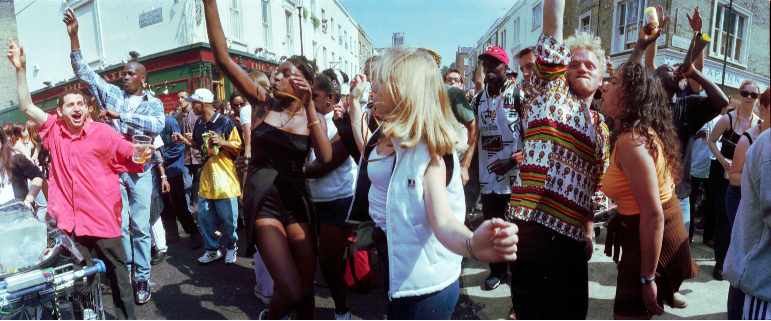
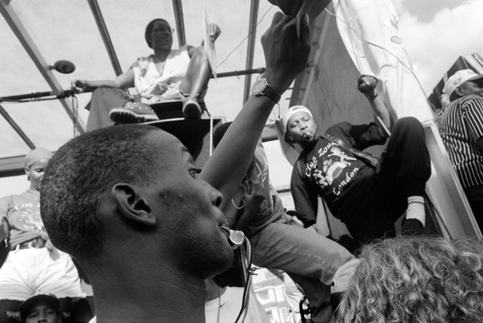
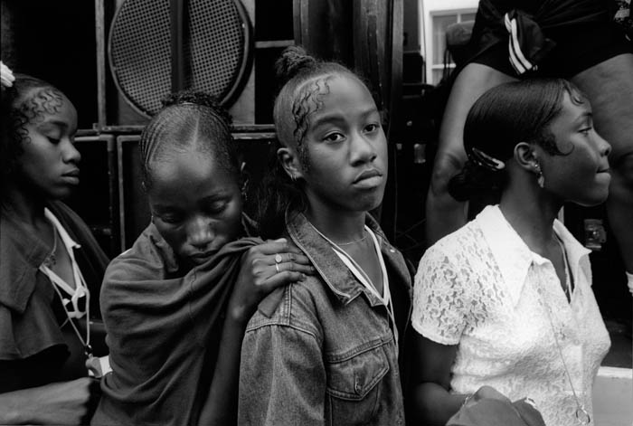
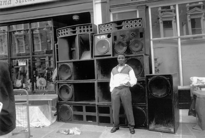
Notting Hill Carnival, 1991

I won’t be going to Notting Hill for Carnival this year, and I feel I’m missing something. But at the moment I’ve a splitting headache, and just can’t get in the mood for dancing on the streets and taking photographs.


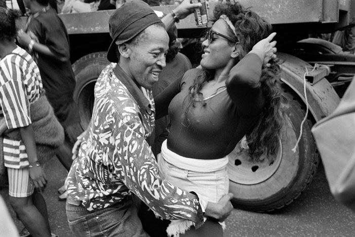
Dancing to KCC and the Rocking Crew, 1998

Carnival suffered from a lot of very negative publicity in the mass media in its early years, and still comes in for it at times. It was perhaps this that kept me away from it before the 1990s, when I went and discovered what a great event it was. For the next 20 or so years I went every Sunday and Monday to take pictures, except for 2005.

That year I had injured my knee jumping down from the plinth in Trafalgar Square a couple of days earlier and was finding it difficult to walk. My doctor had examined it, and it was one occasion I felt rather let down by the NHS, as he advised me it would probably be six months before I could get the phyisotherapy it needed, by which time it would almost certainly have got better anyway, and suggested if I could afford it that I go for private treatment at a local sports centre where staff were used to handling knee injuries. As someone resolutely opposed to private medical practice I decided to grimace and bear it.

I packed a small bag – water bottle, Minolta CLE* with 28mm, films, Minolta 40mm lens – emptied my valuables from my pocket except for a few notes and coins and set out for the station, about a quarter of a mile away, determined to get to Notting Hill. When I collapsed in agony going over the footbridge to the station I finally realised it was no use and abandoned the project, crawling back up the steps, hobbling along the road clinging to fences home. It was a few weeks before I could walk without pain, but I kept true to Nye Bevan.

Since then there has been the odd year when I’ve been away from London on the last Monday of August, but otherwise I’ve been to Carnival on at least one of the two days. I missed it in 2013 as I was up in Yorkshire, and then last year I was planning to go on the Monday, but decided to stay at home with my family. I’ve photographed over 20 years of Carnival, and perhaps feel there is nothing new for me to say about it.

If it was a very short journey, I’d certainly call in for a bit and enjoy the atmosphere, maybe even take a few pictures. It isn’t a major expedition, though the sheer numbers attending sometimes makes travel something of a problem, but enough to put me off. Perhaps too, its because I’m getting older and have come to dislike the crowds and extreme volume, sound which at times vibrates the road surface and your internal organs and often left me part-deafened for several days afterwards.

But it is still an attraction, at least in theory. If you’ve never danced arm in arm drinking Red Stripe down Ladbroke Grove in a vast crowd behind a sound system you’ve never lived in London.


*The Minolta CLE, arguably the best Leica that Leica never made. And the 28mm f2.8 possibly the best ever lens for street photography, when new knocking spots off the Leica equivalent. Unfortunately over time these developed their own spots on interior glass surfaces, making them unusable and uneconomic to clean.

Continue reading Carnival Time

Ultrawide images

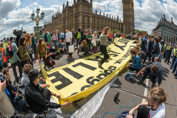
I don’t often use images taken with a fisheye lens without a partial ‘de-fishing’, but this is one case where I think it works. You can see some curvature in the image, but it isn’t excessive and I think helps draw the eye in towards the centre of the image.

Had that clock tower been further off centre its curve would have been more disturbing, and the same is true for the lamp post at the left.  The clouds wrap around rather nicely and even the people close to the edge seem rather less distorted than is often the case. When I took it I was probably thinking that the figure a bottom left would move more into the corner and I would perhaps lose all or most of the two photographers cut off by the edge, as well as most of the empty space behind the white t-shirt at the right.

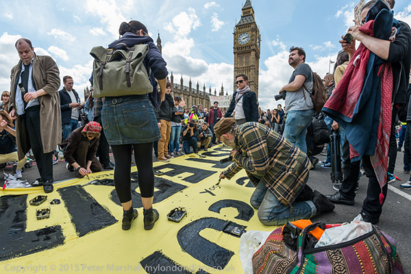
Most people who haven’t used fish-eye lenses think of rectilinear perspective as being somehow natural. It’s how we ‘see’ things, constructing images in our mind in which lines we know to be straight are straight. But it doesn’t work with making images with a very wide angle of view. The image above shows the result using the ‘distortion’ slider in Lightroom at 100%.

It crops the image a little at both left and right edges, and while it does straighten the lines, it makes their divergence much more apparent. That Canon lens at the left has roughly doubled in length and the head at bottom right is a rather more curious shape. What you can’t see in this small reproduction is the softness towards the corners where there just are not enough pixels to be stretched out like this. To be usable this image would need fairly drastic cropping.

If you must have a rectilinear view, stick to a rectilinear lens and avoid really extreme focal lengths. I have a 12-24mm full-frame Sigma lens, and anything below around 16mm I find seldom makes a usable image. It’s a better lens on DX, where the full zoom range can be used. A 16mm rectilinear image on full frame has a horizontal view of around 97 degrees, while the 16mm Nikon fisheye gives around half as much again, roughly 146 degrees.

The best we can do is to keep some straight lines straight, though we can also at the same time improve on the way that rectilinear perspective renders shapes across the frame, stretching them as they get away from the centre of the image.

The image above is the result of using the Fisheye-Hemi plugin for Photoshop, which is my normal ‘de-fishing’ tool. There are other things out there that do the same job, but the plugin is the most convenient I’ve found. It retains the image across the full width and height at the centre of the sides while losing some at the four corners, producing what I think is called a cylindrical perspective, like the rotating lens panoramic cameras I’ve also used.

As you can see, it also shows up the diverging verticals that result from my pointing the camera slightly down when making the image.  But it does avoid the stretching at the corners and the softness which made the conversion to rectilinear a problem.

However I find that divergence annoying – and I didn’t see it in my viewfinder when I made the image. So I’d probably want to use Lightroom to remove at least most of this. Doing so means cropping the image (there is still a small amount of divergence, but not enough to be a nuisance.

It’s a usable alternative to the top image, but I still prefer that; the figure standing on the middle of the banner is a little more prominent, and for me at least seems more to be floating, almost as if she is being tossed up by those holding the banner.

I don’t know what Reuters and those other upholders of the unaltered image would think of all this. Would images whose perspective had been altered in the ways shown here still be accepted for World Press Photo? And I don’t greatly care.  The uppermost image is what I saw in the viewfinder when I made the picture, but I think the bottom image is also a perfectly good record of the scene and my view of it. Probably a truer record of what I saw out of my left eye when I had the viewfinder pressed to the right.

The protest was to point out to Parliament that collecting taxes which are being avoided would bring in enough money to make cuts in public services unnecessary. You can see more pictures from it, including others taken with the 16mm Nikon fisheye as well as the 16-35mm rectilinear zoom and longer lenses at UK Uncut Art Protest.

Barbican

Without doubt the greatest opportunity for the planning of London in the last century came from the destruction of large areas of the city during the war, and one of the areas where the results are most obvious is the Barbican.  It provided an opportunity to develop new approaches with pedestrian walkways high above the city streets separated from their traffic, and put homes back into the city.

It wasn’t an entirely successful experiment, although the recent demolition of parts of the ‘highwalk’ is I think a great loss for the city (and doubtless huge profits for the developers) and while many have found the Barbican an exciting place to live prices now for its over 2,000 properties and those on the adjoining and perhaps rather nicer Golden Lane Estate are pretty astronomical.

For non-residents, finding the way around the Barbican has always presented something of a challenge, with yellow lines needed to guide people to the Barbican Arts centre from the surrounding Underground stations. Inside the Arts centre too, I’ve always found the layout totally confusing, though over the years I’ve learnt easy routes to find my way to the places I’ve used, including the main art gallery and the Library, in which I’ve organised and taken part in several group shows over the years.

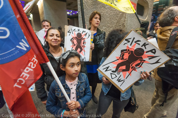
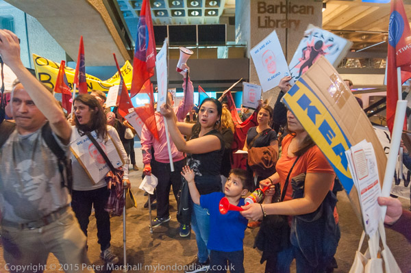
But on May 16th I had no problems in finding my way, simply having to follow the crowd of cleaners and supporters as the United Voices of the World rushed in to hold a protest inside the building.

The UVW are a grass roots union that is standing up for the rights of some of London’s lowest paid and worst treated workers, particularly cleaners who are employed by contracting firms to clean inside London’s many prestige buildings, including the Barbican Arts Centre, owned by the City of London.

The only reason for outsourcing services like cleaning is to cut costs, and the only way that the outsourcing companies cut costs compared to direct employment is by employing workers on conditions that would be unacceptable to companies and organisations that are concerned about their public profile.

The Barbican Arts Centre would feel it had to pay at least the London living Wage, provide proper pension arrangements, sick pay and holiday pay, as well as managing its employees properly, providing proper equipment and materials to do the job and not imposing excessive workloads. I’ve never worked for them, but I imagine that they aim to be a responsible and highly respectable employer.

The cleaners complain that the contracting companies treat them like dirt. Low pay, bullying management, impossible demands, and the statutory minimum conditions. Workers come into work sick because they cannot afford to take time off with only statutory sick pay. And of course an attempt to prevent union organisation and protests. As my summary reported:

Cleaners at the Barbican Centre employed by MITIE have been threatend with sacking if they protest for a living wage and proper sick pay. They say a disabled worker has been assaulted by a manager and that he was accused of terrorism for posting a video of himself at work.

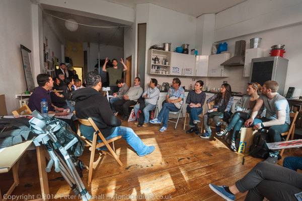
This protest was unannounced, and the cleaners and supporters met up well away from the Barbican. I met with most of them at a union meeting beforehand. UVW is a small and entirely voluntary movement with no paid officials, and as well as negotiations and protests at workplaces also provides representation and support for its members at tribunals and disciplinary hearings, and classes in English, as many of its members are from Latin America or Spain.

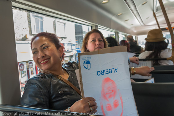
I travelled with them on the bus, then walked with them to a rendezvous with other supporters before they marched quietly to the Barbican, regrouping on a corner close to the main entrance, which they then rushed through at a suitable moment, with me following a short distance behind the leaders, making their way noisily through the building to a suitable area for the protest.

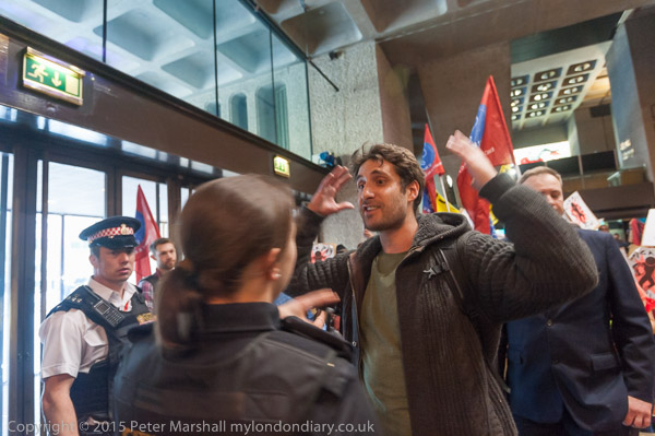
As usual with such incursions, I’m careful to avoid confrontation with security, who made some attempt to stop the first few people who entered, but then had simply to stand back and watch as the rest streamed in following them.  Theoretically I would stop taking pictures and leave if requested by a suitably authorised person, unless I felt there was an overwhelming public interest in the events being recorded, when I would attempt to do so. I would have felt so in this case, but it’s better not to have to make such a decision.

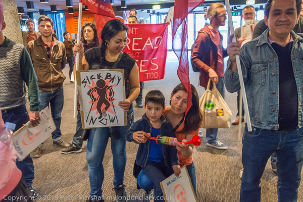
Photographically the main problem in taking pictures was the light. Rather the lack of it, and its unevenness.  The centre always reminds me of a cave, and it has lots of fairly small lights in a very large space.

I didn’t want to use flash. Partly because I didn’t want to attract attention to myself, and experience tells me that security are far more likely to tell you to stop taking pictures if you use flash, but also because it’s difficult when working close to avoid huge differences in lighting between people very close and those a few feet further away. But the light was pretty low in some areas, and when people were moving a lot there was really little alternative. But I think the picture I liked best was taken without, working at ISO 3200.

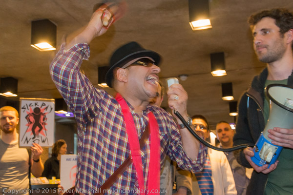
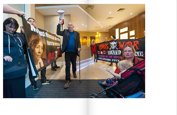
I was also working at ISO 3200 with flash, but with the aperture a couple of stops down (and sometimes about a stop faster shutter speed too) trying to retain a more even result with some exposure from the ambient light. As a consequence there is some double-imaging on these frames, which often but not always enhances the image – it adds a feeling of movement and immediacy to the speaker above.

Colour temperature is also sometimes an issue. Later the protesters moved to an area with both artificial light and large windows letting in some daylight. Using flash might have helped in the lower image, but unfortunately the D700 which I was using seems now to be very unreliable with flash and I’ve been avoiding using it. All the flash pictures I’ve made for some time have been with the D800E.

Shortly after the protesters left the building and continued to protest, marching around a little of the Barbican estate and then continuing outside the main entrance, which enabled me to take some pictures including the Barbican signage, including one of Albeiro, the cleaner being victimised and UVW general secretary Petros Elia, the man with his hands up in the image above.

Many more pictures and more about the protest at Cleaners invade Barbican Centre.

Continue reading Barbican

Larry Towell

Canadian photographer Aaron Vincent Elkaim interviews Larry Towell on Vice in a piece entitled You Will Change: Magnum Photographer Larry Towell Has Advice for Young Photojournalists.  Its an interesting post about one of today’s more interesting Magnum photographers, though probably the advice, good though it is, is unlikely to improve the financial condition of those taking it.

Somewhere else on the web I took a quick look at a piece 19 Signs You Are Treating Your Photography as a Hobby and Not a Business by Bradford (Bradford Rowley), who describes himself as “one the most expensive portrait photographer in the world with an impressive list of prominent clientele.  He operates studios in New York, California and on world famous Worth Avenue in Palm Beach.  He has made over 20 million dollars from selling portraits. He has taught photographers from more than 70 countries.

Its a rather different approach. Having met some of the best photographers in the world and read about rather more of them, I think most would count at hobbyists to Bradford. Few have been in it just as a business.

As Larry Towell says:

The main thing is to be on the right side, and if you’re not on the right side… then you’re probably going to make a lot of money.


PS. Don’t miss looking at the work by Aaron Vincent Elkaim either. The Vice article has links to Larry Towell’s work.

CLASS WAR: Rich Door, Poor Door

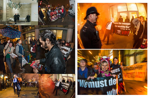
CLASS WAR – Rich Door, Poor Door is a relatively cheap 48 page magazine style publication of my coverage of the protests by Class War at One Commercial St, a large block on the corner of Commercial St and Whitechapel High Street in Tower Hamlets on the eastern edge of the City of London.

The building ‘One Commercial St’ is a tall block which includes shops, a hotel, an entrance to Aldgate East Underground station, parking and expensive flats as well as other flats which are social housing. While the occupiers of the expensive flats enter through a large, well lit lobby with a manned concierge desk and comfortable seating through a door on the main road, social housing tenants have a separate entrance some way down a narrow alley.

When I first visited it, this alley was strewn with rubbish and dog mess, with a strong smell of stale urine, and was virtually unlit, the kind of alley that drunks stumble down to relieve themselves after the pubs have closed. The ‘poor door’ had a card entry system, but for some weeks it was broken and the door left unlocked. It led onto a long narrow corridor, empty except for some post boxes for the residents.

The building manager told us that the social housing was completely physically separated from the privately owned flats, though we soon realised this was a lie. There are links between to two areas both at ground floor level and on at least one of the upper floors which both sets of flats occupy. Inside the building, when I later was taken around by a resident, the corridors and lifts were very similar, with identical signage. We went in the ‘rich door’ and came out after the tour through the ‘poor door’, having during the tour seen two locked doors between the two sides as well as walking through at ground level between them.

Having separate doors for rich and poor living in the same building is something many find unacceptable, and the protests by Class War served to publicise this ‘social apartheid’ and to put the issue on the national agenda, one of a number of direct action campaigns that have brought housing issues increased public attention. Some of those other campaigns supported Class War, with visits by supporters of Focus E15 and New Era, and Class War also supported others including the Aylesbury Estate Occupiers, with supporters also joining other housing campaigns.

During the roughly nine months covered by this magazine, from July 30, 2014 to May 1, 2015, Class War were also running a campaign to stand candidates in the May General Election. Eventually there were Class War candidates in seven seats, three in the Greater London area. Their first policy pledge was for a 50% mansion tax. Although I covered several events connected with their election campaign, including the manifesto launch at the gates of Buckingham Palace, I’ve not included these in the magazine, which includes pictures from 29 of the 31 protests at One Commercial St.

Several of the candidates were prominent in the protests, and one of the more controversial actions by the police was the seizing of their ‘political leaders’ banner which had been produced for the 2010 General Election and displayed at many events over the years without problems. A case for displaying a similar set of posters also produced in 2010 was thrown out of court for restricting freedom of expression.  Class War responded with an updated version of the banner for 2015, which so far police have failed to seize.

Police made at least five arrests at the protests which are shown in the magazine. One case has still to come to court and another was dismissed when it did so, with the court clearly suggesting that the police were trying to restrict legitimate political protest. One other case still pending also seems to have been clearly politically motivated and will I hope be thrown out by the court if not dropped beforehand.

You can read the story of the campaign in the regular posts and pictures from it on My London Diary. In the magazine I’ve included the text from just the first of these which sets the scene along with a chronological selection of over 200 images from the protests. There are just a couple of very short comments and on the final page some biographical material.

Getting over 200 images into 48 US letter size pages involved many compromises. There are a couple of images which have a double page spread and about 45 that are roughly half page size (about 8 x 5.5 inches.) The rest are crammed in at up to 8 pictures a page with little or no white space. I wanted to keep the price down so that I could offer this publication for a fiver.

For the same reason, I chose Blurb’s cheapest paper, which they say gives magazine quality reproduction. This is not the quality of a quality magazine – they call it Economy magazine. The reproduction lacks punch, with no real black, but even the smaller images are detailed and readable.

I’ve made over half the book viewable on the preview at Blurb. If you make the preview full-screen (button at bottom right of preview) you will get a rather better view than the actual magazine – much better, brighter and more accurate colour. But I’d like people to buy the magazine, though I make only a very small margin on it, as it would be good to get copies out there and perhaps seen by more people than would look at it on screen. You can of course already look at the pictures on My London Diary (I think there may be one or two where I’ve chosen slightly different images for the magazine.)

I’ve also decided not to make this publicly available as a PDF or e-book, unlike almost all of my other books. The cost of the ‘hard copy’ – actually a rather floppy soft-cover – is more or less the same.

The magazine CLASS WAR – Rich Door, Poor Door is for sale through Blurb, where it costs £6.00 plus carriage (I haven’t checked but probably an arm and a leg.)  As with my other publications, UK readers can save by ordering direct from me – contact me here to check it is still in stock and arrange payment by cheque, bank transfer or PayPal. I can currently supply copies at £6 including UK postage. I think all my other books are also in stock here.

And for people I meet it’s a fiver if I’ve got a copy on me. The price of a pint in some London pubs these days.

Continue reading CLASS WAR: Rich Door, Poor Door

Things Left Unsaid

I’ve never been a great fan of either Donovan Wylie or Paul Seawright, but the video of their conversation at the opening of Seawright’s show in Paris last November with the working title of ‘Making News’ but shown as ‘Things Left Unsaid‘ at the Centre Culturel Irlandais,  held my attention, although I soon got rather fed up with looking at the two photographers and took to looking instead at the eight images and installation view which you can find on Paul Seawright’s web site.

On the web site it explains the project:

‘Exploring the theatre of war through the internal landscape of the US television news studio. Developing Virilio’s writing on electronic warfare and weapons of mass communication, Seawright focuses on the illusory nature of these spaces, where information is selectively transformed into news. Characteristically Seawright continues his exploration of contested spaces and illuminates an invisible aspect of contemporary conflict.’

(You can read an interview with Paul Virilio on Vice, and more on Wikipedia.)

The book contains – according to the talk – 26 images, and you can see a slide show of 7 images on APB where the 56 page book is on sale.

Seawright at one point says he doesn’t like taking photographs, the ‘moment’ for him is when he sees the exhibition for the first time on the gallery wall, and he comments that the book is secondary, lacking the drama of the exhibition.

WhileI feel with him and Wylie that the camera is a purely functional thing I find myself more in sympathy with Wylie’s comments about taking pictures and the experience of doing this. It may be and often is exhausting, but fore me it is also at times exhilarating. But perhaps it does account for an absence of feeling that I often feel in looking at Seawright’s pictures; something I don’t see even with the New Topographics who he relates his work to.

Near the end of the the discussion Seawright comments “We make work because we believe in the work and the idea behind the work” which seems very much, despite the differences in our ideas and approaches to photography, something with which I can wholeheartedly agree.

Looking at the various other projects on Seawright’s web site, there are others that I find rather more interesting that ‘Things Left Unsaid‘, a title which he suggests on the video could apply to all of his work.  One of the more interesting is ‘Invisible Cities‘ and the site has links to two reviews, one of which is in Socialist Worker. Although not entirely complimentary, and commenting that it fails to show the African dynamism, implying that “the legacy of colonialism in Africa is too dominant and exhausting to ever be changed”, this concludes:

Neverthless, Invisible Cities is a terrific selection of photographic art. It skillfully uses seemingly prosaic scenes of urban life to present an startlingly new image of Africa – one that is not dominated by violence and famine, but rather by human beings engaged in a day-to-day existence that is not a ­million miles away from our own.”

Donovan Wylie’s work can be seen on his Magnum page.

Thanks to Peggy Sue Amison, Artistic Direct for East Wing in Dubai for a Facebook post sharing the link to the video.

Gandhi and Civil Disobedience

I’ve always felt that London wasted Parliament Square. A world heritage site because of the buildings that surround it – notably the Houses of Parliament, Westminster Abbey, Middlesex Guildhall (now the Supreme Court), the actual square is a large traffic island, with a large area poorly maintained grass and some rather crass temporary flagpoles brought out for state occasions. It has an odd assortment of statues, some rather good, others outstandingly poor.

Over recent years their have been some improvements for public access, which no longer demands a death-defying dash between traffic, with light-controlled crossings at two of its four corners, though the seats which tempted the unwary tourists have now disappeared, presumably because of Westminster Council’s vendetta against homeless rough sleepers.

Perhaps the reason for its curious state is below the surface, where I suspect it houses some secret underground bunker, linked by the mysterious underground passages we know exist between various above-ground government buildings in the area. But it certainly always feels like a missed opportunity to me. If nothing else most if not all of its area should be closed to normal traffic.

But something which I think any seat of government should have in its view is a suitable forum for public dissent, where protesters can make their views felt. Ever since the late Brian Haw took up residence on the pavement opposite the Houses of Parliament back in 2001, Parliament, the GLA, Westminster Council and the police have been doing their worst to stop such things happening or to severely limit them. Perhaps there is a case for some limits, but not for trying to set them so that protest becomes severely inhibited.

Occupy Democracy have carried out a series of protests intended to keep the square as a place for democratic discussion and protest, and I’ve photographed a few of these, though missing the main battles with police and GLA security guards (laughably called ‘Heritage Wardens’) over squares of blue tarpaulin the protesters were sitting (and sometimes sleeping) on, which led to the square being renamed by activists as ‘Tarpaulin Square’.

Recently a court has ruled that it is not a crime to have such tarpaulins in the square, dismissing the case against four people arrested, and leading to a second prosecution being dropped. As often, the police, egged on in this case by over-keen private security, have over-interpreted the law to make it mean what they wanted it to mean.

The court decision was hardly surprising. When Occupy Democracy came to the square last October it was clear to me reading the enforcement notices that the police were exceeding the law, and I told them so, to get the response that they would leave it to the courts to decide. It seemed to be a blatant disregard of the law by those who are paid to enforce it.

Occupy Gandhi – stop fossil fuel criminals on May 4, defied both the ban on tarpaulins and on tents in Parliament Square, though I imagine the protesters will argue in court that the tent was only symbolic and that they had no intention of using it to sleep in.

On this occasion police and GLA Security ignored the blue tarpaulins (except for asking one draped on the statue of Gandhi to be removed), and it was only after a tent had been erected in a deliberate act of civil disobedience that police first warned the protesters and later surrounded it and arrested those inside. You can read more about what happened in My London Diary.

Photographically the event once more proved the value of the 16mm fisheye, with several of the strongest images I made being take with it. It’s a lens that needs some care in use, usually at its best when absolutely upright, and the virtual level markers in the D800E viewfinder proved extremely useful.

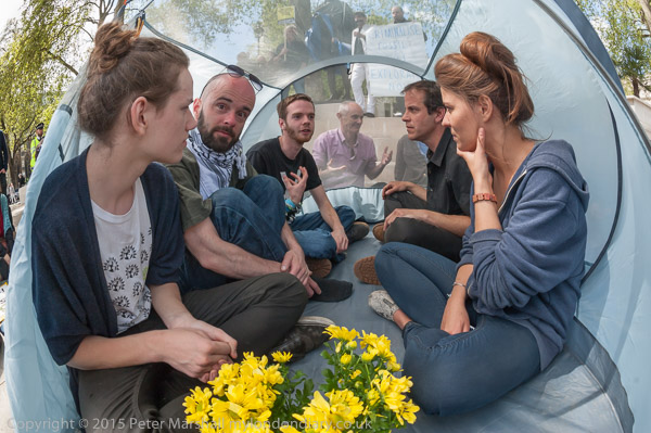
The top image on this post is an example where no perspective correction was needed, and the curvature at the edges adds to the image, producing something of a tunnel effect. I liked the near-symmetry of the scene, and the framing through the fabric at the rear of the tent of Donnachadh McCarthy who was leading the protest (he quickly jumped inside the tent as the police arrived to make arrests.)

To make Donnachadh clearer I increased the local clarity and contrast in Lightroom, adjusting the exposure slightly too. The yellow of the flowers is a nice contrast to the blues of the clothing and tent, and the pink shirt also helps Donnachadh stand out. In some other frames I also managed to include the statue of Gandhi, but his head got cut off in this one (at top centre) and it would have been nice to have a little more of the flowers. Sometimes even a fisheye isn’t quite wide enough!
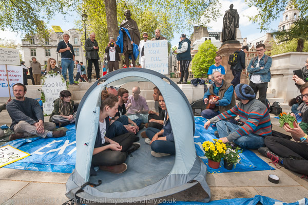
Theoretically I could have moved back a little, but practically that wasn’t possible. I’d quickly moved into position as I saw people going into the tent and worked with the 16-35mm on the D700, then moved away, coming back after the flowers had been put in the tent. After taking a frame with the 16-35mm I changed it for the 16mm fisheye and made a series of five exposures. The people inside the tent were having an animated conversation, and several of those five seemed interesting, but it was when Donnachadh briefly raised his hands that I had the picture I wanted.
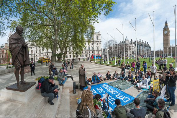
The 16mm fisheye was also the ideal lens to take an overall view of the event, enabling me to work from a close viewpoint and get in both the statue of Gandhi and at the other edge, Big Ben. The horizontal angle of view is around 140 degrees, too wide for a rectilinear lens – which would render both Gandhi and the clock tower as extremely fat. Again I was using the 16mm on the D700, keeping the D800E for the DX format 18-105mm which gives a decent-size file at the 1.5x crop. The D700 lacks the viewfinder level indicators, which accounts for the curved horizon. Correction from fisheye to cylindrical perspective was essential to avoid a curved Big Ben, Gandhi and flag poles.
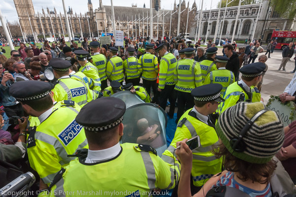
For the surrounding of the tent and the arrests it was fortunate that this took place next to the raised area with the Gandhi statue, giving me a good viewpoint, though the police did rather get in the way, as too did some of the protesters, many of whom were also taking pictures and sometimes holding up phones in front of me. Working with the D700 I did rather wish it had a hinged screen on the back like the Fuji X-T1, so much better when you do have to work with the camera held above your head. For some reason Nikon think this isn’t appropriate in their professional cameras, but I’d find it very useful. As well as the overall views with the 16-35mm, I was also able to take pictures over the shoulders or between the heads of police of the people inside the tent.

Later I went down to ground level and was able to work between the legs of the police surrounding the tent, leaving as Donnachadh was taken away by the police. He struggled as they led him away, then went limp, and was carried by the police to a van at the side of the square.
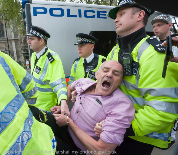
Another inexplicable failure by Nikon is with lens hoods, and in any close situation the lens hood on the 16-35mm will either be knocked completely off (I’ve lost half a dozen that way) or, perhaps even worse, get knocked askew.

This gives vignetting at top left and bottom right corners of the image at wider focal lengths, and is clearly visible in the viewfinder with the lens at 20mm or wider. Unfortunately when things get a little exciting and I’m working flat out I usually fail to notice it unless there is important subject matter in either of those two corners, and I end up with a lot of pictures with dark areas across them. Usually I crop the images to remove them, but often this means losing important subject matter.

The problem is I think a combination of the low profile of the filter mount on the lens with the flimsy flexibility of the Nikon HB-23 lens hood and could probably be more or less solved with a thicker moulding on the hood.

Usually I crop to the normal 1.5:1 format, but in this image I decided to simply cut off the left part of the frame, mainly occupied by more of the police hi-viz jacket. You can see the out of focus lens hood at top right, it’s visual impact removed slightly in Lightroom by desaturating it and the blue fringe it naturally has.

More pictures and an account of the event at:
Occupy Gandhi – stop fossil fuel criminals

Continue reading Gandhi and Civil Disobedience