Adobe Upgrades

Today was I think a good day for photographers so far as Adobe products are concerned. I don’t know if the upgrade to Lightroom 5.5 really changes a great deal, but like most such upgrades, it does feel just a little snappier, which is no bad thing. And I’ve yet to try the updated Bridge and to do anything substantial with  Photoshop CC 2014, though I don’t think any of the enhancements that Julieanne Kost enthuses about will have any great impact on my work – or that of any other real photographer. If I want motion blur etc I’ll take photographs of things that are moving.

Perhaps the improved content-aware fill tool will help improve retouching my scans but most of the other things – like most Photoshop features – are ways to destroy the photographic nature and content of your images rather than tools to enhance. At least 90% of Photoshop should be irrelevant to photographers, but we use it because it does the 10% better than anything else, though it sometimes needs a little help from plugins.

It’s taken a bit of fiddling around to get my favourite plugins working with 64bit Photoshop CC and with Photoshop CC 2014. There are strict instructions to use the plugin providers install software rather than trying to install by hand, but this didn’t work for me for some. Fortunately finding the correct ‘64.8bf’ files and copying them to the plugins directory does work. But having four versions of Photoshop on my system is probably confusing. Perhaps I can cut it down to two now.

But the good news (or at least slightly good news) is that the $9.99 per month photographers package is now a standard one rather than a special offer (with VAT that’s £8.78 in the UK – or you can save 50p a year with a pre-paid annual sub.) It isn’t quite the same, with less cloud storage and no ‘Behance’ portfolio for new subscribers (I haven’t used either) but seems to me to be reasonable value, costing not very much more than the regular upgrades to Lightroom used to. And if, as most photographers seem to nowadays you buy new cameras fairly often, you do need to keep Lightroom up to date. I’d want to in any case, as so far each new full version upgrade – the ones I had to pay for – has added welcome improvements.

It would be even better value if I had an iPad and iPhone now that Lightroom works on these too, something I can see many photographers making use of, though you are only able to work on ‘smart previews’ rather than the actual files.

I’d rather that Adobe had not gone the CC route, but I can see why they have elected to do so. So many photographers I know use somewhat less than legal versions of their software. And I can see why they do as well, given the cost of the old standalone versions – it was really just too expensive for many photographers. Until the announcement yesterday I was a little worried that Adobe had not got the message and might ramp up the price again, but it looks as if they now realise the different market.

Singing about Vanessa

Great to see a fine article by Sean O’Hagan, Vanessa Winship: the great, unsung chronicler of the world’s outsiders in The Guardian.  I’ve been telling people for quite a while about her photography  – back in 2008 I wrote in a piece about not going to Arles that – judging from the previews,

the outstanding pictures were by Vanessa Winship, whose work has deservedly done well in several competitions in recent years (and her ‘Albanian Landscapes‘ was screened at Arles in 2003)

and not long after, looking at a photo diary about the festival I also noted that so far “only Vanessa Winship’s exhibition seems worth more than a cursory glance.”

There are quite a few more mentions of her over the years on this site, particularly Sweet Nothings – Vanessa Winship (2009) and (2013) which are perhaps still worth reading. This piece seems to be the 14th time I’ve written about her here and I think I had mentioned her when I wrote elsewhere. Also worth reading is Michael Grieve’s review of ‘she dances on Jackson’ in 1000 Words, which I also linked to in an earlier post.

So I can only echo the sentiment under the headline of O’Hagan’s Guardian blog:

“From Mississippi to the Black Sea, Winship’s poetic, masterful photographs show how hard it is for people to belong … so why don’t British galleries acknowledge her as this large Madrid retrospective does? She deserves it”

Though I’m afraid the explanation is unfortunately rather simple. She is a real photographer, and there is no major British gallery with a real interest in photography.

Panoramas & Excalibur

First, a final reminder that if you are in London tonight, Monday 16 June, you are welcome to come to the opening of my show with Hilary Rosen at the gallery in University College Hospital (details here.)

The show continues until the 30th July and I have two sets of six pictures, all panoramas. The first set were mainly made when I was working with two panoramic film cameras, the Hasselblad XPan and a considerably cheaper Russian Horizon 202.

The Hasselblad (actually a Fuji camera) received rave reviews, but at first I’d been a little disappointed. It came with a 45mm lens, which really didn’t give a very wide view. What really transformed it for me (though at high cost) was the 30mm, which with an angle of view of around 94 degrees stretched rectilinear perspective to its limits.  Vignetting was absurd, and the already slow F5.6 lens needed always to be used with a centre spot filter, reducing the exposure in the middle of the frame, making the light transmission more like an f10 or fll lens. But as with most Fuji lenses it was superb, and the lens the widest rectilinear lens available for any ‘medium format’ camera – which the XPan essentially was despite using 35mm film, with its 24 x 65mm frame.

But although that kit probably cost something approaching 20 times as much as the Horizon 202 (by then I was onto my second one of these, I think £170 sent in a plain brown-paper parcel from a private address in the Ukraine)  I think most of my best pictures were taken with this clockwork Russian swing-lens model.

It wasn’t just the wider angle of view – around 120 degrees – but the different perspective with the lens rotating about its centre to produce the image on film with the same centre of curvature (so keeping a constant lens centre to film distance and zero vignetting) that made it more interesting and more demanding to use. Stopped down to f5.6 or f8 the quality was similar to that of the Hasselblad too, and the negatives were quite similar in size. All except one of the six earlier pictures in the show was I think taken with the Horizon – and that sixth was made with a Nikon.


Not from the show, but a recent digital panorama from the Excalibur Estate in Catford

It’s taken me some time to really work out how best to work with a DSLR to make panoramic images. I did one project I like using Pt Gui and stitching multiple negatives. Its fine, but time-consuming and tricky with moving subjects, and needs fairly precise rotation around the nodal point if there are any really close objects in the scene – which is why many panoramas avoid any foreground. Images from a high viewpoint make life easy. But seldom makes for pictures that interest me.


Two road that meet at roughly a right angle. Excalibur Estate, Catford, 2014

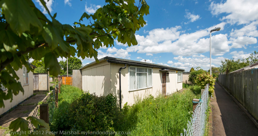
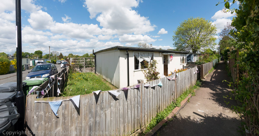
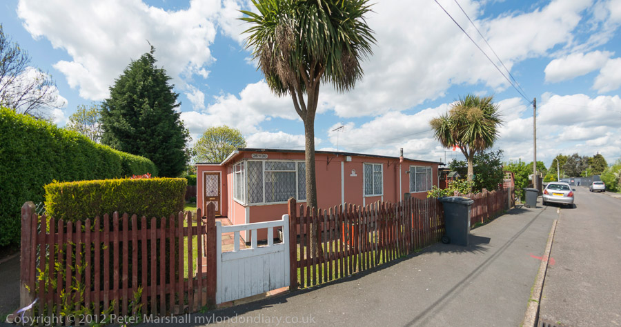
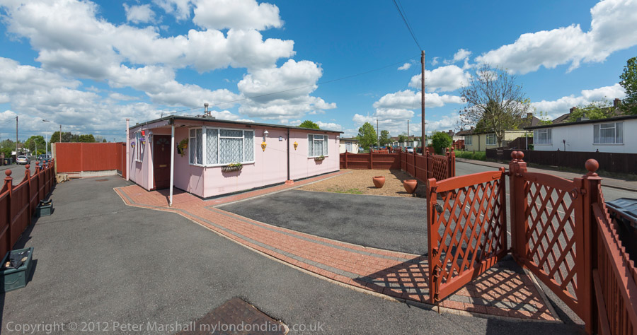
The pictures from the Excalibur Estate in Catford that illustrate this post are my latest effort at producing digital panoramas. They have a horizontal angle of view of around 145 degrees and an aspect ration of 1.9:1, and almost all of them have plenty of foreground. None of these images have any moving objects in them, but that would cause no problem. And yes, I used PT Gui to make them.


Close objects are no problem. Excalibur Estate, Catford, 2014

I’m still working on the details – the images in the UCH show were made in a different way, and I keep having different ideas about how best to work, so it would perhaps be premature to give the details of how these were made, though it shouldn’t be difficult for anyone with a particular interest to work it out.


The Prefab Museum. Excalibur Estate, Catford, 2014

One of the empty pre-fabs on the Excalibur Estate has been transformed into a Prefab Museum, now open to the general public only on Saturdays (11am-5pm) and closing at the end of September. More details about this as well as a full set of 64 pictures from the historic estate, already part-demolished and most of the rest due to follow soon in Excalibur Estate on My London Diary

Continue reading Panoramas & Excalibur

Joint Enterprise

The last fatal duel in England took place a short bike ride from where I live (or if I’m feeling lazy there are a couple of buses that more or less take me up the hill) ino Englefield Green, where in 1852 two Frenchmen came with their four companions to settle their differences. One of them, politician Frederick Constant Cournet, described by Victor Hugo in Les Miserables as “a man of tall stature; he had broad shoulders, a red face, a muscular arm, a bold heart, a loyal soul, a sincere and terrible eye. Intrepid, energetic, irascible, stormy, the most cordial of men, the most formidable of warriors” received a fatal wound and died in the local pub, where you can read a possibly not very accurate account of the event.

Cournet had been one of the engineers on the streets of Paris in the 1848 revolution – Hugo describes his massive barricade in the Faubourg St Antoine as “three stories high and seven hundred feet long.” He was elected to the National Assembly in 1850, but then sentenced to a year in prison for abetting the escape from jail of Eugen Pottier who later composed ‘L’Internationale‘. In December 1851 Cournet was in trouble again, having been one of the leaders of a failed coup d’état against Louis Napoleon and had to flee to London.

His opponent in the duel was another veteran of the 1848 barricades, Emmanuel Barthélemy, and although the dispute is sometimes claimed to be about remarks Cournet made about a former girl-friend of his, more likely it was because Barthélemy was a supporter of Louis Blanc, and Cournet  a supporter of his opponent among the emigre French socialists in London, Alexandre Auguste Ledru-Rollin.

Duelling was illegal, and three Frenchman who got on the train at Datchet were detained on arrival at Waterloo following a message (presumably by telegraph) from the Windsor police. Barthelemey was first charged with murder, but this was later reduced to manslaughter and his sentence was a short one. But less than three years later he was caught in the act of murdering his employer and a neighbour and was hanged at Newgate in 1855. For those who are interested there is more about the duel from the trial (in brief, Cournet fired first and missed, Barthélemy had the second shot, but his pistol did not fire – so Cournet lent him his, and was then fatally wounded) as well as information about the murder on a rather grisly site, Execcuted.Today.com.

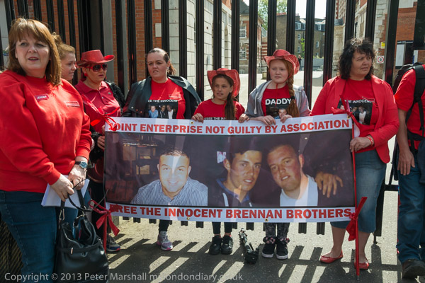
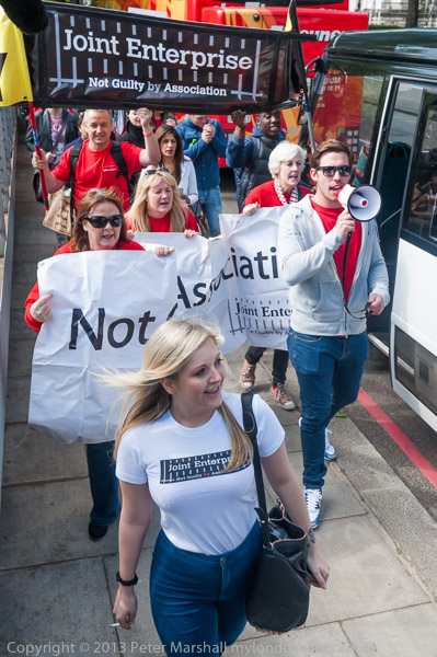
All this came to mind (and prompted a little research, though I’d read the not entirely accurate account inside the bar of  the Barley Mow a while back) when I went to photograph a protest by the oddly named JENGbA, short for Joint Enterprise – NOT Guilty By Association, a campaigning group against the injustice of ‘Joint Enterprise’, an offence said to have been “introduced three hundred years ago in a clamp-down on dueling, enabling the seconds and doctors who attended duels to be arrested as well as the actual duelists.”

Being Common Law rather than defined by any statute the exact history is hard to trace, though there are a number of key cases which serve as precedents to define it. But its Common Law orgin also renders it liable to be misused and subject to political pressures on those responsible for prosecutions who attempt to widen its application. What makes good sense in very limited circumstances has over recent years been expanded into a catch-all offence in what is seen as a war on gang killings. Surprisingly there are no official statistics, but through freedom of information requests researchers concluded recently that more than 1,800 people had been charged with homicide (and many convicted) under joint enterprise in the previous eight years.

I was shocked when I read about some of the cases of injustice that JENGbA has taken up, one or two of which I mention in My London Diary. Although there has been considerable disquiet over this in legal circles with a Bureau of Investigative Journalism study and a report by the House of Commons Justice Committee, there has really not been the public outcry that it demands, probably because most of those convicted come from disadvantaged groups and many are tarred, often inaccurately, with belonging to criminal gangs.

It is just one other aspect where ‘British justice’ no longer meets the standards we used to believe in – as too are the police killings of suspects during arrests like that of Mark Duggan and the many suspicious deaths in custody.


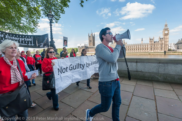
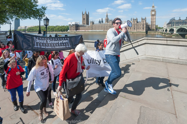
Obviously I wanted the Houses of Parliament in the background, but also carefully framed for the shadow at right

Photographically the main problem I had in covering the march by JENGbA was one of contrast, with the low sun often seeming to come from exactly the wrong direction for my purposes. Of course I should probably have used some flash fill, but somehow I felt this might be a little intrusive and upset what felt like a rather delicate relationship between me and the families involved in the protest.

I’m also getting a little worried about the 16-35mm lens. It does seem to be giving far more flare than it used, and I wonder if it is in need of a good clean. But given the bill I got the last time I took it for repair I’m not keen to repeat the experience, particularly when I’m not quite convinced it is necessary.

I do seem to get both more specular flares (aka ghosts), bright spots of light, sometimes coloured and often hexagonal, and also more veiling flare, the diffuse creeping of light from over-bright into shadow areas of the picture.

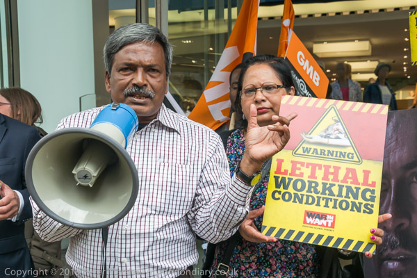
Ghosts sometimes add a little to the image and are usually difficult to remove or ameliorate. Somtimes it is possible totone them down a little. Small ones entirely in areas like sky can be cloned away if necessary. With the diffusion, using an adjustment brush on the affected area to increase contrast, reduce highlights and increases clarity can help, sometimes with a slight positive or negative exposure change.  I’ve tried to do this, perhaps a little clumsily on the head of the leading figure with a megaphone on the top image in this post.

Shortly after the start of the march, it came across the rather macabre site above on the pavement, in an area well away from any buildings in front of the large yard of Chelsea College of Art.

More about the march and a little about some of the cases at Joint Enterprise – NOT Guilty By Association.

Continue reading Joint Enterprise

May Day in Trafalgar Square

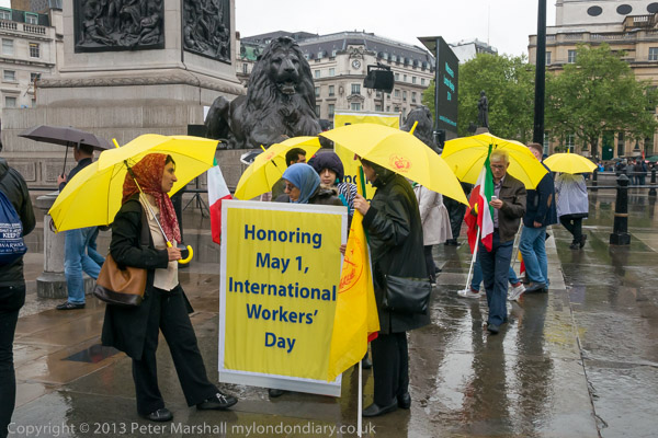
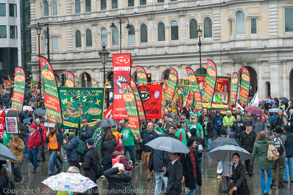
Light rain was a minor problem as the May Day marchers were arriving at Trafalgar Square for the rally there. Apart from the occasional frame spoilt by a drop on the lens filter between my wiping with a microfibre cloth and taking the picture, it was also making the plinth around Nelson’s Column a little slippery. And while a few years ago it was easy for me to put my camera bag up and bound up onto the plinth, now it is at best something of a struggle, though often someone already on it will give me a hand up. But I decided to walk around to the official way up, a small stairway provided for the event, and waved my press card at the stewards.

They were trying without a great deal of success to keep the plinth clear, but rather grudgingly seeing my union logo on the card let me up; I’m not sure I would have made it at this event if I still got my card – part of the same national press card scheme – through the employers!

I wanted to be there mainly to photograph all those people the stewards were trying hard to keep off, spirited young protesters with banners who do so much to give the event a little life and colour, but also to get pictures of the marchers arriving from a higher viewpoint. But as soon as the rally started with speakers on the platform it was not a good place to be and I made my way down into the area below.

With the microphones being close to the front of the plinth there is little room to photograph the speakers from the same level, though I’ve occasionally managed to do so, and today I didn’t want to stand right on the edge and risk slipping. It isn’t a huge drop, perhaps around 5ft, but enough to cause injury and damage to equipment, and I have increasing problems with vertigo. Even standing on a wall a foot high can give me the shakes.


TUC General Secretary Frances O’Grady

Working from ground level isn’t ideal. You need a longish lens and to be able to stand back some way. The long end of the 18-105mm DX is generally OK, but I need the 75-300mm to get tight head shots. Its good to use the 75-300mm as a DX lens, as this lets you see outside the frame, which is good for following the speaker’s gestures and allowing you to zoom to re-frame appropriately. But here I mainly used the long zoom as an FX lens on the Nikon D700, where the DX images are a little small (around 5 Mp) and kept the 18-105mm DX on the D800, as there wasn’t a great deal I might need a wider lens for at that point.

Much of the time I will in any case watch the speaker through my left eye with my right at the viewfinder. Getting decent pictures of people speaking takes a lot of concentration, watching the expression and the eyes in particular. Many speakers move enough to throw a long lens out of focus, but the autofocus normally handles that, but the movements often enable you to find a moment when the microphone is less in the way.

This rally was different to most in that the first part of it very much centred around the two great men whose lives were being celebrated, Tony Benn and Bob Crow, with short videos of selected clips from each of them.

But as the rally wore on, my attention began to lapse, and I was feeling the strain of having been on my feet and working for some hours. I’d come intending to go on with the Occupy London group to photograph their protest against loan sharks Wonga, but in the end only photographed a group of them getting ready to leave from Trafalgar Square before making my own exit for the train home and the lengthy business of editing my work from the day and writing a couple of stories. And of course you can now see the results of this at May Day Rally.
Continue reading May Day in Trafalgar Square

Legends

A few weeks ago (in Bleeding London – re-Inventing Streetview?) I wrote about one widely quoted legend that had become accepted as fact despite it having little or no basis, that of Phyllis Pearsall walking the streets eighteen hours a day for several years in the 1930s to produce London’s first street atlas, the A-Z. It’s a story you can still read on Wikipedia, referencing two apparently unimpeachable sources, her New York Times obit and the Oxford National Dictionary of Biography. But the Wikipedia article (at least now – it was last modified on 31 May 2014 at 05:39.) also contains more accurate information about how the A-Z was put together as well as links to sites which disprove some of the more extravagant claims.


from ‘1989’

Although it linked to photographic issues, including my own personal journey in photography (and I have walked more than the 3,000 miles on London streets she was alleged to have done, though over more than thirty years) and gave a pretext for sharing of few of the images of London I’ve taken, Pearsall’s was not a photographic story. But many of the legends of photography are just that, with only a tenuous connection to the facts, with some photographers being at least as good story-tellers in words as they are with images. While photographs are rooted in the facts of the situation, there is little to anchor the stories that can be constructed around them.


from ‘1989’

The first book I brought out on Blurb a few years ago was a deliberate exploration of some of these issues and of how we interpret or construct the world we see and photograph through stories and other images. ‘1989’ is a series of carefully chosen images taken in 1989 but written in 2005-6 for a web site (and soon after featured on this blog when that site folded and I put it in a corner of my own), then shown as an exhibition in a documentary festival before finally being put into a small book, later re-issued with minor corrections and an ISBN – and in a PDF version. There is a preview of around half the book on Blurb.

In a recent post Ends and Odds Yet Again on Photocritic International which began my train of thought. A D Coleman busts one legend about Steve Martin and Diane Arbus and breaks the spell over Pentti Sammallahti’s mystical relationship to dogs, as well as taking a critical look at ‘Selfies with the Dead‘, ending with a link to a dramatised version of a truly surreal transcript from the Ohio Supreme Court. As ever, Coleman’s posts are stimulating.

Continue reading Legends

Glenna Gordon & #bringbackourgirls

The New York Times Lens blog has a follow-up to its story about the abuse of images by Ami Vitale which were used to publicise the kidnapping of the Nigerian schoolgirls by Boko Haram which I wrote about earlier (Image Abuse.)

In Bringing the Nigerian Schoolgirls Into View, James Estrin writes about the work by Glenna Gordon who having photographed the demonstrations over the kidnapping in Nigeria decided she needed to do something more personal about the missing girls, and made the difficult journey to meet with some of their relatives and friends. In the Lens blog, and on her own web site you can see pictures of some of the clothing, notebooks and other items that belonged to them, along with some short descriptions of them and their hopes in life and some pictures that their families allowed her to share with the world.

It is also worth looking at the other work on Gordon’s web site, which as well as the 16 pictures on the Lens feature includes a longer series, ‘the hunters who want to #bringbackourgirls’, vigilantes keen to take on Boko Haram, said to be better armed than the Nigerian Army, with bow and arrows and hunting rifles.

There is of course much more to look at on her web site, including a lovely series on Nigerian weddings, as well as a powerful set taken in King George Home for the Elderly in Freetown, Sierra Leone.

Rana Plaza

I’ve little interest in fashion, and I think it’s almost 50 years since I bought something because it was fashionable. It was for going to university in 1963, really the first time I bought clothes for myself, and I wore denim jeans (skin tight that took some getting on and off) and a black polo neck under a sports jacket, just like the pictures I’d seen in the newspaper fashion pages. Most of the others in my classes still wore suits and ties.

I kept wearing polo necks for years, partly because in my first real job there was a dress code – men had to wear a tie. With the polo neck, my boss couldn’t tell that I wasn’t wearing one (and often not even a shirt) and somehow I got away with it.

And I still almost always wear ‘designer’ jeans. It began not as a fashion statement but for medical reasons. I’d fallen heavily on my backside one summer around 1980, with painful consequences, and eventually had to have a minor operation, which left me very tender. For weeks I couldn’t sit down without a rubber ring to sit on- and even that required considerable care. Wearing trousers was painful too, I was only really comfortable in a very light pair of summer-weight pyjamas, hardly the ideal kit for going out in.

Sitting cautiously in the doctor’s waiting room I read one of the old magazines left there. It’s the only place I ever read ‘Country Life’ or ‘Vogue’, but on this occasion I think it was some kind of magazine for walkers or outdoor life in some way. And there I read a review of Rohan Bags, which told me that they were tough but so light you had to look to check you were actually wearing trousers. It was I thought worth a try, and sent off for a pair that afternoon.

Sitting here writing this, I’m still wearing Bags, though not the same pair, but the design has changed little. They are comfortable, practical and reasonably hard-wearing, though they don’t quite stand up to the rigours of a photographic life, and I often have to ask my wife to patch the knees.  In a ruck outside the Israeli embassy a few years back one of the pockets got torn halfway off and I lost a CF card with most of my pictures on it, and covering the May Day march one year I heard a loud tearing sound as I knelt rapidly to photograph a group of children, and found a split up the front from crotch to waist – I spent the rest of the day photographing with my jacket tied around my waist as a skirt to keep me decent.

But generally they are great, and I can’t live without the four large pockets to (usually) keep things secure. I’ve tried others but I always come back to Bags. Rohan’s various jackets too are among the best, and I now seldom go out in anything else, and my two favourite jumpers are also from them.


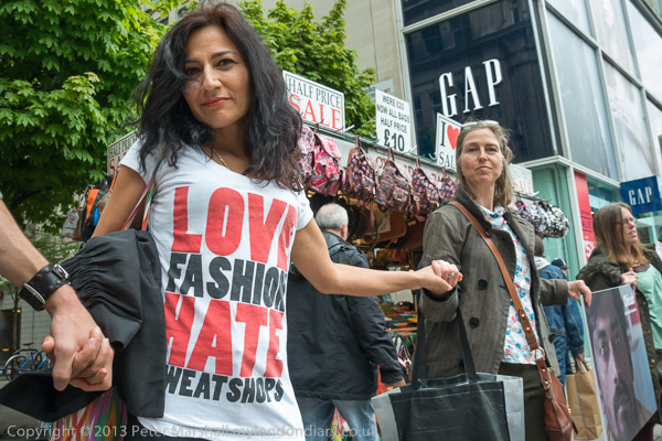
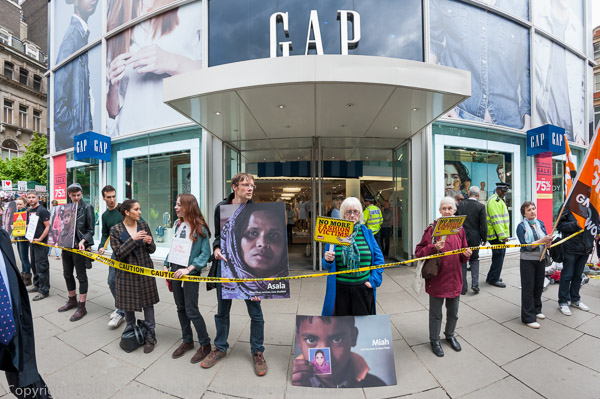
A rare case where I got someone to pose so I could read both her t-shirt and the two GAP
signs – but she was still doing almost exactly the same as before I talked to her

Rohan has been described in the Daily Telegraph fashion column as “a British brand to relish, both for its practicality and glorious immunity to fashion”, and its an immunity that appeals to me.

But although the designs are British they are made internationally, including some in Bangladesh. The company has been a member of the Ethical Trading Initiative (ETI) since 2005, working with their clearly set out standards for the treatment of factory workers in areas such as wages, working hours, conditions, forced and child labour which they insist all their garment suppliers sign up to. They regularly visit the suppliers throughout the year and pay independent and highly qualified auditors to check up on them.

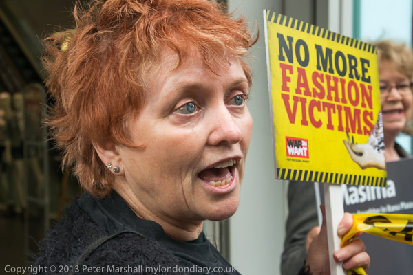
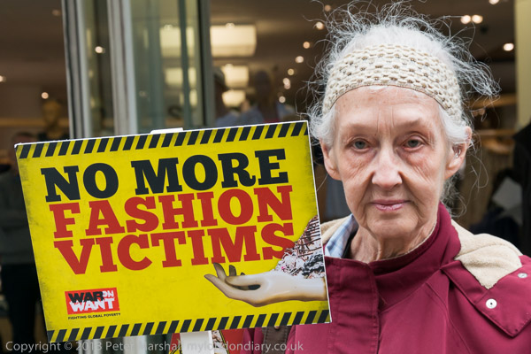
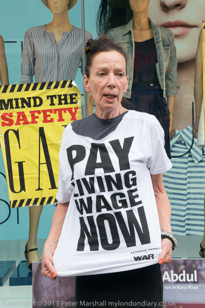
War on Want organised the protest outside GAP as they were one of the outlets for clothing produced in the Rana Plaza factory in Dhaka, Bangladesh where 1,138 workers died on April 24, 2013. GAP is one of several companies who have refused to sign the Bangladesh Accord for Fire and Building Safety launched by War on Want and their Bangladeshi partners the National Garment Workers Federation.

There were quite a few video teams from various media organisations present, always a problem as they all want to do video interviews with anyone at all well known, which often means taking them away from the action for rather long periods. Still photographers want to photograph them in the centre of things, and if they do direct them (I seldom do) and stop the flow of things it is seldom for more than a few seconds. At times too, there was quite a scrum around fashion designer Katherine Hamnett in particular, making it difficult to take pictures.

While I think the main media often concentrate far too much on celebrities (and sometimes the actual event can be almost entirely neglected) as someone who tries to sell images to the media I do of course need to take pictures of the main figures at any protest, especially if they are well known. But I try hard to keep a balance.

But there are plenty of pictures in Rana Plaza Anniversary at GAP of Katherine Hamnett both modelling the t-shirt design she has donated to War on Want and speaking at the event, as well as of Amin Haque from the National Garment Workers speaking, and a few others of both. Another public figure taking part in the protest (and in my pictures) was London’s Green MEP Jean Lambert.

And this was another occasion where the 16mm fisheye came in useful – used here on the D700. There isn’t any real point putting it on the D800E for pictures like this as you don’t need a 32Mp file.

Continue reading Rana Plaza

Inkjet musings

Recently I’ve been making a set of prints for a show next month in London – details and invite coming shortly. It’s not a big deal, a dozen prints in a show together with around the same number by another artist whose work – watercolours and prints – I admire.

Again, I’ll perhaps write more about the subject matter later, but for the moment I’ll just say my contribution is in two parts, work I took on film around 2000, and digital images from this year. The practical details of the show have got me thinking quite a lot about the differences between film and digital and the possible methods of printing both of these.

Most of the earlier pictures I printed before, around the time I took it. In 2000 I made the prints in my own darkroom where  I had a Durst roller processor system running using RA4 chemicals. They were exposed using a Durst AC707 enlarger that was a sweet piece of kit and was fitted with the best enlarging lenses that money could buy. Then, a dozen exhibition prints would have taken me perhaps a full week of printing, as despite some fairly expensive automation each would require a small mountain of tests as I built up a map of the dodging, burning and filtration changes to get just the result I wanted. Two images a day was good, three a real success and four would have been a red letter occasion. I’m not sure I ever made four really good prints in a day’s work.

I thought briefly about using these prints, but I couldn’t find all I wanted, and would like a set that would match. And looking on the wall high in front of me where I have hanging one of the images printed using my Epson R2400 inkjet and Ultrachrome K3 pigment inks on a watercolour paper and decided I liked this better than the C-types.

I wasn’t sure how much of the difference was that the inkjet print was printed from a scan – which had then been extensively adjusted in Photoshop to do exactly the kind of things I used to do in the darkroom but much more precisely – or because of the actual printing process. I considered for a while the halfway house of sending the scanned files to be printed as digital C-types on Fuji Crystal Archive – I have some great prints made this way from digital hanging on my bathroom wall.  But in the end decided to print them myself using the R2400/K3 setup. It would be a little cheaper, take me rather less time. Either way I’d be spending the same time in Photoshop, but I’d save the journey to the lab to take in the files. But the main reason was that I thought I could make better prints.

One of the dozen images I had to print was the odd man out, in that I’d taken it shortly after moving to digital. It stands out to me for two reasons, that the colour is cleaner and truer than those made on film, and that there is just a little lack in fine detail, as the Nikon D100 I was using when I took it just didn’t have quite enough pixels. To make an image at the same size as the others I had to print at 250 dpi, while the high quality film scans are scaled down from around 450 dpi.

The second set of half a dozen pictures in the show were taken with the D800E and the superior qualities of digital over film are clearly visible. The file sizes are roughly the same as the scans from film, but much smoother; I’m not sure there is any more detail but it is clearer and sharper.  And the prints – also on the R2400/K3 –  are certainly better.

I thought and wrote about this because of a short series of article – and some rather long sets of comments upon them – on The Online Photographer blog about the continuing prejudice in some circles against inkjet prints, and suggesting we might need a special name for those produced with quality and longevity in mind as opposed to the typical output from cheap inkjets on cheap paper. Perhaps the only point that almost all are in agreement on is that we shouldn’t call them giclée!

As on any internet forum there are some very ill-informed comments and sheer nonsense, but here there are also some interesting comments from some authorities. In a comment on his first article, Big Mystery,  editor Michael Johnson makes the point that:

“with the exception that most past techniques had distinctive ‘looks’ that specific individuals might have liked and preferred. In terms of controllability, color purity, sharpness, lightfastness, enlargeability, and permanence, the best 2014 inkjet technology surpasses any and all ‘readily available, practical’ traditional color techniques”

to which the site’s Technical Editor, Ctein adds:

“Speaking to the point that Mike didn’t—color gamut—inkjet printing is vastly superior to any chromogenic or dye-bleach process. This isn’t debatable”

and continues to speak about dye transfer, a process for which he has a great reputation:

“Any assertion that dye transfer prints are objectively superior has to be questioned closely.”

A follow-on feature, P+I+P Standards: A Proposal for Future Printmaking Standardization which picks up a point made in the comments is perhaps of less interest. It’s suggestion of some fancy name (IHD) for certain inkjet prints seems to me as silly and unnecessary as the use of the term giclée and the suggestion of ISO or some other certification is I think both unnecessary and unworkable.

To me, IHD sounds too much like that nastily heat-treated milk that makes tea undrinkable, and the other set of proposed initials, VSD, is surely something you should see your doctor about.*

Perhaps the best think is again in the comments, with Ctein again coming out strong.  But as others suggest, this is a non-solution to a non-problem. Some of the most expensive photographic prints sold have been inkjet prints, and certainly these have been common in many galleries for years, often described under obfuscatory names (something I’ve often had a little fun in commenting on in the past.) And if a few dealers have a particular prejudice against them (as some certainly do) it has nothing to do with the actual quality or longevity of the prints.

That it has taken rather longer for black and white inkjet prints to be accepted is perhaps connected to the rather poorer quality of black and white prints produced by most printer manufacturer’s inksets, a problem that has certainly been overcome by the efforts of third party ink makers such as Jon Cone with his several generations of ‘Piezography’ inks.  Ink sets such as his have also prompted the printer manufacturers to raise their monochrome game, and prints made by – for example – Epson’s K3 inks using their ABW printing are now almost in the same league. Many – including photographers – have mistaken mine made on baryta papers for silver gelatin prints.

What in the end was not the final piece, On Vintage Prints (A Last Word) ends (at least at the moment) with a comment by Kenneth Tanaka: “I have seen, and done, more than enough inkjet printing to know that the medium is no longer a valid basis for prejudicial judgement. If you see an ugly print blame the Printer not the printer.”

And, perhaps finally (but I wouldn’t bet on it), Are They Or Aren’t They? beings with a long comment from, the mysteriously named  ‘MHMG’ which perhaps sums up the technical side of things.


* And just in case you are wondering, I simply describe my prints as “pigment inkjet prints”, though of course if anyone asks I’m happy to give them more details – for example that they are printed on the now discontinued Ilford Galerie Gold Fibre Silk (rumoured soon to be produced again.) The only people who ever do are other photographers.
Roman Staines

Good Friday is a day when Christians in different places around the country engage in processions of witness. I’ve often photographed these in Westminster and a few other places in central London, where there are some rather fancier churches and some better known people taking part.

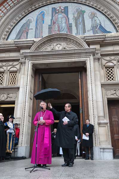
2010 I photographed my third Archbishop of Westminster, the Most Reverend Vincent Nicholls, now Cardinal Vincent Nichols, but there were so many photographers present, and I felt their presence was considerably too intrusive. Of course I tried to behave with appropriate reverence, but others did not, and I wasn’t too keen to go and repeat the experience another year.

Of course, Westminster is not the only game in town, and I’ve also photographed processions in Waterloo, Islington and Archway, as well as the Butterworth Charity at St Bartholemew the Great in Smithfield, and possibly elsewhere. But in the last few years I’ve stayed closer to home and photographed the procession in the town where I live, Staines.

There is nothing very special about Staines. There were settlements in the area thousands of years before the Romans came, and while they built a town here where their road to the south-west went over the Thames, all that was soon gone (though archaeologists made many interesting discoveries in the last half of the last century where they managed to get on to sites before the concrete was poured.) When I was young you could still see cattle being driven down one of its major roads, but it had one major claim to fame. Around the world people walked on linoleum made here – and the air was heavy with the stench of linseed oil. Vinyl put paid to lino; the works is now a shopping centre, and the air is now thick with the pollution and fumes from the M25 and Heathrow instead.

And it was to that shopping centre that the Staines Procession of Witness made its way from the Methodist Church close to the River Thames (spitting distance from where the Romans probably crossed it) to the former lino, now the ‘Two Rivers Shopping Centre’. Neither of the rivers is the Thames; the lino came here in the 1860s to a mill on the River Colne, and around the site’s western edge runs the Wyradisbury River, one of several distributaries of the Colne. A third stream, Sweep’s Ditch.  ran from the Colne along the southern edge of the site, but was blocked by redevelopment in the 1970s and now begins half a mile to the south, with water pumped specially from the Thames.

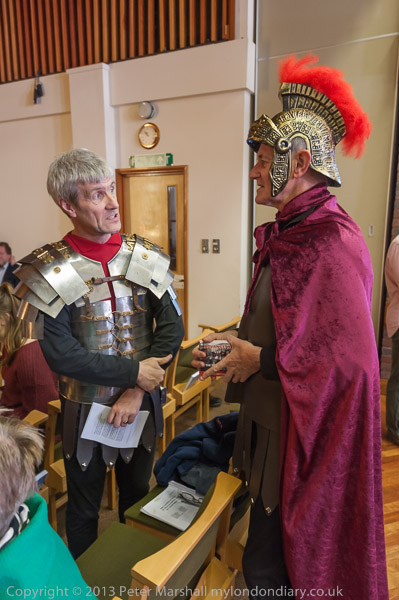
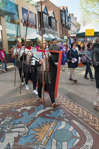
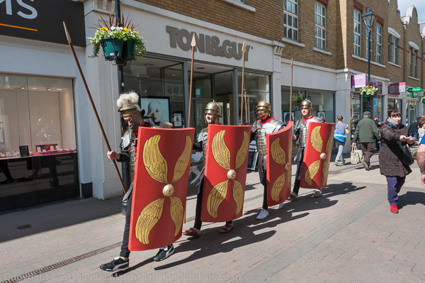
But it did seem appropriate because of the town’s history that there should be a group of four Roman soldiers taking part in the procession, although their presence was rather connected with the history of Christianity and the Holy Land than Staines past. It was Staines one day on that they were there to publicise, when Christians in the town were staging for the first time an open-air performance of the Staines Passion, based loosely on the Passion of Jesus as performed on by the players from Wintershall in Trafalgar Square which I photographed it in 2010.

Staines used to be one of the major towns of Middlesex, but is now a rather minor partner in Spelthorne, whose true blue councillors don’t much care for the downmarket area of the borough, and whose council officers would like to cover it most of it with high-rise offices (and but for the crash might have succeeded.)  It’s also since 1965 a part of Surrey, rather to the disgust of many Staines residents who thus failed to get the advantages of being a part of Greater London – like regular buses.   More recently they played a nasty trick on the town, changing its official name to ‘Staines Upon Thames’, though I’ve never heard any real Staines resident use the new name except in mockery. It appears to have happened because of a drunken bet in the Conservative Club and was achieved by a pathetically bent consultation. Apparently some Conservatives thought that Ali G had given Staines a bad name – but that just shows they have no sense of humour. The local football club had adopted him as their mascot, with some die-hard fans copying his mode of dress for matches.

But a few years ago, Spelthorne did try and spend a little money on Staines, producing a disastrous riverside area and an ‘Art Trail’ with some artworks of very varied quality.  A couple of these were on the route of the procession, and I tried hard to feature them in my pictures, though not too successfully.  The mosaic is one of the better pieces, but the soldiers marched around the wrong side of it for my picture, showing the rather plain backs of their shields.

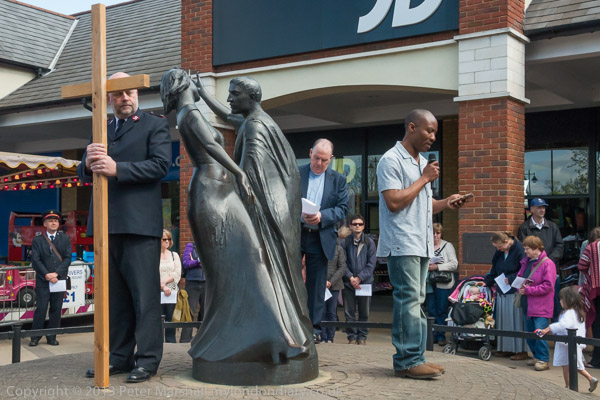
But it was better than my attempt to use the sculpture of the lino workers, where there were just too many people in the way for the picture to work. The goal of the procession was another of the art works, Time Continuum (aka the Two Dancers) which supposedly represents two thousand years of Staines, and is a sundial made with the two figures (supposedly a Roman man and a modern woman) on a mound.

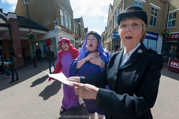
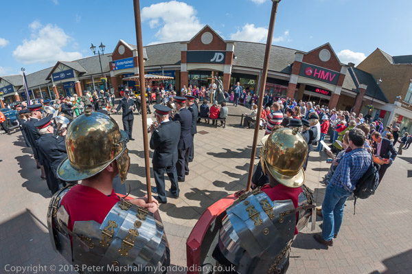
As usual the 16mm fisheye came in useful, both held way up above my head and a couple of Roman soldiers to give an overall view, and in the top picture on this post, where I think the perspective adds a little interest to the three women singing, although I think the Sally Army woman is a little worried that I was getting so close.

After the event had finished and all the hot cross buns were given out (and I had my second of the day) I waited around for the Roman soldiers to march back to the Methodist Church were they would be changing back into civvies and continuing their rehearsals for the following day’s Passion play.

I’d hoped to get a picture of them together with that sculpture of the men with the lino, and I did, but not a good one, as one of them suffered a severe wardrobe malfunction just before they reached it, with the strap on his shield becoming unstrapped. So although you can see a picture in Good Friday in Staines it only has two or the soldiers rather than the neat patrol of four I’d hoped for.
Continue reading Roman Staines