World Press Photo 2015

You can now look at all the winning images in the 58th World Press Photo Contest, selected from the 97,912 images submitted by 5,692 photographers of 131 nationalities on the World Press Photo site.

I haven’t yet had the time to look through all the pictures from 2014 in the 2015 Photo Contest, but my initial impression is that the organisers have tried hard to get away from the accusations that every year is the same, and the selection looks as if they have adopted of rather wider approach than in some previous years.

As usual there is likely to be disagreement about the winning image, Jon and Alex by Danish photographer Mads Nissen, a member of Panos Pictures, from his coverage of the increasing hostility in Russia towards lesbian, gay, bisexual and transgender (LGBT) people.  Although I think its a good image, I wonder if it really is the most outstanding of the crop.

One of the jury, Alessia Glaviano comments on WPP:

“The photo has a message about love being an answer in the context of all that is going on in the world. It is about love as a global issue, in a way that transcends homosexuality. It sends out a strong message to the world, not just about homosexuality, but about equality, about gender, about being black or white, about all of the issues related to minorities.”

and another, Donald Weber stated:

“World Press Photo is more interesting than being just a competition. The winning image fosters debate not only within the photo community, about who we are and where we’re going and what we’re trying to say, but also in the larger community. The images are seen and discussed by tens of thousands of people.”

This year the WPP insisted on having the original camera files as well as the finished image, and their experts “found anomalies in a large number of files and presented their findings to the jury“, resulting in 20% the images that reached the penultimate round being eliminated “because of removing small details to ‘clean up’ an image, or sometimes by excessive toning that constitutes a material change to the image.”

I’m both pleased that the WPP is taking a firm stand, and also very surprised at the level of unacceptable retouching, particularly as they had made it clear that they would be checking  for it. It suggests that many photographers (or their agencies) have failed to appreciate that there is any problem in altering news images.

As they say:

“There is clearly an urgent need to take this matter further. Over the coming months, we will be engaging in further dialogue with the international photojournalistic community to explore what we can learn from all this, and how we can create a deeper understanding of issues involved in the application of post-processing standards in professional photojournalism.”

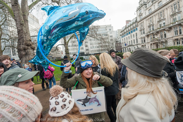
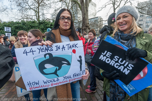
Dolphins on the March

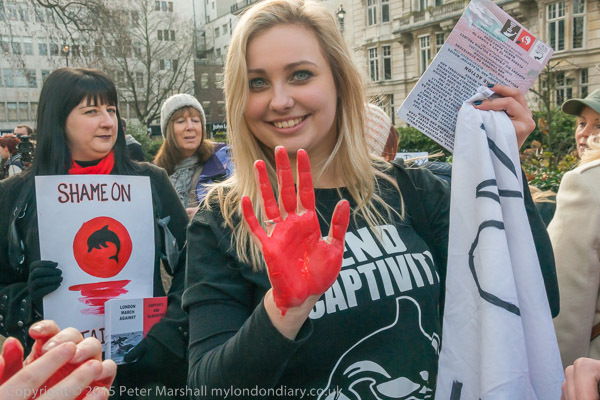
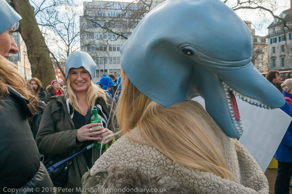
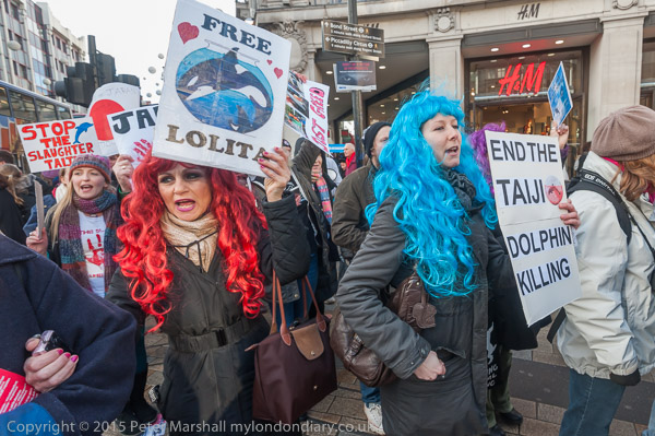
I’d like to make it entirely clear. I am against cruelty to animals. And the annual slaughter of dolphins at Taiji cove in Japan is repugnant. It should stop. Along with other barbaric activities like those than are integral to fur farming – cruelty for profit – and fox hunting – cruelty for fun, which seems particularly abhorrent. And while in principle I’m not against all farming of animals, I’d want it to always be done in an ethical and humane manner – which of course is so often not the case.

And I’m certainly unhappy about capturing and keeping dolphins in restricted spaces, training them to do tricks to entertain the public and would like them to live instead unhindered in the oceans.  But while I have a basic sympathy with these protesters and their protest I also have some reservations.

I do sometimes feel that the issues about human rights and their abuse are event more important, and wish that all these people would also be as enthusiastic about them, coming out on the streets to protest. Of course some do (and I recognised a few from other events), but I think they are relatively few. And it worries me.

We are – at least in some respects – a nation of animal lovers. A society where animal welfare charities get massive support, both in donations and in the adulation of the media, who at the same time are demonising human beings who need support as scroungers.

It’s a strange world in which we humanise animals to make them into appealing stories for children – most of whom will never actually meet these or other real animals. Real bears don’t eat marmalade sandwiches and nature is often red in tooth and claw. And if dolphins aren’t cuddly it is perhaps a strange paradox that it is largely through their performances in dolphinariums around the world that they have acquired the kind of public image which is now exploited in the imagery of the protesters who are so desperate to save them.

Yesterday while waiting for my train I watched a rat scurrying around on a patch of waste ground. From a distance it looked quite cuddly, but this was vermin. Most people would happily shoot or poison it. The squirrels in our garden are more appealing, with their acrobatic skills and fluffy tails, but until 1957 you could get a bounty (begun as 6d, it had risen by then to a florin or perhaps half a crown) for taking their tails to a police station – it was only abandoned when it was decided poisoning was more effective than shooting. There are still plans for a huge cull, seen as the only way to save our native red squirrels, and opposed by animal charities.  I’m not sure where I stand on that one, but given the way the pigeons eat the crops in our garden I might well favour a cull of them.

More pictures at  Carnival March to End Taiji Dolphin Massacre

Continue reading Dolphins on the March

Lightroom Develop Primer

By now I think most of the photographers I know – or at least those who can care more about image quality than speed – have become Lightroom users. There are of course alternatives, and in the past I’ve used several of them, including Capture One and the software from Nikon and Fuji for their own cameras, as well as other independent alternatives.

For sheer speed, important to many press photographers, I’m told that nothing beats Photo Mechanic, and if I were wanting to file images from location I’d probably install this on my Ultrabook.

There are minor differences between the results from different raw conversion software, but all of them do a very acceptable job, and the differences between their renderings seem unimportant except to pixel peepers.

Lightroom appeals to me because of its workflow and versatility, and it also helps that it comes together with Photoshop on a reasonably priced subscription. Like many others I was worried about the Adobe scheme when it was introduced, but I am now converted, especially since Adobe seems to be keeping its promises and also continuing to develop both products.

For me Lightroom does have one weak link, in that it is very slow for the initial editing of the large number of images I usually take in a day’s work. The review of images within the Import dialogue works for a small number of pictures, but slows to almost a complete halt when applied to sensible numbers.

My workaround for this is FastPictureViewer Pro, software that does exactly what it promises. It reads the images from my USB 3 card reader at least as fast as I can view them on screen; after an initial load time of perhaps 10 seconds there is no waiting as I go through the pictures, pressing K for those I want to keep which it copies immediately to my ‘input’ folder.

On the web page they suggest that using Lightroom on a batch of 1000 images with a fast computer takes around 1 hr 10 minutes, while doing the initial edit with FPV and then only importing the selected images cuts this to around 20 minutes. On my system I think the time-saving is perhaps a little greater.

But although many friends have Lightroom, I don’t think many of them have really appreciated or explored what it could really do for them.   It has grown into a fairly complex programme, though basically still much simpler and more intuitive than Photoshop.

I spent a long time going through the various excellent tutorials available on the Adobe site – and a long time searching for answers to various problems in the online resources there, which I feel are not well presented. You can of course buy books telling you how to use it, and I have one, but these become out of date almost as soon as published as a new and improved version appears. Mine had some useful tips for Lightroom 2, but five years or so on, Lightroom is now at version 5, with 6 surely not long away.  But there were some good tips, particularly about workflow which still apply.

Thanks to PetaPixel for alerting me to the video 10 Tips for Optimizing Your Photos with Lightroom: A Primer on Basic Techniques, a lengthy presentation by photography instructor Tim Grey.

And it is lengthy, and I would have preferred a much more business-like presentation which would have cut the length by at least an hour, but it does give a good introduction to the basics of working with an image in the Develop module at the heart of the software. As someone who started at the beginning with version 1 (then somewhat of a disappointment compared to the software Adobe bought out) there wasn’t a great deal that was new to me, and perhaps Gray’s approach may be better for those coming across the programme for the first time. But there were a few little things that I learnt. Though what seemed like ten minutes to tell us it was a good idea to check the ‘Remove chromatic aberration’ box seemed excessive. And is there any reason ever to leave that box unchecked?

Of course, we all work slightly differently as photographers, and there was some advice that wouldn’t work for me. Perhaps because I often have to work rapidly, unlike him I often have a need to adjust the exposure slider, and I have a more aggressive approach to luminance noise reduction than him. But he does make the effect of some of the many sliders in the develop module clear, and in particular things like the difference between ‘saturation‘ and ‘vibrance‘. Though I was sorry when talking about that luminance module he failed to mention at all the functions of the contrast and detail sliders.

Perhaps more significant was the lack of any discussion about sharpening (unless I went to sleep at some point?) Other people tell me that Fuji X-Trans files render better with a 100% detail setting in sharpening. I think a similar high detail setting in the luminance noise dialogue also helps.

If you watch the video, use the link supplied by PetaPixel to the B&H site for whom the video was made, and make it full screen so you can see fairly clearly the quite detailed settings on the right of the Lightroom screen.

I’ve never been to B&H, but have often referred to its on-line catalogue for information and did once buy a camera from them, a long time ago. It arrived quickly and well packed with all the documentation in order, and at some saving to me because of the dollar/pound rate at the time, and because US prices for the Konica Hexar were rather lower. In the UK it was overpriced by the importer and was very hard to find in the shops, and what was perhaps the truly iconic ‘street’ camera was a rare beast indeed here.
My 1980 Colour (Part 2)

The pictures I’ve selected from my colour work in 1980 are probably a fairly random cross-section of those I took, simply the pictures that I’ve scanned for some reason or other in the dozen or so years that I’ve owned a colour scanner.

It’s easy to forget that being able to easily put colour images on the web is something fairly recent. The main reason I bought my first digital camera in 1999 was to enable me to do so. I probably still have it in a drawer somewhere, a Fujifilm MX2700 which was a 2.2Mp camera, one of the leading non-professional models of the time, which gave reasonable results for web use (and with great difficulty and lengthy retouching a 6″x9″ print which was the only digital print in a large group photography show a few months later.)

Before then, I could get colour files by taking a print or slide into work and using the large flatbed scanner I had specified for the art department. It was a tricky beast to work, and while it did a reasonable job with prints, it pretty well failed with slides. I seldom bothered, and mostly used my home scanner – black and white only – to scan colour prints. Later I bought film scanners. The first, an early Canon, was pretty hopeless, but later I had a Microtek and a Minolta Multipro that gave high quality scans – but took a long time over each one.

You could of course also get high quality scans made commercially, but this was and is an expensive business. The Minolta could be coaxed to produce ‘drum scan’ quality at a file size one of London’s leading pro labs now charges £55 or more a time. Though cheaper and possibly better services are available elsewhere.

The My London Diary web site largely came about because of my switch to digital, although the early years have mainly scanned black and white images. But from the end of 2002 I had begun to work with a Nikon D100 alongside film, although it took another couple of years before I stopped using film and everything could easily be posted on my diary.

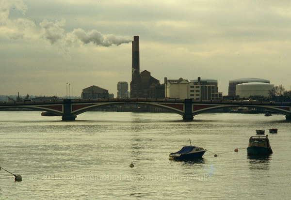
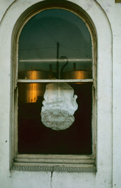
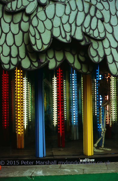
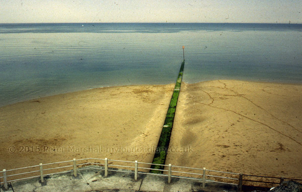
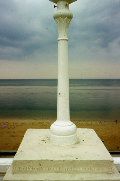
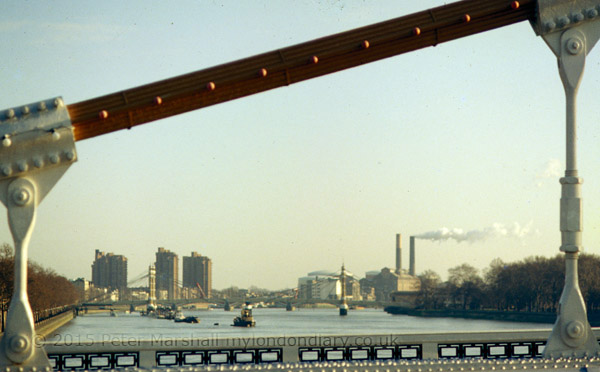
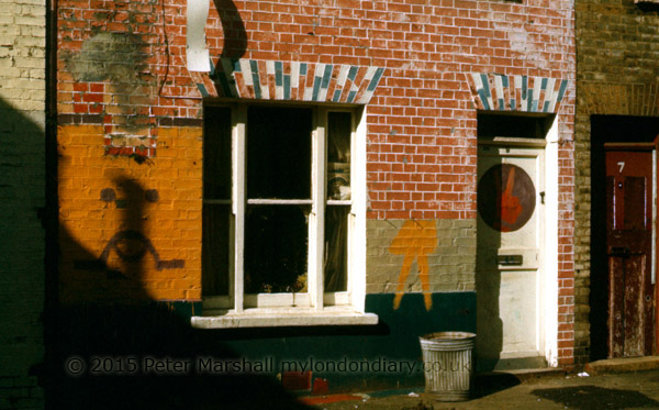
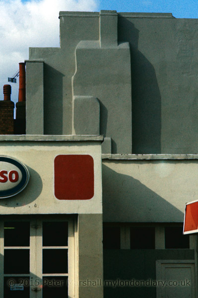
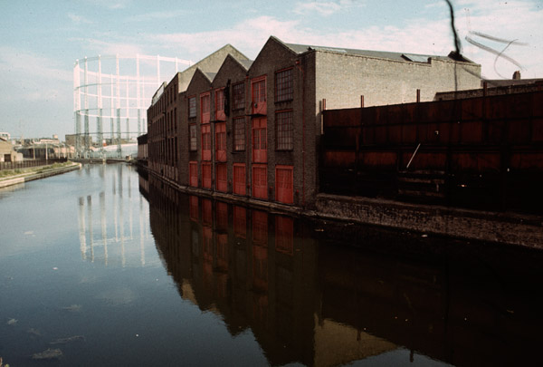
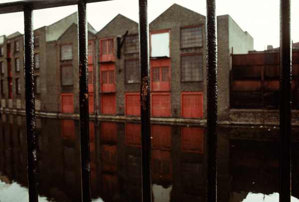
Here then is a small gallery from those colour transparencies that I have scanned from 1980 (or at least I think they are from 1980.) I think most or all of these were taken on Group 6 outings, though what was probably the only one I arranged that year was unusual in that I was the only person to turn up! My lone walk took me around Battersea and Wandsworth, including a number of views of the Thames and to the ‘Royal Laundry’. I’ve done just a little correction and removing dust etc on the scans, but most could be improved by more work – or by making new scans, but some of the originals may have deteriorated beyond redemption.


80-slide051srgb600
London, 1980

80-slide056srgb600
Wandsworth, 1980

80-slide057srgb600
Wandsworth, 1980

80-slide058srgb600
Battersea, London, 1980

80-slide050srgb600
Margate, 1980

80-slide059srgb600
Margate 1980

80-slide060srgb600
Margate, 1980

80-slide062srgb600
Wandsworth Rail Bridge and Fulham B Power Station, London, 1980

80-slide069srgb600
From Chelsea Bridge, London, 1980

80-slide073srgb600
Royal Laundry, Battersea, London, 1980

Continue reading My 1980 Colour (Part 2)

My 1980 Colour (part 1)

80-slide032srgb600Clapham, London. 1980
In 1980 I was usually carrying two cameras when I went out to take photographs, one loaded with black and white film, usually ASA 125 Plus X Pan in the Leica M2. In my jacket pocket, even when I wasn’t going out to take pictures I always had a small camera, a Minox 35EL with a fixed 35mm lens, one of the smallest 35mm full frame cameras. I had both 50mm f2.8 and a 35mm f1.4 for the Leica. In the middle of the year I switched to Ilford FP4, probably only because I found a cheaper source of film.

But in November there was a significant changes. Ilford had brought out the first black and white chromogenic film, XP1-400. According to Wikipedia it went on sale in January 1981, but the first roll of it I took has a few pictures of our Guy Fawkes night celebrations on November 5th, 1980 (and Christmas 1980 comes a couple of rolls later.) I had a Leicameter MR4 on my Leica M2, and it was usually good enough for conventional black and white film, but exposure became (at least for me) more critical with XP1, and I soon switched most of my black and white work to the much more accurate metering of the Olympus OM1.

80-slide047srgb600
London, 1980

I’d started off using the OM1 for colour transparencies, where exposure was always very critical, and had kept the camera when I upgraded to the Olympus OM2, which had an even better metering system. I think all of the colour slides from 1980 will have been taken with the OM2.

80-slide027srgb600
Brick Lane, London, 1980

I’d bought the OM1 with the standard 50mm f1.8 lens (there were two faster alternatives, but it didn’t seem worth paying a lot more for a bulkier and heavier lens with only a relatively small speed advantage.) I’d started too with the latest thing in lenses, one of the first popular zoom lenses, a rather bulky 70-210mm or thereabouts. It wasn’t a bad lens, but after a year or two I sold it and bought a much smaller, lighter and faster 105mm Tamron.

80-slide020srgb600
East End, London. 1980

Later I found a Zuiko 35mm f2.8 shift lens secondhand at a sensible price in Hull – around a hundred pounds less than in London – and added that to my kit, and later still I found a 28mm f2.8 bargain. I had to buy the 21mm f3.5 new, but the 200mm lenses (eventually both the f4 and f5 – I could never decide which I liked best) also came secondhand. But I think all of the pictures in 1980 will have been made with the 50mm or 105mm.

80-slide029srgb600
London, 1980

80-slide030srgb600
Canal, London. 1980. This may have been from a Group Six walk

In 1980 I was working in three different ways. When at home I was making regular trips to London and walking around various areas, mainly taking pictures in black and white, some of which are in my book http://www.blurb.co.uk/b/4048897-london-derives?class=book-title London Derives. One Sunday a month I would go out with a bunch of other photographers -usually between 4 and ten our us – on a photographic outing. We were enfants terrible in a photographic club who refused to take the club restrictions and conventions seriously – or perhaps we were just serious about photography in ways the club didn’t understand. At first we were a group of the club (the sixth group formed, which had, for want of a better idea called itself Group Six, though by the time I joined there were only four others.) We took it in turns to organise where to go, and these often took me to places I wouldn’t otherwise visit, including rural Wiltshire and Margate in the pictures here. Some of those along the Thames may also be from one of these outings. Any I suggested tended to be in London, while most others preferred more obviously picturesque locations.

80-slide021srgb600
A rather wet Wiltshire on a Group Six trip

80-slide023srgb600
Terry King on a Group Six outing in Pewsey, Wiltshire. 1980

The final area of my work was in Hull, where we went several times a year to stay with my parents-in-law. Much of the black and white work from there is in my book Still Occupied, but my show there also included roughly 40 colour images as well as the around 100 black and white works.

I’ve done some rough corrections on the scans that I found, some made a few years ago, but haven’t removed every blemish. It’s hard to know exactly what colour some of them should be, and I still am having to use an uncalibrated screen. Where possible I’ve tried to balance on a neutral gray with Photoshop.

My Seventies Colour

I took quite a lot of colour images in the 1970s, though relatively little of it is of much interest to me now. I’d taken some in the 1960s too, before I became a photographer, though I had some aspirations, if no idea about how to do it. A girl friend when I was sweet seventeen and had no idea much about anything was beginning a career as a model and I took most of a 36 exposure Agfa transparency film of her in one on the cherry trees in my back garden. It wasn’t the reason why our relationship went nowhere – our tastes were very different and she was attracted to older men with money.

I couldn’t afford film and processing then (or girl friends) and mostly I took just a few pictures on a holiday. Things changed when I began teaching when I was around 26, as not only did I have a little money, but I’d also got a largish flat in a New Town, but had learnt the rudiments of black and white processing and could take over the kitchen after dinner to process films and make prints.

79kew01-600
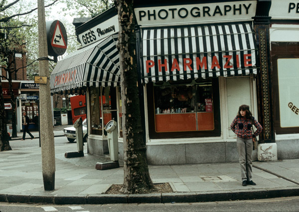
‘Photography’ at Kew

With my first few months salary I’d bought a Russian SLR camera, a Zenith B, to replace the old Japanese Halina that had never really worked since I’d dropped it in the lake at Versailles five or six years earlier, and some black plastic sheeting to cover the windows and the other basic requirements – three trays, a developing tank, measures, thermometer etc. Getting equipped was made easier by mail order, and the previous year living in Leicester I’d got to know the small photographic Aladdin’s cave of Jessops, with the catalogue on a large sheet of very small type – they sold a 10p magnifier with it. Another mail order company was Polysales of Goldalming, with a catalogue which had some useful advice in it as well as the goods.

79thamesatkew-600
River Thames near Kew

Colour became a sideline, and of course most professional work was then in black and white. My first work was for a local theatre company, and the pictures they wanted were b/w also. Colour was still something largely for family pictures and holiday snaps.

79samatkew-600
Sam in bluebells at Kew

Soon after I entered a competition in one of the amateur photographic magazines, and as a prize won 20 rolls of Kodachrome to make an entry into a tape-slide contest. I decided to base my entry on a cycle tour along the Loire Valley, and some of the pictures weren’t bad, but I had no experience and pretty poor equipment to make the sound-track. That was a competition I didn’t win.

But I did begin to use colour as well as black and white film, carrying two Olympus OM bodies (or a Leica and an OM) one with b/w and the other with colour slide film. I soon switched to E4 and then E6 films and cut costs dramatically by processing those myself. But black and white remained the serious side of photography, with colour only being a minor side of my work.

79cherrygdnpier01-600
Cherry Gardens Pier and view to Wapping

79rotherhithe01-600
Rotherhithe

79-stpancrasgas01-600
Gas Holders at Kings Cross

79broadwaymkt01-600
Bethnal Green

79broadwaymkt02-600

I studied colour too, both with the Bauhaus book ‘The Art of Colour‘ by Johannes Itten and also works by photographers including Andreas Feininger, though I found these less interesting. Much of my colour photograph was just about colour, with the subject matter being immaterial, and most of this I now find of little interest.

Colour really only began to work for me when I began to use it for documentary subjects, at first along with black and white in my work on Hull, Germany and the Royal Docks. It was really only when I changed from colour transparency to colour negative in the mid 1980s that I started on projects that were only in colour; before then I’d found the technical deficiencies of colour transparency too limiting.

The images here were I think all taken in 1979, and these reproductions are all from scans made in 2002 which I came across on an old hard disk from a computer  I’d getting ready to throw out as it will no longer start up, probably because of damage caused by overheating when a fan got blocked by dust. But the hard disks are still readable and I’ve removed those on to my backup shelf.

The slides had aged a bit when I scanned them, and some were rather dirty. I’ve tidied them up a little and adjusted contrast and colour balance roughly before posting.
Continue reading My Seventies Colour

After the March

After the March for Homes on Saturday, which ended in a rally outside City Hall, next to Tower Bridge, I was cold, wet and tired and wasn’t feeling at my best. So I got on a bus and made my way home, despite it being obvious that quite a large group of the protesters were clearly intent on other actions. I missed an opportunity for some interesting pictures, but there are times when I feel I just have to stop. It wasn’t as if there weren’t plenty of other photographers around to take pictures.

When I started photographing at protests, it was partly because so few others were doing so, outside of the really big events. Even now there are some where I’m the only photographer present – and my presence there and getting their story out becomes more important. But of course even if there are no photographers, almost every protester now has a phone and is taking pictures. Sometimes its hard to photograph events because so many of those taking part are either themselves taking photographs or looking at the photographs they have already taken rather than taking an active part in the protest.

The March for Homes was against the current redevelopments taking place in London, building expensive flats which are mainly sold abroad to overseas investors, many of whom leave them empty most or all of the year. Buying for investment pushes up the price of properties across London, and is making it impossible for most Londoners to buy or increasingly even to rent a place to live.

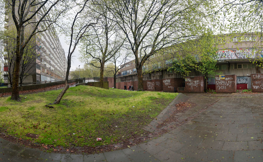
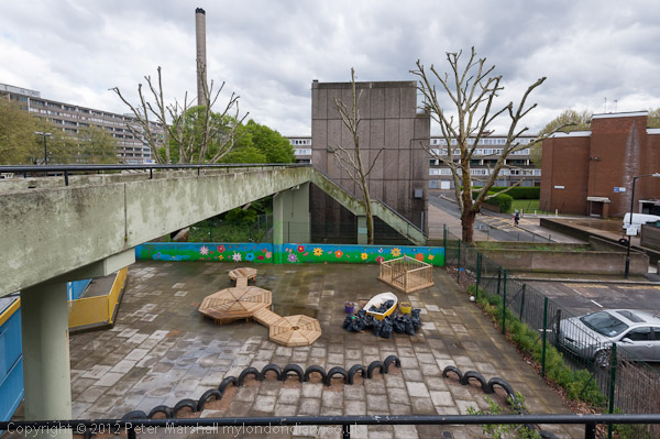
Councils across London, many Labour run, are selling off estates with realtively low rent accomodation, particulary the large council estates built shortly after the second World War to meet the housing needs of Londoners. One of the larger schemes so far was the Heygate Estate, a well-planned award-winning estate at Elephant & Castle. Over the years the estate had been neglected and needed repairs, and had deliberately been used to house anti-social tenants, many with drug and mental health problems. ut most who lived there liked the area; they would have liked to council to do more for the estate, but the council decided the site was an asset they could realise.

Of course they got it wrong. The costs of moving out tenants and leaseholders who didn’t want to move turned out to be much higher than they anticipated, and took many years longer than they had bargained, despite compensation for owners mostly at around half the market value. Individual councillors may well have benefitted from sale, and there were certainly treats from the developers, who ended up getting the site at perhaps a fifth of the true market value, but the council lost a large amount on the sale.

But the real losers were of course the people who had lived on the Heygate, some now in estates at the far-flung ends of Southwark, others in inferior private accomodation at higher rents, and leaseholders either having to take on large mortgages or move to the fringes of London. And the many thousands on the waiting list for social housing with the stock available greatly reduced by the demolition.

It isn’t correct to talk of the new Elephant Park that is now being built as a luxury development, though certainly the new properties will be expensive. But they will probably be less spacious and no more luxurious than those that they replaced, and are likely to have a shorter life-span.

Having made a shameful mess of Heygate, Southwark have now begun the same process on the neighbouring Aylesbury Estate. Its a larger estate and lacks the architectural quality of the Heygate, and again has been allowed (or encouraged) to deteriorate. Initial plans for ‘regeneration’ under the ‘New Deal for Communities’ (NDC) set up by Laboin 1998 led to a ballot across the estate in 2001 in which a 73% majority among those living there wanted to keep the whole estate as council housing. The story around Aylesbury is complex, and you can read more about it on the Southwark Notes blog.

From City Hall, protesters went on the briefly sit down on Tower Bridge and to protest inside the expensive flats currently being erected next to it. Some then marched down to the former Heygate estate and then on to the Aylesbury estate where they re-opened and occupied a part of a block, Chartridge, that had been cleared for demolition.

Although I haven’t yet made it to the occupation as I’m not yet entirely fit after my exertions on Saturday, I have been around the Heygate and Aylesbury estates several times in the past, most recently on a guided tour Walking the Rip-Off in 2012, from which the pictures here mainly come.

On that tour we went inside a few properties on the Aylesbury Estate, and the flats were well-designed and relatively spacious, rather more so than those of the new properties planned to replace them.

Poor Doors Again


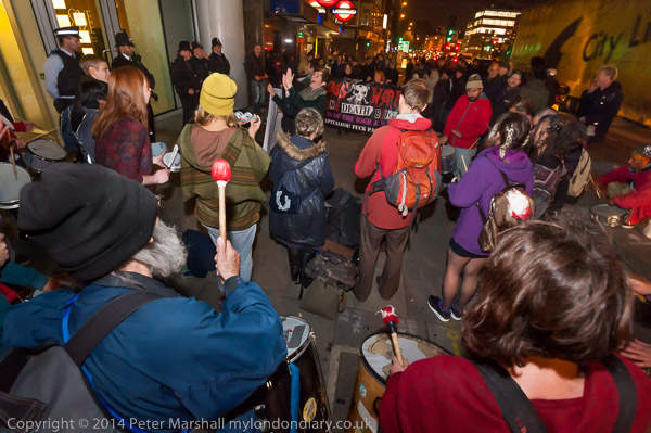
Musical Poor Doors October 18, 2014

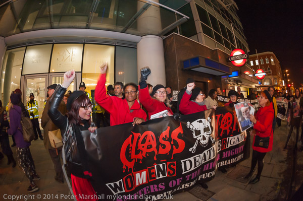
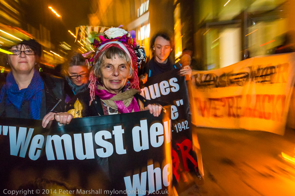
Last year I photographed a whole series of protest outside one of London’s prestige blocks, One Commercial St. Organised by Class War, these started small, with less than a dozen protesters at the end of July, but built up week by week to around a hundred, with a couple of larger events in October and November.


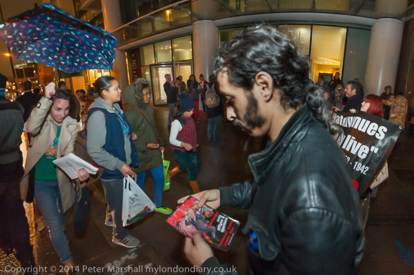
Wet night at Poor Doors October 29, 2014

I didn’t quite go to every one of the protests, missing I think two of the weekly Wednesday evenings when there were events elsewhere I felt it more important to cover at the same hour. But I was pleased when it seemed in November that the new owner of the block had agreed to talks and it seemed wanted to resolve the issue. Not just because it seemed to be a victory for the protest against social segregation, but also because travelling across London for the hour’s protest every Wednesday was having too much of an imposition on my life and work.

Travelling there for the 6.00 pm start to the protests by bus in the rush hour was slow. Tube would have been faster, but whenever possible I like to use the bus, and it cuts my expenses as I travel free on it, but have to pay on the tube. It isn’t that expensive, but this was a long project for which I expected little financial return. At first, getting back by bus was fast, but for later events traffic in the city was completely disrupted by evening road works, and on one occasion when I was in a hurry I got off the bus and walked and ran the last couple of miles.

And while in July the protests were taking place in daylight, by October and November it was dark throughout. We had a lot of wet weather too, which didn’t make life as a photographer easier.


Poor Doors Guy Fawkes burn Boris November 5, 2014.

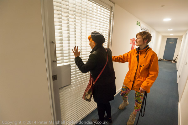
But perhaps the hardest thing, especially for the regular weekly protests, was going there and striving to produce something different every week. It was helped at times by the protesters, who also felt a need to do something new. Class War does like to have a little fun at its protests. So there was a special celebration on November 5th, complete with a guy, Boris Johnson, who mysteriously burst into flames and burnt for a surprising length of time, and at the final protest in the series what was billed as an attempt to get into the Guinness World Book of Records with large numbers of their notorious posters of leading politicians, and when, along with Lisa Mackenzie from Class War, I got a tour of the two areas inside the building.


Class War Women in Red November 12, 2014

The initial meeting between the protesters and the owner was encouraging, and he seemed keen to resolve the issue, and there were apparently discussions with those living in both the expensive and ‘affordable’ sections of the property about how a resolution could be achieved. It didn’t seem to me to be an insoluble problem – as I had found when taken for a tour by one of the residents, there was no problem in accessing the ‘poor’ side of the building from the ‘rich’ area by a separate lift from the ground floor.


‘Bye Bye Redrow’ Poor Doors Street Party November 19, 2014

It would perhaps have required a little interior redesign to allow all residents to enter the building the same way and then have the separation between the two groups inside the building, but I think it would have been possible.

But a few days ago, the protesters met with the owner again, and were told there were to be no changes to the arrangements for a separate ‘poor door’ in the dingy side alley. It looks almost certain that the protests will soon begin again, though it isn’t clear what form they will take. Perhaps I will find myself being busy on Wednesday evenings again, but I rather hope it will be something a little different.

Continue reading Poor Doors Again

Worth Publishing?

_DSC8829-s600

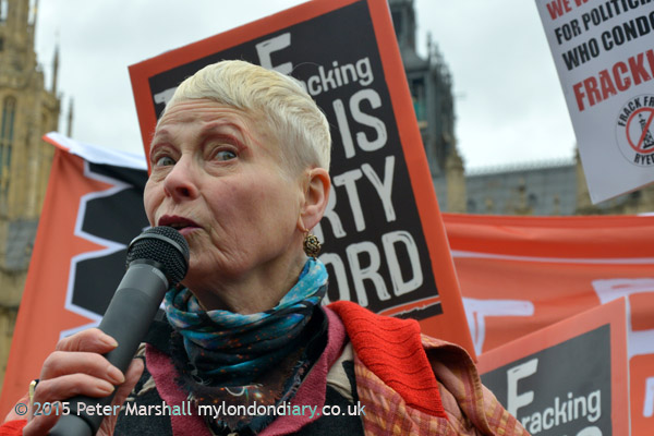
I’ve just been reading an article on the web site of the US National Press Photographers Association,(NPPA) about research they funded into ‘what makes a photograph memorable, shareable, and worth publishing.’ Eyetracking Photojournalism is certainly an interesting read for photographers and the study showed that people could tell the difference between professional and amateur photographs, at least from the pool of published images they showed to the 52 participants in the study.

The study involved an analysis of the eye movements made by people as they looked at the images and also interviews with those taking part, who were asked to rank images in various ways.  And the NPPA were obviously very pleased that it showed that people could recognise the difference between the work of the professionals and UGC (user generated content) and appreciated the professional work.

This is only the first of what the NPPA promise to be a series of four posts, and we will shortly be able to see the 200 pictures used. While I applaud any study that shows the audience appreciate good photographic work (even if the accountants don’t) I do have a few doubts, not least because of the rather average (and sometimes downright poor) professional photography that many of our news  media are prepared to use.

Of course, none of us are always at our best.  And sometimes the picture we get, while not being brilliant, is the only picture available, and there are some of my own like this that I wince at when I see them in print. I know I could and should have down much better. But rather more frequently I see lacklustre images by others being used when I know that much better – either my own or by other photographers – were available.

We do exist in an age of image saturation, with more photographers than ever taking more pictures and submitting more through the various channels available. I hope that studies like the NPPA one will encourage the media to try and discriminate a little more over which pictures they choose to publish, but I fear it will have little effect. Speed and cost are now more important than quality.

But I was pleased to see the picture at the top of this post which I took on Monday being used in at least one publication. I’ve photographed Vivienne Westwood on a number of occasions, and took a great many pictures of her at this event, of which this one, for me at least, stood out.  Her expression is of course the main thing, but also I think I got the framing right – just enough information for it to be clear what she is speaking about and where she was speaking.  

There were possibly another hundred photographers taking pictures (the kind of situation I hate) but I’ve yet to see another that seems to me more than routine. And I think – perhaps I’m kidding myself – that it well illustrates some of the things that people in the NPPA study are quoted as saying.

Continue reading Worth Publishing?

In the Shadow of the Pyramids

Legally I should probably preface this post with a warning that no one should take investment advice from me. I have a proven track record in losing money, particularly in 2007, although I knew what I ought to do then but just couldn’t be bothered. Like I can’t be bothered to switch energy suppliers and all the other things our government thinks we should all spend our time doing.  I rather liked it the old way where we had a Gas Board and it saved a lot of thought. And certainly if we’d subsidised British Rail the way we have the privatised companies we would have a much more joined up, cheaper and better railway system. As well as still being passengers and taking trains from railway stations – and be spared those highly annoying announcements thanking us for travelling on Southwest Trains; if there was any alternative we would be taking it.

Actually I have changed energy suppliers, but not on cost grounds, though I think changing to Ecotricity has saved me money. But they are certainly a nicer company than most and kinder to the planet, and I’m happy to give them a little free advertising on this otherwise deliberately advert-free zone.

But if you want a good investment in a photo book, my advice (for what it’s worth) is that you should be putting your 88.60 Euros (prices differ in various countries) into an order for In the Shadow of the Pyramids, a Project by Laura El-Tantawy described as:

“a first person account exploring memory and identity. With images spanning 2005 to 2014, what began as a look in the mirror to understand the essence of Egyptian identity expanded into an exploration of the trials and tribulations of a turbulent nation. The result is dark, sentimental and passionate. Juxtaposing the innocence of the past with the obscurity of the present, the book is an experience, edited to look like a one night’s encounter. A peaceful and tranquil day suddenly turns violent and chaotic, it’s claustrophobic, until a new dawn rises and there is hope again.”

I’ll buy it not because I think it will be a good investment, with a smallish print run of 500 copies which has already won an award as a dummy, but because I think it’s an interesting work – as you can explore from the front page of the web site.

It also seems to be an interesting example of book design, getting away from the simple formula that we can now all do for ourselves through services such as Blurb. I’m not sure my books will ever be a good investment, though I know they have been appreciated by a number of buyers, and they are certainly likely to be rather rare, so who knows?  UK buyers in particular can usually get any of them cheaper direct from me.