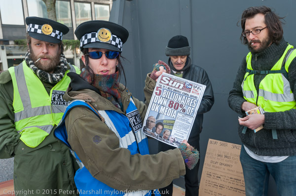
Murdoch Moloch

We may not actually be sacrificing children to Rupert Murdoch and the like, but I think there is a good case to be made that we are sacrificing our culture to him and a few others, with “5 billionaires owning 80% of the media” as the protesters at’Occupy Murdoch‘ pointed out.

Of course this is not unique to the UK, although the spectacular increase in inequality we have seen here over the past 35 years  (a particularly steep rise from 1979-1991, with a slower growth until a slight hiccough in 2008 from which it has now recovered) have transformed us into one of the most unequal societies among the wealthier countries.

I grew up in a period where our society was much more equal, and a welfare state provided at least a basic support for those on low incomes or out of work, and government saw its role as supporting the people who needed it rather than penalising them.
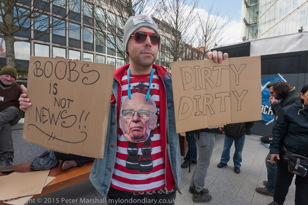
It’s The Sun Wot Won It” was the triumphant headline after the 1992 election victory of John Major, having ended a long campaign of putting the boot into Labour with the election day headline “If Kinnock wins today will the last person to leave Britain please turn out the lights.” And equally, at the next election, it was again the Sun who claimed the the role of king-maker for Tony Blair, having managed to turn the Labour party into a vehicle for its own political views.

Of course it wasn’t just The Sun. There was also The Times, The Telegraph, The Daily Express, The Daily Mail… all together setting a cultural and political agenda, increasingly helped by the BBC as well as commercial broadcasters largely owned by the same small group of people as the newspapers.
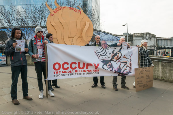
But while I have a great deal of sympathy and agreement with the case that ‘Occupy Rupert Murdoch’ were making, it wasn’t an easy event to photograph, not least because the the fairly low level of support actually on the ground. Starting a protest at 10.30am on a Monday morning is probably not a good idea to attract large numbers of politically active people, most of whom, contrary to the myths put about by the press, actually have jobs to go to. So while many expressed support, most were unable to be there. Though there was a rather fine main banner with a portrait of Murdoch, and a rather less promising Sun. Along with a very well drawn large cartoon and an impressive four page newspaper, ‘The Occupied Sun’.

By the time that the marchers set off on the short walk to present the people’s warrant for the arrest of Rupert Murdoch (listing just a few of his areas of offending – war crimes, phone hacking, political blackmail, tax avoidance and environmental destruction) there was a small but respectable group, although the warrant was a little disappointing for photographers, a replacement having to be drawn up on the spot with a whiteboard pen on a large brown sheet of corrugated cardboard as the more carefully prepared version failed to arrive on time due to travel problems. But it was handed over to one of Murdoch’s employees who – perhaps rather sportingly – came out to receive it at a remarkably civilised ceremony, shaking hands with the organiser, environmental campaigner Donnachadh McCarthy, though keeping his gloves on to do so. There was a cold wind.
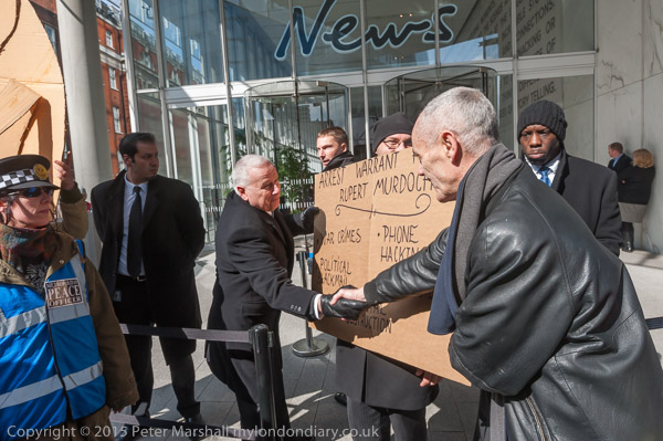
It was an event where it was difficult to anticipate exactly what would happen, and where there were around as many photographers as protesters. As the group carrying the arrest warrant made their way towards the barrier outside the News International building I left the group of photographers crowding around them and tried to envisage where the handover would take place and chose exactly where to stand to get the picture I wanted. It seemed important to get the ‘News’ sign in the image. As the rest of the press gathered around, I had to move in a little closer to keep them out of the frame, and also zoom in slightly from 16mm to 20mm, but essentially was able to take the image I wanted.
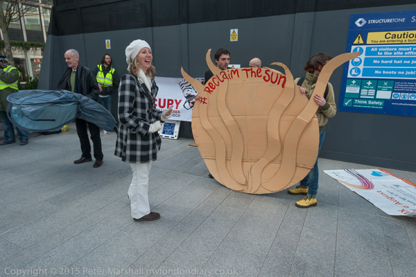
After the delivery of the warrant, the group moved to occupy a part of the plaza in front of News International, though some temporary building works blocked its view of the door. I was rather taken by surprise when Donnachadh picked up a token tent and it sprang out, but caught the moment if not in a very well-composed fashion. I had rather ‘taken my eye off the ball’ photographing and talking with some of the other protesters.
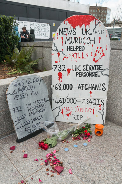
The protest was to last for a whole week, and much of the time when I dropped by there was very little happening, and I didn’t always stop to take pictures. Things got busy every evening, with various events and more people arriving after work but I had other things to do and couldn’t stay, but I promised to come back on Saturday for the mock trial of Murdoch.

More pictures at Arrest Warrant for Rupert Murdoch and Occupy Rupert Murdoch. I’ll perhaps write about the trial later.
Continue reading Murdoch Moloch

Another Massive Saving

If your are a Leica addict, I can save you a small fortune by letting you into a secret. I’ve just been reading When Leica announced the M60 By Kristian Dowling on Steve Huff Photo.com, an article spun on his “about an hour with the camera” on loan from one of his friends.

The big difference between the M60 and the M640, apart from the $18,500 price tag (the M240 on which it is based is a mere $6,380) is that it has no LCD on the back. It’s also made with stainless steel outer metal parts, and includes a newly designed stainless steel bodied Summulux-M 35mm f1.4 lens and a special carrying case – they designed it without strap lugs too.

The camera is a curious mixture of the practical, stripped to the basics, and the cosmetic, and as the edition of only 600 (and a few prototypes including the one that Dowling was loaned) and price indicates is clearly meant for collectors rather actual photographers.

The price difference isn’t quite as large as the figures above (based on Leica store Miami prices) would suggest, as the M240 comes without a lens, and a 35mm f1.4 will set you back $4,532 – and I suspect the lens-hood is an expensive extra. The 35mm f1.4 has never been a cheap lens – when I bought mine second-hand back around 1980 it cost the best part of a month’s wages, and the new lens-hood I finally bought last year for it (not a genuine Leica part, as they gave up making the correct fitting many years ago) cost me I think £70.

But even allowing for these, the price differential between the M60 and the M240 seems to work out at around $7,700 – or around £5000. It seems to me a lot to pay for not having a LCD screen on the back of the camera.

As a photographer who seldom looks at the LCD screen when working, I’ve never experienced the insecurity that Dowling claims to have developed, “derived from digital technology, allowing me to view images immediately after pressing the shutter button. This insecurity has led to many missed opportunities, missed moments, and ultimately – missed shots, and this results in a form of failure.”

If anything I suffer from the opposite, kicking myself at times for not having looked, for example when I find I’ve mistakenly left the exposure on manual and taken a whole hour of pictures around 6 stops under (fortunately I was rescued by having used two cameras and one of them was on P.) And there are certain situations – like the blinking problem I wrote about a few days ago – where the LCD review is so useful that I’d find my work suffered without it.

But Dowling is right to suggest that excessive viewing of images – ‘chimping’ – while working is a mistake. It breaks the vital involvement with the subject. But just because you can do it doesn’t mean that you have to and it’s a habit you can learn to avoid. I suppose when I first got a digital camera (a fat cigarette-pack sized Fuji that took not very sharp 2.2Mp images) back in 1999, I did do a lot of looking at them on the screen, but I wasn’t working with that camera, though I did take it out with me as well as the Leica on New Year’s Eve for the year-early Millennium celebrations. When I did buy a digital camera to do serious work with (a Nikon D100 in 2002) I used it more or less the same as the film cameras I was using alongside it. Mostly the first I saw the images on the camera back was when sitting on the train going home. It’s still the same now.


Fuji MX-2700 7.60mm ISO120, 1/30 f3.2 London 31/12/1999

The MX-2700 had a viewfinder, but with many digital cameras the only view is on the camera back. Optical viewfinders and the EVFs that are replacing them in many cameras leave you viewing your subject through the camera – even with a good EVF, like that on the Fuji X-T1 it still gives you the same feeling of connection with the subject. You look through a viewfinder, whereas with cameras without a viewfinder – and phones and tablets – you are always looking at something in your hand. It seems to me a very different experience, and one that – like chimping – breaks the link between you and what you are photographing.

I sometimes think of taking pictures – particularly of events – as like dancing along the street with the subject. If you keep breaking step you lose connection, lose the rhythm, lose concentration, and it will show in your images. So I’m sympathetic to an extent to the idea behind the M60, though I think it unnecessary to physically remove the LCD, and a camera without a LCD should surely cost less rather than more than twice as much.

So the short way to save that $7,700 is simply to stop yourself looking at the camera back. But if you want to ensure that you get that M60 experience (or know you are weak-willed), you can cut a rectangle of black card to the size of the LCD on your camera back, and fix it firmly in place with four strips of black masking tape. The same tape we used to use on Leicas before Leica finally realised that most photographers don’t want shiny cameras (even if this one is stainless.) It will look almost as good as the M60 and will save you enough to buy at least one more lens, even at Leica prices.

Your favourite Cliché

I rather enjoyed reading a post on The Online Photographer, The Worst Clichés. Of course it’s hard to avoid clichés (particularly if you are a French photographer) and sometimes its easy to feel along with Ecclesiastesthere is nothing new under the sun.” There are only 36 subjects listed in the article, although quite a few more have already been added in the readers’ comments.

I have mixed feelings about some of them (though I’d be happy never to see another cat or food picture on Facebook.) But familiar subject matter can be an incentive to find a different way to treat it. There might even be an interesting way to photograph a cat, though I doubt it.

Certainly the advice to ‘look through the viewfinder and if you’ve seen it before don’t bother to take the picture’ is generally good, if a little harsh. Back in 1964, the great graphic designer, photographer and teacher Alexey Brodovitch (1898-1971) wrote some notes for Photography magazine, which I first read when they were republished by Creative Camera in 1972.  You can read them – and much else besides – on Roy Hammans‘s great web site Photography@Weeping Ash in Alexey Brodovitch Talking, and he has much to say about clichés and what makes a good photograph.

I don’t entirely share Brodovitch’s views. As a documentary photographer, though the image is important it cannot be divorced from content. It isn’t enough for an image to be visually novel, it must also have something to say. And importantly, we can’t all be a “Tony Ray-Jones, John Benton Harris, Hiro, Lillian Bassman, Diane Arbus, Eve Arnold, Richard Avedon, Lisette Model, Gary Winogrand” (as Hammans lists some of Brodovitch’s best-known students) but we can still make images that are meaningful and worthwhile.

The Eyes Have It

It’s stating the obvious to say that the eyes are the most important part of any portrait, though like all such ‘rules’ there are brilliant examples to show it untrue. But it remains a good working basis – and we can’t be brilliant all the time :-), and making the kind of run-of-the-mill images of people that I do, particularly of the speakers at protests such as the Stand Up to Racism Rally certainly the first rule is to look at the eyes – and to focus on them.

Some people blink more than others, and some often speak, especially in bright sun, with their eyes closed.  Others, particularly those who read their speeches or have copious notes, spend much of their time looking down. It’s often a matter of watching them and catching the moment when they do look up, sometimes fleetingly.

I usually, but not always, photograph with my right eye. When others photograph me at work, my left eye is often screwed tight shut as I concentrate on the viewfinder with the other. But while photographing people speaking, especially when using a DSLR where only the actual image area is seen in the viewfinder, I usually keep that left eye open, so I can see the speaker as a whole. It makes it easier to catch gestures, and easier to anticipate when people might look up and open their eyes. Using the 18-105mm DX lens on the FX D800E  when you see a considerable area outside the image frame is also a help.

One great help on all digital cameras is the ability to see immediately if you have taken a picture with the subject’s eyes open. Even those with the steadiest of gazes do occasionally blink, and sometimes cameras seem to have a built in capacity to capture this. On the Nikon D700 I use Custom setting f2 to set the ‘Multi Selector Center Button’ in Playback Mode to Zoom on, High Magnification. If you have taken a picture focussing on the eyes, a simple press will show a highly magnified image centred on the focus area.

I seldom ‘chimp’ when working – for me it disrupts the flow of my work. Sometimes I find I’ve worked a whole day without looking at an image on the camera back, occasionally with unfortunate results. But photographing speakers is a something I make an exception for, checking regularly to see if I those eyes were open, as well as for the gestures and expressions I had hoped to catch. Unlike much of what I do, it is worth checking because if you have missed what you were trying to photograph, people usually repeat similar gestures and characteristic expressions.

Eyes are also often in shadow, set into the face below the forehead. With people who wear hats the problem is often worse.  Mentally we compensate for this and usually fail to notice what the camera faithfully records.  Back in the black and white darkroom days we did it with waving small cards or lumps of Blutak on thin wires above the print, or sometimes with a little ferricyanide bleach and other tricks.

I’m not sure if Reuters or the World Press Photo would approve, but I often find a little extra brightness and contrast with the Adjustment Brush in Lightroom (and sometimes some of that mysterious clarity) produces an image that seems more true to life. Occasionally it’s something I overdo.

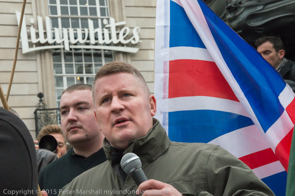
Looking through my images from the Stand Up to Racism Rally it is the eyes that stand out, rather more than usual in my sets of pictures. But even in other sets, such as the images in Britain First Protests anti-Racist March the eyes are important, and I think play an important part  in how we read the images of these racists in their forest of Union flags. Somehow it seemed appropriate that they were standing in front of Lilywhites.

Continue reading The Eyes Have It

Stand Up to Racism

How do I – and other photographers – decide what to photograph? It’s a question I often ask myself when covering events, and although there is no list of rules, there are certainly some things that I bear in mind.

Foremost is that I will only photograph things that interest me. I’m in the fortunate position never to have to take a photograph simply because I think it will sell.

Not that I’m rich and don’t need money, but in the past I earned enough to live on from teaching and now I could get by on my pension (and my wife’s) and my needs are relatively small, having long since paid off my mortgage.  So I don’t need to cover the kind of events – or take the kind of pictures – that are most likely to sell. I’m happy to leave those to colleagues who might enjoy them more and who need the money more than me.

This affects both which events I chose to attend, and also often the type of pictures that I take.  Although I’ve taken some reasonable images of fairly well-known people that have been published, I don’t go out of my way to photograph celebrities. There are quite a few I don’t recognise in any case, and when I’m standing around talking with other photographers and they name one, I’ve often never heard of them.

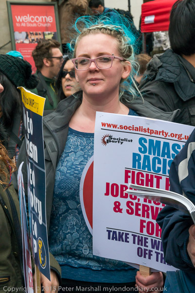
At protests, there are some people who stand out for various reasons. Turquoise hair might well be one of them, but for me it’s important to relate them to the event. I would have been happier with the image above if I could read more of the placard the woman in it was holding.

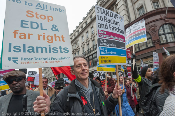
Having taken the first image using a short telephoto (99mm equiv) from a little distance through a crowd I realised immediately it wasn’t quite what I wanted. Although I don’t pose people, I often like them to be aware that I’m taking their picture and with the 16mm I was quite close, and they have posed for me, with two placards that clearly spell out the main issues of the protest.

I could perhaps have framed a little more tightly, but I liked having a recognisable part of All Souls Langham Place in the background, a church with close connections to the neighbouring BBC, though how many people would recognise it is perhaps debatable.

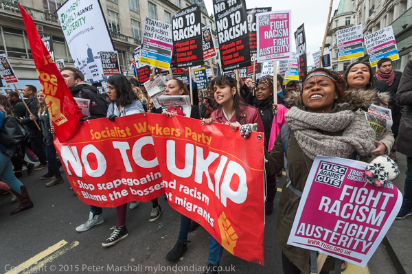
As well as taking pictures that relate to the event, its also important to me to try and give a fair and accurate representation of the event. Although it’s usually important to photograph what is at the front of a march, I always try to work my way through the whole of it (though a few are too large to allow this.)

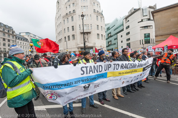
I seldom photograph banners and groups head on from the centre. I find such pictures rather boring, and always prefer to work from some way to the side unless there is a good reason to do otherwise. I’d also prefer the people to be actually marching, but sometimes this isn’t possible – and here they are standing still. I wanted to get the iconic Broadcasting House in the background, and would have liked to take this picture from rather further back with a longer lens to make it seem larger, but unfortunately there were probably at least 50 people taking pictures in the way.

Unfortunately the stewarding on many marches make it difficult to photograph the front of the march once it is moving, but things are usually easier a little way back. Though if a march is tightly packed it is often hard to get enough clear space to photograph banners. Again an approach from the side is usually easier, though it may make it hard to read the banners.

The start of the march is a ‘key moment’ and one I usually try to photograph along with other key moments in the event. There is I think an important difference between key moments and the kind of pictures that make the news; key moments are those that tell the story, while news images are often quite peripheral. Five thousand people may march peacefully but if one idiot attacks a policeman, for most newspapers that is the story and the picture they want. If I see something sensational in this way I’ll usually photograph it, but that isn’t what I’m looking for (and sometimes I have decided not to photograph such things or not to file them where I felt they misrepresented the event.)

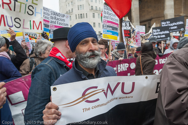
This event was called ‘Stand Up To Racism’ and for me it was important to show the wide range of people taking part, including many from London’s many ethnic communities. As well as those key moments I’m also trying to build up a picture of the event, to tell its story.

Part of that story is the people who are taking part, and I try to show the whole range, though those that look in some way more interesting in some way are more likely to appear in my pictures. As too are any well-known people taking part, who in this case included Peter Tatchell and several others.

And for many events, placards, posters and banners are vital, and it’s important to frame them so that they are legible. Occasionally I’ll deliberately cut one off part way across, though if so I try to leave enough to make it possible for the reader to work out the text. More often I’ll carefully position the frame and zoom to leave them ending close to the edges – as in the image of Peter Tatchell.

Apologies for rambling on, partly because I wrote this over a busy couple of days. But as you look at the pictures in Stand Up to Racism March I hope it helps to make clear why I took them as they are.

Continue reading Stand Up to Racism

Fuji Sense

I like Fuji cameras, and have four of them. Five if you count the film-using Hasselblad X-Pan they made, though this is pretty much in retirement, waiting for me to finish the film I loaded into it Northfleet on Jan 1st 2013.  But I also currently own a Fuji X100, X-Pro1, X-E1 and X-T1, though its mainly the last two that I now use. All have their strong points and their weaknesses, but the X-T1 is my favourite.

I’ve never been good at selling cameras. Sometimes the amount they fetch compared with what you paid seems derisory, but more its because I become attached to them and feel one day I might just want to use them again, pick up that X-Pan and go out to take pictures. Though I know I probably won’t.

But although I’m a Fuji fan, I’m also a Fuji critic. And I hope a Fuji realist. And I get quite fed up with the posts on my Facebook feed by people who enthuse about the special quality of images from their Fuji cameras, about how much better they are than those from Canon or Nikon. People who claim the images are sharper, have higher resolution, better colour etc. It just isn’t so, and though I’d be hard put to prove it, the images from my Nikon D800E and even the smaller D700 files have a slight edge. Though a difference that is seldom if ever of practical consequence.

So I was pleased to read a huge chunk of information and common-sense from ,  about the Fuji System, starting with his recent Fuji X-System, A Clarification which I think has a great summary of their strengths and defects- the major strength being that “in the glass department no other manufacturer comes close.”

Although I wrote almost 15 years ago about EVFs as the viewfinder of the future, the future is not quite with us yet. The X-T1 viewfinder is the first I’ve used that I really like most of the time, but sometimes it’s too slow to update and gets wiped out by rapid and extreme light changes. Optical viewfinders update at the speed of light, and my eyes respond pretty rapidly to light changes. EVF still have a little catching up to do, but I’m a little happier with it than Boyer.

About the other problems – the lack of responsiveness and battery life, I agree entirely, though the X-T1 does have a mode where the EVF only turns on when you put your eye to the eyepiece, which surely ought to enable battery life to be improved?

Boyer also comments on the lack of real changes in various model releases, and it is very hard to disagree. But perhaps to be fair to Fuji they have greatly improved the cameras by firmware updates, making hardware upgrades largely unnecessary for existing users. I’m still hoping that the Version 4.0 Firmware promised for late June is going to make the autofocus noticeably faster in low light.

Also worth reading, written over a year ago in his X100S Vs. Nikon Urban Myths (and I’m sure much more.) There he concludes that the main differences in colour between different cameras (quite a few of which use the same basic sensor as the Fujis) are a matter of white balance. Fuji cameras, as he also shows, interpret ISO differently, and my own simple tests agree.  If I meter a typical subject with my Fuji X-T1 set at ISO3200 I find get the same shutter speed and aperture as with the D700 set at ISO1600. Taking pictures at the same shutter speed and aperture produces files that need rather different exposure adjustment, with the Fuji images despite the nominally higher ISO generally a little darker until adjusted in Lightroom.

I generally prefer the colour from Nikon. I seem to have more problems with colour and the Fujis, particularly with greens. Fuji images often seem to be just a little pink while Nikons are just sometimes a little yellow. Bright orange and red seem a pain with both, but then they were with film too.

Under Surveillance

I’m not sure what I think about Simon Høgsberg’s ‘The Grocery Store’ project,which I read about in a post on DVAPhoto. It’s certainly remarkable, made from around “97,000 photos of people outside a grocery store in Copenhagen” which were then analysed by the  facial recognition algorithms in Picasa  – freely downloadable photo software  – to identify people who appeared in multiple images.

It’s worth reading the interview with Høgsberg by DVA’s M Scott Brauer which explores the how and why of the project and some of the issues, particularly around privacy involved, though I feel this could have been investigated more.

The images were made by Høgsberg “returning to the bike rail outside the supermarket with my camera” and zoom lens on 159 afternoons and “Freezing face after face with a click.” They certainly seem often to be very carefully chosen moments – as you can see from exploring some of the 2067 images that make up the web project – which is a very impressive one, with the images laid out on a single zoomable page as a grid “of sequences of images crossing each other in horizontal and vertical lines. Each sequence shows the same person caught on different days” and ” are arranged in chronological order.” It’s easier to look at than explain.

On Høgsberg’s web site there is more about how the project was carried out and his discovery of the face recognition in Google’s Picasa, software which enables you to “Organise, edit and share your photos” and share them with your friends on Google+L

Picasa uses facial recognition technology to find and group similar faces together across your entire collection of photos. By adding name tags to these groups of faces, new people albums are created.

The link tells you how it is done.  Picasa is software I found rather annoying when I played briefly with it (here is a set of images of Paris I shared in 2006, complete with a multiple spelling mistake), but it seems perfect for this project.

Høgsberg gave some people in his images tags, starting with A1, A2, A3… and Picasa then sifted through the images to find the same people in other pictures. One man, E46, turned up in 276 of them. These sets were used to construct the project image.

There seems to me to be some theoretical problems here. Lets consider three people, who we could call A, B and C, and assume that there is a picture including A and B, another including B and C and a third including A and C. If the set of pictures of A is laid out horizontally  then the set of pictures including B could be laid out vertically, with the picture including both at the crossing point. But  if you then want to add the series including C, it can either be set to include the image together with A as a vertical, or that together with B as a horizontal series, but not both. And if A and B appear together at several different times, what then? Don’t even think about A, B and C all turning up at once…

Perhaps these kind of problems are why only around 2% of the images taken appear in the final presentation, though I imagine the interest and quality of the images was also a consideration.

But these are technical matters, and it is perhaps the privacy implications that concern me more. I wonder what ‘E46’, ‘R51’ and the others make of this project and their inclusion in it.

Its also a project that makes me think about the millions of images gathered every day by security cameras in various public places, and the kind of analysis and use to which they might be put – with the aid of far more powerful software tools than that included in Picasa.


Save Yourself $89,910

Back in February I wrote Prince of Pilfering about the selling by Richard Prince and his gallery of large-scale reproductions of Instagram images and comments without permission from the those who have produced the work. On the web, the photographs look exactly as the Instagram originals, though after having been enlarged and printed on canvas, the image quality must be rather poorer, but by adding his name to them, Prince has apparently persuaded some deluded individuals to hand over $90,000 a throw.

One image was by photographer Donald Graham, though it had been posted on Instagram, apparently without his permission by a third party, and Graham was understandably not amused, and it was reported that his lawyer had sent “cease and desist” letters to Prince and the Gagosian Gallery.

I’ve not been able to find any comment on-line as to the current state of play between the two sides over this case, though while it may seem cut and dried to photographers, for lawyers the issues it raises are more complex, as you can read in The Latest Richard Prince Controversy, Clarified by Patent and Copyright Attorney John Arsenault on Fstoppers.

A day or so ago came a development by another of those whose Instagram image was ripped off by Prince – in this case 5 images.  As I first read in PDN Online,  rather than go to law, ‘Missy Suicide‘ has decided to re-appropriate the work by Prince, making the five prints available through her own web site at the same size and printed on canvas like his for a mere $90 – with any profit being donated to the Electronic Frontier Foundation. Dedicated collectors who bought all five could save themselves £449,550.

It’s perhaps a rather cleverer act of appropriation than Prince’s and one that Prince himself has responded to personally (thanks to PetaPixel for the link) with a tweetMuch better idea. I started off selling my “family” tweets for $18 at Karma not to long ago. Missy Suicide is smart.”

She may be smart, but Prince is already laughing all the way to the bank, though there is no way I would want to buy any of these images, either in the Prince or Missy Suicide versions, though I think the latter are more honest. They will also have considerably higher image quality, being reproduced from the originals rather than the low res Instagram. And in case anyone still thinks this is about photography, that will make them worth considerably less. While the controversy will undoubtedly have increased the art market value of Prince’s pilfering.

Personally I’m going to save myself slightly more – another $90 – by not buying the prints from Missy Suicide.  The site – described by PetaPixel as the “pin-up photo brand SuicideGirls” appears to deal in the kind of idealised soft-porn ‘glamour’ that I find boring, de-humanising and rather offensive. Lets keep photography real.

Deutsche Börse Prize 2015

For once I have to say I was pleased to hear the result of the Deutsche Börse Prize. Although I wasn’t entirely enchanted with the work of Mikhael Subotzky (b.1981, South Africa) and Patrick Waterhouse (b.1981, UK),  Ponte City was an impressive publication which includes some truly excellent photography, and I felt it stood head and shoulders above the other three short-listed works. Perhaps for once the gap between the winner’s £30,000 and the £3,000 to the runners up which I’ve always thought fundamentally unfair could be justified.

The DBP isn’t of course just about photography, its also a prize on several levels about politics which has often resulted in work which I think has little place in a photography gallery being short-listed and sometimes even winning. Unlike this year, politics has meant it often hasn’t been the best photography that has been successful.

Ponte City is a work that uses photography, but certainly isn’t just photography, but unlike many concepts it has photography at its heart and uses it well. There are some superb images here, and some of the other things – like the series of pamphlets published as a part of the book – are fascinating if not for their photography.

There is still time to see this and the other three sets of work that were short listed as the show continues at the Photographers Gallery until 7 June. I think it says something about the gallery’s fundamental contempt for photography that on the web page about the prize, the images from the four projects are shown as a narrow strip cropped from an image, 720x260pixels, an aspect ratio of 2.76:1,though of course you can see the full picture on the artist’s individual pages.

That for Subotzky and Waterhouse shows 7 full images along with one detail view of a multiple image and a gallery view, as well as a postage stamp sized video, which in my browser refuses to go full screen or link to Vimeo except by some tricky right clicking, though perhaps that may have been because of a current heavy demand on the site. You can however watch it on Vimeo, where  the page also has links to the videos of the other three artists. I’d suggest changing the video to HD and making it full screen unless you are viewing it on some miniature device.

The other work I found of some photographic interest were the portraits by Nikolai Bakharev  made on Russian public beaches, mainly in the 1980s, when there were various restrictions on photography and the taking and circulation of photographs containing nudity was strictly forbidden.

While some of these excited me, there were too many that seemed to have little to offer. I had rather similar doubts about the portraits of black gay women by Zanele Muholi, where though the project may have been commendable and worthy, it needed some stronger images. And although I know people who enthuse over the work of Viviane Sassen, it did nothing for me.

New Homes for the Rich


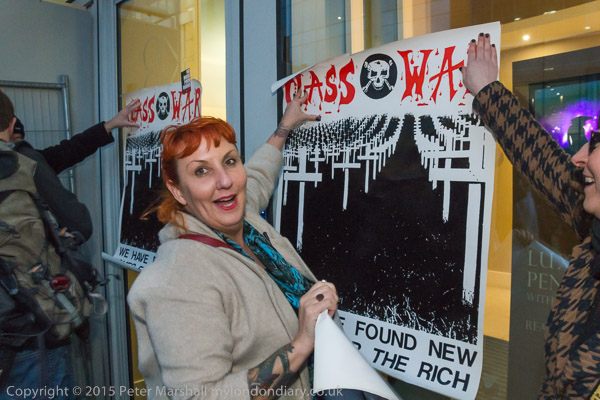
Class War’s Chingford candidate Lisa McKenzie holds a poster on the window of the Rich Door. D800E, ISO3200, 18mm (27mm), Flash, 1/40 f8

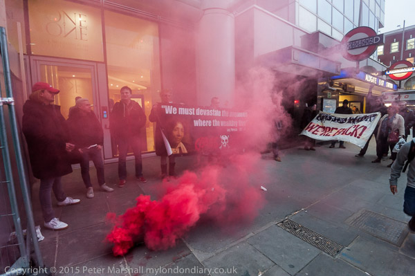
Class War’s protest on March 19th was livelier than usual, partly because the Texas millionaire owner of the block at One Commercial St was thought to be actually in the building, but also because there was a rather larger group present than most weeks. But perhaps the main reason was that there were no uniformed officers present for the first twenty minutes of the protest.


D700, ISO 3200, 16mm, 1/60 f4

The event was more congested than usual as both building works on the front of One Commercial St and pavement replacement works were taking up much of the usual space. It made it harder than usual to get in  the right place to take pictures.

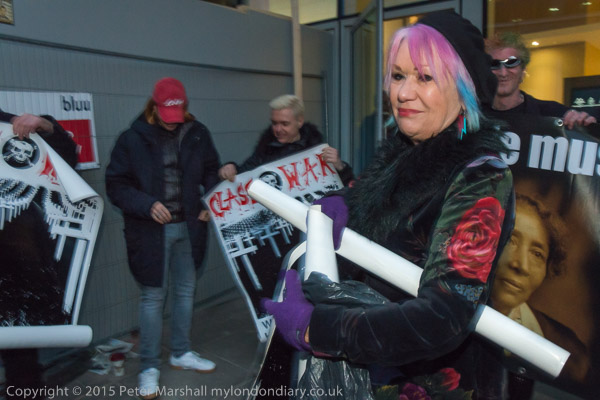
Class War had prepared for Taylor McWilliams‘ presence, producing a ‘Wanted’ sticker with his picture calling for information on him: ‘Dirt? Gossip? Dodgy Deals? Sex? Drugs? Money?‘ They had also brought with them a number of copies of one of their best-known posters, based on a classic Class War magazine cover from over 30 years ago. An image of a giant cemetery with wooden crosses stretching to the horizon, it has the Class War logo and the message ‘We Have Found New Homes For The Rich.’

It may be an image in bad taste, but it is hard to see it as illegal, and I’ve previously photographed it at a number of public events where no action was taken. But one of the charges which police have now made against Lisa McKenzie is of displaying this poster ‘with intent to cause Taylor McWilliams harassment, alarm or distress contrary to Section 4A(1) and (5) of the Public Order Act 1986.‘ You can see from the pictures that the poster was not being displayed to those inside the building – presumably including McWilliams – but to the other protesters outside.


D800E ISO3200 18mm(27mm) Flash 1/40 f9

While clearly McKenzie was displaying the poster at the protest, another of the contentions in the charges is clearly false. She is charged with placing stickers on the building to the value of £50.00. From both from my photographs and my observation of her during the event I am clear that she put no stickers on the glass herself, but was simply holding the posters to the glass, with both hands occupied in doing so. It’s also evident that removing a sticker from the glass surface should take more than a minute’s work and perhaps a scraper and a damp cloth and would hardly justify a cost of 50p, let alone £50.

Of course I did see people put stickers on the glass and metal of the building, but McKenzie didn’t, and I was watching her closely because of her candidature in Chingford. Others were also as my pictures show displaying the poster, and certainly others were also saying similar things to her at the protest, but for some reason police only arrested and charged her.

Could it be because she was standing against a government minister in the coming general election? It seems clear that the arrest and charges against her are simply a matter of harassment – as was the arrest last November of another prominent Class War protester Jane Nicholl, and the seizing of the Class War banner with the accompanying arrest – which I understand has not yet been followed by any charge, although the police have not returned the banner.


D700 ISO3200 16mm 1/50 f4

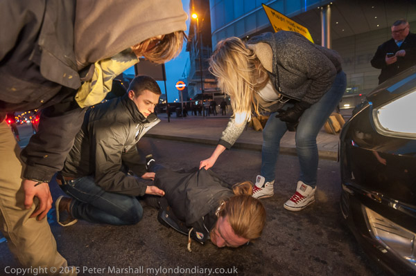
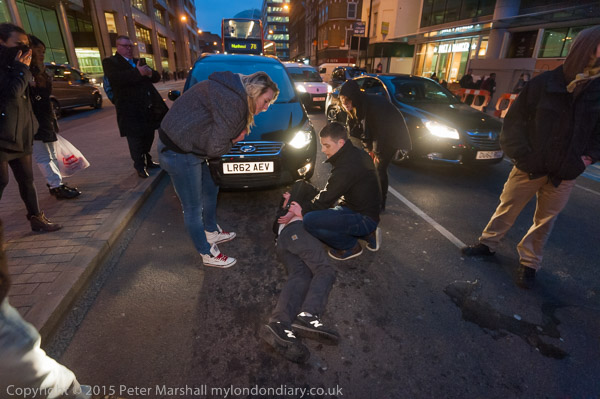
McKenzie wasn’t arrested until two weeks later, but another protester was arrested after plastic road-works barriers were put across the main road. The arrest was made by two plain clothes officers who had earlier been standing around on the edge of the protest, too far away to see what was then going on.


D700 ISO3200 16mm 1/100 f5

The protest started ten minutes before sunset, and the light rapidly faded. But for virtually the whole hour of the protest I was photographing with the D700 without flash at ISO 3200 with the 16-35mm f4 lens wide open, and shutter speeds between 1/13 and 1/80th. Quite a few were a little blurred either due to camera shake or subject movement.  In some I added a little light with a Neewer CN-216 LED hand-held light source.

After taking a few frames with the D800E and 18-105mm without flash, I put the SB80 flash into the hot-shoe, still working at ISO3200 and using a shutter speed of 1/40th to get plenty of exposure by ambient light. Often using a slow shutter speed with flash on subjects where there is quite a lot of movement gives some interesting blur along with the sharp core image from the flash. The effect is sometimes rather hard to see in the web-size images.


D700 ISO3200 16mm 1/100 f4

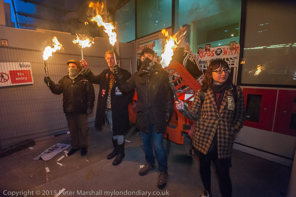
Photographing the arrest was made a little tricky by the car headlights, which illuminated a rather narrow band of the subject and made some frames unusable with burnt out highlights. But I was able to burn in some where the exposure was not too extreme. And the flaming torches also pose some problems, which often call for some fairly extreme reduction of the highlights using the Lightroom slider or local adjustment.

You can see more pictures at Poor Doors blocks Rich Door.

Continue reading New Homes for the Rich