A Bruised Bottom?

There are some images that everyone with the slightest interest in photography know, and two of them were (almost certainly) taken by Robert Capa. Both have long been surrounded by controversy, and the ten or eleven pictures of the D-Day landings have been the main subject of a major series of posts on ‘Photocritic International‘ by A D Coleman and his collaborators.

We can now be certain that while Capa did land on Omaha Beach, he wasn’t in the first wave and was fortunate in that it was a relatively quiet area by the time he got there. ‘Relatively’ is an important qualification and though to the military who were getting on with the job of clearing the beach it was relatively normal, to you and I – or indeed Capa – it was a very scary place to be. So scary that he only managed to take those ten or eleven images before deciding to jump on the next boat out. And who could blame him – or feel they might have done any better?

Capa struck lucky with one of those images, though had it come out as he intended it would have been long forgotten. Imagine it as well-exposed, sharp and with excellent tonality; even if published, it would have been entirely unmemorable – rather like many of the images taken by military photographers on that and the following days.

Discarding the silly myths created around the picture actually make it more interesting. It’s a more human document and we can concentrate on the image and how it evokes what it does rather than think about unbelievable stories about darkroom abuse of film and mythical darkroom workers.

It’s a story I’ve dealt with here and elsewhere on numerous occasions and I return to it only because the latest post on Photocritic International, Alternate History: Robert Capa and ICP (6), from an e-mail by editor and author Jim Hughes has brought it back to mind, and also sent me back to read a contribution by Hughes to the earlier D-Day series, Guest Post 18: Jim Hughes on Capa’s Biographer.

Jim Hughes, as older readers will remember, was a consulting editor for the US magazine Popular Photography, a monthly which in the 1980s I read because it was so much better in its coverage of photography than any of the UK magazines (and I also read its rival ‘Modern Photography‘ for the same reason.) In 1985 he reviewed Richard Whelan‘s authorized biography of Robert Capa for the January 1986 issue.

I’m fairly sure that I will have read that review, in which he was the apparently the first to publish a clear statement that dismisses as myth “the oft-told story of Life‘s London darkroom having ruined the negatives of all but 11 of Capa’s 72 photographs by leaving the film in the drying cabinet with the heat on high and the door closed“. As Hughes makes clear, it just isn’t believable as film is just not affected by heat in the way the story claims.

So while I thought it was my own experience as a photographer (and one who managed to mess up film processing in every conceivable way over the years) that led me to the inevitable conclusion that the story was entirely fictional, perhaps I should now credit Hughes for alerting me to that fact.

Whelan responded to the review by suggesting that Hughes had only seen reproductions of the images in the book of Capa’s photographs, and that these somehow did not allow such conclusions to be made. Was Whelan claiming that the reproductions were so bad that we could not see the obvious? In any case Hughes responded that his conclusions came not from the book but from examination of the original prints.

It seems odd that although photographers such as myself were convinced by the evidence that the darkroom destruction myth was just another story in that great fund of Capa fiction it should have continued to hold such sway – and that even now it has been so comprehensively debunked it should still be published and supported by some leading figures in photography. Whelan simply lacked the photographic knowledge to realise it had to be wrong, but – at least once pointed out – it was clear to those of us who had toiled long in darkrooms.

But more controversial at the time was the discussion by Hughes of Capa’s ‘Falling Soldier‘, already the subject of the 1975 book, The First Casualty by Phillip Knightley. In the latest article, Hughes, who had mentioned the controversy over this image in his review, looks at some of the issues around this image and the attempts by Whelan and Cornell Capa to cover up the controversy.

The post also links to the more recent work by Spanish scholar Jose Manuel Susperregui, which appears to have established conclusively “that Capa’s ‘Falling Soldier’ was staged by Capa at Cerro del Cuco, outside the town of Espejo, Cordoba — and that no soldiers died there that day.”

Painstaking research enabled him to determine the place where the picture was taken. He also establishes that the image was taken on a square format (6x6cm) camera that Capa never used to photograph combat, and was more often used by his partner Gerda Taro; the image characteristics lead him to conclude that this image was indeed taken by Capa although others have suggested it was by Taro.

He shows that the camera was deliberately set up (on a tripod) tilted at an angle to suggest it was on sloping ground rather than the flat field, and the two pictures of different men falling show they were performing for the camera. The post has a link to an English translation of an length illustrated article by Susperregui published in April this year describing his research and conclusions.

The picture does indeed show a ‘falling soldier’, but he is falling not to a bullet but to Capa’s directions, and rather than dying; his injuries will have amounted at worst to a bruised bottom.
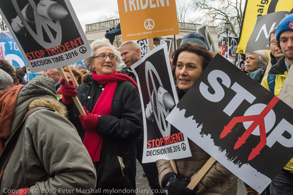
Trident


Jeremy Corbyn

I’ve seen rather less of Jeremy Corbyn since he became Labour leader, and at some events he has been surrounded by a baying crowd of photographers and TV crews that I seldom want to join.

At least when he was speaking on the platform at Trafalgar Square there was a clear view for all of us in the press area below the plinth the speakers use as a platform.

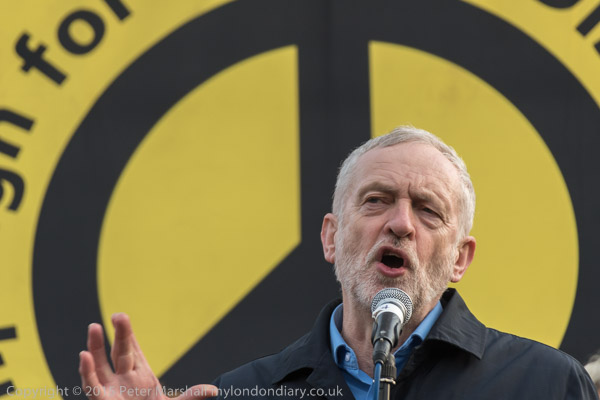
It isn’t an ideal viewpoint, and generally I like to stand some way back as otherwise you are looking rather steeply up at the speakers. Microphones also tend to get rather in the way, and sometimes the background can be rather messy. The obvious background for the speakers was of course the CND symbol on a number of banners. Depending on the angle I chose there was either a rather bright phthalocyanine blue or the mustard yellow which I chose for the image above. Mainly because of its position rather than its colour, but I do like the contrast between it and the blue of Corby’s shirt.

It’s at events like this I do and don’t wish that I had one of those military size telephoto zooms,  though Nikon’s versions are perhaps a little less impressive than their Canon counterparts. But the Nikon 200-400mm f4 G VR II AF-S ED would have been quite useful, though at only 14 inches long and around 7.5 pounds weight it is hardly in the major league.  Instead I had the 28-200mm f/3.5-5.6 G, working at its slightly soft 200mm maximum on DX format as 300mm equivalent in DX format on the D810. Taken at 1/500 f5.6 ISO 800 it isn’t bad – and the lens cost me – secondhand – around one thirtieth the cost of the 200-400 monster and weighs around a tenth as much.

I’d been standing around a couple of hours taking pictures of the many other speakers as we all waited for Corbyn to get back from Sheffield and rush from St Pancras station to speak. Even with my lightweight lens I was in pain from back ache, and I would never have lasted the wait with the heavy beast.


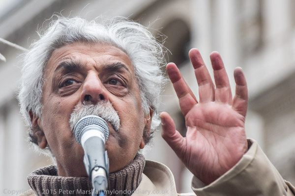
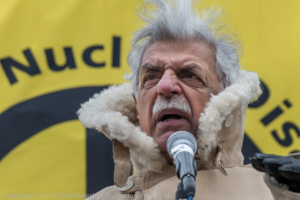
Tariq Ali in an ex-Russian Army winter coat

That lightweight lens is long obsolete, and back in 2003 was one that Nikon gear-fanatic snobs very much looked down on. But there is a lot to be said for a lens that covers such a wide range and is so light and compact. Looked at on screen at 50 inches wide (I only see around a third of the image width at a time) you can see it is slightly soft and would benefit from a little ‘smart sharpening’ but every one of Jeremy’s and Tariq’s facial hairs is clearly and distinctly visible. It would have been just a little sharper had I stopped down from full aperture, but it is still a usable lens for all but the most critical of applications (and I’m not sure what that would be – other than a reviewer’s cliché.) Although I took some photographs at these two events with the 16-35mm, all those in this post were made with this very versatile lens.

There were plenty of other faces to photograph, some very well-known and others less so, Kate Hudson, Vanessa Redgrave, Nicola Sturgeon, Leanne Wood, Caroline Lucas, Mark Serwotka, Bruce Kent, Giles Fraser, Christine Blower among them. You can see pictures of all of them and a few of the crowd at Stop Trident Rally.

It’s hard to find anyone outside the few who will profit greatly from the money spent on replacing Trident who would stand on any platform to support it. Most of the military see our so-called nuclear deterrent as an expensive and redundant side-show. It isn’t a weapon but a massive status symbol, and one we would be better off without.


On the march at Hyde Park Corner

There were (according to CND) sixty thousand people on the march, and it was certainly a large one, even if my guess would have been a little less than their. It was quite a struggle to get through the crowd that was packing Park Lane to reach the front of the march, where heavy stewarding made it difficult to take pictures.


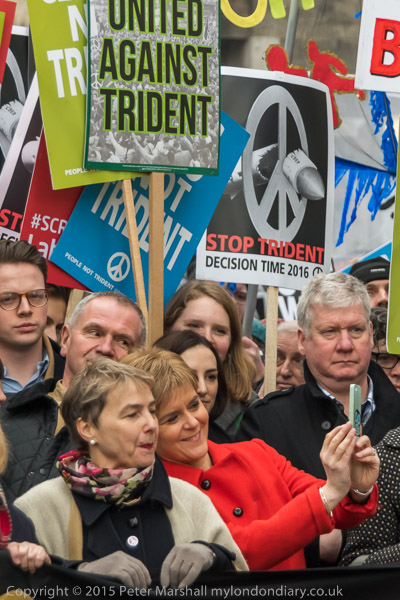
A quick selfie

But there holding the main banner, were many of those who would later speak, including Nicola Sturgeon, taking a selfie with Kate Hudson.


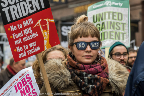
On the march in Park Lane

But it’s generally the rest of the protesters that I like to photograph, like this woman with her dark glasses and others in the body of the march. It’s the 30,000 or 50,000 people that are the real story of the march, not the few that are well-known.


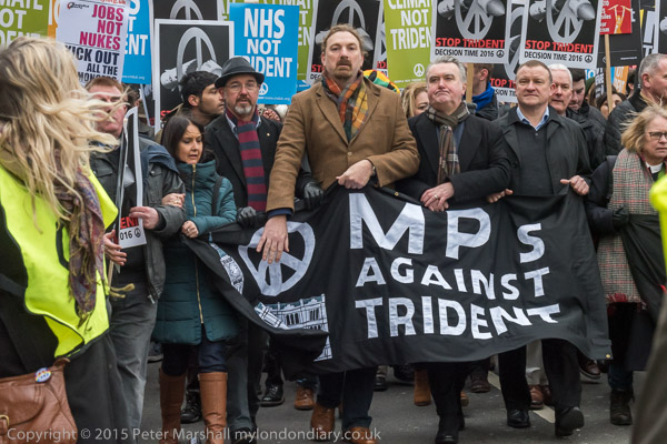
MPs Against Trident enter Trafalgar Square at the front of the march

I’m also not too good at recognising people. I think I’ve always suffered, though fortunately very mildly, from prosopagnosia or ‘face blindness’, which gave me some problems when I was teaching and sometimes when watching films and TV. Now I almost never watch  TV, which in itself makes recognising ‘celebrities’ something of a problem. Though I sometimes wonder if a touch of prosopagnosia might actually help when photographing faces, perhaps enabling you to see what is really there at the time rather than being misled by preconceptions.

Stop Trident Rally
Stop Trident March
Continue reading Trident

A Disturbing Trend

As someone of the same generation as Neal Rantoul it perhaps isn’t surprising that I share much of his thoughts about the increasing way in which “Photographic series or bodies of work are being explicated, explained, contextualized, rationalized, and elevated with text or verbal rationals” which he puts forward in A Disturbing Trend in Photography, published in his blog on his web site and reprinted where I read it on PetaPixel.

Like him I’ve often been to shows where the verbiage is far more impressive than the photography. His is a piece that deserves to be read in full, suggesting reasons for the trend, but perhaps at its centre is this:

Very often the craft of the medium is subsumed, indicating the artist has little interest in the inherent qualities of the discipline itself, using it simply as a vehicle for visual communication ….This constitutes a “literalization” of the medium or in effect a deconstruction of its inherently visual qualities resulting in an analytical and intellectual final result.

Here in the UK, this was something that we very much saw taking place in the late 70s, as photography established itself – or at least something called photography – in academia. Students I taught came back to visit us, showing huge reading lists, sometimes stuffed with works that really had very little relevance to photography, and bemoaned the fact that none of their lecturers seemed to want to teach them any practical skills or make the kind of comments on their photographs that would help them to express themselves more clearly. Some courses were fortunate to have technicians who were prepared to give the kind of photographic advice they felt they needed, but it seemed to be largely left to chance.

In the US, where Rantoul taught at university level for over 40 years there was of course a much greater tradition of craft-based teaching at the highest academic levels, as well as far more emphasis on the importance of photographic history, which perhaps provided a greater resistance to the trend he notes.

I’m perhaps more at ease with the combination of images with text than Rantoul – I have produced several pieces of work that combined image and text, and as well as the example of Robert Adams that he gives, can think of many other photographers whose work successfully combines both, including Minor White. Many pictures are enhanced by appropriate texts, but if I go to a photographic exhibition, or view the work in print or portfolio by someone who claims to be a photographer I expect a certain competence and facility in the use of the medium which is often and increasingly, as Rantoul states, lacking.

Technology has of course, as Rantoul says, made it much easier to make pictures. Many of those old craft skills are now largely redundant. Not of course that all photographers – even very good photographers – always mastered them in the past; many relied heavily on the darkroom magic of others, and it was always clear that a lifetime devoted to the Zone System never guaranteed a single interesting image. But certainly we now live in an age where passable mediocrity is within a button-push for anyone (though often I find myself looking at a set of pictures and thinking it was quite an achievement of someone to make something so bad.)

But taking good pictures remains as elusive as ever. Rather than encouraging students to strive towards this, often a long and difficult process, it is easier to teach people to write texts that obfuscate or even question the existence of ‘good pictures’  and which serve to hide or gloss over the weary and unfocussed images that accompany them.

Yannis Behrakis

Don’t miss the video with Yannis Behrakis talking on Greek Reporter about the work which led to him and the Reuters team working with him being awarded in the Breaking News Photography category in this years 100th Pulitzer Prize awards.

Greek Reporter also has another article about him worth reading, Yannis Behrakis: The Man Behind the Image, which mentions him heing chosen by The Guardian as the agency photographer of the year in 2015, for his work covering the refugee crisis and the economic crisis in Greece.

The Guardian feature shows an incredible range of powerful images produced in a wide range of situations from his 28 years as a Reuters photojournalist, and although I’d seen some of the pictures before, I hadn’t until now realised they were all the work of the same man.

Nat Geo World

When I first saw the reports of a Photoshop cloning error on a Steve McCurry print widely reported after having been spotted by Italian photographer Paolo Viglione I decided there really wasn’t a lot more to say.

It seemed a careless error, and one that surprisingly hadn’t been spotted, but such errors aren’t difficult to make, and don’t necessarily result from any attempt to mislead. Years ago, when making a black and white print for sale, I’d done something similar, while cloning out a scratch from the negative late at night, my stylus had inadvertently dropped onto the tablet, probably as I briefly dozed, and added an extra piece to a shoreline. Fortunately I’d noticed it later, but only as I was taking a last look at the print before sending it to the customer, and was able to make a replacement print without the glitch.

It is something that probably wouldn’t happen now, even though I probably fall asleep at the computer more often, because I very seldom feel a need to use the clone tool now, as Photoshop’s other spotting tools have improved immensely over recent years. But it used to be the only real way to do the job back in the early days. I think the worst that has happened recently when I’ve nodded off has been to spill a glass of a rather good red wine across my keyboard. Doing so woke me with a start and I immediately tipped the keyboard upside down and there were no lasting effects, but I deeply regretted the loss of the wine, the last of the bottle, which I’d been keeping as a special treat for when I finished processing.

One of several prints on display in my bathroom is a large panoramic image of a house and garden, unsold after an exhibition where it was on public display for over a month. I can’t go in there without noticing a small error in the stitching process – it was made from three exposures – which means one of the windows in the house has a small part missing from its central white-painted vertical. I didn’t notice it in my careful inspection of the file, nor when it was on display, and if any who saw it at the show did, they said nothing. It hung on my own wall for several weeks before I noticed it, but now, although small and unimportant in the image, it seems glaringly obvious every time I use the bathroom.

Most of the time we see what we want to see, and not necessarily what is there, and I think that is perhaps one of the points behind photographer Peter van Agtmael‘s view on the McCurry controversy, ‘Why Facts Aren’t Always Truths in Photography‘. It’s an article I find rather disturbing, though entirely in agreement with his “very important qualifier” that “Any photographer working predominantly in a photojournalistic context needs to be rigidly transparent about digital manipulation“, and it is hard to dispute his statement that the best we can hope for in the intensely subjective craft of photojournalism is “a coherent personal truth.”

But in the piece he does seem to be acting as an apologist for a fellow Magnum member, even if one he says he hardly knows. Because it isn’t the silly and unintentional slip in that street photograph from Cuba that is at the heart of the controversy but the other examples of intentional deception that have emerged. And it is hard to believe that what we have seen is not just the tip of an iceberg.

The National Geographic Magazine
formed an important part of my early life, much of it spent, at least on rainy days, leafing through a large pile of the magazines covering the 1930s which had come to us after the death of a more affluent relative, along with his splendid stamp collection – he had worked for the General Post Office and made the most of his connections. The articles were at times rather tedious, but the black and white photographs spoke more directly, showing us how people around the world lived – and dressed, or not.

Coming back to ‘Nat Geo‘ years later was something of a surprise, with Kodachrome bursting out all over, but while presenting its rather over-enthusiastic view of the world, the emulsion was at least not susceptible to manipulation by photographers, though one could hide a great deal in its black shadows. But it would appear that with digital things have changed. Perhaps the revelations now being made will result in rather more editorial control.

I don’t warm to Nat Geo, which just somehow now seems far too American and politically not at all to my taste. That the National Geographic Channel is owned by the Fox Cable Networks division of 21st Century Fox, and the magazine since 2015 is part of a new partnership, National Geographic Partners, controlled by 21st Century Fox, perhaps says it all. But read ‘A Trip Around Steve McCurry’s Photoshopped World‘ by Paroma Mukherjee to see an Indian view of the photographers take on India.

Finally I’d like to mention an article in The Online Photographer, ‘C-E-R: Why we shouldn’t say “post” or “Photoshopping” any more‘. It’s not I think a very useful contribution, but one that reflects the anxiety some photographers feel about their own practices with images.

Post-processing or ‘post’ is just a useful term to cover everything that happens between when the file – raw or jpeg – emerges from the camera to when it appears on paper or screen. It isn’t really ‘after processing‘ as the article suggests, but ‘after exposure‘ processing’ If you want a more accurate term you could expand it to ‘post-exposure processing‘, but I’m all for keeping things short.

I’m not sure it is useful or possible to separate ‘correction‘ and ‘enhancement‘ as the article suggests, or to set clear limits as to what is allowable in photojournalism or documentary work (while in some other areas of photography clearly there are no limits on this or on the final category, ‘reworking‘.)

But what does seem clear to me is that this third element is simply something that should always be avoided by photojournalists and documentary photographers. And if Nat Geo aims to be anything more than a glossy travel-porn mag it certainly needs to give the photographers who work for it very strong guidance to that effect.

Stoke Newington

There’s an article on Flashbak to a set of images that interested me with the title ‘A Faded Suburb with a Jaunty Air’ – Photos of Dalston 1979-1984, with pictures by Alan Denney, a teacher who became a mental health social worker, and who photographed the area he was living in.

They interest me in part because I was photographing at times in the same area as Denney at around the same time, though as a local his work has a far greater focus on the local people and events. To me Dalston was just one small part of London and my projects ranged across the whole of the greater city. His work is also far more politically engaged than mine at that time, though I think we share some of our views.

We both also share an interest and claim some inspiration from the work of Tony Ray-Jones, a photographer I’ve written about on many occasions, and who before his early death in 1972, as I wrote “gave the whole of British photographic culture a much-needed boot up the backside.”

Of course, Denney isn’t a great photographer like Ray-Jones was (or might have become), but does show how interesting a clearly focussed body of work can be, and can become with the passage of time. It’s interesting to go and look at the wider selection of his work on his Flikr site, where you will ifnd that he is now photographing many of the same events and people as I do, and also to read and listen to interviews and articles about him, for example on East London Lines and The Eel.

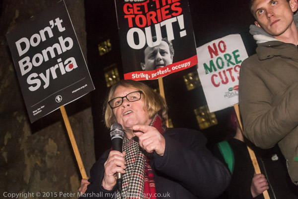
Don’t Bomb Syria

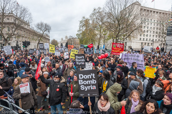
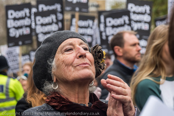
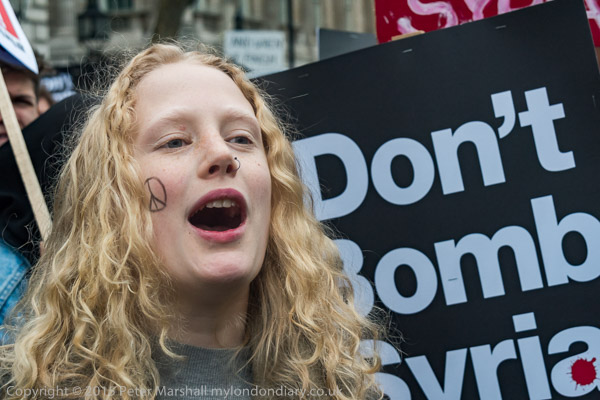
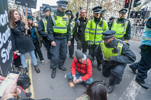
Don’t Bomb Syria was a big protest, attended by several thousand people, and obviously rather larger than the police had planned for, and it soon became obvious that their attempts to keep traffic flowing had been a mistake. It’s hard to think of any road in London which is a vital route – there are always other ways to drive from A to B, and there are often closures for various ceremonial or sporting events, but sometimes the whole purpose of policing protests appears to be to keep traffic moving.

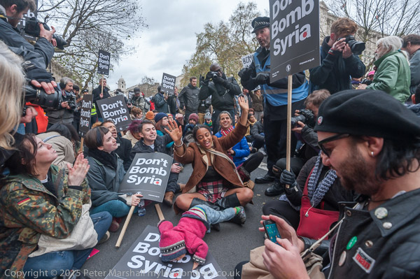
The numbers present forced them to  close the southbound carriageway a few minutes before the rally started, but they continued to keep traffic flowing northbound, having to keep clearing off groups of protesters who kept coming onto it from the pavement to get closer to the speakers. Finally enough people decided they had had enough of the police action and a large crowd moved on to the road and after a while sat down and blocked it.

London has been very slow to take the obvious move of pedestrianising some of its central areas; while many suburban high streets are now traffic-free, Oxford St is still full of traffic and Parliament Square remains a large traffic island. Almost everyone feels that Trafalgar Square is so much improved after the North Terrace was finally pedestrianised in 2003 – except for the National Gallery, which is upset by the buskers and ‘living statues’ who lower the tone by performing there. Much as I hate ‘living statues’,  and would certainly welcome some form of cull, it is far more pleasant now than when the area was full of buses, lorries and diesel fumes.

I wasn’t happy with some of the speakers at the protest, although I agreed that a military intervention by the UK at this time was unlikely to have any positive effect. We should have acted much earlier, though not directly, rather than speaking in support the Syrian opposition and against the dictator Assad but refusing to give those who opposed him any material support.

While the Russian position perhaps made it impossible to act directly it would have been possible to find ways for the Syrian rebels to have much more effective defence against the air attacks of the Syrian regime, and to stop the huge oil exports, mainly smuggled through our ally Turkey which have largely financed ISIS.

What I waited for in vain as I photographed the speakers at the event was for anyone giving a view from the Syrian opposition – instead we got many of the same speakers who get paraded at every Stop the War protest. Some of them are worth listening to, others too predictable to be really worth the effort. And several did stress the need to take effective action about the Turkish oil smuggling that is funding ISIS – something the Russian bombing and press releases have made us all aware of.

From a purely technical point of view it is always a pleasure to watch and listen to speakers such as George Galloway and Tariq Ali, whether or not what they are talking makes sense (and usually at least some of it does.)  Some of the others can reliably be expected to speak good sense, but  as I say in Speakers at Don’t Bomb Syria

” I was left waiting and wanting. There with notebook poised ready to write down the names of the speakers representing the Syrians and the Syrian Kurds, who should surely have been at the forefront of this protest rather than so many old ‘Stop the War’ war-horses. None came, not because none were available or willing to speak, but because the politics of those most closely involved don’t accord with those of Stop the War.”

Eventually I lost interest in the speeches and concentrated on the large group by now blocking the road, as you can see in the third part of my report:  Don’t Bomb Syria Blocks Whitehall.

After around an hour, people were beginning to leave, and the arrival of more police who then went around telling people they would be arrested if they continued to sit in the roadway fairly quickly persuaded the others it was time to end their protest.

Continue reading Don’t Bomb Syria

Osborned?

I was relieved when I checked in our slang dictionary to find that there was as yet no definition for the term ‘osborne‘ or ‘osborned‘; otherwise it might have been confusing for me to propose a new usage.

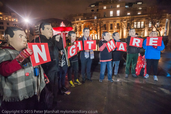
An osborne is clearly a kind of fraud or confidence trick, based on the use of dodgy statistics, false assumptions and long-winded speeches, and aimed at benefiting the wealthy at the expense of the poor. And on Nov 25th last year we were clearly ‘osborned‘. The letters at the protest on the previous night spelt out clearly (at times) that it was a N I G H T M A R E.

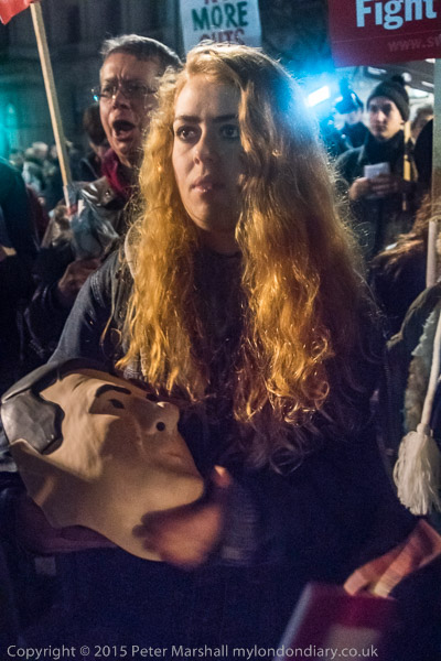
It was also something of a nightmare to photograph, as the area where the figures were standing was probably the darkest point in Trafalgar Square, with most of what light there was falling on the back of the figures – as you can see from the shadows they are casting on the paving in front of them. I’d taken the 20mm f2.8 and it was only wide enough to encompass the group when used from one side – had I moved back you would have seen a pack of around 20 people with cameras and phones all trying to photograph the same group. The few pros possibly had lenses wide enough to encompass the whole group, but on most of the phone images it probably said GHTMA.

I didn’t need to use flash, as there were several people with lights on video cameras – who could pan across the group to reveal the whole word, though I did see one who appeared to be reading it as ERAMTHGIN.  Annoyingly sometimes their lights went off or turned away just when I wanted to make an exposure. With their lights I was able to work with the D700 set at 1/60s, f/4 and ISO 3,200; as usual to get things looking like night I needed to dial in an exposure adjustment – this time -0.7Ev.

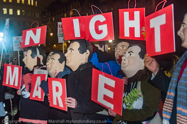
Then someone had the idea it would better fit a still image if the word was split into two and the two put one above the other. I think it made a better picture, but now there was someone shining their video light at me from the edge of the frame. As normal I preferred an oblique view, and for this image I did use flash, working with the 28-200mm on the D810 at 42mm in DX mode – equivalent to 63mm.

Later the protesters marched down to Downing St for a rally opposite and  there isn’t a great deal of light, so most pictures needed flash, particularly for the speakers, where you need a relatively fast shutter speed to capture gestures and avoid subject movement. It didn’t really need the 1/640s that I appear to have used for this image – I was working in S mode and my random wandering finger appears to have shifted the main control dial backwards and forwards rather a lot.

It was perhaps a little fortunate – because as a slower speed – such as the 1/125 I probably intended, that pointing hand might have shown more blur, and the windows behind in the Ministry of Defence would have bee more of a distraction.

Back in the old days of course, flash sync at 1/640th with a focal plane shutter was simply impossible; most cameras were limited to 1/50 or 1/60s, and setting a higher speed resulted in only a part of the frame being exposed. Now with the Nikon D810 if you have custom setting e1 set to Auto FP High-Speed Sync you can use flash at any shutter speed.

I took some more pictures of people in the blackness of the crowd without flash, including some I felt were perhaps just a little to noisy – like the one above. Taken with the camera set at ISO3200, it had a ‘grainy’ effect, which wasn’t unpleasant, but was very noticeable in larger versions of the image than web size. Writing this, I thought this was a good example to try out using the noise reduction of the now free Dfine in the Google Nik Collection

I applied the filter in automatic mode on the full size file, and the difference was pretty remarkable, with the noise virtually entirely removed, and Photoshop’s ‘Despeckle‘ filter cleared it a little more. I can only just see the difference even in the two reduced size jpegs in this post, but on larger images the difference is very apparent.

There very little apparent loss of image detail in the treatment, and removing the noise makes what detail there is clearer. After I made the small jpeg to use in this post, I did clean up the larger file using Photoshop’s ‘Dust and Scratches‘ filter, with a radius of 2px and a threshold of 5px. The resulting image is remarkable for an image in such poor light.

It’s a shame that the Polaroid ‘Dust and Scratches’ filter which often worked rather better than the Photoshop equivalent is no longer available and doesn’t seem to work in Photoshop CC. It will still run as stand-alone software under Windows 7 and can be used to produce even smoother images when applied to the results from Dfine2. But it does so at the expense of a little detail

A double pass can remove both white and black specks, but you need to convert images to sRGB before using it, and it does lose some detail, so need to be used with caution. And of course such processing is time-consuming and largely unnecessary. The Polaroid filter is best kept for use with scanned images where the dust is usually rather larger.

More about the event and more pictures at Osborne’s Nightmare Cuts.

The following day as George Osborne got to his feet in Parliament to deliver his speech I was outside his family interior decoration business on the King’s Road in Chelsea with Class War – as you can see and read at Class War at Osborne & Little.

Continue reading Osborned?

Gear Sense

One post I’ve read on Petapixel sums up many of the things I’ve often said or thought about photographers and gear. The 11 Stupidest Things Photographers Say About Gear is worth a read, as is a series it refers to on fstoppers.

They compared the same scene photographed on leading Canon, Sony and Nikon cameras and asked people to rate the 3 images and say which camera they came from. And the results showed that there was very little difference between whether they photographed the studio scene on a Canon 5DsR, Sony A7RII, or Nikon D810.

Not only was there no real difference in detail, resolution etc, there was an almost identical colour to the three images. I still think there are differences in colour between the images produced by the three cameras, but these are down to differences in how the auto white balance works rather than anything inherent to the camera. And the differences are easily corrected in post-processing.

But the main differences between the three marques are in handling. How convenient is the control layout, and the menus. Which way do zooms zoom? and where do you have to line up the dots when changing lenses, and which way do you turn them. I’ve used Nikon for over 12 years now, and I still find it much easier and faster to change lenses on a camera that works the same way as Leica does. But the buttons etc on Nikon seem so much better than the interface on Canon. And so on. My ideal SLR camera would still be the Olympus OM4, but no one has ever made a digital version of that – and of course I’d like some updates such as auto-focus and high speed flash sync.

Of course the publication of their results was greeted with controversy, and some valid points were made, in particular about the lens used for testing with the Sony, So this led to ‘We Tested the Sony A7RII AGAIN for All the Sony Fanboys‘ and the results were more or less the same: Most People Cannot Tell The Difference Between Nikon, Sony, and Canon High Res Files. And most of those who tried and mainly got it wrong were photographers.

Perhaps I should be pleased that one of the cameras I use came out marginally top on the test, but quite frankly I could not tell the difference and suspect it was probably not statistically significant. But at least it does reinforce my own feeling that the extra pixels in the 50Mp Canon EOS 5DS R are of no significance.

I’m actually thinking of going back to DX format for my next camera – I’ve always thought there was – as Nikon for some years maintained – no real advantage in the larger FX format. It wasn’t that the results were any better, just the larger sensor meant the cameras had a better and brighter viewfinder.

My ailing D700 is still taking good photographs – at least when I manage to point it in the right direction at the right time with the right lens. But its days are surely numbered (and a service that would address its current faults would cost more than its worth.) I’ll probably replace it by another Nikon, but can’t at the moment decide whether to buy a D750 or, when they get into the shops, a D500. Or perhaps by the time I’ve made my mind up there will be something new available to change it!

Back with the Ripper

The so-called ‘museum’ dedicated to Jack the Ripper in Cable St –  a tacky attraction for the strong-stomached tourist lacking in humanity or sense – received a couple of visits in November from protesters which I photographed.

Class War were one of the first groups outraged by the shop to get organised, and I photographed their protests outside in August (here and here) as well as one organised by Fourth Wave: London Feminist Activists in October. There have been other protests that I’ve either not been able to attend or only heard about after the event –  particularly those organised by local groups.

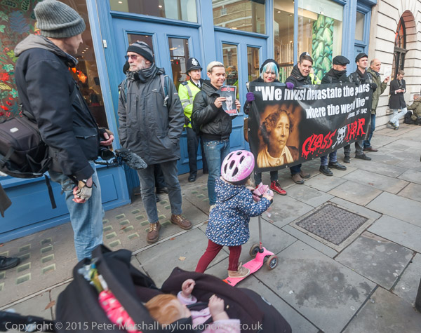
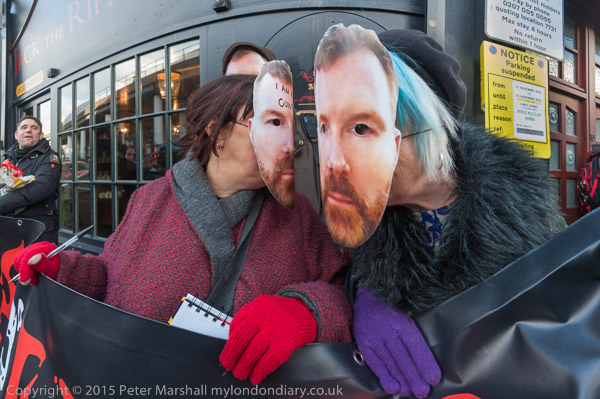
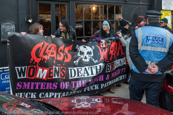
Class War were back again on a Saturday morning, several of them wearing masks showing the face of the museum owner, and stood outside the shop with their ‘Womens Death Brigade‘ banner.

It was a small but noisy protest, watched over by a couple of police officers who seemed quite amused by some of  Class War’s comments. He had to go inside the shop to talk with the proprietor’s partner who was  behind the counter and ask him to stop dialling 999  repeatedly as the police were already here.

He – and perhaps his assistant – were obviously unnerved by the protest, which appeared to have disturbed what otherwise would have been a rather lonely morning – the door to the shop was open until he decided to lock it, but I think there were no customers during the hour or more of protest. Clearly it doesn’t appear to be a viable business, despite quite an effort on the PR side, including some obviously false comments on online review pages, and a man who came along to complain at the protesters.

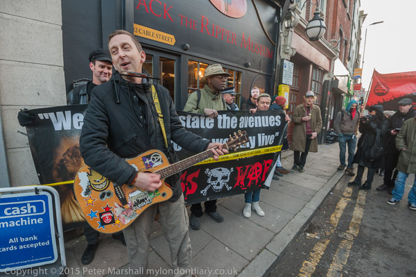
Rather more welcome was anarcho-folk singer/guitarist Cosmo, who came from Cardiff to perform some of his great songs at the event.  After which Class War decided it was time time for the pub, and for once I had the time to join them, though I didn’t stay long as I needed to get home and process and file the story.

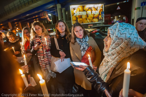
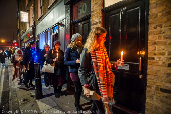
Five days later I was back at the same place for a protest with a very different feel, a candlelit vigil organised by the local Church of England and supported by the Theology centre at St George’s and London Citizens’ Whitechapel HQ as well as various women’s groups. There were one or two people present who had been there the previous Saturday, but it was a very different group, and included the great-great-great granddaughter of Catharine Eddowes , one of the Ripper’s victims.

Photographically it was considerably more challenging, and something that would have been virtually impossible on film. Using the D700 I was working by candle light at ISO 3200. It was fine for people actually holding candles, but the light from them follows the normal inverse square rule for point light sources, and away from the candles it was dismal.


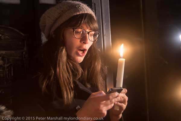
A woman holds a candle as she reads from her phone about one of the victims of Jack the Ripper outside the ‘museum’ which celebrates his vile murders.
I didn’t want to use flash, partly because it would destroy the lighting effect, but also because I felt it would be inappropriate at the vigil. The 16-35mm gave me a good angle of view working close to the circle of those taking part, but even with that wide angle I had problems with depth of field. Mostly the better pictures were made using the 20mm f2.8 – that extra stop over the f4 16-35mm was really useful. I didn’t use the D810 much, and had forgotten that I’d taken it off auto-ISO, which caused problems, though a few images were fine – like that above at 1/15s, f/4.5, ISO 800, -0.3Ev, 50mm (75mm equiv.)

A photographer working for the local paper was also present, and did use flash, but he took considerably fewer pictures than me. But when the cleaner who had been working inside the closed shop came out, and was photographed, he responded by shouting ‘Don’t take my photograph!’ and lunged at the photographer, grabbing his camera and assaulting him.

Without having flash on my camera, my pictures of this event were too blurred to be of use, but I’d had a clear view of what happened from several meters away. Police jumped out of the van where they had been sitting and threatened to arrest the photographer rather than his assailant! I and others volunteered to act as witnesses, but the photographer concerned declined to press charges.

After the vigil, when those taking part walked together to the local church I did take some flash exposures. By this time I was late for dinner and had to rush off before the service began.

More text and pictures at Class War at the Ripper ‘Museum’ and Ripper ‘Museum’ Candlelit Vigil.

Continue reading Back with the Ripper