Oomska!

Ten days ago, in Ponytail Pontifications, I wrote a little about an old friend of mine, Derek Ridgers, who had just been invited to give his thoughts on the ‘future of photography’ on the Oomska blog, the fourth photographer in what was then a five-part series.  I commented there that the responses to the questions “tell you rather more about the people questioned than casting much light on the future of photography.”

As a result I got invited to give my answers to those same questions, and I suspect the same is true about me – and you can judge for yourself in what is now part 10 of the series, with Carlein van der Beek, Tamara Bogolasky, Emma Jay and  Nick Turpin also having had their say. Comments are of course welcome, both at Oomska and here.

What I found a real problem was not answering the questions but deciding which two pictures I should send to be published with them, and, perhaps even harder, finding a picture of myself to send with them.

John Carvill who runs Oomska had actually asked me for a ‘self-portrait’ though I think he meant a picture of me. I have taken some in the past, but probably it is thirty years since I made anything but a mug-shot for ID purposes. Some of those were pretty poor by any standards, and I wince every time I pull out my press card, with a picture of me taken perhaps 15 years ago which shows me as a desperate criminal. It really isn’t even at all recognisable now and I have tried to change it by supplying a more recent (and more flattering) image on renewing the card, but the system doesn’t seem to allow for this.

Over the years other photographers have taken a number of pictures of me, some in more compromising situations than others, but there are just a few that I’ve used on line. One that I use on Facebook was taken in a rather nice London pub just after I’d got a new digital camera and several friends were passing it around and took pictures on it. But the one I chose was from the only proper portrait session I’ve sat for (I don’t count those where I sat in as a teaching aid for my students.) A friend of mine, Tony Mayne, decided around ten years ago to take a series of portraits of photographers, and brought his lights along to my house for a session.  Photographing photographers is probably always difficult, but I think he did it admirably, although some of his other sitters were undoubtedly more photogenic. And being the generous person that he was, as well as supplying me a set of proofs from the session he also gave me permission to make use of the pictures as I liked, though of course I’ve always credited the image to him, unfortunately now posthumously.

You can see that picture, and the two that I selected to go with my thoughts on Oomska.

Going back to Derek Ridgers, yesterday I went to the exhibition at the Saatchi Gallery where the Sunday Times is celebrating 50 years of their magazine. I’ll possibly write about it at greater length shortly, but if you are around there before 19 Feb it is worth a visit (though it is closed Feb 11-14.) There is a special anniversary issue of the magazine on Sunday 5 Feb, though I think it looks rather disappointing, and it and the show reminds me why I gave up buying the paper. But certainly in its early years and at times since it has used some fine photography, particularly in the early years by Don McCullin. But of a number of portraits on display as large backlit images, one for me was head and shoulders (sorry!) above the rest, Derek’s fine image of Keith Richards.
Disabled Block Road

© 2012, Peter Marshall
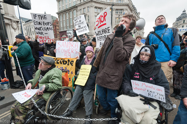
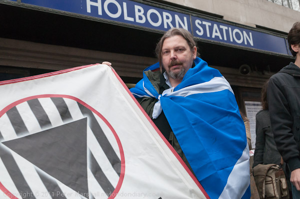
Protesters met outside Holborn Station

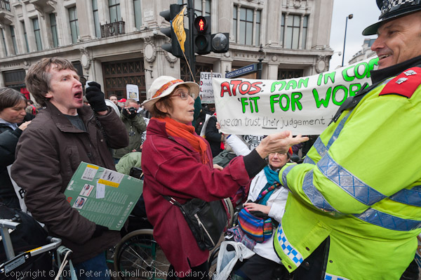
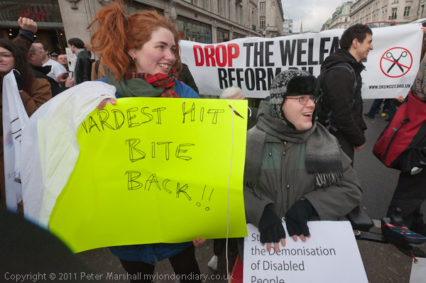
Saturday morning I arrived at Holborn Underground station to find almost every other photographer in London was there. We’d all come for the start of what the press release had described as “group of disabled, sick and elderly people … going to engage in a daring and disruptive act of civil disobedience” at a “secret location” in protest against the benefit cuts of the Welfare Reform Bill, currently going through our parliament.

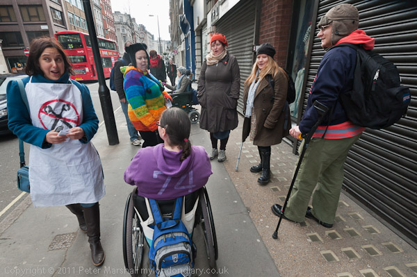
It didn’t look too hopeful, as there were only a few protesters, perhaps around 20 and probably around a hundred photographers, videographers and reporters. But as I was there, I got down to taking a few pictures, taking care to get the station name in at least some of them. As well as photographing some of the half-dozen or so in wheelchairs I also took a picture of two guys with the banner of one of the organising groups.

We were all hanging around, waiting to be directed to the “secret location”, when I saw the banner being rolled up and the two carrying it hurrying into the station. I started to follow them, then stopped, deciding wrongly it would be a better story to stick with the wheelchairs.

© 2012, Peter Marshall
Protesters make their way to Oxford Circus from the taxi drop-off point

We were all still hanging around being told nothing, and then I saw that the people in wheelchairs were beginning to get into taxis. I can’t afford taxis – and generally they are a slow way to get around London – but I did overhear where the taxis were taking them, so decided to take the tube to Oxford Circus and walk the short distance to that point, getting there more than five minutes before the taxi. Unfortunately by the time they had arrived and we had walked to the protest I had just missed the start.

© 2012, Peter Marshall
Protesters on the road with the chain across them

Most of the protesters had obviously met elsewhere and together with the press who by then had been taken to Oxford Circus where the protest was. Sometimes using a little initiative doesn’t really pay off!

I don’t think I had missed much, and the main problem now was that there were still probably more photographers etc than protesters, and it was hard to take photographs without getting in other people’s way and them getting in yours. What really annoys me are those people – mainly not the pros – who keep pushing their cameras out at arms length directly in front of your lens.

I’m always trying to think in terms of the story as well as the picture, perhaps a slightly different perspective to many of the press and agency photographers. They know that probably at best only one or two of their photographs from any event will get used, while I know that I’ll put a whole story both on Demotix and also in greater depth on My London Diary, and also hope I may get a picture published elsewhere.

© 2012, Peter Marshall
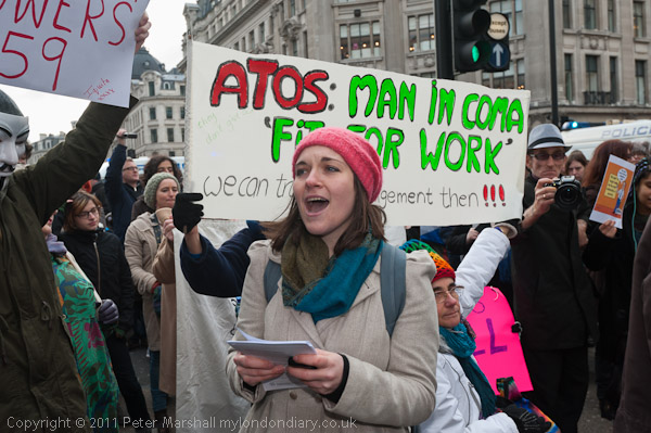
Woman leads the ‘human microphone’ against the Welfare Reform Bill

© 2012, Peter Marshall
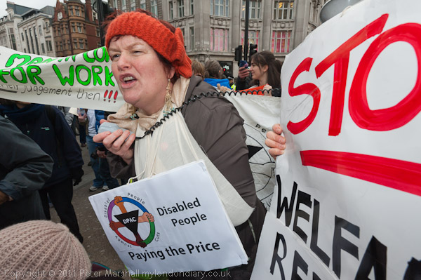
One of many people who spoke at the protest

© 2012, Peter Marshall
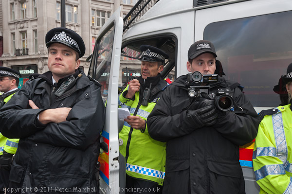
Police officer in charge warns protesters they are committing an offence

© 2012, Peter Marshall
Protesters confront police officer

Other than photographers getting in the way (and of course they have the same right to be there as me, though there are a few who really need to learn manners) my other main problem was Nikon’s lousy lenshoods, a subject I’ve mentioned before.

© 2012, Peter Marshall
The dark area at bottom left is my lens hood

Working in crowds, lenshoods get knocked – and the main reason I use one is often as protection – they get knocked rather than the lens. Cheap substitutes from e-bay can be a little better than the Nikon originals, and the one that cost me around a tenth of the genuine Nikon is a little firmer and gets knocked completely off rather less often (and eventually after I’d picked the original up a few dozen times from the ground it was cracked) but they still have the same fairly useless bayonet mount which makes them easily turned round, and it’s easy to miss that this has happened for a while when taking pictures. I’m someone who usually frames tightly, and it is seldom possible to rescue the situation by cropping the images. But here is one where I could crop at top right, and the lens hood at bottom left isn’t a great problem – it could easily be someone’s shoulder, and if I didn’t tell you you wouldn’t know what had happened.

It was also a fairly large intrusion into the image, which in a way was fortunate because I fairly quickly noticed it and twisted it back into position. But a well-designed lens hood would have a much more positive lock.

The other problem I had was down to a little of my own finger-twiddling (probably also a design fault, but not one I can blame Nikon for.) At some point I managed to move one of the sliders on the 16-35 lens barrel from Auto to Manual focus. Working at 16mm, images didn’t look particularly un-sharp in the viewfinder when slightly out of focus, and rather oddly the camera still occasionally makes little focusing noises even when it isn’t! However it soon became obvious something was wrong when I zoomed out to 35mm, but not before I’d taken a few rather soft pictures.

The slider on the barrel is sensibly quite difficult to move accidentally, but somehow I managed it though I can’t quite understand how. It was a cold day and I was wearing thin synthetic woolly gloves which make handling the camera a little less positive. More often I wear thinner silk gloves that retain a little more feel.

The story and more pictures are now on My London Diary .

________________________________________________________

My London Diary : Buildings of London : River Lea/Lee Valley : London’s Industrial Heritage

All photographs on this and my other sites, unless otherwise stated are by Peter Marshall and are available for reproduction or can be bought as prints.

To order prints or reproduce images

________________________________________________________

Ansel Adams on Film

Ansel Adams is not one of my real favourite photographers, perhaps because his view is both very American and also from an earlier era*; it’s fine to admire what he did (and in many ways I do) but it has inspired too many to try and do the same, and the results are almost always uninspiring and insipid.

I did learn a lot from him, and his ‘Basic Photo‘ series in particular, teaching myself to print from an old copy of one of the volumes that I came across by accident in our local library when I moved to a new home in 1974. I ended up buying my own copy of ‘The Print’ and the other volumes in the series. But Ansel taught me how to print, and it was then a true master-class, though later editions of the work did get somewhat dumbed down.

I sat down at the computer today to write about something completely different, then spent the best part of 80 minutes (I did fast-forward a little) watching  the PBS documentary on Adams that I found on the Peta-Pixel site. As it says, “an elegant, moving, and lyrical portrait” though perhaps sometimes lacking in critical bite about his photography.

After watching it, I went to take another look at some of his photographs, which he also deserves to be remembered for and are too often forgotten, on the Library of Congress site, Ansel Adams’s Photographs of Japanese-American Internment at Manzanar.

Ten years ago, at the time of the centenary show of his work, I wrote about Ansel Adams at some length as well as reviewing the show, but those features are no longer available. Written at the same time and published in The Atlantic Monthly was a long piece by Kenneth Brower, still available on-line and worth reading.   Among many other things he tells how MoMA in New York censored the show of his Manzanar work, insisting on the removal of a panel by Nancy Newhall referring to a letter written by Lincoln and including the words:

As a nation we began by declaring that “all men are created equal.” We now practically read it as “all men are created equal except Negroes.” 

MoMA insisted on the removal of this panel and that the original title of the show be changed from “Born Free and Equal” to “Manzanar: Photographs by Ansel Adams of Loyal Japanese American Relocation Center.

_____________________________________________

*But that doesn’t stop me liking Walker Evans.  I think there is a line between creating creative landscape images and pretty pictures that just sometimes Ansel Adams got the wrong side of. Or perhaps I just prefer the classical to the romantic. Or think it wrong that there were people who failed to realise that Edward Weston was so much a better photographer!

The Near and Elsewhere

Although The Near and  The Elsewhere, showing at the PM Gallery in Ealing was in various ways a disappointment to me, I was still pleased that I had gone to see it (and it remains on show until 17 March, Tue-Fri 1-5pm, Sat 11-5pm) and would recommend a visit if you are in London – it’s a short walk from Ealing Broadway tube.  Firstly because of the setting, in a 20th century extension of Pitzhanger Manor-House, once the country home of Sir John Soane who rebuilt most of it between 1800 and 1810. It’s a splendid building and well restored, owned by the London Borough of Ealing, and looking quite dramatic when I arrived there in the dark for the opening. Just along the road from Ealing Studios, it has its own film history having starred as the Tate Gallery and Kensington Palace among other places, even appearing in Doctor Who.

Inside, the gallery is a fine large space and perhaps demands some at least of the large images that are on display, although for me most of them were rather lacking in interest. My first disappointment – a minor one – on hearing about the show was to find that it had no connection with the blog of the same name. The second, on reading that it “shows the physical growth and loss of urban architecture in cities across the world” was to find that photographers who would have been at the top of my list for addressing such issues were almost entirely absent. And thirdly, on looking around, I found that much of the space was taken up with frankly boring art works many on a very large scale. But fortunately there were still some things worth looking at, and others will have different interests to me. I’m a photographer after all.

My favourite picture was one of Ferit Kuyas‘s images from his ‘City of Ambition‘, a project taken in Chongqing, the largest city agglomeration in the world with a population in the city of around 32 million. It is a view looking down from a height on a construction site, taken in 2005 with the slight mist seen in many of his images of the city which he tells me is not pollution but the fog that the city is famed for. It’s a wide angle view and the site is packed with small details; as you look at it gradually you realise more and more men are working on the site. Although it is quite a large print, 100x125mm, I found myself walking right up to it so I could see details with my reading glasses, then moving back to take in the whole picture. This is an image you can look at for a long time and still find new things in.

His other work in the show, Jialing River Shore, a diptych of a vast concrete space, reminded me of some images taken underground in vast reservoirs and comes from a couple of years later, when he was deliberately avoiding including a horizon in his images. The two pictures are views made from the same place but looking in different directions, with a part of the subject repeated on both (they are mounted together as a diptych in the opposite way round to the view.)  There is a pleasing subtletly about the printing that was absent in some of the other works on display. Both of these works are in his book ‘City of Ambition‘ but neither seem to be on his web site, which does however have a fine selection of his work from the project.

One of Michael Wolf‘s distant views of Hong Kong’s blocks of housing was another impressive image, and I quite liked his 100×100, a set of 100 pictures of the residents of cramped 100 square feet single room homes in Hong Kong, a contrast to most of his images which are devoid of people. The relatively small images from this project are shown displayed as a tower block in a corner of the gallery, which works as an idea but does make actually viewing the upper images rather tricky.

Another interesting set of work was One million $ houses by Noel Jabour, showing buildings “turned into redundant monuments to greed” through the failed US mortage economy. These structures, like many of Kuyas’s images of Chongqing, emerge from the Galveston, Texas sea mist, giving them an air of unreality that mirrors the financial unreality which created them.

The invitation carried a dramatic image of a Shanghai house by Canadian photographer Greg Girard, whose book Phantom Shanghai captured the ruins of the pre-war international city, and were taken in 2005 just before (or as) they were being demolished, with highly theatrical night lighting and garish colour that somehow works. This was a pretty vast print,  210 x 180cm, and one of very few very large photographs that really merits its scale (and certainly the only one in this show.) The images are well reproduced well in his book, but ‘Rags, One Room Apartment, Liyang Lu, 2005′ in the print on the wall had one of the worst colour casts – a strong cyan – I’ve ever seen in an exhibition; it is unrecognisable as the same image in the book (and may perhaps be from another exposure made with different lighting.)

Girard’s book has an foreword by William Gibson, but it was another book, J G Ballard’s Empire of the Sun, that came to mind, and these pictures can truly be described as Ballardian, and I’ve just bought a copy on-line. Incidentally you can see a good set of Girard’s pictures on today’s New York Times Lens blog of US bases in Japan, Korean and on Guam, taken in 2008 – and this and more work on his web site.

I think Gregor Graf‘s work looks better on the web than on the wall; by digitally removing all signage and people from his pictures of cities he creates strangely alien places. Linz, in his Hidden Town – Situation 2, 2004 could be London or Warsaw, but the lack of textures makes it more than anything else resemble a cardboard model of a city than the real thing. Its a curious but perhaps just slightly more interesting reversal of those artists who build elaborate models to photograph.

Also in the show is work by Francis Alÿs, Sarah Beddington, James Casebere, Thomas Demand, Edgar Martins, Gaia Persico (who curated it), Peter Piller, Sara Ramo, Rachel Whiteread, and Cino Zucchi Architetti.

The gallery also has an interesting complement to this show in the small and almost monochrome paintings based on her recent photographs of small town America by Marguerite Horner, ‘The Seen and Unseen’ (closes 25 Feb) which I enjoyed seeing. It very much reminded me of the work made in similar places that formed a bedrock for much American photography of the last century, through  Wright Morris, Walker Evans, David Plowden and others to Robert Adams.

Copying Clichés Can Infringe Copyright

It would be hard to exaggerate the shock I feel at the ruling by Judge Birss at the Patents County Court in London on 12 January. There is a good account of the case on the Amateur Photographer site, and this links both to the full court ruling and the two pictures concerned.

The case concerned two pictures of a Routemaster Bus on Westminster Bridge, both of which had a bright red bus on a picture which had otherwise been converted to black and white. Both had the Houses of Parliament in the background. It would be hard to think of a more clichéd image of London and indeed that was in both cases the intention.

Although there were some common elements, as the defence tried to point out these are shared by many other pictures of London. In a quick search on Flickr I turned up around 20 similar images, and it would be hard to argue any real degree of originality in any of them (although in the judgement there is a discussion of this, which would seem to imply that almost any photograph is legally original, which is perhaps just as well for most of us photographers.)

The treatment converting the background to black and white is also surely a cliché. And despite the similarities of subject and treatment, the two pictures seem significantly different, for example in lighting, in viewpoint, in the angle of the bus to the camera and the angle of view (although the claimants apparently stated it was “at the same angle as the claimant’s work” but it clearly isn’t.)

The judge does go into his deliberation at great length but I find some of his statements rather odd. He writes “At the crudest level the two images in question simply look strikingly similar” and I just have to disagree. Given that both have a red bus and a black and white Houses of Parliament they look strikingly different.

It is actually a very interesting discussion about the originality and copyright of photographs but unfortunately one that I think has resulted in a fairly ludicrous judgement in this case.

In one of the many points the judge writes that the photograph claimed to be infringed is not what

I will call a mere photograph; by which I mean an image which is nothing more than the result of happening to click his camera in the right place at the right time. I do not need to grapple with the scope of copyright protection arising from such a photograph.

I think the corollary of this may be that those of us who are proud to be mere photographers have  little to worry about the outcome of this particular case.

Ponytail Pontifications

Derek Ridgers was recently interviewed by Oomska on the future of photography, the fourth in (so far) a five part series so far includes Ed Swinden,, George Plemper, Steve Gullick and Philip Greenspun.  Derek, who I’ve known for years is always interesting to talk to, and clicking on the fine portrait of Willie Dixon at the head of his piece will take you to his web site.

When I taught photography it was always a great pleasure when Derek came to talk to the students, who recognised far more of the people in his portraits than I did. But even if my knowledge of the pop scene from the 70s on was abysmal I could see the quality of his work. Too many portraits get published simply because the person in them is well-known, even though the pictures may be poor (and the walls of our National Portrait Gallery have more than their share of such work) but Derek’s work stands out.

Even if you have little interest in such music, there are still some interesting stories on Derek’s blog,  The Ponytail Pontifications,  where among other things you can find why both he and one of his photographic heroes Garry Winogrand “both had deadbolts on the inside of our darkrooms”.

Derek used to come to Framework, one of the photographer’s groups I was involved with in the 1980s and showed work in a number of the shows we organised. We all used to bring work along and discuss it with the group, and he was in some respects our most useful member; when we often wasted too much time in trying to find redeeming features in some of the more vacuous work that some people brought, his comments were generally rather more forthright.  And usually spot on.

The answers to the set of questions posed by  Oomska, “a new, UK-based online arts and pop culture magazine” which began in 2010 tell you rather more about the people questioned than casting much light on the future of photography. Photographically, apart from Derek, the most interesting work they led me to was by George Plemper, who in the late 70s was (like me) teaching as Head of Chemistry in a large comprehensive school. While I took a few pictures (and started a photographic course) he produced a very much larger body of work both inside the school and in the local community which you can see on Flickr. Perhaps the most interesting set I investigated is One moment in time: England 1975-1982.

Yurian Quintanas Nobel: Transfiguration Day

You may have to wait a day or two to access the web site of Yurian Quintanas Nobel which is currently getting rather a lot of traffic doubtless thanks to his essay Grabarka: Transfiguration Day which appeared on Burn on Friday. Burn “is an evolving journal for emerging photographers… curated by magnum photographer david alan harvey”  (and like My London Diary in its early days has a shortage of captial letters, although not it its articles) which publishes a great deal of good new work.

One of the things that drew my attention to Nobel’s feature was that it was in black and white, but also it was taken in Poland, a country I have fond memories of, and also looks at a religious event of which I have covered a few. It is a nicely structured set of 17 images, presented at high quality, almost good enough to be worth viewing at full screen on my largish display (most web displays aren’t, and look better small.)

Looking through the pictures, there are certainly some where black and white works well, particularly in making light coloured crosses stand out against a dark background. But there were a few others where I longed to see the picture in colour. Looking at it, the quality of some of the images in low light suggests to me it was actually taken on digital and then transfigured into colour.

But the use of black and white is appropriate for several reasons, not least that it fits with the ideas about darkness and light and the living and the dead that are at the heart of this mystical and spiritual location and the events there.

But – whether or not it would be appropriate here – I think that many photographic essays might benefit if photographers were to break what appears to be a taboo and mix colour and black and white images. It used to happen often somewhat randomly in the old days of magazines when only certain pages of publications were printed in colour, although too often it was the images that really needed colour were printed in black and white and vice-versa.

_______________________________________________

It still occasionally happens, though now it is largely a matter of designer whim as most printing is 4 colour, and there are several examples in my work in the Stop the War book.

© 2007, Peter Marshall

I obviously took this picture in colour, and for reasons best known to the editors it was used in the book as a black and white image. Not quite as well-converted as my black and white below, rather darker and duller, and of course cropped.

© 2007, Peter Marshall

In the black and white version, the placard at the bottom of the image pulls the eye far more strongly (perhaps why they printed it all darker) whereas in colour the focus is very much more on the warmly-lit faces of the two women clapping, and I think it works very much better.  I think I might have framed it rather differently if I had been thinking in black and white when I took the picture, although without being there it’s hard to decide. Obviously I was interested in the two prominent CND symbols as well as the group of people clapping.

It is only one of several pictures on a page, printed fairly small, and some of the others are in colour. It certainly doesn’t help the picture to be in black and white and I don’t think it makes for a better page either.

Magnum Advice For Young Photographers

Some years ago I was interviewed over the phone by one of the consumer digital photography magazines for a small feature on my work – I can’t immediately recall the details, except that I think it was one of the few occasions when I was stupid enough to decide that the publicity was worth letting them use a few pictures, all taken on film, without paying me – one of the questions was something like “what is the most important accessory for taking good photographs?” and my answer was “a really comfortable pair of shoes.” Though I can’t remember if that made it into print. But photography does often involve a lot of walking and a lot of standing around. And it’s no fun at all if your feet hurt or are wet and cold.

Shahidul News has just re-published some advice by 35 Magnum photographers, originally published in 2008 at the prompting of Alec Soth, and it still makes a lot of sense. The photographers were asked two questions, “When did you first get excited about photography?” and “What advice would you give young photographers?”

First to respond in the vaguely alphabetical listing in a Magnum document with the title ‘Wear Good Shoes: Advice to young photographers’ was Abbas, who made the doubtful claim to have have got excited about photography from birth and followed this with some sound advice “Get a good pair of walking shoes and… fall in love.

Everyday People & A Nightmare

Imagine going back to your parked car and finding someone had broken into it, stealing not just your camera and lens, but also your laptop and two external hard drives containing the raw files from your last six months of work. It must be one of the worst nightmares for a photographer (though mine is slightly different as I don’t have a car.)

It was Theron Humphrey‘s New Year present when he returned to his pick-up parked in Jackson, Mississippi, where he was half-way through a Kickstarter crowd-sourced project travelling across the USA making portraits of ordinary people, as Pete Brook recounts on his Rawfile blog.

Humphrey had got backers to put up over $15,000 for his project, promising them postcards, signed prints t-shirts and more depending on the amount they contributed, and at the higher end you could camp with him, nominate a person to be photographed as a part of the project or he would tattoo your name on his leg!

While he travels across the USA – and is able to continue with the project thanks to some more generous support when people heard about his loss, with loans from friends and $4000 from a donations page – his web developer Chris Barnes is putting up the work on his web site. There are certainly some interesting portraits in his cross-section of everyday Americans on This Wild Idea.

It’s also a reminder to us never to rely on a single backup of our raw files. Unlike negatives you can easily make a copy, and by storing it in a different location, keep your work safe against catastrophe.  Humphrey is now using cloud storage for his files as well as presumably still saving them to hard drives.

History Recoloured

It has always been accepted wisdom in writing about photography that black and white was somehow more gritty, more realistic, more serious in presenting news and reality, and I’ve never been entirely convinced. With almost all the news appearing in colour for some years now, it has long been clear that this particular cultural conditioning is losing, perhaps has completely lost it’s grip on us.

A week ago, Swedish artist Sanna Dullaway posted a message (as MyGrapeFruit) on Reddit  “For my second cakeday I thought I’d show my best colourizations and some restorations that I’ve been doing for fun. Hope you enjoy!” which linked (and still does) to a photo album on photo-sharing site Imgur, although since then her pairs of vintage black and white images – including such truly iconic photographs such as Dorothea Lange’s Migrant Mother and Timothy O’Sullivan’s Harvest of Death, as well as others clearly still copyright – have been copied to more blogs than I knew existed.

On her web site and her DeviantArt page you can read a statement from her about the copyright problems involved in some of the pictures. In part she says

“Ignorance is not an excuse and I (now) know some of the photos are not public domain but copyrighted. Please note I do not take credit for the iconic photos I colourized, only the actual colouring.”

Later she makes clear:

‘I did not want to “improve” nor “replace” the photos I DID colourize as some of you may think. I just wanted to show you a new perspective of the black & white old world, it used to be in colour, too. I thought famous photos would touch most hearts. Focus on the photos, not me.’

Of course copyright is important, and I try carefully to respect it here both for words and pictures. Her ignorance is not unusual for internet users or bloggers, but perhaps surprising for someone who is setting up in business as a restorer and colouriser of black and white images. That she is using other people’s copyright images and gaining publicity for a business she is setting up makes her offence more serious.  I don’t agree with those who suggest it is “sacrilege” to colour photographs such as Eddie Adams’s 1968 Saigon Execution picture, but it does certainly offend against his moral rights and copyright.  As Adams himself died in 2004 we can’t know what he would have thought of it.

Personally I think it is sensitively done and don’t find it offensive, but it isn’t my picture. But on several occasions artists have asked  to use my images in various ways as a basis for their work. The vital difference is of course that they asked – and paid.

What do I think about them? Some perhaps don’t quite ring true; that Migrant Mother for example perhaps looks just a little too healthy and well-fed in colour, but many I think are improvements on the black and white original.  Of course we can’t know how true they were to the actual scene that was photographed, and one problem with working with colour is that there are often very distracting elements in a scene.

Margaret Bourke-White’s 1937 ‘The American Way’ (see it at Life too, where it is shown more dramatically)  completely changes its dynamics. In the original, the dark and sombre line of flood victims  dominate the light greys of the background billboard, reality against dream, while in the coloured version the bright tones of the poster overpower the dull line. And in reality, someone might just have been wearing a bright red jacket or tie, which would have rather changed the picture.

Now we have colour, and most of the time it makes sense to use it. But a few things perhaps still look better in black and white, and it can certainly simplify some images.  What I find rather silly and sometimes very annoying are some photographers who have never learnt to use black and white who shoot in colour and then routinely (and usually poorly) convert the pictures to black and white thinking that it makes their work more serious as photojournalism.