WPP Pietà

I’ve been reading quite a lot of criticism of the WPP winning image by Samuel Aranda on various pages around the web, and you can read an interesting summary of the controversy it has aroused from Jeremy Nicholl on his ‘The Russion Photos Blog’ in his Why The Critics Of The World Press Photo Muslim Pietà Are Wrong – By The People Who Know Best.

I’ve not always been too impressed by WPP winners, and I share many of the overall criticisms that various people have made over the years of the WPP and other similar awards. I’m not a fan of such competitions, which I think tend to trivialise work and concentrate on the spectacular and neglect work that is perhaps in the longer term more important in changing attitudes and exposing evil. Although I have a great admiration for those photographers who continue to expose the horrors of war – and think it is a necessary and useful work, unfortunately much of it is now only too familiar.

Samuel Aranda’s image spoke strongly to me when I first saw it and still does now. And its strength comes from the way it uses various stereotypes, and repositions them.  I don’t agree that the Pietà can be claimed as uniquely Christian imagery, although we know its representation in Western art. But I would expect similar images to emerge in any representational art tradition, because essentially it is about a human relationship, between mother and child, which is widespread across humanity and I think has a powerful evolutionary basis. Although taken up and used by Christians and made a part of Christian iconography, its roots I think lie deeper in our humanity.

The black burkha is in some respects a more potent and loaded symbol of our times, promoted by Western media in a demonisation of Muslims, a looming presence that relates back to sinister and shadowy nightmares and horror, as well as to more recent images, media hysteria and even some government bans. This is a picture that reminds us strongly of the person and the humanity underneath that black covering, her gestures amplified by the white gloves.

This is a picture that speaks at several levels about good and evil, and the framing and the shadows help to make it a powerful statement, as well as a complex one.

Nicholls ends his piece with the comments from four Yemenis, including the young man and his mother in the picture, both of whom are proud and happy to see it winning the contest. Like him I find it hard to disagree with their verdict.

Cleaning the City

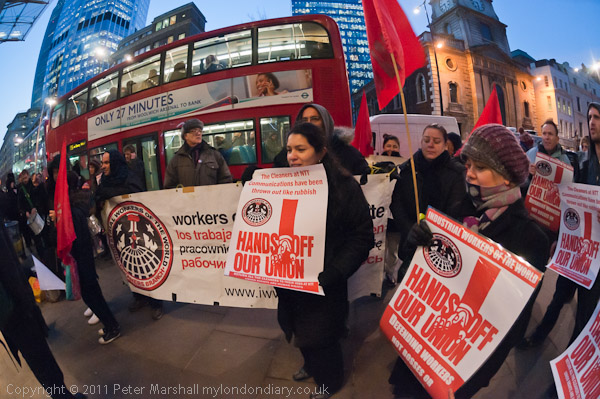
One of the clearest indications that there is something very wrong with our society is the huge disparity in wealth and income, and nowhere is this more apparent than in the City of London, where people who work in the same offices may be on the minimum wage – around £6 an hour – or being paid millions in bonuses on top of huge salaries.

Those at the bottom of the pile, the cleaners, suffer from unsocial hours, part time jobs, poor working conditions and little or no job security. You can’t live in London on the minimum wage and many have several jobs to keep their families afloat.

The campaign to get a ‘London Living Wage’, a couple of pounds a week above the UK-wide minimum has had some success, largely through the vigorous actions of the cleaners and other low-paid workers themselves, organised through various groups, and I’ve photographed a number of their protests. Although they got some important support from some British trade unions, in some cases cleaners felt that they were neglected in the settlements the unions made with the bosses, their needs compromised by unions who also represented people on higher pay.

© 2012, Peter Marshall
16mm, 1/30 f5.0, ISO 2500, flash

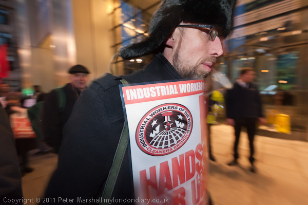
Now many of the cleaners belong to a branch of the IWW, the International Workers of the World, a US based international union only formally recognised as a trade union by the UK in 2006, although small branches have existed here since shortly after its founding in 1905. The IWW is based on the kind of grassroots action that the cleaners have been taking, and is notable for its democratic structures making it run by and for the rank and file.

Alberto Durango has been in the lead in the cleaner’s fight for better wages and conditions, leading a number of successful campaigns to gain the London Living Wage. Last summer I met him outside Heron Tower where he was able to tell me that the protest planned for that evening had been called off because the contracting firm employing the cleaners there had agreed to their demands. Towards the end of the year, the cleaners were taken over by a new company who refused to accept those agreements reached earlier (despite our laws about the take-over of enterprises,) and soon found a reason to dismiss Durango who was standing up for his rights and those of his fellow workers.

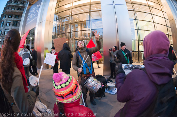
The IWW organised a protest against his dismissal outside Heron Tower at 5pm on a Friday night, in the rush hour as workers were leaving for home, and darkness was falling. Half of the pavement is actually owned by Heron Tower, and their security soon moved both protesters and photographers off from that onto the fairly narrow strip beside the road.

© 2012, Peter Marshall
10.5mm, IS01600, 1/60 f4.5

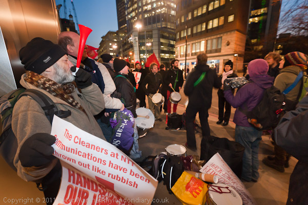
Bishopsgate is one of the busier streets in the city, with a fairly constant stream of buses, taxis and other traffic passing, and it wasn’t possible to step out into the road except when this was halted by a nearby traffic light, so most of the time I had to work from within a fairly crowded pavement area with a small supporting samba band as well as the cleaners and their banners.

Fortunately there was just enough light from inside Heron Tower, the street lighting and the windows of passing buses to work by available light with the 10.5 mm lens on the D300. Although I can generally handhold this at very slow speeds for static subjects, with protests there is generally movement, and anything less than 1/30 is likely to blur just those parts of the subject you want sharp. It is an f2.8 lens (actually as fast as anything I own in a Nikon fitting) and although you seldom if ever need to stop down for depth of field, and it performs well more or less wide open. I think all of the pictures I made with it at this event were between f2.8 and f4. The sky was rather darker than it looks in the picture, and got darker still while I was taking pictures.

© 2012, Peter Marshall

You can forget flash with the 10.5mm, except as a special effect, unless you have some kind of magic diffuser that will cover 180 degrees. Occasionally I’ve played with it to highlight a part of the picture. I had the flash on the D700, where the longer end of the 16-35mm was as extreme a telephoto as I had room to use. With the D700 I gave myself another stop, working at IS02500 to get a better balance between flash and ambient, mainly working on shutter priority at around 1/30th to try for just a little blur along with the sharp core from the flash.

© 2012, Peter Marshall

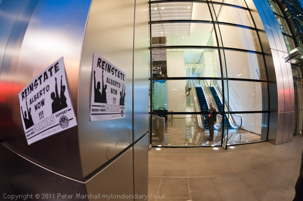
As always there were the ones that got away. I’d been photographing a couple of posters on one of the metal-clad pillars in the middle of the pavement supporting the building calling for Alberto’s replacement, with a security guard inside the glass-fronted atrium looking out at the protest. A minute later he came out and tore one of them off the pillar, but I saw him too late to get in a suitable position to photograph the moment. Others I missed when the D300 mirror stuck in the up position – it takes just a second or two to press the menu button, select to lock the mirror up, press the shutter release, turn the camera off and then back on, but remembering to do all that in the correct order in the heat of the moment can be tricky. I keep putting off the time and money to get it repaired, but will have to do it soon.

Perhaps it was some kind of compensation for this problem that I ended up taking far too many pictures – as you can see in IWW Cleaners Demand Reinstate Alberto  on My London Diary.

© 2012, Peter Marshall
16mm, 1/30 f5.6, ISO 2500, flash

A few days later I got some good news, though not about Heron Tower. Some of the cleaners at the protest had been sacked in another dispute in which Alberto and the IWW were engaged, and there was to be a protest outside their workplace the following week. A day before it was to take place I was pleased to read a message it had been cancelled after agreement had been reached with the management.

________________________________________________________

My London Diary : Buildings of London : River Lea/Lee Valley : London’s Industrial Heritage

All photographs on this and my other sites, unless otherwise stated are by Peter Marshall and are available for reproduction or can be bought as prints.

To order prints or reproduce images

________________________________________________________

Original Prints?

In a recent post I linked to a video showing Richard Benson, and there is an awful lot more interesting material on the The Printed Picture site, produced in conjunction with a 2008 exhibition at the Museum of Modern Art  and a book, The Printed Picture by Benson, the former Dean of Yale Art School and an acknowledged guru of photographic printing.

Perhaps there are some people who don’t recognise his name, but the photographic community owes a huge debt to him and his work over the years. If you look in the small print of almost any finely printed photographic book – one that really stands out for the quality of its reproduction – you will find his name somewhere in the small print. Picked almost randomly from my bookshelves – arranged vaguely alphabetically – I came first to Atget: Modern Times, the fourth volume of a fine series published by the Museum of Modern Art in New York in 1985, and there on the final printed leaf found among the various credits ‘Halftone negatives by Richard Benson’. He also gets a mention in the front of the book as ‘special consultant and supervisor’ for the series, responsible together with Tim McDonough from the museum ‘for the quality of production of these volumes.’ And there are many other books on which he has worked.

I’ve seen prints of many of the works in that series made by Atget himself, and if there is a fault in Benson’s handiwork it could be argued that the reproductions at least in some cases improve on the originals. The books give us something arguably better than the prints we couldn’t afford to buy.

In a video on his web site, Richard Benson looks at this rather curious situation using a Paul Strand print as an example.  Perhaps on the video it isn’t possible to see that his final version costing a few cents is superior to the original platinum, but I’d be prepared to take his word for it.

Years ago, as a fairly young photographer, I watched Lewis Baltz looking through the proof prints for ‘Park City’ (you may have more luck than me in seeing this work on the California Museum of Photography site, where only some of the pictures display for me), which he had just received while giving a workshop in the UK, and he was comparing them to some of his original prints. I made the mistake (as I often did when young) of saying what was obvious to me, that the images in the book – by the Acme Printing Company – were even better than the artist’s own fine silver prints. Looking in particular at the treatment of the highlights, I’m sure Ansel would have agreed with me. But it certainly wasn’t tactful and wasn’t well-received. It probably didn’t help that I’d already pointed out the tonal effects of the particular spectral sensitivity of the film he was using.

Unfortunately although I admired the book I didn’t buy it when it came out a few months later, as I couldn’t afford it, though it would have been a decent investment, and I think it is perhaps the most interesting of his works. Even at what then seemed a high price for a book, each of the images would have only cost around 50p each. I suppose I could have afforded the massive $600 reprint collection of Baltz’s works from Steidl last year, but replacing a lens and other necessary photographic expenditure seemed more urgent. Although I have a stack of Robert Adams‘s books the only Baltz books I own are Nevada (with his illegible signature) and Maryland.

We work in a medium that allows production of prints both as relatively low cost artisanal works in the darkroom or inkjet printer or their mass production for pennies. Although of course we need to find ways to support practice in the medium and reward those who excel in it, I’ve never felt happy with imposing such artificial restrictions as ‘limited editions’ or ideas about ‘vintage’ prints.

What we make as photographers is essentially not an object to be valued for its intrinsic properties but as the expression of an idea, an intellectual property. It makes the proposals for changing the UK Copyright laws, currently the subject of consultation, vitally important, and the proposed changes would be disastrous for photographers – and in the longer term for our culture. Many of us will belong to unions and other bodies that will be making our views on the proposals felt, but you can also download the consultation form and make your own views known before the closing date of 21 March 2012.

New York Prints

Where I in New York rather than old England, I would be making my way to the  Howard Greenberg Gallery, which currently has several shows worth a visit.

New York in Colour has quite a few interesting images, but it perhaps somewhat of a ragbag show of gallery inventory.  The odd web design probably means many visitors never get to see the 42 images on show, as the link from the thumbnail only works close to its top edge. In the main it is the earlier work that has most interest for me, and perhaps the only interesting image from this century is one of Abelardo Morell’s Camera Obscura images.

Among the earlier work are some good images by a number of photographers, including Danny Lyon, Micha Bar’am, Evelyn Hofer, Helen Levitt and Erwin Blumenfeld (and a few rather weak works by some others) but I was particularly pleased to be introduced to the work of Marvin Newman, who has an enviable biography, having studied for his BA with Walter Rosenblum who suggested he take classes with John Ebstel at the Photo League, and later studing with Harry Callahan and Aaron Siskind at the Chicago Institute of Design where he was one of the first students to gain an MS in photography in 1952. The best place to see more of his work is probably at the Bruce Silverstein gallery.

Those who manage to find the 24 images for An Italian Perpective will also find some images worth looking at. I’ve always found the work of Luigi Ghirri (1943-92) extremely uneven, but there are a few intriguing images among those shown here even if it is hard to imagine why he felt others worth taking or printing. I’m always pleased to see work by Gabriele Basilico, and there isn’t too much else. And although there is a picture by Massimo Vitali, his work always looks much better small on the web than it does large on the gallery wall, where I find it curiously devitalising.

But most interesting of all for me is the third show, like the others ending 17 March 2012, on the work of the Photo League, including pictures by some of the well known names as well as a couple I’ve hardly heard of before.  But of course the place to go to see more of their work is the Jewish Museum, where the show
The Radical Camera: New York’s Photo League, 1936-1951 continues until 25 March 2012, and has a fine web site, which I could and probably will spend hours looking through. I wrote several pieces about the Photo League in my earlier on-line life, as well as on a number of the photographers involved, and ten years ago there really was very little information about them on the web.

One oddity which emerges in the New York in Colour show is in the description of the prints. Greenberg appears to have invented the “Chromogenic inkjet print“, a curious hybrid of two very different and competing methods.

Chromogenic refers to silver halide based processes in which the development of a silver image is accompanied by the production of coloured dyes from the oxidised developer molecules by reaction with dye couplers. Normally we call such prints ‘C types’. Nowadays most C types are made from digital images – something that is sometimes called a ‘digital chromogenic print’ – and you can see and hear on his web site what Richard Benson thinks about that.

Benson points out that digital chromogenic prints have all the disadvantages of darkroom C-types – fairly poor colour reproduction and rapid deterioration, whereas good inkjet prints can give much better colour and last longer than the photographers who make them. But he stresses more that while digital chromogenic prints require hugely expensive lab equipment, good inkjet prints can be made on cheap printers, enabling photographers to do their own printing.

I don’t particularly buy that. The important part of printing, the magic laying on of hands that we used to do in the darkroom that made some people better printers than others has now moved away from the actual physical printmaking stage to the preparation of the file on the computer. And if I then send my file off to the lab, I’ve already done the creative part of the process.

But of course ‘chromogenic inkjet print‘ is just nonsense. Either it is chromogenic – a C-type – or it is an inkjet. Certainly not both. Just another indication that many guys in galleries don’t have a great deal of knowledge or understanding of our medium. Their expertise and knowledge is all about making money.

Pictures Not Words?

I tend to agree with Ctein‘s view on The Online Photographer “that most decent art is capable of speaking for itself. With occasional exceptions—and there are always exceptions—I think that work that cannot be understood in its own vernacular is not successful work.”

And having belonged to a number of informal photographic groups over the years – although none that centred around a “potluck” or my waistline might be rather larger – I certainly think that there are some photographers who talk too much about their own work. But that doesn’t mean I’m against talk, just that if you are going to benefit from such meetings (other than in culinary satisfaction) then you need to come ready to listen and reflect on what other people have to say about your work rather than try to con them into thinking how you do.

And I’ve learnt much (or at least I think I have) from looking carefully and thoughtfully at the work of other people and then attempting to articulate those thoughts. It’s a process of sharing ideas that can be stimulating, and has often been stimulated by the presence of a little alcohol, though too much can lead to trouble.

I’ve also been to many exhibitions where the true work of art has not been the photographs on the wall but the artist’s statement – and some of our fine art photography courses seem to be far more directed to producing these than meaningful and well-crafted images.

But although I’ve never been to San Francisco and visited Andy Pilara‘s Pier 24, a photography museum (entrance free but by reservation only) which displays work without text in the galleries – though there is an exhibition book you can pick up which may give you some basic information, I think that unlike Ctein I would find the experience annoying rather than indescribable.

I felt a little of this at the brief visit I was able to pay to Lise Sarfati‘s exhibition ‘She‘ at London’s Brancolini Grimaldi gallery in Albermarle St (as usual I was in Mayfair to photograph a protest outside the US Embassy.) Although there was what I think is an excellent gallery handout, with information on the photographer and the work – and with San Francisco connections, with the text – written in English rather than Artspeak – was by Sandra S Phillips, Senior Curator of Photography at the San Francisco Museum of Modern Art and some of the pictures were taken in San Francisco, the 27 pictures in ‘She‘ were displayed on an otherwise bare white wall.

Very arty perhaps, but not very practical as I struggled to relate the positions on the wall to the numbers on a plan of the gallery. Because ‘She’ is a work about identity, and all of the 27 images show one of four American women, two sisters and the two daughters of one of them, who often wear wigs or makeup that makes them hard to distinguish, it is  important at some stage in viewing (though possibly not initially) to know who it is in the picture. I would certainly have welcomed some small and discreet labels that gave me the information such as ‘Christine #10 Hollywood, CA 2006‘ or at least the numbers of the images rather than having what seemed to me to make it into a kind of parlour game, working out from the position on the wall the number of the picture I was viewing and then turning over the sheet to consult the list to find the caption.

Perhaps if I was the kind of person who, in an otherwise empty gallery, would look at the plan first and then go around it in the sequence indicated by the numbers I would have found it easier. In crowded galleries you really have to stay in line, which is one reason why I tend to avoid the blockbuster art shows; I always like to do things my own way.

But ‘She’ is certainly a show worth visiting, and continues until 17 March 2012. I’ve written about Lise Sarfati before, mainly elsewhere, though I did find the five pictures from  ‘She’ on the Brancolini Grimaldi stand one of the highlights of my 2010 trip to  Paris Photo. She was one of the three or four Magnum members I remember enthusing about on a lengthy car journey with a person from Magnum in 2005, not long after I had written about her work. You can read a review of the show by Sean O’Hagan in The Guardian, which also has a short video and seven of the images.

So while I often find the words on gallery walls or the photographer’s spiel an annoying distraction, I think that it isn’t because there are word with pictures, but because they are things that don’t help you to confront the images. But there are sometimes words that are necessary, and sometimes those that enhance the experience. Let’s have shows with that kind of texts and not just pictures on blank walls.

January 2012

© 2012, Peter Marshall
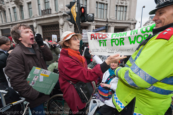
Disabled argue with police at Oxford Circus protest
I’ve finally decided that January has ended and that I’ve put all the work that I’m going to post for it on My London Diary.  I’ve mentioned most of the stories on here before, but here’s the set of links for the month so you can go directly to any of them.

No War Against Iran & Syria
Disabled Welfare Reform Road Block
Around Trafalgar Square
Westminster Bikers Parking Protest
Egyptians Protest Against SCAF
Peace For Iran – No To War
Congolese Keep Up Protests
Parliament Square Peace Camp
National Gallery on Strike
Welfare Reform Bill Lobby at Parliament
Parliament Square Protests Continue
Arbaeen Procession in London
EDL March in Barking
Bikes Alive – End Killing Of Cyclists
Bhopal: Drop Dow From London Olympics
London Mourning Mothers of Iran
Shut Guantánamo: End 10 Years of Shame
53 Years Of Cuban Revolution

Although they may look slightly different because of a different style-sheet, these are the links that are on the left of the January 2012 page. If you use Firefox they conveniently stay fixed when you scroll down the page, but I’ve never managed to get Internet Explorer to do that – and there are other minor differences between how the two browsers display things. It sometimes annoys me, but never enough to get me actually trying to solve the problem, and I notice quite a few sites where similar things happen.

© 2012, Peter Marshall
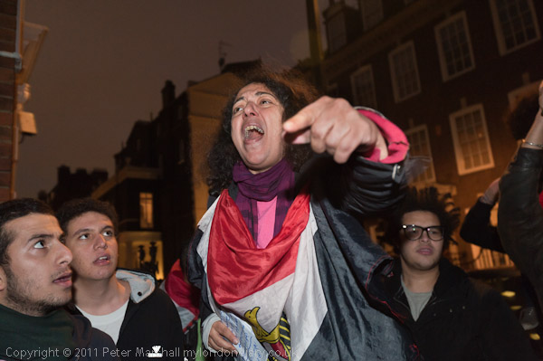
At a stupid trivia quiz on Saturday I couldn’t even remember that Egypt has a bird on its flag!

I’ve been deliberately trying to cut down on work a little, and to start catching up with things – like scanning my work from the 1970s, and also wanted to get work on My London Diary rather faster than I had been doing.  I’ve had some success – after all it’s only a few days into February and I noticed the other day I still haven’t managed to post my pictures for October 2002 – and there are a few other gaps in the diary elsewhere too.

February will of course follow shortly!

D800 Announced

I imagine like many photographers my first reaction to Nikon’s D800/800E announcement was ‘Oh No, who needs 36Mp!’ or something rather less polite, but thinking a little more about it I’m not so upset, particularly as it offers a 15.4Mp DX option.

I’m also very pleased that at last Nikon have introduced a new Auto ISO system that relates the minimum shutter speed to the focal length in use, something I’ve long suggested –  since before cameras had auto ISO.

Other useful improvements appear to include a better LCD monitor and USB 3.0, though I’ve already moved over to faster transfers simply by using a USB 3.0 card reader. And certainly some with be pleased with the video, though it isn’t something that greatly interests me at the moment.

Of course my first reaction on hearing about it was to go to the ‘Hands-on Preview‘ on DPReview, much easier to read than Nikon’s own pages, and giving a little more idea of what it might be like to use. But as always it will be some time before any proper reviews that actually give us the details and in particular the performance of actual production cameras emerge.

But despite what Nikon calls its ‘light weight and compact size’, at 146 x 123 x 81.5 mm (5.7 x 4.8 x 3.2 in.) and 1,000 g (2 lb 3.3 oz) with battery and SD memory card it’s rather too big and heavy for me, more or less the same as the D700 I already have which is still working well, and which I don’t really have a need to replace. If I could persuade myself I could work with a single camera, I’d think much more carefully about it, as the ability to switch to DX mode and still get good size files would make a lot of sense. That 16-35mm would double as a 24-47mm as well as being able to use my existing DX lenses – such as the 10.5mm on the camera. Perhaps when I see the full reviews I’ll decide I can and get one to replace both the D700 and ailing D300.

But for the moment, I think I’m waiting for later in the year when perhaps we can expect the D400 (or whatever Nikon decide the D300S replacement should be called) – possibly to be announced in March, though likely rather later in the year. We may also see a replacement for the D7000 which might also be possible in place of the D300.

Nikon do rather seem to be making the running in DSLRs at the moment, just a shame they haven’t produced a serious competitor in the mirrorless class.

Old Snow

The winter of 1978/9 we had snow fairly seriously, and in the last few days I’ve been going through my contact sheets from that time, including quite a few pictures taken in the snow.

I went up to another workshop at the Photographers Place in Derbyshire with Paul Hill and Ray Moore, I think in early January, and it seemed quite likely that we would get snowed in. I’m not sure that we would have minded all that much, as we were all having a good time, though of course we all had work to get back to. As usual we went out a few times together taking pictures, including a visit to a snow-covered Alton Towers, but one of the few images I now felt worth preserving was one from a walk on my own along a snow-covered lane.  Most of those taken on the outings I seemed to be trying too hard to be ‘arty’.

© 1979, Peter Marshall

It didn’t help that the Leica M2 which I took most of the pictures (though I think the one above was with an Olympus OM2) with turned out to have a shutter fault – perhaps it didn’t like the cold weather, and it gave uneven exposure, with a strip at the right hand edge of the frame getting rather less than it should. As soon as I developed the films it went off for repair (at excessive cost, being a Leica) but by then I’d ruined quite a few images. I did manage to print some of the pictures fairly well, dodging the affected area – at least the boundary was a nice straight line, so a simple straight piece of card held in the right place and height above the paper could do the job. And now of course with digital it would me much simpler to correct.

© 1979, Peter Marshall

But we did manage to get home on time (I think with Peter Goldfield driving his van through the snowy roads), and I went back to work, but soon there was more snow, and there were several days when my colleague and I spent an hour or so trying to drive to work before finding roads closed or impassable. So I had a little unexpected time to wander around with a camera in the snow. But again most of the pictures I made seem now to have little interest. Again the exceptions were mainly those which were more straightforward – such as the surprisingly almost car-free Crooked Billet roundabout above.

© 1979, Peter Marshall

Perhaps the best of my snow images from 1978-9 was a scene in the snow at Marble Hill Park, on the banks of the Thames in Twickenham, where a group of boys were cycling on the snow-covered grass. I only had time for a couple of frames as they were moving around, and the first, taken a second or two earlier shows a fourth cyclist going away to the right of the group.  I moved to more accurately line up the cyclists with the house and managed to take this frame with just the three of them in a tight group in a near-silhouette against the snow. Although it has a wide-angle feel with that wide expanse of snow, I think the only lens I had for the Leica (fortunately now repaired and working well) on which it was taken at the time was the collapsible 50mm f2.8 Elmar. Taken in a hurry it also had quite a slope to the horizon and needed a little rotation and subsequent cropping.

© 1979, Peter Marshall

Here was the only example of the ‘artier’ snow pictures I bothered to scan, and this shows the entire frame.  I suspect when I took it I didn’t mean to include the black spot near the top right corner, but decided not to crop it. The picture has a certain mystery about it that I like (it could be an alien landing site) and I’m not going to dispel by telling anyone much about it!

Let Truth be the Prejudice

AFP photographer Hazem Bader photographed a Palestinian construction worker screaming in agony as an Israeli army driver drove a trailer over his legs on a construction site on 25 Jan. The Israeli army had turned up to seize the tractor and trailer as the Palestinians were building on land that they owned in an occupied zone where Israel has forbidden them to build.  The picture – and it is a striking image – was widely published in the USA and the Israeli embassy in Washington wrote to the US newspapers alleging that the vehicle shown was stationary, that the worker was not injured and suggesting the picture was staged, and asking the newspapers to issue a correction,  and to “to consider ceasing to publish the photographs of Hazem Bader“.

AFP have now issued a statement which includes a translation of the medical certificate confirming the injuries sustained by the worker and an interview where he describes what happened. Their press release, which includes the picture concludes:

In the light of these inquiries and based on the trust we have in our photojournalist, AFP Management does not believes that this event could ever have been staged.

Given the ferocity of the attacks against the AFP Photo service, we have decided to release this statement in order to set the record straight. We will not make any further comment.

The Committee for Accuracy in Middle East Reporting in America  continues to dispute the veracity of this image, although some of the points it raises appear to be minor quibbles, for example when they state that the confiscation operation would be a “civil administration mission where soldiers provide security rather than an army operation and so any driver would not have been a soldier.  You can also read similar comments on the CiF Watch site, which also attacks Bader for the contents of his web site, which they say “quite consistently portray Palestinians as victims of Israeli villainy (something of a specialty for Bader), and further demonstrates an egregious pro-Palestinian bias decidedly at odds with any pretense of objective photo-journalism.”

I can’t tell you for sure about the exact circumstances of the particular image, I wasn’t there when it happened, though I have an opinion on it, but I can say something about photo-journalism. Having looked through a considerable number of the pictures on Bader’s site – with some difficulty as it is an exemplar of poor web design – I think his work as a whole seems very much in the fine traditions of the genre.

I thought of the work of one of the great heroes of the genre, Gene Smith. Would CiF Watch find his work at Minimata unacceptable because of his concentration on the tragic effects of mercury poisoning on the inhabitants of that fishing village?

The photo-journalist is a witness, one who tells the story that he or she sees; in Smith’s phrase “Let Truth be the Prejudice.”  At its heart is subjectivity. It isn’t the same as bias or distortion. And there is fortunately no such thing as objective photo-journalism – which would be a real pretence.

But perhaps for me the the most important part of the story is not about the detail of a particular picture but about laws and ways of thinking that make it seem normal and acceptable that when people start building on land that they own, soldiers should come that their equipment should be confiscated at gunpoint and the building destroyed.

Snow Business

A couple of days ago the Daily Mash carried a feature  “‘UK braced for mediocre weather photography‘ SNOWY weather will result in a million of pictures of nothing much, experts have warned” and this morning I decided to play my part in making this prophecy come true.

It had looked pretty promising the night before as I walked home through the falling snow, making the Staines back streets look almost fairy-tale, at least with the benefit of the best part of a bottle of a rather fine Sauvignon Blanc inside me. I should get out and take some pictures I thought, but not for long as I reached a warm house, coffee and biscuits and bed.

So this morning, bright and early (not that early, but the only footprints other than ours from the night before on our local stretch of pavements were those of the neighbourhood fox) I donned long-johns and an extra pair of socks underneath my normal boots, bags and jacket and with two pairs of gloves and a woolly hat sweated my way around Staines.
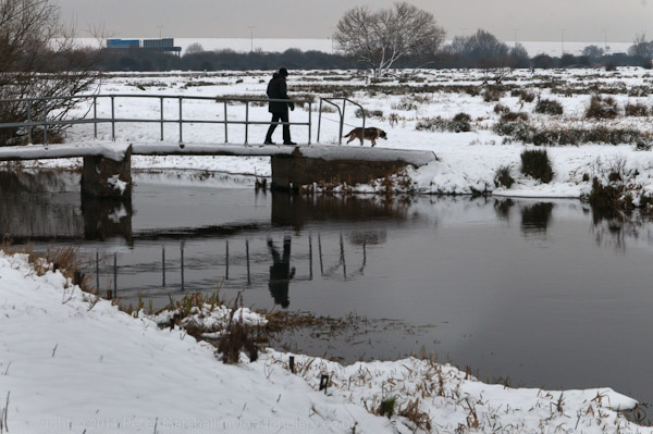
© 2012, Peter Marshall
Bridge over River Colne, Staines Moor (D300, 70/105mm)

Staines unlike Rome, is built around seven rivers, or possibly more. The main one of these is of course the Colne, which reaches the Thames here, and the rest are (or were) bits of water from the Colne finding their own way into the Thames, and my route took me to the County Ditch and across the Wyradisbury River, the River Colne, Bonehead Ditch and Sweeps Ditch. We also have several rather mysterious streams that appear around Moor Lane and Yeoveney either from the Colne or old gravel workings and then disappear, doubtless into culverts, but the one I count as the seventh is an artificial ditch, the Staines Aqueduct, taking water from the Thames to various reservoirs.
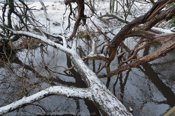
© 2012, Peter Marshall
My bridge over Bonehead Ditch, Staines Moor (D700, 16mm)

So the Romans, who called Staines ‘Ad Pontes’ or ‘at the bridges’ knew what they were talking about, and my route included a number of them, including two on Staines Moor, one of which was natural rather than man-made.
© 2012, Peter Marshall
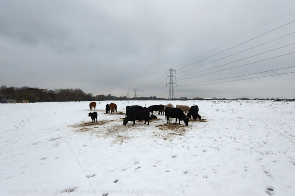
Animals feeding in snow on Staines Moor (D700, 17mm)

I’ll write more about Staines and my route in a day or two on My London Diary, but here I’ll concentrate on the photographic aspects. Digital makes photographing snow a lot easier, both in taking the pictures and in ‘developing’ them. Probably every photographer knows that cameras have exposure problems in snow, because exposure generally relies on scenes ‘averaging to grey’. Many of us back in the old days used to carry around a ‘gray card’ specially produced (and priced) with a neutral gray that reflected 18% of the incident light. When taking stuff on colour neg it was handy to put that in one corner of the image so you could balance using it when printing, and for getting the exposure spot-on you stuck it in your scene and took a light reading from it.

Nowadays I usually let the camera more or less work it out, though today for snow I set it to give an extra stop of exposure and then checked that the histogram looked more or less fine, going more or less all the way across to the right of the graph, but not past it. On many of the scenes I could have used two stops more and still been OK, but there would have been too great a chance of blocked highlights.
© 2012, Peter Marshall
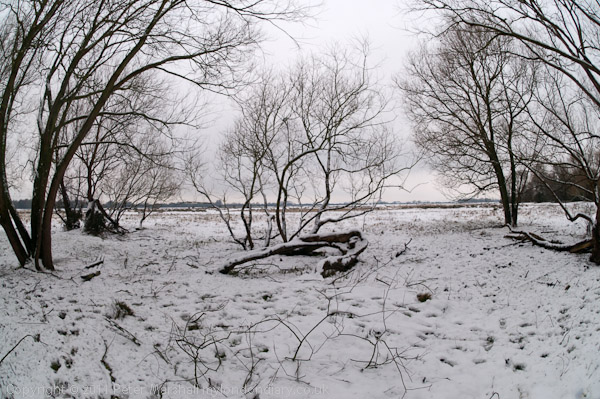
Part of circle of trees on Staines Moor (D300, 10.5mm)

In Lightroom, most of these images did need a positive tweak to the exposure to bring the brightest highlights right across the the right hand side of the histogram. Then I had to bring down the brightness to get the kind of texture I wanted for the snow. Apparently the next version of Lightroom won’t have the two controls, which leaves me wondering how I’m going to do that kind of thing – I think it will probably mean I’ll have to go back to working with the ‘Tone Curve’ as I used to with the previous Raw Shooter software. The slider that I’d actually like to get rid of is the ‘Recovery’ one, which I’ve learnt always to set at zero. Not that you don’t sometimes need to recover highlights, but that it is always best to do so on a local basis rather than the overall image degradation that the ‘Recovery’ slider provides.

My D300 is now severely in need of a service – or a replacement. I’ve been hoping for a while that Nikon would bring out a replacement either for the D300s or the D700 or both so I can retire it. Apart from the cracked plastic on the top-plate LCD which doen’t bother me, it now sometimes fails to return the mirror after an exposure, and simply stops working, which obviously does.
© 2012, Peter Marshall
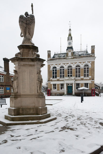
Staines Town Hall, sold by the local council for pennies and now a pub.(D700, 21mm, slight crop)

It happened for the first time a month or two back, and after a lot of cursing I found a way round. Use the menu and select to raise the mirror for cleaning, press OK and then the shutter release to ‘raise’ it (though it’s already raised), then switch off the camera and it comes down just as it should, and when you switch the camera back on it works properly again.

If it happens – as it has recently – perhaps once a day it’s annoying but not a problem. But this morning it did it at least a dozen times, which became rather a pain.
© 2012, Peter Marshall
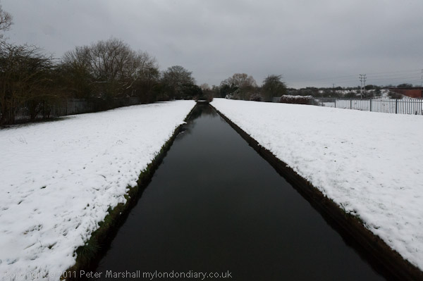
Staines Aqueduct which carries Thames water to the reservoirs. (D700, 16mm)

It’s also sometimes having problems focussing. A few times it did a bit of hunting rather than the usual fast focus. In the end I switched to manual focus, but by that time I was in any case working with the 10.5mm fisheye, where there is very seldom any need to focus at all.  The only problem with manual focus is that when you switch to manual there is virtually no resistance to turning the focus ring, and it is easy to knock it away from the infinity setting that normally works for virtually any distance.

More pictures and more about Staines on My London Diary shortly.

________________________________________________________
My London Diary : Buildings of London : River Lea/Lee Valley : London’s Industrial Heritage

All photographs on this and my other sites, unless otherwise stated are by Peter Marshall and are available for reproduction or can be bought as prints.

To order prints or reproduce images

________________________________________________________