Many photographers have been busy with various projects taking advantage of the unique situations created by the Covid-19 lockdown, but the most impressive set of images I’ve come across so far are the hauntingly empty cityscapes by Chris Dorley-Brown which are featured in an article with the over-lengthy title ‘Chris Dorley-Brown’s photographs of London during lockdown are “terrifying and exciting in equal measure”’ on web site It’s Nice That.
These images of well-known locations from meticulously researched locations were all taken on weekdays, between the hours of midday and 2 PM and in the article Dorley-Brown says that they took him “about an hour each“. There are just a few people visible, mainly in the distance in some of the images, but they do convey an incredible feeling of emptiness and I imagine it took some time to exactly fine the best position and sometimes to wait for the few wanderers around the city to move into less conspicuous positions, and sometimes for the light.
There is something of a contrast between these and one of Dorley-Brown‘s earlier projects, The Corners, on his web site with other works, where he very effectively made use of multiple exposures to overpopulate the streets of East London in unreal but fascinating tableaux vivants.
Thanks to another photographer, Paul Baldesare, for drawing my attention to this article.
Photographers who have been able to keep working during the lockdown may be interested in a competition with free entry and a £1000 prize on the theme of ‘My New World‘:
The World as we knew it six months ago has been changing dramatically. Many people’s lives were put on hold, some endured hardship and loss, some had to reinvent themselves and perhaps have been working harder than before. There have been important social movements and appreciation of inevitability that we all facing a New World.
This competition aims to collectively record the experience of people in the United Kingdom during and post lockdown reflecting new challenges and aspirations, bravery, kindness, love, sadness and humour.
Entries – one image per person – are invited through Instagram until midnight Wednesday the 19th of August 2020. You can find full details of submission, terms and conditions at the link above
If you are short of reading material for the remaining few days of April, you may find the Winter 2018 issue of Souce, available online until the end of this month, of interest.
Source, subtitled Thinking Through Photography, is a magazine published in Belfast by Photo Works North in cooperation with the Gallery of Photography. The issue which takes a look at privacy as it relates to photography is only available free to view on line until the end of April 2020, though of course subscriptions are available and give access to the current issue as well as a number of back issues including this.
Here’s a little from the magazine introduction to the issue:
“Culturally, our attitude to photographs seems to encompass our contradictory feelings about privacy today. We are increasingly intolerant of being photographed in public but ever more willing to expose ourselves in photographs online. This has political, societal and legal consequences that are explored in our interview with Camille Simon, a picture editor of the French news magazine L’Obs, and Laura Cunningham’s article on the evolving law of privacy.”
This edition is available in full online and you can see the first few pages of the current issue which includes a feature on the Art Council’s photography collecting without subscribing.
Source has been published since 1992 and is described as a “a quality quarterly magazine that provides readers with a critical discussion of photographic practice and an appreciation of the importance of photography in the wider culture.”
Photographers recently featured in Source include: Victor Burgin, Hannah Collins, Thomas Joshua Cooper, Sarah Dobai, Richard Gilligan, Emma Hart, Anthony Haughey, John Hilliard, Karen Knorr, Sirkka-Liisa Knottinen, Hew Locke, Mari Mahr, Trish Morrissey, Suzanne Mooney, Wendy McMurdo, Mark Neville, Roger Palmer, Steven Pippin, Paul Seawright, Simon Starling, John Stezaker, Jane and Louise Wilson and Donovan Wylie.
The page cited also includes a similarly long list of writers. It isn’t quite my photographic cup of tea but may appeal to some readers of this post. Again this was mentioned on the British photographic history blog.
Regular readers of this blog will know about my interest in and admiration for the work of Japanese photographer Issei Suda, and remember the post I wrote about him, Issei Suda (1940-2019) shortly after his death last year with some links to his work and writing about it.
A couple of days ago I came across a post on the British Journal of Photography online site, Issei Suda: 78 unseen photographs, which tells the story of how Cécile Poimboeuf-Koizumi, co-founder and director of Paris-based publishing house Chose Commune, wrote to Suda for the first time in January 2019 to ask about a new publication of his work. He was keen to cooperate, but sadly he died before she visited later in the year – but he had set aside a box of unpublished pictures for his widow to show her when she visited.
The book ’78’ presents 78 of these previously unpublished photographs taken between 1971 and 1983, typical of his work with its strangely unusual views of ordinary people and situations. It was only when she got back to Paris that Poimboeuf-Koizumi realised that the number of pictures she had selected for the book, 78, was also the age at which Suda had died.
You can see more pictures from the book on the Chose Commune web site, and it looks to be a finely produced work and a fine tribute to one of Japan’s most interesting photographers who received far less attention in the west than others whose work is rather more controversial and perhaps less intimate.
It’s a book I’m unlikely to buy myself as it is a little expensive at 55€ and I already have an earlier book of his work and a house with overflowing shelves and far too many books in it. But if you haven’t already met and lived with his work this is certainly worth considering.
News today in a Facebook post from George Georgiou who is one of the many photographers taking part in a splendid initiative to help the Giovanni Paolo XIII hospital in Bergamo, the city most affected by the coronavirus in Italy, which has been inundated with patients.
The prints, on 30x20cm paper, large enough to hang and frame on your wall, are a great bargain at €100 each, and include work by some really great photographers. As well as those George mentions I noticed pictures by Susan Meiselas, Stanley Greene, Michael Ackerman, Christopher Morris and Ami Vitale as well as a number of other intriguing works by photographers less familiar to me. This appeal began with a hundred Italian photographers, but roughly double that have now joined. The big problem is deciding which to buy. Even if, as George is doing, you buy several.
Here is his post from Facebook:
Vanessa Winship and I, alongside a number of other photographers, including, Alec Soth, Mark Steinmetz, Paolo Pellegrin, Claudine Doury, Paolo Ventura have donated prints in international solidarity with Bergamo, the city most affected in Italy. The campaign was started with 100 Italian photographers, in 5 days they have collected €350,000, they have now added 50 international photographers to the list. All the money apart from printing costs will go towards providing new resuscitation and intensive care units at the Giovanni Paolo XIII hospital, which has been inundated with patients. All prints are at €100, there are at least 3 or 4 that we will buy.
Please think about donating to this cause if you can afford it – and you will also get a fine print for each €100 donation. The prints, unsigned and on Canson Baryta Prestige paper, will be made and posted as soon as the LINKE lab in Milan, one of the finest in Italy which is making them is able to resume normal work. The lab will take only the production and delivery cost of €11.50 from your €100 donation which can be made by Paypal or credit card – the rest will go to the hospital.
I already have one Atget print hanging on my wall in my front room, not an original print made by the man himself, but an excellent high quality reproduction which was a special supplement to a US photographic magazine back I think in the 1970s, printed by a much higher quality process than the normal magazine. I also have another rather fine image by Josef Sudek framed and on the opposite wall; I think they are sheet-fed lithographs and they certainly have a remarkable quality.
I don’t think anyone who has seen them framed on the wall has ever taken them to be anything other than a normal photographic print, and certainly in many of the books on my bookshelves there are some fine examples of the printer’s craft, duotone and quadtone reproductions that are often equal and sometimes superior to the darkroom prints that are shown in exhibitions and sold for high prices by photography dealers.
Not all photographic prints are particularly good prints, and some ‘vintage prints’ that make their way into the hands of dealers were never intended to be so. Some are prints that were rapidly made with little consideration to be printed in magazines and newspapers, and many do not represent the image at its best. When I spent a lot of time in the darkroom I would often make half a dozen prints from the same negative before I arrived at the one which I thought was exactly how I wanted it. That was the print which went into my portfolio or onto the exhibition wall, but there were often others that were almost right that I couldn’t bear to throw away, and I think the same was true of many photographers in the past. And I’ve seen prints on some dealers’ walls which surely must have come from the photographer’s waste bin.
Things are rather different for most photographers today. Many actually produce limited editions of prints, either made by themselves or a professional printer that are more or less identical, and if working from a digital file exactly so. The kind of work we put into each print, including dodging, burning and retouching is now incorporated into the making of the digital file.
Photography is essentially a medium of reproduction. The calotype became more important than the Daguerreotype despite its technical deficiences because the negative could be used to make multiple prints, limited only by the time it took to produce them. And digital has taken that a step further, with the digital file that produces as many prints as you like itself being infinitely reproducible without any variation.
High quality digital files of a number of great photographic images have of course been available for some years, particularly of the work available in the Library of Congress collection. On my computer I have large digital files of a number of the best images made by Walker Evans for the FSA, of Dorothea Lange’s Migrant Mother and of many other fine photographs. Enough to make a fine gallery of photography.
I have only ever printed one or two of these files largely because I simply don’t have the wall space to display them – and what I have is already filled with other images, including both photographic prints by myself and others as well as a few painting and some reproductions of paintings.
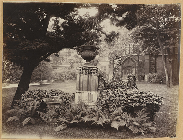
Jardin de l’hôtel des abbés de Cluny, (actuel Musée National du Moyen Age), 24 rue du Sommerard, Paris (Vème arr.). 1898. Photographie Photographie d’Eugène Atget (1857-1927) Paris, musée Carnavalet.
But today I downloaded a rather beautiful Atget and there are many more online along with works by many other great photographers, particularly French photographers, as the City of Paris has made available over 100,000 of the works in its museums freely on-line as high quality 300dpi digital images under a Creative Commons CC0 licence, essentially dedicating “the work to the public domain by waiving all of his or her rights to the work worldwide under copyright law, including all related and neighboring rights, to the extent allowed by law. ”
The CC0 licence is only applicable to “the reproductions of a work the author(s) of which died more than 70 years ago, after which time his/her works have fallen into the public domain, and which is the reproduction of a two-dimensional cultural asset the author of which died more than 70 years ago, a reproduction created by a photographer who has permitted Paris Musées to place the photograph under a CCØ licence or by a photographer employed by Paris Musées.” It also restricts you from selling the files, though you can use the images for both commercial and non-commercial purposes.
As their press release states (in French), you can now download the “oeuvres des grands noms de la photographie (Atget, Blancard, Marville, Carjat…) ou de la peinture (Courbet, Delacroix, Rembrandt, Van Dyck…). ” And while for the painters what you are downloading is a photograph of their paintings, for the photographers it is something much closer to the orginal, enabling you to make excellent digital photograph prints.
So far I’ve only downloaded a couple of Atget prints from what must be a very large collection, as his main source of income was selling his prints to the Paris museums. I first became aware of his work in a Paris museum, where some of the prints in a display of historic Paris for me stood out from the rest, and there in the small print of their captions was his name. The image above was probably one of those that impressed me and made me want to find out more about the photographer when I visited the musée Carnavalet in 1973.
There is a slight problems to overcome in downloading the images, in that they come in ZIP files, the image jpg accompanied by a PDF about usage (in both English and French) and a text file with some image details and its source. Unfortunately those I tried have file names that are too long for Windows 7 to handle and I needed to use the free 7-Zip to access the files. I haven’t yet tried in with Windows 10.
I’ve never travelled on the Orient Express, but years ago one of my late friends, Terry King, got what seemed to be a dream job, working on an advertising commission for the company.
He’d gone to their offices with his portfolio of gum bichromate prints and they had sat around them in awe in their kaftans (it was then a rather new age company.) I’ve described elsewhere how Terry, Randall Webb and myself had all started investigating the process but Terry had evolved his own methods of progressing with the process, using several large paper negatives printed in different tones and colours and with carefully controlled manual development at each stage to produce highly pictorial results.
So Terry got a free trip on the Orient Express to Venice, where he spent a few days taking pictures before returning to his London studio and working on the results, producing prints to take back to the company. He went in to show them the results and immediately sensed the company had changed management; in place of kaftans the executives were now all in smart business suits and ties. They didn’t appreciate his work and the project was abandoned.
Terry did make some fine prints of his work in Venice, and some of them will still be hanging on people’s walls around the country, with sales through an art dealer in Richmond. (I have one of his pictures of London on my wall – we did a swap – but not of Venice.) Until recently you could see some of them on his web site, but that is no longer on line. The only example I can find is on the Silverprint web site, a company which supplies fine photographic materials – including some of the chemicals and sundries that both Terry and I used. It is a picture from Venice and I think is possibly a cyanotype over a gum image, though it could possibly be simply a gum using two shades of blue.
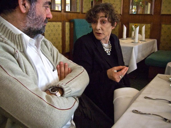
I have met Sarah Moon (above with photographer Joan Fontcuberta), though only fairly briefly when we were both speaking at the FotoArtFestival in Bielsko-Biala in 2007. We shared several meals at the event and had some long conversations and there are a few more pictures of her in my diary.
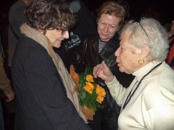
Sarah Moon with film-maker Nina Rosenblum and photo-historian Naomi Rosenblum
Which brings me – finally – to the reason for this post, Sarah Moon : Orient Express – Louis Vuitton Editions – which was featured on ‘The Eye of Photography‘. This is a book in their Fashion Eye collection, a series in which each “book evokes a city, a region or a country, seen through the eyes of a fashion photographer.”
LV is a French fashion house and luxury retail company founded in 1854 by Louis Vuitton, who introduced a range of luggage with flat-top trunks for travel, which meant they could be stacked, particularly on rail journeys – previously trunks had been made with rounded tops so that the rain would run off when they were carried on open waggons and carriages. The Orient Express which began in 1883 thus seems a very appropriate subject.
You can read about this book on the UK LV web site, which has the same selection of stills as ‘The Eye of Photography’. But if you scroll down the page there is also an over- rapid ‘page-through‘ video of the book, which gives a good idea of the size and layout of the work. And if you change the video to 1080px, make it full screen and stop the playback you can actually see and read the pages. Presumably you can buy it in their shops as well as on-line, but at £42 (including standard delivery) although it looks an intersting book I find it a little too expensive – like their luggage.
As so often A D Coleman got me thinking with his look at The Waters of Our Timein his post Three Weeks in Bookworm Heaven (3), one of a short series about his recent 3 week residency on a Teti Photography Fellowship at the Institute of Art and Design at New England College in Manchester, NH, USA.
The book by photographer Thomas Roma and his writer and musician son Giancarlo T. Roma is very clearly based in its concept and design on the ground-breaking 1955 publication The Sweet Flypaper of Life in which photographs by Roy DeCarava were accompanied with a fictional text inspired by the images written by the poet Langston Hughes, who edited a larger selection to fit his writing. This was the first monograph by a Black photographer, and the publisher had been reluctant to publish it simply as a book of photographs but accepted the work with the much better-known poet’s name as co-author.
If you don’t have a copy of The Sweet Flypaper of Life you can get an idea of the book in another page turning video which shows not the original but the 1984 Howard University Press edition, and even the music is rather better and more appropriate than the Roma book linked above.
Not that Richie Havens version of the Jerry Merrick song “Follow” which accompanies that page-through is bad; it’s a great song but pacing the view of the book to it just doesn’t work, and the words are an unfortunate intrusion into the viewing of the pictures. Sentences from Merrick’s lyrics are also quoted at intervals in the text of the book – which accounts for the pacing of the video which more or less keeps up with there use. It’s quite hard to keep up with the pace reading the rest of the text, and I had to pause the video a few times both to look at the pictures and to read it.
Unfortunately, although there are some interesting images, too many fail to have much interest to me, and the juxtaposition with the images seldom seems to really make sense. Even the layout of the images and text, a feature of the original work, seems shoe-horned into an inappropriate format. Coleman has clearly studied the work at greater length and depth than I and in book form rather than the video, and it is hard to disagree with his conclusions.
Fortunately for those of us who lacked the foresight to buy the 1955 original of The Sweet Flypaper of Life, a near-facsimile edition with an afterword came out in 2018 and can still be bought new as well as second-hand.
You can also watch several short clips about De Carava on You Tube as well as a lengthy panel discussion of ‘The Sweet Flypaper of Life’ moderated by Thelma Golden, director and chief curator of The Studio Museum in Harlem -has an introduction to the book at around 19’12”, after which each of the panel, including A D Coleman, talks about their favourite image from the book. There is a set of his images on NPR, along with some links.
This is the question I’ve been asking myself for some weeks or months. For a year or so I’ve been finding a camera bag full of Nikon gear too heavy to carry for the length of time needed to cover events in London. It’s mainly standing around that I find a problem so far as my health is concerned, and I have to remember to either sit down or to keep moving to stop my ageing veins becoming inflamed. Walking is a little better, though I do get tired much more quickly, and while I used to walk for the length of a working day and perhaps cover ten or a dozen miles, now I get tired and give up in half the time.
I can still run when I need to, though not quite as far or as fast as when young. Last Saturday when I saw a march going down Whitehall from in front of the National Gallery I ran to catch up with the front of it, around 600 yards in the fastest time I’ve done for some years. But still slow compared to my youth, when before smoking took its toll I recorded some decent but not outstanding times. I once won a quarter mile at the local youth sports in a world record time and at least fifty yards ahead of the next runner. The timekeepers ran up to me pointing at the time on their watches, and in a perhaps stupid fit of honesty I told them that the race officials had put the finishing tape in the wrong place. I was very annoyed as the conditions had been perfect and I would surely have recorded a personal best on the day over the full distance.
But no I feel a great need to cut down the weight I carry, and the Nikons are only for special occasions (the D810 is now my slide scanner – more about that one day in another post.)
For some years my holiday cameras have been Fujis. I started with the fixed lens Fuji X100, then went on to an X-E2, followed before too long by an X-E3. I swapped my Leica M8 with a friend for an X-Pro1 because I wanted to work in colour without all the fuss that the M8 needed. All of these Fujis were good in their way – and if I could be satisfied with just a say 28, 35 and 50mm equivalent lenses I would have been happy with the X Pro1. But I really got serious with Fuji with the X-T1.
I tried working with the X-T1 and one of the Nikons. It was still a fairly heavy combination, but the X-T1 was pretty good (if occasionally mystifying.) Its 10-24mm wideangle zoom was an improvement optically than the Nikon 18-35mm that I’d bought when the 16-36mm gave up the ghost (it remains on my desk with an equally almost certainly beyond economic repair D700 as an expensive paperweight) though sometimes a little slow to focus. It was good to have the extra wide angle that its 15-36mm equivalent provided – I sometimes found the Nikon’s 18mm not quite wide enough.
But things were still too heavy. And when I saw an Olympus OMD M5 II selling new for just over £400, Micro Four Thirds seemed to be the answer (as one of my colleagues had been telling me whenever we met.) Along with the body I bought the absurdly small and light Olympus 18- 150mm, also going cheap. Just over 3 inches long and only 10 oz. I don’t own the Nikon equivalent, but it is half as long again, weighs almost three times as much and costs over twice what I paid for the OM lens.
And using the M5 II usually turned out to be a great experience, except for a few quirks – the most serious of which was perhaps the ease with which the main control dial could be inadvertantly moved. Working in shutter priority it is far too easy to find yourself taking pictures at 1/8th rather than the 1/250th you have consciously selected. Though with its effective in-camera stabilisation the pictures were still usually sharp unless anyone moved.
I don’t make a great deal of use of long lenses, but this August I spent some time testing the Nikon telephotos I do have, an elderly 70-300 and a couple of shorter zooms (one a DX) against the Olympus. Despite the much smaller 4/3 sensor, this gave the sharpest images and I could see no difference in the amount of detail.
For the past months I’ve been working almost all the time with the Fuji X-T1 and the Olympus M5 II. I’ve bought an expensive Panasonic Leica wide angle zoom for the Olympus, and can chose either camera for wide-angle or telephoto use, and can’t quite decide which I prefer. Both cameras have their quirks and neither is as straightforward to use as the Nikons. And winter weather and working in poor light have made some limitations felt, particularly with the noise in Olympus images at ISO over 3200. The D750 gives noticeably better results at ISO 6400 and focuses better in low light.
Of course the X-T1 is quite an old model by now – and the M5 II is now being updated as the M5 III. It would be easier to work with two cameras from the same marque, and I’ve been wondering which way to go. The M5 III seems only a minor upgrade on the II, and annoyingly takes slightly different batteries. I’ve been thinking of getting a second M5 II instead of waiting for the III, and the price is now even slightly lower. The X-T30 looks much more of an upgrade on the XT1, and is even lighter than the Olympus, but is not weatherproof, and I have more Fuji lenses… With some special offers and rebates the difference in cost isn’t great…
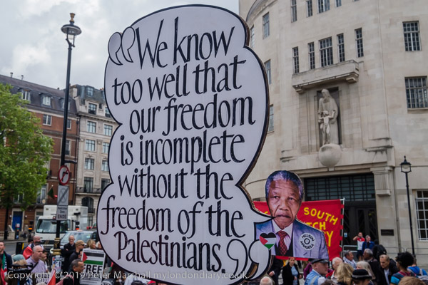
As someone born as World War II was finishing it isn’t surprising that I grew up with with a great deal of sympathy and support for the young state of Israel, which had won its freedom from the British mandate by a number of terrorist attacks, most notably the King David Hotel Bombing, a massacre which killed 91 people and left around 50 badly wounded.
I was too young to know anything about it at the time of the attack, but in later years the Zionist underground organization the Irgun was the first which I heard some call terrorists and others freedom fighters. Around 15 years later when I started a real interest in politics and free cigarettes at the local young socialist meetings in the Co-op Hallit was certainly the latter view that prevailed, not least because many of those in the Labour movement were Jewish.
Then we believed the lies that were told about Israel occupying a largely empty land and making the deserts bloom. Since then we have become aware of the properties and land stolen from the Palestinians, many of whom were forced out as refugees, and of the shrinking map of Palestine and the attacks on Gaza. The Zionist Israeli government has become increasing right-wing, violating the human rights of the Palestinians and international law over the years, setting up an apartheid system in Israel, making it impossible now not to support the Palestinian cause.
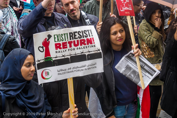
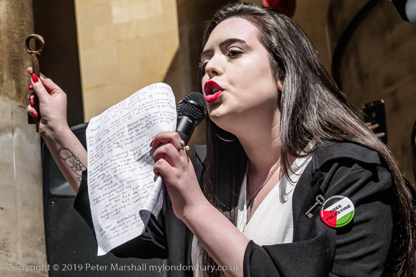
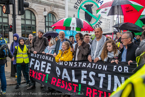
The protest on 11th May came at the start of the week remembering the Nakba and called for an end to Israeli oppression and the siege of Gaza and for a just peace that recognises Palestinian rights including the right of return. It urged everyone to boycott and divest from Israel and donate to medical aid for Palestine. Many of those on the march carried keys, some those of properties they had been forced to leave back in 1948, others simply as a reminder of the dispossession.
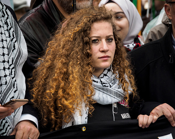
Among those marching was Palestinian teenage activist Ahed Tamimi, arrested after slapping an Israeli soldier in December 2017 after soldiers had entered her home and severely injured her 15-year-old cousin Mohammed. It wasn’t easy to photograph her on the march as stewards kept photographers outside the area in front of where she was marching holding the banner at the head of the march.
I wasn’t able to get close to her, but had to photograph with a long lens from a distance. With the 14-150mm lens on the Olympus E-M5 Mk II I managed to get a decent image with her filling much of the frame. The lens is equivalent to a 28-300mm, and for this picture I was using it at its extreme and at f5.6 and 1/250th at ISO 1250.
I think the result is rather better than I would have expected using a Nikon, thanks to the stabilisation of the OM body. And I would probably only have been carrying a lens with a maximum focal length of 200mm, so would have had to crop to get a similar image, thus losing some of the advantage of the larger sensor. I think the autofocus is almost as good as the Nikon, close enough to show no real difference in speed, and face detection is sometimes a help. And as a final point, despite weighing half as much, the Olympus lens is I think a better performer.
As well as the Olympus, my second camera was a Fuji X-T1, with a 10-24mm lens (15-36 equiv) that is also a fine performer. It doesn’t have quite the advantage in size and weight over Nikon that the Olympus has, and the camera somehow feels a little less responsive. I bought it when I was hoping that a Fuji system could replace my Nikons, but now I’m more likely to move to Olympus, keeping a Nikon only for the larger file size when used with bellows and a macro lens for digitising negatives and slides.
As with most events showing solidarity with Palestine it was joined by several Jewish groups, including the ultra-orthodox Neturei Karta and also opposed by a small group of Zionists. You can see pictures of both on My London Diary, along with coverage of the rally close to the BBC before the march. I left and went home before the rally at the end.
Although the ‘stars’ of photography so far as the media are concerned tend to be those who fly into trouble spots around the world to report on various crises – usually backed by the big international agencies, much interesting documentary work is carried out by people who never get an international reputation, and whose work is made inside communities in which they are embedded, sometimes for years, occasionally for a lifetime.
I’ve long believed that there is a huge unseen body of work out there which has never attracted museum shows, publications or any real exposure, perhaps just seen by a few friends or shown in a local library. Of course now, it may appear on Facebook or Instagram, but tends to remain hidden among the dross and the cat pictures. Of course there are some good cat pictures, probably at least three a year.
My thoughts were directed to this by a Facebook post linking to an article in the Nottingham post, Photographer reveals unseen images of St Ann’s before demolition, about work in the area of Nottingham which was being comprehensively redeveloped when then student photographer Peter Richardson was working ina temporary summer job as a labourer on buildings that were replacing the Victorian housing.
Now, around 50 years later, the freelance photographer has put together a book with 98 photographs that show a real insight into the crowded neighbourhood before demolition. You can see rather more pictures from it in the preview of St Ann’s, End of an Era on the Blurb website.
As well as the quality of the work, the book has other interests for me. At the time when Richardson was taking his pictures I was heavily involved in a similar redevelopment in a similar area of inner-city Manchester, not as a photographer but as an activist. Groups working in the two areas made contacts and learnt from each other – and I think were the first two areas to bring ‘planning for real’ modelling exercises which had originated in Sweden to local community groups in the UK.
I regret very much that I was not at that time an active photographer, being penniless, unable to afford a working camera and lacking any practical training in photography that would have enabled me to work on a shoestring – both things that were remedied a couple of years later. But Richardson’s pictures remind me very much of the people and the homes that I met in Moss Side.
Like Richardson too, I’ve also published books on Blurb – with 16 of them still available. It isn’t an idea way to publish, but does give you the freedom to do so at relatively minimal expense and being print on demand comes with no problems of storing and distributing editions, and the print quality can be good, though not state of the art.
But the problem is price. A single softcover copy of this book costs £44.99, plus an excessive postage charge. Authors can benefit from fairly large discounts offered from time to time by Blurb (and don’t pay any author’s markup), but even so the books are expensive. It makes it impossible to sell through bookshops, where a realistic price would need to be at least £75. There is a cheaper EBook for £9.49 which is more reasonable, and I always advise people interested in my works to buy it in electronic form, though I also sell most of my books direct a little below Blurb prices.
Personally I’ve been thinking for the last couple of years of abandoning Blurb for any new publications. Perhaps publishing a small short-run print book, but making my work available free as PDFs or at higher quality on the web than my current web site. I do make a little from Blurb sales, but hardly enough to notice. For me the point of publishing is to share my work, not to make money.