Anna Atkins was born 216 years ago on 16 March 1799 and the anniversary was celebrated by Google this year with a doodle. Her Photographs of British Algae: Cyanotype Impressions in October 1843 is generally thought to be the first book to have been produced – if only in a very limited edition – with photographic images. These were ‘cyanotype impressions’, photograms of handwritten pages and of the algae specimens.
The cyanotype process had been invented by Sir John Herschel the previous year, and is a simple process to use for making prints, and is now often used in children’s workshops as well as for some more serious work. There were later adaptions and improvements to it (most recently by Mike Ware who thoroughly investigated the process and came up with a technically improved ‘New Cyanotype ‘.)
I’m not aware of any evidence that Atkins ever used a camera, though she has sometimes been cited as the first woman photographer. Certainly no camera produced images made by her have survived, nor are they any by another woman also awarded the title, Constance Talbot, the wife of the inventor of photogenic drawing and the calotype. Possibly one or other of them was the first woman to print a photograph.
I would describe the pages of ‘British Algae‘ as photograms rather than photographs, in a distinction I feel useful, though certainly not one that has always been present in photography. Until the 1930s it was common to use the term photogram interchangeably with photograph, and I have a number of copies of the annual publication ‘Photograms of the Year’, none of which contain what we would now call a photogram.

I have to admit that I’m not in general a great fan of cyanotypes, and have only kept a few of those that I have made. Several of them are from a session photographing a nude female artists model, something I’ve done very rarely, and were taken on 5×4″ during a workshop session where it was important to have a suitable subject on hand to produce images in a fairly limited time.
The problem I have with cyanotypes is that they are blue, and often not a very pleasant shade of blue – certainly one that does nothing for the model in this image.

It doesn’t really suit this street image either, but it illustrates one of the common problems of the traditional cyanotype – it is very easy to lose highlight detail. The problem here is partly that the negative was made for salted paper printing and has a very high contrast, too high for a good cyanotype print. Much better as a salt print.
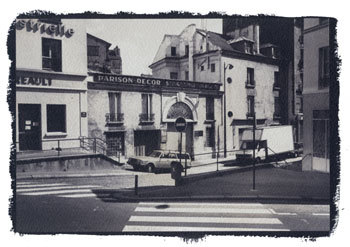

It is possible to moderate the blue colour, and there are various ways to tone cyanotype images, though the results are not always permanent. In this case I started with a slightly weak salt print, and rather than throw it away (good quality watercolour paper costs as much as bromide paper) I overprinted it in register using cyanotype. The result was mildly interesting and I made a few more prints that way. Most but not all of the salt print disappears during the overprinting butas the image above shows, the blue is considerably altered.

And for the final image, I carefully avoided painting the cyanotype solution over the poster at right in the initial salt print.
But then I came to my senses and realised that I spending far too much time playing with chemicals and not spending enough of it on taking pictures. And a few years later I found that inkjet printing was a far more flexible way to produce images.