Without doubt the greatest opportunity for the planning of London in the last century came from the destruction of large areas of the city during the war, and one of the areas where the results are most obvious is the Barbican. It provided an opportunity to develop new approaches with pedestrian walkways high above the city streets separated from their traffic, and put homes back into the city.
It wasn’t an entirely successful experiment, although the recent demolition of parts of the ‘highwalk’ is I think a great loss for the city (and doubtless huge profits for the developers) and while many have found the Barbican an exciting place to live prices now for its over 2,000 properties and those on the adjoining and perhaps rather nicer Golden Lane Estate are pretty astronomical.
For non-residents, finding the way around the Barbican has always presented something of a challenge, with yellow lines needed to guide people to the Barbican Arts centre from the surrounding Underground stations. Inside the Arts centre too, I’ve always found the layout totally confusing, though over the years I’ve learnt easy routes to find my way to the places I’ve used, including the main art gallery and the Library, in which I’ve organised and taken part in several group shows over the years.
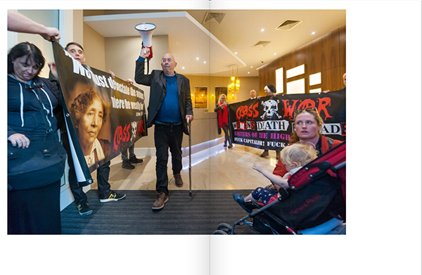
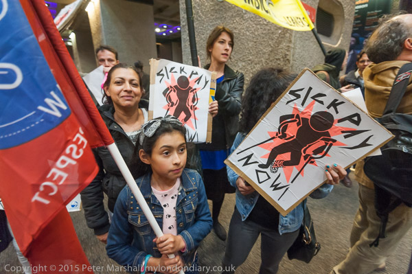
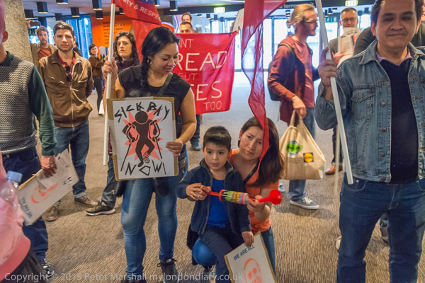
But on May 16th I had no problems in finding my way, simply having to follow the crowd of cleaners and supporters as the United Voices of the World rushed in to hold a protest inside the building.
The UVW are a grass roots union that is standing up for the rights of some of London’s lowest paid and worst treated workers, particularly cleaners who are employed by contracting firms to clean inside London’s many prestige buildings, including the Barbican Arts Centre, owned by the City of London.
The only reason for outsourcing services like cleaning is to cut costs, and the only way that the outsourcing companies cut costs compared to direct employment is by employing workers on conditions that would be unacceptable to companies and organisations that are concerned about their public profile.
The Barbican Arts Centre would feel it had to pay at least the London living Wage, provide proper pension arrangements, sick pay and holiday pay, as well as managing its employees properly, providing proper equipment and materials to do the job and not imposing excessive workloads. I’ve never worked for them, but I imagine that they aim to be a responsible and highly respectable employer.
The cleaners complain that the contracting companies treat them like dirt. Low pay, bullying management, impossible demands, and the statutory minimum conditions. Workers come into work sick because they cannot afford to take time off with only statutory sick pay. And of course an attempt to prevent union organisation and protests. As my summary reported:
Cleaners at the Barbican Centre employed by MITIE have been threatend with sacking if they protest for a living wage and proper sick pay. They say a disabled worker has been assaulted by a manager and that he was accused of terrorism for posting a video of himself at work.
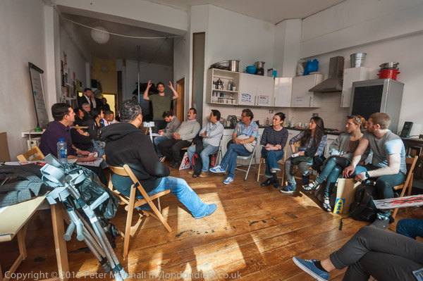
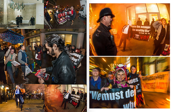
This protest was unannounced, and the cleaners and supporters met up well away from the Barbican. I met with most of them at a union meeting beforehand. UVW is a small and entirely voluntary movement with no paid officials, and as well as negotiations and protests at workplaces also provides representation and support for its members at tribunals and disciplinary hearings, and classes in English, as many of its members are from Latin America or Spain.
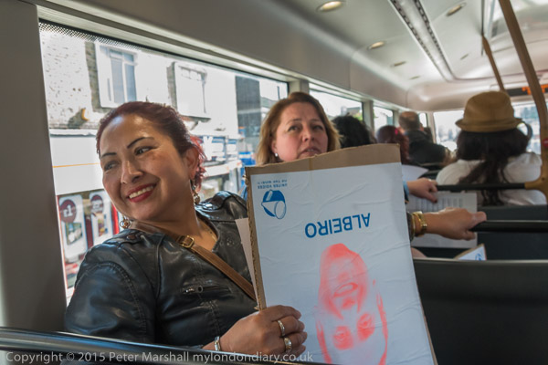
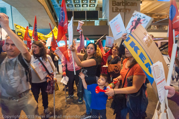
I travelled with them on the bus, then walked with them to a rendezvous with other supporters before they marched quietly to the Barbican, regrouping on a corner close to the main entrance, which they then rushed through at a suitable moment, with me following a short distance behind the leaders, making their way noisily through the building to a suitable area for the protest.
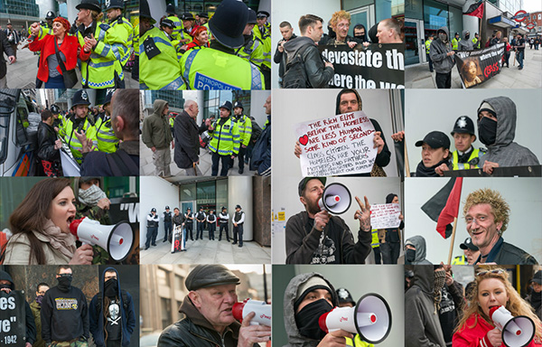
As usual with such incursions, I’m careful to avoid confrontation with security, who made some attempt to stop the first few people who entered, but then had simply to stand back and watch as the rest streamed in following them. Theoretically I would stop taking pictures and leave if requested by a suitably authorised person, unless I felt there was an overwhelming public interest in the events being recorded, when I would attempt to do so. I would have felt so in this case, but it’s better not to have to make such a decision.
Photographically the main problem in taking pictures was the light. Rather the lack of it, and its unevenness. The centre always reminds me of a cave, and it has lots of fairly small lights in a very large space.
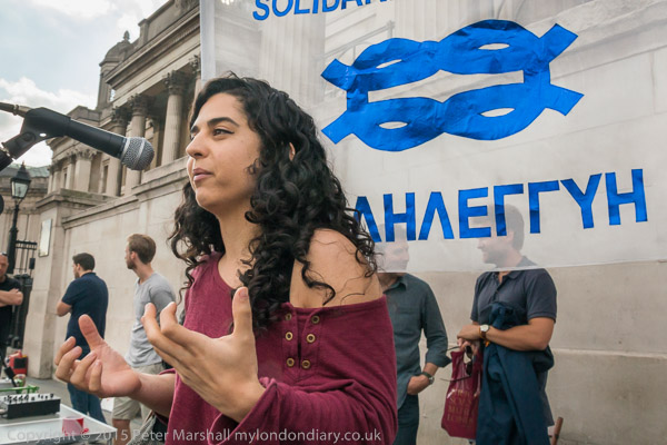
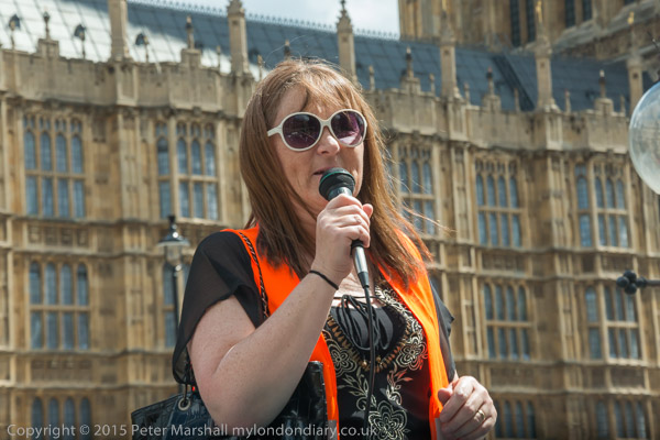
I didn’t want to use flash. Partly because I didn’t want to attract attention to myself, and experience tells me that security are far more likely to tell you to stop taking pictures if you use flash, but also because it’s difficult when working close to avoid huge differences in lighting between people very close and those a few feet further away. But the light was pretty low in some areas, and when people were moving a lot there was really little alternative. But I think the picture I liked best was taken without, working at ISO 3200.
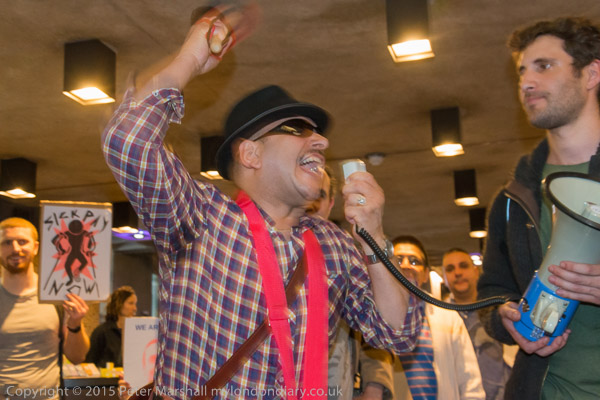
I was also working at ISO 3200 with flash, but with the aperture a couple of stops down (and sometimes about a stop faster shutter speed too) trying to retain a more even result with some exposure from the ambient light. As a consequence there is some double-imaging on these frames, which often but not always enhances the image – it adds a feeling of movement and immediacy to the speaker above.
Colour temperature is also sometimes an issue. Later the protesters moved to an area with both artificial light and large windows letting in some daylight. Using flash might have helped in the lower image, but unfortunately the D700 which I was using seems now to be very unreliable with flash and I’ve been avoiding using it. All the flash pictures I’ve made for some time have been with the D800E.
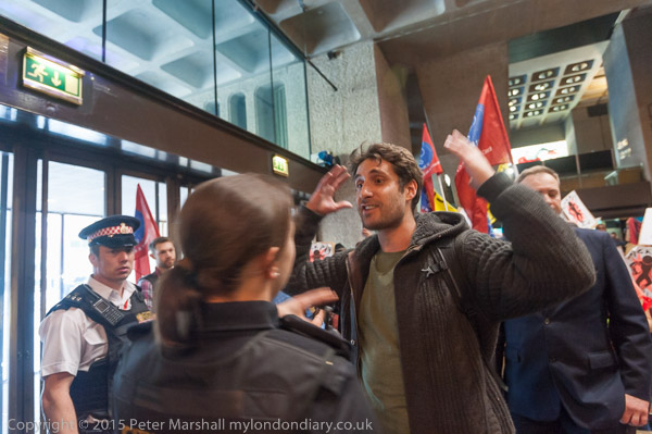
Shortly after the protesters left the building and continued to protest, marching around a little of the Barbican estate and then continuing outside the main entrance, which enabled me to take some pictures including the Barbican signage, including one of Albeiro, the cleaner being victimised and UVW general secretary Petros Elia, the man with his hands up in the image above.
Many more pictures and more about the protest at Cleaners invade Barbican Centre.
Continue reading Barbican