Today it really seems summer is over. The rain stopped and I went out in the sun, getting a little hot in my jacket to buy something to bring home for lunch, thinking it would be nice to sit out in the garden and eat it with a glass of wine, but by the time I got home, dark clouds filled the sky and there were a few drops of rain. And it was dark by 8 o’clock.
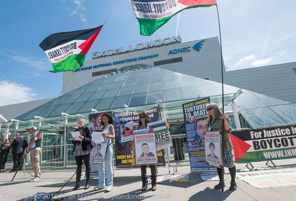
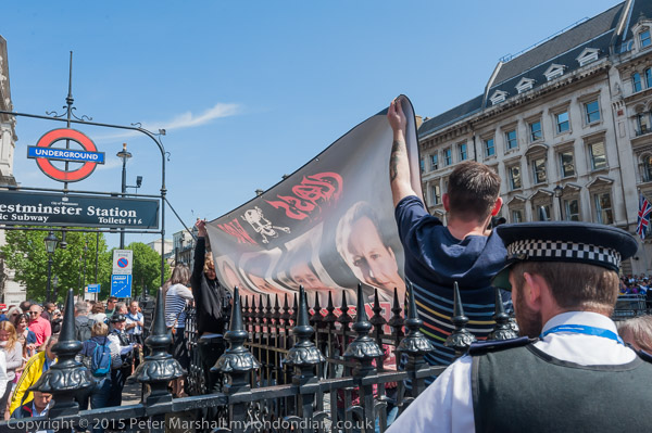
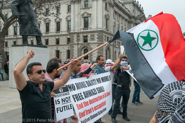
Looking back we hardly seemed to have had a summer at all, but there were a few good days, and one was early in June, when there was a protest in the morning at the Excel Centre in East London, where G4S had chose the UN International Day of Innocent Children Victims of Aggression to hold their AGM. Actually like me they probably didn’t know there was such a day, but it was established back in August 1982. And though it’s an international day and relates to all children around the world, it was established because the UN General Assembly, meeting in a emergency special session on the question of Palestine, was “appalled by the great number of innocent Palestinian and Lebanese children victims of Israel’s acts of aggression“.
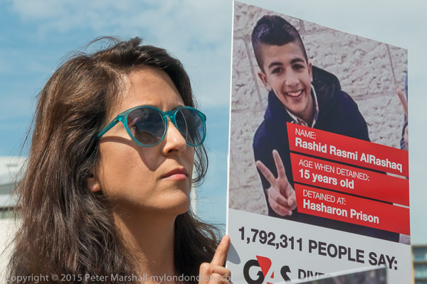
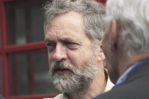
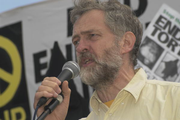
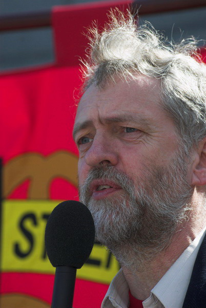
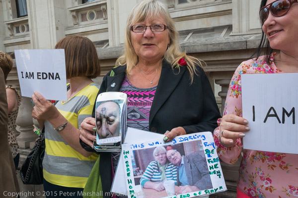
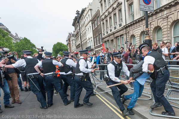
Unfortunately the UN General Assembly’s resolution 33 years ago appears to have done little to change the situation for Palestinian children, and the protest was aimed at G4S because of its involvement in running the Israeli prison system in which young Palestinians are held, sometimes in solitary confinement in underground cells, are threatened and sometimes tortured. There are regular protests outside the G4S HQ in Westminster which I’ve occasionally covered, but the AGM brings together a wider range of organisations comprising the StopG4S coalition to protest, not just about their work in Israel but also in this country, where they are best known for their failure to provide security at the London Olympics and the death of Jimmy Mubenga during his forcible deportation. They currently run five UK prisons as well as a young offender institution and secure training centres and “is the main provider of in-country escorting, overseas repatriation services, and the operator of four of the eight of the privately run immigration removal centres in the UK.”
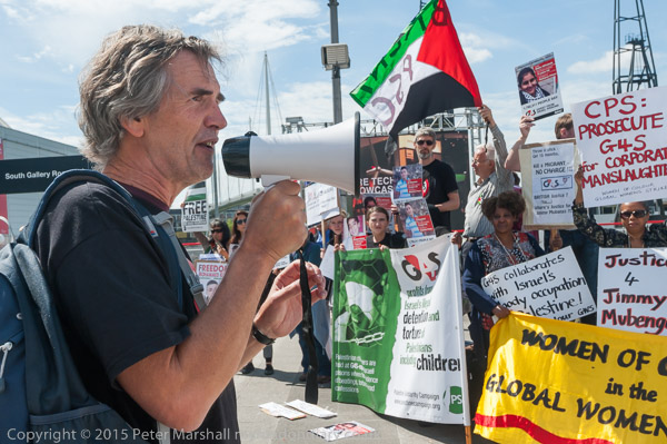
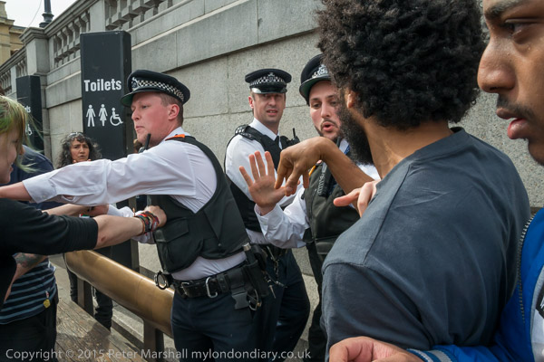
Although there was plenty to photograph outside, with protesters from the various groups, much of the protest takes place inside the AGM, where protesters purchase shares to entitle them to attend. When they ask awkward questions or otherwise protest inside the meeting they are removed, sometimes rather forcefully, by security staff. After the bad publicity following the publication of a mobile phone video taken of this at last year’s AGM, mobile phones were not allowed to be taken inside at this year’s events – and I certainly had no chance of taking pictures there.
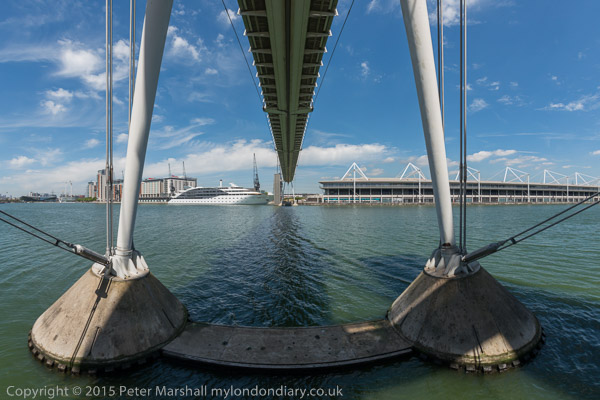
But it was a fine day, and the protests had started early, and by 11.50 I felt I’d taken enough (though looking back at G4S AGM Torture Protest I think I could have done better) and had the rest of the day to myself. I started by going over the high-level bridge across the Victoria Dock next to the Excel Centre, then walked around the dock to photograph the three sculptures there as a part of The Line – Sculpture Trail.
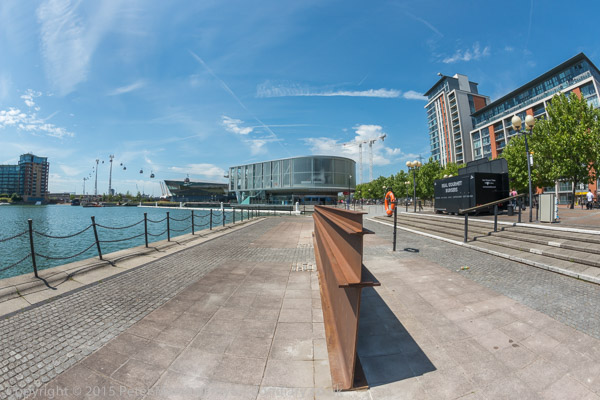
It was an experience that left me under-impressed. The docklands cranes, the high level bridge and the cable car all seemed rather more interesting than the sculptures, with the only work of the three there really having a strong presence being the tall figure of Vulcan, a 30ft-high bronze by the late Scottish artist Eduardo Paolozzi. This proved tricky to photograph, situated on a corner where I wanted to be suspended over the water for what seemed likely to be the best viewpoint. Perhaps it would be easier at a different time of day.

Martin Creed’s ‘Work 700’ perhaps looks better straightened out
I was working to produce very wide angle images, using the 16mm fisheye on the D800E, and transforming these to remove the curvature of vertical lines. The D800E has a big advantage for this in helping you to get the camera level, providing markers at the right and bottom centres of the viewfinder. Get both of them showing as little triangles and you have the camera straight and level. It would be slightly easier with the camera on a tripod, but you can – and I always do – work hand-held.
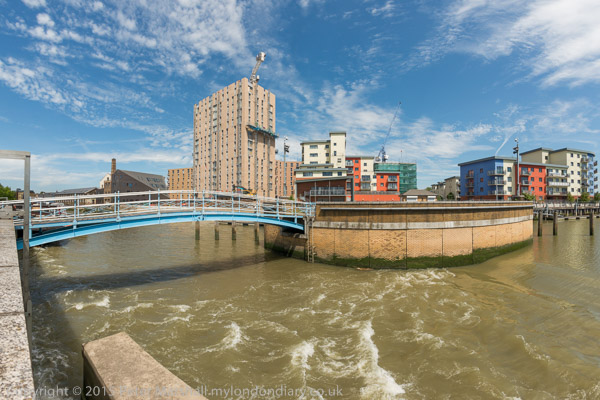
Barking Barrage
As usual I’d bought a Travelcard, so I could then travel on to anywhere in London, and decided to revisit the River Roding and Barking Creek. I’d tried a few years back to walk along the riverside path there and found it was closed. Unfortunately I found it still was and again had to walk in the other direction and went as far as the Barking Barrage, which I crossed and then returned along the other side of the river to the A13 to catch a bus.