Juggernauts in London

© 2009 Peter Marshall

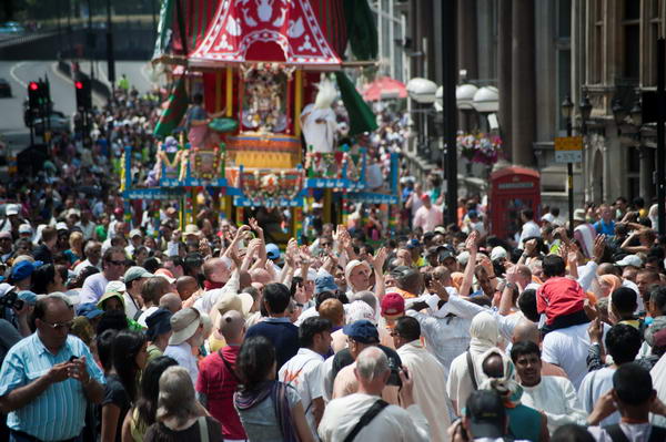
This was the view I got clinging to the side of a crossing light on a centre of the road refuge near Green Park station as the three chariots were pulled up Piccadilly in this year’s Sri Jagannatha Rathayatra Festival. This is the first chariot, the other two are hidden behind it in this picture.

I’m not quite sure why – perhaps it was the effect of heat on my brain – I’d decided to photograph the event with minimum depth of field, working with both lenses I had wide open for almost all the time.  This is actually a un-cropped full-frame (FX)  image made with a Sigma 55-200 mm DC lens designed for use on DX format only,  and shows hardly any vignetting or loss of sharpness – even when wide open at this focal length. Of course wide open isn’t very wide – f5.6 at this end of the range, and this for me was part of it’s attraction when I bought it a few years ago, as it makes for a very compact and light lens – and it was very cheap. I don’t shoot a great deal a long focal lengths, but I’m happy to carry a 350 g lens for the few occasions that I need it.

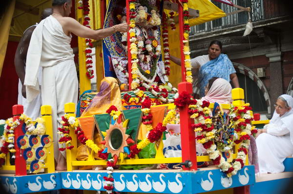
At the 55mm end – where the lens is f4 – there is some actual image cut-off, not visible in the D700 viewfinder but showing in the slightly larger image on the back of the camera. You can see it on this picture of Jaganattha taken from the same lamp-post:
© 2009 Peter Marshall
1/800, f4, 56mm (Exif reports this while the lens is engraved 55mm)

This cut-off is caused by the rather effective cylindrical lens hood – as I found later by using the lens without it (although there is also some partial vignetting – which can be dealt with in Lightroom. I’m thinking at the moment about taking a few mm off that hood with a hacksaw or perhaps ‘petalling’ it with a file, but can’t work out exactly how much it needs to be.

Sharpness does seem surprising good to the edges and corners, although  possibly a test chart would reveal weaknesses. But the glasses on the woman in white at the right edge are acceptably sharp, though her ear is a little soft!  Of course depth of field – and flatness of field also come into play. The railings and moulding on the balcony at top right actually get noticeably sharper towards the corner of the picture when viewed at 1:1.

It would certainly be useable on the FX format for many purposes – such as portraits – though might be a little lacking for say architectural work or landscape (though I did go on to try it on these later in the day.)

I was surprised at these results – other DX lenses that I have show some very noticeable cut-off – with the Nikon 18-200 at almost all focal lengths.  That doesn’t mean that this lens can’t be used on the D700, but it does restrict you to the DX format on the camera, with image files back to the 6Mp that we were used to on cameras such as the D100 – and just a little limiting on image quality. Given that the Sigma is also a better performer at least at the longer end, unless I need the full range of the 18-200, there is now no contest.

The D700 has a feature that will automatically crop the results from Nikon DX lenses if you set it to Auto crop. It’s perhaps good news that this doesn’t work for older Sigma lenses, so I can leave it set for when I feel a need for the 10.5mm fisheye, but don’t need to turn it off when I use the Sigma 55-200 DC.
© 2009 Peter Marshall.
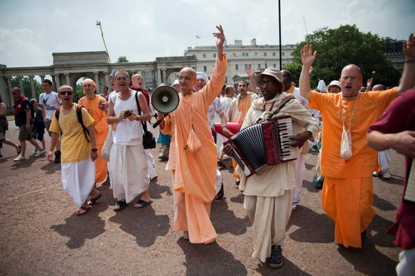
The procession starts – taken at 24mm, f2.8
. Vignetting not corrected.

Although many of the pictures from the event were taken from that same spot above ground as the whole procession passed, I did also photograph more conventionally. For that I was using another Sigma lens, the new HSM 24-70 f2.8 – and working at f2.8. More about this lens at a later date.

Orbs, Bad Weather & Summer Nights

Last night I was at a London Bloggers Meetup and one of the other bloggers present asked me if I would take a look at some photographs she had posted on her ‘Shaman UK‘ site of ‘orbs’ and tell her what I thought about how they might be caused.

What I found was one image of orbs – a rather nice example  – and a number showing illuminated blurs well outside the orb zone – perhaps insects or even small birds. Orbs are actually circles of confusion, out of focus images of the lens iris caused by light reflected from small particles too close to be brought to a focus.

The orb image – with the two cats – still contains its Exif data, and it’s interesting to see that it was taken on a Nikon D40X using flash at 1/60, f3.5 (full aperture)  with a focal length of 18mm (27mm equiv.)  This is interesting, since ‘orb’ pictures are much more common with small sensor cameras; also unusual is the blog author’s comment, about some other images, that she was  “actually seeing the orbs through the view-finder prior to pressing the shutter. ”

You can read a considerably amount about orbs, and the Orb Zone Theory of how they are produced –  and how to make them – on the ASSAP site  (Association for the Scientific Study of Anomalous Phenomena) which also has an interesting feature Paranormal photos and analysing them. The book also gives some advice should you want to produce your own ‘orb’ images (though my own advice would probably be to consult a doctor.)

Looking at the pictures showing flash reflections from objects in the air reminded me of Martin Parr‘s 1982 book, “Bad Weather” and I wandered to the shelf where I thought I might find it, but it wasn’t there.  I hope I still have it somewhere around the house, partly because I still think it (his first book) is probably also his most interesting, but also because it now sells for silly prices. There used to be a gallery of images from the book on the Magnum site, but it is no longer there, and a search (enter ‘bad weather Parr’)  now only brings up ten pictures from the book (plus one unrelated colour picture.)  You can also (with difficulty and persistence) find the book on Parr’s own web site.  Clicking twice at the bottom right corner of the cover image then allows you to look ata pair of images from the book which have a similar effect to those here, his flash illuminating the falling flakes in the right hand picture (click again for a few more images from the book.)

The image on the left of the pair I think shows a similar effect with rain drops, which are all apparently moving upwards, as a result of the flash at the start of the exposure followed by a tailing off effect as they continue to fall.  It’s like photographing other moving objects with a slow shutter speed, to get a light trail behind the object you need to use rear-curtain flash – probably not an option on the camera Parr was using, but I’m sure he would in any case prefer the odder effect given in his picture.

Parr of course deliberately went out in bad weather, while ‘Shaman UK‘ chose more pleasant times and at least on one occasion a location close to the Tom Cobley pub. As she says “spending time on warm evenings, in a beautiful location, with good company, human and animal, while photographing Nature, was wonderful and also fun.”

Summer Nights” is another of my favourite photography books, by Robert Adams, and the V&A have a nice little piece on it with a dozen images, mainly taken around twilight (click on them for larger versions.) There are possibly some among those of his pictures on the Fraenkel Gallery site, but that – like Parr’s – is another though very different text-book example of how not to write a web site, and I gave up before finding out.

Rogue Frames and the f0.0 lens

I don’t know whether I’m unlucky but I do seem to get some fairly inexplicable problems with cameras. Back in April I suddenly found that while taking pictures my Nikon D300 had suddenly decided to switch from using program mode to manual, and then to set the rather unlikely speed of 1/8000. Since I’d been shooting on around 1/250, this gave considerable underexposure and it was a few shots before I noticed. I do suffer from wandering fingers and it’s just possible that I had twiddled the dials while intending to do something quite different, but I rather doubt it.  Apart from anything else, I make a point of always leaving the manual setting on 1/250 f8 as a handy starting point under normal conditions, and there had been no reason to change it that day.

But even more curious were 5 or 6 rather dark frames that appeared on Sunday. I was using the D700 with my new f2.8 HSM Sigma 24-70mm zoom, and the first 960 exposures were more or less spot on.

I didn’t notice it at the time, but scattered through the next 250 or so exposures are 5 or 6 rather dark frames. I was taking pictures at Kew Eco-Village, and for frame 972 I have a perfect histogram and the settings show I’m in mode P, 1/500, f11 and 24mm.

© 2009 Peter Marshall.

Frame 973, for reasons best known to the camera, was apparently taken using mode A, 1/5000, f4*  and 8mm*, while 974 is back to the identical settings as 972.

© 2009 Peter Marshall.

By giving +4.0 stops of exposure in Lightroom, and pushing up the brightness, I can actually see and image, but it’s as if I had shot at perhaps ISO 12,800 rather than the indicated ISO 400. You can clearly see the difference even when reduced to web size.

© 2009 Peter Marshall.

I didn’t change the settings for 973, just pressed the shutter again. I hadn’t changed lenses and the widest that lens goes is 24mm. I’ve no idea what those asterisks mean – and despite its 444 pages I don’t think the D700 manual tells me. I’ve tried asking Nikon support, but they don’t have a clue either.

In Lightroom I can actually reclaim a rather noisy but possibly usable image from 973, and I also learn that I took it with my 0.0mm f0.0 lens…

Of course as photographers, you will be surprised that the frame was actually under-exposed. 1/500 at f11 isn’t that different in terms of exposure value from 1/5000 at f4 – perhaps 1/3 stop less, or the equivalent of perhaps ISO 650, while the actual result looks more like ISO 6400 or faster. So the camera is lying about the exposure it actually gave.

Yesterday I actually took around 1150 frames on the D700 working on several different things in various locations. A few used the internal flash, and all were shot using RAW. The battery was still up for more when I finished, but perhaps in future I’ll try and remember to change it whenever it gets below around 50% and see if that gets less rogue frames. But battery life when I used my first digital camera was less than a hundred frames – sometimes considerably less. It’s an area where we’ve really seen a dramatic improvement.

I’ll also perhaps try to look at the back of the camera rather more often. I actually don’t like to do so, finding ‘chimping’ disturbs my concentration.

Do other photographers suffer from this and similar problems?  Odd frames that the camera has obviously thrown a wobbly on – if not identical to mine. If so I’d like to know – please either comment or e-mail me (petermarshall(at)cix.co.uk – replace the (at) with the @ character.)

Cameras are now computers. So we shouldn’t be surprised if occasionally they crash or give obviously nonsense results, or even hang.  All of the digital cameras I’ve used have occasionally stopped working. The D100 had a little hole you could poke a pen down to reset it, but that seems to have been left out on recent models.  If your camera starts playing up or simply stops working, usually simply removing the battery then replacing it will reboot it and sort things out.

And if anyone actually finds that f0.0 lens, I’d like to borrow it for some available light work at dead of night!

Lightroom 2.4 & Picture Window Pro

Despite my previous experience of upgrades to Adobe Lightroom, I threw caution to the winds and downloaded the latest version, Lightroom 2.4, as soon as I got the notification from Adobe.

Of course I did back up my current Lightroom catalogue before installing the upgrade, but in fact everything went smoothly. Apart from adding a few newer cameras, and fixing some minor bugs, there are no great changes listed for Lightroom 2.4, but on my system at least, the latest version is a welcome improvement.

I’d been thinking that perhaps I needed a more powerful computer when processing a lot of images in Lightroom. It wasn’t that it was particularly slow, but even the odd second or two waiting here and there adds up to a very late night when you have shot a lot of stuff.

Lightroom 2.4 just feels more responsive, making it faster to go from images to image, easier to adjust the various sliders, lagging behind less when you dodge or burn.

I’ve long been an evangelist for Lightroom,  recommending it so often and so firmly that people have told me I should be getting a salary from Adobe. But it really has improved the way I handle digital images, getting better pictures faster from those RAW files. So I’m just a grateful user, though should Adobe read this I wouldn’t turn down some bounty  – a free copy of the ridiculously expensive Photoshop for example…

Seriously though, if you are using Lightroom, I think you’ll find this free upgrade worthwhile – and so far, working with it on around a hundred images, I’ve come across no problems. And if you take digital images and haven’t yet moved to Lightroom, what are you waiting for?

Another recent upgrade, one that I’ve not tried, is to Picture Window Pro 5.0 a sensibly priced alternative to Photoshop from Digital Light & Color (Windows only.)  I quite got to like this program in an earlier version, but though I think in some ways it was more powerful, I never got to find it’s approach to simple things as intuitive as that of Photoshop.  It was very much a program written for photographers rather than graphic designers, but I’d been using Photoshop for too long to really adjust.

The new version does have a powerful range of features including full 48 bit support, colour management including soft proofing and raw conversion and the price – $89.95 ($44.95 for an upgrade from previous versions)  is sensible. I think the only feature I needed (if very occasionally and under protest)  missing from the earlier version was CMYK conversion, and I assume it still doesn’t do this. It can read CMYK files, although I think this still needs an additional dll to be installed.

Olympus Pen?

I don’t often write about cameras and stuff, but the Olympus EP1 finally anounced at a press launch in Berlin does on the face of it look as if it may be something special. Not least because with the 17mm lens (34mm equiv)  and external viewfinder it can double as a reasonably portable and very capable compact camera for those times when you want to travel light. The body is about 120.5 x 70 x 35 mm (plus some protrusions) and weighs only 335g and the pancake 17mm f2.8 only 22mm long and 71g, with the VF-1 viewfinder adding 20g. A total weight of less than half the body only for my D700. If you want a flash the FL-14 is 84g with the 2AAAs adding a little more.

Unlike the other current Micro Four Thirds offering, the Panasonic Lumix DMC-GH1, the E-P1 doesn’t have a viewfinder, enabling it to be considerably more compact. This still rules it out for some kinds of photography, and I certainly won’t be abandoning my Nikons for a while.

The first thing I did on reading more about the EP-1 on Digital Photography Review was to go to their hands on preview but I found a more useful set of sample images on the Photography Blog which were taken with an actual production camera and I could  to download a full-size sample file taken at ISO 1600. The 12.3 MP jpeg made with the 14-42mm lens on a production camera was a 5.8Mb file. It’s not perfect but very adequate, and doubtless the results from a RAW image would be better.

A perhaps small added advantage for me is that almost any lens can be fitted to the micro four Thirds system camera using suitable adaptors. Olympus supply one to fit all my old OM series lenses, one or two of which might be useful with the body, and perhaps more usefully, any Leica M fitting lens can also be used. Apparently the results with some modern Leica lenses on the Panasonic Lumix DMC-GH1 are exceptional.

Frankly I don’t much like the EP-1’s “stylish design” with a deliberately retro glance to the old Olympus Pen. At the bottom of the first page of the DPR feature is a pair of pictures comparing it with the Panasonic Lumix L3, which to my eyes looks so much better. Perhaps in time an all-black version will evolve (as well as the black and silver version there is an even more hideous light taupe and white body.) And as on almost every other camera there are now the built in “art filters” to really f**k up your pictures and gain Flickr kudos.

I’m probably not going to rush out and buy one as soon as they come into the shops in July, but suspect I may not long be able to resist. It isn’t a cheap camera and the 17mm with VF-1 costs rather more than the zoom. It will also be interesting to hear how well the body works with other lenses, and perhaps in particular with a wider zoom than the 14-42mm.

Don McCullin’s Selection

The National Media Museum has a fine collection of early photography, and Don McCullin, one of the better British photojournalists of the 20th century was invited to pick images of archaeological sites around the Mediterranean taken in the 19th and early 20th century to go on line on Flickr (he has a new book of similar sites taken recently.) They are also available as a slide show, which I found technically disappointing.

Possibly better still, if you can manage to get to the Museum’s Collections & Research Centre – for some reason they call it Insight on Wednesday 3 or10 June at 2pm or Sundays 7 and 14 June at 12pm you, together with all the others who’ve come, can see them for real.  It may be in a rather obscure place, but  even so I’d be surprised if the numbers are small enough to make this a worthwhile experience.

McCullin’s show at the Museum until Sunday 27 September 2009 in covers his personal vision of England, and is certain to be worth a visit – and the web site also has a number of video clips of the man talking about his life and work. There is also the full 70-minute podcast of Don’s talk with exhibition curator Colin Harding, recorded live on 8 May which you can access from this page.

According to the Flickr page, “Copies of the photographs selected by Don can be obtained through the Museum’s picture library, the Science and Society Picture Library.” It’s a pity that there isn’t a little more co-operation between the Museum and its picture library. I searched for one of the pictures, “Maxime Du Camp (1822-1894); ‘Haute Égypte, Grand Temple de Denderah, vue genérale’ (Upper Egypt, Great Temple of Dendera, general view), 1852 ; Salt print; 16.2 x 20.8″ and failed to find it. A second search on “Maxime Du Camp” gave 8 results, none of which was by the photographer (for some reason it felt I really wanted Tony Ray Jones or Roger Fenton.)

I’ve previously bought prints from the picture library and found them to be good quality inkjet prints – in some cases better prints than the vintage bromide originals. I rather doubt if those of fine salt prints from calotype negatives would be as satisfactory.

For a rather larger and more informative selection of similar pictures take a look at Voyage en Orient from the BNF (there is an English version, but the French is better if you can.)

March for Jobs

My first destination on Saturday was Highbury and Islington, and I took the precaution of consulting the Transport for London web site to find whether the Victoria Line was working, and it told me it was fine. So I got off the fast(er) train to Waterloo at Clapham Junction (You can’t really call it a fast service when Southwest Trains have increased the timetabled time to get there by 5 minutes over those when I first started travelling from here in the 1970s  – to avoid any fines for running late.

One of the many things that has completely disillusioned me about New Labour was its failure to take control of the railways when we voted it back into power in 1997. Privatisation had so obviously failed that there was no sensible alternative but reverting to a nationalised system – and with the chance to set it up on a much improved basis. But instead they made it worse. Now we have trains that close their doors half a minute before the timetabled time – if they want to run a train at 9.58.5 they should call it the 9.58.5 service, not the 9.59.  We have services that take 35 minutes to Waterloo rather than 29 0r 30 minutes. And we have fares that have increased considerably more than inflation. That’s the legacy of privatisation.

There are of course a few improvements. The trains are quieter and smother running. They are non-smoking throughout. What’s really annoying is that they actually have greater acceleration and higher maximum speeds – so really we should be seeing services that are faster rather than slower. Occasionally when engineering works re-route mainline services by our route we get speeds that show what modern trains can do on our route, cutting times from the now normal 35 to around 20 minutes.

I only have to wait 5 minutes for the even slower service that stops at Vauxhall, and walk briskly down to the Underground, where I find no service. It wasn’t TfL’s fault, as a passenger has jumped in front of a train at Stockwell. But given modern communications I think we could have expected to be told this before getting off the train at Vauxhall.

The fastest way to proceed is to go back into Vauxhall station (its claim to fame is that it provided the Russian word for station) and get on the next service to Waterloo, arriving there around 15 minutes later than if I’d stayed on my original train.

Fortunately the parts of the underground I need are working, though as usual at weekends several lines are suffering from closure. It’s a slightly slower journey than usual from having to change at Piccadilly Circus, and the Victoria Line, still running from Victoria only, has some large gaps and it’s around ten minutes before my train arrives.

Logistics  – working out how to be at places at the right time – is very important in the kind of photography I do, often covering several events in different parts of London over a day.  Fortunately, although the March to Defend Jobs, Services and Education was timed for 11.00, this was the time to start gathering, and the  march doesn’t actually get started until around 11.40, so despite the travel problems I actually arrive well in time.

As a photographer in London, you need to allow plenty of time for snarl ups and other problems. Driving is frankly pretty hopeless for getting around quickly, not least because of parking problems. The most reliable way to travel is a bike, either motor or leg-powered, and for longer distances you need to rely on underground or overground trains. One of my most useful photo accessories is a folding bike, which can be taken on trains at any time, but it gets in the way when covering demonstrations and marches.

For this march, which goes from Highbury Fields to Archway, I do rather wish I had brought the Brompton, as it’s a bit further than I remembered. But I know it would get in the way later in the day.

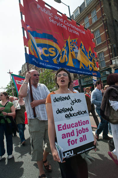
It’s hard to photograph events such as this. There just isn’t a great deal of visual interest, and it involved no real celebrities.  The trade union banners are colourful, but essentially two-dimensional.  It’s really hard work to get much out of it, but there are a few pictures I’m pleased with.

© 2009 Peter Marshall.

This was my favourite, taken with the 20mm f2.8 Nikon lens on the full-frame D700 from a low angle and including a placard that says what the event is about as well as one of the more colourful union banners from the PCS.  The expressions of the two main figures , shouting a slogan, also helps, and there are a number of strong lines all in the same direction – just off of vertical that give it a strong dynamic feel. Working at ISO 400 gave an exposure of 1/640 at f10,  freezing the movement at giving depth of field that extends from the hand close to camera in the bottom centre to the top of the banner and the buildings in the background.

In the old days, I would have been shooting at a pre-set aperture and using ‘zone focus’ to give me a  good idea of the depth of field I would get. Nowadays I’m increasingly relying on ‘Auto-area AF’ which claims to distinguish people from background, along with continous servo autofocus – the C setting. Exposure was also automatic, using matrix mode, and its coped well with the bright area of sky. Usually – as in this case – I’m impressed by what modern auto systems can do. I could have done it as well manually, but not in the fraction of a second I had to take this picture.

I left before the rally had finished – by then it was running considerably late – and again was thankful I’d come by public transport, as I could just walk the short distance to Archway tube rather than having to go back to the starting point.

Many more pictures on My London Diary.

Colour Management

One of the presentations at the NUJ Photography Matters conference that I missed (too busy eating lunch, drinking wine,  meeting people, looking at the exhibition and taking snaps) was on Colour Management.

Assuming that you work with colour (and in this digital age we all do, though some like to pretend they work in black and white, though often the results are not too convincing,)  colour management is something you need to embrace.

Fortunately it’s pretty simple. Buy a decent monitor. Get a hardware monitor calibrator – such as the Eye-One Display 2 – and use it. Shoot in Adobe RGB and supply files tagged as that for print and convert to sRGB for web (and clients who don’t have any idea what they are doing.)

If you want prints, talk to the lab about how they want files and profiles for soft-proofing. To make your own ink jet prints, get specific profiles made for your printer, ink and paper. Apply these only once (usually in Photoshop where you can soft-proof rather than in the printer driver.)

Sorted.

Of course there is a little more to it than this. One clear and concise introduction I’ve just been reading comes from Louis Dina, a Birmingham, Alabama based  photographer and printer. From the Color Management page on his web site you can download two free PDF documents, both very straightforward and readable.

The first, (use the Introduction link at the left of the page to open the page with the download link) is an Introduction to Color Management which tells  you why you need to do it and gives a clear explanation of how it works.

The second,  downloaded from the Monitor and Printer Profiling page gives highly detailed click by click instructions, almost all of which are good advice whoever you get to make your printer profiles. There are a few places where I do things a little differently (for example over the exact monitor settings I use) but I suspect Dina’s approach is likely to be better, and I’ll probably try it out.

[I first came across Dina when looking at black and white printing – a rather more complex subject, and one that takes you – if you are serious – into the world of RIPs, spectrophotometers and specialised ink sets. Colour is in many ways more straightforward because that’s what the printer manufacturers make their ink jets and inks to do.]

If you are in the US, you may want to make use of the mail custom profiling service offered by DinaGraphics mentioned on these pages  – it seems very reasonably priced for what it offers, although I’ve not tried it myself –  but there are also excellent services elsewhere.  But looking at the prices charged by professional sites in the UK, it could be worth paying the postage to the US.  On the site you can also download  profiling targets, and one of these, designed for preliminary testing to establish the best driver settings for a particular paper (its use is detailed in the second PDF) seems worth using whoever you are going to get to make your custom profiles.

I’ve tried making my own profiles using scanner based systems, and tried profiles made by people with some of the cheaper spectrophotometers marketed to  photographers and studios. Both better than nothing, occasionally even an improvement on ‘generic’ profiles from paper vendors, but neither a match for those produced on more expensive equipment.

One of the UK specialists in Colour Management is Neil Barstow, and together with Photo Pro digital editor Michael Walker he is producing the forthcoming e-book “Practical Colour Management for Photographers“, and they were both at Photography Matters to talk about this and discuss colour management.  There is a great deal of information on colour management on his web site including a knowledge base and also a free consulting service.  Much of the site is aimed at press and pre-press and the approach is perhaps overkill for working photographers. I can’t at the moment find more information about the forthcoming book.

Another resource that can be downloaded is  the complete text from the colour management chapter in Martin Evening‘s Adobe Photoshop CS3 for Photographers – which of course some may already have. Being designed for the printed page I find it a little confusing on screen. But I can in any case look at his advice on the subject in his book on the older version of Photoshop I use.

Lightroom Magic Brush?

One small discovery in using Lightroom that has really changed things for me.

Ever since the program came out I’ve had problems with the ‘Recovery’ slider which you can use to  ‘recover’ image highlights – areas of the picture that are too bright to fit on the histogram.  If you load any image and slide this slider from 0-100 you will see that although it does shift the highlights down, it also alters all areas of the histogram, and that with higher values you get very dull-looking highlights.

So I try to use only very low values of ‘Recovery’, if any at all, usually reducing the level set by the Auto-tone that’s part of my development preset. This usually leaves large areas marked in red as being overbright (that setting you toggle with the ‘J’ key.)

Sometimes you can get rid of these simply by reducing the Exposure Value, but of course that will usually make the image too dark. But while Auto-tone often seems to over-egg the ‘Recovery’ it generally seems to soft-pedal on ‘Fill Light’, and increasing this can both sort out those blue blocked shadow areas and brighten up the picture . And if necessary you can brighten up a bit more with the ‘Brightness’ slider.

The I had what in retrospect seems a blindingly obvious idea (and it’s probably mentioned in all those books on using Lightroom I’ve never quite got round to buying because I know I’d never get round to reading them.)

Often if the ‘red’ areas are just in the sky or other easy areas I’d simply attack those areas with the selective brush tool, usually using a value of around -40 for exposure. But this sometimes brought the problem of giving obviously visible boundaries, and in skies sometimes some very artificial looking cloud edges and poster-like effects.

The obvious answer was to use a brush set to both decrease Exposure and increase Brightness, and after a little experiment I found that sets of values like -40E, +25B or -50E, +35B did more or less as I wanted, bringing in over-cooked highlights while the rest of the histogram stayed more or less unchanged.  Because it has zero effect except on very light values you don’t need to worry about applying it carefully, and can use a broad brush, applying it several times to the same area (with a K, K to turn it off and on again)  if necessary. It all seems too good to be true.

Of course no kind of magic can get back the really over-exposed, where you have over-saturated the sensor and there is no detail, but I have rescued a few shots which I’d thought were impossible. In more extreme cases it may help to add a little ‘Contrast’ and ‘Saturation’ to the brush as well.

Jiro’s Café

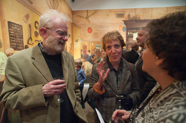
Of course it’s only sensible that the lighting in art galleries is on the pictures, but it doesn’t make things easier when you are trying to photograph the people at an opening. There might be ways around this with some serious effort, but I hadn’t gone to the opening of Jiro Osuga‘s installation, Café Jiro, in the Flowers Gallery in Cork St, London, to take pictures, but to admire his incredible imagination and painting.

© 2009 Peter Marshall

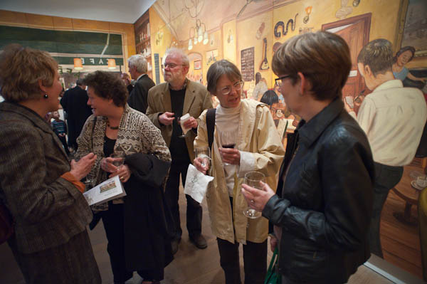
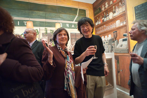
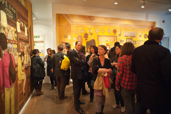
The lighting on the pictures gives a white balance at around 2300K (and around -6 magenta) so using flash to add a bit of light would really need a suitable filter to bring it from around 5600K. And there is a largish door and window at one end of the room with evening daylight at closer to 8000K. I’m travelling without my camera bag, just the D700 with a 20mm, and its built-in flash isn’t too great in any case, so though I take a few with it, most of the time I elect to work with available light at ISO 3200 and later adjust the lighting balance in Lightroom, burning the brightly lit painting on the walls and dodging the dimmer figures.

© 2009 Peter Marshall

I discover you can even apply a little amber to the street outside the gallery to more or less neutralise the colour cast should you want too, but I quite like the mixed colour effect. The quality from the D700 at ISO 3200, which allows hand-held exposures at around 1/100, f3.5 in the fairly dim interior, is nothing short of amazing compared with the bad old days of film.

© 2009 Peter Marshall

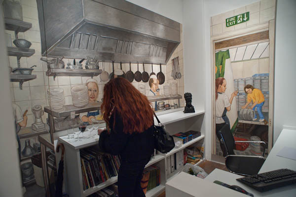
I’ve long been an admirer of Jiro’s work and have organised several group shows including some of his pictures, but in this show he has created something on a larger scale than before, re-creating the whole ground floor of the gallery as ‘Jiro’s Café’. The words ‘accessible’ and ‘fun’ can seldom be attached to shows in this most famous of Mayfair gallery streets in London, but this show is certainly both, and also a powerful showcase of the intelligence and vision that Jiro’s work always displays, applied to a much larger canvas, or rather series of canvases.

The large area around the room took seven months to paint in the artist’s studio, where he could only see and work on it a canvas at a time, and it must have been a considerable relief to see it altogether for the first time in the gallery when the show was hung and find it all fitted together perfectly.

© 2009 Peter Marshall

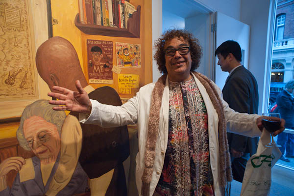
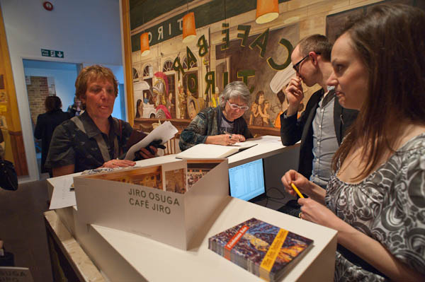
My pictures concentrate on the people at the opening – and particularly on friends of mine who were there – including the artist.

© 2009 Peter Marshall

A few of those in my photographs are also in the paintings, particularly the gallery staff who can be found in the kitchen. Y0u can see 19 panels on the Flowers Gallery web site
which includes most of the display except the topmost level, but you really need to get to Cork St and see it as a whole to appreciate it as an ensemble and the relationships between the parts. In the basement gallery there are also other some smaller paintings by Jiro (and some other gallery artists) in the downstairs area.

© 2009 Peter Marshall

Although it contains some references to the original site for which it was designed – such as the windows on the front wall which are those of the street opposite, it is a work that would stand on its own and could be shown in galleries and museums elsewhere, and I hope others around the world will get an opportunity to see it.

© 2009 Peter Marshall

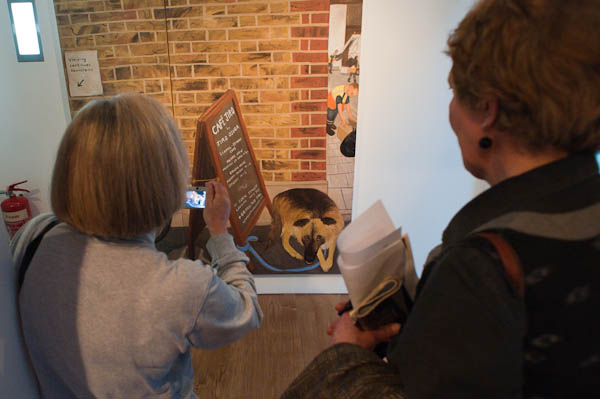
At the gallery you can buy a nicely illustrated catalogue for a tenner and also a one metre long thin card showing all the paintings that make up Café Jiro at a quid, including the panels in the doorway showing a dog tied to the café’s sandwich board. In my photograph he is being photographed by his owner and his head is clearly visible on the screen of her camera in a larger image. Hidden behind her head is the painted wheel of Jiro’s bicycle.

© 2009 Peter Marshall

Don’t miss it. The show continues until May 23, 2009.