Island History

On Tuesday evening I went to the opening of Isle Of Dogs Then & Now: Photographs By Mike Seaborne, which is showing at George Green’s School Café Vert, a venue for various community and youth organisations, open to the public at times. But it is rather easier for most to see Mike’s work elsewhere, particularly in the ‘Then and Now‘ section of Mike’s 80sIslandPhotos web site.


Mike Seaborne talks about his work on the Isle of Dogs in the 1980s at Café Vert

In 1983-6 Mike undertook an extensive photographic project on the Isle of Dogs in East London to document the area prior to its redevelopment, in conjunction with the Island History Trust. In 2013, a Heritage Lottery Fund grant enabled him put approximately 1500 of his black and white photographs into Tower Hamlets Local History Library and Archives where the albums can be viewed by the public. But you can also see them on his 80sIslandPhotos web site, where they are covered by a Creative Commons license that allows them to be copied and used for non-commercial purposes provided they are correctly credited (Copyright © Mike Seaborne) and are not altered or cropped. So here is one of the pairs of images in the show at Café Vert,


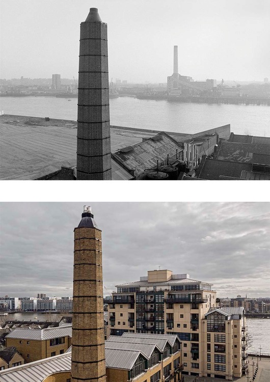
View south from the Plate House belfry, Burrell’s Wharf.                             Copyright© Mike Seaborne

In the show his black and white images from 1983-6 were paired with colour images taken from the same place over the past year or so. For some it was easy to know exactly where he had taken the earlier photograph – the belfry was still there, and the chimney of the former colour works has been retained, although it is the only thing in the recent photograph that remains – even the river walls have been rebuilt since then. The power station across the river on Deptford Creek is long gone – and you can see the chimney in mid-air as it was dynamited in one of Mike’s pictures.

Mike’s photographs of the area form an important record, not just because of the quality of the work but also because of the information that is attached to them, both by him and also by others, and part of the reason for making them available on-line is to enable others to come forward with more information about the people and places in them.

You can also see more of Mike’s work from this and other places on his main web site, and also on the Urban Landscapes website that we set up around 12 years ago and co-curate.

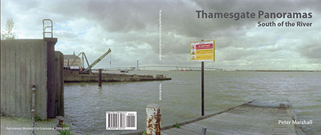
Although I took quite a few pictures on the Isle of Dogs around the same time as Mike in the 1980s – some of which are in my book City to Blackwall 1977-84  (preview here) – my work there just a small part of a much larger project on post-industrial London and not dedicated to a particular area. His is a much more in-depth study than mine and one that involved considerable interaction with the local community. It was only a few years later that I got to know him, when I joined a group of photographers he set up, London Documentary Photographers, to document the changing city, though by then I had seen some of his work – both of us had four pictures in the 1988 BJP Annual, two of his from the Isle of Dogs.

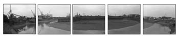
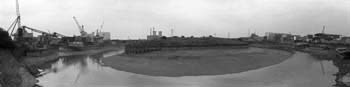
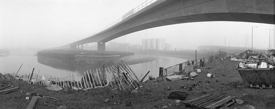
At the opening I talked briefly with Mike about the problems of re-photographic projects such as his, particularly in areas like the Isle of Dogs which have undergone almost complete redevelopment. I’d had a few hours spare and had walked through the Island on my way to the show, taking a few panoramas. Much of the way I was walking along streets and paths I’d walked on back in the 1980s, and little remained. I think I would find it tricky to exactly pinpoint the locations of many of the pictures I made back then, or the exact direction in which my camera was pointing.

Later I began to take more careful notes about locations, and as well as street names the contact sheets from much of my later work also contain grid references, although these only locate to a 100 meter square. Life would be much easier now with GPS and the ability to automatically record the image location into metadata.

Capa Under Fire

I’ve never believed the story about Robert Capa‘s D-Day films being ruined by a darkroom technician, but though I’ve certainly expressed my doubts in discussions I can’t find anywhere where I’ve published them clearly in print or on the web.

I don’t believe it because I’ve tried hard to melt film, and it isn’t easy, and when you do so the results don’t look anything like those familiar D-Day images. Back when I was teaching art students, some of them worked hard to distress films in various ways, and found modern emulsions surprisingly resilient. They couldn’t get results like Capa’s using a film dryer or a hair dryer on full heat and ended up using more extreme means – ovens, matches and gas burners – and the results were rather different.

I didn’t believe it also because of the conflicting stories that have come out, but I kept quiet about it. I hadn’t done the research that would be necessary to write what I felt in my bones, though I tried to express a certain degree of scepticism when I wrote about it back in 1999 (and rather more in my lectures on which this was based:)

Both Capa and Rodger covered the D-Day landing in Normandy. Rodger strode ashore at Arromanche and found little happening, while Capa hit Omaha Beach where all hell was breaking loose. He shot three rolls of film on his two Contaxes, during the approach and wading ashore from the landing craft and then while lying flat on the wet sand while bullets raced over his head. Capa’s most quoted remark about photography is ‘If your pictures aren’t good enough, you aren’t close enough’, but here he was closer than he intended. He realised his duty as a photographer was to get the pictures back and rushed himself and his film back on to a landing craft and from there to England.

Only 8 of the 106 frames were fit for use. Apparently the Life darkroom technician was so excited by what he saw that he allowed the film to overheat while drying it, ruining most of the film. Life at first put out a story that the pictures had been ruined by sea water, then, after telling Capa what had really happened, ran the pictures with a caption that enraged Capa, saying he had not focused properly in the heat of the action. Of course this and a certain amount of camera shake would have been pretty excusable in the circumstances. The faults that are present in the existing pictures give them a graphic quality which would have been lacking in properly processed work.

What I was implying in the section emphasized above, though being careful not to be explicit, was that to me these pictures looked just as if they were out of focus and suffering from camera shake and that we needed no other explanation for what we can see.

But while I only implied and failed to research in any detail, J Ross Baughman recently made his views quite clear in two guest posts on Photocritic International, Robert Capa’s Troubles on Omaha Beach (1) and (2).

A D Coleman himself has followed this up with his usual dogged forensic attention to detail with a series of posts Alternate History: Robert Capa on D-Day, currently up to part 7, in which he comes to the conclusion about the ruin in drying “I no longer believe a word of it. I’m embarrassed that I did for so long, and amazed that it’s gone unchallenged for seven decades.”

But he also concludes “But it no longer matters, because whatever caused the complete loss of three of Capa’s rolls of 36-exposure 35mm film and 2/3 of the fourth roll, none of that film — according to the photographer’s own caption notes and the data encoded in the remaining negatives themselves — contained any further images of the landing at Omaha Beach.”

It seems pretty clear that Capa only made 11 exposures on Omaha beach (not the 8 which were said to have survived when I wrote) although the best of those negatives has since gone missing. Another was apparently too poor technically to print. Coleman suggests pretty convincingly that the other exposures on the film were made by Capa before the landing craft reached the beach and were drastically overexposed (as shown on the stills from a recent video.)

Coleman’s account is not quite as clear as it might be in part 4, as his mind has been changed by an exchange with photographer Mike Doukas. The frames shown on the contact sheet appear to be the final ten from a commercially loaded 36 exposure cassette, ending as usual at frame 38 (with 37 the missing negative.) They start with 5 exposures made from the landing craft as troops wade ashore  and end with the final picture Capa took on the beach.

The other films lost or ruined appear not to have been taken on Omaha beach but – according to Capa’s own notes, to have been taken earlier during boarding and the journey across the channel.

It is hard to know what to make of Capa’s claims – discussed by Coleman in part 5 – to have taken more films (or indeed about anything else in his life – Capa was nothing if not a great story teller, and good stories are always at least a little more than the truth), but Coleman’s dismissal of this seems convincing. But he is surely too harsh on Capa in the conclusion that by only taking 11 pictures and then running to get away from the beach that “On this crucial occasion, the opportunity of a lifetime, he failed himself, his picture editor, his publisher, his public, and history itself.”  It is perhaps a conclusion that reflects Coleman’s own anger at having been taken in for so long by the improbable story.

It was arguably a surprising failure not to have reloaded the camera immediately before the craft hit the beach so as to have a full 36 exposures at his disposal, but perhaps there was not enough warning that it was about to happen. But flat on the beach under withering fire he would have known that he only had a few frames left, and probably felt that loading another film would have been too much of a risk to his life. To get a couple of good images, pictures that became icons for whatever reason –  and to keep alive to take them back to England seems to me a success.

You need to read the whole story, starting with  Robert Capa on D-Day which Coleman published on June 10th.

One mystery I think remains. The young lad in the darkroom was long thought to have been the 18 year old Larry Burrows, but later LIFE‘s London picture editor John Morris who was in charge later made clear that he had not been involved, laying blame on the youngest of the darkroom staff,  15-year-old lab assistant Dennis Banks (although according to Capa biographer Richard Whelan, his name was Dennis Sanders.)  15 in 1944, if still alive he would be 85 now, and in any case there must still be many people alive who would have known him, and doubtless he would have told some his story. If he – or anyone who knew him – is reading this we would all like to hear from you, so please get in touch. Or was he simply a fictional character?

Rochester Views

I’ve finally worked out how to get TIME Lightbox to almost work on my computer, running the latest Firefox. It has always been a frustrating experience before and the only way I’d found to see all the pictures was to manually alter the address line in the browser. But now I’ve realised you can actually go on to the next image by simply waiting for the black rectangle to appear along with the ‘timer thingy’ and then pressing the ‘F5’ key to reload.

It still isn’t perfect in that to see the pictures in the full window (they call it full screen) you have to do it individually for each image, as the reload reverts to normal view. Or perhaps that is how it’s supposed to work?

I suspect my problems come from my computer refusing to accept some advertising or tracking stuff TIME want to load on me. I do have a few things set up like ‘DoNOTTrackMe‘ which blocks four trackers on the page.   Although I post a lot of material on the web I value my privacy and can’t really understand people who use Facebook but don’t look at their privacy settings. And I use and would recommend FB Purity and the advice in How to stop Facebook snooping on your web browsing activity and other similar articles.

Actually it is best to look at the work on the photographers’ own site, where there is also some text about the project. The pictures were made in 2012-3.

Back to Rochester, long the home of the yellow box which fed so many cameras, and as well as Kodak, also Bausch and Lomb and Xerox. Kodak no longer make film, and some of the pictures by Alex Webb here were shot on the last few rolls of the Kodachrome that was so symbiotic to his photographic style. But now the film can only be processed – with slightly unusual ‘distressed’ results as black and white. There are also some typically bold colour images by Alex (which I presume were made on digital), to my taste rather stronger than the more poetic pictures by his wife, Rebecca Norris Webb, still working with (no longer Kodak) film.

The book is published by Radius Books who advise “As both previous RADIUS books with these artists have sold out quickly – this is sure to be a collector’s item.” I could ask why if they think this to be the case they did not produce a larger print run. But then perhaps they did!

Although the US release date is give as June 30, it appears to be available in the UK now. ISBN-10: 1934435767 ISBN-13: 978-1934435762 and

As well as the standard edition, signed copies are available for an extra $5, as well as a limited edition with a couple of signed digital C-types thrown in for an extra $1440. I’m not greatly attracted by signed books – though I do have a few, mainly from having attended book launches or having bought directly from the photographer.  But though I’d never pay a great deal more for a signed copy, I think the idea of marketing them at a small premium – so long as most or all of it goes to the photographers – is a good one. Although given the deliberately small print runs of many new photographic books, there really is little reason why every copy should not be a signed copy.

Rochester of course still has a special place in photography, George Eastman House, the world’s oldest museum dedicated to photography which opened in 1949. It was also one of the first institutions to put a large collection of its photographic works on-line in 1998, and although the original site was decommissioned in 2006 it remains available for ‘historic and research purposes’.  The replacement site is perhaps easier to search, and quite a lot of the older work is on Flickr

DPAC at DWP over ILF

I was on my knees in the doorway – locked and guarded by security – of the Department of Work and Pensions, where protesters from disablement activists group DPAC had brought a letter for the Minister for Disabled People, Mike Penning.  There wasn’t a great deal of room, even though I was the only photographer in front of the protesters, and I was using the 16-35mm, so was very close to the guy holding the envelope. Even at the time I was wishing they had written his name rather more clearly on the envelope, though I’ve brought it out a little in post-processing.

The lighting was tricky, with a little bright sunlight leaking into the scene in various areas, but all the significant subject matter in shade. Those near-white buildings opposite were very bright – and have been brought down quite a bit in Lightroom, where I’ve also brought up the shadows considerably. As taken the envelope was reflecting quite a lot of light and looked rather lighter than a manilla envelope should. But Nikon’s pattern metering worked well, though I doubt if this picture would have worked if I had not been using RAW.

Although I was only working at f5.6 (1/125, ISO 640) at 17mm there was considerable depth of field and the figures in the foreground – with the slight exception of the moving tiger – are pin sharp. Those at the back and the background are a little soft, just enough to add a little depth to the image, and the slowish shutter speed adds just a slight blur to those moving, particularly one hand of the figure holding the poster ‘Stop Killing Us’.

I’ve not bothered to correct the slight barrel distortion at 17mm, because I think it actually – if fairly subliminally – improves the image. You can see it in the lines of the background building and I think it has a slight effect of keeping the eye drawn in to the centre.  It is actually more than you think – that tiger’s heel at bottom left just touches the edge of the frame after correction.

Of course I didn’t have time to think about everything when I was making the image – things were changing quite rapidly as usual, but I was certainly very conscious of the framing – and the images before and after this and its partner were both made at 16mm and from slightly different positions.  This was the sixth of three seven frames where I was concentrating on the letter (the next differs only in having the tiger stationary a foot or so to the right), and after it I moved to the left as I wanted a clearer view of the placard with the scissors and the message ‘ILF Cruelist Cut’. But this picture stood out.

The next frame was good too, and appealed to me because the tiger holds in his left hand a grey bag with my name, MARSHALL, clearly visible – making this a pre-signed image. But it seemed just a little static compared to the above. Perhaps I should get one of those bags and take it to all protests!

This was another picture I liked, and I had to look at the original RAW file to confirm that this was exactly how I framed it when making the picture. It’s another good example of why I like working close with the wide-angle – in this picture at 21mm. Here I had more time to work and took around 20 frames – this has the best framing and fortunately the best expression on the speaker’s face too. And it shows up those tattoos well.


When it became clear security would not let the protesters in to deliver the letter, Mary Glindon, the Labour MP for North Tyneside took it in for them

Of course I don’t always get what I want, but at this protest I made a number of images I was pleased with. Although it was quite crowded on the pavement – and wheelchairs take up quite a lot of space, there were not very many other photographers present – and those present cooperated with each other. The DPAC protesters are always nice people to work with and of course they have great reason to protest, with disabled people having suffered the most from the government’s cuts. You can read more about their protest  at Save Independent Living Fund where there are also quite a few more of my pictures from the event.

Continue reading DPAC at DWP over ILF

Bin British Gas

Back before the Thatcher era the idea of private companies making profits out of supplying gas seemed ridiculous. It was an industry with a single network of pipes across the country. Of course in the distant past we had over a thousand gas companies, each with its own area, some private and some municipal, all merged into the nationalised area ‘gas boards’ under Clement Atlee in the Gas Act 1948, and into the single British Gas in 1972.

It was an industry where nationalisation made sense, and I think delivered a better deal than the privatised British Gas created by the Thatcher government in 1986. For the next 10 years, domestic users had no choice of supplier, and it was only in 1998 that the market was fully open to competition.

It’s hard to see any real benefit for the consumer that privatisation has brought, and after recent price hikes few still believe there was any financial advantage – except to the shareholders of the privatised British Gas and other big energy companies and those who bought shares cheap and sold quickly at a large gain.

In the days of the gas boards things were simple. Anything to do with gas and you knew where to go. There was a ‘gas showroom’ in every town of any size where you could go and look at new gas appliances, and to pay your bill, and if you smelt a leak or needed maintenance or anything else, the board (and from 1972-86 British Gas) was the place to go. Things were simple and they worked pretty well.  Much the same was true of electricity, again nationalised by the Atlee government – by the 1947 Electricity Act, and privatised in 1990.

Most people would prefer a simple national system for energy in the UK again, with a YouGov poll in November 2013 showing over two thirds of people backing the energy companies being brought back into the public sector and only 21% saying they should be private. Even among Conservative party voters over half – 52% – thought they should be re-nationalised. It is a pretty clear indictment of the current system, so it is perhaps surprising that none of the major political parties seems to be even considering renationalisation. I think it says something about how our democracy works -or rather fails, protecting some private interests rather than the public good.

Few of us can be bothered to change our energy suppliers to get a better deal – and many who have done so have found themselves actually paying more with an incredible level of misleading selling. In the 18 years it has been possible to switch suppliers I’ve only done so twice; once to get the small benefit of a ‘dual fuel discount’ from buying gas and electricity from the same supplier, and more recently for ecological reasons to a green energy company, Ecotricity, which has no shareholders but uses all its profits to develop new renewable energy services. As a bonus, it also seems to be saving me a little money.

So I was very much in sympathy with the protesters outside the AGM of Centrica, the parent company of British Gas, a protest organised by Fuel Poverty Action, with their slogan ‘Bin British Gas’. You can read more about their aims and the protest, along with many more pictures in Bin British Gas on My London Diary.

Another picture taken with the same lens, the Nikon 16-35mm f4 from more or less exactly the same position, but at a slightly wider focal length has a big difference. The name of the conference centre is straight on the upper image (at 22mm) but rather definitely curved in the lower 16mm version.

There is more distortion at the wider focal length, but the real reason for the difference in these pictures is that I have used the lens profile in Lightroom to correct the 22mm version. I could have done so for the lower image but chose not to. I have changed my default setting for the profile in Lightroom to use 0% distortion correction, because for most subjects the distortion actually gives a slightly less distorted looking effect at the edges of the pictures, avoiding a little of the problems of rectilinear correction on extreme wide angles. It also gives a slightly wider field of view, with any correction of distortion always resulting in a little loss at the edges.

The distortion is only generally a problem with architectural subjects and other things with obvious straight lines – as in this case. But correcting it would have lost more than I was willing to lose of the hair of the woman at the left of the image.

Pensioners are among those hardest hit by high fuel prices – many now find themselves having to chose between keeping warm or eating. I took several pictures of one of them holding a hand-made placard. I think this was the best, though probably it would be improved by a little crop at top and right, but you can see another version on My London Diary. Obviously the face and placard were both important, but less obviously I think his hand gripping the placard adds to the picture. As (almost) always the images are un-posed.

I rather like the picture of a giant gas bill being torn up, though it proved a little difficult for them to tear. I was surrounded by other photographers when taking this and the other pictures and unable to move much, but I’d chosen a fairly good position – thinking in advance what was likely to happen and where and getting there before the others.

They did eventually tear it to pieces and then Terry who was right next to me threw them into the air. It was a picture with no second chances and I would have liked more of the pieces to have been the other way round – ideally to show the British Gas logo.  But you have to take what you can.

The finale of the protest was the planting of windmills made from folded gas bills in the grass in front of the centre. They had been planning to do so on Parliament Square in front of the House of Commons which might have made a better picture, though the ‘Heritage Wardens’ there would certainly have objected.  There were supposed to have been 100 of them, but quite a few didn’t get planted

Along with the other photographers present (and we did get in each other’s way a little) I had a few minutes to think about how to take this, and to try different ideas, with focal lengths from 16mm fisheye to 70-300mm telephoto. There are four different views at Bin British Gas but this is my favourite.

Continue reading Bin British Gas

Protest Photographers Arrested

Human Rights Watch report that Authorities in Bahrain are arbitrarily detaining photographers who have covered protests and convicting them in unfair trials. Four award-winning Bahraini photographers are either in jail or facing criminal charges in what appears to be part of a policy that violates photographers’ right to freedom of expression.”

Today (22 June 2014) Hussain Hubail is appealing a five-year sentence for taking part in an ‘llegal gathering‘ and inciting hatred of the government for photographing a protest, and on June 25, Ahmed Humaidan appeals against a ten-year sentence. You can see some of his work on 500 pix. (I’ve just heard that Hubail’s appeal has been postponed until August 20th.)

Photographers say that they are targeted by police because their pictures show the reality that the Bahrain government wants to hide, and are subjected to mistreatment when arrested. Ahmed al-Fardan was arrested in the early hours of December 26, 2013 and his cameras, hard drives and flash drives taken. He was blindfolded, handcuffed a kept in a freezing cell for interrogations – and comes to trial on September 14th.

al-Farden like me submits work to Demotix, and it is distributed by Corbis. Among the events he has covered was a Demonstration in support of arrested photographers in Bahrain on 25 October 2013. An earlier group of pictures, Political Participation and Toxic Gas won him first prize in Freedom House’s 2013 Images of Repression and Freedom. You can see many of his pictures from protests on Demotix.

Although I’ve occasionally been pushed, hit and threatened by police covering protests in London, the situation is clearly very different here and usually at least our authorities are much more subtle. Photographers may sometimes be taken to court to get them to produce their pictures as evidence, and I have friends who have got settlements after being assaulted by police, but we simply don’t face the same problems here as in Bahrain.

Protesters here don’t get shot by police, though occasionally a criminal suspect or innocent person has been, as well as some people detained in police stations. We can all remember cases like that of newspaper seller Ian Tomlinson who died after being assaulted by a police officer at a protest – or Alfie Meadows, very nearly killed and prosecuted for assaulting a a police officer, but these are exceptional.

The UK establishment mainly simply ignores protests. I’m writing this on the day after a protest on the streets of London by anywhere from 15-50,000 people. It started outside the BBC so they could not miss it, but they only reported it – in a short and vague fashion – after many, many protests to them by phone, e-mail and tweets. To get the story in any detail meant going to foreign-based news channels or left-leaning news sheets. Even Demotix, although it publishes the pictures, no longer publishes the stories that go with them.

Derbyshire & Sheffield

It was good to get away from London for a weekend, although it was a bit rushed and not entirely relaxing.  But I was able to spend a little time using the Fuji XE1 and both the 14mm and 18-55mm and 8mm Samyang lenses.

The 14mm was great for some group pictures (not included on My London Diary) at the conference weekend I was taking part in, and also a good lens for some landscape pictures. But I did have one problem with it. It’s largely a matter of getting familiar with the system and I haven’t yet used it enough to spot the things that are likely to go wrong.

The focus ring on the lens has a nice feature which switches from manual to autofocus by a short push towards or away from the camera body, which also hides and displays the distance scale. It works very well and needs just enough of a push that you are unlikely to change it accidentally. It’s also very clear in the viewfinder when you are using autofocus, with a green rectangle or cross (depending on whether you are using single or continuous autofocus) appearing, But I still managed to make quite a few exposures with the lens in the manual position while I thought I was using autofocus.  I’ve now set it to make a beep as well – something I really find annoying, but perhaps I need it.

It’s particularly annoying, because one of the things I really like about the Fuji-X cameras is how quiet they are compared to the Nikons. The other great thing is of course their light weight and small size.

On the Saturday afternoon we had a free couple of hours and left hoping to get to the top of Mam Tor, which was not a huge distance from the conference centre. I took the XE1, three lenses and several spare batteries, the camera on a strap around my neck, a lens in each of the large pockets on left and right of my waterproof and one on the camera, the plastic bag of batteries in an inside pocket. No need for a camera bag.

It was raining on and off, and it was no problem to tuck the XE1 inside my jacket to keep it dry, unlike the Nikon with the 16-35mm which is just a little bulky to fit comfortably. I could easily have fitted in a second Fuji body and lens too.

There were a few times when I would have liked something longer than the 18-55mm (27-83mm equivalent); the extra reach of the Nikon DX 18-105mm is really a big advantage. But it does weigh 35% more and takes a 67mm filter compared to 58mm for the Fuji – despite the Fuji being almost a stop faster. Optically I don’t think there is much to choose between the two; despite the Nikon being one of the cheapest Nikon lenses it is a better performer than many in their range, though the build quality is perhaps best illustrated by the fact that I’m now on my third example. The Fuji certainly seems better built and is more expensive when bought alone.

Even more expensive at around £750 is the new Fuji XF18-135mmF3.5-5.6 R LM OIS WR which is roughly the same size as the Nikon, but looks pretty impressive – and is weather resistant with a claim that it offers the equivalent of 5 stops of image stabilization to partly make up for its rather low maximum aperture.

But for most purposes you can use a bit of ‘digital magnification’, cropping the 4896 x 3264 pixels (16.3 Mp) to say 3264 x 2176 – still 7Mp – and enough for most purposes. That makes the 55mm into a respectable 127mm telephoto. I think I’ll stick with the 18-55mm, though possibly getting a longer zoom for those few occasions where length is vital. Of course it’s actually the wider end that interests me more, and the Fuji 10-24mm f4 R OIS is a rather lighter alternative to the Nikon 16-35mm, so may well be my next lens purchase.

Unfortunately we ran out of time and had to turn back before the final climb to the top of Mam Tor, but at least is wasn’t because of exhaustion at carrying a heavy camera bag. But it does still take longer to take photographs on Fuji than on Nikon, and there were still some of those frustrating moments where the quickest way to bring the camera into life was to turn it off and then on again. If only Fuji could follow Nikon’s example, where the lightest touch on the release instantly brings the camera back into picture-making mode.


There is still some steel in Sheffield

I had a second chance to use the camera on the way home, where I was able to take a more leisurely walk around a little of central Sheffield as we had an hour to two to wait for a train. With a little more time to take care over what I (and the Fuji EX1) was doing there were no problems with the photographs.

More pictures from Derbyshire and Sheffield.

Continue reading Derbyshire & Sheffield

Adobe Upgrades

Today was I think a good day for photographers so far as Adobe products are concerned. I don’t know if the upgrade to Lightroom 5.5 really changes a great deal, but like most such upgrades, it does feel just a little snappier, which is no bad thing. And I’ve yet to try the updated Bridge and to do anything substantial with  Photoshop CC 2014, though I don’t think any of the enhancements that Julieanne Kost enthuses about will have any great impact on my work – or that of any other real photographer. If I want motion blur etc I’ll take photographs of things that are moving.

Perhaps the improved content-aware fill tool will help improve retouching my scans but most of the other things – like most Photoshop features – are ways to destroy the photographic nature and content of your images rather than tools to enhance. At least 90% of Photoshop should be irrelevant to photographers, but we use it because it does the 10% better than anything else, though it sometimes needs a little help from plugins.

It’s taken a bit of fiddling around to get my favourite plugins working with 64bit Photoshop CC and with Photoshop CC 2014. There are strict instructions to use the plugin providers install software rather than trying to install by hand, but this didn’t work for me for some. Fortunately finding the correct ‘64.8bf’ files and copying them to the plugins directory does work. But having four versions of Photoshop on my system is probably confusing. Perhaps I can cut it down to two now.

But the good news (or at least slightly good news) is that the $9.99 per month photographers package is now a standard one rather than a special offer (with VAT that’s £8.78 in the UK – or you can save 50p a year with a pre-paid annual sub.) It isn’t quite the same, with less cloud storage and no ‘Behance’ portfolio for new subscribers (I haven’t used either) but seems to me to be reasonable value, costing not very much more than the regular upgrades to Lightroom used to. And if, as most photographers seem to nowadays you buy new cameras fairly often, you do need to keep Lightroom up to date. I’d want to in any case, as so far each new full version upgrade – the ones I had to pay for – has added welcome improvements.

It would be even better value if I had an iPad and iPhone now that Lightroom works on these too, something I can see many photographers making use of, though you are only able to work on ‘smart previews’ rather than the actual files.

I’d rather that Adobe had not gone the CC route, but I can see why they have elected to do so. So many photographers I know use somewhat less than legal versions of their software. And I can see why they do as well, given the cost of the old standalone versions – it was really just too expensive for many photographers. Until the announcement yesterday I was a little worried that Adobe had not got the message and might ramp up the price again, but it looks as if they now realise the different market.

My Panoramic Adventures

For those who missed my speech at the opening of City Streets and River Paths, here is the complete text – less only the few words of introduction and thanks and with a few minor corrections and some stage directions and explanations.  None of the illustrations to this post are included in the show, except for the image on the cover of Thamesgate Panoramas.

My Adventures in Panoramic Photography

My adventures in panoramic photography began close to the River Thames, the subject of my pictures in this show. Aged 16 I piled into the back of a battered van with nine other senior sea scouts and we took off for a tour of Scotland. On Skye, four of us were sent to walk across the Cuillins; in exact opposition to Baden Powell’s motto ‘Be Prepared’ we had little suitable equipment and only the sketchiest of maps.

We waded through bogs and streams, up hills and valleys, got soaked by torrential rain and exhausted.  We had a long detour as our expected crossing point of a major river was under feet of flood water, but finally on the second day when the sun had come out I climbed a ridge and saw in front of me a magnificent wide vista, across some lower peaks and down into a hidden valley were the sun was glinting on a lake.

I reached for my camera – there were still a few pictures remaining on the roll of 20 I’d bought for the fortnight holiday – raised it to my eye and immediately was hit by a deep frustration. The scene was this wide but the picture could only show this. (You will have to imagine my wide flung arms narrowing to a ‘standard’ lens view.)

The next day, coming down what are perhaps Britain’s most impressive mountains to our rendezvous I had another unforgettable panoramic experience. Losing my footing I found myself taking a vertical route through the air, the splendid view whirling upside-down for a second or two – and then – oblivion! (My right fist slammed into my left palm. In the event I came round to the anxious face of one of my companions who had climbed down more slowly to the small patch of grass on which I had landed, the large rucksack on my back cushioning the fall – but on the opening night I left my cliff hanging.)

The history of panoramic photography is virtually as old as photography itself; in the Daguerreotype era two approaches emerged that are still with us. The first was simply to take several pictures and display them side by side, and the second – patented in Austria in 1843 – involved some ingenious clockwork rotating a lens to scan the image onto a curved plate behind.

Around 20 years later I made my first successful panorama by the first method, once again close to the Thames, on Bow Creek – the final few tidal miles of the River Lea, where the river turns through around 360 degrees in the first of two great bends – squeezing through a gap in fencing on Orchard Place and taking a careful series of five overlapping images as I rotated the camera on the tripod. Back home I printed these, trimmed them carefully and mounted them in a line. They almost fitted together (and the sixth on the right or the set I had to discard.)


Years later I combined them digitally with this result for an article on making panoramas

Ten years later still I read the book on Panoramic Photography, with its rules on making panoramas most of which I still regularly break today, but it did inspire me to save for a Japanese clockwork swing lens camera.  Soon after I bought it I went back to Bow Creek, now a building site, and left sunny central London to find the area covered in dense fog. I could hardly see the viaduct of the Dockland Light Railway being constructed that I’d come to photograph.

Shivering with cold I almost went home without taking a picture, but I’d made a long journey so thought I’d take one or two. You can see a little more in the pictures than I remember and one of them became one of my best-known pictures – and the first of mine to somehow mysteriously enter the Museum of London collection.


Docklands Light Railway crosses the River Lea, 1992

My earlier pictures on the wall from around 2000 came partly as a result of the breakup of the Russian Empire. This and the digital revolution that created the World Wide Web enabled me to order a Russian-made miniature swing-lens camera through the Ukrainian black market. It arrived as a ‘gift’ in plain brown-paper wrapping for £170 – probably the only camera I’ve ever bought that I’ve dared to tell my wife how much it cost.

Its big advantage was that – unlike the expensive Japanese model which made do with two arrows marked on its top to define its view – it had a viewfinder. During exposure the lens swings round through around a third of a circle, recording a roughly 120 degree view onto normal 35mm film, though the frames are the same width as a medium format camera.  Some of the pictures from the show are in this book

(At this point in my speech I should have held up Thamesgate Panoramas, but realised I’d left it in my bag on the other side of the room. But I did go and get the next exhibit below.)

Digital photography now means everyone has a camera or phone that can take panoramas, though for seamless high quality results you still need to take a series of images and stitch them together with specialised software. With Mireille Galinou’s help I was able to gain entry to a number of gardens behind those high private walls of St John’s Wood and make a series of images for this book and a show at the arts café she then ran. The image on the back of the book (and now 36 inches wide on my stairs) was produced from around a dozen separate exposures, which between them contained one full dog and around half a dozen dog parts as the animal rushed around the garden.

Since then I’ve been working on a method of making high quality digital panoramas with a single digital exposure, and the second half dozen of my images, from the Thames path in Battersea and Wandsworth were produced in this way.

Of course, in the end the techniques are just a means to an end, and it is the pictures that matter. I hope you enjoy them – and thanks for coming.

____________________________________________________________

I wrote a little about the methods I was trying to make digital panoramas in January’s post New Panoramas, which included the above image. Unfortunately I got the maths slightly wrong and failed to display it correctly in the post. Here is how it should have looked (and it now does, as I’ve just corrected the original.)

The recent images in the current show are all roughly 42 x 22 cm, giving them an aspect ratio of 1.9 which I’m now using as a standard. It would have been good to print them larger – and at 300 dpi they would print around 75cm wide and would still look good larger still. But the costs of printing and framing dictated a smaller size for this show. Perhaps in the future I’ll be able to show more images and larger images, but for the moment you can see more more or less as I make them in various posts on My London Diary.

Continue reading My Panoramic Adventures

Singing about Vanessa

Great to see a fine article by Sean O’Hagan, Vanessa Winship: the great, unsung chronicler of the world’s outsiders in The Guardian.  I’ve been telling people for quite a while about her photography  – back in 2008 I wrote in a piece about not going to Arles that – judging from the previews,

the outstanding pictures were by Vanessa Winship, whose work has deservedly done well in several competitions in recent years (and her ‘Albanian Landscapes‘ was screened at Arles in 2003)

and not long after, looking at a photo diary about the festival I also noted that so far “only Vanessa Winship’s exhibition seems worth more than a cursory glance.”

There are quite a few more mentions of her over the years on this site, particularly Sweet Nothings – Vanessa Winship (2009) and (2013) which are perhaps still worth reading. This piece seems to be the 14th time I’ve written about her here and I think I had mentioned her when I wrote elsewhere. Also worth reading is Michael Grieve’s review of ‘she dances on Jackson’ in 1000 Words, which I also linked to in an earlier post.

So I can only echo the sentiment under the headline of O’Hagan’s Guardian blog:

“From Mississippi to the Black Sea, Winship’s poetic, masterful photographs show how hard it is for people to belong … so why don’t British galleries acknowledge her as this large Madrid retrospective does? She deserves it”

Though I’m afraid the explanation is unfortunately rather simple. She is a real photographer, and there is no major British gallery with a real interest in photography.