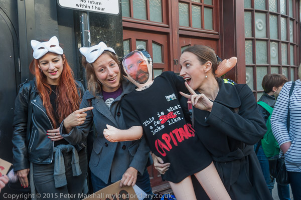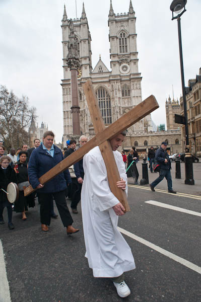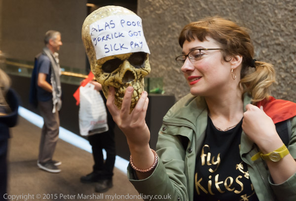
It’s all to easy to miss important details in the heat of the moment. The message on Yorick’s skull read “Alas Poor Yorick got NO sick pay”, but in my picture that all important word ‘NO’ is missing. If whoever wrote it on the skull had spelt Yorick right perhaps it would have been visible – or if they had put the word on the next line. What would have worked find on a flat surface was not so good for wrapping around a skull.
Had I noticed at the time I would have requested a slight adjustment of the angle. Although I don’t pose photographs I’m not so much of a purist that I would consider it a sin to do so. The woman holding the skull and gazing into it was doing so without me having asked her, and surely intended that my photograph showed the message in full.
Sometimes protesters hold up a poster upside-down by mistake, or a placard back to front. Sometimes I’ll photograph it like that, but more often I’ll point out their error.
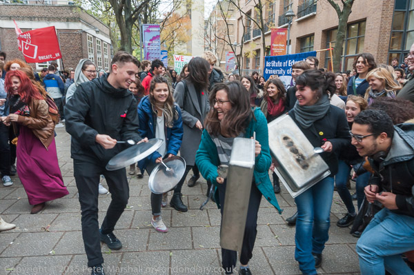
This protest inside the Barbican was organised as a ‘flash-mob’ and I’d been e-mailed the time at which it would happen by the organiser. I was a little worried about going back to the Barbican as I’d rushed in there with the same group of protesters only a couple of weeks earlier and thought I would probably be recognised by the security there and asked to leave, but if they did recognise me they said nothing.
I was there a few minutes early, and sat down close to where I thought the protest would take place in a foyer area and waited. At the appointed time, nothing happened, and I wondered if I had the details right. I recognised one or two other people also hanging around and went to talk to them – and we agreed that it was the correct place and time.
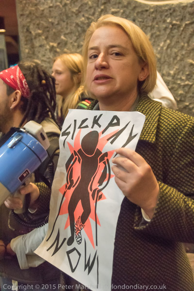
Green Party leader Natalie Bennett walked into the foyer and saw me and came over, telling me she knew she was in the right place when she saw me waiting, but there was still no sign of the protest. In a bar area below us there was a loud drumming and I thought it was perhaps the protest starting, but it turned out just to be a group there starting their performance.
Eventually I lost patience and got out my phone and did what I should have done 15 minutes earlier, and phoned the leader of the group who was coming to protest, who confirmed they had been held up and were still on their way and should be here in about 5 minutes. I passed the message around discretely among those I knew.
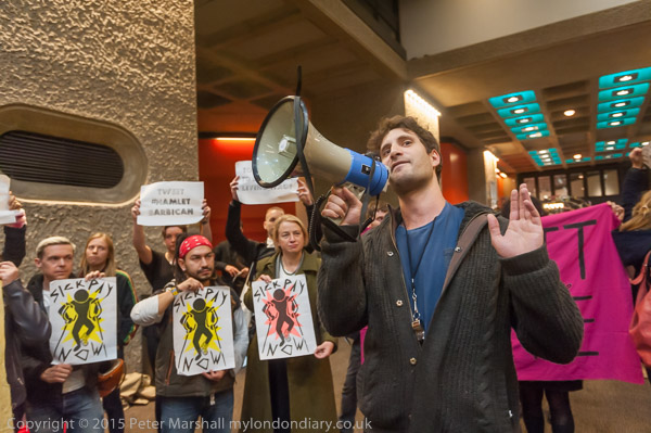
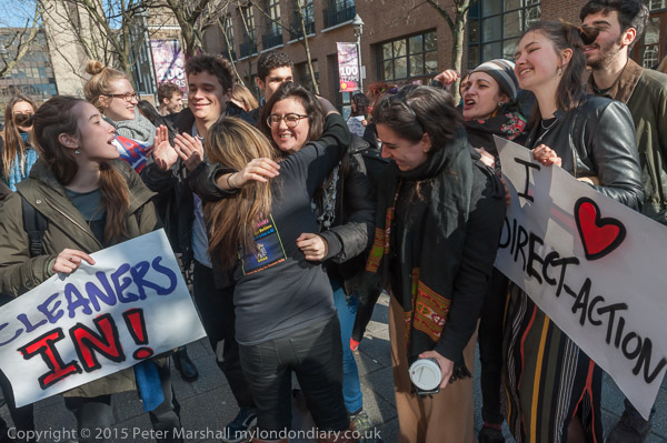
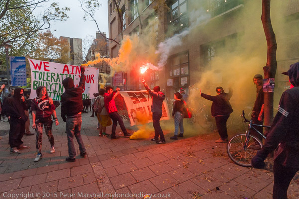
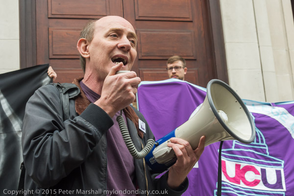
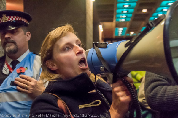
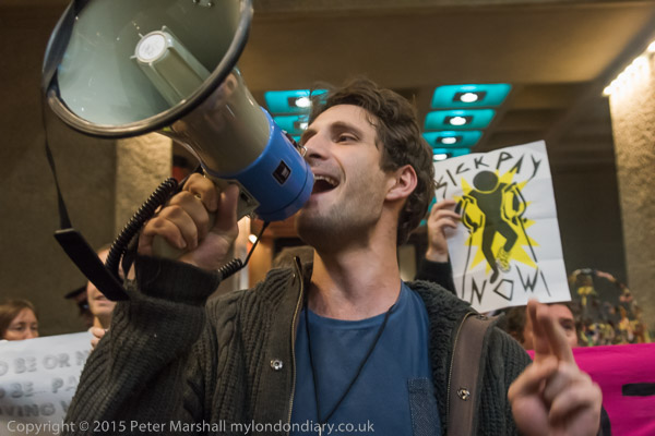
There was no mistaking it when the United Voices of the World arrived, as usual making a considerable noise.
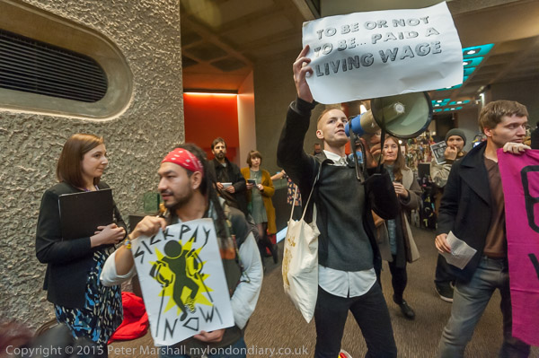
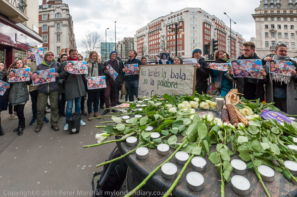
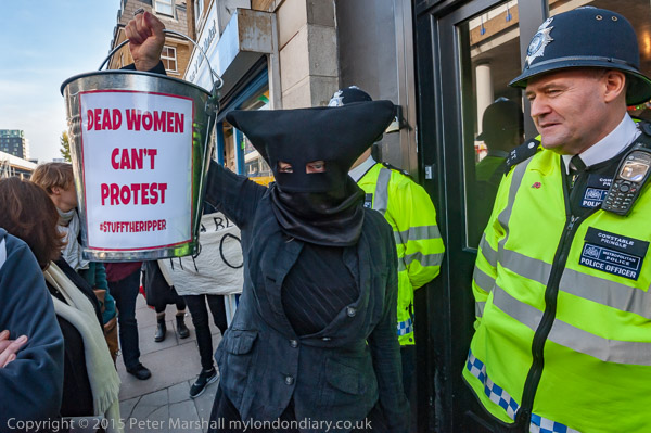
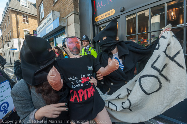
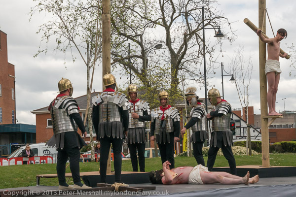
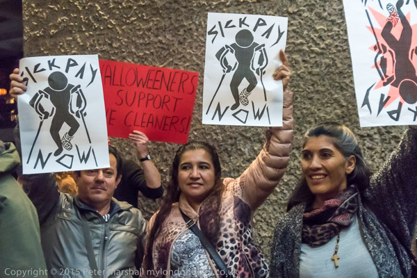
This protest, for full payment of the living wage, sick pay and proper holidays and pensions for the Barbican cleaners and an end to workfare in the centre had, as the first image suggested, a Shakespearian theme, as tonight was the last night of a season of ‘Hamlet’ in the theatre adjoining where it was taking place.
Missing the word ‘No’ wasn’t the only mistake I made during the protest inside. As usual I was working with two cameras, the D700 and D810, and while sitting waiting for the protest to start I’d set both of them to ISO 3200. I’d left the D700 on ‘P’ setting as the light is quite variable inside and using P saves having to think about it, but earlier in the evening had put the D810 on to ‘S’ to use flash. I left it on that setting and selected a shutter speed or 1/60th which would just about give correct exposure in most parts with the lens wide open.
Unfortunately it’s rather easy to change the shutter speed without noticing it, and it was about two minutes into the event before I realised I was working at 1/250th – at least 2 stops underexposed in most areas. I don’t like to look at images on the rear screen while I’m taking pictures – it interrupts my thoughts too much – and I was far too involved with what was happening to notice the figures along the bottom of the image in the viewfinder.
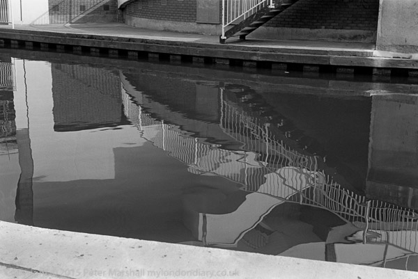
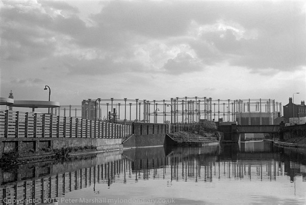
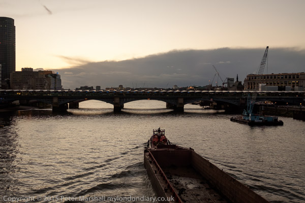
Immediately I changed to 1/60th, and rushed around trying to take similar images again – but that’s never possible. Water, bridge…
But later, Lightroom came to the rescue. On the web the difference in the two images above isn’t clear, though there is a slightly coarser and more saturated look to the upper one, at 1/250th compared to the lower at 1/60th. Working at 1/250th does have the advantage of being less affected by subject movement, and while the images effectively at around ISO 12,800 have a less smooth tonality and higher noise, they are in general faster.
Here are a couple of 1:1 details from the two images which show what pixel peepers will see:
Of course I need not have made the saturation as different as in these two examples. Clearly there is more noise at the higher ISO, but the increased sharpness really is more important.
Looking at the lower image – which seems adequately sharp at normal viewing sizes, I think the lack of critical sharpness is probably due to either subject or camera movement, perhaps both. Both would be ameliorated by using a higher shutter speed.
My conclusion is that my reluctance to raise the ISO beyond 3200 reflects my experiences with older digital cameras (and film). There really isn’t any reason not to work when in low light at ISO 6400 with the D810 (and the same applies to the D700.) When I replace the D700, which is slowly showing its age, probably I can add at least another stop and work at 12,400.
My other conclusion is that a faster lens might help, though anything with a wider aperture than f2.8 might give me depth of field problems. Unfortunately I’d taken the 20mm f2.8 out of my camera bag to lighten my load, but at 296g including lens cap and filter I doubt if I’d really notice the difference.
More pictures at UVW Hamlet-themed Barbican Flash-mob.
Continue reading Barbican Revisisted