‘The Gardener’ Jan Brykczyński (Dewi Lewis Publishing, 2015)
I have to confess to being a colourist. Someone who seems more affected than the general population and by the art photographic establishment in particular by colour. I had to quickly leave one room in Photo London when confronted by wall-sized images with a particularly nasty thin yellow cast.
My first real job was as a colour chemist, in the research lab of a company making dyestuffs, where small differences in shade were vital. For various reasons I didn’t stay in it long but perhaps something of it stayed with me. When I began as a photographer in the early ’70s, carrying two cameras, one for black and white and another for colour, I was seldom if ever in doubt about what was a colour and what and black and white image and my work in the two was quite different. I was, as a then eminent photographer commented on my work, a colourist.
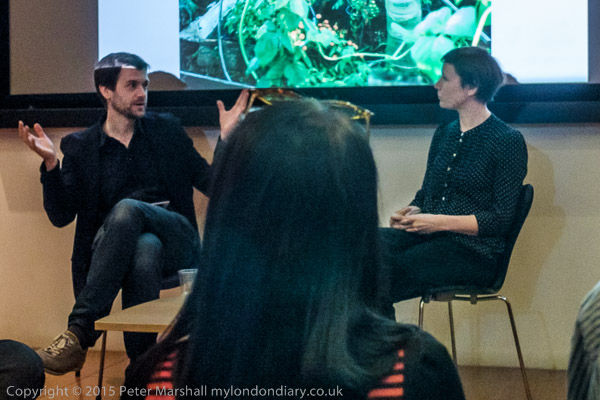
Jan Brykczyński talks to Diane Smyth at Photo London detail- apologies for poor quality
Few photographers now actually work in black and white, and most of those who do seem to think – if they think at all – in colour. Others certainly do think in colour, and Jan Brykczyński is certainly one of them, but his colour is rather different to mine – around R+3 B+7 different from both me and Photoshop, as I find if I put one of his images into that programme and examine the colour of a neutral shade.
It may not seem a great deal, but R+3 B+7 is enough to make me feel a certain nausea when I turn the pages of this book, and it gets in the way of my appreciating his imagery. I have a slightly smaller problem with the rather muted colours and contrast. Brykczyński uses a large camera (4″x5″?) and film, and likes to shoot on dull days, staying in and researching when the sun comes out, to lessen the technical problems of light and shade. Colour film has always been balanced for summer sun (or tungsten); back in the bad old days of transparencies you had to use CC filters when the sun went in to get the colour right, though with the switch to negative we got lazy and made the corrections on the enlarger and it almost worked. But breathed a huge scream of relief when digital gave us more accurate colour with far less hassle. Film has become relegated to a ‘look’, something one can apply to digital with what a less polite than me photographer referred to as ‘f**king up filters’.
I’m not criticising Brykczyński for having chosen a particular aesthetic with its desaturated and slightly unreal colour, just relating my own difficulties in approaching his work though a barrier which for me is hardly mountable but others may take in their stride; from his comments in the presentation at Photo London, the approach may in part derive from having to blend together images taken at different times in four very different areas. But personally I would have liked to have seen a book that represented differences in the conditions under which the images were made rather than attempt to minimise them for the sake of a perhaps spurious unity.
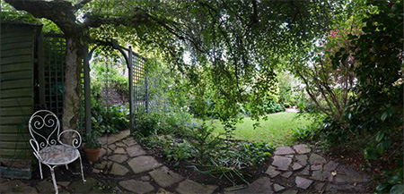
A very different garden image from ‘Secret Gardens of St John’s Wood’ by Peter Marshall’
As a photographer who has also produced a very different book on gardens I appreciate the problem of dealing with all that green. And back to that room I had to leave, some can live with (or at least work with) and pay very silly money for giant images I find nauseating.
Jan Brykczyński talks to Diane Smyth
So I struggled to appreciate this book, although the images there are at least clear. I felt for the photographer at the presentation, where his images on screen behind him and Diane Smyth of the BJP asking him questions were projected at a standard that would have disgraced an amateur gardening club in a run down church hall. It seemed a disgraceful contempt to the photographer and his work and the seriousness of his approach as well as to a paying audience. Some images from the position I was sitting, a few rows back from the front, were almost completely burnt out with the screen a glaring white.
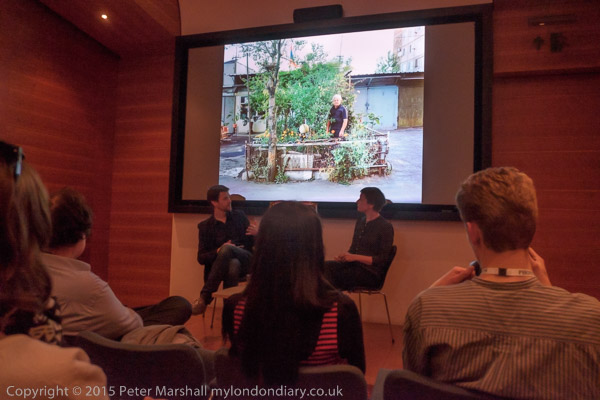
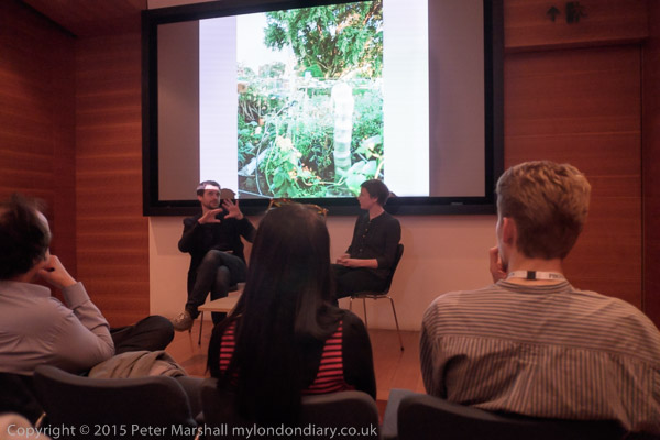
I took pictures only when a few images were better projected
The project looks at urban gardeners in 4 cities in very different states of development and with very different histories, Nairobi, New York, Warsaw, and Yerevan in Armenia, and seems to attempt to suggest à la ‘Family of Man‘ that whatever our social arrangements and historical development, at base people around the world are much the same. It’s a thesis undoubtedly close to the heart of a multi-national Swiss-based giant like Syngenta, and behind the singular title ‘The Gardener‘ that the photographs, mixed together as they are in the book, rather triumphantly overcome.
Perhaps behind the book there is a rather more subversive mind than the company hoped for. Perhaps I should make myself a pair of colour-correcting spectacles to enable me to get to grips with it more adequately. But you may well not share my personal problem.
Boiko, Brykczyński’s series on rural life among the Rusyn people (a small group of farming people who apparently consider the name Boyko derogatory) in the Ukrainian Carpathian Mountains which became his first self-published book is a fascinating series (and I have no problems with their colour), as too is the group of photographs of the sheep farmers of Árnes in Iceland that won him the Syngenta Award, with a grant to pursue the project and, later, to publish the book ‘The Gardener’.
Born in Poland in 1979, much of Brykczyński’s work has been on rural areas. He is a founding partner of Sputnik Photos, an international collective of photographers that focuses on transformation in Eastern Europe and post-Soviet states.
______________________________________________________
My London Diary : Buildings of London : River Lea/Lee Valley : London’s Industrial Heritage
All photographs on this and my other sites, unless otherwise stated, are taken by and copyright of Peter Marshall, and are available for reproduction or can be bought as prints.
To order prints or reproduce images
________________________________________________________
Peter, you comment about colour with regard to Jan Brykczynski, that “his colour is rather different to mine – around R+3 B+7 different from both me and Photoshop…It may not seem a great deal, but R+3 B+7 is enough to make me feel a certain nausea”.
A recent online newpaper article displays many illustrations of Felice Beato’s hand-coloured photos taken in Japen in the 1860s-70s. A newpaper website that is not the most attractive but in this particular case it would be interesting to know your reponse to that hand colouring.
http://www.dailymail.co.uk/femail/article-3092617/Courtesans-samurai-tender-family-scenes-Stunning-colour-photos-Edo-era-Japan-dating-1863-display.html
I think it very much depends on the nature of the work. Looking at the images in The Gardener I have a very different expectation from that when I view hand coloured photographs. Then I have no expectation of realistic colour.
Hand-coloured photographs are a rather curious hybrid, and have a peculiar quality – and sometime charm – of their own. We have a nice hand coloured portrait of my wife taken by an Indian photographer when we lived in Manchester, and hand-coloured in the UK. It doesn’t worry me that her green jumper came out as purple. nor that her skin tones are perhaps a little different to reality.
Of course I know the Beato images are really black and white photographs. If they had been presented to me as colour photographs I would have commented the colour was not at all accurate. But even the Mail is careful to refer to them as ‘coloured’ in the text even if the headline is misleading (as headlines tend to be.)
So these are really paintings made on photographs. They have a consistency and particular palette that I think is appealing. But its something that I think has little if any documentary validity. Who knows what colour any of the coloured parts of the image really were? From a documentary point of view I would prefer better prints made from the negatives in monochrome.
With colour photography, there is a range of ways a negative can be expressed (and with transparency a photographer might chose different films to acheive different colour interpretation.) On my Fuji camera I can dial in such renderings to acheive a Kodachrome look or Provia, Astia, Velvia etc (though I don’t do so.) But outside that relatively limited range where colour is to me believable it can just look wrong – as I think it does in this book.
Others may disagree.
I also wonder if the colours on the Beato prints are actually the same as when they were made. And I notice that only one of the images has any real tonality in the faces, and I wonder why this should be?