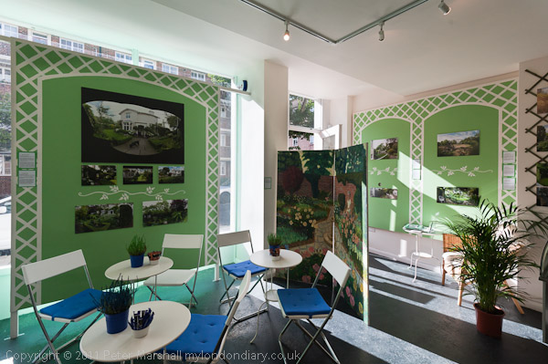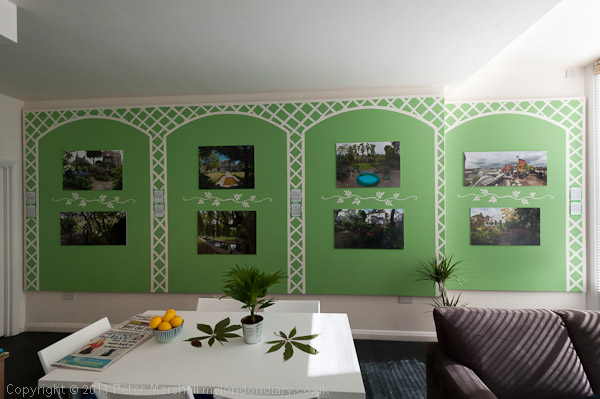
The larger print is 40″ wide. The screen by the door is by Jiro Osuga
My current show at the Queen’s Terrace Café in St John’s Wood is a novel venture for me in several ways. It isn’t the first time I’ve shown in a café, but it is the first time that a café has been revamped as an environment to match my work, with the main exhibition walls made into a kind of garden setting, with arches of trellis work and the various gardens in my pictures separated by painted ‘branches’ with leaves.
I’ve always in the past rather decried such things, preferring a classic white wall approach, along with prints on large white (or rather archival not quite white) mounts. I still remember the shock and distaste I felt at a Martin Parr show at the old Photographers Gallery many years ago which was cluttered with aqualungs and other shells and stuff and where the photographer turned up in Bermuda shorts. Good photography I thought (and still rather feel) is belittled and marginalised by such gimmickry; it should be treated with a proper respect.
The colour of the screens on which most of the work is mounted is a green that is more or less café’s own colour, used on its leaflets and other promotions, and it seemed appropriate for a gardens project. I tried to get the book cover the same green, but using the RGB values I was given gives a purer and brighter colour, perhaps the result of printing (as Blurb do) in sRGB colour rather than from AdobeRGB or as a spot Pantone colour.
The redesign of the gallery was by Jiro Osuga, whose also has a garden screen showing at the entrance to the café, and despite my misgivings I think it works well. It is after all a café rather than a gallery. The large prints in the show work well, and I think I was right to insist that given the way they were to be incorporated they should be shown without borders or frames. I would have been happy mounting the prints directly onto the walls, but the cafe insisted on them being mounted onto card or, for the larger prints, foamboard. It’s actually good to see the prints without glass. As well as the spaces shown in these two views there is another small area of wall with five of my prints.
The prints are C-types, made on Fuji Crystal Archive paper at The Print Space, and I chose the Pearl finish (they call it matt) rather than gloss. I had intended to make the smaller prints (A3 and below) in the show myself as ink jet prints, but given the low cost of A3 prints there I decided it made sense for me to pay them to make these for me, and I was very happy with the results.
There was a curious slight difference in colour balance between my printer and computer screen and that of The Print Space, both colour managed systems. To get matching results I had to apply a small colour balance correction to the files in Photoshop, generally R+5 M+3 B-7 in Photoshop’s colour balance dialogue, and also very slightly lighten the files using a vale of around 1.03 for the mid-tone slider in the Levels dialogue.
If you go to to the Print Space, you can of course check your files on their colour calibrated systems – and if you do it quickly they don’t charge for this. The charge if you take a little longer isn’t steep either. You can also look at them in their non-calibrated systems you use to put them into their system, which seem to be reasonably close in colour. All their systems are Macs, which I find just slightly less easy to use as I’m used to working on a PC, but the colour should be the same.
Unless you need to check colour, it’s probably best not to go there, but to upload your files from home. You then get the prices immediately, and will know if you have made a mistake in your image sizing. You can still save postage by going to collect the prints from the lab – and sending the files in advance they are likely to be ready when you arrive to collect, which saves waiting. But the one print I did order on-line and have posted to me arrived the following morning.

30″ and 36″ wide prints on the main display wall still look rather small
I calibrate my Eizo ColorEdge monitor using a Pantone i1 and print using either an Ilford generic profile for Ilford Gold Fibre or a printer specific profile produced by Chaudigital for their Da Vinci fine art paper (which is very similar if not identical to that sold as Innova and Permajet), which both give very similar results. I use Photoshop’s soft preview feature with the profile supplied by The Print Centre to preview my prints but I still have to fudge things a little to get accurate results. Colour management seems to almost work but not quite exactly.