It’s in the nature of Seesaws that they go up and down, and I have to say there is work in the summer 2008 edition of this on-line magazine that excites and work that depresses me.What depresses me is perhaps not so much a reflection on the photographers concerned, but more on the photographic education some of these photographers have recently suffered. That they occasionally manage to rise above it is a tribute to their talent.
Last year in Birmingham a number of us looking at portfolios were driven almost to breaking point over so many portfolios of work in which students had gone back to their childhood homes and explored their memories (or some such similar idea) producing images that may have had interest for them but frankly were worse than boring for the viewer. But although Betsie Genou‘s Les Moguichets is an example of this genre, I actually found the variation in the subject matter and her feeling for lighting and colour made this a series of pictures I clicked through several times and ended wanting to see more. And there are more at her own web site.
Rian Dundon’s black and white work on the Chinese born since the planned birth policy limited families to a single child is also well worth a look. After getting his BFA in 2003, he worked in China from 2005-8, and on his web site you can see more of his photography from China, the US and Europe as well as his writing about China.
The third set of pictures I found of interest was Latvia:Terminus Riga, a very personal and visual investigation of the city with some intriguing images. You can also see more of Iveta Vaivode‘s work on the Latvijas fotogrāfijas Gada balvas galerija 2007 site, including both fashion and five very wintry images in “Dārziņi” (at the bottom of the page.)
Teaching photographers is never easy, at least once you get beyond the basics (though many photography courses in this country have never quite managed to teach these – where I taught it used to be a constant refrain from students who came back to visit us after a year on a higher level course: “Thank God you taught us how to… , because nobody does here.”) What is difficult is encouraging people to see things in their own way and not to be afraid of actually looking both at the motif and their own photographs and seeing where the visual might lead them, rather than working from neatly expressed and constricting ideas or reworking themes that are currently fashionable.
Perhaps there are some hopeful signs in some of the work here that I’ve not mentioned, some glimpses of individual talents that may escape the academic straight-jacket that photography tied itself into from the late 70s. There are certainly some pictures I like among the portfolios, although I think there is rather more interesting work in the Seesaw archives.
Also in this issue Seesaw is a reprint of an interview with Ryan McGinley which more or less tells us exactly the same as every other interview or feature on him (including one I wrote a few years back) and its main claim to fame is that it was made on his 30th birthday. I wrote not long ago about OjodePez, the Madrid-based on-line magazine for which Seesaw editor Aaron Schumann guest-edited issue 13 on ‘This Land Was Made for You and Me‘, including work by McGinley. Schumann contributes three found images of a bare-breasted Tahitian dancer to this issue, found in Winchester (UK) in 2008. I can see no particular reason for finding these images and even less to publish them.
Dundon is one of the contributors to the fascinating collection – kind of a photographic version of fishing stories, where it is always the biggest fishes that got away – made by Will Steacy, ‘The Photographs Not Taken‘ with an essay on social conventions in China, ‘Drunk in Fujian‘. Here’s a completely gratuitous fish that didn’t get away, a 27lb pike caught in Hornsea Mere in 1907.
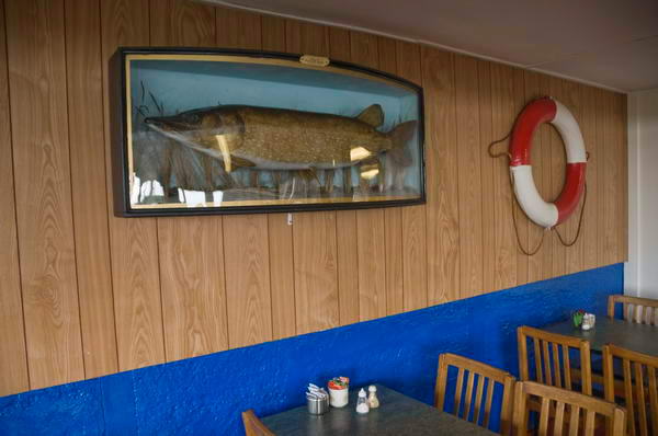
The Cafe at Hornsea Mere. (C) Peter Marshall, 2008


