Archive for the ‘Technical’ Category

I’d love to love Fuji, but

Monday, April 13th, 2015


Fuji X-T1, 18mm (27mm eq)

Around Easter I’ve taken some time off from my normal work and have spent a lot of time using the Fuji X-Pro1 and Fuji X-T1 cameras, mainly with the 10-24mm zoom on the XT1 and the 18-55mm zoom on the X-Pro1, but also working with my favourite 18mm and the 35mm Fuji lenses. At times I carried around some others, but didn’t find the need to use them.

It’s taking me a long time to get used to some of the idiosyncracies of the Fuji cameras, probably much longer than if I just used one of them. If I had to pick one it would be the X-T1, largely for its far superior electronic viewfinder. Though I do like the optical viewfinder of the X-Pro1, I’ve often found myself switching to the electronic alternative, as the zoom lens blocks a significant part of the optical view. It works rather better with the smaller 18mm and 35mm primes, where only a small part of the view is blocked.

If these – and others in this focal length range – would satisfy all my photographic needs, I’d prefer the X-Pro1, but I like to have both a wider and a narrower view.  With the 18-55mm, by the time the long end is reached, the viewfinder image with the optical viewfinder is just too small for my liking, making the electronic view a preferable option, and with the fine 14mm f2.8 too much of the image is hidden where the lens obtrudes into the optical viewfinder.

The X-Pro1 is a fine but very limited tool which does appeal to me as it feels a simpler camera to operate than the X-T1, but for me the flexibility of the latter is vital. For so many lenses it works better. Even with that 18mm, seeing the bottom right corner in the viewfinder is much better. And now I’m used to it, and don’t waste time searching throught the menus for it, I very much like having a dial on the camera top putting ISO at my fingertips. Being able to walk from dark interior to bright sun without having to fiddle with menus is great.

I find switching from using a camera with a direct vision optical viewfinder to an electronic viewfinder can be confusing. Using mainly DSLRs and the X-T1 it’s just too easy to get into the habit of thinking if the image is sharp in the viewfinder it will be in focus on the sensor – and I have made many, many exposures that prove it just ain’t so. The occasional arty blur might be of interest, but to find you’ve taken 50 in error because you forgot to change back from manual focus can be annoying. With the 18-55mm at its wide end, depth of field may be your friend and cover your stupidity, but it doesn’t work at 55mm.

Of course it should be obvious that you are still on manual focus – no little green rectangle confirming focus – but in the heat of the moment it can be so easy to forget this. And if you are not photographing in the heat of the moment, perhaps you should ask yourself why you are bothering to take pictures at all.

I think now that I have finally figured out most of my problems with Fuji colour in Lightroom.  I’ve been using the X-Pro1 on and off for a couple of years and have always been surprised at how many people enthuse over Fuji’s colour rendition. Even though I think I’ve now discovered how to deal with it, I still often prefer Nikon colour.

The best result I’ve got with Lightroom come from changing the ‘Camera Calibration‘ from the normal ‘Adobe Standard‘ to the Fuji ‘Camera Pro Neg Std‘. It seems to give better colour than the camera Provia/Standard that I normally use for in-camera jpegs and the viewfinder/screen image (it seems wrong to use a different setting for camera and Lightroom, though the camera setting doesn’t affect the RAW file, but working this way seems to give me a better match between what I see in camera and the developed files.)

Setting up a development preset that applies this and uses Auto-tone produces images that need little adjustment – similar in that respect to my Nikon files, while with Adobe Standard they were a problem to deal with. Though there still seems to be an undesirable propensity for pink in Fuji’s auto white balance to correct. Lightroom’s Auto-tone perhaps works even more reliably than with the Nikon files, though this may be a reflection on the less challenging situations I’ve used the Fujis in.

I have a small issue over file sizes. Fuji’s similar quality to Nikon comes from files with a roughly similar number of pixels, but while the RAW files from the D700 average out at around 11Mb, the Fuji RAW files are roughly two or three times that size. The 16GB cards I now mainly use in camera get filled up rather fast, particularly on the X-T1, and I’ll probably buy larger ones; transfer times to the computer and into Lightroom are noticeably longer, and my external storage is filling up at a faster rate. Nikon’s compression with no real life noticeable quality loss is very useful.

Fuji battery life is a problem, even using mostly the optical finder on the X-Pro1. Nikon batteries hardly ever need changing during a day’s work. I carry spare batteries, but hardly ever need to use them, and have to remember to swap them over occasionally or the spare loses its charge over months. Working with the two Fuji cameras, at the moment I have a total of five batteries. Just enough to see me through a day of fairly light work, but I really need at least one more. Expense isn’t a problem, with replacement batteries being fairly cheap, but it’s a nuisance having to carry and to change them.

Overall I’m feeling rather frustrated with the Fujis. With the Nikons I can turn them on when I get the cameras out of the bag, and turn them on when I pack up. Between those times – often hours apart – every time I put my camera to my eye and press the shutter release, the camera takes a picture, almost every time in focus and with hardly any perceptible hesitation.

With both Fujis, things are rather different. Unless you are going to be taking pictures every few seconds, it’s quicker to switch the camera off, then turn it on when you want to use it again, waiting the roughly two seconds start up time, otherwise you can be pushing the button and swearing for even longer until the camera wakes up.

Focus, even with the improvements from firmware updates, still takes a noticeable time, but its the time taken to persuade the camera into life that is for me the real killer.

For some photography with wide-angle lenses in fast-moving situations you can of course do what we always used to do, turn off autofocus and rely on depth of field, using ‘zone focussing’. Once it’s up and running the X-Pro1 with the 18mm does the Leica thing rather better than the Leica M8 I used to use, and about as well as the real thing.


X-Pro1: 18mm, 18-55mm (27mm eq)

I have had some issues with framing using the 18-55mm with the optical finder of the X-Pro1, though these may well be down to me rather than the system. Certainly I seem to chop off the tops of people’s heads rather more than when working with the similar frame inside the view with the 18-105mm DX on the D800. And using the Fuji combination yesterday, at times the bright line frame was fading away as I was working, which was not good news. I fear an expensive repair may soon be needed.

So, much though I like the Fuji cameras, and much though I prefer to take them with me when I go out for a long walk or some relaxed occasion, they won’t be replacing the Nikons for much of my more intensive work. Perhaps I might just try working with a hybrid kit, with the X-T1 and 10-24mm replacing my ageing D700 and the superb but heavyweight Nikon 16-35mm. Perhaps. I’ll certainly give it a try before getting around to buying a D750.


Fuji X-T1, 10-24mm at 15mm (22mm eq)

For some photographs, that couple of seconds wait isn’t a problem, nor the slight pause you get between the shutter press and exposure. Some people wouldn’t even notice it, but when you are used to a camera without appreciable delay it annoys. Catching the moment is often vital in photography; catching the moment a little after just won’t do.

While in this post I’ve concentrated on some of the negative aspects, particularly for certain types of work, there are also some very positive aspects of the Fuji. Working in quiet environments, the quiet (or truly silent in electronic mode on the XT1) shutter is a great advantage, both to me as a photographer and in preventing annoyance to those you are photographing, and fast lenses such as the 35mm f1.4 combined with good high ISO performance are great in low light on the X-T1. I’ve often found myself while working wishing I had this camera in my hands instead of a rather clunky Nikon with a slowish zoom. The 23mm f1.4 is more expensive, and I’ve not yet bought one, but I’m tempted by this and the weather resistant 18-135mm …

(more…)

March 2015 complete

Saturday, April 11th, 2015

I fell asleep around midnight last night trying to finish putting my work from March on to My London Diary, waking with a start to find a black screen in front of me, and when I moved the mouse to rouse the monitor from its dreams, found myself facing a blank page where I’d almost completed the coding. In my daze it seemed something of a calamity.

Fortunately hitting Ctrl+Z to undo my last action – presumbably hitting the space bar with the page selected as I collapsed on the keys – restored my work, although had I been thinking clearly I would have realised that only the few keystrokes I had made since the last saved version would in any case have been lost. But it was certainly time to give up and go to bed. And finish the work the following morning, which I now have. I think there are 40 stories from March, though not all have a great deal of content, and a couple are just pictures from my occasional days off.

But I’m also aware of the many events I’ve been aware of but been unable to cover, invitations I’ve had to refuse because I have to be at another place. We are indeed living in interesting times, and it is something of a curse.

Mar 2015

Another Country Walk
Cross Bones Open Day
Murdoch on Trial – Guilty as charged


Jon Bigger Class War South Croydon
RMT protest Ticket Office Closures


Sweets Way at Annington Homes


Quiet Night at Poor Doors
Occupy Rupert Murdoch
Around Tower Bridge
Arrest Warrant for Rupert Murdoch
John Lewis customers support Living Wage


Stand Up to Racism Rally
Britain First Protests anti-Racist March
Stand Up to Racism March
Great British Tax Robbery
Bermondsey Walk


Poor Doors blocks Rich Door
Unite protest against Benefit Sanctions
Dolce & Gabbana Boycott
Debt Resistance UK #Blockupy solidarity
Free Shaker Aamer vigils continue
Savage cuts to Adult Education budget
Stratford to Hackney Wick
Class War go to Aylesbury Estate
Class War celebrate Election Launch
Class War Chingford Election Launch
Free the Hares boys protest at G4S


Poverty pay at the Royal College of Art
Save Our Lions – ban Canned Hunting
Let Ife Stay in the UK!
Police seize Class War banner
Viking longship invades Tate steps
Climate Change Rally


Time to Act on Climate Change
Poor Doors Zero Police
Aylesbury Estate Occupiers Move
Homeless Persons Matter
Mexican President told Stop the Killing
Shut Down Yarls Wood


Maximus – Same Circus, Different Clowns

As always there are many more pictures from most of these events on My London Diary if you follow the links, and in some cases some fairly lengthy stories.

(more…)

To the Tower!

Thursday, April 2nd, 2015

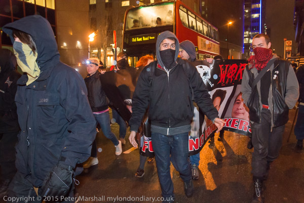
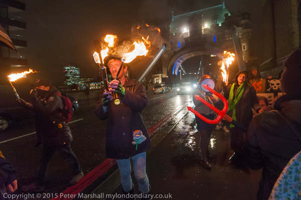
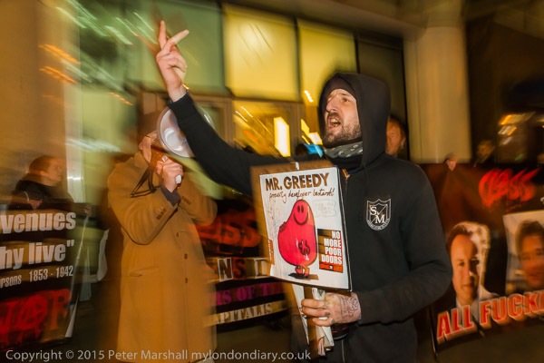
I think the image above captures something of the atmosphere of the march by Class War from ‘Poor Doors’ at ‘One Commercial St’ in Aldgate to the building site at ‘One Tower Bridge’, which as its name suggests is next to London’s trademark structure. It was an interesting event in several ways, and you can read more about it and see more pictures at Poor Doors to Rich Gardens on My London Diary.

The Exif data also makes interesting reading, at least for photographers, and here is a summary, copied with minor editing from viewing a larger copy of the image in FastPictureViewer Pro:

1/60s, f/4.5, ISO 3,200, -2.3Ev
Mode: A, Meter: Matrix, Flash, Auto WB
Focal: 18mm, 19/02/2015 18:46:20, Adobe RGB (1998)
15.4MP (4,800×3,200) NIKON D800E, 18.0-105.0 mm f/3.5-5.6, (C)2015,Peter Marshall

You can see that I was working in aperture priority mode, which surprises me slightly, as more often at night with moving subjects like this I use shutter priority, setting a shutter speed that will let me control the blur from ambient light, or more often still, manual, so I can chose both aperture and shutter.

The DX lens at 18mm has a maximum aperture of f3.5, so I had chosen to stop down by almost a stop, probably to get a little more depth of field. My focus was on the central figure, perhaps around 2.5 metres away, which would render anything from around 1.5 to 8m sharp at f4.5, while at f3.5 this would only have been from 1.7 to around 5.5m.  Or perhaps I just felt that most lenses do get noticeably better if stopped down one stop (or usually better still two.)

With the camera on A setting (aperture priority) the camera selects the shutter speed, and it seems to do so on the basis of the ISO and the +/- Ev setting when I test. So ISO3200 and -2.3EV should I think mean it was actually using ISO 640, but the actual results are very different from those at that setting.  But I give up trying to work these things out, just set things up and alter the exposure compensation until things seem to work. At night you always need a stop or two compensation or the camera will make it look like daylight.

Of course using flash I could have stopped down more. The SB800 I was using is a reasonably powerful unit, and had I left the camera on P, Nikon would have had me using it at a rather ridiculous f10, and the picture would have been a dismal failure with little or nothing visible behind the front trio.

It’s also a picture that needed considerable post-processing. The figure at left was rather close to the flash and needed rather a lot of burning in. The other two close figures also needed some, and parts of the subject further away needed to little brightening.  Almost all flash images need some help in this way to get closer to how the scene actually appeared.

Another problem in using any light source at night is colour temperature. Flash is daylight balanced, and the ambient light seldom if ever is. In some pictures the difference isn’t important, but in others it becomes very noticeable. Occasionally it’s an interesting effect, but more often a distraction – and one that can be overcome with a little post-processing.

Flash also produces an unnatural effect in this image with a number of translucent white spots of varied sizes – for example between the skull and the W on the banner at the right of the picture. These are reflections of the flash from out of focus rain drops. It isn’t really something that was a part of the scene, but an artifact of the way that the image was produced, and although the WPP or Reuters might not agree, I’d have no compunction about removing any of them if I felt they obtruded on the image that I saw when I made the exposure. But fortunately I don’t feel they do in this case, they are just one of the happy accidents of the medium that I embrace.

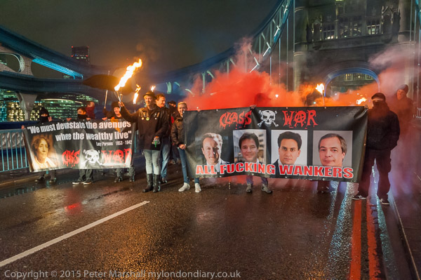
I chose the second image here partly because I thought it would be nice to have one of Tower Bridge.

It shows Class War blocking the bridge with flaming torches and with two banners including the ‘Political Leaders‘ which on a later occasion the police seized. Again, here’s the Exif data:

1/50s, f/4, ISO 3,200, -0.7Ev
Mode: M, Meter: Matrix, No Flash, Auto WB
Focal: 29mm, 19/02/2015 19:09:53, Adobe RGB (1998)
12.1MP (4,256×2,832) NIKON D700, 16.0-35.0 mm f/4.0, (C)2014 Peter Marshall

The 16-35mm is pretty usable wide open, and there was no reason to stop down. Although this was taken without flash, I was using additional lighting, otherwise the banners and the faces in shadow were rather dim.  Although I’m really a little out of range for the Neewer CN-216 with its 216 LEDs, it has done just enough.

It isn’t the sharpest image I’ve ever taken, but just sharp enough, with just slight problems caused by subject movement at 1/50s.

You can find the CN-216 (sold as Neewer, NanGuang and other brand names) on Ebay for £25-30 (or you can pay more) and it has a smaller and some larger brothers. I’ve tried a CN-160 which is nicely small (it fits in my jacket pockets) but the extra power of the larger CN-216 seems just worth having. The CN-304 probably gives a little more light still, which would be useful, but is significantly larger and heavier. (They also make yet larger and yet heavier versions branded EPHOTO which might be worth investigating for studio use.)

The CN-216 seems very useful used at ISO 3200 within 2-3 metres of your subject, and with the diffuser in  place gives reasonably even lighting for a 35mm lens. Fall-off is noticeable with real wide-angles, but that isn’t always a bad thing, and like lens vignetting can usually be compensated for in post-processing if necessary.

Light output is controllable by a dial, which is also the on-off switch. I’d prefer it to have a separate on-off switch as, having to rotate it to full power for almost every use is annoying. The switch is also rather easily knocked on while in your camera bag and will then run down the 6 AA batteries – though supposedly they last for two hours. I now tape down the switch in transit, moving the tape to an adjacent part of the body while the unit is in use.

You can fit the unit into a hot shoe, or simply hand hold it, which gives more control over the lighting. The hot-shoe mount is a little flimsy and only allows up-down adjustment, but I find it handy to park the unit on top of the camera.  The light comes with two filter sheets that slide over the top, one a clear diffuser to give 5600K daylight and the other amber giving 3200K. Probably the amber is more useful in terms of colour balance, but it does absorb a little light.

I’m unconvinced the diffusers give a greatly more even spread of light. The clear diffuser cuts down the light by around 2/3 stop and the amber by around another stop, so it might well be better to use the unit without either.

All of the pictures in Poor Doors to Rich Gardens were taken either with flash or with the CN-216, though in some the flaming torches were often themselves a significant light source. Getting detail in the flames and in the subject can also be rather tricky!
(more…)

Feeling Blue

Tuesday, March 17th, 2015

Anna Atkins was born 216 years ago on 16 March 1799 and the anniversary was celebrated by Google this year with a doodle.  Her Photographs of British Algae: Cyanotype Impressions in October 1843 is generally thought to be the first book to have been produced – if only in a very limited edition – with photographic images.  These were ‘cyanotype impressions’, photograms of handwritten pages and of the algae specimens.

The cyanotype process had been invented by Sir John Herschel the previous year, and is a simple process to use for making prints, and is now often used in children’s workshops as well as for some more serious work. There were later adaptions and improvements to it (most recently by Mike Ware who thoroughly investigated the process and came up with a technically improved ‘New Cyanotype ‘.)

I’m not aware of any evidence that Atkins ever used a camera, though she has sometimes been cited as the first woman photographer. Certainly no camera produced images made by her have survived, nor are they any by another woman also awarded the title, Constance Talbot, the wife of the inventor of photogenic drawing and the calotype. Possibly one or other of them was the first woman to print a photograph.

I would describe the pages of ‘British Algae‘ as photograms rather than photographs, in a distinction I feel useful, though certainly not one that has always been present in photography. Until the 1930s it was common to use the term photogram interchangeably with photograph, and I have a number of copies of the annual publication ‘Photograms of the Year’, none of which contain what we would now call a photogram.

I have to admit that I’m not in general a great fan of cyanotypes, and have only kept a few of those that I have made. Several of them are from a session photographing a nude female artists model, something I’ve done very rarely, and were taken on 5×4″ during a workshop session where it was important to have a suitable subject on hand to produce images in a fairly limited time.

The problem I have with cyanotypes is that they are blue, and often not a very pleasant shade of blue – certainly one that does nothing for the model in this image.

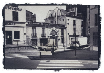
It doesn’t really suit this street image either, but it illustrates one of the common problems of the traditional cyanotype – it is very easy to lose highlight detail. The problem here is partly that the negative was made for salted paper printing and has a very high contrast, too high for a good cyanotype print. Much better as a salt print.

It is possible to moderate the blue colour, and there are various ways to tone cyanotype images, though the results are not always permanent. In this case I started with a slightly weak salt print, and rather than throw it away (good quality watercolour paper costs as much as bromide paper) I overprinted it in register using cyanotype. The result was mildly interesting and I made a few more prints that way. Most but not all of the salt print disappears during the overprinting butas the image above shows, the blue is considerably altered.

And for the final image, I carefully avoided painting the cyanotype solution over the poster at right in the initial salt print.

But then I came to my senses and realised that I spending far too much time playing with chemicals and not spending enough of it on taking pictures. And a few years later I found that inkjet printing was a far more flexible way to produce images.

February Finished

Wednesday, March 11th, 2015


Class War block Tower Bridge – and the banner than police threatened arrest over the following week

I had  late night last night and finished uploading images and text to My London Diary for February 2015.

I’m still catching up after several weeks of computer problems, and my heart sank yesterday morning when my desktop seemed to be refusing to start up. The initial checks before Windows start to load normally only take a few seconds, but yesterday it was over 5 minutes. I went away, did something else and came back to find that eventually it loaded.

So I took a little look at the Windows log files etc, ran the troubleshooters and there wasn’t anything that told me I had a particular problem (or at least not anything I didn’t know about and have been living with for ages.)  Later I found from Skype that my microphone wasn’t working and that told me I had no sound card. Well I knew that – its on the motherboard! But other than that everything seemed to be working OK.  But I decided that while I had the computer on and working I’d get February completed in case it wouldn’t start up again – and around 15 hours later I had, although perhaps given more time I would have written more about some of the events.

I also did something I’ve been meaning to do for some time, and blew the dust out of the computer. My previous machine died after it had collected so much dust inside that one of the fans stopped working, and it overheated. I’ve been meaning to open the box and give this machine a spring clean ever since, and today’s problem prompted me to do so. It was pretty dusty.

Today, to my relief, the computer started up more or less normally. The microphone still wasn’t working, so I removed and replaced the USB wireless link for my microphone, then pressed the ID button to link it up, and that’s now fine too. But much as I like the advantages of digital photography and computer processing and the web, I still feel uneasy about having to rely so profoundly on sometimes temperamental systems that none of us truly understands.

Anyway, here is February:

My London Diary

Feb 2015


Judging the cake competition
Grow Heathrow’s 5th Birthday
People’s Republic Of Aldgate Free Speech Fight


Lambeth against £90m cuts
RMT protest Underground Job Cuts
Welfare Advocacy not a Crime


Striking Firefighters block traffic
Free Shaker Aamer at Parliament
Bracknell Forest
Take Back Our World – Global Justice Now
Shoreditch & Brick Lane
Poor Doors to Rich Gardens
End Isolation Torture for Kevan
Deport Altaf Hussain


Let Greece Breathe!
Occupy Democracy return


Venus CuMara Reclaim Love 13 at Eros
Valentine Day – 13 years for Shaker Aamer
‘BadBoy Borises’ in Global Divestment Day


Poor Doors Truce Over – It’s War!
Muslim Lives Matter – BBC protest
Aylesbury rubble to Southwark Council


Surround Harmondsworth 6
Burberry Cleaners Strike
Sanctions protest at Croydon Job Centre
Getting By – Lisa’s Book Launch
Aylesbury Estate Occupation
Around the Elephant
No Privatisation At National Gallery
Close Guantanamo – 8 Years of protest
(more…)

Salted Paper Prints

Wednesday, February 25th, 2015


Paris Xe, 1988 Salt Print – Peter Marshall

To coincide with the opening of Salt and Silver: Early Photography 1840 – 1860  at Tate Britain, here is a slightly updated version of a piece I wrote some years ago on salt prints, including step-by-step instructions on making them and four examples of my own efforts from the late 1980s.

Key Facts

  • ‘Photogenic drawing’ used ordinary paper which had been given a coating of silver chloride or similar light-sensitive silver salt.
  • Prints were made by placing objects on this paper and exposing to light. In the 20th century this way of working was named as a ‘photogram’.
  • Photogenic drawing was a printing out process – the image actually appeared during the exposure to light.
  • Photogenic drawing can also be used as a method for contact printing from negatives – prints made in this way are known as salted paper prints or salt prints.
  • Contact printing requires the negative to be held in close contact with the printing paper, usually in a special printing frame, while being exposed to light through the negative.
  • Exposure times in salt printing vary from around 10 minutes to 8 hours depending on the strength of the light source and how transparent (or translucent) the negative material is.
  • As with all contact processes, the print is obviously the same size as the negative.
  • Talbot fixed his images by using strong salt (sodium chloride) solution, or a weak potassium iodide solution. Neither was totally effective.
  • Later, Herschel’s suggestion of hypo (sodium thiosulphate) as fixer was adopted. This was fast and totally effective.
  • By repeating the sensitising process several times, Talbot found he could increase the speed of the salted paper sufficiently to use in a camera obscura.
  • Typical exposure times in the ‘camera obscura’ were around 30 minutes, with apertures probably around f8 in modern terms.
  • The paper negatives were fixed and then often made translucent by treatment with wax or oil before being placed on top of a fresh sheet of sensitised paper and contact printed using sunlight as the light source. Typical printing times would be around 30 minutes to an hour.
  • Although rapidly superseded for use in the camera by the Calotype process, the basic salted paper print was the normal process for photographic prints on paper until replaced by the albumen print around 1850.
  • After 1855, salted paper remained in use mainly as a proofing medium and by a few who preferred its matte image. It saw a revival in the 1980s and 1990s as a part of a growing interest in historical and alternative processes

Talbot’s method

  1. Talbot started with a sheet of best quality writing paper ‘with a good firm quality and smooth surface’.
  2. This was dipped it into a weak solution of common salt and then wiped dry
  3. The sheet was then coated on one side with a weak solution of silver nitrate (a saturated solution diluted with six to eight times the amount of water) and dried in front of a fire.

The paper was then ready for use for making photogenic drawings or as Talbot more poetically wrote ‘nothing can be more perfect than the images it gives of leaves and flowers, especially with a summer sun : the light passing through the leaves delineates every ramification of their nerves.’

A more modern version of this procedure is still used by those photographers today who wish to make salted paper prints – also known as salt prints – see below for directions.

For use in the camera, the speed of the material needed to be increased. Talbot found he could do this basically by repeating the treatment. He first washed the prepared paper with a saturated solution of salt, and dried it. Tested at this stage it was more or less insensitive to light, but if re-brushed with ‘a liberal quantity of the solution of silver’, it became more sensitive than before.

By repeating the coating several times, it would become fast enough for use in the camera (though his exposures might be 30 minutes.) Talbot obviously found the process rather unpredictable, noting that sometimes the paper would begin to darken without any exposure to light, showing the process had been taken too far.

After each coating with silver, he clipped a small part from each of the sheets he was working with, numbering them carefully to correspond to the sheet, and ‘placed (them) side by side in a very weak diffused light for about a quarter of an hour.’ If one of them darkened considerably, the corresponding sheet was ready to be exposed in the camera obscura. It was a crude but effective system of control for a process where there were too many variables to guarantee success by simply following a given procedure.

Talbot’s results

Looking at Talbot’s early results from the camera – or rather at reproductions of them – it is not surprising that they were generally not regarded highly compared to the splendidly sharp and detailed daguerreotypes. In some cases it is hard to see any image at all, others are more weak splodges than detailed pictures. His first existing negative shows a window made of small panes, and on the back he notes that it was possible to count them all when it was first made. Presumably it was no longer possible when he made the note. The image is certainly not now highly detailed and the shadows in particular are completely empty.

Although the photogenic drawings – made as what we now call ‘photograms’, by placing objects such as leaves and lace on the paper – have considerable elegance and are finely delineated, his early camera attempts can only be seen as suggestions that it might be possible to get the process to work rather than as a successful solution. It was a problem that Talbot was to solve himself in the following years with the Calotype process.

The major problem was of inadequate sensitivity to light. These first photographic materials relied entirely on the printing out of the image, which is slow. In the Calotype, Talbot made use of what became to be called a developer to amplify the effect of the light, bringing out the ‘latent image’ from the apparently unchanged paper. It was this discovery that was really to lead to the domination of the next 160 years of photography by silver based materials.

Another aspect of the problem that Talbot faced was inadequate fixation. After exposure he either washed the paper with a dilute solution of potassium iodide or a strong solution of common salt before ‘wiping off the superfluous moisture, and drying it.’ The potassium iodide solution formed silver iodide that was largely insensitive to light, but too strong a solution would dissolve parts of the image. As he had found in his repeated coating, using a large excess of salt solution produces a very low light sensitivity. However images fixed in these ways still faded in light – and certainly the bright sun needed to expose through the paper negative will have also caused fading of the negative.

When Talbot visited Herschel at Slough on 1 February 1839, he received a solution to the problem. Herschel’s wife, Margaret, noted in a letter to a friend that ‘when something was said about the difficulty of fixing the pictures, Herschel said “Let me have this one for a few minutes” and after a short time he returned and gave the picture to Mr Fox Talbot saying “I think you’ll find that fixed” – this was the beginning of the hyposulphite plan of fixing.’

It was also Herschel who provided a clue – in the shape of gallic acid – that was to be the key to Talbot’s discovery of the latent image and development in the Calotype. There are many of us who have made prints using salted paper and even a handful of photographers currently using the Calotype process – some have used actors to recreate Talbot’s later pictures at Lacock Abbey. The recreation of images in camera obscura using his methods, and making prints from these again following his directions would perhaps be an interesting project. It is the only way any of us can possibly see these kind of images in the same condition as when Talbot made them.

Make your own Salt Prints


Montreuil, Paris, 1988 © Peter Marshall, 1988.
Gold toned salt print on Georgian Watercolor Paper.

Ordinary writing paper is now factory produced and no longer of suitable quality for any of the alternative processes. Machine made papers generally have shorter fibres and fall to pieces readily when wet, and you need to use a suitable hand or mould-made paper, usually sold for use in watercolour painting.

Silver nitrate needs to be handled with care – you should use gloves and wear safety glasses. When handling any finely ground chemical powder a mask should be worn. Silver nitrate is a poison that can build up in the body and it can both burn and stain skin. It produces stains and marks that are often very difficult to remove from some surfaces.

Like all chemicals, both solid and solutions should be kept in a secure place, locked away from possible reach of children. Silver nitrate solutions are sensitive to light and are normally stored in brown bottles, but it also helps to keep them in a cupboard.

Procedures normally give precise quantities required for solutions measured in grams. However, there is seldom any real need for great accuracy, and many people have made salt prints without using any weighing equipment. Chemicals such as silver nitrate will generally be bought in fairly small quantities and you can make up the full amount into an appropriate solution.

  • You can use ordinary table salt or sea salt, making up a solution of roughly 1-2 ounces (25-50g) per litre of water.

Other salts, which some people prefer, include ammonium chloride, potassium citrate, potassium tartrate and potassium bromide. You will often get small differences in image colour and paper speed using the different salts or mixtures of them.

  • The silver nitrate solution is generally around 10-12% by weight – so you can dissolve 7g (1/4 oz) in around 60ml of water.

I’ve used a range of watercolour papers, including Waterford Hot Pressed which was possibly my favourite, along with Rowney’s Georgian. Some other papers give better results if coated with a dilute gelatin solution and left to dry before use – this is called ‘sizing’ – but Waterford works well without. Most watercolour papers are already sized when you buy them, and extra sizing is often not needed. You will get good results with most papers.

You also need a brush to coat the paper with – a wide, thin brush is best. Japanese hake brushes which do not have metal ferrules are probably the best, as the silver solution corrodes metal.

Salt printing is a contact printing process and you need a negative the same size as your print is to be. Unless you have a large format camera you may like to follow Talbot’s examples and start work with photograms, using materials such as leaves or lace etc. If you do have a large format camera, take a picture specially and try doubling your normal development time as you need a much higher maximum density than normal for salt prints. You can also work by printing large negatives with an inkjet printer, preferably on to acetate film designed for inkjet use. Prints on paper do work – better on thin paper – but exposure times are much longer. You can also work with negative prints made on photographic paper.

Talbot used the sun for his exposures, which meant the times he could work in England were limited. Unless you are blessed with a sunnier climate you may want to find another light source. You need something which is strong in ultraviolet, such as a tanning bed – or you can buy or make special light sources using mercury lamps or UV fluorescent tubes similar to those in sunbeds.

A printing frame is needed to hold the negative in contact with the paper. You can buy or make these, but a sheet of plate glass and a card or ply backing board with some rubber bands round will do (for large prints the weight of the glass is enough to ensure contact.) These were once cheap photo accessories, and small sizes (such as 5″x4″) can still be found cheap in junk shops. I had a good look at an expensive hand-made version, particularly the price-tag, took out a pencil and designed my own, which took about an hour to make. Precision freaks will want a vacuum frame!


St Denis, 1988, © Peter Marshall, 1988. Gold toned salted paper print.

Step by Step Instructions

Making a salt print

      1. Tear or cut the sheets of paper to the size required – you need at least a one-inch margin around your negative. Mark the top side of the paper on each piece.
      2. Make up the salt solution, soak the paper in it for 2-3 minutes at room temperature or slightly above, gently brushing each side while under the solution to remove any air bubbles. Lift out, drain and hang to dry, putting down newspaper if necessary to catch the drips. Paper treated in this way can be used as soon as it has stopped dripping or dried and used weeks or months later.
      3. Tape the salted paper top side up to a board. Put the negative on top and mark the position of its corners lightly with pencil.
      4. In dim room lighting (away from sun and fluorescent lights), pour a few ml of silver nitrate into a small beaker or dish. Dip the tip of the brush in, and spread left to right across the paper making sure to cover the marked area. Keep the brush wet. Repeat using a series of top to bottom strokes. Try to get the surface of the paper evenly wet all over, but without any pools of solution. Don’t return any excess the solution to the bottle; add a little more to it to coat the next sheet. Leave horizontal until any liquid on the surface has been absorbed, then hang to dry in a dark place. Use gentle heat from a hair-dryer if you are in a hurry to get on.
      5. Put your negative on top of the dry prepared paper, matching its corners to your pencil marks. Unless you have a proper hinged-back printing frame, secure it to the paper down one edge using crystal clear transparent tape, making sure this does not go over any of the image area. Check you have the negative the correct way up. Put under the glass or in your printing frame.
      6. Typical exposure time needed is 10 minutes in bright sun, but you can remove it from the light and peel back the negative slightly to inspect the image. Take care not to move the negative – this is where a proper hinged-back printing frame is a great advantage. Expose until the highlight detail is slightly darker than you want it – the shadow areas will normally seem too dark, but will lose some density on processing. Paper negatives may take several hours, particularly in winter.
      7. In dim light, remove the paper from the printing frame and put into a tray of water – preferably use distilled or purified water for the first rinse. Use gloves and be careful how you dispose of this first rinse in particular as it will contain most of the silver nitrate. If possible it should be added to your normal waste fixer for recycling. Later rinses will have much lower silver content. Agitate for about a minute before pouring off, and repeat several times (using tap water for these later rinses.)


Paris XIIe, © Peter Marshall, 1988. Gold toned salt print.

      1. If your image is successful, you may wish to gold tone at this stage. Prints with developed edges are often trimmed to avoid waste of gold toner. You will find instructions for gold toning in books dealing with alternative photographic processes. As you may expect, it adds considerable expense. Gold toning was a later development not use by Talbot. I’d suggest you leave it until you have gained some experience in the process. Gold toning changes the image colour (not always for the better) and improves image stability.
      2. For prints that can be displayed and last, you should fix using hypo.If you are interested in following Talbot’s methods, you will find his instructions in various sources, including Beaumont Newhall’s ‘Photography: Essays and Images‘. Talbot does not appear to have washed his early prints either before or after ‘fixing’. For prints that will last longer, fix using a solution of 25 gm (1 ounce) of hypo crystals in 500ml of water with a pinch of soda (sodium carbonate) added. You can also use normal print fixer, diluted perhaps twice as much as usual, but this will alter image colour more and also remove more of the highlights. Fix for up to 5 minutes, keeping a careful watch on the highlights and remove the print and wash immediately if these start to disappear.
      3. Wash for around an hour in occasional changes of water and then hang to dry.

Resources

Various books have been written with methods for making salted paper prints in the more than one hundred and sixty years since they were introduced.

Henry H. Snelling‘s 1849 volume ‘The History And Practice Of The Art Of Photography‘ is subtitled ‘The Production Of Pictures Through The Agency Of Light’ and claims to contain ‘all the instructions necessary for the complete practice of the Daguerrean and Photogenic Art, both on metalic, plates and on paper’ (sic), and is well worth downloading from the web if you want to experiment further. Snelling more or less copies the details given by Talbot for making salted paper, but does add a number of further details.

The year after this was published saw the publication by Louis Desire Blanquart-Evrard of his work using albumen. This was an idea first proposed by an anonymous contributor to ‘The Athenaeum’ in May 1839 but Blanquart-Evrard was the first to put forward a practical method that contained the chlorides in the albumen. Albumen rapidly replaced salt printing as the normal photographic print because of its greater brilliance and depth of tone, and remained the dominant print medium until 1895 (finally going out of production in 1929.)

All paper prints in the first ten years of photography were salted paper prints, but after around 1855 it was probably mainly used for proofing. However, modern salted paper prints that I have made are a good match in terms of colour and tonal range to many matte prints from the 1850s (and later) identified in collections as ‘albumen prints’ and although it is possible to make matte albumen prints I suspect these are relatively scarce. If a print is matte, made before 1885, and does not have yellowed highlights it is highly probably that it is a salted paper print, whatever the curator’s label.

Many later photographic books also had instructions for salt printing and other early printing methods, but they were dropped out of most photographic textbooks by the 1930s. One of the best known from this period, ‘Photography, Theory and Practice‘ the English edition of ‘La Technique Photographique’ by L P Clerc, contains details of this and other by then obsolete processes such as albumen printing.

If you are interested in older processes and practices, you will find books such as the 1911 ‘Cassell’s Cyclopaedia of Photography‘ enthralling. I find it a useful source of information particularly for its many line drawings and learn something new every time I pick it up. However the older chemical nomenclature and weights and measures do make life a little trying at times, and there are some procedures suggested which bear no relation to common sense let alone health and safety procedures. Almost every page deserves a health warning. It lists salted paper under one of its alternative names, Plain Paper.

The best modern source of information on the whole area is ‘The Albumen & Salted Paper Book’ by James M Reilly mentioned above. First published in 1979 and long out of print it is now available in full on line – a generous gesture from the author. It really tells you everything you could wish to know.

The same year saw the publication of William Morgan’s ‘The Keepers of Light’, which remains a key text for those interested in older processes and is available secondhand. Since then a number of other books have also appeared which cover alternative processes in detail. Although some of these have excellent articles and illustrations on salt printing, there is nothing essential in them that is not available in the earlier works.

There are also a number of on-line resources, including the alternative processes mailing list and a number of fine web sites – too many for me to list or spend the time reviewing – just search on Google.

Materials for the processes can be hard to come by in but can be found online at specialist dealers, including Bostick & Sullivan and Photographers Formulary in the USA and Silverprint in the UK. Many articles on alternative processes have appeared over the years in various photographic magazines, and there have been independently produced magazines dedicated to alternative processes in both the UK (now defunct) and the USA.

Hope for Linux Users

Friday, February 20th, 2015

I’ve always wanted to stop using Windows. Well at least since I first installed it many years ago. At the time, back in the 1980s, Gem seemed to be a rather better system. But by the time Windows 3 came along, around 1990, Windows seemed more or less the only game except for the uber-rich fuelled by advertising who could afford to go the Mac route.

For those with computer science degrees there was of course UNIX, which became affordable in the form of Linux. Over the years I’ve installed Suse and Red Hat on quite a few computers, and my wife’s computer is now running happily on Ubuntu. Or mainly happily, but after it crashed while running an update I had to do a complete reinstall. Which worked fine, but had problems finding the parallel port printer. Not that it couldn’t find it at all, just that it seemed to insist on sending data a bit or two at a time, so it might take half an hour before a page would emerge.

There was a lot of advice on the various support forums, and I tried it, but nothing worked. Clearly too, a lot of other people were having similar problems from all the messages that were posted – and a few did find that the solutions posted worked. Most I think finally gave up and brought a USB printer instead.

Fortunately both my sons are computer science graduates, and when the elder came home he soon solved the problem, editing a few files here and there on the system – and posted his fix on a support forum too, so others may benefit. But if you don’t have a first in Comp Sci, and don’t want to devote most of your life to learning Linux there are still rather a lot of possible hurdles.  We’ll probably have to call Sam in again after the next OS upgrade too.

But if you are running some flavour of Linux, you might be able to install Darktable.  If you are running a Mac, it’s also possible, though looking at the instructions not entirely straightforward. If you are using Windows, you could run it in a virtual machine (likely to be slow)  or should you be a true geek you might just be able to get it to run natively if you have most of your life to spare.

Why should you want to? Well it does seem as if it is almost a alternative to Lightroom for the Linux user.  Here is the start of the description from the web site:

darktable is an open source photography workflow application and RAW developer. A virtual lighttable and darkroom for photographers. It manages your digital negatives in a database, lets you view them through a zoomable lighttable and enables you to develop raw images and enhance them.

And here is most of what the FAQ says about a Windows version:

  • What about a Windows port?

None of the developers use Windows, so a port of darktable to that operating system is very, very unlikely to happen.

That being said, many things should already work, so the actual porting should be relatively straight forward. It’s just that we won’t do it. However, there is the “win” branch which kind of cross compiles using MinGW to generate a Windows version. It’s still really buggy and might crash, kill kittens and eat your baby. You have been warned.

Like much Linux software, Darktable comes free. Of course it isn’t the only alternative, and there are a couple of review articles I quickly found that briefly compare some of them. Best Linux photo editors looks at half a dozen of them, including two I’ve tried, Gimp and Corel’s AfterShot Pro, but this review is a couple of years out of date (and the versions I tried and found a little wanting were older still – when the Corel software was called Bibble.) Top 15 Photo Editors for Linux Distributions is more recent, but also rather less informative.

AfterShotPro (now AftershotPro2) isn’t free, but commercial software, though reasonably priced, and were I seriously going the Linux route would probably be my choice.  But as the writer of the ‘Top 15’ article says at the end of his roundup:

I’m quite happy with how the list turned out, and it also made realize that there is still a quite big gap in the photo editing software market when it comes to Linux. A ton of people I know, and even those that I encountered during my research – still prefer to work with Photoshop through Wine.

For the moment, rather than tangling with Wine (a Windows-like environment which allows some Windows programmes to run in Linux) I’ll continue to whine about Windows, and when necessary drown my sorrows with a glass or two of a decent red. Oh dear!


JPEG or RAW

Wednesday, February 11th, 2015

While I was having computer problems recently I had to work in ‘Raw+Jpeg’ mode, and I chose the highest possible jpeg quality from the Nikon, ‘Fine’.  And they are certainly pretty good files. But I was also having problems working with them on an uncalibrated screen and using Photoshop rather than Lightroom.

I tried to calibrate the screen visually, using one of the sites on the web that offers suitable graphics, but it wasn’t very satisfactory. I decided that my best approach was to rely mainly on Photoshop to make the judgements, keeping my own tweaks down to a minimum.

This also speeded up processing. I suppose I could have automated the process, but soon a set series of keystrokes became wired into my brain. ‘Alt+E, V, Enter’ to change from Adobe RGB to sRGB, then ‘Alt+I, A, U’ on the outdated version of Photoshop on the laptop for Auto-contrast. Next came Ctrl+M, which took me into the curves dialogue, where I used the mid-tone dropper to set the colour balance on a neutral in the image. Though it isn’t always possible to find a neutral, and sometimes it was a matter of trying a few different patches of the image until the result looked about right. And a little tweak of the curve produced a result with what looked like appropriate brightness and contrast.

Having OK’d this, then came the rather riskier business of trying to guess whether I’d got things about right, and sometimes fiddling a little with Brightness and Contrast, adjustments I normally try to avoid. It was hard not to try and alter the colour balance a little, and although I knew I wasn’t seeing it correctly. But I also know that having things a little on the warm side is always more acceptable than the opposite.

Here’s one of the results:
20150119_DSC6786

It isn’t too bad, though it does have something of a colour cast – I obviously added a little too much yellow. Perhaps most obvious in the sunlight grass.

It was a difficult day for lighting, photographing the Green Party Photocall What Are You Afraid of Boys? in a shady corner of College Green, next to the Houses of Parliament, sunlit in the background at right. And at the left, the building has completely lost detail in the jpeg.

I’ve now been able to process the raw file, and to make it a little easier to compare I’ve adjusted it to a similar colour balance, though I would normally have left it more neutral.

20150119-d104s600Overall the image from Raw is a little less contrasty and less saturated colour, and the shadow areas are lighter, but part of the difference is also because I’ve made some use of the Lightroom local adjustment brush.   That could have improved the jpeg too, but would not have restored the missing detail in the blown-out highlights.

Looking at the full-size images, there does seem to be just a little more detail in the raw file. Although I think the jpeg version of the jacket that Green Party leader Natalie Bennett  is wearing actually looks better for being a little darker, I think the raw version is probably more accurate.

As I stood there taking a whole series of photographs of her, I was hoping that she would make the same expression as her portrait on the poster behind her, but she didn’t quite do so, keeping her head more upright. But I was worried by that picture of her, as it didn’t quite look like her. What it lacks is the determination that I think shows in her jaw when she talks.

I stood there taking pictures wondering whether it was digital retouching or just careful lighting and choice of view that had caused the difference and made her and Caroline Lucas look rather more like a toothpaste advert than real people. But somehow it was a look that shouted PR and advertising and didn’t at all fit with my vision of the Green Party. More like the old politics we need to get away from.
(more…)

Slow Recovery

Saturday, January 17th, 2015

I’m sitting typing at my notebook, and using it to copying my files from 2007-8 from an old external hard disk onto my new Drobo 5N NAS. And rethinking how I intend to backup my work. This is a slow process, as the hard disk is only USB2, and at around 15Mb/s the 500Gb will take around 8 hours.(Later I found the speed roughly doubled if I actually plugged the Ethernet cable into the router, rather than just assuming it was connected and transferring over the wireless link.) I’ve another 9 disks to go through, some larger, though I’ll not transfer everything to the new system.

To my right, my desktop computer is still chuntering through Chkdsk on my drive G:, all 3TB of it. It’s now got on to telling me that there are around 450,000 files that need fixing and is looking at each in turn to tell me it can’t fix them. It says that it is 10% through, but I don’t believe the figures. Probably it will finish some time early next week. Meanwhile I’m doing the best I can with the notebook.

I got all ready to take pictures yesterday when I got a message telling me the event had been cancelled. There was a suggestion I might cover something else, but unfortunately by the time I read the message it seemed to late to get there.  I don’t have Lightroom installed on my notebook – I decided the screen was too small and the keyboard and pad wouldn’t make it worth having. I could install it now – or put it on my smartphone as the licence allows, but instead I’ve decided to work in RAW + Fine jpeg mode until I get back onto the desktop machine. I do have an old copy of Photoshop I can use to do some adjustments.

The Drobo has advantages and disadvantages. It should protect against a hard drive failure, enabling me to replace a failing disk without losing work, and it should also allow me to increase the capacity of the system by installing disks of higher capacity. It also means that should my computer go down I will be able to easily access all my files from any other computer I attach to the network. And it is certainly convenient to have access to so much work in the one place.

Its big disadvantages seem to me to be that it is a proprietary system, and that it is also a single point of failure. So while I’m backing up my files to it, I’m also looking at keeping at least one other copy of all important files elsewhere.

I’ll store the old external hard drives carefully – and hope they remain in working order unused. And I’ll keep another attached to my main computer to store current work, replacing that as it gets full. I suspect that they will remain usuable if stored well – at least so long as we still have hardware with USB ports.
I still have boxes full of CDs and DVDs with most of my digital work (and some scans) on them, going back now in some cases around 20 years. Despite the health warnings many have given over the years, so far these have remained readable – I did always look for disks which were supposedly of good quality. I gave up writing work to these around a year ago when with 32Mp files things really got out of hand. And some of the scans and panoramas come to around 250Mb a time, which makes DVD at 4.7Gb look rather small.

I’m thinking now of going back to them, though only for storing a copy of the jpegs that I develop from Lightroom – a much more manageable proposition. An alternative would be to use USB memory sticks, given the low prices of 64Gb USB3 sticks; again people say these are not suitable for long term storage, but those I wrote when they first came out remain readable. I’ll also consider getting a Blu-Ray – perhaps external – writer which are now available at a reasonable price, and 25Gb media at around a quid a piece, but I’m less sure about them.

Of course I should be using cloud storage, but I trust that less than I do optical media. Who can say which companies will still be in business next year – or whether the promises they make will be kept? And cloud storage for all of my work would be prohibitive in cost. It does provide a valuable safeguard against theft, flood or fire etc, but perhaps I’ll ask a friend to keep a small bag of memory sticks or box of disks instead.


Computer Problems

Friday, January 16th, 2015

Today I’m having computer problems. Yesterday while I was working we had a little power glitch; the light and my printer went off for a fraction of a second and then restarted; I don’t have a proper inyterruptible power supply, but the mickey-mouse protection on my fancy socket kept the computer working. People not far away had a power cut that lasted some hours, so we were fortunate. Unfortunately one of my external hard disks although it seemed to keep on working appears to have suffered some damage.

I turned on the computer it’s connected to today and went away to leave it to boot up, returning a minute of so later to find that it was running CHKSDK on my drive G:, with white figures about unreadable files flashing across the screen. Seven hours later it is still doing it, with a message telling me “10% complete”. It isn’t a good idea to interrupt CHKDSK (and I think the only way to do so is to turn off the power), so I’m working today on my notebook.

It isn’t a bad notebook, but the screen is around a third the area of my desktop, and the keyboard isn’t great for typing. But perhaps the main problem is that I can’t easily access the files stored on the desktop machine and its attached external drives.

For years I’ve been meaning to go over to network attached storage, but haven’t managed to persuade myself to pay out the cash for a decent system. Instead I’ve just added more external drives, though not all permanently connected.

I don’t know how much of the data on the disk currently being checked I will be able to recover. I think most or all of it will in any case be stored elsewhere, either on other hard disks or on CD or DVD. So I’m hoping little will be completely lost, though I anticipate it will take me quite a while to sort everything out.

Meanwhile, I’ve finally got around to ordering that NAS system I should have installed years ago, and once everything is up and running will be copying my work onto it. It will be a very long job, but should end up with things being better organised than before. It may mean rather less time for me to write here for a while.