Flash or Not?

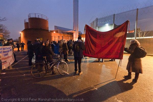
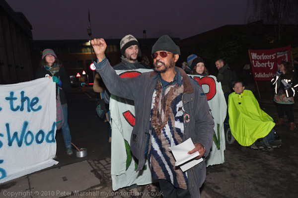
On New Year’s Eve I went to photograph a demonstration at Holloway prison (or as it calls itself ‘HMP Holloway‘.) You can read more about the protest calling for the release of the Yarl’s Wood 3 and see the pictures on My London Diary (or Demotix); here I want simply to look at some of the photographic issues. It was an overcast winter’s day, and even in the middle of the day the thick cloud cover had made it seem dark. The protest was starting at 4pm, and I determined to get there early to make the most of the light. I don’t much like having to use flash.

So I arrived at 3.50pm, to find only two people there, though others were beginning to arrive. So I wasn’t able to start taking pictures until a little after 4pm, by which time it was getting to be definitely dark.

While people were standing still, working without flash wasn’t a great problem, using the D700 at ISO 3200 and the 16-35mm wide open at f4 gave shutter speeds around 1/20 second. But once people start getting a little animated, things were rather different, and I had to use flash to get sharp images.

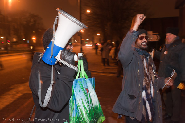
Here’s an example: Two consecutive images as the action was repeated, the first with flash:
© 2010, Peter Marshall
1/60 f8, ISO 1250, SB800 flash on camera

the second without:
© 2010, Peter Marshall
1/40 f4, ISO 3200. No flash

I made an error in choosing a slower ISO for flash, as it has severely reduced the exposure in the background of the image. I should have kept the ISO at 3200 and also used a wider aperture, perhaps f5.6 which would have put the ambient just around a stop down from the non-flash result.

The closer you get the ambient to the flash exposure, the more the chance of getting a blur combined with the flash on the moving person, often a nice effect, but other times something to be avoided. It might have been better to use a faster shutter speed with the flash, perhaps 1/125, though that would obviously have reduced the ambient fill over the image.

I can’t actually remember what I thought at the time, in fact I think I turned on the flash for the first image and didn’t really have time to think about it. Always easier in hindsight.

Neither image really truly reflects what things looked like. It was darker than the ambient only image suggests (showing detail in the dark skin tones meant I couldn’t afford to cut the exposure) and when using flash there is always the problem of fall-off, which you can fight against a little but not eliminate in outdoor images such as this.

Using flash makes the man in the foreground and his gesture stand out rather better; without flash shows the overall scene better, but he is not quite sharp, possibly both because of the slower shutter speed and less depth of field at the wider aperture.

A further complication in this case was that much of the available light in the foreground area was from sodium street lighting, almost all in the orange-yellow range of the spectrum and quite different from the flash output.

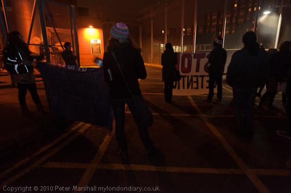
Later, around the back of the prison, some of the most effective pictures Later when it was completely dark and the group was at the back of the prison, there was a different lighting situation, with rather lower light levels and the people much more spread out. Working simply by available light produced some effective near-silhouettes, but when it got really dark some of the better results came from working with a small amount of flash to give a little detail.

© 2010, Peter Marshall
16mm, ISO 3200, 1/13 f4 no flash around 30 minutes after “sunset”

© 2010, Peter Marshall
An hour later with just a tiny bit of flash fill: 21mm ISO 1250 1/5 f8

For this I was using the ‘slow’ flash setting which allows the use of flash with slow shutter speeds, firing the flash at the start of the exposure (the normal flash setting has a user selected minimum shutter speed in some exposure modes, which I normally have set to 1/60.) I had to make a few experiments to get the flash level low enough to retain the mood of the image.

The Nikon also allows you to set rear shutter curtain flash, when the flash will fire at the end of a long exposure. It’s main use is that it get motion blurs that lead up to the sharp flash image.  On this occasion I managed to set it by mistake but took quite a few pictures with it as I found it rather amusing (and there really wasn’t a great deal happening that I hadn’t already photographed.) Using rear curtain flash is, I found rather unpredictable when trying to capture actions, but I rather enjoyed the challenge. It’s rather odd using it, as you get a pre-flash before the exposure and then the working flash at the end of the exposure.

© 2010, Peter Marshall
Using slow speed rear curtain flash: 32mm 1/5 f8 ISO1250 Rear flash

More pictures on pictures on My London Diary

More on the Students – Day 1

I’m at last beginning to catch up with putting my work on My London Diary, though I’ve still got a few things to do. I’ve already posted here about the pictures that I put on Demotix immediately after the days of protest, but you can now see a wider range of the work that I took on My London Diary.

© 2010, Peter Marshall
Before the march

On the first of the protests against the cuts on 24 Nov , rather to my surprise (and it was a longer day than I expected too) I took almost 1,500 images, although there are considerably fewer on My London Diary – about 100, or roughly one in 15 of those I took. I don’t normally shoot as many, but there were times when there was a lot of action and I was shooting short bursts of images.

© 2010, Peter Marshall

Editing down such a large number of images is a problem, and I’ve been rethinking my workflow a little recently. Lightroom (I’m now using version 3.3)  is a great piece of software and I’ve found out a little more about how to use it.

The way I used to work was to import all my images into Lightroom, before starting to select them in the Library Module, where you can rate them in various ways, giving them 1-5 stars or with one of five colours.  So usually I went through all the pictures and give those I thought worth processing a 2 star rating. Ones that particularly stand out might get 3 stars. Then I reviewed all those with 2 or more stars to select a small sample to process immediately and send off to Demotix or elsewhere, giving them a colour rating. If I’d shot several events on the same day, I used a different colour for each.

I decided a while back, that it was no longer generally worth sending pictures directly to newspapers – the time I spent simply wasn’t justified by the results, and I wasn’t prepared to make the effort and compromises required to get my  pictures there fast enough.

Partly it was a matter of equipment – I seldom take my notebook computer with me when I’m out taking pictures, but more important to me was that I like to select and process my pictures carefully before they are used. I also like to write stories to go with my pictures, and taken together these eliminate my chances of meeting the kind of deadlines papers expect – literally wanting pictures within minutes of being taken (or even seconds with some events.)  My pictures do sometimes get into the papers, but not as urgent news.

© 2010, Peter Marshall
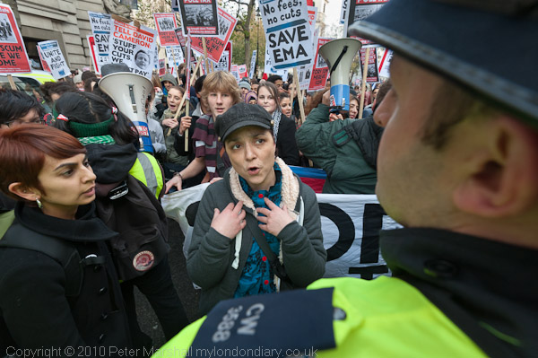
Clare Solomons argues unsuccessfully with police to let the march continue along Aldwych

So uploading the whole contents of the memory cards from a particular event into Lightroom isn’t usually a problem, though it can take quite a while. It gives me time to do other things – like research and write a story to go with them, or even have some dinner.

Often while I’m travelling home to do this, I have time to do a quick edit using the screen on the back of the camera, but I find this too small for most purposes. It does enable you to delete the really hopelessly exposed or framed images, and you can zoom in to check for sharpness, but not really a great deal more.

Recently I’ve started  to do a more rigorous selection on the computer before importing the images, reading them while still on the card. The import dialogue in Lightroom enables you to view the images still on the card either as thumbnails in a grid or singly, and to decide whether or not to import each of them. Just as in the Library grid view you can also zoom into the images and check sharpness too. It isn’t perfect – and I’d like it to actually start the import as you are making the decisions rather than do it as a batch when you have completed your review.

There are also quite a few pictures that I’m unsure about because the default jpeg that Lightroom presumably reads from the RAW file isn’t good enough, and which need a certain amount of processing before you can decide if they are worth keeping. It’s actually easier to do the review of these once they have been imported into Lightroom, as the processing in my import preset usually helps, and in any case the Library module allows you to quickly apply some rough processing – such as increasing or decreasing exposure.

© 2010, Peter Marshall
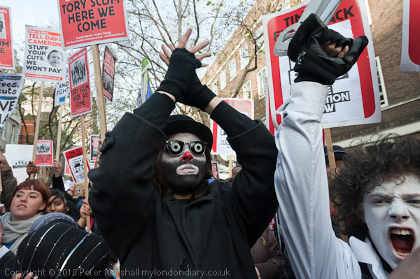
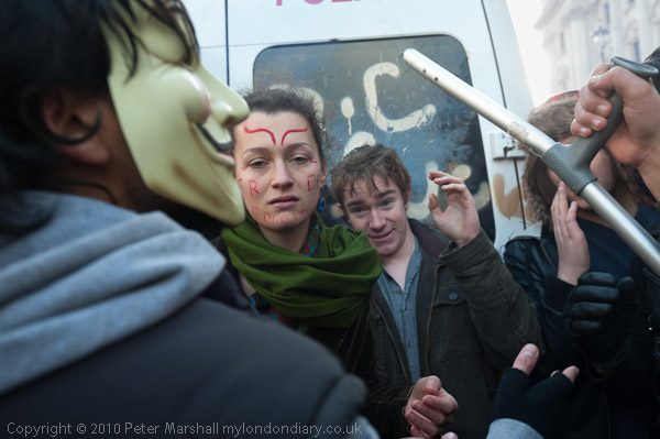
Protesters try to stop others falling into a police trap by smashing the van

Lightroom is sometimes just a little slow at viewing them on my computer (which at more than 3 years old is beginning to show its age) but overall I find quite a saving in time if I can drastically cut the number than I import.  It also of course saves storage space – those 1500 images are about 11 Mb each, and would occupy around 16 Gb on the hard disk – or 4 DVDs for a backup. So unlike working on film where everything got files, I’m moving to a more selective approach. Of course had I been using film I would have shot less, worried about running out of film – and I seldom used more than a dozen 36 exposure cassettes – about 450 frames.

© 2010, Peter Marshall
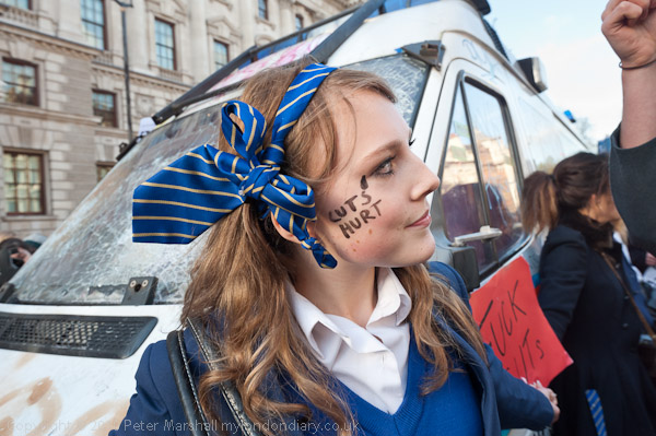
A school student tries to protect the van from further damage

Until now I’ve kept almost every file that I created with the digital camera, worried that I might miss something important. Now, having imported those files that I selected I go back and open the import dialogue again, making sure that I’ve ticked the checkbox not to import duplicates. I can then check through the pictures again, more rapidly as thumbnails in grid view (I use the slider to make the thumbnails as large as possible) and import any that I missed first time, before removing the card and putting it back in the camera. The pictures will stay there just in case I want to find something else from among them until I format the card, usually on my way to the next event.

© 2010, Peter Marshall
The kettle. Police were letting a few people, mainly young girls, leave at this point.

The pictures here are just a few of mine from the day that I don’t think have been used anywhere other than in my own story, now on My London Diary, with a fairly large set of images including these.

A Place to Cut?

I’d not gone to Windsor to take photographs, but for a walk with my wife, daughter-in-law and grand-daughter. Fortunately the latter of which finds beards fascinating, so when I was pushing her around in a push chair all I had to do when she got a little upset was to tilt the chair back to horizontal so she could see me making silly faces and she smiled back. She even seemed to enjoy my singing and whistling, which is more than I do.

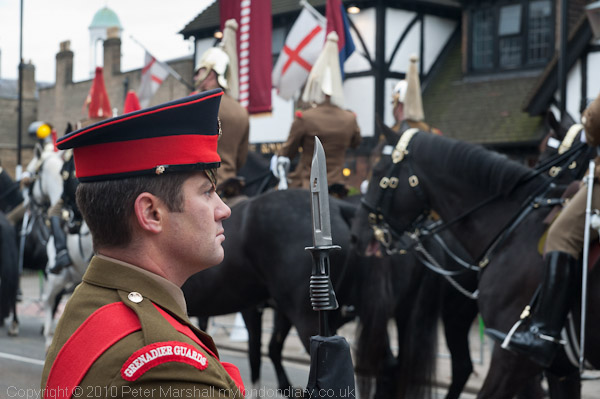
But as we got off the train at Windsor, lots of men on horses started to come past and so I stopped to take a few pictures of them. And there were a lot of police around. Apparently it was all a rehearsal for the state visit a few days later of the Emir of Qatar, paying a visit with one of his wives to the Queen.

© 2010, Peter Marshall

I suppose you can’t expect an Emir to pay for a taxi to take his suitcases up the hill, and the Queen could have sent a car down to meet him, but the scale seemed pretty obscene given the cuts we are going to have to make in other things. Keeping hundreds of horses isn’t cheap, and there seemed to be three carriages. The army are complaining about lack of manpower, so these guys could have been better occupied, as too could the police.

I’m not entirely against a little pageantry, and I’m sure it does tourism no harm, though I doubt if too many actually get to Windsor to see it, but couldn’t we make do with just a dozen or two guys and some inventive filming to create a  bit of spectacle?

I wasn’t at my best that day, and at some point managed to switch the camera to manual by mistake and didn’t notice. It’s fairly easy to do, holding down the wrong button with your first finger when trying to dial in some exposure compensation. When I’m very much engrossed in looking at the scene (as I usually am)  I can be completely unaware of the viewfinder display – sometimes I think it was better when cameras didn’t have one. Of course camera designers can’t win. Reviewers would grumble if they made changing the mode settings hard to do and I’d like them to make it harder.

When I’m going out to take pictures I always like to do a quick check through the settings for A, S and M modes and set them to sensible values before I start taking pictures (things like f8, 1/250 second.)  It’s one slight disadvantage of using Auto ISO as I was that however silly the settings you make there is a good chance of getting an image that looks OK at a glance on the camera back. On the way to Windsor I hadn’t bothered, and the manual setting I’d engaged – 1/60 f6.3 – was actually perfect for taking a few family pictures later inside the pub where we had lunch, but pretty hopeless for galloping horses, where a considerably faster shutter was needed to stop movement or a much slower one for arty blurs. At 1/60 what I got was slightly unsharp images – sharp enough for the blur not so show at a quick glance on the camera back.

© 2010, Peter Marshall

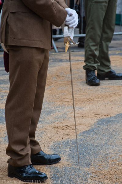
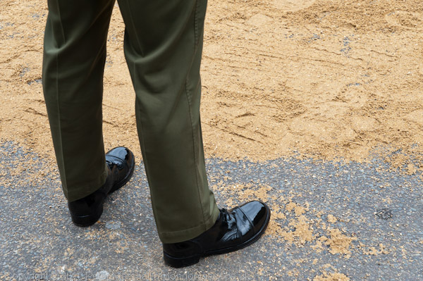
I was standing right next to the road as the cavalry came back and galloped up the hill, and it was an impressive sight. If I was an infantryman on the opposite side with only a musket and a short sword I would have felt pretty scared at the crashing of hooves and the shaking of the ground as the troop passed. But those days have gone and its perhaps time to move on too. These guys really are real soldiers, but we are still getting them to dress up as if they were fighting Napoleon, to carry swords and to shine their boots so they can see their faces in them.

© 2010, Peter Marshall

There are just a few more photographs on My London Diary.

Alec Soth

I’ve written a few times recently about Alec Soth, and he now has a new web site and its front page says:

My name is Alec Soth. I live in Minnesota. I like to take pictures and make books. I have a Labradoodle. I also have a business called Little Brown Mushroom.

Go there and click on the link and you’ll find the Labradoodle is well-named. Fortunately the site also has pictures from half a dozen of his projects:

all of which need you to scroll across the page* to see more pictures. The site also has quite a lot of information about him, definitely a good idea as he must get thousands of students writing to him with similar questions and he can just tell them to look on the web site.

If you have a large screen, it’s better to click on the picture and watch them larger as a slide show, but you need to have a screen around 1500 pixels wide to see the landscape format images properly, as on smaller screens the left side menu gets in the way.

The images in the slide show good quality jpegs, maximum dimension 1024 pixels but may not look their best in your browser as they are AdobeRGB images. These will only display correctly if your web browser is color managed. You can find out more and check that on the image at top right of this Web Browser Colour Management Tutorial, which should not alter when you move your mouse over it or click on it.  If you find it changes it is worth considering updating your browser. Recent versions of Firefox are colour managed (though it can be switched off) and I think Safari always has been.  The only version of Internet Explorer I have is IE7, and it isn’t.

Without colour management browsers will normally display all files as sRGB (or at least roughly so) as 95% of monitors use the same 2.2 gamma as sRGB. This is why it almost always makes sense to convert your files to SRGB before putting them on the web. Very few monitors can actually display many colours outside the gamut of sRGB in any case, so if you display an AdobeRGB file on them with colour management it won’t look any better than if it was converted to sRGB, and without colour management will look considerably worse.

Of course if you are at all interested in looking at photographs on the web you will have already have a properly profiled and calibrated monitor – to to 2.2 gamma and D65- 6500 Kelvin – and you can read more about that on the tutorial linked above. As G Ballard explains, the Mac default of 1.8 can cause problems.

While many lesser photographers (and sites such as Magnum) are pretty paranoid about putting images on the web, limiting the size and decorating them with watermarks, Soth does neither. It’s good for all of us who like looking at his work and particularly for those students I mentioned earlier who can print them off in their reports, and for other ‘fair use‘ of the images. If your work is as well known as his, you don’t need to worry too much about the images becoming ‘orphans‘, the main reason I now include both metadata and a visible watermark on all new web images.

*I’ll possibly think that is sensible design when I get a mouse that comes with a ball on top rather than a wheel, but not before.

Carnival Thoughts

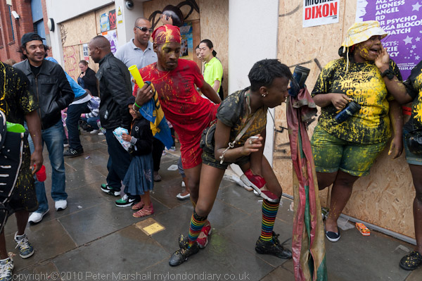
This year I didn’t spend as long as usual at the Notting Hill Carnival, arriving an hour or two later than usual as I was waiting for an gas engineer coming for an emergency service to our water heater on Sunday.  The weather forecast hadn’t been too good and it did seem a little less crowded than usual.

Sunday is Childrens’ Day at carnival, and is always a little less crowded, while the Bank Holiday itself can get too crowded to move around easily in many parts of the area. I find it rather easier to photograph on the Sunday, although the Monday is a better day for partying.

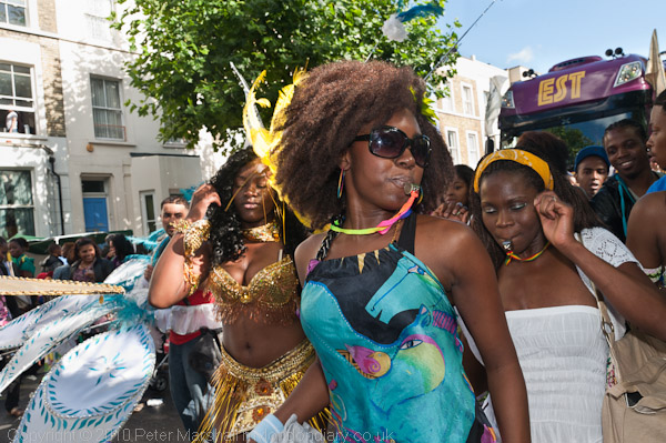
There did seem to be fewer elaborate costumes than previous years – perhaps the recession is hitting the carnival. Certainly many voluntary groups are expecting cuts in funding from local councils if these have not already happened.  But its always been the people that interested me more.

© 2010, Peter Marshall

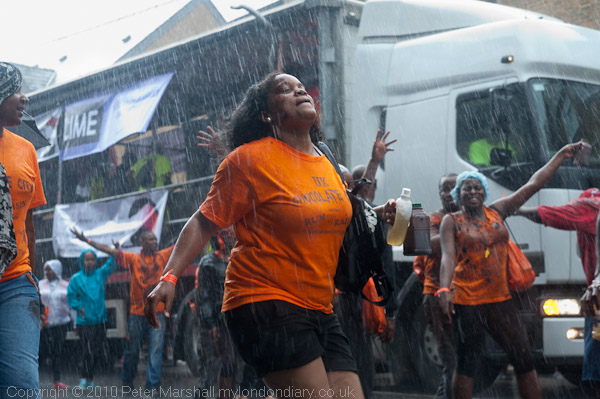
We got a little light rain, which didn’t dampen the atmosphere much at all, but dark clouds made a pretty drastic cut in light levels making photography a little trickier. But then it really poured down for a few minutes and I took shelter, while trying still to photograph the few braver souls who were partying on in the street.

© 2010, Peter Marshall

Fortunately for them (though perhaps not for me, as I rather like the effect of the driving rain) although the shower was very heavy it didn’t last long.  I was working at ISO 1250 and although the D700 is pretty waterproof I needed to keep just under shelter in that kind of downpour, so had the Sigma 24-70 set at 70mm. 1/160 s was just fast enough to get a sharp image despite the moving subject and gave rather nice streaks on the image.

Later the sun came out and the lighting got very contrasty. So working on Ladbrooke Grove I perversely decided to work in the trickiest area I could find for light. Fortunately Lightroom is able to work wonders if you shoot RAW (as I always do.)

© 2010, Peter Marshall
Image after processing in Lightroom

Here’s an example, with some of the people in deep shade and others in sun. I’ve evened things out a little with some fill-flash (nominally at -1 stop with the SB-800)  and exposed  (probably more by luck than judgement) to avoid burning out the almost white houses in bright sun in the background.  Here is what the file looked like when first imported into Lightroom:

© 2010, Peter Marshall
Raw file imported into Lightroom with my usual defaults

Back in the days of film and darkroom printing it would not have been possible to make these kind of changes.  Working with transparency, the starting point would have been completely burnt out in some areas – the situation hopeless. With colour neg there would have been similar highlight detail, possibly very slightly more, and with some fairly tricky burning I might have managed to bring out the blue sky and some of the building detail, but some of the more subtle changes would certainly have been impossible.

We do now have an incredible degree of control in the printing process, enabling us to change so much about an image with some precision. Back in the darkroom we could play around a little – as well as dodging and burning we could also try local warming of areas, swabbing them with concentrated developer or alkali, flashing and more, but they were all rather limited tricks and not exactly reproducible. Printing from the computer we can make precisely located and exact area adjustments of tonality, contrast, saturation, hue, sharpening etc.

Of course there may even be some people who prefer the effect of the original (as happened when I posted previously about how I’d improved a picture.  But it wasn’t the way I saw the scene and didn’t reflect what I was thinking when I took it.

Jpegs From Lightroom

Two weeks ago, in the post Lightroom 3.2 RC I wrote “they haven’t tackled any of those things I find most annoying – like ‘Export’ giving lousy soft and over-large file size small jpegs.”

I met bahi a couple of months back at one of the monthly London meetings of Photo-Forum – well worth attending if you are in London on the 2nd Thursday of the month – it takes place in Jacobs Pro Lounge in the basement of their New Oxford St shop, from 6-8pm and afterwards we enjoy free food at a nearby pub paid for by a raffle during the meeting – the prizes are usually prints donated by the photographers who present work that evening.

Bahi is from Shoot Raw, an organisation that delivers support and training for photographers in digital photography, including Lightroom training and in a comment to that earlier piece  gives a useful link to Jeffrey Friedl’s analysis of file size vs quality for Lightroom JPEG export, and also asks me to go into more detail about the problem I mention.

When I read his comment I’d just been going through some of the pictures I took at Notting Hill yesterday and so decided to use the picture I’d just developed in Lightroom 3.2RC(on PC) as a fairly random example.

This is the full image – scaled down from the original D700 raw file taken at ISO 800 from 42656×2832 px to 600×399 px (and displayed here at 450x299px.)

© 2010, Peter Marshall

Not one of my greatest images!

First I tried using File Export to produce this file – here are the settings I used :

At 70% quality the file size for the 600-399px was 312kB.
At 30% quality the file size for the 600-399px was 254kB.

I tried to get File Export to produce a file using a file size limit of 150 and200Kb, but both times it reported it was unable to do so.

I selected the file and went to the web module in Lightroom, outputting a web site containing this file. I used the same 70% quality setting as before. The file produced was 118kB.

Here are some 300% details from the three Lightroom jpegs – as you can see, despite the huge file size differences the two 70% files are very similar.

© 2010, Peter Marshall
300% view of detail: File Export, Quality 30, 254 kB file

© 2010, Peter Marshall
300% view of detail: File Export, Quality 70, 312 kB file

© 2010, Peter Marshall
300% view of detail: Web Output, Quality 70, 118 kB file

[These files were created by viewing the files at 300% in ACDSee Pro, capturing with PrintScreen and pasting into Photoshop and cropping.]

70% is the setting I currently use for My London Diary, generally giving file sizes that are reasonable for broadband users – even on a page with a dozen pictures. Back in the old days of slow dial-up I used greater compression (and some special software that could actually use different compression levels on different areas of the same image) to trim file sizes to the bone, but this is no longer needed.  Before switching to Lightroom I had moved on to batch processing from full-size images with ACDSee Pro, which typically seemed to produce comparable quality with file sizes a little  smaller than Lightroom.  It isn’t possible to simply select an equivalent quality setting, but files slightly under 100kB from ACDSee seemed comparable to the Lightroom 70% file.

I’ve not investigated this Lightroom problem in great detail, butI get the impression it gives the largest files from those images I’ve worked on most with the tools such as the adjustment brush.

Friedl in his piece at the link given above points out that despite having quality settings labelled 0-100 actually only implements 13 quality levels  – just like Photoshop. I think you also get those same 13 quality levels if you use the checkbox to limit file size, but the file sizes can be different. Using quality 92 (or rather 85-92) on the above image gave a file size of 3748 kB, while limiting the file size to 5000 kB produced a visually identical file of 3550 kB.

Long, long ago when I produced jpegs using a DOS command line program I there were at least two parameters which had to be specified. One was a 1-100 setting for the quality of the match required between cells which would be replaced by the same cell, and the second was some kind of smoothing function. I don’t know that we need that kind of control, but perhaps we could be offered a little more than we have at present.

My Printing

Many photographers prefer to print their own work, and I’m one of them, although I realise the difference that a skilled printer can make. It took me years of work- perhaps around seven or eight – before I was usually happy with the results I was getting, and I had one of the best teachers, if only in book form, Ansel Adams.  But of course there were also many things I worked out for myself, and a few picked up from other photographers and printers.

I can’t claim to be a great printer, certainly not in the same league as Voja Mitrovic, but I certainly became a reasonably adequate one, and was fairly often asked by others if I would make prints for them. But I had a job, and I didn’t want another one, so I always refused. I’m not sure if it would have worked, or whether as I suspect my skills were very specific to my own work and my own negatives. I have occasionally had my work printed by other people, though never any of the truly great printers, but the best black and white prints of my own work have been those I’ve made myself.

Now that darkrooms are more or less a thing of the past, and we almost all print using a computer, it’s rather easier for anyone to acquire the technical skills (though many struggle.) But the hardest aspect, knowing what a good print would look like, is still much the same.
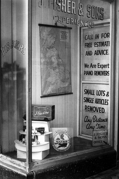
© 1983, Peter Marshall

At the moment I’m working on the first major project I produced in the early 1980’s on Kingston upon Hull.  Most of the prints were made on Agfa Portriga grade 3 (and later on Record Rapid) both now long discontinued. Their formulation had changed considerably earlier to remove cadmium, and certainly Record Rapid was never the same again.

Portriga had a warmer tone (in the right developer you could get a kind of chocolate brown that most people took for a toned print) and Record Rapid was a warm neutral but both were capable of very deep blacks and a kind of velvet quality with pearly whites. I consistently overdeveloped both papers, using either Agfa’s own Neutol developer at higher than normal concentration or, better still, May and Baker’s Teknol, formulated for use in tropical darkrooms, which I used at 23-24 degrees.

Even if I wanted to, I could no longer get the same print quality in the darkroom with modern materials. And today I would find it very hard to perform the tricky dodging and burning that I managed in my youth, some of which is still roughly recorded on the back of the contact sheets but these sketches will still come in useful when printing on the computer.

The original prints I made for the show were deliberately, perhaps wilfully small at 105 x161mm, (4.13 x 6.3″) over, designed to be viewed intimately by people with good eyesight! The just over 4x enlargement gave images from 35mm (mainly taken on a Leica M2 with a 35mm Summilux lens, though later I moved on to an Olympus OM2) a large-format quality even though only on a small scale.  They were designed so that either a portrait or landscape format image could be mounted on a 10″ wide by 9″ high card, which where then mainly shown as groups of four in 20×18″ frames.

I’m intending to show this work in a group show where I have only an 8 by 4 foot panel rather than the top floor of a large gallery they filled in 1983, so I won’t have all 148 prints on show. But printing digitally does make it a lot easier to make several prints on a single sheet of paper, as well as simplifying the process of dodging and burning.

Good digital prints start from good scans, which is where the dedicated film scanner helps. Scanning the large number of negatives is a little of a chore, and at the moment I’m perhaps a third of the way through.  I use VueScan software because I find it easier to control (and it gives great results with colour negative) and gives very good scans, and I’ve written a very short guide on how I scan b/w negs with it.

The scans are saved as 16 bit TIF files, using my default working space for greyscale, Grey Gamma 2.2, usually a good choice for greyscale images as it is almost identical for them to sRGB.  In Photoshop I rotate them as needed (using Photoshop’s ‘Measure Tool‘ to mark along one edge of the image area, then Image, Rotate Canvas, Abritrary to make it accurately horizontal before cropping with the rectangular marquee. I then do a quick and rough correction using the levels command and/or the curves command before archiving the files to DVD and to an external hard disk. This means I can always go back to this file at this state should I mess it up in some way, and I’ll not need to re-scan.

Further work on the file includes the inevitable spotting, mainly with the Healing Brush, but occasionally some areas need the Clone tool.  That’s generally the longest part of the process and I’ll usually update the archive file on the external hard disk after this is done.

Next comes dodging and burning, mainly by selecting areas with the lasso tool, feathering them by an appropriate amount (anywhere from 5 – 200 pixels, depending on the size of the area and only using low values where an object selected has  a clearly defined edge) and then using the levels command, with values between 1.10 and 0.90. If a greater amount of burning or dodging is required, it’s normally better to build it up using different selection areas, made by moving the original selection or using the Select Modify command or the image can start to show distinct boundaries where burning has taken place.

As well as dodging and burning to get the results I want will also require some tweaking of the image curve, either for the whole file or for selected areas – again making sure to feather any selection appropriately.

Its easier to do most of this work with a stylus rather than a mouse, and in some ways I’m as busy as I used to be working in the darkroom, but for much longer on each image. But there are two good sides to this; first you can take a break whenever you want and nothing will change, and second that when you’ve done it for the file you never have to do it again.

Again I usually update the archive file on the external hard drive when the file is exactly how I want it.

Usually I print from Photoshop, using either a Cone Piezography Quad Grey ink set on matte paper (usually Hahnemuhle Photorag) or Epson Ultrachrome K3 inks using the Epson ABW (Advanced Black and White) on a fibre based glossy paper. Both methods can give excellent results, and once images are framed under glass the different Dmax are seldom important. Although matte papers have a considerably lower DMax they can still seem black and the mid tones can be stunning.

For printing I take the saved 16 bit file and convert to 8 bits (unless I’m using a specialist print driver  that works with 16 bit files.) The Cone inks I have are only suitable for matte papers, and as they work through an ICC profile it’s possible to ‘soft proof’ the file on Photoshop,  giving an on-screen version of what the printed version will look like. You can then add adjustment layers to the file to compensate for the effect of the ink and paper. I’ve always used Epson printers (since one early and slightly unfortunate experience with another brand) and as well as Epson’s own solutions for them, they have the widest range of support outside this.

Printer manufacturers would like you to always use their paper with the printer and seem to deliberately make using it with other papers difficult by making the details of how the printer driver works. Sometimes I use a print ‘rip’, third party software that sends data direct to the printer rather than to the manufacturer’s print driver. Particularly if you want to use specialised black and white inksets, then the shareware ‘Quad Tone Rip‘ is excellent value, and it will also work with the Epson Inks, though of course limited by them – and if you print just using the three blacks you get a slightly unpleasant greenish black. Quadtone Rip has tools to enable you to produce profiles for soft proofing, but I’ve not used it.

Epson do not make grey profiles available for their ABW system and there are none I can find to download for the Epson 2400 printer that I use, although some have been made available for the Epson 3800, and may work with some other printers  If you want to use ABW, you should read the lengthy report by Garry Eskin, which greatly clarifies some of the aspects that Epson deliberately keep quiet about. I usually only use it for Epson’s own poorly named Archival Matte (which is at least matte)  and for third-party gloss papers with which ABW seems to pose fewer problems.

As Eskin notes, using gloss papers you can usually get a reasonable match by simply using the Tone setting. This appears to be a gamma setting, changing the mid point but not altering the white or black points. The ‘Dark’ setting seems often to be better than the ‘Normal’ setting or the apparently default ‘Darker.’

Media type and ‘Paper Config’ settings in the Printer driver are also important. The media type alters not only the warmth of the black, but also the maximum amount of ink used – watercolour papers which are more absorbent apparently need to have less ink used. Probably its best to start with the type recommended by the paper maker.

The amount of ink can also be altered in the ‘Paper Config’ dialogue, using the ‘Color Density’ setting. I often find prints can be improved by setting this at around -10% and it will also cost less per print.

It’s easy to make black and white printing sound difficult, and perhaps to get absolute control over the process it is, but with just a little trial and error it is easy to get decent prints using ABW, particularly if you are willing to print on Epson papers.
Scanning B/W Negs With Vuescan

A lot has been written about scanning black and white film, and not all of it makes much sense to me. But different scanners work differently, and you need to try and find a method that works well with your negatives, then hope it continues to do so. A few months ago I replied to a query on an internet forum saying that I didn’t have problems with Newton’s rings (interference patterns with an oil on water appearance) with my negative holder – and within days was doing scans were they really were obviously apparent.

So what works for me isn’t necessarily the best approach for you. Some people like to scan things as positive rather than negative and then invert later, or to tell the scanner they are using a different media type. Others always scan in RGB then convert themselves to grey, or choose just one of the  three (or four)

With my scanner and Vuescan software I find I get good results from a straightforward approach, scanning as black and white negative, 16 bit grayscale. I scan at a preview resolution of 1200dpi, which both enables me to crop precisely and also to zoom in to check sharpness. I set Vuescan to take 2 samples, which slows the scanning down but improves the scans over normal single sampling. Values higher than 2 give little if any more information but greatly slow down the scans.

On the crop tab, the vital setting is for the ‘Border’. I set it around 10 which means that I can crop images with a slight border (especially necessary when the negs are not in the carrier exactly straight and you need to rotate later in Photoshop.) The exposure and histogram then ignore a little bit around the edges of the selected area.

‘Infrared cleaning’ does not of course work with normal black and white films, but with chromogenic films it can be worth using the lowest setting.  With other black and white films I use ‘grain reduction’ at the light setting. I’m not convinced it does anything, but high settings certainly lose detail.

My aim in scanning black and white film is not to get a perfect image direct from the scan, but to transfer all of the information from the negative to the scanned 16 bit file. So the vital tool is not the image preview but the histogram.  Vuescan has a pretty confusing number of parameters on the Color tab when in ‘Advanced  Mode’, but fortunately most don’t matter a great deal when scanning black and white.


You can play with the B/W Vendor, brand and type, but will generally find nothing that quite corresponds to the film you are scanning, and it really doesn’t matter a great deal, though you will see some changes. Similarly with the curve high and curve low, though I find values of around 0.25 and o.5 generally work well. The two vital settings are actually the black and the white point, but unfortunately setting them isn’t entirely straightforward.

In general, for most negatives I find I need to set the Black Point to zero and then use the ‘Brightness’ setting to avoid clipping the shadows. Sometimes the White Point also needs to be at zero, but more often a small value that cannot be directly set using the buttons is needed, perhaps 0.08. You can also set the needed value – at least roughly – by switching to show the ‘Graph b/w’ and sliding the right hand triangle to meet the bottom right of the curve. But mostly its the ‘Graph Image’ that you need to keep an eye on.

Sometimes when you’ve set both black and white points as above, the actual image may be too dark or two bright. You can try altering the brightness setting while keeping an eye on the Graph Image to see you are not introducing excessive clipping.

Years ago when I first bought Vuescan (having found the software that came with my Canon scanner was useless with colour negs) I  had some e-mail exchanges with Ed Hamrick, the writer of Vuescan about the white point and the small problem I had with that. I don’t think I ever got him to understand my difficulty, and although the software has improved greatly and he has responded quickly to other bug reports, this hasn’t changed.

Because I scan in 16 bit, its possible to adjust the curves considerably without getting any problems in Photoshop. So altering the tones of the scan is simple. If I ever want to I can hide shadow or highlight detail. But if you don’t scan it you can’t use it.

Lightroom 3.2 RC

No, you haven’t missed anything, they skipped 3.1 in order to align the fractional release numbers with Lightroom and Camera Raw (for which 6.2RC is available) which makes sense. Details and download link on Lightroom Journal

Great news for me is among quite a few added lens profiles is one for the Nikon 16-35mm, and there are a couple of others, along with lots more for Canon and Pentax and also profiles for some Zeiss lenses on both Canon and Nikon. And if anyone has managed to afford a Leica S2 they will be pleased too, along with owners of a number of more lowly cameras. They also hope to have more cameras and lenses in the final version of LR 3.2.

Also there is a pretty good long list of bug fixes. If you don’t have one of the cameras or lenses for which support has been added, it’s probably worth checking through this to see if it solves any of your problems.  Although there are a few things that look as if they may help me a little, they haven’t tackled any of those things I find most annoying – like ‘Export’ giving lousy soft and over-large file size small jpegs. So I’ll continue to have to use the web module when I want to make the 600x400pixel images, then copy these out of the website created before deleting the hundreds of files I didn’t want.

One little bug fix that should help me is:

  • Develop: The local adjustment brush could have a very slow first stroke when exposure is the selected adjustment

Fortunately the catalogue format hasn’t been changed so there is less likelihood of installing 3.2RC causing any problems. But overall if you haven’t had any of the problems that are fixed in the list and if you don’t have any of the cameras and lenses for which support has been added there isn’t any point in downloading the release candidate – wait for the final release.

Otherwise, I’ve just begun my download and you should be after me in the queue to get it.

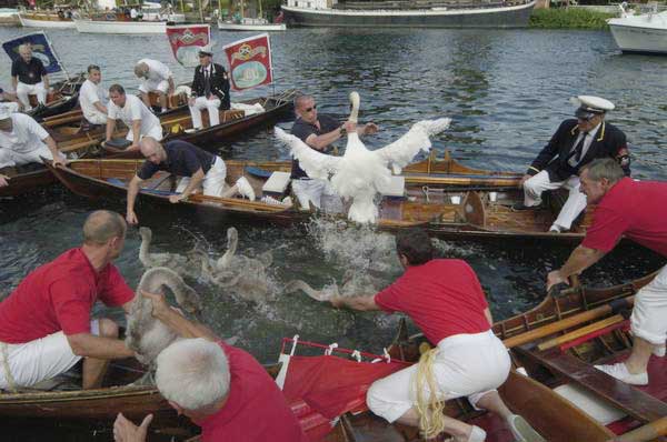
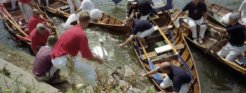
Swan Up

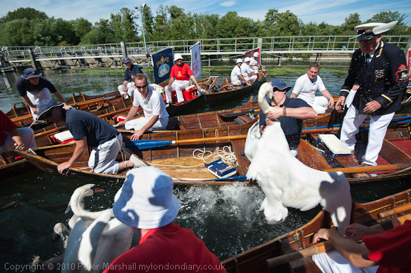
I was in two minds over whether to go and photograph the Swan Uppers again this year. It’s a subject where I think I’ve probably more or less done all I can do over the last ten years, and which in some respects doesn’t change a great deal year to year. But it was a nice day and the river is only a five minute walk away, so I went along again – as you can see below and in many more pictures on My London Diary.

© 2010, Peter Marshall
Swan upping 2010 – Nikon D700

© 2004 Peter Marshall.
Swan upping 2004 – taken on a Nikon D100

Photographically it’s very hard not to repeat – with small variations – what I’ve done before. And since I think I’ve had some good luck in the past those variations generally result in pictures that are not quite as good as some I’ve taken before – as you can see above.

It’s also an event which is getting just a little harder to photograph, not because of any real changes in the event but simply because interest in the event, and in particular press interest has increased.  I think the first year I photographed it there were probably only around three or four other photographers present. Now it becomes virtually impossible to move at the times when you really need to be in exactly the right spot, and it isn’t quite predictable where the peak of the action will occur.

A couple of years ago there was some extra interest as it seemed likely that the Labour government would be tidying up some  of our ancient laws and this might remove the rationale behind the upping – basically an annual census of swans born each year on the non-tidal River Thames between Sunbury and Abingdon, in which the year’s cygnets are shared between the sovereign and two City of London livery companies, the Dyers and the Vintners.

In the old days swans were a feature of royal banquets – and also until around 25 years ago those of the two companies (and by a special royal dispensation, at St John’s College Cambridge); it was a privilege rigorously protected against more plebeian tastes and catching one of these royal birds could get you sent to the Tower or transported; now you only risk a fine of up to £5000 and/or six months in jail under the Wildlife and Countryside Act, 1981. I’m told that properly cooked they can be delicious, though others are less keen (and the description that they are like a ‘fishy goose’ certainly doesn’t attract me.) Certainly it doesn’t seem worth the risk.

Perhaps the best coverage I’ve made of the event was on film, using a Leica M fitting Konica Hexar RF and the Hassleblad Xpan panoramic camera (made by Fuji) , which produces a 58x24mm negative on 35mm film.  Although it was a camera I lusted after when it came out, I soon found using it with the normal 40mm lens a little disappointing.

With the 40mm you get roughly the same horizontal coverage as with a 28mm on the standard 35mm format, but of course a greatly reduced vertical coverage.  You could get the same picture simply by cropping a 28mm image, although the area of the negative would then be  less than 4/10 that of the XPan. To get the same quality you would need to shoot on 6×6 and crop, so the XPan did give you the advantage of using medium format but with handling (and choice of films and costs) of 35mm.

© 2001, Peter Marshall
Swan Upping 2001 – Hasselblad XPan and 40mm lens

But what really transformed this camera for me was the 30mm lens, equivalent to around a 20mm across the image. It comes with its own accessory viewfinder giving a beautifully large and bright view- and with a visible spirit level – and needs a special filter to combat the vignetting which is inevitable with ultra-wide rectilinear lenses. It was wider than anything available for medium format and a superb quality lens that could normally be left wide-open.

It would I think be too expensive to produce a digital version of the Xpan, and the film version is only available second-hand,  production having to be abandoned because of environmental legislation that banned the method used to make its circuit boards. The camera sold better in the UK than in other countries, but sales were not high enough to justify redesigning board to get round this.

At least one reviewer has stated that with the 30mm lens it is essential to use the camera on a tripod. I don’t think I ever tried that, but it certainly wasn’t a lens for low light work, with the maximum aperture of  f5.6 reduced by a stop and a half by the filter. But in good light it was easy enough to use hand-held, and given the focal length and aperture you seldom needed to use the normal range-finder window to focus. The automatic exposure was generally pretty accurate and in good light it was really a point and shoot camera, but as the auto-wind had to cope with almost twice the normal movement it was just a little slow to wind on for rapid action – so then I switched to the Hexar RF (the first modern ‘Leica’) which gave 2.5 fps.