Unnecessary Replication

Although one can greatly admire the ingenuity and professionalism of both photographer Sandro Miller and “legendary Hollywood A-Lister John Malkovich” (I had to look him up, but that just shows how out of touch I am) and presumably also the makeup artists etc involved, the work in ‘Malkovich, Malkovich, Malkovich: Homage to photographic masters‘ recently shown at the Catherine Edelman Gallery and on sale as ‘pigment prints’ (which almost certainly means inkjet prints using pigment-based ‘inks’) in editions of 35 + 5 artists proofs at prices from $3,200 to $12,000, raises a number of questions.

In his discussion of the work in The Photographer and the Painting (5), A D Coleman looks mainly at the copyright angle, and whether the aping of famous images by well-known photographers, mainly still in copyright, could possibly constitute ‘fair use’ under US copyright law. Although careful to disclaim any legal expertise, he  details his thoughts on the subject using the University of Minnesota’s online ‘Thinking Through Fair Use‘ which appears to me to be very useful tool. Though again they add a clear disclaimer: “it does NOT tell you whether a proposed use is fair or not, and does NOT provide any kind of legal advice. It simply helps you structure your own reflections about the fair use factors, and provides a record that you did consider relevant issues.

Coleman also provides a link to Bored Panda which publishes 16 pairs of images, putting the remake by Miller/Malkovitch next to the original images which have been recreated, so you can judge how closely they have acheived the aim of reproducing the original works.

My initial reaction to these image pairs was “how very clever, but how entirely pointless“. And on further reflection, I think it was absolutely correct. What is the point? Other than of course to make money for Miller and the gallery (and perhaps Malkovich, who with more than 70 films under his belt, a video game and an Italian clothing line surely doesn’t need it?) And Coleman questions “The creative ethicality, if I may call it that, of generating such straightforwardly replicative ‘derivative works,’ even if legal questions don’t pertain.” Absolutely so.

What is perhaps most surprising is to learn from Coleman not only that Miller informed him that he took legal advice which told him thatthe work would be covered by “fair use”, but that the possible legal problems have not been mentioned in the many publications on the work which he lists in his post. I don’t expect it’s possible to sue lawyers for their advice, but if so I think it fairly likely that Miller may have to do so. But of course I’m not a lawyer either.

I imagine the images will sell, if only because a man who has been in over 70 films must surely have fans, some of whom are sure to have more money than sense. As a commercial proposition it would seem to make sense, but it is the commercial possibility that seems to this non-lawyer to be both something that makes ‘fair use’ far less likely to apply and also to greatly increase the chances that one of the rights-holders in the 40 out of the 42 images not in the public domain will sue.

When I taught photography, it wasn’t unusual for students to copy or attempt to copy works by well-known photographers, though usually their efforts were usually so different from the originals despite their intentions that there would have been zero danger of a law suit. But after they had done so, I would discuss with them what they had learnt from the exercise and tell them to go out and make their own work. We all learn by ‘beg, borrow and steal’, or to put it more positively, exploring the tradition and becoming a part of it, but our aim should surely be to contribute, rather than simply replicate the work of others.

I came across another case which is more debatable on Sunday, when a photographer pointed out in an online forum that a picture of sculptor Hans Haacke holding up his design for the new sculpture on Trafalgar Square’s fourth plinth published in The Guardian and attributed to “Hans Haacke/VG Bild-Kunst. Courtesy of the artist and Paula Cooper Gallery, New York” was rather similar to one he had made earlier and that was published in the New York Times last October.

There are of course similarities as you can see from the links above. It is the same man, and he is holding up the same drawing. And being known for his dislike of having his face photographed he is holding the drawing in front of most of his face.  But there are also clear differences. In the image in the Guardian the framing is portrait which I think better suits the subject, and Haacke holds the image up with two hands instead of one. He also carefully holds his drawing so that none of the horse is obscured, and the photographer has shown rather more of his black glasses, the arc of which at the left of the white print is important in the image.

There is a delicate line to be drawn. I’ve photographed Tower Bridge many times, but would not claim any breach of my rights in anyone else’s photograph of that building, even if taken from exactly the same position. For the photographer to have a valid claim I think he would have to persuade a court that Haacke had never ever held up a photograph or drawing in front of his face before, and that he was the first photographer ever to have got him to do that – or perhaps even to have got any other artist to do the same thing. It would be tough.

I’ve taken far too many pictures of people holding things in front of their faces, usually when I don’t want them to, but also on a few occasions when people haven’t wanted their face to be shown. Resemblance it seems to me isn’t enough, there has to be some real originality to claim infringement, and for me the idea isn’t orginal enough and the similarity perhaps not close enough. Of course a court might see it differently. Again, IANAL.

There was clearly an originality about Doisneau’s ‘Picasso and the Loaves‘, with two “main de Nice” replacing the painter’s hands, and it’s something that has been reused by some others, in a way that I think is fair use.  But I dimly recall a case where Doisneau’s estate prevented a rip-off of this image being used in an advertisement.

Nan Goldin

I’ve always beeen a little ambivalent about the work of Nan Goldin, and it seems a totally appropriate reaction.  A recently published feature on her on Dangerous Minds is labelled with the topics: Art; Drugs; Queer; Sex; Unorthodox; often I wonder if my own interest in the pictures might be labelled prurient. Not that I would consider them pornographic or abusive (unlike the Gateshead police). But I certainly find her work interesting.

The article, Being human: Sexuality, gender and belonging to family in Nan Goldin’s photography (NSFW) might not be safe for your work, but seems fairly tame for mine and includes a fairly short video of Goldin talking about her life and work. Although she speaks with great candour, and her work has made aspects of her life very public, I sometimes feel she does not entirely admit (perhaps even to herself) the control she exerts in making her images.

Commenting many years ago I wrote about her work “It only offers us glimpses, framed and caught with more or less skill by the person who directs it – and Goldin’s control as a director is remarkable.” Even when she is in bed and using a long cable release to a camera placed earlier on a tripod across the room.

One of the skills that distinguish good photographers of events develop is that of visualising a scene from a different viewpoint.  When you may see something happening while you may immediately make an exposure even though you are not in the right position just in case,  but the first reaction is to think where your camera should be to best photograph the scene, and to try to get there.  If the camera is fixed and you are in a different position, choosing the right moment to press the release is not largely a matter of chance but again of visualisation. And of course after the event editing, selecting the images that work best.

I first wrote about her after seeing her work in the book, The Ballad of Sexual Dependency, (you can see a 42 minute video version to a soundtrack by The Tiger Lilies on Vimeo, but it seems incredibly slow moving compared to her slide show which I saw – and there are various other shorter versions on YouTube) which she described as “the diary I let people read” and revised the piece as Nan Goldin’s Mirror on Life in 2002 after seeing her work at the Whitechapel Gallery, and again in 2007 to put on this site.

Still Life

I suppose like most photographers I’ve occasionally taken what might be labelled a ‘still life’ but it has never been a genre that has held my interest in photography. Some I’ve done because people have asked me for a particular purpose, like recording the flowers that my wife has been sent or a birthday cake she made, though these are perhaps not truly still life.

Here’s the start of what Wikipedia has to say:

A still life (plural still lifes) is a work of art depicting mostly inanimate subject matter, typically commonplace objects which may be either natural (food, flowers, dead animals, plants, rocks, or shells) or man-made (drinking glasses, books, vases, jewelry, coins, pipes, and so on).

The whole article is worth reading, and the Wikipedia MediaViewer shows images of some great examples, none of which is a photograph, though the last example is a computer generated image.

More often I’ve photographed inanimate objects as objets trouvés, and perhaps an important point that the definition above omits is the element of arrangement in creating still life compositions.  So looking at the Pencil of Nature,  Talbot’s image of a fruit bowl

A Fruit Piece LACMA M.2008.40.908

to my mind qualifies as a still life (if perhaps a rather poor one) while other images including ‘A Scene in a Library’ and ‘Articles of China’ are not, as although the photographer has carefully framed the pictures he has not (or not effectively) arranged the objects for the purpose of the photograph.

Licenced under Public Domain via Wikimedia Commons - http://commons.wikimedia.org wiki/File:Articles_of_China.jpg#mediaviewer/File:Articles_of_China.jpg
Articles of China” by William Fox Talbot – The Pencil of Nature, 1844.

There have been relatively few photographers who have made still life images that I find of much interest. Perhaps the best of these was Josef Sudek, who produced some truly fine examples. Of course many other photographers produced some fine still lifes, including Edward Weston (and many of his nudes were more still life than nude.)

What sent me thinking about this, and almost made me miss a train starting to write about it on Saturday morning, was a Facebook post about an article in Vice magazine, No More Lazy Still-Life Photography, Please , by Vice photo editor Matthew Leifheit, which includes illustrations by another phtoographer whose work in the genre I’ve also long admired, particularly for her colour work, Jan Groover. Again, Google Images is a good place to see a large selection of her work.

As Leifheit writes “any 13-year-old with a camera flash can throw some pineapples onto a brightly-colored backdrop and call it art. ” But making a really satisfying still life with a camera is I think something rather more difficult. Perhaps even more difficult than doing it with a paintbrush.

POYi 72

I’ve not yet had time to look at all the pictures from the winning entries in the University of Missouri School of Journalism‘s 72nd annual Pictures of the Year International competition, though I can say that there are some fine images among those I have viewed on the POYi web site.

One photographer who gets a number of mentions is Brad Vest, 2011 Alexia award winner, with a portfolio of 40 images from Memphis local newspaper The Commercial Appeal winning the Newspaper Photographer of the Year award, as well as two mentions in the Newspaper Issue Reporting Picture Story category with first place for “Last One Standing” about the last public housing project in Memphis and an Award of Excellence for “Paul Joseph Oliver” on the lives of the family and friends of a Marine after his death.

The competition has its roots in 1944, when

the Missouri School of Journalism sponsored its “First Annual Fifty-Print Exhibition” contest. Its stated purpose was, “to pay tribute to those press photographers and newspapers which, despite tremendous war-time difficulties, are doing a splendid job; to provide an opportunity for photographers of the nation to meet in open competition; and to compile and preserve…a collection of the best in current, home-front press pictures.”

For many years it was a USA only contest, and was run jointly with the NPPA, but since 2001 it has again become solely the responsibility of the Missouri School of Journalism, and an international competition (POY became POYi), and has slowly become less dominated by US photographers and organisations, though still keeping a very US flavour and not quite yet POYI. Funding for it comes from endowments and also sponsors Fujjifilm, US cable and satellite company MSNBC, National Geographic as well as the entrance fees to the yearly competition.

There is also an archive with many thousands of winning images (either 41,766 or over 60,000 depending on where you look) over the years, starting from 1943. It gives an interesting overview of the changes in news photography over the years.

The Missouri School of Journalism has always had a clear view of photographic ethics, and the USA generally has a rather more clear view on news photography than pertains in the UK. It was something I was made very aware of when I spent 7 years working for a US company from London, and which I applauded. Although there may be disagreement about whether the best work won in some categories, there is unlikely to be the kind of controversy that the WPP has recently attracted. The staging in Je Suis Chaleroi? would certainly never have been thought acceptable here.

2015 PDN Top 30

If you want to be featured in PDN’s Top 30 your best bet is either to be born in the USA or to go and live there, as do I think all but about six of this year’s crop (and two of that six are in Vancouver, which only around 30 miles over the border.) Having said that, there is still much interesting photography, and, perhaps unsurprisingly some of the more interesting is from those four more distant. Give yourself plenty of time and go and enjoy.

Rather than otherwise influence you on the work of this years pick I thought it would be interesting to revisit the Top 30 of ten years ago, 2005, and begin by asking how many of those featured you have heard of. It’s hard to be entirely sure, but for me I think the answer perhaps five or six, but most seem to be having succesful careers if not becoming household names:

Kevin Cooley
Cig Harvey
Mark Zibert
Andrew Zuckerman
Christa Renee
Matt Stuart
Jesse Chehak
Eri Morita
Farah Nosh
Chris Mueller
Eric Ogden
Joao Canziani
Colby Katz
Dave Anderson
Jehad Nga
Erik Almas
Jessica Todd Harper
Hayley Harrison
Karine Laval
Steve Giralt
Casper Dalhoff
Emily Nathan
Carlos Rios
Matthew Pillsbury
William Mebane
Masood Kamandy
Kareem Black
William Lamson
Gina Levay
Karim Ben Khelifa

I’ve also tried to link them to their current web sites, though there may in some cases be confusion with other photographers of the same name. Two presented a problem – I couldn’t find a site for Hayley Harrison and although there are many links to work by Khalim Ben Khelifa I could not find an actual web site. And be warned that even on a high-speed broadband connection some of these sites are slow to load. Too many still have huge flash downloads.

This year’s crop give a little advice to others on the web site, and I’d like to add another small piece of possible wisdom. If you want to be remembered as a photographer, choose a good and memorable name. If like me you have a very common name it will not help in your career. And simply because you were blessed by your parents with something simple shared by thousands of others there is no reason to use that as your professional name.

I share my name with at least three other photographers (a confusion that has led to me being refused credit by one photography retailer and threats of bodily harm by an extremist right-wing organisation – I’m not sure what it has done for the other guys), a very well known preacher and his son, various sporting heroes (I don’t even swim or squash and gave up footy long since), the author of some great books, a journalist and  acouple of radio and TV personalities, a police chief, several professors, a breeder of ferrets and thousands more.

Somewhat surprisingly if I put my name into Google (I don’t make a habit of vanity searching, but have just done so as ‘research’ for this post) I find I come up in 14th, 17th and 24th position underneath two featured posts and some images, none of which are of me. On going to Google Images and searching well down the page I do find myself twice, as well as 38 taken by me, among the seven or eight hundred featured. They seem to include a couple of copyright violations, though I think neither worth chasing.

Salt Prints


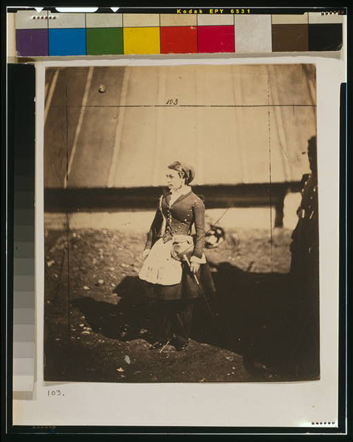
Vivandière (French cantinière)  Library of Congress Prints and Photographs Division Washington, D.C. with Fenton’s crop marks

It was back in the 1980s that I got briefly into salt printing (more on that here), around 140 years after W H F Talbot showed us the way (possibly picking up the idea from Sir Humprey Davy) in 1839, and with his ‘The Pencil of Nature‘ (1844 to 1846) published the first major printed work incorporating a number of them with his ideas.  I wrote briefly about the salt print process back in the 1990s, and published a revised version in the following decade with my own illustrations. I’ll try and find it and republish, but the truly definitive work on the process, Reilly, James M. The Albumen & Salted Paper Book: The history and practice of photographic printing, 1840-1895. Light Impressions Corporation. Rochester, 1980, is available free on-line for those who want full details.

Its a process you can read about in most if not all the histories of photography, and there are many manuals available in print and on-line to tell you how to do it apart from the Reilly book mentioned.  In some it will be called ‘plain paper’ printing or just ‘silver’ printing and it was performed in the 1840s and 50s making use of ordinary writing or drawing paper of the age, which was first coated or soaked in a salt solution (sometime common cooking salt, sodium chloride, though other salts were also used) and then after having been dried, made light sensitive by floating on a bath of silver nitrate solution (or this could be brushed on.) The paper then had to be dried in dim light and exposed with as little delay as possible in contact with the negative in a printing frame in sunlight.

The papers used were only lightly ‘sized’ or coated with a material – usually gelatine or starch – and the solutions soaked into the paper, with the light sensitive silver chloride (or other silver salts) being embedded into the paper. Later photographers began to use more sizing or other materials to keep these salts on the surface which enabled a better tonal range. The most successful of these was albumen (egg white) and as well as making matt surface prints this also enabled prints to be given a glossy finish. It used to be a standard museum practice to label all early matt prints as salted paper and early glossy prints as albumen.

Many photographers continued to make their own salted paper into the early years of the twentieth century, with directions still being published in various manuals of the times, although by then there were many commercial alternatives. You could also buy papers that were ready salted and only needed the photographer to sensitise them, but there were also other alternatives for the photographer. In a 1910 issue of ‘The Photo-Miniature, the author writes “Twenty years ago, when photography was not a popular pastime but a mysterious hobby, a photograph could be only one definite thing, namely – a so-called silver or albumen print.” (This refers to albumen prints only, not to salted paper prints.) The title of the article ‘The Six Printing Processes‘ gives us some idea of how much things had then changed since 1890, although there were many other processes also in use by then, some dating back to the beginnings of photography such as the blueprint (aka cyanotype.)

I was reminded of all this while eating breakfast this morning by the Today programme which featured two people talking about Salt and Silver: Early Photography 1840 – 1860 which opens to the public at Tate Britain tomorrow (25 February – 7 June 2015) with a claim to be the first exhibition in Britain devoted to salted paper prints. While this may be strictly true, many shows have included works from this period, many of which will have been salt prints, and other shows focussing on particular photographers or groups have been entirely of salt prints. But this is the first to be actually built around the process and while the show appears to include some well known works, it also brings out some less familiar.

The text also states “The few salt prints that survive are seldom seen due to their fragility, and so this exhibition, a collaboration with the Wilson Centre for Photography, is a singular opportunity to see the rarest and best early photographs of this type in the world.”  Silver is a fairly reactive metal and much of the early research into different printing methods was aimed at ways to prevent the fading of images, particularly from an age where the necessity for thorough washing of prints was not fully appreciated. I don’t think salt prints are rare, but examples from this early period, and particularly ones in good condition perhaps are. But prints by WHF Talbot regularly appear in auctions and even in recent years some have sold for well under £5000.  My own salt prints, now around 20 years old, are still looking much the same as when I made them, but may well not last 170 years. As to whether these are the best, you will perhaps have to visit the show to find out, although the works selected to display on the web site by Hill & Adamson, Talbot and Fenton are certainly not those I would have chosen.


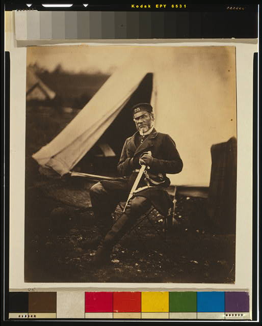
Captain Andrews, 28th Regiment

There are two included in the  on the Tate web site by Talbot, and also two by Roger Fenton, who made both albumen and salted paper prints. There is a marvellous collection of 263 of his Crimean War pictures at the US Library of Congress,  which includes prints of the same two reproduced here. You can if you wish download high resolution TIFF files of these (Vivandière is called Cantiniére on the Tate page) and print out your own copies, either on an inkjet or, if you really wanted, convert to a negative to make your own real salt prints. It really isn’t too difficult!

Prince of Pilfering

I’ve never had a positive response to ‘appropriation art’. It’s always seemed to me parasitic rather than in any way symbiotic. A total lack of respect of the authorship of the work being appropriated combined with a false assertion of authorship by the appropriator.

Of course it’s OK to use work by other people, though if you do so in a direct and recognisable way you should clearly attribute this – and where appropriate pay for a licence for its use. I was quite happy recently when an artist wanted to use some of my pictures on some cushions she was making – and supplied her with files for the purpose. We came to an agreement and my contribution to the work is acknowledge; that’s how it should be, and others who have wanted to use my work in their own paintings and illustrations have made similar agreements over the years.

As for ‘appropriation‘ I think what has to say about it and about Prince’s ‘Instagram’ works is worth reading. Here’s just a couple of sentences from it:

Seen as most people access art today, in their social media feeds, Prince’s appropriations are visually indistinguishable from the original sources. The thing that separates them is celebrity and recognition within the contemporary art world/business framework.

One way that Prince went wrong was to pick as one of his steals from Instagram a work by photographer Donald Graham.  Obviously a very succesful and accomplished photographer (if not particularly to my taste), on his ‘Fine Art’ web site it tells us: “Donald Graham is an internationally recognized photographer with work in the Metropolitan Museum of Art in New York and the International Center of Photography.”

While your average Instagram user might be flattered that Prince would re-use one of their images, someone who is already showing work in a museum context it likely to see it just as a rip-off. Unsurprisingly, as you can read in Hyperallergic‘s Photographer Sends Cease and Desist Letters to Richard Prince and Gagosian, Graham’s response is to go to law.

As the article states, Graham’s picture had been uploaded to Instagram not by the photographer himself, but by a third party,  Jay Kirton, who uploaded it without accreditation (and presumably without permission.) I presume that neither Prince nor his gallery, Gagosian bothered to check – by Google Image Search or other software – on the copyright status and ownership of the image. It appeared Hyperallergic‘s review of the show last October with the name of the poster rather than the photographer “appropriated from @rastajay92.

As I’ve pointed out before, (for example in it just isn’t practicable to prevent the unauthorised use of images on the web. It would take up the whole of any photographer’s life to police the usage of their images, and in most cases prove impossible to acheive any recompense. But where anyone is making large sums of money from your work, things are different.

Graham in October posted to Instagram about it (as you can read on Hyperallergic), and I imagine he may also have contacted the gallery without any satisfaction, but now his lawyer has sent “cease and desist” letters to Prince and the Gagosian Gallery. Perhaps it will go to court.

It isn’t the first time Prince has been taken to court, (and not even the first about images of Rastas) and although in at least one previous case an out of court settlement was finally reached with a photographer, generally Prince has been treated with inappropriate leniency by the courts. If there are people ignorant enough to pay over $40,000 for very large but rather dull reproductions from Instagram, the photographers who produced the original works on which Prince imprinted his own lack of originality deserve at least as much as him from them.

World Press Photo 2015

You can now look at all the winning images in the 58th World Press Photo Contest, selected from the 97,912 images submitted by 5,692 photographers of 131 nationalities on the World Press Photo site.

I haven’t yet had the time to look through all the pictures from 2014 in the 2015 Photo Contest, but my initial impression is that the organisers have tried hard to get away from the accusations that every year is the same, and the selection looks as if they have adopted of rather wider approach than in some previous years.

As usual there is likely to be disagreement about the winning image, Jon and Alex by Danish photographer Mads Nissen, a member of Panos Pictures, from his coverage of the increasing hostility in Russia towards lesbian, gay, bisexual and transgender (LGBT) people.  Although I think its a good image, I wonder if it really is the most outstanding of the crop.

One of the jury, Alessia Glaviano comments on WPP:

“The photo has a message about love being an answer in the context of all that is going on in the world. It is about love as a global issue, in a way that transcends homosexuality. It sends out a strong message to the world, not just about homosexuality, but about equality, about gender, about being black or white, about all of the issues related to minorities.”

and another, Donald Weber stated:

“World Press Photo is more interesting than being just a competition. The winning image fosters debate not only within the photo community, about who we are and where we’re going and what we’re trying to say, but also in the larger community. The images are seen and discussed by tens of thousands of people.”

This year the WPP insisted on having the original camera files as well as the finished image, and their experts “found anomalies in a large number of files and presented their findings to the jury“, resulting in 20% the images that reached the penultimate round being eliminated “because of removing small details to ‘clean up’ an image, or sometimes by excessive toning that constitutes a material change to the image.”

I’m both pleased that the WPP is taking a firm stand, and also very surprised at the level of unacceptable retouching, particularly as they had made it clear that they would be checking  for it. It suggests that many photographers (or their agencies) have failed to appreciate that there is any problem in altering news images.

As they say:

“There is clearly an urgent need to take this matter further. Over the coming months, we will be engaging in further dialogue with the international photojournalistic community to explore what we can learn from all this, and how we can create a deeper understanding of issues involved in the application of post-processing standards in professional photojournalism.”

Morris Strikes Back

The Capa D Day saga continue with the first of a series of responses by A D Coleman to a remarkable statement The A. D. Coleman Attack by John G Morris, which he concludes with the words ‘We may never know the entire truth‘. Reading it through I get the feeling of a man who has rather lost touch with reality and is unable to understand much of the research that Coleman and others have put into this and very much wants to make sure the truth remains hidden.

Morris, who was 98 in December, claims to have remembered facts that he had clearly forgotten back in 1944 when he first gave the now disproved legend of the films ruined in processing by ‘the young darkroom assistantDennis Banks. He now claims that these ‘ruined’ rolls, which seem almost certain to have been pre-invasion images by Capa, were actually blank rolls of film, and, if I understand him, that Capa in his agitated state had been unable to remember which of the films he was carrying he had actually put into his Contax and exposed.

Morris’s newly remembered story also includes a mysterious mid-channel rendezvous between Capa and another Life photographer, Dave Scherman, which had brought Capa’s earlier films to London with him before the D-Day pictures. It’s an element of the story that Coleman demolishes with a sledgehammer in his first response, most of which is employed in pointing out places where Morris misrepresents (or completely misunderstands) aspects of what Coleman and others have written.

Capa was a professional photographer, and I think Morris is questioning his professionalism. I can’t believe he will not have had a foolproof system to distinguish exposed and unexposed film, probably involving either tearing off the film end on unloading or rewinding inside the cassette and then storing it in a different container. I wasn’t taking pictures in the 1940s, so I’m not sure exactly how they would have done it then, but some method was surely a part of every film photographers basic training?

Then the mysterious ‘young darkroom technician’, presumably either working under the supervision of someone more senior or else someone experienced in film developing despite his youth. You don’t just pull any guy off the street to work in the Life darkroom. I can’t believe that any darkroom technician, even the greenest, would not recognise a completely unexposed film when he pulled it out of the fixer and put it to wash. Morris perhaps would not; he appears to be proud of his lack of knowledge in this area, claiming ‘I have never developed a roll of film in my entire life.’ It’s one statement in his piece I find entirely believable.

It is mysterious too that Dennis Banks appears to be unknown to anyone (and there does still appear to be some confusion about his name.) Inventing another story about him doesn’t help. Morris adds yet another with the suggestion he makes about the younger man “I presume he is long gone.”  Why so, when at the time he – if he existed – was said to be 17 and  Morris was ten years older?

And had Capa’s preparations for D-Day rolls arrived along with Scherman’s, who can believe that none of his pictures would have been considered for publication, not even have been edited as Morris suggests. Would any editor presented with pictures by two of his small team of photographers take a look at only one of them, find a few pictures he could use and not even bother to edit those taken by a rather better-known photographer?

We may well never know the entire truth – and I think Morris is determined to try and stop us doing so. We can only speculate on why this is, but we do now have a much better idea about what actually happened on Omaha beach – and afterwards than we did before the work of J Ross Baughman and A D Coleman.

I don’t think having a more truthful account in the slightest detracts from the pictures or from my respect for Capa as a photographer, though it perhaps makes him a little more human. His reaction to the situation is entirely understandable and probably saved his life, and the underexposure and camera shake gave his images an added drama. Capa was a gambler and we are richer because he had a bit of luck and knew when it was time to leave the game – even though he had only taken perhaps ten pictures.

Cartier-Bresson and more

I’ve just been watching a BBC film from 1998, directed by Patricia Wheatley,  featured on the Petapixel blog.  Pen Brush & Camera has a lot of the then 90 year old photographer talking, which is interesting, and a number of people talking about their experiences with him or his work, which are rather more variable.

Like most TV programmes, at times it’s frustrating for those who know something about the subject, and there were many times when I would have like the interviewer to ask questions but she didn’t. But certainly the man’s character comes across well, as does the basic information you probably already know.

Seeing a TV film on computer is unfortunately not a good way to look at photographs, despite the efforts of the cameramen, and although Cartier-Bresson’s work is less challenging in this respect than much photography – he somewhere talks about printing and not liking deep blacks and only wanting the printer to respect the tones; the images are shown sadly lacking in both highlight and shadow detail. And even looked at in a relatively small window nothing in this YouTube version is sharp. Usually watching films I like to switch to full-screen, but in this case it was hopeless, and I soon reverted to the smaller image. There are quite a few other films on HCB also on YouTube, including a short clip in French showing him at work on a busy street.

Pen Brush & Camera, rather longer at around 50 minutes is still worth watching, though it would be a good idea to do so with a Cartier-Bresson book by your side, pausing the video occasionally to remind yourself what the pictures really look like.

Writing this today, on the 50th anniversary of Churchill’s funeral, I was reminded by a post on Facebook by David Hoffman that HCB covered the occasion for one of the UK’s major papers (possibly the Times or Sunday Times) but they didn’t like his pictures enough to use any of them. The comment was made to a post about some of the press coverage of that event, Farewell To Greatness, on Graham Harrison’s Photohistories.

It was also that occasion that brought one of my friends, then a young American photographer travelling on a military discharge at the end of his service as a photographer in Italy, to this country. Meeting a young English woman at a party led to his staying here, where he has been studying the English over the last 50 years. You can see a little of John Benton-Harris‘s work on his web site, though I hope it will not be too long before a book is available of his pictures of the English. And today he is out in London celebrating 50 years by taking more pictures of us. I won’t be celebrating Churchill myself, though perhaps he was the leader we needed in 1940 (before my time) he certainly was not at other times. Socialist Worker‘s verdict on him as ‘A vicious reactionary—racist and brutal‘ is perhaps a little one-sided, but a useful counterpoint to today’s wall-to-wall media sychophancy.