Down the Tube

I think it was in 1979 that I first met Paul Baldesare. We had both joined a group set up by the then curator of photographs at the Museum of London, Michael Seaborne called London Documentary Photographers. It was not officially a group from the Museum, but held its meetings there and organised a couple of shows on the premises before moving to hold them elsewhere.

There were around 30 photographers who attended that meeting, and most of us brought at least some examples of our work to show the others. Several people stood out for the quality of their work, and one was Baldesare, who showed pictures from a project he was still making of travellers on the London Underground.

These pictures were all unposed, generally taken without the subjects noticing the man sitting in the seat opposite or just down the carriage with a camera – I think usually a Nikon with the pentaprism removed so he could look down and frame the image on the top of the camera body. Fortunately tube trains are usually noisy enough to drown the rather loud shutter sound.

Soon after the group decided to produce a show on the theme of Transport, which Baldesare’s pictures fitted perfectly. I didn’t have any current work that fitted, and having seen his work on the tube, decided to try my hand at some similar work on London’s Buses. You can see some of the work I produced in an earlier post, On the Buses Again.

Some of Baldesare’s work is now also available from Café  Royal Books, which has just published his ‘Down the Tube Travellers on the London Underground 1987–1990‘, available like my Notting Hill volume for just £6.  You can save on shipping by ordering the two – and other volumes – at the same time. Another recent volume by a photographer I  know that I’d highly recommend is Paul Trevor — India Road.  I’ve long been of the opinion that Trevor was the most interesting British photographer to emerge in the 1970 – bar none.

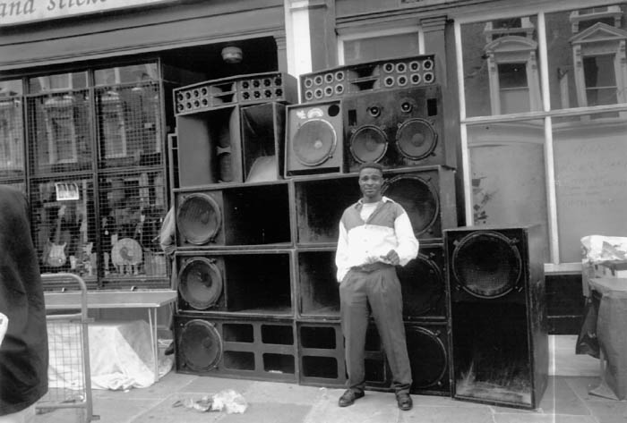
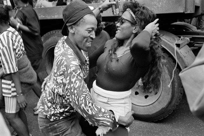
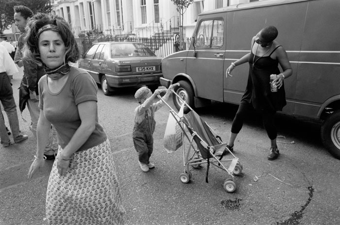
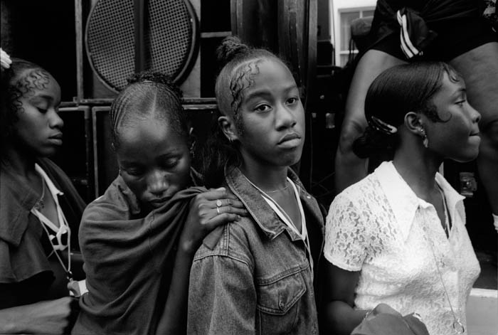
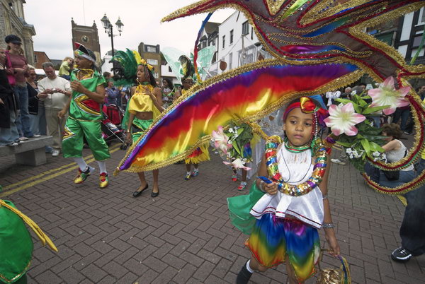
You can see more of Baldesare’s work on his own web site. Click on ‘Portfolio’ and scroll down the page to find three black and white projects,  his tube pictures, and two others which are due to also come out on CRB, Victoria Coach Station and A Local Event, pictures from carnivals and village fairs in the Surrey Hills.

Andrea Bruce

According to the NOOR web site, “Andrea Bruce is an award winning documentary photographer whose work focuses on people living in the aftermath of war.” So it perhaps made her an obvious choice as photographer for a recent New York Times article, ‘In Britain, Austerity Is Changing Everything‘ by Peter S Goodman.

Both text and pictures are interesting and illuminating, though much of what Goodman writes will be familiar to those of us living in the UK. But I particularly admire Bruce’s images and her use of space, as well as the range of images and the research and gaining access that must have gone into the project. She obviously had a very good ‘fixer’, often the unsung heroes of documentary photography.

You can see more of her work on the NOOR web site, where there is also a short biography of this American photographer born in 1973. She also appears on the World Press Photo site for her Soldier’s Funeral which was awarded second prize for single photos in the Daily Life section of the 2014 WPP awards.

Some of you may also be able to access her own web site, but on my normal browser all I get is a white screen with the message ‘Click to enable Adobe Flash player‘ which fails to respond to my clicking. I tried on a second browser and just got a dark grey filling the screen.

There are several videos of her on-line, including one on a workshop she gave in Bali, a shorter one of her talking about her approach and another of her talking about her ‘Our Democracy’ project in the USA.

Notting Hill Carnival- Café Royal Books

It’s carnival time, or almost so, though I’m not sure I will be going this year. I came late to Notting Hill, only discovering it in the 1990s but was immediately captivated by it, our largest street festival. For the next fifteen or so years I went every year I was in London, spending two days taking photographs and then a further several days recovering my hearing. Carnival is a hugely visceral experience, where you feel the sound and your whole body vibrates, and I wanted to try and capture something of that in my pictures.

Of course carnival is a very colourful event, and I did photograph it in colour, but somehow it was the black and white images I also took (and some years only took) that somehow managed – at least for me – to convey the spirit of the event.

Some of these pictures were among the first of mine to be put on a web site, Fixing Shadows, back in 1994 or 5. Fixing Shadows was one of the earliest web sites to show photographs on an internet that was only just beginning to display images as well as text. The site is still on-line, though the scans, made on a black and white only flatbed scanner, while effective, are not quite up to current standards.

Later, J David Sapir, who as well as setting up Fixing Shadows, a site ‘concerned with photographs of historic interest and with contemporary straight photography in general‘ was editor of the Visual Anthropology Review, commissioned fellow academic George Mentore to write the leading article in the Spring/Summer 1999 edition (Volume 15 number 1), Notting Hill in Carnival in which, as well as his writing about Notting Hill in particular and carnival in general from an anthropological viewpoint, also featured 20 of my pictures, each accompanied by a sometimes lengthy comment by Mentore.

Those of you with JSTOR or similar academic logins will be able to read it, but those without can only access the first page of the text  – and none of my photographs – without payment. (The issue also contains an excellent article by Darren Newbury, Photography and the visualisation of Working Class Lives in Britain, illustrated by work by Paul Trevor, Nick Waplington and Paul Graham.)

Since 1999 a few of the pictures have appeared here and there and in 2008, twenty of them were a part of a show ‘English Carnival‘ in London’, also still on-line.

I’m delighted to say that Café Royal Books have now published ‘Notting Hill Carnival in the 1990s‘ and for a mere £6.00 you can buy a copy of this 36 page issue with 18 of my pictures, including just a few that I’ve not printed or published before.

Notting Hill Carnival in the 1990s

A Sort of Home – David Hoffman

Finally today I managed to get to see David Hoffman’s show A Sort of Home: 1970s Whitechapel at Gallery 46 in Whitehchapel. I’d been very disappointed to have to miss the opening because of a nasty stomach upset last month, and finding a time to get out to Whitechapel was a problem as I’ve been rather busy and also away from London for some time. But today I got on a 25 bus and made the rather slow journey there, and it was well worth the trouble.

If you haven’t already seen the show you haven’t got long as it is only on until August 15th, which is next Wednesday. According to the web site the gallery is open 12 – 6pm, but hidden on the contact page is the information that it is closed Sunday and Monday, so that means your only chance is now Tuesday or Wednesday. Also rather discretely it is only on the contact page that it discloses that the gallery is at 46 Ashfield St, E1 2AJ – which is tucked away behind the Royal London Hospital. You walk south down Turner St, which seems to be a part of the hospital site, almost directly opposite the new Whitechapel Station Entrance, and Ashfield St is a couple of hundred yards down on the left.

Plenty of people had found it when I was there earlier today – one of the best attended small galleries I’ve been in for a long time. As well as the prints on the wall there is also a short audiovisual presentation, which I think displays the pictures rather better. For my taste some of the prints on the wall are a little dark and lacking in contrast and don’t do the great images any favours.

If you can’t make it you can see some of the work on the Gallery 46 web site, where 10 of his prints are for sale. But for a greater selection go to his own web site, particularly the ‘Fieldgate 20’ page.

As a small bonus for visiting Gallery 46, you also walk past one of the better 1930s block of flats in East London, which I photographed rather better in black and white some time in the 1980s for an (as yet) unpublished book with the provisional title ‘London Moderne‘. Gwynne House, architect Hume Victor Kerr, a block of 20 modern flats for ‘students, social workers and professional people in east London’ was completed in 1938. For some years it was owned by the hospital for its staff, but they sold it in 2011 to a company that modernised its interior and gave it portholes on the doors. Go a little further south along Turner St to 9-17, and you come to another of Kerr’s buildings, Comfort House, built in 1932 as a factory and showroom for gown manufacturer M Levy.

Muybridge’s Horse

I don’t recall coming across the blog Muybridge’s Horse before, which is a site featuring artists whose work relates to the way we interact and experience animals and nature run by Emma Kisiel who lives in Portland Oregon.

It was drawn to my attention by a post featuring work by Carl Corey from his series Americaville, which you can see in more depth on his own web site and in particular in his Americaville blog, which appears to have been running since November 2016, though the photographs on it are undated. A feature on Slate suggests that Corey began the project in 2014, and you can hear him talk about the project on Wisconsin Public Radio in 2016.

You can find out more about Corey and see more of his archive and current projects on his impressive web site (a few may still need telling that the symbol with three horizontal lines close to top left indicates the menu.)

Corey’s work attracted my attention so much that I completely forgot about Muybridge, who I’ve previously written about elsewhere at some length. He came from Kingston, on the edge of London, close to where I was born and not far from where I live, and a few years ago in 2007 I took part in an exhibition with two other photographers, Paul Baldesare and Mike Seaborne, in the museum there which houses a display on Kingston’s most famous son, though the work which made him famous was made in California. Kingston Museum has put together a web site about him with the local university which is perhaps the best introduction to his work.

So much is written about Muybridge and is available on line that adding more would be superfluous, but perhaps I might link to the web site on our show at the Kingston Museum, still on line some years later, Another London, and a picture from Kingston in 2006, a very different place to that which Muybridge knew.

Birth of the Fake News Photo

Another splendid piece by Kenneth Jarecke on Medium, Birth of the Fake News Photo takes a look at the principles that grew up (if unevenly) to produce the ethical basis of photojournalism and their more recent undermining, in particular by World Press Photo.

Jarecke writes with beautiful clarity, and is (as Wikipedia states) an American photojournalist, author, editor, and war correspondent. He has covered “everything, from wars to Olympic Games, in all corners of the world”.

You can see some of his fine photographs on his own web site, and at Contact Press Photos – of which he was one of the founding photographers.

His web site also contains a age worth reading in which he outlines his philosophy, which is also worth reading.

Famine Porn?

I hesitated to add my thoughts about the World Press Photo Instagram posts from Alessio Mamo showing villagers from Uttar Pradesh and Madhya Pradesh in front of tables with what for them would be exotic foodstuffs. Really I didn’t want to give what I felt was a misguided project any more publicity. But since every man and his dog, including The Guardian and the BBC have had their say I felt I too should say something, just in case anyone had manage to miss this and the enormous stir it has created on the web.

Firstly I think it important to state that some of the criticism has been ill-informed. The villagers that Mamo worked with were not starving or particularly malnourished, though certainly they were not the obese figures we are so used to in the west.

As Mamo has stated:

Most of the people enjoyed spontaneously to be part of this and photographed behind the table. The people I photographed were living in a village and they were not suffering from malnutrition anymore, they were not hungry or sick, and they freely participated in the project.

Mamo, as he says, “brought…a table and some fake food, and…told people to dream about some food that they would like to find on their table”. But the food on the table was not food and would not represent the dreams those people had of food.

It isn’t true to say as some critics did, that this was bringing fake food to starving people. It wasn’t although it did rather look like this, and it is that impression which matters. We make pictures but it is others who read them, and create their own meanings from them whatever our intentions.

This picture highlights the problems when photographers start doing rather gimmicky projects like this imposing a false situation on their subjects. It might be art, though I think not particularly impressive as such, but it certainly isn’t photojournalism, and should have no place at all on the World Press Photo site, whose Instagram posts Mamo was given the opportunity to takeover for a week.

The guidelines to photographers who take on this responsibility remind them that they should present “quality visual journalism and storytelling’ and “present accurate, compelling and creative work allowing people to see the world freely.”

WPP reserves the right to step in and “edit a post or a photographer’s selection”, but chose not to do so, and instead gave what many of us feel a response which fails to support any clear idea of what photojournalism is or should be.

The area into which these pictures fall is certainly not photojournalism, but rather more that of advertising, with Mamo thinking like an art director trying to sell a product to an audience than allowing “people to see the world freely”.

There have been so many comments on this work already made – with large collections of them on various web sites including Scroll and PetaPixel. For a couple more opinions you could read Allen Murabayashi of PhotoShelter and Yamini Pustake Bhalerao on ShethePeople.

Not Quite Déjà-vu

This morning I took a look at the front page of Café Royal Books, a small independent publishing house based in Southport, England originally set up in 2005 by Craig Atkinson as a “way to disseminate drawings and photographs, in multiple, affordably, quickly, and internationally without relying on ‘the gallery’“.

Since 2012, Café Royal Books has published at least weekly an ongoing series of publications presenting mainly ‘British Documentary Photography since 1960’. As he says on the site:

“This type of work has historically been neglected, in the UK and overseas by major institutions. It is often neglected by the photographer too, possibly because there has been no outlet, as such, for it.”

The publications usually present a series of images by a single photographer on a single project. It may be the work from a single event or representing a much longer project.  CRB has produced some larger works, but these weekly publications are generally between 24 and 40 pages, more a zine than a book, with the aim of building up a comprehensive survey of the area of work. Some photographers are represented by quite a few such volumes, in some cases more than 20, while others have preferred to stop at a single issue.

Atkinson keeps down costs, wanting to keep the issues affordable – currently £6 each for most.  You can get every title (except the special editions etc) with a 60 issue subscription – roughly the annual output – and there are also limited editions in a boxed set of 100 books every 100th title aimed “at public collections, so the books remain accessible.”

Among the photographers who have already had issues published are some very well-known names – including Martin Parr, Jo Spence, Daniel Meadows, Brian Griffin, David Hurn, Victor Sloan, Chris Killp, Paul Trevor and others, but some of the best books are by people you may well never have heard of.

The three most recent titles are Diane Bush — The Brits, England in the 1970s,
Ian MacDonald — Greatham Creek 1969–1974 and Janine Wiedel — Chainmaking: The Black Country West Midlands 1977, each worth a look, and you can page through them on the web site. Another recent title is John Benton-Harris — The English, where I have to declare an interest, as I helped John translate his ideas into digital form. It’s a great introduction to the work of this photographer who came to London to photograph Churchill’s funeral and stayed here as one of our most perceptive observers – and was also largely responsible for the seminal 1985 Barbican show ‘American Images 1945-80‘, providing most of the ideas and contacts and doing much of the legwork for which others were rather better at taking most of the credit.

But the déjà-vu? It came on the back cover of a book by another US visitor to this country, Diane Bush, who was here from 1969 for ten years, becoming a part of the Exit Photography Group with Paul Trevor and Nicholas Battye which produced ‘Down Wapping‘. On the back cover of her ‘The Brits, England in the 1970s’ was a picture of a car parked in front of a fence, using the reflections of that fence. It isn’t the same car nor I think the same fence, nor quite the same treatment, but I immediately thought of my picture when I saw hers.


Parked car, Vauxhall, Lambeth, 1978 – Peter Marshall

I don’t think there is much possibility that I had seen her picture when I took mine, but have a nagging suspicion that somewhere, by some photographer, is a similar image that we both had seen before making our pictures.
______________________________________________________

There are no adverts on this site and it receives no sponsorship, and I like to keep it that way. But it does take a considerable amount of my time and thought, and if you enjoy reading it, a small donation – perhaps the cost of a beer – would be appreciated.

My London Diary : London Photos : Hull : River Lea/Lee Valley : London’s Industrial Heritage

All photographs on this and my other sites, unless otherwise stated, are taken by and copyright of Peter Marshall, and are available for reproduction or can be bought as prints.

To order prints or reproduce images

________________________________________________________

Pennies for the guy…

Pennies for the guy who took the picture is the offer to photographers from  National Geographic Fine Art Galleries (NGFA) revealed in the article  Is National Geographic Fine Art a Ripoff for Photographers?  published on PetaPixel. In it Ken Bower writes of how his initial reaction to having one of his landscape images selected to be sold by the NGFA turned sour when he found out more about how the NGFA sales programme works.

The NGFA explained it to him, and you can read their explanation in the Petapixel post. If NGFA sell the print for $1800, 10% of that amount goes to the National Geographic Creative agency – so in this case a miserly $180. That agency then gives half of their cut to the photographer, who ends up with $90 – just 5% of the price the buyer has paid.

Simple maths shows us that the NGFA itself takes 90% of the purchase price – in this case $1620. That’s 18 times as much as the photographer. And although NGFA increases the price of the prints as the edition – of 200 prints – sells, that ratio remains the same. If they sell the whole edition of 200, those pennies for the photographer would however add up to a substantial amount – if nothing like as substantial as that made by the NGFA.

Now I appreciate galleries have costs. In this case they are making the prints, running a web site, conducting the sales etc. I’ve sold a few prints through galleries, and their commissions have ranged from 20% to 35%, and a 50:50 split is not unusual. Some I’m told even take a little more – but even the worst deals I’ve heard of leave the photographer with 40%, eight times what NGFA are offering.

As Bower points out, the NGFA seems to be “targeting photographers who have placed well in Nat Geo photo competitions or who are popular on the Your Shot community” for their sales, rather than the extremely professional and talented professionals whose work is published by National Geographic – who would have a much better idea of the worth of their images.

I’m not a great fan of commercial photo galleries, as regular readers will have noticed. With few exceptions I don’t feel they have the best interests of photographers or photography at the base of their activities. I still think and have often argued that the concept of limited editions is inimical to our medium and am unhappy at the fetishisation of the photographic print and in particular of the ‘original print’ that they foster. Overall I think they are parasitical on photographers and photography, though there are a few I respect for how they have genuinely contributed to our knowledge and understanding of the medium’s history.

But while buying prints from a commercial gallery, or better, from a photographer may at least sometimes be a sound investment as well as a pleasure to be enjoyed, it seems to me that the NGFA is essentially selling high price decor. I’m not dismissing Bower and those who have signed up with them as photographers – his is certainly a decent landscape image – but those with cash to spare will buy it or images like it because it goes with their colour scheme – and the next time they have new interior decorators in, that picture will go out with the trash – or if they try to sell it they will almost certainly find its resale value is far less than they paid, possibly little if any more than the worth of the frame.

As Bower hints, essentially what is being sold are high-price posters. Not printed by the photographer, the printing not overseen by the photographer, decisions about paper etc. not made by the photographer. An edition of 200 might almost as well be labelled unlimited, and the prints are not signed by the photograph but machine-signed with a ‘digital signature’.

There is a poll at the bottom of the Petapixel page asking for readers to rate the deal. When I looked at it, to my astonishment there were 15 people out of a little over a thousand who thought NGFA were offering a great or good deal. It made me wonder if they worked for the company, though on any poll you can get a few random drunken clicks. At the other end of the scale almost 96% thought it a bad or horrible deal. I think you can guess how I voted.

David Goldblatt (1930-2018)

One of the first photographic books I bought was ‘On The Mines’ by David Goldblatt and Nadine Gordimer, published in 1973 in Cape Town, and I think purchased from Creative Camera’s bookroom in Doughty St, which played an important role in my own development as a photographer. Unlike many books, I still have that first edition hardback, and can still find it and am sitting looking at one of Goldblatt’s best-known pictures on its back dust-jacket, “Boss Boy”, taken in 1966 and from the essay ‘The Witwatersrand: a time and tailings’ with Gordimer’s text and Goldblatt’s pictures and captions which is the first of three parts of the book – which continues with his ‘Shaftsinking‘ and ‘Mining Men‘.

So far I’ve read five obituaries of Goldblatt, though doubtless many more will be published, and I may even look out a dust off a short piece I wrote about him perhaps 20 years ago, though probably not, as certainly others knew him far better and probably wrote more perceptively about his work. Of course, back when I was growing up we all knew about apartheid and condemned it – and as a teenager I remember acting a part in a play about it, and later joining the Anti-Apartheid Movement and going on marches and protests.

But Goldblatt’s photographs, often very calm and carefully composed like that superbly framed ‘Boss Boy, the tips of the folding rule in his top pocket a fraction from the tope of the frame and his presentation ‘Zobo watch presented by the company for his safe working at the bottom edge, and on his left arm the company’s three star rank ‘Boss Boy’ metal badge touching the right edge of the picture, along with the texts strikingly brought home the realities of living under the Apartheid regime.

The five articles I’ve so far read are in the New York Times, The Daily Maverick  and Mail and Guardian from Zambia,  Al Jazeera and The Guardian.