Uncle Earl’s Photos

I thought I had said my last word about the pictures that made the headlines when it was claimed they were long lost works by Ansel Adams when I wrote Lost Ansel Adams? in which I made clear that whatever the authorship of these images, I felt they were of no value, going perhaps a little further by writing “I’d really like to see some kind of mechanism for losing much of Mr Adams’s work rather than anyone coming up with more.”

What seemed absolutely clear from the images on the web was that whoever had made them they were not a product of the mature photographer who produced a number of truly outstanding images. I found it hard to believe that had he made them he would not have destroyed at least some of them, and more than unlikely that he would, as alleged have shown them to others during his teaching.  It was also clear that none of those supporting the claim had any real competence in the matter.

But I revisited the scene after reading A D Coleman’s comments in his Cowflop from the Adams Herd (1) largely because of some of the points that he made about the idea of ‘original prints’ with a post Coleman on Adams or Not in which I tried to look at whether there was any way we could reclaim the term and give in some true meaning in a photographic context.

But now I’d recommend you go back to Coleman’s  Photocritic International, scroll down to the bottom of the page and start reading each of his contributions in turn just for the sheer pleasure of seeing a critical sledge-hammer applied with immense control and precision to a rather small and mouldy nut. It kept me up for an hour later than I intended last night reading through it.

Coleman has not yet finished his series, and there is more to come, and I think it possible that there could be some clumsily litigious comeback against him from the by now aggrieved parties, though given his apparently meticulous evidence-based approach I see little chance of any success.

Of course the whole story has little to do with photography, but a great deal about the curious distortions that the art market has imposed on much of the institutional basis that now underpins our medium. It perhaps would not matter much if it was confined to the world of dealers, but it also now very much determines the agendas in the museum and academic sectors.

Personally, I’m going to get on with making pictures and with showing them on the web and elsewhere when and where I can, producing moderately priced books through Blurb and perhaps in other ways, and selling them for reasonable prices as prints or licensing them for use at costs that reflect both my needs and my customer’s ability to pay rather than the kind of bulk-buy rates available from the image superstores.

Perhaps finally on this topic (though who knows what may ensue) Eric Felten has an interesting piece in the Wall St Journal, Ansel Adams And the Art World Name Game which concludes with the thought:

we might want to be more open-minded when we encounter art of dubious provenance, allowing ourselves to judge and appreciate works for their quality rather than their attribution. Who knows, maybe Uncle Earl was an artist with something to say.

Although I very much regret that Uncle Earl isn’t around too enjoy his moment of posthumous fame and gallery showing, I’m afraid it is only too clear that he was not.

Photo Paris

© 2010, Peter Marshall

I still get a great buzz from seeing my work in print*, and although once again it’s “only in Blurb” I still felt that same thrill as I ripped open the packet containing my latest publication, Photo Paris.

Although it’s a new book – I finished and uploaded it earlier this month but only made it public today when I’d checked my first ‘proof’ copy – in some ways it’s also rather old. I took the pictures  in 1988, twenty two years ago, and shortly afterwards assembled a number of the enprints from the visit there into a single copy of a book, made from cartridge paper sheets cut to page size and bound together using an office report binding system that punches a row of rectangular holes along one edge for a plastic ‘comb’ binder.  To make it look more like a proper book, I laser printed a cover to go around and hide the binder.  It’s still there on my bookshelves and over the years I’ve often taken it down to look through.

© 2010, Peter Marshall

Although it looks rather amateur and is now showing signs of wear, it has one advantage over the new Blurb-printed edition, in the the pictures are genuine photographs.  But they were machine-produced prints with no dodging or burning and the colour is sometimes not quite how I think it should be. Although the printed work just lacks the kind of quality of a photographic print, at least I was able to work on the scans to get the pictures looking how I wanted them.  The print quality from Blurb is adequate though not spectacular, and I think the premium paper which I specified makes slightly less difference with colour than with black and white.

This is an extended volume – which has more than twice as many images as the original version – now 67 in the actual ‘Photo Paris‘ series, along with the view from the window of the flat I stayed in and the usual portrait of me.

© 2010, Peter Marshall

Rather than working from the original, I made contact prints of all the negatives from the project using my Epson V750. Most of the negatives were already in transparent filing sheets and it was relatively quick and easy to simply put them on the scanner in these, although some I had to transfer to new sheets to do so. From these ‘contacts’, scanned at 1200 dpi so I could enlarge individual frames for a good look, I discovered a number of images I’d overlooked at the time, in some cases because the en-prints were rather poor.

I then scanned around a hundred images at 4800 dpi on a negative scanner – the Minolta Multi Pro, no longer made but still one of the best negative scanners around when equipped with third party ‘Scanhancer‘ diffuser and Xpander negative carrier. This was around 20 hours of work, with probably around the same time in Photoshop needed to get the scans into decent shape. Of course I didn’t need files that big for the book, but I’m also working for a show of some of these pictures in a couple of months, and if you are making scans it generally makes sense to scan at the highest optical resolution of the scanner in case you need a larger file later.

Scanning negatives doesn’t entirely take up your time for all those hours – it takes some time for each actual scan when you can occupy yourself doing other things. As I write this I’m actually scanning another book/exhibition project – Blurb is seriously habit-forming! But using Photoshop or some other software is too processor intensive and seriously slows down the scanner on my computer.

© 2010, Peter Marshall

Computers are good for many things, but at this point I still find it best to go to physical prints. The next step was to make a set of small prints of these scans to continue with the selection and editing process. Although Photoshop can print out multiple images on each sheet of paper, I find it easier to use QImage for this job.

Our dining table is fortunately large enough to lay out all one hundred of the prints, and to start working out a sequence for the book and discarding any images that I didn’t want to use. Some photographers like to get other people to work on their books at this stage, but for me its a vital part of the creative process that I want to keep 100% under my control.

I think a photo book needs to have both some kind of structural idea, a start and a finish and a view about how you get from one to the other and the various themes that run through the work, and also be alive to and work with the graphic elements in the pictures.  If, as in this case you use pictures on facing pages you have to be particularly careful in selecting images that will work together, not least because although you design a book to be read from start to finish, many people will read it simply by turning to random spreads.

© 2010, Peter Marshall

Looking through the book now, I think I made a pretty good stab at it, though perhaps there are one or two images I might have ordered differently, and one or two I might have left out. But had I done so I’m sure I’d now be thinking the reverse. I was surprised in making a new selection from the contacts how good my editing had been before – every single image from the original 25 is in the new book.

You can see around a quarter of the book on the preview on the Blurb site, although I’ve selected pages with some of my favourite pictures rather than just the default first 15 pages.  As always with Blurb, at £16.45 it seems just a bit expensive, and adding the postage makes it rather silly – though not so bad if you buy several books at once.

I’ll be showing a few pictures from the book in a show with two other photographers at ‘The Shoreditch Gallery‘ in the Juggler in Hoxton Market in October, and hope to bring some copies for a book signing at the opening at a slightly cheaper price – and of course if you come and buy one you don’t have to pay postage. More details on the show and an invite to the opening later. The show is a part of the East London Photomonth 2010, and the website for this is also coming soon!

* but I still require money for any commercial publication!

Gangland

João Pina’s photo essay Gangland – Rio de Janeiro’s Urban Violence, shown in Bite! magazine is a remarkable document, showing the lives of the drug dealers and gang leaders and the police units, working in some of the most dangerous places imaginable and making fine black and white images that tell the story in a remarkably powerful manner. He shows us both sides of a war on the streets in which everyone is a victim and “it is nearly impossible to escape the violence.”

Some of these pictures I found extremely moving though they are not exactly pleasant viewing, and I think it is essential to turn on the captions before you view – though it is a shame they obscure a little of the bottom of the image.  I think by default they are off, which I think is the wrong decision for a documentary site; viewing them without captions tends to aestheticise them and turn  the viewer into more of a voyeur.   I think it is a shame too that the larger set of these images on the photographers own web site – with some more other great work – presents them entirely without captions, although they are prefaced by his statement about the work.  Although it is only too obvious what some of the images are about, others are frankly impenetrable without some added context.

João Pina (b Lison, Portugal, 1980) started working as a photographer in 1998, and first went to Latin America in 2002; in 2003 he joined the Portuguese collective Kameraphoto, and from 2004-2005 studied on the Photojournalism and Documentary Photography program at the International Center of Photography (ICP)  in New York, USA. Since 2007 he has been based in Buenos Aires, Argentina.  His work has been published in newpapers and magazines around the world. He worked together with writer Rui Daniel Galiza on his  first book, Por Teu Livre Pensamento, (2007) about the people, including two of the photographer’s grandparents who were  arrested, tortured and imprisoned by the long-running Portuguese fascist regime which only came to an end in 1974.

Honest Reporting by Reuters?

I’ve not come across the Honest Reporting site before, but it apparently started at the time of Yom Kippur in 2000, when a group of Jewish students at British universities decided to do something to combat unfair reporting of the Intifada. In particular there was one photo distributed and published around the world of a “young man — bloodied and battered — crouching beneath a club-wielding Israeli policeman” that was published around the world as a Palestinian victim of Israel violence. In fact it showed an American Jewish student who had been beaten up by a mob of Palestinian Arabs, and the Israeli solders had rescued him and were protecting him from further mob violence.

As too often happens with the media, once the mistake had been pointed out, the corrections were half-hearted and many inaccuracies remained. The photograph is still used as anti-Israeli propoganda on various web sites – you can read more on  HonestReporting.

A recent post on HonestReporting looks at the coverage by Reuters of a clash on the Israeli-Lebanese border during what was described by Israeli sources as a routine tree-pruning mission a couple of weeks ago. Their report makes clear the very unusual level of coverage from both the Israeli and Lebanese sides by Reuters photographers, who appear to have been given unusually wide and unrestricted access to the combat zone and have worked without injuries while Lebanese photographer, Assaf Abu Rahhal, working for the pro-Syrian paper al-Akhbar was killed and another, Ali Chouaib was injured.

As well as the five Reuters photographers, the agency also had other images from stringers; normally Reuters give the names of stringers but in this case unusually they are not identified. They too appear from their pictures to have had privileged access to the events.

Its worth reading the report in detail and looking at the pictures. The article raises a number of important questions about the integrity of Reuters and I hope they will issue a full explanation. Thanks to Jonathan Warren for posting a link to this feature on the London Photographers Branch Facebook page.

Another Israel-related photo story of the moment is Israeli soldiers posting images of themselves with Palestinian detainees on their Facebook pages.  A story on Haaretz.com (brought to my attention on Facebook by Fil Kaler) reports the claim by Israeli human rights group ‘Breaking the Silence‘ that Israeli Defence Forces soldiers putting pictures showing themselves on Facebook “alongside handcuffed and blindfolded Palestinian detainees represent the norm, not the exception.” To back up their argument they themselves have published a few such more pictures on Facebook.

Chariot Festivals in London

 © 2010, Peter Marshall
Shree Ganapathy Hindu Temple Chariot Festival, Wimbledon

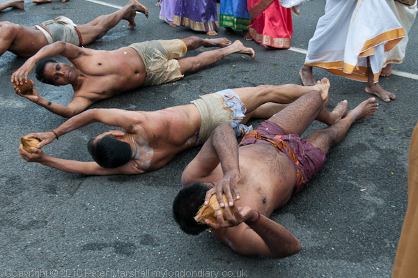
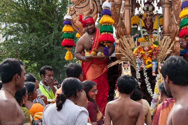
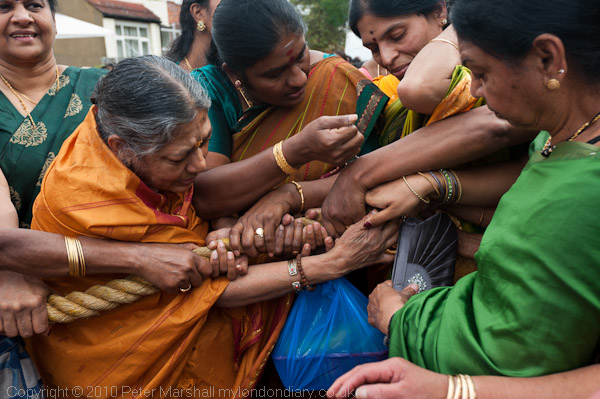
This month I’ve photographed two Hindu chariot festivals in London, both from Tamil temples, and although they have had much in common, there was noticeably a different atmosphere to the two, and it shows in the pictures.

© 2010, Peter Marshall
Shree Ganapathy Hindu Temple Chariot Festival, Wimbledon

Ealing was the larger and more showy of the two, with many more dancers and costumes, but although everyone was very friendly I found I didn’t want to stay long. At Wimbledon I felt much more at home; it was smaller, somehow a little more domestic and more caring and I stayed working there for twice as long and was very tempted by the invitation to stay and have a meal but after working pretty well flat out for over two hours decided I needed to go for a rest with a glass or two in the pub, and then get on with processing the pictures.

© 2010, Peter Marshall
Shree Ganapathy Hindu Temple Chariot Festival, Wimbledon

Of course my view is an outsider’s view of these events, and may not reflect the realities for those involved in these religious festivals. But it’s very important that when I photograph events such as these that it is my point of view, and that I’m not producing Temple publicity.

So though I try to be sensitive to the event and observe so far as I understand them the protocols (like working without shoes) and not get in the way of what is happening, there may well be pictures that some of those in them don’t like. But fortunately, most of the time, the people I photograph react very positively to the pictures.

I also think its important to try and understand what is going on in order to photograph it, and at some religious festivals this is not easy. Hinduism claims to be the world’s oldest religion and seems to me the most intricate and dense, with a deeply philosophical approach and a language that makes it hard for me to understand. Getting the captions right can be problem but I like to try and give some idea what things are about and I’m always happy to correct any errors or make any necessary clarification, although I’m unlikely to alter my opinions. But the pictures are what I saw and how I saw it and I stand by them.

The largest of these festivals in London is I think the Sri Murugan Temple Chariot Festival in Manor Park, East Ham which I photographed last year.

1848 Daguerreotypes

There is a fairly remarkable story on ‘Wired’ about the digital cleaning of the 1848 daugerreotypes by Charles Fontayne and William Porte, a set of eight whole plate (8.5 x6.5″) images taken from across the river at Cincinnati and together showing a couple of miles of the waterfront (with some small gaps.) By 1848 the daguerreotype process was more than 10 years old, although it was only announced to the world in 1839, and technically had been considerably improved, particularly in the USA.

We’ve long known the incredible detail of the best daguerreotypes, so the hype around this particular set of pictures is rather overdone, but it’s certainly good to see that the images can be restored to something like their original state by scanning and the use of digital techniques to remove spots, although I rather wish they had ignored the wishes of the art historians and also removed the polishing marks.

If anything the actual resolution of the images turns out to be rather less than I expected, with a 1mm wide clock face being only just legible after the cleaning process.  An 8.5 inch wide print is around 216mm wide, which would be around 20 pixels wide from a D700 file and that might also be just enough to make out the time.  But if I read correctly the Bite piece suggests that you would need a 170Mp back rather than the 12Mp of the D700 to match the dags, and that doesn’t quite seem right.  Perhaps digital pixels are worth more than dag pixels, just as we found we could outdo film with around a third of the pixel count?

Probably what limited the resolution of the dag were the optics, though at least they had a simpler job to do than today’s lenses, as the plates were only blue sensitive. And since the image made in the camera was the actual final piece, in normal viewing their was no enlargement.  It’s perhaps surprising that the “details — down to window curtains and wheel spokes — remained crisp even at 30X magnification” as this was rather more than required, but I get pretty crisp detail when I enlarge a 12Mp digital file from the D700 by the same amount too.

The daguerreotype is not the only highly detailed process, and perhaps the real trail-blazers were the giant(or even Mammoth) plates taken by some wet plate photographers, which I think would be difficult to equal with modern materials, even by the few people I’ve known who’ve used larger than 8×10 film cameras.

Byte describe it as “one of the most famous photographs in the history of the medium” though I doubt if many of us have heard of this set of pictures and one of the things that appeals to me greatly is how ordinary it is. But it gives us a small glimpse into everyday life in one US city 162 years ago, which is truly remarkable. Of course its great value comes from the rarity of such images at the time – taking them was both expensive and highly skilled. But I think it is likely to be true that those images that we take today which will become truly valuable in the future are not the arty or conceptual creations that currently clog many gallery spaces and dealers, but pictures of the ordinary and everyday.

Flattry, Theiving and Photojournalism

The Russian Photos Blog by Jeremy Nicholl has an interesting post today And Now For Something Completely Different: Is Photojournalism Dead Yet? relating back to Neil Burgess’s pronouncement of the death of photojournalism made on the EPUK web site and discussed here two weeks ago in Funeral For Photojournalism?

Hardly had the ink dried on Burgess’s piece at EPUK than exactly the same piece appeared on another web site, lifted completely without permission and promoted by this site as their own piece (and apparently they are so proud of it that they’ve made over a hundred tweets about it.) As well as the text they have also reused the accompanying photograph by David Hoffman, along with his copyright notice.

EPUK not surprisingly are upset and have passed the matter to their “lawyers who will be looking for proportionately substantial damages, an apology and an immediate takedown.”

The organisation concerned is the London Photographic Association (LPA) which “is a trading identity of London Photographic Awards Limited” which started in 1997, as an annual competition with a “coffee table catalogue”.  LPA Membership costs £125 a year (less for overseas members and students.) When I was writing professionally about photography I used to get press releases about the LPA and its competitions, but they never convinced me that it was something I should write about.

Nicholl picks up a few other contributions to the debate over the future of photojournalism, and ends with the conclusion that although these have some different perspectives, one thing they have in common is that they are not by working photographers, and that “it might be more appropriate to talk to the monkeys than the organ grinders.”

Well, he could perhaps have done just that, but it seems to me he has chosen not to do so.  One very positive contribution to the debate comes from VII photographer Tomas van Houtryve (which I first read about on dvaphoto last week)  but is covered by a post on Tomas’s own blog, Testing new funding models for photojournalism.

I’ve often mentioned the need for some working micro-payment model for the web, hoping that something could emerge that worked by a levy on the payments we all make for internet access and be distributed on the basis of page hits in some way, rather like the current DACS system for copyright payments for photocopying of images in UK newspapers and books. (I filled in this year’s claim and sent it off on Saturday.)

But Flattr, which van Houtryve is implementing on his web sites, is a voluntary subscription scheme that would appear to overcome many of the problems both of implementing the kind of cumbersome official scheme I’ve envisaged, and better still, one that is already working, if only just now released into open beta.

To join Flattr you have to engage to pay a fixed monthly amount to cover all web pages that you want to reward for their content that month – I understand the minimum monthly amount is 2 euros, though to save administration costs you have to sign up and pay up front for a minimum period which makes it worth transferring the cash.

Once joined, you can reward web sites you like that carry a Flattr button by clicking on it – you Flattr them. Every month your monthly amount is divided equally among the sites you have clicked (and Flattr of course takes its tithe) and credited to their Flattr accounts.

As a content provider you collect up the payments from the clicks and when it’s reached a sensible amount can transfer it to your Paypal account.  It really does seem to get round most if not all of the problems currently associated with ‘Donate’ buttons or other ways of generating income from simple web sites.

But. And it’s quite a big but. There are obvious advantages for content providers in joining Flattr, and I suspect that the great majority of those with Flattr accounts at the moment are content providers, but I’m not convinced that large numbers of other internet users will be signing up for the scheme.  So at least at the start its a way of distributing small amounts of money between creators. Though I think many of us would like at times to have some way of thanking people for their work which we’ve found useful or entertaining, will that translate into actually committing an annual amount to do so?

It might, and perhaps it’s worth a try. But I think it really needs the support of rather larger players in the internet league than Flattr. And its perhaps something that the links between these guys and Pirate Bay, and also the support that it is giving to Wikileaks may not help. But as that article at TechCrunch Europe (link to http://eu.techcrunch.com/2010/08/02/wikileaks-will-fund-itself-via-flattr-pirate-bay-founders-startup/ removed as my antivirus now reports a problem)  points out, one of the companies backing it is Clerkenwell’s White Bear Yard, whose previous successes include Skype.

Dvaphoto also mentions Kickstarter, which offers an alternative method of attracting funding for creative projects. At the moment a US bank account and address are required to start a project and receive funds, but the scheme enables you to advertise projects and also offer inducements (for example a photographer might offer a book or a signed print from the project) to those who agree to give financial support. The money – typically $15-$100 from each donor – doesn’t change hands unless the total needed for the project is pledged, and each project has a time limit to try and attract funds, with Kickstart taking 5%.

Still Occupied

I’ve just started work on scanning another of my early projects, really the first organised and extensive work I produced, on the urban development of Hull , or, to give its proper title, Kingston upon Hull.

© 1983, Peter Marshall
Cafe, Hessle Road

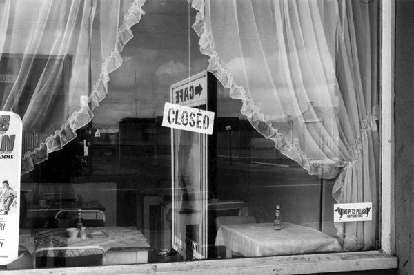
I just walked into the city art gallery there one day with a small packet of prints and asked to see one of the curators. She obviously wasn’t expecting anything like I’d brought, took a brief look and then asked me to come back with more work at a later date. I think it’s still true that outside of London people are much more open and prepared to look at new work, and that was certainly the case in Hull at that time.

The prints I had made were quite small – around 5×7 inches, very sharp and printed rather intensely using Agfa Record Rapid – my favourite printing paper and something of a legend. I’d started using Agfa Portriga – a warm tone paper – a few years earlier, because it was being sold off cheaply after Agfa had stopped importing their black and white papers in the the UK and had been impressed. Then somehow – perhaps a note in a magazine or by word of mouth – that Peter Goldfield had set up a small company called Goldfinger to import another and even better Agfa paper, the more neutral Record Rapid, into the UK.

Muswell Hill was somewhere in London and I was soon catching a train and the underground and then walking up the long hill from Highgate tube station only to find that the address I had was a chemist’s shop rather than a photo store. Evemtually I decided to go in and ask, having come so far, and was told that I had indeed come to the right place and was taken to a door around the side of the shop where stairs led to a photographic Alladdin’s cave.

In there I met two fellow enthusiasts, Peter Goldfield and Martin Read, both of whom I got to know over many visits. Peter who was my age and I was to get to know better through workshops – at first when he gave me a lift up to  the Photographers Place in Bradbourne to see Lewis Baltz and later at the workshops that he set up and ran at Duckspool – sadly died last year. Martin had long continued the photographic business on his own as Silverprint – it celebrated 25 years in 2009 – a short walk from Waterloo station south of the river. It’s still the place to get the best of materials for black and white photography though it now also offers a wider range of products and services. And from the web site you can still download a pdf of the original ‘Goldfinger Craftbook‘ which when published in 1978 became the second essential piece of reading for any photographer wanting to produce fine prints (the first was of course the Ansel Adams Basic Photo volume, ‘The Print.’)

© Peter Marshall 1979
Pulman Street War Memorial, Hull

The show ‘Still OccupiedA View of Hull‘ took up the whole of the top floor of the gallery in 1983. I’d originally intended to show around 80 black and white prints, but by the time it came to hang, the number had grown rather and I’d also added some colour work, and I think the final total was just under 150.

This year’s show will be rather smaller, as I’m limited to an 8 foot by 4 foot panel. In the original show the 7×5″ prints were arranged in groups of 2 or 4, and were mounted behind specially cut window mats. This time I’m thinking of using a similar layout but simply printing the 2 or 4 images onto the same sheet of inkjet paper and showing them unmatted.

Although the show won’t have so many pictures, I’m also hoping to make another Blurb book, which may well contain thumbnails of most or all of them with a smaller and tighter edit of full page images. But I’ll also be making a slightly different selection the second time round and the picture above is an example. In the original show I used a vertical image which included the doorway and the war memorial to its left, and also the whole of the window above. Now I think the car with its broken headlamp and the shop window with its boxes of ‘Tide’ and other detergents has a stronger message.

There are a few more pictures from this project on the Urban Landscapes web site.

Gloomy Day

Two bits of news have made today a gloomy one for at least some photographers. Particularly depressing for those staff photographers working for the Daily and Sunday Mirror. A post on Press Gazette states that six of the ten staff photographers working for the two titles are to lose their jobs.  After the cuts each paper will have just two staff photographers.  Only a few years ago even a small local paper would have as many if not more. The other Mirror Group national, The People, already runs without a single staff photographer.

Of course the papers still use photographs, but most of these will probably come from the mega-agencies and be increasingly generic images.  Increasingly there are more and more freelances around chasing fewer and fewer sales opportunities.  Bad news for all of us.

The other bit of gloom will only really affect those few photographers still using Fuji Sensia film. The BJP reports that all production of these ISO 100, 200 & 400 transparency films has stopped, although current stocks are expected to last until December.  It won’t affect many because they’ve only stopped making it because sales are too small.  Provia and Velvia remain in production.

I gave up using slide film (except when a client insisted on it) around 1985, when it seemed to me that colour negative film enabled me to produce better results. In the BJP article, Jonathan Eastland says he came to the same decision last year, when Kodak brought out its new Ektar 100, which has finer grain and more latitude than any reversal emulsion.  More or less the same reasons that drove me to the same conclusion 24 years earlier, although since we now all work with scanned images, the fact that it is far easier to get good scans from negative is also vital.

Transparency film was kept going in professional use for many years largely because editors could easily assess images on a light-box and repro technicians couldn’t be bothered to set up scanners for negative film. Once we started scanning our own and submitting digital files we could all see the advantages of negative.

Then of course came digital. And by the time we had 6Mp cameras like the Nikon D100 film of all types had really lost the battle for most purposes.

Lightroom 3.2 RC

No, you haven’t missed anything, they skipped 3.1 in order to align the fractional release numbers with Lightroom and Camera Raw (for which 6.2RC is available) which makes sense. Details and download link on Lightroom Journal

Great news for me is among quite a few added lens profiles is one for the Nikon 16-35mm, and there are a couple of others, along with lots more for Canon and Pentax and also profiles for some Zeiss lenses on both Canon and Nikon. And if anyone has managed to afford a Leica S2 they will be pleased too, along with owners of a number of more lowly cameras. They also hope to have more cameras and lenses in the final version of LR 3.2.

Also there is a pretty good long list of bug fixes. If you don’t have one of the cameras or lenses for which support has been added, it’s probably worth checking through this to see if it solves any of your problems.  Although there are a few things that look as if they may help me a little, they haven’t tackled any of those things I find most annoying – like ‘Export’ giving lousy soft and over-large file size small jpegs. So I’ll continue to have to use the web module when I want to make the 600x400pixel images, then copy these out of the website created before deleting the hundreds of files I didn’t want.

One little bug fix that should help me is:

  • Develop: The local adjustment brush could have a very slow first stroke when exposure is the selected adjustment

Fortunately the catalogue format hasn’t been changed so there is less likelihood of installing 3.2RC causing any problems. But overall if you haven’t had any of the problems that are fixed in the list and if you don’t have any of the cameras and lenses for which support has been added there isn’t any point in downloading the release candidate – wait for the final release.

Otherwise, I’ve just begun my download and you should be after me in the queue to get it.