The Integrity of the Image

With the continuing debate over the disqualification of around 20% of the entries that reached the later stages of World Press Photo for excessive manipulation I think it is well worth reading the WPP’s Photo Research Project ‘The Integrity of the Image‘ by Dr David Campbell.

It’s a subject I’ve written about myself on various occasions, and tried to do so from the perspective of a working photographer, someone who does their own image processing in Lightroom and Photoshop.

I’ve always felt it’s basically a straightforward issue. The key concepts are integrity and intention, and my view can be summed up very briefly:

Correction – Fine; Emphasis – within limits; Alteration – Never.

Of course its a statement that requires interpretation, and back in 2010 I published my views on what was and wasn’t acceptable when processing an image. I think it bears repetition (with some minor changes and additions to clarify) :


Always appropriate (as necessary)

  • dust removal (scratch etc removal from film
  • level correction
  • colour temperature correction
  • exposure correction
  • brightness correction
  • minor contrast correction
  • marginal cropping
  • image rotation
  • highlight removal
  • image resizing
  • image sharpening
  • lens distortion and aberration correction
  • image noise reduction
  • Vignetting reduction/removal

Often appropriate (within limits)

  • Curve adjustment
  • Local dodging
  • Local burning
  • flare removal
  • local contrast adjustment
  • perspective correction
  • saturation / vibrancy adjustment (including conversion to black and white)

Sometimes appropriate

  • Deliberate blurring/pixellation of detail (eg where necessary to hide identity)

Seldom appropriate

  • radical cropping
  • excessive vignetting
  • colour toning
  • graphic effects

Never appropriate

  • Content sensitive fill
  • Removal or addition of important image elements

Of course many of these require judgement as to what level of use is allowable. While it may be appropriate to emphasize some elements of an image and de-emphasize others, dodging or burning certainly shouldn’t eliminate them.

Some photographers attempt to justify excessive manipulation (or colour casts etc) by saying that it was how they saw the image when they made it; its seldom an argument that convinces me; images have to be believable to the audience, and the techniques we use appropriate to the purpose.

One aspect I’m pleased to see included in Campbell’s report, in his list he describes as a  ‘general consensus’:

  • Photos cannot be staged, posed or re-enacted.

As the report states:

“This consensus applies most directly to news and documentary images. Our respondents noted that they generally regarded nature and sports images in the same way as news and documentary images. Fashion and staged portraits were a different matter altogether. In those genres, there were no policies, and in fashion especially the prevailing attitude was that anything goes and all is permitted.”

I’m all in favour of keeping ‘news’ news, of keeping sports real and stuffed squirrels out of nature photography.

Pancake Day

This year I just don’t have the energy for pancake races. Not that I ever took part in them, but since I first photographed the Worshipful Company of Poulters Pancake Race in 2007 I’ve returned most years, as well as photographing other races in Spitalfields and elsewhere.


Pancake Day 2011

The race in Guildhall Yard has become something of a tradition for those taking part, particularly for a few of my photographer friends, and is certainly one of the odder events in the city. Hardly an ancient tradition (it began in 2005, a couple of years before I first went) but as I noted in 2007 is:

organised by The Worshipful Company Of Poulters which got its charter to regulate the sale of poultry and small game in 1368, and run, by permission of the Chief Commoner, in the yard fronting the Guildhall building, which got a controversial new gothic facade in 1788 thanks to George Dance the Younger. It was first run in 2005*, but as befits the city it has a serious set of classes and rules, music from the Worshipful Company of Musicians (1500), time-keeping by the Worshipful Company of Clockmakers (1631) and a starting cannon for each of the many races provided and fired by the Worshipful Company of Gunmakers (1637.)


Pancake Day 2012


Pancake Day 2013


Pancake Day 2014

Like most of the other pancake races, this is a charity event, and one thing the City is not short of is money. And while I suspect that many of those taking part will be up to all sorts of dodges to (mainly legally) avoid paying tax they will at least be giving some of their ill-gotten gains to good causes.


2008 Poulters’ Company Shrove Tuesday Pancake Race

Its an event that often amuses me, with some very serious people trying hard to let their hair down and wearing very silly hats, but also one that shows how competitive the City can be – and with sometimes a certain amount of sharp practice despite elaborate rules and a large number of people observing compliance.


Great Spitalfields Pancake Race winners 2007

My own athletic ability has some years been taxed by jogging with a heavy camera bag from the Guildhall Yard to The Great Spitalfields Pancake Race across the border in Tower Hamlets. Taking place in what was a part of the Brewery site off Brick Lane, the shortest route is just over a mile, and the only sensible way to make the journey fast is on foot or bicycle. But taking a bicycle to events like this involves an unacceptably high risk of not having a bicycle for the journey home. So I walk and run and walk and run…

Unlike the Guildhall race, this and three others are included in the Official Tourist Guide to London. It takes place in a rather more confined space making it difficult to take pictures for the crowds of others taking pictures. It starts a little later than the Guildhall event, but they overlap in time and it isn’t really sensible to try and cover both – so most years I’ve done so. The contestants here are teams, mainly from local businesses and there is rather more fancy dress, and rather fewer rules, most of which are broken. It’s much more straightforward fun than with the Livery Companies.


The start of the 2008 Parliamentary pancake race

Another that I’ve photographed in the past – and is starting as I write now – is the annual race between media and parliamentarians in the Victoria Tower Gardens, which takes place too early to draw a very large crowd and is a rather more serious event. This is a highly organised and tightly fought race to raise funds for the charity Rehab – complete with a 32 page brochure for various sponsors to advertise in.

There are also an increasing number of other pancake races, mainly charity events around London, now including many suburban centres. I could even go and photograph one ten minutes walk away from where I live in Staines this lunchtime, and I may just stroll down there later, but I doubt it.  I’m not a great fan of pancakes (and crepes really give me the creeps – such a food rip-off) and I feel I’ve photographed enough.


* or 2004 according to the Clockmakers who ought to know.
Continue reading Pancake Day

March for Social Housing

Back in January I had a very busy Thursday, starting with an event on the other side of London to where I live, Stop Arming Israel picket HP at BETT, a picket by a group I’ve now photographed on quite a number of occasions. Most of their protests against Hewlett Packard’s support of the Israeli war machine have been outside HP’s offices in the middle of the City of London, but this was at ExCel on one of London’s former docks, well to the east of the centre. It’s an area I first photographed in the 1980s – with a few images you can see in my book ‘The Deserted Royals‘, though fortunately now much easier and faster to get to.

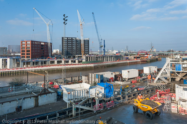
I spent an hour or so there taking pictures, then took a walk across the Lower Lea Crossing, from where I took the picture above of Bow Creek. It was a fine day for January, and decent weather for panoramas, though I would have liked rather more interesting clouds. Thanks to my recent computer problems I’ve not had the opportunity yet to process the panoramic images I made – so I’ll hopefully write about them later. Though I’m always rather loath to put a message on line “<small”>more pictures coming shortly” as I think there are still some such gaps waiting for me to fill as far back as October 2002. Really I will one day!

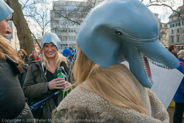
Next was a trip up west, to the Ritz and Mayfair, where I had expected to meet rather more members of Class War than the three who turned up for Class War visit ‘Rich London’.  It was all just a little tamer than I had hoped for.

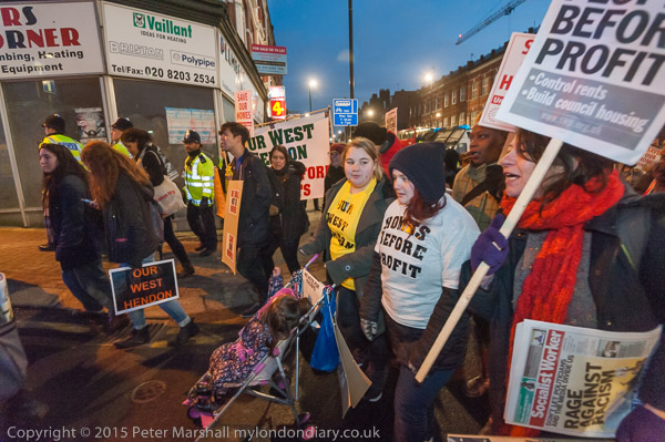
But it did make me late for what was the largest event of the day, the West Hendon march for Social Housing, in one of London’s north-west suburbs. It took just a little finding too, and had me cursing my smartphone as it showed me a black area instead of the map I’d told it to load. Paper maps have the advantage of not needing a signal. I was annoyed to have arrived just a minute or two too late for the photographs outside the community centre where the protesters had been holding a meeting, seeing them dispersing as I rounded the corner a hundred yards or more away.

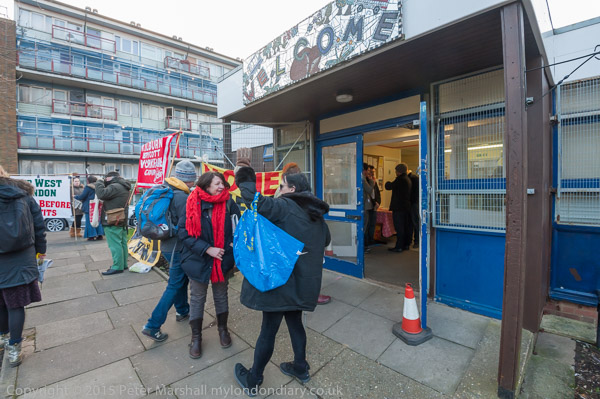
Fortunately the best was yet to come, though there was around an hour of waiting around with relatively little to photograph. A few groups stood around outside the community centre talking, some with placards and banners, while others sensibly kept in the warm inside. I took a few pictures inside, had a free cup of the hot soup and talked to some of the protesters, many of whom I knew from other events. Finally it was time for the next part of the protest, the promised giant banner drop.

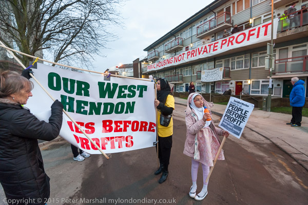
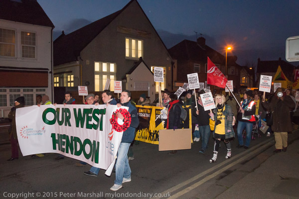
As you can read in West Hendon march for Social Housing there was then a rather long memorial event for a local war hero, the only female Sapper of WW1, who locals are hoping to commemorate in the area.  It was an interesting story, and one which I did a little more Googling on before writing my piece for My London Diary, but I wandered off shortly before the end to take a few pictures of the various posters I’d seen on some of the flats.

It was getting steadily darker and darker, and I was trying out a new toy, a Neewer CN-216 LED light, which has 12 rows of 18 LEDs (which explains the 216 in its name.)  Its a slightly chunky box, about  5.5 inches wide, 3.75″ tall and2.25″ deep with a reasonably sturdy fitting on the bottom to attach it and angle it up and down a bit on a hot shoe. Fitted with 6 AA batteries it weighs in at a smidgeon over a pound (458 grams.)

It doesn’t really produce a great deal of light, though noticeably more than the earlier and cheaper LED lights I’ve tried. Enough to make a difference when fairly close to you subject, but not really an alternative to flash at more than a few metres away, even when working at ISO 3200. When it got really dark I was working with it at 1/30th f2.8 ISO 3200.

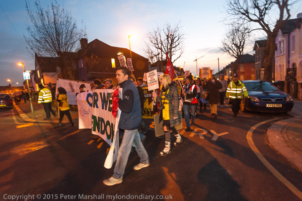
In the image above, as the march turned off from the Edgware Rd, the CN-216 provided useful fill on the closer figures, while streetlights gave reasonable overall illumination. When a little later we got to darker streets and the CN-216 became the main light source it was less useful.


D700 16mm 1/15 f4 CN-216 ISO 3200


D800 18mm (27mm equiv), 1/60 f8 ISO 3200

The two pictures above were taken within a few seconds of each other, both in a dark area with inadequate street lighting. Both have had considerable burning and dodging to partly equalise the lighting across the image. The CN-216 is a rather larger light source than the flash, but still the normal inverse square law more or less applies, doubling the distance from the light giving only a quarter of the illumination.

I’d chosen 1/60th for the flash exposure to reduce or eliminate any motion blur and the kind of double image that often results from slow shutter speeds. There is a four stop difference between the two images (two stops in aperture and the same effect as two stops in the different shutter speeds) and it’s this that makes the main difference between the two images.

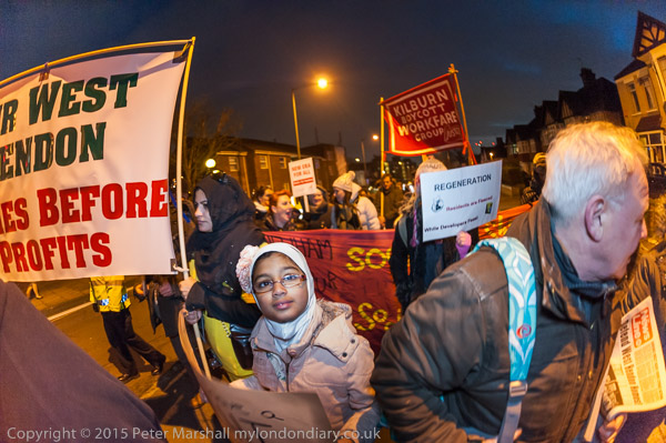
Another image taken with the aid of the CN-216, this time with the 16mm fisheye at 1/30 f2.8 close to the end of the march. Hendon seems to have some pretty dark roads. The LED light doesn’t of course cover the full 180 degree diagonal, and you can see some fall-off in the banner at upper left.  This was an advantage for the figure at the right, as he needed less burning – and was so close that with an even light spread would probably have been to far burnt out.  The girl at the centre, although a little further away was almost at the limit of the highlights.

The lens comes with a pair of diffusers, one plain the other an orange to convert the light from daylight to roughly tungsten. So far I’ve always used it with the daylight diffuser in place. Vignetting is noticeable with any wide-angle lens, but can be corrected with Lightroom, so isn’t a huge problem.

The CN-216 is just about powerful enough to be useful for this kind of work, and working with portraits at close distances you might sometimes even want to use the control wheel which dims the light rather than work as I did always on full.

Ideally I’d like a light with at least twice the output, especially since I have no really fast lenses for the Nikon. Usually the f4 16-35mm is fast enough, but rather limiting for this use. The two faster lenses I have are the 16mm f2.8 fisheye, a 20mm f2.8 and a60mm f2.8  Micro Nikkor.  The CN-216 would be more useful with the Fuji XT-1 where I have a 35mm f1.4, 18mm f2.0 and 14mm f2.8 (52mm, 27mm and 21mm equivalents) as well as a f2.8 fisheye.

And the best thing about the CN-216? The price. If I believe the specifications, the light output is much the same as that from other models costing well over £100. Without batteries it cost me a little under £30 including postage from eBay.

The link for the story and more pictures again: West Hendon march for Social Housing
Continue reading March for Social Housing

World Press Photo 2015

You can now look at all the winning images in the 58th World Press Photo Contest, selected from the 97,912 images submitted by 5,692 photographers of 131 nationalities on the World Press Photo site.

I haven’t yet had the time to look through all the pictures from 2014 in the 2015 Photo Contest, but my initial impression is that the organisers have tried hard to get away from the accusations that every year is the same, and the selection looks as if they have adopted of rather wider approach than in some previous years.

As usual there is likely to be disagreement about the winning image, Jon and Alex by Danish photographer Mads Nissen, a member of Panos Pictures, from his coverage of the increasing hostility in Russia towards lesbian, gay, bisexual and transgender (LGBT) people.  Although I think its a good image, I wonder if it really is the most outstanding of the crop.

One of the jury, Alessia Glaviano comments on WPP:

“The photo has a message about love being an answer in the context of all that is going on in the world. It is about love as a global issue, in a way that transcends homosexuality. It sends out a strong message to the world, not just about homosexuality, but about equality, about gender, about being black or white, about all of the issues related to minorities.”

and another, Donald Weber stated:

“World Press Photo is more interesting than being just a competition. The winning image fosters debate not only within the photo community, about who we are and where we’re going and what we’re trying to say, but also in the larger community. The images are seen and discussed by tens of thousands of people.”

This year the WPP insisted on having the original camera files as well as the finished image, and their experts “found anomalies in a large number of files and presented their findings to the jury“, resulting in 20% the images that reached the penultimate round being eliminated “because of removing small details to ‘clean up’ an image, or sometimes by excessive toning that constitutes a material change to the image.”

I’m both pleased that the WPP is taking a firm stand, and also very surprised at the level of unacceptable retouching, particularly as they had made it clear that they would be checking  for it. It suggests that many photographers (or their agencies) have failed to appreciate that there is any problem in altering news images.

As they say:

“There is clearly an urgent need to take this matter further. Over the coming months, we will be engaging in further dialogue with the international photojournalistic community to explore what we can learn from all this, and how we can create a deeper understanding of issues involved in the application of post-processing standards in professional photojournalism.”

Dolphins on the March

I’d like to make it entirely clear. I am against cruelty to animals. And the annual slaughter of dolphins at Taiji cove in Japan is repugnant. It should stop. Along with other barbaric activities like those than are integral to fur farming – cruelty for profit – and fox hunting – cruelty for fun, which seems particularly abhorrent. And while in principle I’m not against all farming of animals, I’d want it to always be done in an ethical and humane manner – which of course is so often not the case.

And I’m certainly unhappy about capturing and keeping dolphins in restricted spaces, training them to do tricks to entertain the public and would like them to live instead unhindered in the oceans.  But while I have a basic sympathy with these protesters and their protest I also have some reservations.

I do sometimes feel that the issues about human rights and their abuse are event more important, and wish that all these people would also be as enthusiastic about them, coming out on the streets to protest. Of course some do (and I recognised a few from other events), but I think they are relatively few. And it worries me.

We are – at least in some respects – a nation of animal lovers. A society where animal welfare charities get massive support, both in donations and in the adulation of the media, who at the same time are demonising human beings who need support as scroungers.

It’s a strange world in which we humanise animals to make them into appealing stories for children – most of whom will never actually meet these or other real animals. Real bears don’t eat marmalade sandwiches and nature is often red in tooth and claw. And if dolphins aren’t cuddly it is perhaps a strange paradox that it is largely through their performances in dolphinariums around the world that they have acquired the kind of public image which is now exploited in the imagery of the protesters who are so desperate to save them.

Yesterday while waiting for my train I watched a rat scurrying around on a patch of waste ground. From a distance it looked quite cuddly, but this was vermin. Most people would happily shoot or poison it. The squirrels in our garden are more appealing, with their acrobatic skills and fluffy tails, but until 1957 you could get a bounty (begun as 6d, it had risen by then to a florin or perhaps half a crown) for taking their tails to a police station – it was only abandoned when it was decided poisoning was more effective than shooting. There are still plans for a huge cull, seen as the only way to save our native red squirrels, and opposed by animal charities.  I’m not sure where I stand on that one, but given the way the pigeons eat the crops in our garden I might well favour a cull of them.

More pictures at  Carnival March to End Taiji Dolphin Massacre

Continue reading Dolphins on the March

JPEG or RAW

While I was having computer problems recently I had to work in ‘Raw+Jpeg’ mode, and I chose the highest possible jpeg quality from the Nikon, ‘Fine’.  And they are certainly pretty good files. But I was also having problems working with them on an uncalibrated screen and using Photoshop rather than Lightroom.

I tried to calibrate the screen visually, using one of the sites on the web that offers suitable graphics, but it wasn’t very satisfactory. I decided that my best approach was to rely mainly on Photoshop to make the judgements, keeping my own tweaks down to a minimum.

This also speeded up processing. I suppose I could have automated the process, but soon a set series of keystrokes became wired into my brain. ‘Alt+E, V, Enter’ to change from Adobe RGB to sRGB, then ‘Alt+I, A, U’ on the outdated version of Photoshop on the laptop for Auto-contrast. Next came Ctrl+M, which took me into the curves dialogue, where I used the mid-tone dropper to set the colour balance on a neutral in the image. Though it isn’t always possible to find a neutral, and sometimes it was a matter of trying a few different patches of the image until the result looked about right. And a little tweak of the curve produced a result with what looked like appropriate brightness and contrast.

Having OK’d this, then came the rather riskier business of trying to guess whether I’d got things about right, and sometimes fiddling a little with Brightness and Contrast, adjustments I normally try to avoid. It was hard not to try and alter the colour balance a little, and although I knew I wasn’t seeing it correctly. But I also know that having things a little on the warm side is always more acceptable than the opposite.

Here’s one of the results:
20150119_DSC6786

It isn’t too bad, though it does have something of a colour cast – I obviously added a little too much yellow. Perhaps most obvious in the sunlight grass.

It was a difficult day for lighting, photographing the Green Party Photocall What Are You Afraid of Boys? in a shady corner of College Green, next to the Houses of Parliament, sunlit in the background at right. And at the left, the building has completely lost detail in the jpeg.

I’ve now been able to process the raw file, and to make it a little easier to compare I’ve adjusted it to a similar colour balance, though I would normally have left it more neutral.

20150119-d104s600Overall the image from Raw is a little less contrasty and less saturated colour, and the shadow areas are lighter, but part of the difference is also because I’ve made some use of the Lightroom local adjustment brush.   That could have improved the jpeg too, but would not have restored the missing detail in the blown-out highlights.

Looking at the full-size images, there does seem to be just a little more detail in the raw file. Although I think the jpeg version of the jacket that Green Party leader Natalie Bennett  is wearing actually looks better for being a little darker, I think the raw version is probably more accurate.

As I stood there taking a whole series of photographs of her, I was hoping that she would make the same expression as her portrait on the poster behind her, but she didn’t quite do so, keeping her head more upright. But I was worried by that picture of her, as it didn’t quite look like her. What it lacks is the determination that I think shows in her jaw when she talks.

I stood there taking pictures wondering whether it was digital retouching or just careful lighting and choice of view that had caused the difference and made her and Caroline Lucas look rather more like a toothpaste advert than real people. But somehow it was a look that shouted PR and advertising and didn’t at all fit with my vision of the Green Party. More like the old politics we need to get away from.
Continue reading JPEG or RAW

Roll Over Photoshop?

Mac users may now have a serious alternative to Photoshop as an image editor for photographers in Affinity Photo, according to a report in Creative Bloq. Available now as a free beta version, the full version is likely to cost £39.99.

Its part of an intended suite of three products, with Affinity Designer  (an alternative to Adobe Illustrator) already available at the same price getting some very good reviews. Also planned is an InDesign alternative called Affinity Publisher due for release later this year.

The programmes come from Serif, who have in the past produced some interesting products aimed at the non–professional market in similar areas. Like products from other developers that I’ve tried in the past, and Adobe’s own Elements these have lacked a few essential features and lacked the ease of of use that – once learnt – makes Photoshop so straightforward, at least for most of the things photographers really need to do.

But Serif aren’t simply trying to match Photoshop, but to outdo it, and have obviously learnt something from other software too. There is a nice promotional video and it does look good, promising greater speed and the big advantage – like Lightroom – of non-destructive editing. And “CMYK, 16-bits per channel editing, LAB colour, RAW processing, ICC colour management, and Photoshop PSD and 64-bit plug-in compatibility.”

It certainly looks promising. The only bad news is that it is Mac only, although there are plans in the longer term for a Windows version.

Lightroom Develop Primer

By now I think most of the photographers I know – or at least those who can care more about image quality than speed – have become Lightroom users. There are of course alternatives, and in the past I’ve used several of them, including Capture One and the software from Nikon and Fuji for their own cameras, as well as other independent alternatives.

For sheer speed, important to many press photographers, I’m told that nothing beats Photo Mechanic, and if I were wanting to file images from location I’d probably install this on my Ultrabook.

There are minor differences between the results from different raw conversion software, but all of them do a very acceptable job, and the differences between their renderings seem unimportant except to pixel peepers.

Lightroom appeals to me because of its workflow and versatility, and it also helps that it comes together with Photoshop on a reasonably priced subscription. Like many others I was worried about the Adobe scheme when it was introduced, but I am now converted, especially since Adobe seems to be keeping its promises and also continuing to develop both products.

For me Lightroom does have one weak link, in that it is very slow for the initial editing of the large number of images I usually take in a day’s work. The review of images within the Import dialogue works for a small number of pictures, but slows to almost a complete halt when applied to sensible numbers.

My workaround for this is FastPictureViewer Pro, software that does exactly what it promises. It reads the images from my USB 3 card reader at least as fast as I can view them on screen; after an initial load time of perhaps 10 seconds there is no waiting as I go through the pictures, pressing K for those I want to keep which it copies immediately to my ‘input’ folder.

On the web page they suggest that using Lightroom on a batch of 1000 images with a fast computer takes around 1 hr 10 minutes, while doing the initial edit with FPV and then only importing the selected images cuts this to around 20 minutes. On my system I think the time-saving is perhaps a little greater.

But although many friends have Lightroom, I don’t think many of them have really appreciated or explored what it could really do for them.   It has grown into a fairly complex programme, though basically still much simpler and more intuitive than Photoshop.

I spent a long time going through the various excellent tutorials available on the Adobe site – and a long time searching for answers to various problems in the online resources there, which I feel are not well presented. You can of course buy books telling you how to use it, and I have one, but these become out of date almost as soon as published as a new and improved version appears. Mine had some useful tips for Lightroom 2, but five years or so on, Lightroom is now at version 5, with 6 surely not long away.  But there were some good tips, particularly about workflow which still apply.

Thanks to PetaPixel for alerting me to the video 10 Tips for Optimizing Your Photos with Lightroom: A Primer on Basic Techniques, a lengthy presentation by photography instructor Tim Grey.

And it is lengthy, and I would have preferred a much more business-like presentation which would have cut the length by at least an hour, but it does give a good introduction to the basics of working with an image in the Develop module at the heart of the software. As someone who started at the beginning with version 1 (then somewhat of a disappointment compared to the software Adobe bought out) there wasn’t a great deal that was new to me, and perhaps Gray’s approach may be better for those coming across the programme for the first time. But there were a few little things that I learnt. Though what seemed like ten minutes to tell us it was a good idea to check the ‘Remove chromatic aberration’ box seemed excessive. And is there any reason ever to leave that box unchecked?

Of course, we all work slightly differently as photographers, and there was some advice that wouldn’t work for me. Perhaps because I often have to work rapidly, unlike him I often have a need to adjust the exposure slider, and I have a more aggressive approach to luminance noise reduction than him. But he does make the effect of some of the many sliders in the develop module clear, and in particular things like the difference between ‘saturation‘ and ‘vibrance‘. Though I was sorry when talking about that luminance module he failed to mention at all the functions of the contrast and detail sliders.

Perhaps more significant was the lack of any discussion about sharpening (unless I went to sleep at some point?) Other people tell me that Fuji X-Trans files render better with a 100% detail setting in sharpening. I think a similar high detail setting in the luminance noise dialogue also helps.

If you watch the video, use the link supplied by PetaPixel to the B&H site for whom the video was made, and make it full screen so you can see fairly clearly the quite detailed settings on the right of the Lightroom screen.

I’ve never been to B&H, but have often referred to its on-line catalogue for information and did once buy a camera from them, a long time ago. It arrived quickly and well packed with all the documentation in order, and at some saving to me because of the dollar/pound rate at the time, and because US prices for the Konica Hexar were rather lower. In the UK it was overpriced by the importer and was very hard to find in the shops, and what was perhaps the truly iconic ‘street’ camera was a rare beast indeed here.

Fingers Crossed


Ken Loach, Jasmin Stone of Focus E15 and Lisa Mackenzie, author of ‘Getting By’
D700, ISO 3200, 16-35mm at 16mm, 1/40s f4

For the moment at least, though I hesitate to commit this to print, I appear to have regained control of my computer systems here, and am back at work on a nice, largish and calibrated screen, with a proper keyboard after spending over two weeks on my very portable notebook.

To my right, the Drobo 5N has a reassuring row of green and blue lights as I type, and on the desk in front of me is the external hard drive that caused my problem. It took my desktop computer around 20 days to run a disk check, outputting error messages every few seconds on 450,000 files telling me it had insufficient disk space to fix the problem for each in turn, leaving me swearing at the sloppy programmer who wrote those routines.

It could even have been Mr Gates himself, for underneath Windows, even fairly recent versions such as Windows 7 which this computer is running, is a residue from the days of MS-DOS. But what was perhaps acceptable when a large hard drive was only 20Mb doesn’t scale up well to 3Tb. Though so far, when I’ve cautiously connected the rogue disk to a running Windows system it has served up the few files I’ve requested with no demur, so perhaps these slow routines somehow managed to solve some problems, though it will be some time before I examine the whole disk.

At the moment I’m slowly transferring work from about 10 days taking pictures from the Drobo into my Lightroom catalogue. It’s a slightly more complicated process than it might be as Lightroom doesn’t currently appear to be able to see the network attached drive, so I have first to copy the files across to a directly attached disk. At least this transfer is reasonably rapid, at around 40Mb per second. Once in Lightroom I’ll need to spend the usual amount of time making a final selection of images and developing them for my web site and archive. And of course updating my web pages.

Perhaps the biggest problem I’ve had over the 20 days is having to work with jpegs. When the lighting is easy, both Nikon and Fuji do a reasonable job, but whenever things get tricky, jpegs just can’t cope. And well Photoshop is a great programme (I think I’ve used it since version 2), Lightroom is just so much faster and I think better for most editing and adjusting. Of course I was taking RAW + jpeg, but wasn’t able to edit the jpegs as I only have an old version of Photoshop on the notebook. Probably I should have updated it and installed Lightroom (as I think my licence wold allow) but I kept thinking it wouldn’t be long before I was back on a real computer.

I doubt if sending out files based on the jpegs rather than raw will greatly have affected my sales, but I certainly noticed the difference in quality. As I slowly work through the backlog I’ll try and find some good examples and write a post or two here.

Friday was my first day back processing with Lightroom, and as well as the work from that day I also had some pictures from a friend’s book launch the previous evening. Thursday had been a long day; I’d covered two protests, then gone on to a third story, where I’d taken some pictures but didn’t really have enough to be worth submitting and then taken some urban landscape panoramas before the launch. By the time I’d come home, had some food and processed and submitted pictures from the first two events it was early morning and I needed to be in bed. But before I went out the next morning to take pictures in an icy windtunnel (aka Croydon) in South London I’d started to process the party images, taken in lighting that bordered on the impossible, thankful that I could resuscitate them in Lightroom. The landscapes will wait until I have more time.

Continue reading Fingers Crossed

Morris Strikes Back

The Capa D Day saga continue with the first of a series of responses by A D Coleman to a remarkable statement The A. D. Coleman Attack by John G Morris, which he concludes with the words ‘We may never know the entire truth‘. Reading it through I get the feeling of a man who has rather lost touch with reality and is unable to understand much of the research that Coleman and others have put into this and very much wants to make sure the truth remains hidden.

Morris, who was 98 in December, claims to have remembered facts that he had clearly forgotten back in 1944 when he first gave the now disproved legend of the films ruined in processing by ‘the young darkroom assistantDennis Banks. He now claims that these ‘ruined’ rolls, which seem almost certain to have been pre-invasion images by Capa, were actually blank rolls of film, and, if I understand him, that Capa in his agitated state had been unable to remember which of the films he was carrying he had actually put into his Contax and exposed.

Morris’s newly remembered story also includes a mysterious mid-channel rendezvous between Capa and another Life photographer, Dave Scherman, which had brought Capa’s earlier films to London with him before the D-Day pictures. It’s an element of the story that Coleman demolishes with a sledgehammer in his first response, most of which is employed in pointing out places where Morris misrepresents (or completely misunderstands) aspects of what Coleman and others have written.

Capa was a professional photographer, and I think Morris is questioning his professionalism. I can’t believe he will not have had a foolproof system to distinguish exposed and unexposed film, probably involving either tearing off the film end on unloading or rewinding inside the cassette and then storing it in a different container. I wasn’t taking pictures in the 1940s, so I’m not sure exactly how they would have done it then, but some method was surely a part of every film photographers basic training?

Then the mysterious ‘young darkroom technician’, presumably either working under the supervision of someone more senior or else someone experienced in film developing despite his youth. You don’t just pull any guy off the street to work in the Life darkroom. I can’t believe that any darkroom technician, even the greenest, would not recognise a completely unexposed film when he pulled it out of the fixer and put it to wash. Morris perhaps would not; he appears to be proud of his lack of knowledge in this area, claiming ‘I have never developed a roll of film in my entire life.’ It’s one statement in his piece I find entirely believable.

It is mysterious too that Dennis Banks appears to be unknown to anyone (and there does still appear to be some confusion about his name.) Inventing another story about him doesn’t help. Morris adds yet another with the suggestion he makes about the younger man “I presume he is long gone.”  Why so, when at the time he – if he existed – was said to be 17 and  Morris was ten years older?

And had Capa’s preparations for D-Day rolls arrived along with Scherman’s, who can believe that none of his pictures would have been considered for publication, not even have been edited as Morris suggests. Would any editor presented with pictures by two of his small team of photographers take a look at only one of them, find a few pictures he could use and not even bother to edit those taken by a rather better-known photographer?

We may well never know the entire truth – and I think Morris is determined to try and stop us doing so. We can only speculate on why this is, but we do now have a much better idea about what actually happened on Omaha beach – and afterwards than we did before the work of J Ross Baughman and A D Coleman.

I don’t think having a more truthful account in the slightest detracts from the pictures or from my respect for Capa as a photographer, though it perhaps makes him a little more human. His reaction to the situation is entirely understandable and probably saved his life, and the underexposure and camera shake gave his images an added drama. Capa was a gambler and we are richer because he had a bit of luck and knew when it was time to leave the game – even though he had only taken perhaps ten pictures.