Yet more May Day!

And then I changed my mind” was the sentence I left off my previous piece on May Day 2016 (and have now added). It was May Day, and though I was tired and hungry I knew that things were going to get interesting.

The party, F**k Parade 4, sound system at eleven and coloured smoke flaring, set off down Leman St, led by the Class War banner with a man wearing a pigs head and with me hurrying backwards in front.

After going under the railway bridge they turned left into Cable St and massed outside the Jack the Ripper premises, perhaps London’s sleaziest tourist attraction, where I’d previously photographed Class War and feminist groups at several protests and vigils. A line of police guarding its front looked quite worried as Class War brought their banner to stand in front of them, but soon the air was too full of red smoke to see much, and I was finding breathing unpleasant.

You need to be a little distance away from the smoke both to breathe well and to get good images. When you are actually in it things get difficult to see and the camera metering becomes unreliable. Fortunately the marchers soon moved off, and it became clear they were heading for Tower Bridge.

And I wasn’t disappointed as having blocked the bridge there were then more flares and also fire-breathing.

It’s technically pretty impossible to get good pictures when a huge cloud of fire explodes into the air, the extreme brightness of the flame compared with the ambient light is beyond the capabilities of film or sensor. And it certainly is more than the automatic exposure can do to get the best balance. Parts of the flame are white, burnt out where the light intensity has overexposed the sensor, with no detail that can be recovered in post-processing.

I think I should have taken the pictures here using manual exposure, but I actually made them using ‘P’ setting, as things were just happening too fast to think much about the technical stuff.  The camera – D700 – has underexposed by around a stop so far as the general scene is concerned, plus the 0.3 stops under I normally have set. Working around dusk at ISO 3200 this gave an exposure of 1/500th f11, enough to more or less stop action and give plenty of depth of field. Ideally I think I should have underexposed perhaps another stop or two, perhaps using the same aperture and speed but working at a lower ISO. This would have given me a little more highlight detail and made post-processing easier – considerable work was needed on these pictures.

I don’t think the metering really reacted much to the fire, as the exposure remained pretty much the same across a series of frames with different amounts of flame. In the second image you can see (at least on a larger image) the rain of drops of unburnt paraffin which was falling on me.

After the marchers left the bridge I followed them on to Tooley St before deciding the time had come when I could no longer ignore the messages of my body, and I left to go home. I was sorry to do so, as I guessed from previous conversations that they would be heading towards the long tunnel that takes Bermondsey St under the railway lines from London Bridge, where both the sound and the visual effect would be great.

F**k Parade 4: Ripper & Tower Bridge

Continue reading Yet more May Day!

Fuji blues – and greens

I’ve been using Fuji-X cameras for some years when I want something a little lighter and more compact than the Nikon DSLRs. They are usually the cameras I turn to when I’m not photographing events and don’t need the file size of the D810. The cameras I take on holiday.

But though I like some things about them, and have got some decent results, I also have some reservations. They are just too complicated and the controls and menu system lacks the simple and logical pattern of the Nikons. And there are too many ways in which they are just not so responsive and so reliable.

I can leave a Nikon switched on all day, safe knowing that the battery won’t run down and the camera will respond at the slightest touch of the shutter release. With all the Fujis, even if you switch off the rear screen and digital viewfinder, and don’t make any exposures, the battery still runs down. It’s kind of the worst of both worlds in that it Fuji cameras have an auto switch off that you can set, which does switch the battery off after the set time, but fails to stop the battery running down. When you want to take the next picture, even if the battery is still in juice, you have to wait a second or two while the camera starts up – and while you miss the pictures.

With the first Fuji I bought, the fixed lens X100,  things sometimes got even worse and the camera refused to switch on, either until you took the battery out and back again or pressed the shutter for ages, turned around three times widdershins and said the magic word. At least later models more or less fixed that, but still too often meant that when you pressed the release nothing at all happened.

Then there is the colour. Most digital cameras I think have problems with intense reds, losing the highlights, but Fuji has its problems with greens as well – unless you like your grass super-emerald rather than au naturel. And my XT1 has another problem – which needs extra work on the raw files – in that some Fuji lenses give results that are far too magenta, typically needed a correction of perhaps -35M in Lightroom. It doesn’t seem to be something that every XT1 suffers from, though I have found fellow sufferers, and possibly it could be solved by sending the camera back to Fuji for repair, but it only came to my notice after the guarantee period (when the camera went back to Fuji twice for other issues) was up when I bought another lens.

Then there are the mickey-mouse modes. I’d like to ignore them, but the combined ISO and mode knobs on the XT-1 are tricky to use, and changing ISO all to often puts you into what Fuji laughably call the Advanced Filter mode. The two dials are supposed to move independently – and sometimes they do, but other times both turn together. The resulting images are not nice. Jpegs rather than RAW and with impossible to correct contrast or colour or both. You can’t convert from ‘Dynamic Color’ or any of the others back to sensible colour, though you can just about get a half decent black and white.

It’s a shame because all of the Fuji cameras I’ve bought – X-Pro1, X-E1 as well as those already mentioned  have been almost there. Delightful in many ways, which is perhaps why I’ve several time bought another, but…. I’m even hoping that Fuji have at last got it right in the X-T20, and mug that I am, I’ll probably buy it.

And then there are those X-Trans sensors. It seemed a good idea to get away from the Bayer pattern, but I’ve never been convinced that they really improve things, though Lightroom at least seems now to have learnt how to get usable results after a really shaky start. But if  you still feel they are definitely an improvement (and Fuji cameras seem to have a unique facility to produce fanboys) you should read an article by Jonathan Moore Liles, which I first saw in PetaPixel, but is a little better read on medium com, where the pictures are larger.

Its an article which I think more or less destroys the claims of superiority of the X-trans sensor, which can perhaps at worst be seen as a marketing gimmick and at best simply a different balance between colour and luminance, and one which has some unfortunate side effects. In practical terms these are seldom if ever particularly important, and are often mitigated or eliminated by suitable corrective processing which I tend to apply fairly routinely in Lightroom. There is a tendency in portraits – whether on Nikon or Fuji – for faces to look a little flat that a little brushing with a positive value of ‘Clarity’ can improve, and the whites of the eyes (sclera to use the technical term preferred by Liles) usually benefit from a little more brightness and contrast which I think reduces the colour bleed into them.

Then there is the question of the Raw processing software preferred by Liles:

The RAW file was processed using Darktable’s Markesteijn demosaicking algorithm (3-pass mode) with a single iteration 9×9 chroma median filter followed by application of a bilateral filter on the chroma channel and light sharpening. The color profile is my own, generated from shots of a Wolf Faust IT8 chart and should accurately represent the colors in front of the camera.

Most of us just rely on Lightroom, though Fuji purists stick with the free Silkypix converter that Fuji provides, insisting on its superiority. Like me, unless you are a Linux user you have probably never heard of darktable, but Googling takes me to the site which tells me “darktable is an open source photography workflow application and raw developer. “  There is a MacOS version but not one for Windows, though I wouldn’t be rushing to try it out if there was, and there is a page about its X-Trans support which gives you some idea about that Markesteijn thingy, but includes the statement  “Though darktable now can read and process X-Trans files, there are plenty of opportunities to improve camera support. In particular, as mentioned in “What’s involved with adding support for new cameras“, each camera model could benefit from its own basecurve, white balance presets, lens correction, and noise profile.”

Although I have nothing against open-source software – and there are several programs I use or have used (including before Lightroom got better another RAW converter) – I think the use of it here is a serious weakness in the argument. First it entirely locates the article in the high geek rather than photographic sphere, and secondly it raises doubts about whether this particular software is as effective as that recommended by the manufacturer (and privy to their unreleased data), or to the commercial software such as Lightroom (and Adobe have enjoyed some cooperation from Fuji) and Phase One.

Of course, the debates about X-Trans and Bayer are marginal. Both can produce decent images and the differences between the two will seldom be apparent or important. Photography really isn’t about the minutiae of technical differences, but about what your images speak.

Frank Herzog & Early Colour

I don’t often mention Amateur Photographer here, though it’s a magazine that I used to read many years ago as a schoolboy – well before I started taking pictures – probably mainly attracted by pictures of scantily-clad women which occasionally appeared in its pages, or even those carefully posed nudes with strategically placed accessories or gauzy fabrics that amateur photographers were wont to produce in the 1950s and 60s (and they still dominated many club contests when I was on the edge of that world in the 1970s.)

Later, before the web, it became the magazine to go to in the UK when you were searching for cheap materials or equipment, or wanting to sell cameras, with pages of secondhand listings and adverts from Marston & Heard and others, as well as the first camera discounters. There seemed to be several times the pages of adverts as editorials, and much of the editorial was hardly worth reading. Compared to the US magazines such as Modern Photography and Popular Photography, their reviews were decidedly amateur. AP’s idea of a lens test was to open a window, take a few snaps of a ship at anchor on the opposite bank of the Thames and blow up the results.

There were the occasional articles that were worth reading. Once in a while there would be an interesting historical article or series by one or other of the few British photo-historians, or perhaps an extended review of a new book or exhibition which enabled the magazine to print some pictures without having to pay reproduction fees.

I even wrote a few articles for the mag, illustrated by my own photographs, including one with some of the Hull pictures I’m currently putting on my Hull Photos site, as well as several, intended to be amusing, on the outings and exhibitions of a small and atypical group of club photographers that got me more or less thrown out of the camera club, whose august members became aghast and I was summoned to appear before the committee. Some people had no sense of humour.

I’ve not looked at a print copy of the magazine (you can also subscribe to a digital version) since my local library stopped having magazines in some earlier round of cuts, but I do occasionally glance at its news feed online, and sometimes find something of interest. And a couple of days ago my attention was caught by a review of a book, Modern Color by Fred Herzog, written by Oliver Atwell, illustrated by several of Herzog’s pictures. The book was published last year by Hatje Cantz in Berlin.

I wrote about Herzog back in 2013, having seen some of his work in a lazy show at Somerset House, in which his work had stood out, along with some pictures by other photographers whose work I knew well, and I’ve seen more since. You can view many of his images online at the Equinox Gallery which brought his work to a wider audience with two shows in 2007. Before then he had previously had one-person shows also in Vancouver in 1994 and 1972 and had work in a few group exhibitions.

Herzog, who worked as a medical photographer at the University of Columbia and also as a Fine Arts Instructor, apparently took to working with colour because he didn’t have the time to make black and white prints, though his work suggests that he had a strong feeling for colour. It wasn’t unusual for photographers to work in colour at the time he started back around 1960 – and I took my first colour film – before I was a photographer – a year or two later. It’s the quality and intention of his work that were different, at a time when colour photography was largely the province of commercial photographers and amateurs like myself photographing their holidays or their girlfriends sitting in cherry blossom as I did.

Herzog chose to use Kodachrome, an excellent choice in terms of longevity, and a film with an attractive and distinctive pallette, if not the most accurate colour. It was also a film with high contrast, rather restricting the subject matter and lighting if you wanted to avoid large areas of empty shadow. Over many years of working he produced an extensive archive and you can look through 162 of the 100,000 or so at Equinox. They were taken from around 1958 to 2009, but it is work from the first 10 or 15 years that I find more appealing.


When I began working as a photographer in colour, Kodachrome was a rather expensive option, and I generally used less expensive alternatives, either process paid, or films which I could buy in bulk and process myself in E4 (later E6) chemicals. To cut costs I kept away from expensive Kodak chemicals too, making use of alternative and cheaper brews. Usually these produced good results, but keeping the solutions at the correct temperature and accurate timing was difficult.

Although producing transparencies was in some respects an easy option, it created a problem if prints were needed for exhibition. There were reversal papers available – and I used an Agfa version for the colour prints in my show German Indications – they were fiddly and it was hard to get good prints. More expensive were colour prints made from inter-negatives, which could be good, especially when paying for professionally made 4×5″ negatives from 35mm, and For those on very large budgets it was possible to get excellent dye transfer prints, but a single print would have cost around half my monthly salary.

Things changed a little with the introduction of Cibachrome-A by Ilford in 1975, making it possible to produce prints from slides in amateur darkrooms. The prints were brighter and bolder than those produced on conventional colour papers, and more long-lasting, but it was difficult to tame the contrast. Good for many commercial uses, Cibachromes were death to more sensitive images.

The chemicals used for the Cibachome dye bleach process were also pretty nostril-searing and disposal required some care. They were never very suitable for those of us with small and not too well-ventilated darkrooms, probably shortening the lives of many of us.

I abandoned colour transparency and moved to colour negative film for my own work in 1985, either processing the film myself or using cheap amateur film processing services, which also provided enprints as proofs. The change for me made sense because of new and better colour negative films and paper from Fuji becoming available. Until I moved over to digital almost of my colour work was made on Fuji materials, though I did try out some of the newer Kodak films that emerged after Fuji had disturbed their complacency.

But the advent of high quality negative scanners and archival inkjet printing have opened up new possibilities for all of use, and particularly those who worked with transparencies, giving a degree of control over contrast and colour that was simply impossible in the past. And it meant a new lease of life for Herzog’s Kodachromes.

Laughlin’s Third World

One of the books I’ve had on my shelves for a very long time – since soon after it was published in 1973 – is is ‘Clarence John Laughlin: The Personal Eye‘, a catalogue for the Philadelphia Museum of Art exhibition and a double issue of Aperture, Volume 17, Numbers 3 & 4, also published ‘as a book for general distribution’.

I don’t think its distribution in the UK would have been very wide, but like many US photographic publications of the time it would have been available at the Creative Camera bookshop in Doughty St and doubtless advertised in the magazine.

For those without a copy on their bookshelves, you can get a good idea of Lauglin’s thinking from ‘First Principles of the Third World of Photography – THE WORLD BEYOND DOCUMENTATION AND PURISM ONE – TEXT AND IMAGES BY CLARENCE JOHN LAUGHLIN’ on Carnival of Dogs. His 12 point manifesto there begins “In Photography, as in all arts, the quality of the human imagination is the only thing that counts – technique, and technical proficiency, mean nothing in themselves” and ends “The limitations of photography are nothing more than the limitations of photographers themselves.”

Much of Laughlin’s work is now in the Historic New Orleans Collection, where you can view and zoom into many of his pictures, so many indeed that it is hard to know where to start. But it is worth paging through the many pages of thumbnails and picking some to look at.

Although in the end I learnt that my own creative interests were in purism and documentation, in my early years in photography work such as Laughlin’s made a strong impression on me, and I’m rather surprised that although I wrote about him and other photographers who might be considered to follow in his footsteps such as Arthur Tress in another place, this is the first time in several thousand posts I appear to have mentioned him here.

Laughlin’s work was brought to my mind by two posts Clarence John Laughlin: In Memoriam on Photocritic International by A D Coleman, who wrote about Laughlin in his 1977 critical survey The Grotesque in Photography.

The first piece takes its sub-title Prophet without Honor from the subtitle of the Laughlin biography, Clarence John Laughlin: Prophet without Honor by A. J. Meek, professor emeritus of art at Louisiana State University (University Press of Mississippi, 2007), and one of two stories in it recounts Coleman’s meeting with Laughlin around 1975 when the photographer showed his of work to collector Sam Wagstaff. He set out a strict set of conditions about what he expected anyone who bought his pictures must do – and after looking through the work, Wagstaff rejected the idea that a photographer should have any rights over their pictures after they had been sold.

Over the ages, artists have almost always had an uneasy relationship with those who have provided them with a living, but it is only in relatively recent times that photography has succumbed so entirely to patronage by individuals and corporations. Most of the early photographers were themselves wealthy and others have maintained some sort of independence based on various commercial practices and around the reproducibility of the medium.

The second piece, subtitled Lament for the Walking Wounded, is an article published by Coleman in his “Light Readings” column in the December 1977 issue of the magazine Camera 35, together with a postscript.

Published at the time without names, it recounted the speech by Hilton Kramer, then chief art critic for The New York Times, at a New York City national meeting of the Society for Photographic Education, in which Kramer held Laughlin up to ridicule not for his photography, but making tasteless jokes about his eccentric nature. Coleman himself felt ashamed after the event at having joined in the whole-heated laughter at a man he describes as on of “the walking wounded of photography” who have suffered from their dedication to the medium and “never got their due and are beginning to realize that they may never get it.”

Though relating events now around 40 years in the past, these are stories which are still relevant, perhaps even more relevant, today.

Do we need artybollocks?

Photography Critics, Theorists and Academic Writing: Does Photography Need Them? is the question asked and answered by Grant Scott on his ‘The United Nations of Photography‘ blog.

It’s an article which makes a great deal of sense, although I come at photography from a rather different angle. Most commercial photography just fails to interest me, and I take it as seriously as I do the text that goes with it on the magazine pages or billboards. I may sometimes, often, admire the craft, but I’m far more interested in reading a novel or a poem.

A good photograph strikes me as being something like a haiku and some can perhaps tell a short story, while a set of photographs can certainly be an essay and a good book at least a novella. Some photography (and even some commercial photography, though precious little) is more profound than other, and it isn’t elitist to say so.

I think also that in writing that art theory based criticism “exists within a niche created for a specific reason. Just as ‘commercial photography’ is created to meet a need and provide an income this academic approach to photography provides a career for those involved with it” Scott is confused. Commercial photography is created to meet a need and does thus provide some with an income, but its justification is that need, not that it provides a career for some photographers. And it can be no justification for the academic activity unless it too has some utility. Perhaps their shouldn’t be people getting paid for doing it.

Where I’m 100% behind him is when he then goes on to comment on “impenetrable academic text, agenda heavy theory and ill-informed criticism”. It’s only purpose is just that rather incestuous career-building which he has previously said he has no issue with.

I’m happy too in agreeing with him and Einstein, who apparently actually said “It can scarcely be denied that the supreme goal of all theory is to make the irreducible basic elements as simple and as few as possible without having to surrender the adequate representation of a single datum of experience” though “Everything should be made as simple as possible, but not simpler” is certainly pithier.

But I think the growth of theory-based criticism in the 1970s actually led to an impoverishment of our medium, and certainly to an impoverishment of many photographers, and to the growth of a new and largely unnecessary stratum of paid curators and other professionals who took funding away from the artists, along with a huge cohorts of photographers who could talk the talk but had little to say with their pictures.

I’m not actually against critics or curators. I’ve played a little on both sides over the years, and even achieved a little appreciation from fellow photographers on occasion. But good curation and criticism has to be built on an informed appreciation of the work and not on arcane theory.

And of course we don’t really need any of these guys. The  Artybollocks generator can create it all for us, with its ‘instant artist statement generator coming up with such gems as:

My work explores the relationship between Critical theory and copycat violence.
With influences as diverse as Derrida and L Ron Hubbard, new tensions are distilled from both constructed and discovered dialogues.

Ever since I was a teenager I have been fascinated by the unrelenting divergence of the mind. What starts out as vision soon becomes manipulated into a cacophony of lust, leaving only a sense of unreality and the chance of a new synthesis.

As spatial phenomena become distorted through studious and repetitive practice, the viewer is left with an insight into the darkness of our condition.

Artybollocks also offers you a printable certificate to show you are an artist (“Please keep this certificate in a safe place. Nobody else will ever ask to see it but you may feel better if you behave as if it is important.”) as well as a generator for tweets. And so I leave you with 144 characters:

What starts out as triumph soon becomes finessed into a manifesto of lust, leaving only a sense of chaos and the possibility of a new beginning

Grossman & the Photo League

Around 15 years ago, I wrote a series of articles and short notes about what was still then a very much overlooked part of American photographic history, but which is now referred to as ‘New York’s famed Photo League‘. An organisation that was destroyed by McCarthyism as ‘anti-American’ it remained largely outside the pale until this century, and I was pleased to be able write about it and to mention some of the photographers still alive and working who learned and developed their craft there, largely under the critical eye of Sid Grossman (1913-1955). I’ve mentioned it before on this site, including two posts with the same title, The New York Photo League where I quote from my 2001 article, and a longer version here.

You can get some idea of the critical blind-spot by reading the lengthy introductory essay by Gerry Badger to the 1985 Barbican show ‘American Images: Photography 1945-80’ which relegates Grossman and others to what is essentially a footnote to the later work of Robert Frank and the Photo League to an introductory sentence to the work of Aaron Siskind which makes clear that his importance as a photographer was due to breaking away from his early work with the League on Harlem Document.

Although none of Grossman’s work appeared in the Barbican show, that the work of several others involved in the Photo League does probably owes itself – as did much of the show – to the ideas and graft of John Benton-Harris, a native New Yorker who studied with Alexey Brodovitch, and who grew up with the work of the Photo League photographers and their successors and their views of his city.

As his artist page at the Howard Greenberg Gallery states, Grossman, who had founded the Photo League with Sol Libsohn in 1936, “had a tremendous influence on a large number of students who studied with him including Weegee, Lisette Model, Leon Levinstein, Ruth Orkin, Arthur Leipzig, Rebecca Lepkoff and numerous others.”

The main show at the Howard Greenberg Gallery in New York until Feb 11, 2017 is the “first solo exhibition in 30 years to explore the legacy of Sid Grossman” and the exhibition also includes “a small selection of work by some of Sid Grossman’s students including Rebecca Lepkoff, Leon Levinstein, Marvin Newman and Ruth Orkin.” Also showing at the gallery is a “companion exhibition with work by Sy Kattelson, a student and close friend of Sid Grossman.

Last September, Steidl co-published with Howard Greenberg Gallery ‘The Life and Work of Sid Grossman ISBN, 9783958291256′ with a biographical and critical essay by Keith F Davis, the first comprehensive survey of Sid Grossman’s life and work, with over 150 photographs “from his early social documentary work of the late 1930s to the more personal and dynamic street photography of the late 1940s, as well as late experiments with abstraction in both black and white and color.”

Whose Streets? Our Streets!

My thanks to writer on the New York Times Lens Blog for pointing out the exhibition ‘Whose Streets? Our Streets!‘ currently taking place at the  Bronx Documentary Center until March 14, 2014, but more importantly for most of us, on-line.  Curated by photo editor Meg Handler  and historian Tamar, it features work by 38 photographrers, including a few familiar names.

But as Handler says in the Lens feature, few of the pictures  were widely seen when they were taken; “It used to be, you’d show your contact sheets to a couple of your friends and that was it,” she said. “They’d rarely get seen.”

Handler goes on to say that the freedom of movement for photographers ended in 2002, but she continued by saying that any demonstrator with a phone can now project images to the world almost as the events are happening.

I’m not sure how different things are in New York to here in London, but here there is certainly no shortage of photographers covering protests, and while it’s obviously true that protesters with smart phones now tweet and post images as events take place, this is a rather more recent phenomenon.  When I first got a mobile phone, a little after 2002, like most at the time it didn’t have a camera, and it was only at the end of that decade that phones with cameras began to be widespread.

Things did change around 2002. Photographers got digital cameras – like the Nikon D100 I bought towards the end of the year. A few professionals had used them earlier, but mainly in more lucrative areas than photographing protests. For a few years after most of the photographers at demonstrations here were still using film – and I continued to use both film and digital for several years.

Back then, unless you had something that was startling news, you took your pictures, came home, developed film, looked at the contacts, maybe made a few prints and took them to the agency a day or week or more later. If you though you had something special, you would phone a paper and if they were interested take them the film to rush through for the next day. Staffers would of course take in their films – and most of the protest pictures published were from photographers on the staff of the major agencies and papers. They only bothered to attend major events, and seldom stayed for more than a quick photo-op.

Photographers who really covered protests were a different breed – and it shows in the pictures in the Bronx show. Here – as there – some worked for the left-wing magazines and small circulation newspapers – such as Mike Cohen who gave me advice at times when we covered protests and whose work appeared regularly in the Morning Star, Socialist Worker and Searchlight, which also regularly featured pictures by David Hoffman, a photographer who some on the extreme right confuse me with and I get a share of his abuse along with that really intended for me.

The other thing that has changed and encouraged more photographers to cover events is the growth of online photo agencies that have little or no bar to submissions. Sites like Demotix (bought out and closed down a year ago by the Chinese to end its competition with Getty) encouraged people to put much unfocussed (often literally as well as metaphorically) photography online – with many more people becoming photographers, and a few of them producing work at least as good as that of the professionals who disparaged such sites. And of course there are professionals around the world who now contribute to such on-line agencies.

The freedom of movement all ended in 2002,” states Handler, but here protesters have often managed to avoid being penned by police, and except for those on the extreme right and some anarchists, protesters have largely remained on good terms with most photographers.

So we have more photographers than ever taking pictures at protests, although no more pictures are being used. Many that do appear are pretty poor because what matters most is not quality but getting the images in first, with many photographers rushing into a corner before a protest has even started to file some pictures. It’s a race I refuse to take part in, but then I’m in no danger of going hungry or getting evicted if my pictures don’t make the news. Like those photographers in the Bronx show I’m more interested in telling the stories – but at least now I can get them out on Facebook and My London Diary even if the newspapers don’t pick them up.

Another big change is of course the move to colour that came with the move to digital. There are rather more colour pictures in the Bronx show than I would expect from any similar UK show of the same era, but it is still black and white that dominates. Now using black and white is largely only an affectation practised by a few largely younger photographers hwo have never really learnt how to use it, other than clicking on a button in Lightroom or other software.


Found at last

Back in 1983, the Radio Times and BBC2 held a ‘Photo-Assignment‘ competition for the BBC2 National Photographic Week Competition, and although I didn’t like the idea of having to send off my film along with the two 10×8″ prints I decided to enter a set of pictures taken in Hull. I loaded a roll of FP4, 36 exposures loaded from bulk into a camera body and set out on a Sunday morning in early August for a trip around the city taking pictures for the competition on that body as well as some just for myself on a second camera.

Back home later in the week I developed the film, selected my two pictures and sent them off to New Broadcasting House in Manchester on 22.8.83. I was reminded of this today when I read the label on the back of an old print with my entry form stuck to it. It wasn’t the picture they chose, but the other I sent in was selected and they made two 12x9s and a 16×12 of it for showing on BBC2 and the touring exhibition. Not owning A TV (I still don’t, seeing enough in life and not having the time to watch it secondhand), I got my college to record the programme so I could see my picture on it for a few seconds.

But it was the picture rather than the reverse of the print that caught my attention, and I realised it was an image I hadn’t seen since 1983 and had forgotten about completely. And it wasn’t a bad picture and would certainly have been included in my Hull book had I had it to hand. So I looked for it in my file containing the contact sheets from Hull, searching for it at some length, but it was nowhere to be found.

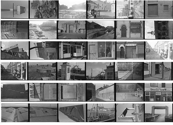
The BBC had of course returned my negatives in the stamped addressed envelope I had included, and they came back in October or November and were filed with the work I was taking then – but somehow I forgot to make a contact sheet, which made the negatives were very difficult to find. Finally I did find them, and made the digital contact sheet above, rather too small to be seen properly in the small version on this post, but good to see at full size on my screen.

Looking at the set of 36 pictures, it’s obvious that I had decided to go an visit some of the favourite locations I’d photographed earlier and retake versions of images I’d taken before. This isn’t generally a very good idea, as if you have made a good picture before you are likely to get something that doesn’t match up to it when you return.

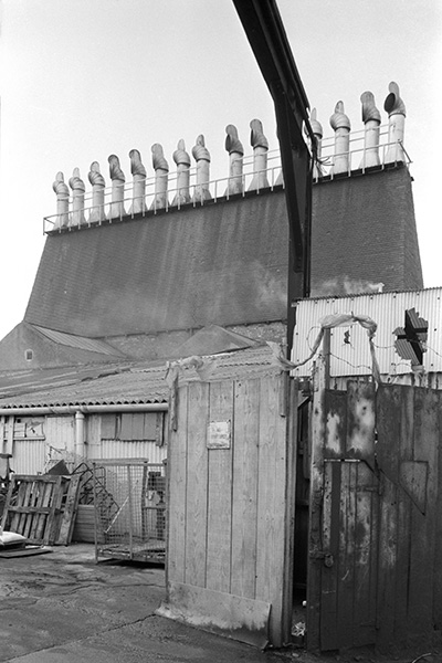
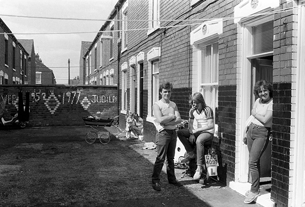
Though mostly I seem to have tried hard to make pictures that were just a little different, and in some parked cars or other obstructions made a repeat performance impossible. If you have are following my daily posts on Hull Photos for the UK City of Culture 2017, then today’s image showed the shadows of the chimneys of a Fish Smoke House, perhaps even the one in the image above, though there were several others in the area, all now gone – a piece of heritage lost.

The other of the two I printed for the BBC – which was the one they selected I also took on the other camera I was carrying – and I think did it rather better, and in time two better images will appear on Hull Photos – and I’m unlikely to post it myself (its the fourth frame from the left on the fifth row down.)

But the image I’d found this morning I’d only taken on the film for the BBC and it’s  only one in the 36 where I made two exposures, presumably because I realised I had over-exposed the first. The two are almost identical  so far as the three people in the foreground are concerned ,though the over-exposed frame is just a little better framed and has the woman and child in the background in a different position. It would have been hard to get a decent print from the negative in the darkroom, but I may be able to rescue it digitally.

The pictures were taken using an Olympus OM-1 camera, and the FP4 was processed in Acutol. There are two slightly darker bands across every frame, only noticeable in even areas such as sky. I’m unsure whether these represent a film fault or uneven processing, but at least with digital these can be treated, and they are almost entirely invisible after a little work in Photoshop.

Faulty film was not that unusual, particularly in bulk film, and I had some batches replaced by Ilford over the years, though they ever admitted the faults. Now I might be able to reclaim some of those faulty negs by digital retouching if I have time and patience.

I had found the print when I went up into the dark recesses of the loft in my house, looking for more of the actual prints I showed in Hull back in 1983. I didn’t have a great deal of luck with these, only coming across a handful to add to those I’d already found. Perhaps I had sold a few, and others might have got lost or still be hiding in a cupboard or lost after taking them to talks or shows.

But as well as the  print which led to my rediscovery of that BBC competition film, I also found a slide filing sheet with 14 sides from Germany in the early 1980s, including an image I’d spent several days searching the house for when I was producing the book ‘German Indications‘ and had to leave out, and a couple of others that might have been included had these slides, obviously selected to send to a gallery at some point along with some black and white prints been available.

A couple of others are probably the originals of images which I reproduced from duplicate slides, although most of the duplicates, made using an Illumitrans slide duplicator, were of exceptionally high quality. The only way I can identify the originals is if they are in the original Agfa slide mounts, but some of them I will have taken out of these for various reasons, especially if I wanted to reproduce the full image, a small part of which is hidden by the slide mount.

The image above is in the book (and the preview on line) but with a different colour balance to the new scan. I’m not sure which is more accurate, but the book image, considerably more yellow, is closer to the slide, though my memory prefers the bluer version above, though perhaps it is just a touch too blue… 

Which reminded me of a post on The Online Photographer a couple of days ago, on Color Correction (which I’d spell as Colour Correction) which is worth reading, including some of the comments. And you are welcome to download the above image as one to practice on though of course despite the lack of a watermark it is still copyright.

Slide films always added their own personality to the colour pictures we took, and we have now rather got used to the more accurate rendition of digital, though digital cameras too have their own differences. I generally prefer the results from my Nikons to those from the Fuji cameras I less often use, but others rave in admiration of the Fuji colours, especially in jpegs. I just adjust their RAW files to give something that seems more like I see.
Continue reading Found at last

Axe Drax Again


The ‘Grim DECC’ attacks a Drax cooling tower with his axe

Some protests are rather drab, with little visual material to work with, which can make for a hard time for the photographer. I like the challenge of photographing people, and there are always people to photograph, but the problem is to get those people to visually express something about the protest. Unless of course they are celebrities, names the papers lap up and will publish almost any picture of- though sometimes they are inundated with pictures of them and even if your photographs are better than the rest, the chances of an editor even looking at yours are small.

Celebrities aren’t any more interesting to me than the next guy, though some people are more interesting to photograph than others. Including some well-known people, though others don’t impress me, particularly some women who hide their faces behind a heavy mask of makeup which robs them of life. Protesters – and most people I watch avoiding eye contact when I’m sitting on the tube – are generally more interesting.

I’m often surprised at how poor some of the pictures of people we see in the press are. And I don’t mean the amateur snapshots which might be the only available image of a murder victim, but the work of professional photographers. Of course editors sometimes deliberately pick bad pictures because they make the subjects look bad. The kind of images that I usually don’t bother to import onto my computer and disappear when the card is formatted ready for the next day’s work.

Axe Drax presents a different challenge, with an embarrassment of symbols – a Draxosaurus, a cooling tower and a grim reaper with his ‘Grim DECC’ axe, and some splendid banners as well as the people. I’ve photographed the Draxosaurus a few times now, and I think I have not yet managed to get a good picture – and I do wonder how many people who see it understand what it is about. The cooling tower is much better, though sometimes hard to see it is a cooling tower in photographs, and the Grim Reaper is fine if rather hard to see where he fits in – and the DECC is certainly not attacking Drax or its cooling tower, rather cosseting them – it’s axe is reserved for green initiatives.

Drax is about dirty coal and environmentally unfriendly biomass – which is benefitting from green subsidies, while genuinely green developments are getting sidelined. It’s about huge CO2 emissions, the devastation of large areas of Colombia with open-cast mining. And while I may get some interesting images, it sometimes feels like I’m trying to write a story in English with only a Cyrillic font.

Physically it’s also difficult space to work in, with a narrow pavement in front of the Grocers Hall with a fairly steady stream of pedestrians. The City of London police keep telling me not to obstruct the pavement most of the time I’m taking pictures – and object when I stand – as they are – in the gutter. For quite a few of these pictures I not only had to look to see the subject, but also to see when the police had turned away and I could get into a suitable position.

It’s actually inevitable that this pavement will be somewhat obstructed – and it would be sensible and cause little obstruction to road traffic, which isn’t particularly heavy and gets held up by the traffic lights anyway – to put down a few cones to give a yard or so more to allow free movement along the pavement for pedestrians. And to get those officers off my back. There probably is a limit to the number of times they will warn me I’ll be arrested for obstructing the pavement before they really do, and I think on this occasion I came pretty close – despite being careful not to actually get in the way of people who were walking past.

More pictures at Drax AGM Biomass opposition and more about the campaign on the Biofuelwatch web site.

Continue reading Axe Drax Again

Do I have a problem?

On the ‘United Nations of Photography‘ site you can read a contribution by an anonymous ex-photographer, who took his last picture as a professional in 2006, I’m a Photographer and I Have a Problem…, and it got me thinking a little about my own and other photographer’s motives, particularly in the main area of photography which I’m now involved with.

The writer is not the only photographer I’ve known who has had similar thoughts and a change of career – in his case to becoming “a Support Worker (£7.20 per hour) at a Residential Drug and Alcohol Rehabilitation Centre.” The current weekly hourly minimum in the UK, it’s actually better money than many photographers now earn, though I’m sure that was not the reason for the change.

Yesterday as I waited outside Harrods for a protest there to begin, I was talking to one photographer about the poor wages earned by some workers in the world’s richest store owned by the richest family in the world – the Qatari royal family. Many of the waiters there get either that same legal minimum hourly rate, or just a few pence more, while that “needy” family get the lion’s sahre of the tips and service charge the public think are for them. We reflected that many if not most of the photographers present put in long hours for a pretty low return, in many cases amounting to an even lower hourly rate than that minimum.

I thought too of a series of exchanges with Chauncey Hare after I’d written about his work. I’d first seen his work when Lewis Baltz showed some of it at a workshop I attended, and went out and bought his 1978 book ‘Interior America’. In the 80s he gave up on photography and became a therapist who concentrated on work related abuse. The piece I wrote about him is no longer on the internet, but you can read a review on ‘5B4’ of the eventual republication of his work as ‘Protest Photographs‘, an extended version of that 1978 Aperture publication.

While informative, Mr. Whiskets’s review is I think in one aspect misleading. The light printing of the book was not “so typical of books from the late 70s” but was the result of a deliberate aesthetic choice by Hare – as was the harsh flash lighting; I think he did not want his work and the book to be seen as “art” but as a manifesto. But I was pleased when in 2009, a few years after our on-line conversation, someone managed to persuade him, as I had failed, to have his work re-published.

The anonymous photographer’s article is illustrated with an image of smashed cameras and equipment; Hare threatened to destroy all of his work – 50,000 negatives, 3500 prints and 30,000 35mm slides and many taped interviews – unless the University of California’s Bancroft Library would accept it as a donation. Fortunately they did, and now the library holds all rights and permission to reproduce pictures from his work in social situations requires the following sentence to be used with them: “These photographs were (or ‘this photograph was’) made by Chauncey Hare to protest and warn against the growing domination of working people by multi-national corporations and their elite owners and managers.” There are no items on-line.

Later yesterday, another photographer said to me that he didn’t mind about the protest we were photographing, all he wanted was “some action“. I didn’t reply but thought to myself that I was only there because I did mind, did care about the issues and the people, and that although I’d do my best to take pictures of anything dramatic that occurred, it wasn’t what motivated me.