Kash, Afghanistan and the Threat to Journalists

11 Carlton House Terrace is an impressive Nash building from around 1830, designed as a scenic backdrop to St James Park and grand enough to have been home for two prime ministers, Lord Stanley and William Gladstone as well as William Crockford and the Guiness family. Inside it has an impressive double staircase and some formidable public rooms. The Foreign Press Association has been here since 1946, and in 2006 Gabriele ‘Kash’ Torsello was awarded the FPA’s Premier Award, the ‘Dialogue of Cultures’. After his release (see below), Kash was at a low ebb, and this recognition of his work was important in giving him the will to continue with his Afghan project. The interior of the building is hung with large banner prints of some of his powerfully empathetic images, in the first of a series of exhibitions to be announced shortly at the venue. Kash’s show is the launch of a larger exhibition in southern Italy, where as ‘Staramasce’ 30 huge photographs will be hung throughout the summer, one in each of 30 public squares in Lecce province, together with an exhibition of all 30 in the Lamarque Museum.


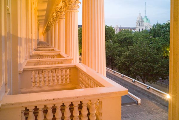
The balconies of Carlton House terrace overlook The Mall

It was a beautiful evening, an unforgettable venue and there was good Italian wine and very likeable Afghan-style food, and I met and talked with many interesting people – including most of those in the panel of speakers, half of which is shown below.

I first met Kash at an NUJ party last year, unmissable with his beard, dark clothing, warm and intense manner and a battered film Nikon, and talked to him about his work in Kashmir. A few days later, the book he promised to send me, his ‘The Heart of Kashmir’ (2003) arrived; I was impressed and published a short note on him and his work on About.com in July 2006. Heart seemed a very appropriate word, for this was work full of passion by a man whose heart was very much into his photography and his closeness to the people he lived with and photographed. As well as the pictures, its short texts gave a very real insight into the problems of working in such situations.

It came as a shock to read last October of his kidnap in Afghanistan. More so because he was someone who lived among and worked for the people, and worshipped with them as a fellow Muslim. I was pleased to be a small part of the worldwide campaign for his release, both through About Photography and also with links to the note I’d written previously from other sites, including the NUJ.

And of course we were delighted with the news of his release after being held for 23 days. But it’s important to remember that he was only one of many journalists and photographers who has suffered, and many die recording events around the world. According to Reporters Without Borders, one of several organisations that keeps such grim records, 84 journalists were killed in 2006, and halfway through 2007 over 50 journalists and media assistants have been killed, and 130 imprisoned.

Half the panel
From Left: Farid Popal (Afghan Embassy), Leila Blacking (ICRC) Gabrlele Torsello, Nazenin Ansari (FPA President), Abdullah Annas (ex Arab Mujahidden)

The panel of speakers included Leila Blacking of the ICRC, which had the same day released its press release, ‘Afghanistan: Insecurity spreads amid escalating conflict’ giving a bleak view of the situation there. The Red Cross’s view was largely dismissed by Farid Popal of the Afghan Embassy, and an equally complacent view came from the US Embassy representative.

Reporting here from Afghanistan is limited – despite the determined and hazardous efforts of many of our colleagues, including Kash and a number of his friends also at the opening. The ICRC views are based on their 20 years continuous working in the country and note the deteriorating military situation and the problems this creates for development work and the increased need for emergency assistance. Almost two and a half thousand people were detained by Afghan authorities last year in connection with the armed conflict over the past year, and there is a general lack of security in the south of the country leading thousands to abandon their homes in both rural and urban areas.

Blacking spoke impressively and responded openly to questions from the floor as well as in private conversations later. Listening to the diplomats, both very likable men, it was impossible not to remember Sir Henry Wooton’s comment (made in Latin almost 400 years ago) that “an ambassador was an honest man, sent to lie abroad for the good of his country.” Unlike English, Latin allows no ambiguity about the meaning of the phrase.

I also thought about events of the nineteenth century, and the great images brought back by Baker and Burke as they travelled with the British Army, whose opinion of the campagn there is encapsulated in rhyming slang. To Kipling the Khyber Pass might have been “a sword cut through the mountains“, but the troops saw it differently. Perhaps after some 200 years, ‘The Great Game’ is now coming towards its end game.

Journalists are coming under increasing pressure, and both Afghan and US responses where chilling, with the clear implication that those who went into certain areas were just asking for trouble – and deserved what they got. Why, asked the guy from the US, only slightly more circumspectly, won’t journalists go and write nice success stories from the places in Afghanistan where we would like them to go?

From the ICA
We were joined on the neighbouring balcony by people from the ICA.

How We Are: Twentieth Century Blues

Coming back finally to the current Tate Britain show, ‘How We Are’, the first section ‘First Moves’, dealing with the nineteenth century is certainly the most comprehensive and inclusive of all six chronological sections of the exhibition.

Around 120 photographers are listed for the remaining five sections, and they include some fine photographers (as well as some whose inclusion is hard to justify on any grounds.) My own selection of a similar number of photographers would perhaps have included rather under half of those chosen. It was certainly good to see a fair number of those whose work I think deserves to be better known – for example Norah Smyth and Edwin Smith in their very different genres, and obviously pleasing to see a number of photographers I know or have know with work on the wall, as well as to find some of those books on my shelves are now museum pieces. Some people – such as Bill Brandt – could not of course be omitted (although I’m assured that it was initially planned to do so.) Others, quite frankly had little relevance even to the particular view that the curators were presenting, perhaps representing strongly argued cases by some of those called in to review the plans.

In part the titles given to the different eras both indicate and dictate the omission of many fine photographers. ‘Into the Twentieth Century’ may seems pretty vague for the period 1900-1918, but appears to be a pretext for ignoring almost all of the pictorial photography and news photography of the era. As this was the first age in which cheap methods of mass reproduction led to photographically based newspapers, I would have expected more emphasis on how these new media used photography, rather than the rather specialised examples in the show. The photography of the Suffragette movement, with Christina Broom (Christina Livingstone, (1863-1939), Britain’s first woman press freelance photographer) and Norah Smyth, is a highlight of this section, reflecting the curatorial interest perhaps more in that movement than in their photography, which for both was considerably wider than the visitor to this show might conclude. Both of them are also featured in Mike Seaborne’s Photographers’ London: 1839-1994, which, despite its obvious metropolitan bias, succeeds in offering a considerably wider view of this era and others covered by the show.

By defining the period 1918-1945 as ‘New Freedoms in Photography’, the curators again choose particular work from the era rather than cover it more generally. Despite the title, there is perhaps less emphasis on photojournalism that might be expected from the era that saw the growth of the photographically illustrated magazines such as Liliput, Weekly Illustrated and Picture Post.

Again, it seems to me impossible to consider the period 1945-69 adequately as a whole under the title ‘The New Britain’; for most of us it changed radically at some point between the fifties and the sixties.

Equally it seems hard to argue that the seventies and eighties were dominated by ‘The Urge to Document’ or indeed that since then we have been making ‘Reflections on a Strange Country’. These are strange generalisations indeed, and the choices (and missing persons) they lead to make the show unrepresentative.

That isn’t to say that there is not a great deal of work of interest in this show. British photography does have a great deal to offer, and the story of British photography shown here is at time enthralling. But different curators would have made different choices of photographers and images, telling at least an equally valid view of photographing Britain.

So here are just a few names from the 70 or so who would have been on my personal list for 1900-1990 but are missing, in vaguely chronological order. Where I’ve written about them elsewhere and remember I’ll give a link.

Horace Nicholls, John H Avery, George Davison Reid, Emil Otto Hoppe, Felix H Man, Margaret Monck, Cyril Arapoff, Kurt Hutton, Thurston Hopkins, Henry Grant, John French, Eric de Mare, Raymond Moore, John Blakemore, Philip Jones Griffiths, Don McCullin, Ian Berry, John Benton-Harris, Jo Spence

Among the foreign visitors who perhaps have a greater claim to be included than most of those actually present are Izis Bidermanas, Henri Cartier-Bresson, Robert Frank and Sylvester Jacobs.

The final selection deals with contemporary work, and selection in this area is always going to be a lottery. The 20 or so photographers whose work appears in this section are an almost random cross-section from the several hundred whose work I find of some interest at the present time.

Although there is much to see, How We Are is a show that disappoints, as a missed opportunity. How long will it be after this before Tate Britain once again tries to tell the story of photography in Britain?

Missing Persons: First Moves

The ‘Missing Persons’ series has provided me with a little amusement although I think the point is basically serious – publicity from Tate Britain suggests that How We Are: Photographing Britain is “The unique story of British photography” when it is just one of many possible stories about British photography.

To adequately tell the story of British photography would need a larger space and a larger budget than the Tate provided. (Budget problems may also explain the rather unusual choice of images for some photographers.) As well as the particular viewpoint of the curators, these factors also helped to shape the show that we see.

This first section, entitled ‘First Moves’, and dealing with the nineteenth century is certainly the most comprehensive and inclusive of all six of the chronological sections of the exhibition. As a history it lacks some major figures, but also fails almost completely to deal with the technical, aesthetic, political and even largely the social changes that helped to change the nature of photography in Britain over the sixty years concerned.

There are of course many others apart from those already mentioned in ‘Missing Persons’ who might well be included in a proper overview of British nineteenth century photography, far too many to devote a whole feature to each one of them. So here are just a few more from the nineteenth century who I would have expected to see in any show claiming it was the story of British photography.

One of the best of the daguerreotypists was Antoine Claudet, and Calvert Richard Jones and John Dillwyn Llewelyn produced some fine work with the calotype and later wet plate process. It is hard to believe that there were no portraits by Lady Clemintina Haywarden in the show (perhaps by some error they left her out of the credits?), but she is not on the list. David Wilkie Wynfield was another of those to whom Julia Margaret Cameron turned for advice, and on who she perhaps based her approach.

A man very much after my own tastes, Henry Dixon produced some splendid records of London streets, showing both the buildings and the people. He also took some early candid street pictures, using a camera obscured by tarpaulin on the back of a cart.

Of course there are so many other interesting photographers of the period who I’ve not mentioned who are an important part of the early history of photographing Britain. What we do get – and is certainly of some interest – is a number of relatively anonymous works by rather ordinary photographers, including the work of commercial studios (some good, some bad) and others.

Viewed on its own, and for what it is – a kind of cross section of Victorian photography, seasoned with a number of choice tidbits from some of the finest photographers of the era – this section has much to recommend it. The coverage of some of the later eras – as I’ll show in later posts – is much less complete and more biased.

Peter Marshall

1989

Like 1984, but 5 years later. George Orwell wrote his famous book when the date was some 40 years in the future, but I photographed 1989 at the time and wrote about it badly around 17 years later.

(C) 1989, Peter Marshall

Of course there is no real connection with Orwell (though I do have friends who live in his former house in the North-East.) 1989 is just a kind of account of my wanderings in north-east London on a few days in that year, both in straightforward images and rather convoluted text. What is on line is merely chapter one of this fictional work, which has amused some. It does have certain literary influences, but I can blame nothing on Orwell.

(C) 1989, Peter Marshall

It’s perhaps best just to see it as 20 images of the city and not try to read the rather small text. I put this selection of images and the texts together for another web site, which seems to have folded shortly after these went live, though doubtless just by coincidence. On that site the images appeared in reverse order, but I’m not sure it made a great deal of difference.

In some cases the text does reflect at least some of the thoughts that went through the photographer’s mind as he stood in front of the scene and took the picture. Other parts came long after the event.

Peter Marshall

The ‘I’ Word

Archival Ink Prints

One of several things that impressed me at Photo-London last week was the number of inkjet prints on display, mainly in colour, but also some black and white, including what I thought was technically one of the best prints, if not the best, in the show (I don’t much like the subject matter, so perhaps won’t mention the photographer.)

Even more impressive was that none of the wall-labels for these prints mentioned the ‘I’ word. I*kj*t is certainly a taboo word so far as dealers are concerned. Instead there were various circumlocutions, varying from the entirely misleading ‘carbon print’ to things that were more essays than media descriptions, such as “printed with pigment based inks on archival cotton paper.” At least the term giclĂ©e seems largely to have gone out of fashion, though not entirely absent. It was probably never too popular in France, where I’m told the word, meaning ‘spurted’, has unsavoury slang associations.

Of course many inkjet prints are of poor quality and fugitive in nature, particularly in the early years of inkjet printing. The same problems beset photography in its early years, with salt prints and albumen prints often disappearing almost before your very eyes – and many watercolours also have fading problems. The rise of the photographic gallery in the 1970s and 80s more or less coincided with the so-called ‘new color’ photography, and many of those early C-types are now more a study in browns than colour images (although some at least of the dye transfer prints from the era retain their stunning quality – and there were some fine examples by Eggleston in particular at Photo-London.)

Dealers are also reluctant to use the term inkjet because everyone has an inkjet printer at home, just as many don’t like the term photograph, because the whole world takes and makes photos. Calling them ‘silver gelatin prints’ or even ‘color coupler prints’ associates them with the long and distinguished heritage of print-making rather than that common upstart photography.

Most of the descriptions of inkjet prints currently in use would surely fail under the Trade Descriptions Act as misleading. Carbon prints are something quite different, dating from the nineteenth century, which produced some of the richest and most lustrous images in existence (as well as many that were atrocious.) Of course many of those did not use carbon as pigment.

Archival is also a term lacking in definition. In terms of paper, cotton is a fine material for long-lasting papers, but probably the best lignin-free alpha-cellulose materials are probably its equal. All papers, including 100% cotton materials, may also contain optical brighteners (OBAs) whose fading will make papers yellow with age, and may also be coated with ink-receptive materials whose archival properties in such situations are undetermined.

Inks too are complex materials. Early inkjets all used soluble dyes, chosen with little thought as to their light stability, and prints faded fast. But there are dyes that are stable, that can most likely match the stability of the pigment inks we use. Not that pigments are always particularly stable, and carbon itself isn’t without problems. Of course even inks sold as carbon based inksets for black and white printing have turned out also to contain metallic pigments and often dyes as well (and there is good reason for their presence.) Inks also contain other materials which may too contribute to their fading.

It perhaps isn’t surprising that Stephen Livick, a photographer who seriously studied the problems of making long-lasting inkjet prints and published his personal test results received “serious litigious threats” which eventually forced him to remove his test information from the website. You can still read some of his conclusions, including the fact that certain coatings, particularly Clearstar’s Clearshield, applied after printing will greatly increase print longevity.

Of course, however prints are made, it is largely storage and display conditions that will determine the rate of their deterioration. Most prints would do pretty well if kept in an inert atmosphere at low temperature and controlled humidity – even silver negatives will keep for a considerable age under these conditions. Mounting on acid-free or impermeable supports (and of course any adhesive material used), framing under glass etc all will affect the rate of fade.

Although inkjet printing covers a wide range of materials (and some differences in method) I think we need a commonly agreed simple term intended to describe such prints rather than the current attempts at obfuscation. I don’t like the term archival, but it is hard to think of a better word, so I think we are stuck with it. Otherwise I think it best to keep the description as short and simple as possible. So I propose the term:

Archival ink print.

It is short, avoids the ‘I’ word (and the ‘P’ word), makes it clear that the image is an ink image, while avoiding much confusion. Of course many photographers will want to give a more detailed description of their working practices, perhaps as a part of a ‘Certificate of Authenticity’ which may also include advice on storage or display (such as “should be displayed framed behind glass out of direct sunlight.”)

This is a subject that has been discussed in various on-line forums over the years, and I’ve taken part in those often heated debates. My views as I’ve thought (and learnt) more about the problem have changed. So for me at least, this is a new suggestion. Your views are welcome.

Peter Marshall

Water, Water Everywhere.

From the beginning, photographers have always had a thing about water. Of course it’s inherited from painting, as a quick walk around almost any art gallery, at least of work before the twentieth century, will soon confirm. Walking around art galleries is always useful exercise for photographers, and in London we are peculiarly blessed with both the National Gallery and the National Portrait Gallery adjoining Trafalgar Square where I’m often photographing events, and Tate Britain a short and pleasant walk from Parliament Square, where I’ll drop in and say hello to Brian Haw even if there is no other demo taking place. These galleries are also handy places to dry out when you’ve got soaked photographing in the rain.

In the first decade or two of photography, exposures were long, and one of the great challenges was to photograph waves. I wrote recently on ways to photograph water, and mentioned the success of John Dillwyn Llewelyn in an image of waves breaking on the Welsh coast in the early 1850s.

Water was essential to the wet-plate process that he used, where the photographic plate had to be coated and made sensitive to light on the spot, then exposed and developed before it dried to form a hard, impermeable skin. Of course water remained essential to photographic processing until the advent of digital, but we didn’t need to do the business on the spot. Even now, large quantities of water are needed for the manufacture of digital cameras, computers and the other equipment we need. Truly water is essential for life!

Few photographers, even the most cynical of us, are not occasionally seduced by the reflections of our subject in a smooth pool or broken by ripples, even though we know such things have already been done to death (and there is much evidence of this demise on Flickr and elsewhere.)

I’m trying hard to remember which the photographer was when asked for his definition of photography replied “never anything shot on a beach” or words to similar effect. I don’t think it was me, though I have a certain sympathy with the sentiment. As in the same way I used to call for a moratorium on the sale of colour film in the “Fall”, so aptly named by Americans. O Kodachrome, O tempora, o mores!

So when I agreed to take a walk with Linda and Samuel along some of London’s canal system last Saturday, did I stick to my principles and leave the camera at home? Of course not. From Mile End, we walked not to Paradise, but Willesden Junction by way of Kensal Green.


Grand Union Canal (Paddington Branch) at Kensal Green, steady rain.
(C) 2007, Peter Marshall

Water, at least towards the end of our journey was certainly everywhere, with an intense fine rain falling constantly as we walked the last few miles, although for once I managed to keep most of it out of my Nikon. Perhaps the canal looks at its best in rain?

More pictures from the walk in My London Diary, May 2007

Peter Marshall

Photo London: Fish out of Water

It was I suppose apt that I felt like a fish out of water as I wandered around Photo-London on the opening day yesterday. Its new venue, the old Billingsgate fish market, seems an excellent choice, airy and open, completely unlike the underground tomb in which Paris Photo is held.

What made me feel out of place and uneasy was in the main the work on the walls. Photo-London is supposedly dedicated to contemporary photography, meaning from the 1970s on, although a little earlier work did creep in, so I’d expected to see contemporary work. What I hadn’t been prepared for was the almost complete dominance of the show by large empty photographs. Of course shows like Photo-London are dealer shows, and the dealers follow the money, and big money is largely corporate money with vast office walls to fill.

Although the work in corporations may actually get done in open plan offices and cubicles often with virtually no walls at all, reception areas are designed to impress by scale, and 20×16 prints look rather small on a 30 foot high wall. As Photo-London showed, there is plenty of photographic choice for such spaces, from garish to minimal, to suit your company profile.

Of course not all big photographs are bad photographs, but in general I don’t think a large scale fits the medium well. Its most powerful statements have an intimacy that works better on a moderate scale, perhaps best of all in the pages of the photographic book.

Of course there was work that stood out for me, though relatively little. I’ll go back to the show (it runs until Sunday) and look at some again. Much of what attracted me was however familiar, for example – a fine set of work by Don McCullin as well as pictures by Chris Killip, John Benton-Harris and Ian Berry, all showing “How We Are”, (although three of these four are unaccountably missing on the walls of the Tate show) – but there was also work new to me (at least in actual print form) which I found exciting and hope to write more on later – so long as I can find images on the web. Along with much that confirmed my exisiting predjudices.

Portraiture in particular seems very much in a rut. Use flat lighting, stand your subject or subjects central, looking deadpan at the camera, photograph in medium or large-format colour and you seem to be guaranteed gallery space. Around ten years back this seemed fresh and new (at least to those who had never seen the work of August Sander, who did it so much better, if in black and white.)

Photo London opening
John Benton-Harris (2nd from left) with friends at the opening.

As openings go, its a rather dreary and disappointing event, with small cliques in the different gallery spaces and its hard to meet new people or have a real party. At least at Billingsgate you could go and sit outside by the Thames, although it was a chill evening on the north bank, even though the sun shone on the buildings on the other bank.

Peter Marshall

Missing Persons 4: Frederick H Evans

No proper view of British photography in the late nineteenth and early twentieth century would be complete without the work of Frederick Evans. At a time when most photographers with any pretention as artists were busily engaging in making their prints look less like photographs and more like paintings through the use of rough papers and special printing techniques that allowed them to work on the image.

Evans followed instead the example of P H Emerson, photographing in a technically precise manner and printing on platinum paper, which produced a linear tonal scale and was not normally susceptible to manipulation. He was noted for refusing to retouch his work, relying instead on perfecting his technique. His images owed their effect to light, and he would sometimes spend hours, days or even weeks studying the effects of light in the buildings he wanted to photograph in order to find the time of day and light that would produce the photographic effect he wanted.

He valued the clear and delicate tonality of the platinum print to such an extent that when the material went off the market he made no more prints, refusing to use the cruder and less linear tonal scale of the silver print. Some of his images were also reproduced using the Woodburytype process, which uses a relief image on a lead printing plate to produce different thicknesses of pigmented gelatin – and hence different tones – on the paper – essentially a mechanically produced carbon print.

As well as his architectural studies, which certainly include some of the finest images of English cathedrals and their interiors, he also made a number of fine portraits, including justly well-known images of Aubrey Beardsley.

Evans was a leading member of the ‘Linked Ring’ group of artistic photographers. He was also the first English photographer to have his work printed by Alfred Stieglitz in his magazine ‘Camera Work’ in 1904, and 2 years later Stieglitz showed his pictures in his New York gallery, ‘291’, along with the work of D O Hill and James Craig Annan.

Peter Marshall

Missing Persons 3: H P Robinson

Looking at the booklet for the show ‘How We Are: Photographing Britain’ before making my way into the gallery I got a shock. The curators appeared to have omitted the very man who started the whole thing, W H F Talbot. I checked again – it couldn’t be true, and thankfully it wasn’t. They had simply placed him wrongly in alphabetical order under the letter F. So when I realised that H P Robinson was missing, I immediately looked for him under ‘Peach Robinson’, but he wasn’t there either.

Although Rejlander’s ‘Two Ways of Life’ showed a path for photography, it was one taken most enthusiastically by his friend Henry Peach Robinson (1830-1901), who, over the years, starting with ‘Fading Away’ (a ‘touching’ deathbed scene which is perhaps hard for us to appreciate, but was only too common an experience in the era before modern medicine) produced a number of impressive works using similar combination printing techniques (such as ‘When The Days Work is Done’, as well as many fine portraits and landscapes.

fading away - HP Robinson
‘Fading Away’ is one of 12 images by H P Robinson available on the Free Information Society web site.

Robinson had trained and exhibited as a painter and was a great fan of Turner and of the Pre-Raphaelites, and he composed his works in much the same fashion, and dealt with some of the same subjects, including for example, a picture of “The Lady of Shallot“.

His use of combination printing continued to cause controversy in photographic circles, Robinson arguing that the aim of photography was to make beautiful pictures, and that the techniques used were irrelevant. He explained his appraoch in the influential book, “Pictorial Effect in Photography“, published in 1867, and was famously involved in arguments with another great photographer, Peter Henry Emerson, who favoured a more simply photographic approach to produce pictorial images.

Pictorialism to which both men contributed, remained a powerful influence in art photography for the next 40 or so years, particularly through groups such as the ‘Linked Ring’ (a strangely masonic guild established by Robinson and others when he left the Photographic Society in 1891) and various other seccesionist groups of art photographers based in other countries.

Although pictorialism was eclipsed in art photography by the rise of modernism in the early twentieth century, much of the debate between Robinson and Emerson had strong resonances in the 1970s and since, when increasingly fine artists began to take up photography and reject much of the purist orthodoxy.

Peter Marshall

Missing Persons 2: Oscar Gustave Rejlander

Rejlander, (1813-75), the son of an officer in the Swedish Army, had studied art in Rome and Paris before coming to England and trying to make a living as a painter. Once he saw a photograph, he realised tha this was the future, and in 1846 he opened a photographic studio in Wolverhampton.

As well as portraiture, his early work included a number of child portraits, some clearly erotic. He later married one of his child models, over 20 years his junior, who he had photographed since she was 14. Lewis Carroll was a collector of this early work and Rejlander, who became a leading expert, helped both him and Julia Margaret Cameron to set up as photographers. Rejlander’s later images of children living on the London streets in the 1860s attracted public attention to their condition.

Rejlander’s major contribution to photography was through his use of multiple exposures and combination printing. While other photographers may previously have used separate sky exposures largely to combat the lack of color sensitivity in all early photographic materials (being sensitive to blue light only, blue skies were over-exposed and lacking in tone if the exposure was made for the rest of the scene), he realised the potential of such methods for artistic purposes.

The best-known picture by Rejlander is his ‘The Two Ways of Life’, said to be put together from around 40 different exposures, painstakingly printed to give a virtually seamless image. It aimed to illustrate the choice between good and evil facing a young man at the start of life, a subject that gave considerable licence for posing models in various states of undress – so much so that when shown in Scotland, one half of the image was covered by a curtain. Read more about it.

Rather than include the image here, take a look at it on the George Eastman House website, where as well as this image you can go to the ‘thumbnails’ link and see their full collection of almost 70 images by Rejlander.

It would be a tricky feat to photograph such a scene today as a single exposure, needing a large studio with impressive resources of artificial lighting. In 1857 it was totally impossible. Using multiple exposures also helped in the tricky problem of finding models, with many playing different roles in the roughly 39 plate negatives he used.

At the time the image was highly controversial. Fortunately for Rejlander, Queen Victoria saw it and was amused, paying 10 guineas for a copy, which she gave to Albert, and he hung it on the wall of his study. With such royal approval, his reputation was made.

There was also a question of scale. At the time, all photographic printing processes were contact processes, producing images exactly the same size as the plate exposed in the camera. Most photos were small – ‘full plate’ size was 8.5×6.5 inches, and many cameras were half or quarter plate. By using a number of plates, Rejlander could make a larger print. The ‘Two Ways’ was 31×16 inches, bringing photography into the same order of scale as easel paintings.

Without doubt, photographs such as these had an influence on painting, and the work of pre-Raphaelites such as Millais often look peculiarly like these combination photographs. Photographs by Rejlander and others were indeed often used as source material, and combined together by painters to give similar results to those he obtained in the darkroom.

But his influence on other photographers was much stronger and more direct. Rejlander was a key figure in British photography in the nineteenth century, a pioneer in a number of respects, and has with considerable justification been called “The Father of Art Photography.”

Peter Marshall