Boston Globe – Big Picture Mumbai

Thanks to EPUK for sending me a link to a dramatic set of large images of recent events in Mumbai on the Boston Globe site.

Last week I went to see the World Press Photo exhibition, on show at the Festival Hall on London’s South Bank until Dec 7.  Worth a visit if you are passing, though you can also see the work online.  Some of it possibly looks better on the screen than on the wall, although other images are more impressive on a large scale.

WPP does sometimes seem to be more about the dramatic nature of the incident than the quality of the photography – though often the two coincide. But there are a few images on the Boston Globe roundup that I would not be surprised to see featuring in the 2009 prizewinners. It is incidentally, one of the easiest contests to submit an entry to, and it is free to enter – if one of the hardest to win. You have until 15 Jan to send in your work,whether over the internet or by courier.

Paris Photo and Japan

There is much more I could say about Paris Photo, but much was the same as ever, or perhaps more so. At many gallery spaces it was very much a case of deja vu, and there were some images I welcomed as old friends, in particular a very nice Steichen gum platinum print and some fine dye transfers of artists studios by Evelyn Hofer. If one can’t own such beautiful objects it is at least nice to see them on a regular basis.

However there were other works I would be happy never to see again, and indeed some I would happily add to a bonfire or put back in the photographers rubbish bin from which some ‘vintage works’ do appear to have been ‘rescued.’ I think the gallery scene lacks any mechanism for dealers to admit to making mistakes – they just have to keep on putting out the work and hope that suckers will take the bait.

It was good to see some of the Japanese work, in particular some fine large prints by Daido Moriyama which made a nice comparision with work by William Klein it was shown alongside. It was disappointing not to see more work from Eikoh Hosoe, but there was a magnificient very large screen made from his picture of a Kamaitachi running across a rice paddy, a wide open and highly luminous patchwork landscape. This very large inkjet print made on silk paper was truly one of the most desirable objects in the show.

There is a lengthy illustrated essay by Mariko Takeuchi, guest curator of the “Spotlight on Japan” at the show on lensculture which attempts the kind of overview of Japanese photography that would be beyond me. However, there are a few things  it fails to mention, for example what was possibly a vital influence on photography in Japan in the 20th century (it was listed on the very detailed history board in the exhibition) in 1931 when ‘Film und Foto‘ brought the modern photography world to tour Japan.

Also without a mention is one of my favourite Japanese photographers, Issei Suda (b1940), (you can see around 30 of his pictures – though not my favourite works at the site of the  Portland USA Charles A Hartman gallery.) I was pleased to see pictuers by Suda both at both Galerie Priska Pasquer from Cologne and a particularly fine image with a tatooed torso, from Zeit-Foto Salon from Tokyo. Its a picture that’s hard to describeand I can’t find on the web, so here I’ll do something I don’t like to do and put my very bad snap, taken as an ‘aide-memoire’  and full of reflections, on line. (Incidentally everyone seems happy with people taking pictures of the pictures at the show – which comes as a little shock after some museum policies. )

(C) Issei Suda, Zeit-Foto Salon
One of four Issei Suda images on Zeit-Foto Salon Tokyo stand at Paris Photo

Another fine image on the same stand was a large print by Ihei Kimura (1901-74) one of a generation across the world whose creativity emerged with the Leica, and whose work desrves to be more widely known here.

Takeuchi does mention Kimura, and also another phtogorapher whose prints I liked, Tomoko Yoneda, whose black and white pictures seen through the spectacle lenses of the famous have for me a very Bauhaus feel.  Another photographer who doesn’t get a look in is the only one of the more recent photographers from Japan who held any great interest for me, Nobuhiro Fukui, who I mentioned in an earlier post.

Serial Numbers

Ed  Ruscha with his “Twentysix Gasoline Stations” and “Every Building on Sunset Strip” has a lot to answer for, although he could perhaps shift some of the blame onto Bernd and Hilla Becher in Dusseldorf.

Since they made their work, splendid though it often was, the rather straightforward and simple concept of “typologies” has provided rather easy ways to think of and carry out photographic projects, though it’s been instructive over the years to see what a pig’s ear some students have made of them. Perhaps fortunately in that it has usually been the “mistakes” that have given any interest to their work.

What soon becomes obvious is that, even given the straight-jacket of the concept, the interest in the result is still so very dependent on the photographic seeing of the photographer, a thought that came very obviously to me on seeing the black and white set of images by  Jeff Brouws, which you can see on artkrush , Twenty-six Abandoned Gasoline Stations (very consciously a direct homage to Ruscha’s work) on a stand at Paris Photo. (There is also a good interview with Brouws on the site with a link to more pictures.)

Typologies such as this are succesful as photographic series because Brouws is a photographer who very much follows the advice of the sage to “let the subject determine its own composition.” You can see more of his more recent work on his own website, where it also becomes clear that typologies greatly benefit from interesting and important subject matter.

This is perhaps even more clear in the work of the Bechers, where the intrinsic complexity of the industrial structures elevates their work above the tedium of the framework house series.

Paris Photo: BMW Prize

A major area at the very centre of Paris Photo is devoted not to photography but a car showroom.  As someone who was a friend of the earth before the Earth officially had Friends (and who got rid of his first and last car in 1966) I find it inappropriate and distasteful, even more so this year since it it’s a make very much associated with bankers, whose bad book-keeping has certainly not put them into my good books of late. If I wanted to worship the motor car I’d go to a car show.


The centrepiece of the show – not photography

BMW are the sponsors of the BMW-Paris Photo Prize, a contest that has always turned up some rather odd entrants and chosen peculiar winners. The entrants are nominated by the galleries taking part in the show, which accounts for some fairly unlikely submissions.


Shortlisted work for the prize displayed on the upper level

Perhaps the most unlikely this year was the winner, Yao Lu’s New landscape part I – Ancient Spring Time Fey, 2006. Yao Lu was nominated by the 798 Photo Gallery, Beijing. He photographs mounds of garbage covered by green nets and digitally manipulates them to resemble traditional Chinese paintings.  It’s more bad Photoshop than photography as I know it, though, as the pdf file says “speaks of the radical mutations affecting nature in China as
is it subjected to rampant urbanization and the ecological threats that endanger the
environment
.” But I still think its a shame that a jury that included one photographer and one curator I admire couldn’t pick something more photographic.


Looking at the winning entry

I took some time going round the works shortlisted for the prize that were on show in Paris, and picked my own top five (not in order): Janne Lehtinen from Finland, Yuki Tawada, Ken Kitano (click on the pictures to see them larger) and Nobuhiro Fukui from Japan and Atta Kim from South Korea.

But this, as I’ve mentioned previously, is the year of China, thanks to the Beijing Olympics, so perhaps Yao Lu’s victory should not have come as a surprise.

Paris November: Galerie Berrger

Galerie Berrger: Callitypie: Julia Zeitoun and David Rase

Berrger are of course manufacturers of photographic films and papers, and now also make inkjet papers and COT-320, a 100% cotton paper designed for hand coated alternative process work. The two photographers on show had used this to make kallitypes, which use the light sensitive property of iron salts to produce silver images. It’s a process sometimes thought of as a poor man’s platinum print, and visually the two can be indistinguishable, although kallitypes have a poor reputation for stability – and certainly some but not all of those I made round 20 years ago have faded.

David Rase took Rodchenko as his inspiration for a series of modernist square format architectural studies. Although I liked a number of the images, I couldn’t help feeling that they might better have been printed using normal silver gelatin paper or probably even better as inkjet prints., and the highlights  did not quite seem as clear as I would have liked.  I think the images made good use of the square format.

Rodchenko’s pictures of similar architectural material – such as his Mosselprom Building, 1926 in the linked feature – show his use of unusual angles and a very strong sense of design, but have a clarity that was missing from these prints.  Modernism in photography after all swept away a pictorialism that had given great attention to the actual print and aimed for a machine quality that was exemplified by the glossy bromide print.  That doesn’t of course rule out using kallitype for work such as this, but somehow these prints didn’t quite seem to me to come up to the kind of quality needed – and which one could find for example in the platinum prints of Frederick Evans.

Julie Zeitoun‘s subject matter – details of cemetery monuments – perhaps suited the material better, but I felt her rather grainy treatment was unsympathetic.  The kallitype is a contact printing process, and it looked as if these prints had been made from enlarged negatives taken on fast 35mm film, perhaps even pushed or developed to increase grain. It is perhaps such a well-worn subject that it is hard to produce anything new.

When I worked with the alternative processes, we all either worked on large format (at least one of the people I knew had a 12×16″ camera, and on occasion I worked with a friend using 8×10″, though more often I used 4×5″ and made prints at that size – particularly when using platinum, palladium and gold) or made enlarged negatives on film.  Using large sheet film was expensive and especially with panchromatic materials needed for colour separations for tri-colour printing was a little tricky, particularly in my small and primitive darkroom, and at times we chose to work with negatives made on photographic paper, although the paper base did increase exposure times and add a little texture.

When desk top computers became able to cope with high resolution images, alt photographers turned to them with relief, printing out enlarged negatives with ease onto acetate sheets. When such negatives had been made with high-quality imagesetters in print bureaus, the quality could be superb, but some of those produced on cheap inkjet printers could only produce alt-process prints that had some of the same quality limitations to the inkjet prints from those same printers.

With increasing quality of ink sets and desktop printers – such as the Epson Ultrachrome K3 inks for colour and Jone Cone’s Piezotones for black and white printing, the quality of output from inkjet printers has reached new levels.  I soon began to find I could get prints very similar in quality to those from platinum or kallitype  direct from the printer, and although the historical processes continue to be of interest in themselves, I could see little justification for continuing to use most of them as a contemporary printmaker.  But that’s a heretical position among alt photographers!

Trouble in the Suburbs

One of the more interesting shows in Paris last week was at  the Galerie Fils de Calvaire in the 3e, which was showing Périphéries by Mohamed Bourouissa, (click on ‘Artists‘, then select his name)  a photographer born 1978 in Blida, Algeria who lives and works in Paris. These were staged images from the estates around the edge of Paris, “la banlieue“, usually translated quite misleadingly as “the suburbs”, which evokes Acacia Avenue and rows of neat semis and bungalows rather than the concrete wilderness of these images, seen often at night. These are the “suburbs” that riot rather than those leafy roads that commuters take the Southern Railway back to.  You can see a rather better presentation of 15 of these images elsewhere on-line.

I’m seldom a great fan of staged photography; it seems in its very essence to negate the true power of photography which comes from its ambivalent linkage to the real, but these images are perhaps a little different. Bourouissa is from the banlieue and certainly knows it and its inhabitants intimately, and the scenes they enact for his camera have a raw edge that is usually lacking in staged images. The people in his images seem to be playing themselves rather than appearing to be taking roles in someone else’s fiction, and many are not far in age from the 29 year old photographer.

There is a palpable tension in the group of youths hanging around in the entrance lobby of a block in Red Square. In front of the picture I felt much of the kind of hesitation and fear that a resident might feel on coming home and coming upon such a scene. Visually the square of the title on the back of one of their jackets in an otherwise grey scene carries a suggestion of that menace. Bourouissa says of his work: “What I am after is that very fleeting tenth of a second when the tension is at its most extreme. We have all known those imperceptible moments when the tension seems more violent than the confrontation with the other. At that extreme point, anything could happen, or nothing,” and this picture illustrates this to perfection.

There is a similar frisson in an image made in what looks like a car park next to some sports facility at dusk, where at right a man sits on a low wall drinking beer from a bottle, while at left another in a bright yellow jumper stands behind an open car door. In the centre of the picture, caught in the light, a man holds a large white dog, caught apparently in mid-air as its teeth seize the jacket of another man.

Another remarkable picture concentrates on a face to face confrontation between a black and white youth, seen from just behind one of them, looking over his shoulder towards another black youth who stands coolly a metre of so back, recording the event on his camera phone.

I can only find a postage stamp size image of ‘The Reflection‘ on line – on the Fils du Calvaire web site – follow the link in the first paragraph and click on ‘Works‘, then Périphéries, then the second thumbnail to see a slightly larger thumbnail.  A youth sits back to the camera facing a small wall made of around 25 discarded TV sets piled up 3 or 4 high on the edge of a concrete area on an estate. His shoulders are hunched and he looks down. What can’t be seen in the small reproduction is the reflection in one of the screens that gives this large – roughly 5′ wide – image its title on the gallery wall, of a tree hit by sunlight on its bright yellow autumn leaves, contrasting with the drab blacks and greys and dull greens of the rest of the scene.

The notes with the show refer to photographers including Jeff Wall, Philip-Lorca diCorcia, and Karen Knorr, but frankly I found his work considerably more interesting, perhaps because it has something they all seem to me to lack, a concern for the subject.

Paris Photo Party

Paris Photo is of course only a front. Why so many photographers and others go to Paris in mid-November is to attend Millie and Jim’s Paris Photo Party.

party

If you’ve any interest at all in photography, you will be a fan of Jim Casper’s  lensculture web site and blog and, like me, look forward to each new issue of this online magazine devoted to “international contemporary photography, art, media, and world cultures” with keen anticipation.

party

For me it was a great opportunity to further my scientific researches into the effect of champagne on photographic reflexes and I took the utmost advantage of the situation, although my results were somewhat inconclusive, and further work on the problem is clearly needed.

party

I’ve decided not to put names to the pictures, but you may well spot some familiar faces from photography, film and publishing. The photographers included several whose work was on show in Paris. There are more pictures from the party in a special Paris2008 supplement to My London Diary.

party

The party was still going strong – with people still arriving – as I left around 23.30 to take the Metro across Paris to my hotel. It kept going for me too on the Metro as I had an animated conversation about photography with a number of young women I met there, ending as we walked through the lengthy passages under the Gare du Nord to change to different lines – fortunately their English was considerably better than my French.

party

View
Smokers enjoy this view from the balcony

In the days after the party I went to several shows I might have missed if  I hadn’t met the photographers there – because there is just so much happening in Paris with many interesting shows as well as those included in the ‘Mois de la Photo’ and the ‘Photo-Off’.

Catherine Cameron was showing work at Galerie Plume in rue Montmorency in the IIIe – you can read more about her and the show in Lensculture.

And on Saturday I went to Galerie Blue Square in rue Debelleyme, also in the IIIe, to see the remarkable images from the Global Underground project by Valera and Natasha Cherkashin.  I intend to write more about this in a later post.

Paris and London: MEP & PG

Late yesterday I got back from a week in Paris, and one of the highlights of any trip there for a photographer has to be a visit to the Maison Europeene de la Photographie (MEP) .

I’ll write in more detail about some of the things I saw there in other posts, but what really struck me – yet again – was the complete difference in outlook between the MEP and our London flagship The Photographers’ Gallery (PG).

Of course we can hope that some things may change when the PG moves to more extensive premises shortly, but the biggest difference so far as photography is concerned is one of attitude. The MEP clearly believes in photography, celebrates it and promotes it, while for many years the PG has seemed rather ashamed of it, with a programme that has seemed to be clearly aimed at attempting to legitimise it as a genuine – if rather minor – aspect of art.  (It was something that worried photographers in the nineteenth century – but most of us have got over it by now.)

One important difference between the two spaces is that at the MEP you pay to see photography – 6 euros (3 for reductions) though Wednesday is something of a photographers’ evening as entry is then free to all. (A press card gets you in free at all times.) This charge doesn’t appear to put people off, and almost every time I’ve visited over the years I’ve had to queue anything from 5 to 20 minutes to get in. But it does make it a little more of an event to go there, and it does mean that the MEP has got to offer something people feel is worth paying for.


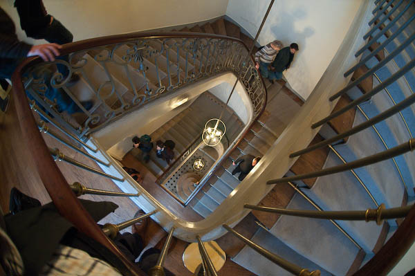
The staircase at the MEP

Of course the MEP does have a rather grand space with perhaps 3-5 times the size of the old PG, it also makes better use of it – at the PG half the space was usually largely wasted by being a coffee bar with a few pictures around the wall (and I think some other areas, such as the print room could also have been far better used.) And although I did sometimes enjoy meeting people in the cafe and having a coffee, I’d rather have been able to see a proper show and then pop across to the Porcupine or elsewhere to socialise (which of course I also did over the years.)

Sabine Weiss signs books in her MEP exhibition
Sabine Weiss talks to visitors and signs books at her MEP exhibition

This time, one floor of the MEP – perhaps around the total amount of exhibition space at the PG – was given over to a retrospective of the work of Sabine Weiss – which I’ll write about in another post. A Swiss-born photographer, she started her distinguished career in Paris and took arguably her best pictures there, so this was a particularly appropriate venue, although it would be nice to see this work in London too.

But one could also propose shows by a number of British photographers of similar stature who have so far been largely or entirely neglected by the PG. Not that I would want any gallery to be insular, but I feel major galleries do have a responsibility to promote work connected to their country and place, especially when like London and Paris they have played vital roles in the history of the medium.

Another floor of the MEP showed the complete photographic works of David McDermott and Peter McGough, two USAmerican artists who have made extensive use of various alternative printing processes (good salt prints, rather indifferent cyanotype and gum bichromates etc) as a part of an extensive lived re-enaction of life as late nineteenth and early twentieth century gentlemen. I don’t think they would want to be called photographers, but their work, as well as the interest of the processes concerned was witty and full of ideas, whereas some of the shows by artists at the PG seem very much one-trick ponies – including the last that filled the space adjoining the book shop.

Another, smaller space at the MEP covered the career of Turkish photographer Göksin Sipahioglu, who became ‘Monsieur SIPA, Photographe‘ after founding his agency when he came to Paris as a photographer in the 1960s.

Sipahioglu is a perhaps unfairly often thought of as a no-frills photojournalist who excelled at being there and getting pictures rather than for subtlety, but the work on show made me want to rewrite the lengthy piece I wrote about his work a few years ago.

Also showing in the MEP were a series of colour portraits  of artists in their studios by Marie-Paule Nègre, originally produced on a monthly basis for the Gazette de l’Hôtel Drouot to accompany interviews with the artists. While the theme is well worn, the images were well done and often had a freshness and interest. Which is more than I can say for Mutations II  / Moving Stills, a selection of videos made by European artists – part of the European Month of Photography – the short sequence of which I viewed had all the Warholian attraction of paint drying. However each did have its small group of apparently enthralled watchers.

Although of course curators play an important role in the exhibitions at the MEP (from a visit a year or two ago I recall an awesome show of the life of a single photograph by Kertesz) I get the feeling that photography at the MEP (and perhaps in France in general) is still very much based on the work of photographers. In the UK in the late 1970s the Arts Council made the fatal mistake of handing over the medium to curators and galleries, and we – as the PG evidences – are still suffering from it.

Metadata shows its worth

On the Photo Attorney web site, I just found a link to a story that illustrates how useful metadata can be. You can read the full account at Kevin German’s Wandering Light blog.

But the bones of the issue are that German found that another photographer he had travelled with had copied his raw files from his computer on the trip, as well as downloading images from his web site, and used these images to enter the UNICEF Photo of the Year  competition. The theft came to light when German sent in the same work.

Perhaps the thief hadn’t appreciated that every image carries a camera identification in the metadata, and German could prove the images were shot on his camera (a Canon 5D.)  You can display the serial number in Photoshop or Lightroom (with great difficulty) but not all software that can read EXIF displays it. One free program that seems to be able to show everything, at least for Nikon (and some other cameras) is PhotoME, which clearly shows the camera serial number in my RAW files (or jepgs shot in camera.) It doesn’t get written into jpegs exported from Lightroom. PhotoMe also shows the shutter count.

It turned o ut that image theft wasn’t the culprits only crime, and as a comment on the post suggests, “he might be the only guy in history to blacklisted from both the New York Stock Exchange and the Photojournalism community at the same time!

German has now registered his entire online portfolio along with the entire RAW shoot from his trip with the US Copyright Office; you can file on-line as a zip containing several hundred files for 35 USD, and he will be visibly watermarking his on-line images from now on.  The latest regulations for electronic uploading seem to make it possible to upload a large collection of works on a fast connection (there is a 30 minute maximum upload time) “made up of multiple published works contained in the same unit of publication and owned by the same claimant” for a single charge, which can now be paid by credit/debit card.  It’s something I’ll be trying out for some of my web images in the near future.

Anderson on Objectivity

I was sorry to miss Christopher Anderson talking at the HOST Gallery at the start of last month but I did manage to see his show there, My America which continues until 15 November, and have to say I was a little disappointed. It combined work from the two presidential campaign trails of President George W Bush with pictures from the campaigns of both Barack Obama and John McCain to produce a view of the US political process steeped in its fakery and image creation and the excesses of a kind of patriotic sycophancy (and make-up) but it often failed to catch my interest in the way that his other work has. Perhaps it is a show you really need to be American (or particularly USAmerican)  to appreciate. For me there were just too many men in bad ties.

But it is a show that demonstrates his views on objectivity, which you can also hear him talk about in a conversation on the Magnum blog. Anderson doesn’t like to be called a photojournalist, and feels that he functions as “an editorialist rather than a reporter.” In the classic age of photojournalism, the public relied on photojournalists to inform them about what was happening around the world, but now we get the news through TV and other sources, and still photographers have a different function, “not just make a nice picture or not just report an event but in some way comment on an event or offer a perspective on it.”

Although he still feels that he tries to be as honest and as “truthful” as he can, this doesn’t mean being objective but being essentially subjective, to have a point of view and make clear what it is as well as expressing his views clearly through his images.

Of course there is nothing new in this. Many photographers have said similar things over the years.  Philip Jones Griffiths made his views absolutely clear “To me, there is no point in pressing the shutter unless you are making some caustic comment on the incongruities of life. That is what photography is all about. It is the only reason for doing it.” He mocked editors who didn’t understand when he asked how they wanted him to approach South East Asia by saying they all they could tell him was that they wanted “temple bells.” But although we may have wider and more complex views than Jones Griffiths, we all know that you have to have a point of view (physical and metaphorical) to make pictures and, more importantly, to know which of the infinite possibilities are worth making.

Anderson’s Magnum page has a slightly different message to the video: Emotion or feeling is really the only thing about pictures I find interesting. Beyond that it is just a trick.”  Look at the pictures there and click on the ‘Major features‘ link at bottom right to see how well he puts that into practice. But there were too many in the HOST show that I at least felt were just a trick.