D5 or not D5?

We can get some idea of the quality of the extreme ISO pictures on the new Nikon D5 from some sample image by Leon Ostrom of Randorn in a post on PetaPixel.

Not able to take away any images on a memory card, he photographed a series of test shots on the Nikon stand at CES 2016, then photographed the results displayed on the LCD screen on the back of the camera, both showing the full frame and a magnified detail, at Hi-1 (ISO 204,800) to Hi-5 (ISO 3,280,000).

Although these are only pictures of the image on the LCD screen.they give a very good impression of the possibilities of the camera, although the actual images could be greatly improved by appropriate noise reduction in post. Most impressive is the quality at Hi-1, which of course drops off as amplification increases. Hi-2 (IS0 409,600) looks to be usable for many purposes after noise reduction, while higher ISOs are distinctly emergency only.

Its a remarkable achievement, and one that makes me lust after the D5, though it isn’t a feeling I can sustain for long given the price and weight of the camera. But certainly it does make me hope for better high ISO and more affordable and lighter new models from Nikon. Even going back to DX with the D500 might be an option.

It also is a stark reminder of the ridiculous nature of the arithmetic ASA system. which was incorporated into ISO along with the much more sensible logarithmic DIN scale, where a one stop difference is an increase in 3, which makes it much easier especially when the ASA numbers get astronomical.

Back in the days of Tri-X, it was a 400/27 film (though we actually often rated it differently depending on which developer we were using and how we liked our negatives.) But its a good starting point for thinking about film speeds, and my starting point for this little table (more about film speeds for geeks on Wikipedia):

ASA	Din
400	27
800	30
1600	33
3200	36
6400	39
12800	42
25600	45
51200	48
102400	51
204800	54
409600	57
819200	60
1638400	63
3280000	66

Either using this little table (or being able to divide by three) you can see that Hi-2 gives us a 10 stop advantage over Tri-X (or 8 stops over Tri-X pushed a couple of stops) which is certainly not to be sneezed at.

With the D700 and D810 I’m now working with, the practical limit I find is around ISO 6400 – so the D5 is performing at around 5 or 6 stops down the scale better. The D4 and Sony A7SII both claimed 409600 in 2014, so the D5 claims 3 stops more than them. It does seem pretty remarkable.

Adobe Goofs

I’ve used Lightroom since it came out. I wasn’t pleased because Adobe bought out Pixmantec, developers of Rawshooter software, which I had been using, because it was better than the software they were developing. Of course I could continue using that – and I did for a while, but once I bought a new camera that wasn’t supported by Rawshooter I was forced to move to different software.

I might have chosen one of the alternative products – and I did try out several, including Bibble, Phase One and some others, but none appealed. And Adobe had provided a free copy of Lightroom 1 to us Rawshooter users. It wasn’t as good as Rawshooter for processing my RAW files but I decided to go with it.

And I’ve kept with it over the almost 10 years it has been going, first paying for the various major upgrades and then paying for a monthly subscription to both LR and Photoshop. Though I didn’t like the subscription idea it did give me access to the latest versions of the software and at a lower cost than buying the major updates.

Lightroom has improved fairly dramatically over the years – and every major upgrade and some of the incremental ones have added mostly useful new features. Whenever Creative Cloud told me at startup that a new version was available, I’ve always welcomed it and upgraded immediately. Except for the latest update. I’m still running LR 6.1.1 and have not upgraded to 2015.2/6.2.

Before I saw the button upgrade I’d see a post in my Facebook news feed about various problems people were having with the upgrade. Some of those were major bugs, with the software crashing and blue screening, and Adobe is putting out a bug fix*, though I’m waiting to hear whether this had been effective. But perhaps this is an update to miss.

Lightroom has always been very stable software on my current Windows 7 system, very rarely giving problems and working at a reasonable speed with some pretty large catalogues. At the moment I’ve no pressing reason to upgrade – and won’t until I hear that they have really solved the problem. Although making dehaze available as a local adjustment will be useful – currently I have my own ‘anti-flare’ preset which performs a similar function.

But a greater problem is that Adobe have massively changed the Import dialogue. Currently I use LR import to rename my files, add metadata from a preset file, add keywords, chose where to place the files on my system and make a backup on another drive.

Watching the Adobe tutorial I first found suggests you can’t do any of these things, but it isn’t actually  as bad as it seems. Most of these things are still available. but harder to find and use. Most photographers will find that going into Preferences and turning off the ‘Show Add Photos screen‘ option will both greatly improve performance and give you an import screen that makes some sense. And the online Import help for 6.2 shows that most of the functionality is still there, if rather hidden and less transparent.

Laura Shoe’s Lightroom post on the redesigned import process is far, far better as a simple introduction to the changed dialogue, and helped to calm me down a little. Perhaps after all I might be able to live with it.

Adobe say the complexity of the import dialogue put some people off buying the software, but it’s power is what made many of us stick with it. I don’t have a problem with Adobe providing an ‘Input for Dummies‘ option, but not at the expense of making it harder for those of us who want to do more.

Their explanation of why they made the changes issued after the outcry really is frankly arrogant nonsense. We were not “universally unable to decipher the Import dialog without getting frustrated” though it did take a little work.  Improvement without gelding would have been simple to acheive and universally welcomed. The changes have actually made it less transparent in various ways and it looks like they were a panic reaction to extreme pressure from marketing.

My reaction seems to be shared by many if not most other LR users. When I first read about the changes I went into panic mode, wondering which other software I could use in place of LR, but now I’m thinking I may be able to live with it.

I don’t just use LR when bringing my pictures from camera to computer. It’s far too slow for viewing and assessing images in the Import screen, and also too slow to import everything you take and then delete the no-hopers.  For some time I’ve been using FastPictureViewer Pro to go through the images on my cards – in a USB 3 card reader. FPV lives up to its name for speed, and a single keystroke copies the images I need to keep to my ‘Input’ folder on an external hard drive for later ingestion by LR.  FPV is great as a general file viewer and can also be used for renaming files and other things.

I’m still not sure if I can continue with my current workflow to get files into Lightroom and on disk, but if not FPV may be able to replace LR for parts of the workflow. Its rather a shame that we still have to rename files, as Nikon filenames only allow for 9999 images. It would be useful to be able to automatically add a yyyymmdd or other prefix to the file names in camera – the current 3 user specified letters isn’t enough. In some ways its good that Nikon has hardly changed the firmware through the whole series of six DSLRs I’ve owned, but there are some features like this that are long overdue for change now that far more memory is available.


* As often happens, I’d written this piece some time before it was scheduled to be posted to the blog. When I loaded Lightroom after saving it, the promised bug fix was available, though I’ll wait until I’m less busy (and other users have tested it) before I upgrade.

And Tom Hogarty and the Lightroom Management Team have issued an apology which you can read in full in Lightroom Journal. Here’s one section of it:

We made decisions on sensible defaults and placed many of the controls behind a settings panel. At the same time we removed some of our very low usage features to further reduce complexity and improve quality. These changes were not communicated properly or openly before launch. Lightroom was created in 2006 via a 14 month public beta in a dialog with the photography community. In making these changes without a broader dialog I’ve failed the original core values of the product and the team.

So far on person has commented on the apology, saying that the ability to eject a card after import is important to him and questioning how they decided this was a ‘very low usage feature’. The answer was somewhat surprising to me, “we have in-product analytics that measures feature usage and we also reference that against the quality of any one feature and the effort required to bring it up to our standards.”  It does sound a little more like “We know best” than might be expected after the apology.

Light on LIGHT

PetaPixel  has an article about a revolutionary new camera, the LIGHT L16, which looks rather interesting, along with sample images. Its a novel concept and could change the camera market considerably, though perhaps is priced too high to really replace phone and compact cameras, costing more than many DSLRs with their kit lenses.

Apart from PetaPixel, most informative page I’ve so far found on the LIGHT L16 is  Introducing the Light L16 Camera by Rajiv Laroia, Light co-founder and CTO which has a couple of videos and at the bottom of the page the press release, which doubtless you will read recycled as articles on many photography web sites and magazines.

Here are a couple of quotes from it:

Key features of the L16 include:

Integrated 35mm-150mm optical zoom
DSLR-quality high-resolution images
Exceptional low-light performance
Low image noise
Fine depth of field control
Five-inch, easy-to-use touch-screen interface with on-device editing and social network sharing

The L16 will retail for $1,699 and ship in late summer 2016. A limited quantity will be available for pre-order through November 6 at a special price of $1,299 at https://light.co/.

It looks interesting and truly innovative, though only fuller reviews next spring and summer – and user experience – will really tell how well it works.

I don’t see it as a replacement for my own DSLR – it simply doesn’t cover much of the focal length range at which I work – around half my pictures are taken with the 16-35mm lens and mainly in the wider part of its range, while some require a rather longer reach than the 150mm can provide. And although they say its innovative technology gives great low-light results, I think they may be thinking in camera-phone rather than DSLR mode on this.

But there are certainly some very interesting aspects. I remain somewhat sceptical until it actually reaches the point of sale, as we have had a number of innovative products that never quite made it in the past, but this could well be the a great success. And if so, it may be a killer for DSLRs not because it can really replace them, but because it will take away the market for cheaper amateur DLSRs without which the higher end models may not survive.

I’m not sure whether I would want to buy one. It lacks one key feature I’d find it hard to live without, a viewfinder.

Bags

I don’t think I’ve written before about camera bags. Well, not for some time anyway. There may be somewhere in the 2,500 posts I’ve written (not quite all published) for this site a small rant, but certainly I’ve never done the whole thing, with those photographs beloved of some photographers with all their gear laid out neatly beside the receptacle of choice. And you will probably be pleased to hear that I don’t intend to do that now, though often things do change once I sit down at the keyboard and let my thoughts roam.

I’m not sure why they are called camera bags, because when I’m working the one thing they don’t contain is cameras, which are hanging around my neck. And the most vital things that my bag contains are not cameras, but sandwiches, a water bottle and a book to read. And yes, a couple of spare lenses, the odd map, and a few other things that I like to take but probably don’t use.

There’s a plastic fork, in case I get extra hungry and buy something that needs a fork to eat. It’s occasionally useful when the sandwiches I take fall to pieces; home made bread may be delicious but it doesn’t have the tensile strength of the rubbery shop-bought ersatz. And of course an umbrella. Then there’s the flash unit, spare batteries for camera and flash, lens cleaning stuff I almost never use, the lens pen I do, an old voice recorder that might still work, and a battery operated cable release that I last used at the spring solstice. A wad of business cards and a few spare memory cards just in case. A pocket on the back has a rain sleeve I can never find when it rains and when I do find it can’t be bothered to use. An old pocket-sized A-Z that’s falling to pieces and never covers the area I’m in as I usually only need it in outer London which it doesn’t cover or looking for a street built since I bought it in 1991, but then I reach for the London cycle map (they came free) but always find I’ve got the wrong sheet of the 14 that covers the whole of Greater London (and a bit in pale grey outside.)

It was Jeremy Corbyn that got me thinking yet again about camera bags. I was crouched on the floor at Speakers Corner in Hyde Park at the front of a group of photographers covering the Victory Party planned by supporters there, listening to the results. When his almost 60% vote and election as party leader was announced, the supporters went wild, but so did some of the photographers, and I was trampled underfoot as large men with large video cameras raced forward over me, kicking over my camera bag as they did so, scattering flash, water bottle, sandwiches and more on the ground. It wasn’t a big deal to have to pick the stuff up, but I missed some of the moments I’d been waiting in place to record.

I’ve used a Lowe Pro Stealth Reporter bag for many years, despite the silly name and my current bag is the second with the same name, but distinctly inferior to its predecessor. They have a zip along the top of the cover, so you can reach in and grab stuff while keeping it reasonable secure. It worked fine on the original model, but is pretty hopeless in its replacement, so most of the time I find myself working with the cover unfastened though still covering the top of the bag, so I can just push it aside to get stuff in a hurry. But then if it’s kicked over stuff falls out.

I think like most photographers I have a whole collection of bags, though others are better than me at throwing out old stuff. I still have my old Olympus film outfit with two OM4 bodies and various lenses in a rather nice but highly worn Fogg canvas and leather bag that I loved, waiting should I ever decide to give up digital, but too small to take the Nikon gear. And there’s another rather anonymous smaller bag still with the Leica/Konica/Minolta CLE kit waiting too.

There are several small bags that came free in various ways. Not a lot of use, but sometimes when I go out to walk rather than take pictures I’ll through a water bottle, map and a couple of Fuji-X bodies and lenses in one. Not to mention the five spare batteries.

When I’m working more seriously with the Fujis I usually use a black messenger bag that can take an A4 document. They don’t look like camera bags because they are not, but they can carry all the other stuff I need. I bought a new one recently, and it just isn’t as good as the old one which is wearing out after many years. Probably someone went to great lengths to redesign it; it does have a special padded notebook compartment, but the old version had a compartment that would take my notebook padded by whatever you placed in compartments on either side which seemed an adequate solution that wasted no space.

There isn’t such a thing as an ideal case, and all photographers have their own views and preferences. Some rave over the Billingham bag which I only own because a friend gave it to me; though undoubtedly well-made it seems to me truly the most awkward and badly designed camera bag I’ve ever had the misfortune to meet. And costs a ridiculous amount.

The alternative to shoulder bags for many photographers is a back pack. I have one of those too, though I’ve never used it for photography it is quite handy for a fairly spartan weekend away. I bought it in weak moment, tried it out and decided it wasn’t for me

Back packs worn by other photographers are often a menace, swiping you inadvertently and getting in your camera view. A photographer stands next to you to take a picture, then takes a step away and turns to the side to chimp the image, turning his (or her) bag right in front of your lens.

They get in the way as you try to move through crowds. They make photographers into snails with their houses on their backs and are generally inconvenient to use. If you need a backpack you are carrying too much gear.

What I’m probably working up to is buying yet another bag. It probably won’t be any better but who knows. If anyone has any advice or suggestions feel free to comment.

Brian Griffin: Himmelstrasse

I don’t think I’ll be able to make the book launch of Himmelstrasse by Brian Griffin at the Photographers’ Gallery tonight, though the book with its images of the railway tracks in Poland which took around three million people to the death camps seems a powerful and impressive personal response to the Holocaust. And any opportunity to meet Brian is always rewarding.

I’ve twice been to the area of Poland close to Auschwitz, and never felt able to make the visit there, always telling myself “perhaps next time.” It would have been difficult to fit in to a busy schedule, but I think this was just an excuse.

The images of the rails, all single track, running through areas of forest have a desolation, seem all to be made in winter, a few with snow on the ground. Some are a little overgrown, but most seem still to be in use, with occasional track-side signs and still shining rails. The 15 images on Brian’s own web site are half in black and white and half in colour (as well as the Nazi-style design book cover with its title in ‘black type’ and simple graphic design in red and white.)

Although most publicity for the book seems to have chosen the black and white images – and particularly one with two sofas and a chair neatly at the side of the line – I think the colour images are perhaps more straightforwardly emotional, with their sombre browns and dull winter greens, with sometimes sparse patches of snow. A couple also have the blue sky of ‘Himmel‘ in the cynical Nazi joke which gives the book its title.

The single track in most images is an appropriate metaphor for what was for almost all a one way journey, although the death trains must of course have returned empty on the same rails before their next journey. Much of Poland’s rail system that I saw ten years ago seemed to be single track like these with only very occasional trains making their way slowly along them.

I’ve not seen a copy of the actual book, which looks excellently produced by Browns Editions, though the colour in the nine double page spreads  reproduced on their web site seems rather garish compared with that on the photographer’s own site.  At £50 it’s perhaps too expensive to add to my already rather large collection, though I’m tempted to do so.

The book will have a second launch at the New York Art Book Fair 2015.

Himmelstrasse
Brian Griffin
Published 2015
Designed by Browns
297mm x 232mm
Hardback
120 pages
69 black and white images
33 colour images
Edition of 500 hand numbered.
ISBN 9780992819415

Lightroom Dashboard

Here’s a nice idea that was on PetaPixel today, but…

Lightroom Dashboard is a web site that will give you an easy and graphic analysis of your Lightroom Catalog (OK, its a catalogue to me, but a catalog to LR.) It loads a web page that you drag your catalog file (or rather if you have any sense, a copy of it) onto and the web page then analyses your photographic habits. And as it says, it is “100% free, no software, no plugins, no uploads, all done within your browser.”

It doesn’t I think do anything that you can’t actually do in Lightroom itself, using the metadata filter in the Library view, and I think it will only do its magic on the catalogue as a whole.

You can see the kind of information it supplies in the demonstration on the web site.

Perhaps the most surprising statistic from the demonstration is that whoever produced the catalog took only 13,962 images in two years – about 19 a day – despite using 15 cameras to do so (and my calculator tells me that’s only on average 930 per camera.)

Unfortunately, a small note at the bottom of the application page reads: July 15th UPDATE – It appears as though large catalog files at 2GB and above are having problems loading. We’re looking into this issue and they are correct. Attempting to load the smallest catalog I could find – my current one I started on January 1 this year – immediately crashed my browser. The Library module at the top of the Catalog section tells me that it has only 52,235 pictures in it,  pressing the \ key brings up the Library filter, and I can look at the figures, filtering by Text, Attribute or Metadata.

I’ve managed to produce these using only 5 cameras and 13 lenses, the most exotic of which was the 0.0mm f0.0 which apparently managed to take two perfectly decent images on my Nikon D700! Another oddity was the ‘Unknown’ lens which produced 90 pictures on the Fuji X-T1, while revealing its identity for another 230 as the XF 35mm f1.4.

Lightroom – with the help again of my calculator, reveals that I made 46% of those exposures with the D700 and 44% with the D800E, and a virtually equal number with the 16-35mm and 18-105mm – both at 41% of the frame count. My favourite lens is really still the 16mm fisheye, but there are far fewer situations where that is appropriate, and it accounted for only a little under 4% of exposures.

Lightroom Dashboard is a nice idea and great for the light user of cameras, and I hope it’s possible to fix the large files problem. It would have been good to see some nice graphs, pie charts etc, but the information is all there in Lightroom if you need it. And in Lightroom you get to see exactly which exposures you used that f0.0 lens for!

Another Massive Saving

If your are a Leica addict, I can save you a small fortune by letting you into a secret. I’ve just been reading When Leica announced the M60 By Kristian Dowling on Steve Huff Photo.com, an article spun on his “about an hour with the camera” on loan from one of his friends.

The big difference between the M60 and the M640, apart from the $18,500 price tag (the M240 on which it is based is a mere $6,380) is that it has no LCD on the back. It’s also made with stainless steel outer metal parts, and includes a newly designed stainless steel bodied Summulux-M 35mm f1.4 lens and a special carrying case – they designed it without strap lugs too.

The camera is a curious mixture of the practical, stripped to the basics, and the cosmetic, and as the edition of only 600 (and a few prototypes including the one that Dowling was loaned) and price indicates is clearly meant for collectors rather actual photographers.

The price difference isn’t quite as large as the figures above (based on Leica store Miami prices) would suggest, as the M240 comes without a lens, and a 35mm f1.4 will set you back $4,532 – and I suspect the lens-hood is an expensive extra. The 35mm f1.4 has never been a cheap lens – when I bought mine second-hand back around 1980 it cost the best part of a month’s wages, and the new lens-hood I finally bought last year for it (not a genuine Leica part, as they gave up making the correct fitting many years ago) cost me I think £70.

But even allowing for these, the price differential between the M60 and the M240 seems to work out at around $7,700 – or around £5000. It seems to me a lot to pay for not having a LCD screen on the back of the camera.

As a photographer who seldom looks at the LCD screen when working, I’ve never experienced the insecurity that Dowling claims to have developed, “derived from digital technology, allowing me to view images immediately after pressing the shutter button. This insecurity has led to many missed opportunities, missed moments, and ultimately – missed shots, and this results in a form of failure.”

If anything I suffer from the opposite, kicking myself at times for not having looked, for example when I find I’ve mistakenly left the exposure on manual and taken a whole hour of pictures around 6 stops under (fortunately I was rescued by having used two cameras and one of them was on P.) And there are certain situations – like the blinking problem I wrote about a few days ago – where the LCD review is so useful that I’d find my work suffered without it.

But Dowling is right to suggest that excessive viewing of images – ‘chimping’ – while working is a mistake. It breaks the vital involvement with the subject. But just because you can do it doesn’t mean that you have to and it’s a habit you can learn to avoid. I suppose when I first got a digital camera (a fat cigarette-pack sized Fuji that took not very sharp 2.2Mp images) back in 1999, I did do a lot of looking at them on the screen, but I wasn’t working with that camera, though I did take it out with me as well as the Leica on New Year’s Eve for the year-early Millennium celebrations. When I did buy a digital camera to do serious work with (a Nikon D100 in 2002) I used it more or less the same as the film cameras I was using alongside it. Mostly the first I saw the images on the camera back was when sitting on the train going home. It’s still the same now.


Fuji MX-2700 7.60mm ISO120, 1/30 f3.2 London 31/12/1999

The MX-2700 had a viewfinder, but with many digital cameras the only view is on the camera back. Optical viewfinders and the EVFs that are replacing them in many cameras leave you viewing your subject through the camera – even with a good EVF, like that on the Fuji X-T1 it still gives you the same feeling of connection with the subject. You look through a viewfinder, whereas with cameras without a viewfinder – and phones and tablets – you are always looking at something in your hand. It seems to me a very different experience, and one that – like chimping – breaks the link between you and what you are photographing.

I sometimes think of taking pictures – particularly of events – as like dancing along the street with the subject. If you keep breaking step you lose connection, lose the rhythm, lose concentration, and it will show in your images. So I’m sympathetic to an extent to the idea behind the M60, though I think it unnecessary to physically remove the LCD, and a camera without a LCD should surely cost less rather than more than twice as much.

So the short way to save that $7,700 is simply to stop yourself looking at the camera back. But if you want to ensure that you get that M60 experience (or know you are weak-willed), you can cut a rectangle of black card to the size of the LCD on your camera back, and fix it firmly in place with four strips of black masking tape. The same tape we used to use on Leicas before Leica finally realised that most photographers don’t want shiny cameras (even if this one is stainless.) It will look almost as good as the M60 and will save you enough to buy at least one more lens, even at Leica prices.

Deutsche Börse Prize 2015

For once I have to say I was pleased to hear the result of the Deutsche Börse Prize. Although I wasn’t entirely enchanted with the work of Mikhael Subotzky (b.1981, South Africa) and Patrick Waterhouse (b.1981, UK),  Ponte City was an impressive publication which includes some truly excellent photography, and I felt it stood head and shoulders above the other three short-listed works. Perhaps for once the gap between the winner’s £30,000 and the £3,000 to the runners up which I’ve always thought fundamentally unfair could be justified.

The DBP isn’t of course just about photography, its also a prize on several levels about politics which has often resulted in work which I think has little place in a photography gallery being short-listed and sometimes even winning. Unlike this year, politics has meant it often hasn’t been the best photography that has been successful.

Ponte City is a work that uses photography, but certainly isn’t just photography, but unlike many concepts it has photography at its heart and uses it well. There are some superb images here, and some of the other things – like the series of pamphlets published as a part of the book – are fascinating if not for their photography.

There is still time to see this and the other three sets of work that were short listed as the show continues at the Photographers Gallery until 7 June. I think it says something about the gallery’s fundamental contempt for photography that on the web page about the prize, the images from the four projects are shown as a narrow strip cropped from an image, 720x260pixels, an aspect ratio of 2.76:1,though of course you can see the full picture on the artist’s individual pages.

That for Subotzky and Waterhouse shows 7 full images along with one detail view of a multiple image and a gallery view, as well as a postage stamp sized video, which in my browser refuses to go full screen or link to Vimeo except by some tricky right clicking, though perhaps that may have been because of a current heavy demand on the site. You can however watch it on Vimeo, where  the page also has links to the videos of the other three artists. I’d suggest changing the video to HD and making it full screen unless you are viewing it on some miniature device.

The other work I found of some photographic interest were the portraits by Nikolai Bakharev  made on Russian public beaches, mainly in the 1980s, when there were various restrictions on photography and the taking and circulation of photographs containing nudity was strictly forbidden.

While some of these excited me, there were too many that seemed to have little to offer. I had rather similar doubts about the portraits of black gay women by Zanele Muholi, where though the project may have been commendable and worthy, it needed some stronger images. And although I know people who enthuse over the work of Viviane Sassen, it did nothing for me.

Gardeners Delight?

‘The Gardener’ Jan Brykczyński (Dewi Lewis Publishing, 2015)

I have to confess to being a colourist. Someone who seems more affected than the general population and by the art photographic establishment in particular by colour. I had to quickly leave one room in Photo London when confronted by wall-sized images with a particularly nasty thin yellow cast.

My first real job was as a colour chemist, in the research lab of a company making dyestuffs, where small differences in shade were vital. For various reasons I didn’t stay in it long but perhaps something of it stayed with me. When I began as a photographer in the early ’70s, carrying two cameras, one for black and white and another for colour, I was seldom if ever in doubt about what was a colour and what and black and white image and my work in the two was quite different. I was, as a then eminent photographer commented on my work, a colourist.


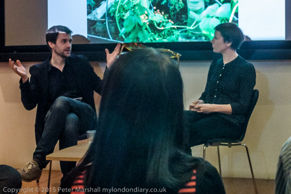
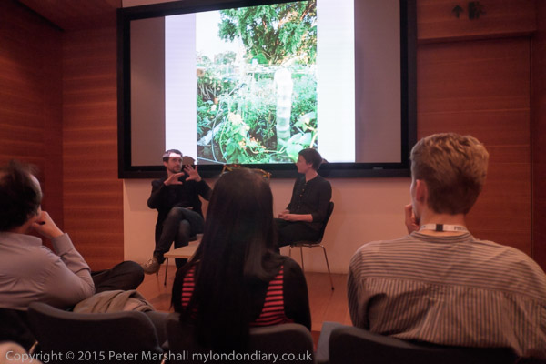
Jan Brykczyński talks to Diane Smyth at Photo London detail- apologies for poor quality

Few photographers now actually work in black and white, and most of those who do seem to think – if they think at all – in colour. Others certainly do think in colour, and Jan Brykczyński is certainly one of them, but his colour is rather different to mine – around R+3 B+7 different from both me and Photoshop, as I find if I put one of his images into that programme and examine the colour of a neutral shade.

It may not seem a great deal, but R+3 B+7 is enough to make me feel a certain nausea when I turn the pages of this book, and it gets in the way of my appreciating his imagery. I have a slightly smaller problem with the rather muted colours and contrast. Brykczyński uses a large camera (4″x5″?) and film, and likes to shoot on dull days, staying in and researching when the sun comes out, to lessen the technical problems of light and shade. Colour film has always been balanced for summer sun (or tungsten); back in the bad old days of transparencies you had to use CC filters when the sun went in to get the colour right, though with the switch to negative we got lazy and made the corrections on the enlarger and it almost worked. But breathed a huge scream of relief when digital gave us more accurate colour with far less hassle. Film has become relegated to a ‘look’, something one can apply to digital with what a less polite than me photographer referred to as ‘f**king up filters’.

I’m not criticising Brykczyński for having chosen a particular aesthetic with its desaturated and slightly unreal colour, just relating my own difficulties in approaching his work though a barrier which for me is hardly mountable but others may take in their stride; from his comments in the presentation at Photo London, the approach may in part derive from having to blend together images taken at different times in four very different areas. But personally I would have liked to have seen a book that represented differences in the conditions under which the images were made rather than attempt to minimise them for the sake of a perhaps spurious unity.


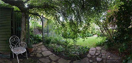
A very different garden image from ‘Secret Gardens of St John’s Wood’ by Peter Marshall’

As a photographer who has also produced a very different book on gardens I appreciate the problem of dealing with all that green. And back to that room I had to leave, some can live with (or at least work with) and pay very silly money for giant images I find nauseating.


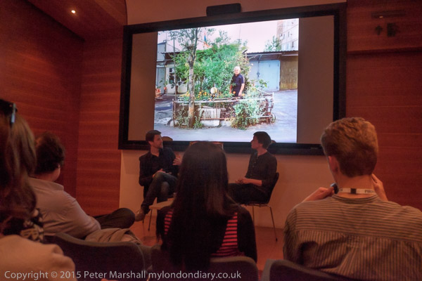
Jan Brykczyński talks to Diane Smyth

So I struggled to appreciate this book, although the images there are at least clear. I felt for the photographer at the presentation, where his images on screen behind him and Diane Smyth of the BJP asking him questions were projected at a standard that would have disgraced an amateur gardening club in a run down church hall. It seemed a disgraceful contempt to the photographer and his work and the seriousness of his approach as well as to a paying audience. Some images from the position I was sitting, a few rows back from the front, were almost completely burnt out with the screen a glaring white.


I took pictures only when a few images were better projected

The project looks at urban gardeners in 4 cities in very different states of development and with very different histories, Nairobi, New York, Warsaw, and Yerevan in Armenia, and seems to attempt to suggest à la ‘Family of Man‘ that whatever our social arrangements and historical development, at base people around the world are much the same. It’s a thesis undoubtedly close to the heart of a multi-national Swiss-based giant like Syngenta, and behind the singular title ‘The Gardener‘ that the photographs, mixed together as they are in the book, rather triumphantly overcome.

Perhaps behind the book there is a rather more subversive mind than the company hoped for. Perhaps I should make myself a pair of colour-correcting spectacles to enable me to get to grips with it more adequately. But you may well not share my personal problem.

Boiko, Brykczyński’s series on  rural life among the Rusyn people (a small group of farming people who apparently consider the name Boyko derogatory) in the Ukrainian Carpathian Mountains which became his first self-published book is a fascinating series (and  I have no problems with their colour), as too is the group of photographs of the sheep farmers of Árnes in Iceland that won him the Syngenta Award, with a grant to pursue the project and, later, to publish the book ‘The Gardener’.

Born in Poland in 1979, much of Brykczyński’s work has been on rural areas. He is a founding partner of Sputnik Photos, an international collective of photographers that focuses on transformation in Eastern Europe and post-Soviet states.

Continue reading Gardeners Delight?

Andrzej Baturo – 50 Years

It seems a very long time ago that I first met Andrzej and Inez Baturo in Bielska-Bialo, and it’s something of a surprise when I realise it was only 10 years ago.

You can read more about my first visit to Poland and the first FotoArtFestival held in Bielsko-Biala, Poland in June-July 2005, organised by the Foundation Centre of Photography there, with Andzej, the centre’s president as Art Director and Inez, the vice president as Programme Director in my Polish diary.

It was a fine festival, with an international cast of photographers, one from each of around 25 countries, with some well-known names including Eikoh Hosoe from Japan, Boris Mikhalov from Ukraine, and Ami Vitale from the USA, as well as work by the late Inge Morath (Austria) and Mario Giacomelli (Italy) and others. There was also a strong Polish representation, with soft-focus pictoriasm by Tadeusz Wanski from the middle of the twentieth century, and the much gritter group show ‘”Unoffical Image” – Polish photoreportage of the 1970s/80s‘ which included work by Andrzej Baturo.

Last year Galeria Bielska showed ‘Andrzej Baturo – 50 Years Of Photography‘ with around 200 images over the years since he began taking pictures in 1962. You can read an English version of the page about it, which quotes Andrzej as saying:

The photograph was first invented simply to record social realities, but with time, social documentary photography and reportage photography have both been raised to the status of art, much in the same way as the journalism of Hanna Krall or Ryszard Kapuściński are now considered great literature. I feel a close affinity with both these areas, and I’ve never been sure whether I’m more of a journalist than an artist, or the other way round.

The Polish version is here. Also in Polish, but worth watching for the images even if you understand little or nothing that is being said, is the video, Andrzej Baturo – 50 lat z fotografią. There is also a page about the show with some comments on his work on the Polish site Art Imperium, which I viewed through Google Translate.

There is now a crowd funding appeal for the publication of a book Andrzej Baturo – 50 years of photography. I’m not sure how well a link to the page through Google Translate will work, and if you understand Polish or have a browser that will automatically translate, you may find the Polish original works better. And even if like me you don’t speak Polish, the pictures speak in any language.

The various rewards available for supporting the publication are of course priced in Polish Zloty (PLN) and where items are to be posted, international postage would presumably need to be added. But 150 zł (about £27) for the 240 page hard-cover book with around 200 photographs seems very reasonably priced. But registering and using the Polish crowd-funding site might need the help of a Polish speaker and charges for converting currency may add to the cost.