PGDB Shortlist: John Davies

John Davies is a photographer who I’ve long admired and the only one of the four I know personally. I’ve written and talked about his work (I’d also written about the work of Holdt before the nomination for the prize) including an extended review of the superb large-format book of the show ‘The British Landscape‘ (2006) which was nominated for the prize.

John is included in the Urban Landscape web site which I run with Mike Seaborne, but you can see more of his work on his own site.

His work is the best presented of the four short-listed photographers, filling the gallery at No 5 (with the coffee bar) with large, well printed black and white silver gelatin prints.

John’s landscapes are panoramic not in format, but in the sense that he likes to work from a high viewpoint with a relatively wide angle of view. Simply in terms of technique, his work stands out compared to the competition, but of course that isn’t it’s main strength. What strikes me on viewing these prints is their sheer lucidity both physically and conceptually.

The prints on show are a cross-section of his black and white work from 25 years in the book – and in the larger show. The book was my choice for the photo book of the year when it came out and the even larger prints here are just slightly more impressive. I do just wonder if they are a little too large on the wall, with the grain beginning to become intrusive in some areas. But they are certainly very well printed.

I’ve long considered John to be the leading contemporary exponent of urban landscape photography (though I also love the work of others including Gabriele Basilico.) On show here are some of his classic images, although I think I am currently even more interested in his colour work, and would feel that that is now making a greater “contribution to photography” than his older black and white work. Perhaps the weakest element of John’s work are his captions which sometimes seem to me to be too prosaic and concerned with the place rather than the precise location of the picture or its content.

One curious aspect of his work in the catalogue is the warm tone of the illustrations, brown rather than the much more neutral tone of his images. I don’t think this – or the small scale does them justice.

PGDB Shortlist: Jacob Holdt

Jacob Holdt‘s work is a slide-show of images he took while hitch-hiking across America as a penniless and trusting Dane from 1970-75. On his odyssey he met and befriended many, mainly from the poorer American underclass, both black and white (though mainly black), living with them. As he has often said, he was a wanderer, a vagabond (occasionally an image made me think of Gaylord Oscar Herron, a photographer of the same era with very different work – and like Larry Clark, from Tulsa) I though and not a photographer and took his pictures largely as a record of his travels with a cheap Canon Dial half-frame camera sent him by his family so he could show them what he was up to. Back in Denmark, he made a slide show, which became in great demand, and before long he was showing it to mainly student audiences across America and elsewhere, a career that has kept up for over 30 years.

This work has been available on the web for years, and I wrote about it and linked to it a few years ago in those days when I had an audience of millions. Last year his work was picked up by Steidl and published in a book, leading to this nomination.

Holdt obviously has a great deal of interest and empathy for the subject that he took on – the American underclass and its treatment by rich America. He has a great ability to get to know people and gain their confidence (and apparently still keeps in touch with many of those he photographed.) But much as I liked his work on the web I found the slide show at the Photographers Gallery hard to watch. It’s perhaps some measure that, having come in part way through the showing I found it very hard to be sure when I had got to the same pictures again, and I think watched another 10 or 15 of the 81 slides before I was sure I had seen one before.

Much of the problem for me is quite simply his photographic incompetence. Almost every picture I found myself thinking “if only…” There was this guy in a fantastic situation and if only he had taken a slightly different viewpoint or moment, or got the exposure closer to correct or had better lighting… Add to that some decidedly odd colour processing and rather small negatives, along with what appears to have been a deliberate immersion in dust and hairs. In a way it’s like citizen journalism, those fuzzy cameraphone images whose very lack of quality sometimes adds to their impact, the feeling that comes from them being records from someone who was really caught on the spot when the bomb went off. Powerful as they may be, I wouldn’t be happy if one of these scooped the World Press Photo Prize.

There is a programme at the gallery with his captions in running order, but it isn’t really good enough (and impossible for me to read in the dark.) What the slide show needs is his commentary, as well as more thought about the timing for different images.

For the book the images were made much more respectable, cleaned up, and some corrections made to the exposure, though some images are still clearly beyond the limits of the film. Together with the much smaller scale of the printed images, these changes make the work look much better in the book than in the slide show. The book is also I think better edited, although most of the pictures in the slide show are also in the book.

Several of the images shown included TV sets, but in one the screen appeared on the initial view to have a huge crack across it, sending my mind flying in a particular direction until I realised that it was only either a hair (or the image of a hair) on the slide. The interiors did make me recall the very different work of Chauncey Hare, truly one of photography’s forgotten figures, and his book ‘Interior America‘ whose work showed a deep spiritual despair at the centre of the nation. Unlike Holdt, Hare was a photographer, although after making the work in this book and ‘This Was Corporate America‘ (1985) he moved out of photography into taking more direct action as a co-director and therapist involved in a not-for-profit community-based business supporting those who have been abused at work.

Holdt tells a powerful story, and the pictures provide some good illustrations for it. On the web presentation he also makes use of pictures from other sources, including historical documents about slavery. He writes about his own pictures “I have never been interested in photography as art so very few of my pictures can stand alone“, and I think he is right. And whatever you think about photography and his work I think it would be beyond human ingenuity (even of such ingenious people as those on the jury) to justify his work as making any significant “contribution to photography over the previous year.” So perhaps he should be my hot tip!

PGDB Shortlist: Esko Mannikko

It was seeing the work of Elina Brotherus which won her the 2000 Finnish Photography Prize that first prompted me to take a deeper look at Finnish photography, and to write a feature about it at the start of 2001. Before then I think most of us had thought of Arno Rafael Minkkinen as the only Finnish photographer. Esko Männikkö was not among the almost 30 photographers I mentioned in my feature, nor did I feel it necessary to add him when I revised it a few years later.

This isn’t an opinion that the work on show at the Photographers’ Gallery would cause me to revise. There is something deeply wrong when the most interesting thing I could think of to write about is the frames (and these are not very interesting) and the fact they are hung without space between them, apparently his ‘trademark.’ Though not it seems in Berlin.

But I have actually changed my mind rather about him as a photographer, not because of the pictures on show, but for the book ‘Mexas‘ (1999) included in the corridor display at No. 5. This must qualify for some kind of award for the worst colour repro in recent years, looking like a comic book version of poor inkjet printing. More like the kind of thing we got in the 1950s than modern publishing. For $75 I expect more, although Photo-Eye, where you can see a few pages from it, thinks differently, writing “The printing, done in Finland, is lush.” But despite this I found the work impressive.

At least one of the pictures from this book is in the show, ‘Simon, Batesville’ and on the wall – like the other works – is impeccably printed there. In fact the most positive thoughts I had about his work on the wall was about the quality of the printing, particularly in the still life works.

Batesville, Texas, near the border with Mexico is the location for many of the pictures in ‘Mexas’ and in particular some very impressive panoramas (as Gary Michael Dault remarks in one of the two introductory essays, “The panoramic works are the key“.) My advice is not to waste too much time looking at his stuff on the wall, but to take a good slow meander through the pictures in this book.

PGDB Shortlist: Fazal Sheikh

Fazal Sheikh’s work is far better for me in the book (and on the web) than on the gallery wall. On his web site he describes himself as “an artist-activist who uses photography to create a sustained portrait of different communities around the world, addressing their beliefs and traditions, as well as their political and economic problems. By establishing a context of respect and understanding, his photographs demand we learn more about the people in them and about the circumstances in which they live.”

Reading the exhibition labels, and even more so the book, I found the texts considerably more interesting than the photographs. You can read the complete book, Ladli – ‘Beloved Daughter’ in either English or French on his web site (or of course you can buy it in print.) The text on the web (actually present as images) is just a little small for my comfort on the web, but the images are well reproduced.

Part of the problem on the gallery wall is the scale of the images. In his work, Sheikh makes use of a narrow plane of focus, usually rendering the eyes and face sharp, while the side of the head and ears are out of focus. It’s a technique that for me only really works at a particular size of print, as the print size alters the apparent degree of ‘fuzziness’, giving a different effect at different scales. The web images, at around 13.5 cms high are a little too small, and just look slightly annoyingly unsharp, for example the ears in the portrait of Kajal. It looks more like a slight mistake than deliberate decision, while in the large gallery prints they seemed too fuzzy. There is an uneasy line between when a ‘signature’ becomes merely a ‘formula’ and seeing all these works gathered together on the gallery wall rather than embedded in the lengthy text of the book did start to make me find the approach relentless.

Sheik’s prints are inkjet prints, and according to the catalogue are maked on “handmade Photo Rag paper.” They are actually pretty good prints, but the paper looked to me rather like a machine made Hahnemuhle paper that many of us use for our exhibition prints. But perhaps this is just another manifestation of the extreme problem that galleries have in spitting out (or gicleeing) the “i” word.

I think his are fine books, and that they deal with important issues. However I think that other photographers have produced essays around these topics that are more powerful photographically, less mannered and more direct.

The Final Four: Deutsche Börse

This evening I went to the opening of the Photographers’ Gallery Deutsche Börse Photographic prize, where work from the 4 shortlisted photographers is on display until April 4, with the winner to be announced on March 5, 2008.

The drinks for the event were kindly supplied by Asahi (beer) and Errazuriz (wine) but as usual were not to my taste. So perhaps my thoughts I’m now writing will be more lucid than might otherwise be the case. I’ve been a supporter and member of the gallery for over 25 years, because I think photographers ought to give their support to the major London gallery supposedly devoted to the medium. However I sometimes despair of the gallery’s taste in photography as well as wine and beer!

In previous years, when I was writing for the largest commercial site yet to deal seriously with photography (alas no longer) I’ve given a prediction of the winner of this prize (formerly sponsored by another bank.) I’ve always found it necessary to think who should win the prize because of their photography, but then to look at the jury and where they are coming from and try and predict the winner on political grounds. This is a process that usually gives me two chances out of four of being right, although my experience is that choosing the photographer “who has made the greatest contribution to photography over the previous year” (the stated purpose of the award) seldom finds the winner.

This year the contest is between John Davies (b1949, Britain), Jacob Holdt (b1947, Denmark), Esko Männikkö (b1959, Finland) and Fazal Sheikh (b1947, USA). Although I personally think one of them stands heads and shoulders above the rest, it is perhaps possible this year, unlike in some previous years, to see reasons why any of the four might walk away with the £30,000 first prize. There is a reasonably illustrated catalogue available from the Photographers Gallery at £16.99, though I didn’t feel moved to buy a copy, for reasons that will probably be clear when you have read my four pieces on the people in the show.

In my previous post on the Deutsche Börse Shortlist I gave some basic information about the four people selected, along with links to their work online. What I will write now are some fairly short pieces based on the work as now displayed at the gallery and my reactions to it.

John Davies
Jacob Holdt
Esko Männikkö
Fazal Sheikh

You can read some of the basic information about these photographers (and a little more) on other sites – one of the better examples is the Daily Telegraph, (not a paper I would normally bother to read, though many years ago my step-mother used to take it simply on the grounds that it had a crossword she could cope with.) This has features on Davies, Holdt, Männikkö and Sheikh, each accompanied by a set of pictures from those at the gallery.

More Blueeyes

Another issue of the on-line photography magazine Blueeyes, edited by John Loomis and his team, is always worth a good look, and the seventeenth issue which appeared recently is another fine one.

Little Voice‘ is a powerful essay by Lisa Wiltse (b 1977, Weston, Connecticutt, USA) who got her BFA from the Art Institute of Boston in 1999 and is now a staff photographer for the Sydney Morning Herald. Her work has concentrated on humanitarian issues in Central America, Uganda, India. In Little Voice, she looks at the consequences of the annual flooding in Bangladesh, which this year displaced some 9 million people. The country is one of those most at risk from global warming, with a sea-level rise of only 1 metre being enough to flood half the country. Her essay demonstrates the emotional power of black and white photography at its best.

Cosmin Bumbut’s work on Blueeyes is very varied, with both colour and black and white and a wide range of subject matter and approach, coming from a number of different projects. Among the best images for me are several interiors, including a fine image of a two people and two where we see through doorways. Born in Romania in 1968, he studied at the Film Photography Dept 0f the Film & Theatre Academy in Bucharest, and he is now based in that city as a freelance photographer.

Bumbut was also one of the founders of Punctum, which is a downloadable Romanian photography magazine – the latest edition includes work by Lois Greenfield. Don’t miss looking at the pictures from Rosia Montana on his own site.

Kelly Shimoda was also born in Connecticut, but in 1976, and is a Brooklyn based freelance. She studied American Civilization & Latin American Studies at Brown University and worked for six years before taking the Documentary Photography and Photojournalism certificate program at the International Center of Photography in New York. In 2005 she founded the collective Veras Images, on whose site you can see work by her and ten other photographers.

Her project on Blueeyes, ‘Last Saturday Night‘, uses richly emotional colour to look at the final nights of the last two roller disco skating rinks in New York that closed early in 2007. Some of those skating there had started as kids 40 years ago.

As well as these major portfolios there are several other contributions worth looking at, and of course the archives. Blueeyes publishes documentary photography projects that focus on social, political, and environmental issues, and welcomes submissions of suitable unpublished projects – see the simple and clear guidelines on the site. But like many worthwhile things in photography, Blueeyes is a labour of love, produced without sponsorship and advertising – and without payment to any of those concerned.

Cornerfix

For most users of the Leica M8, Cornerfix must rank as one of the most useful piece of software available, and certainly the best value since it comes free, thanks to the generosity of its writer, Sandy McGuffog.

The M8 designers found that the way to get sharper results, and to make a 1.3x size sensor usable with their wide-angle lenses was to use a thinner IR barrier filter over the sensor. When they released the camera they appear not to have realised the problems this would cause photographing in particular some black synthetic fibres.

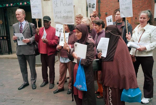
The first job I used my M8 for included photographing a group of people demonstrating against the development of Queen’s Market in Upton Park (pictures and text are some way down the page on the link) outside a shareholders’ meeting in the City of London. Most were wearing black but these clothes were rendered nicely by the M8 in various shades of plum and brown.


More uncorrected Leica images from this event

Careful selection of much of the black clothing in the image, darkening and slightly de-saturating it to produce a more natural result took several hours of work for a small repro fee. I’d done a quite a few test pictures before I took the camera out on this small job, but hadn’t chosen the right subjects or lighting to show how bad the problem could be.

By contrast, here is a picture taken with the Leica under similar lighting at last Saturday’s Ashura procession in London, using the same 21mm Voigtlander lens, taken and processed as described below:

No problems with colour, although rather more shadow noise from the M8 than I would like. The pictures in My London Diary were taken on a Nikon D200, which is more flexible and gives better colour although slightly less resolution.

Leica’s solution was to partly to provide a couple of free IR cut filters for the front of the lens. Apart from these being in rather short supply and slow to arrive, these were an excellent solution for 50mm and longer lenses, but gave an additional problem with wide-angles. Rays from the corner of the image came through the filter obliquely, resulting in a longer path and an over-correction, resulting in cyan vignetting at image corners.

Modern Leica lenses have a set of dots on the rear of the mount which can be in six positions and allow infrared sensors on the camera body to identify the lens. Using this information, camera firmware can correct the vignetting. Overall it’s a very good system giving better image sharpness across the frame than other cameras, but it leaves a problem for those of us who want to use non-coded lenses.

Leica will add lens codes to some older lenses (at considerable cost) but my wide angle wasn’t one of them. In any case I mostly use the considerably cheaper and more compact Cosina Voigtlander lenses. Various people soon found do-it-yourself ways to code these lenses, and for a time my old Leitz 35mm was working well this way. Then the ‘Sharpie’ marks wore off, and after wasting several hours trying to get it working again I gave up.

Cornerfix removes the need for lens coding, correcting the vignetting in software by using a simply created lens profile. It can actually do a better job than firmware as you can create different profiles for different lens apertures, though I think this isn’t really necessary.

To create a profile, you need to photograph a neutral sheet – either grey or white – filling the frame and using even light, avoiding any exposure clipping. Loading this into Cornerfix enables you to create a profile in a few seconds.

As stated, you can create profiles for different apertures, and also for different lighting conditions, however so far I’ve not really found this necessary, perhaps because the light has generally been overcast! Perhaps if we get a summer?

You need to separate out your DNG files by which lens was used, and then these can be batch processed to produce files with _CF suffixed to the name. If you are someone who changes lenses, this could be a problem. File size is also a slight issue for archiving; the _CF files with lossless compression are considerably larger, and Adobe Lightroom seems to lose the compression, producing 40Mb files compared to the original .DNG from camera at around 10Mb.

So I’m having problems in fitting Cornerfix and the processed files into my workflow and archiving. Should I archive the originals or the processed files? How do I fit this in with using Lightroom?

But Cornerfix itself couldn’t be simpler:

Shoot your white or grey card, load the image, use the Lens Profile menu to create a lens profile and save it into your cornerfix directory or elsewhere.

Most of the image settings should be left at the default unless you have good reason to alter them, but you may like to enable lossless compression:

Once you have lens profile(s) for your lens or lenses, you simply need to load the profile, then load either a single image or a batch of images for processing and let the program get on with it.

Left is input file, right is output.

Total process time on my computer is around 8 seconds.

During batch processing it writes the output to the same directory, so you should normally have copied the files onto your hard disk first. The output files are also DNG files and can be processed in any raw processor as normal.

A House that was Home: Oyvind Hjelmen

Many of us have had the rather gloomy experience of clearing out a house when an elderly relative dies or goes into a home, and over the years I’ve seen quite a few photo essays around this theme, with photographers often photographing the house they grew up in as it is cleared ready to be sold.

I’ve done similar things myself, though more often regretted the fact that I never managed to get round to recording such places as my father’s old workshops at the back of his family house, sold when I was away from home at about the time I took up photography seriously. His premises were a health and safety officer’s nightmare, with a more extensive collection of tools from the cart-building trade than I’ve seen in any craft museum. But around 1970, nobody was interested in such things.


My Aunt’s house (C) Peter Marshall

Years ago, when one of my aunts moved out the home in which she had lived for around 50 years into sheltered housing, I did go round and photograph her, and her house in a small series of pictures, just before she moved.


My Aunt’s house (C) Peter Marshall

But most of the pictures I took, and almost all of those sets of work that I’ve seen by others in the past, have perhaps been too personal, too linked to the photographer’s own memories, to be of much interest to others. But there are exceptions, and one of them inspired this posting.

What made me think about this are a set of 12 pictures by Norwegian photographer Oyvind Hjelmen, ‘A House that was Home‘, on the ‘Lens Culture‘ web site. This series of a dozen small square images (the original prints are 12x12cm, exactly the size that I see them on my monitor) demonstrate Hjelman’s sensitivity to light and the subject. As Jim Casper writes, they “reverberate with a visual language of archetypes, memories and dreams.”


House that was Home VI

(C)
Oyvind Hjelmen

Jim has written rather more that you can read on the site, and I’ll leave it to him rather than write more myself – so do take a look. The above image from this series is also available as a signed limited edition print from Lensculture editions.

You can find out more about the photographer on his own web site which has four portfolios, including ‘House that was Home‘, which has one picture not shown on Lensculture.

Despite using Flash, it is a very clean and nicely designed site that is reasonably fast to load. The text is in English, although Google thinks otherwise and tells me “Yvonnee Charlotte Erdal bor i Bergen og er en anerkjent fotograf både innenfor kunstnerisk og kommersielt foto,” suggesting I might like to restrict my search to English sites. Fortunately I’m not so chauvinistic and though seriously linguistically challenged I don’t let it worry me. After all it is the pictures that matter, and they are worth looking at.

Jane Bown: Deservedly Well-known

In the Guardian/Observer Newsroom at 60 Farringdon Road, London EC1, until 25 Jan 2008 you can see ‘Unknown Bown‘ 1947-67, with many of the images also on-line, in a Flash presentation that covers her photography over 60 years.


The Newsroom with some folders of the Manchester Guardian and Bown’s show

Hers is a truly remarkable career – and on-line you can see the first picture she took for the Observer on the 28th January, 1949, a portrait of Betrand Russell. In 2006, she was still taking portraits, and really not that differently, with the best perhaps her image of Dame Maggie Smith, as well as a freshly informal image of the Queen which makes her look like someone’s granny, just after the hairdresser has been in, gussied up for a trip out from the old people’s home.

The selection in the Newsroom does include some of her better-known pictures – and quite a few of those that are on-line, but also has pictures I’d not seen before, including some of the more interesting in the show. So while on-line, Southend on Sea 1954 is just her very well-seen view of two people in deckchairs from behind, in the gallery under the same title there is also a far more exciting and lively Cartier-Bressonesque group (she photographed the man himself in 1957), a man sprawling in the foreground, a woman standing holding a towel or clothing (and another man appears to be dangling one of her feet from his hand) as a boat leaves. And those hats! Similarly there is a picture from the 1957 Fuel Crisis on the wall which I find much stronger than the on-line image.

Much of this work was taken when she was herself a young mother, and there are some fine portraits of young children on the wall (perhaps just a few too many.) But throughout her career she was someone who obviously made people feel at ease – and children are perhaps more sensitive than most adults. She makes people – wherever they are – feel at home, at ease. Where some photographers set out to shock or surprise, her work usually has a warmth, a friendliness, a domesticity that appeals.

Where she does sometimes produce work that is striking is by her use of light. Perhaps her most striking portrait is that of Samuel Beckett, made in 1976, and it is certainly one that qualifies for the title ‘iconic’; on those rare occasions when I think of him, it is her image that I see. But perhaps the selection for the presentation suffers from an overdose of politicians and pop-stars, and is based rather too much on the names rather than the quality of the images. Of course they are all good pictures, but I think not always among her best images, and sometimes are overshadowed by the again iconic images by other photographers.

On show at the Newsroom is also the old Rolleiflex which I think it says cost her £50 in 1947, which seems excessive. In the 1960s she was still carrying this (or perhaps a similar replacement) to assignments in a shopping bag, though changing times and expectations led her to increasingly use an SLR from that time on.  At first it was a Pentax, but one of the things I have in common with her is that we both bought an Olympus OM1 more or less as soon as they came out in late 1972, though I think hers lasted longer, and definitely captured many, many more famous sitters. You can also see more of her work as a student, as well as a picture of her tutor, Ifor Thomas, who recognised the talent of this 21 year old who had just come out of the WRNS and enrolled on his course at the Guildford School of Art. At the time it was the only place in England where photography was not simply taught as a technical subject – though unlike some colleges today they also made sure that students learnt their craft.

I could write more, but I’ve just found two other features on her at the Guardian, Jane Bown: A biography, and an introduction to the Unknown Bown written by  Germaine Greer that perhaps tells you rather too much about Greer’s own prejudices, particularly on the subject of Diane Arbus,  but does also have some interesting thoughts about Bown and her work. Those who know their photography will also spot a few obvious errors, such as the fact that her Olympus OM1 will not be 40 until 2013 and is unlikely ever to sport a 50mm f2.5 lens. They didn’t make one, and most of us were happy with the f1.8, which was a superb performer at the f2.8 that Bown habitually set – with shutter speed of 1/60th using whatever light was available. And if she needed more, most people had a reading lamp. It’s also a discussion of her work that ignores the great cultural and photographic influences of the era in which she grew up and started work, in particular the illustrated weeklies such as ‘Picture Post‘.  While few in that era would have known the name of, for example, Henri Cartier-Bresson, and most photographs were published without attribution (as too many still are) the influence of his and other similar work was strong enough in the early 50s for young turks to feel the need to rebel against it, while others, such as Bown, developed their own style very much within its general ambit.

No Love Lost: Michael Grieve

Jim Casper at Lens Culture has been busy lately, and I’m finding it hard to keep up with him. One fairly recent photo-essay on the site is ‘No Love Lost‘ by Michael Grieve, a visual project made in “sexual environments” – around “pornography, prostitution and stripping” in contemporary Britain.

Grieve describes his work as a “lyrical documentary metaphor in a
factual world about real fictional encounters
” which is a phrase I find some difficulty with (as I do too with environments being sexual.) But he certainly conveys a feeling of spiritual emptiness in these images, some of which are more peripheral to the actual encounters than others.

His pictures are of a world with which I have little in common, though many years ago as a student I did live in a multi-occupied house where two of the other occupants were prostitutes who entertained clients on the premises. One was a very motherly woman, quite unlike anything in Greive’s pictures, with whom I sometimes shared a sociable cuppa in the afternoon (though I’m not really a tea drinker) while the other would have more readily fitted into his work, with a kind of vacancy like that of his ‘Mistress Storm.’ (All of the pictures I mention are on the Lens Culture site,)

There is a peculiar sadness about ‘La Chambre swingers’ club, Sheffield’, a rather ordinary looking corner shop except for the covered windows and red-lit name (curiously also present inverted in the image.) Above the door the sign says “YOU TOO CAN HAVE FUN”, but in the sequence on Lens Culture is followed by one of the most depressing scenes imaginable, with a sickly green light, a filthy ceiling with straggling wiring and an off-white plastic fitting that somehow makes me think of a skull above three men in black masks. A second image from the same place, largely back views of several men in a rather dimly lit room with what appears to be a gloomily painted obscene mural is perhaps even less enticing.

Perhaps the most striking image comes from a porn shoot in Peterborough, and at its centre are three feet, two of a woman wearing nothing but a gold chain around her left ankle and red nail varnish, forms an incredible conjunction with a man’s foot coming down from the top centre of the image, the shape between them and the contact having a sensuous quality lacking in the other pictures.


Click for a larger image on Lens Culture

The woman, cropped to more or less a pair of legs, is posed with these open but her left toes squash against the back of her right leg just above her heel, her hand delicately hides the meeting of her legs, her little finger pointing delicately up. Another male leg comes in a the back of the others from the left, and on the right is a second woman, her knees towards the top centre of the image, feet tucked back underneath, the frame cropping her just above the waist. It is a picture of incredible geometry, a kind of ‘Edward Weston meets pornography.’

If you actually come to these pictures in search of pornography you will I think be disappointed, although there is one simple image of a naked woman looking at the camera who I do find rather attractive. Another which appeals in quite a different way is the last in the sequence, ‘Break in porn shoot, London, UK, 2003′, which appears to be a rather impossible to unwrap reflection in which a naked couple lie entwined with a touching tenderness.

I also find a certain curious appeal in some of the captions. ‘View from brothel, Slough‘, the roofs of some very ordinary suburban houses, seen through one of those front doors with a half-circle of window in a kind of sun-ray pattern of 5 panes. Like the view from many suburban halls out through the closed front door, but the glass is red.

Slough is just down the road from where I live, but impossible to think of without Betjeman’s “Come friendly bombs and fall on Slough!” (perhaps the red is their incendiary fires?) and John Bunyan’s “slough of despond” that hampered his pilgrim Christian’s progress. Despond is perhaps rather appropriate for ‘No Love Lost‘, an interesting body of work that reflects on one of the sadder aspects of modern life.

Grieve was born in Newcastle, England in 1966, and after a BA in Film, Video and Photographic Arts at the Polytechnic of Central London, he gained an MA in Photographic Studies at the University of Westminster in 1997. Based in London, he worked for two years as a photographer for the Independent newspaper before freelancing as a portrait and feature photographer for various magazines. His work is now distributed by Agence Vu.

No Love Lost is his first book project, and according to ‘Vu‘ will be published soon. He is working on a second project, ‘In Passing’, on motorway and airport hotels.