Good/Bad Light

I’ve written at times about my own rather coarse flash techniques using high ISO, and it was interesting to come across an article by a photographer working in a very different area,  Kristian Dowling, on PetaPixel a few weeks ago. Obviously the ideas and solutions that Dowling presents in  What Photographers are NOT Considering When Using High ISO work well for him – as you can see from the example images – but I’m not sure they are suitable solutions in my own practice, where situations tend to be fairly fast-moving and often rather crowded with both protesters and other photographers.

Like Dowling I have experimented with using LED lights, though not the Westcott Ice Light mentioned in the feature, and have not been too impressed with the results, though I’ve often piggy-backed on the video lights of others at events (though at other times they have been an annoyance.) At $500 the Ice-light seems a little on the expensive side (and there are ‘Accessories Galore’ to add to the expense), but perhaps it does do a better job than the £15 ‘160 LED Video Light Lamp Panel’ you can find on E-Bay. This seems to claim a similar light output, but is perhaps a more suitable rectangular shape than the long, thin, Ice Light sabre. But the cheap units I’ve tried have been a little disappointing in terms of light output for photographic use, though good for other purposes. More powerful units are available for around £100, but I’ve yet to try these.

Similarly while fashion work may make the Phottix Odin wireless TTL flash triggers seem a snip at $329 or $399 for the twin pack with second receiver, for those who work for the poverty fees now paid by newspapers and magazines (or more often 50% or less of them) may find the Yongnuo RF 603-II which offers a manual Wireless Flash Trigger and 2 Transceivers for around £20 of more interest (or if you want iTTl the Yongnuo YN-622N is around £60). At these kinds of price I’m tempted to try one out myself.

But I think what is important is to understand the difference between good and bad light, and there are things in the article by Dowling that I find confusing, either because they are confused or because I got to bed to late last night. Here’s how I think about lighting.

Quantity & fall-off

Light intensity is perhaps the most obvious feature. And for most artificial light sources we need to think in terms of the inverse square law – twice as far away means a quarter of the intensity etc. (Theoretically only for point sources but even with large soft boxes or bounce the light falls off, just not quite so dramatically.)

Spread

The angle from the light source over which you get relatively even light distribution. Can be increased by diffusers over the light source

Size

The size of the light source viewed from the subject (where the sun is a small light source but the light from a small flash tube bounced off a large white wall is large.) This mainly effects the hardness/softness of the shadows. Despite what many photographers seem to think, putting a diffuser in front of a flash hardly effects this unless the diffuser is considerably larger than the flash reflector, at least where there are no large reflectors around – it does work in rooms with low white ceilings. But using it outdoors simply cuts down the range of the flash and increases recycle time.

Colour

Pretty obvious, but mainly important in avoiding mixing light of different colour temperature. Filters come in handy at times, though I seldom bother to filter my flash, there are times when it would help to do so. The LED panels usually come with both a simple diffuser and an amber one to use with tungsten lighting, but little outdoor lighting is 3200K.

Direction & Position

The horizontal angle between the light, the subject and the camera, and the angling of the light down (usually) on the subject

Main Light and Ambient/Fill

Although we can have very complex lighting situations, it is useful to think in terms of the main light – which gives the subject its ‘volume’, the ambient which illuminates the whole of the scene and the fill, light used to soften lighting contrast by putting light into the shadow areas.

In Practice

The main light is always better away from the camera, whereas fill is best from close to the lens. So flash on camera is great for fill, but rather lacking as a main light. With camera systems like Nikon, flash in bright sun for fill is simple, and handled very well by the TTL BL mode with a flash in the hot shoe. With some lenses you can alternatively use the built-in flash on some bodies, but physically large lenses such as the 16-35 cast an ugly shadow in the frame.

At night, working in fairly brightly lit areas, you can still use flash for fill, (though not in P mode) by working at high ISO, setting up the camera with appropriate underexposure to give some feeling of night, and then adding a touch of flash to illuminate close subjects. Often I’ll combine the flash – of short duration – with relatively slow shutter speeds such as 1/15s to retain information in relatively dimly lit areas of the background.

When the light falls so low as to make flash the only possible main light source, again I usually like to use as high an ISO as practicable so as to pick up what little I can from ambient in the background. Here it would be good to have the light source off camera, but it isn’t always practical to do so. Probably the easiest method for my sort of work would be a long flash cable enabling me to hold the flash in my left hand, arm outstretched and above head height, but I think a wireless flash trigger would give more control and get in the way rather less, so I’m considering that option.

Even with flash on camera, there are things you can do to make life easier and your pictures better, at least with units like the SB800 I like, where the head will swivel both left and right and up and down. If you are able to have close foreground on only one side of the frame (often the case) you can get some help from the flash fall-off by angling the head away from the closer parts of the subject. Just occasionally I see the chance to bounce the flash from a suitable white wall or even a white coat or other white object rather than use direct flash, almost always an advantage.

And then of course there is post-processing, burning in closer parts of the subject and brightening the more distant. And just occasionally a little burning in parts of the face can help add the volume that the flash wiped out. Getty might not approve, but it is getting back towards how I saw the subject – without the distortions introduced by the flash.
More River Panoramas


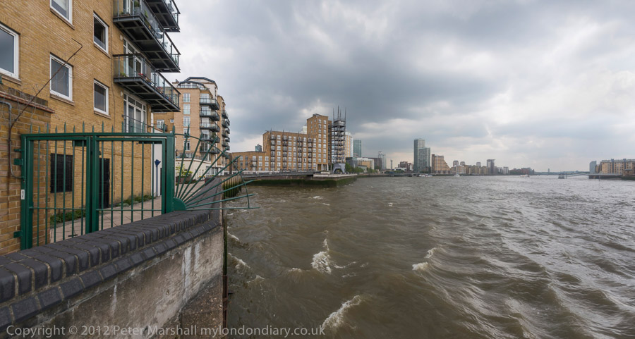
The Thames path goes through a gate open during daylight hours D800E, 16mm

I bought my first proper panoramic camera towards the end of 1991, having lusted after one for some years. I’d thought about the possibilities on offer – not all that many – but it was mainly cost which had stopped me getting one before. I’d played with panoramas a bit, taking multiple images, had used cheap single-use cameras that called itself panoramic and had investigated masking down wide-angle images taken on Kodak Ektar 25, but all these were a pain and not really satisfactory.

The single use camera did give images in a panoramic format, but didn’t have a very wide angle of view – perhaps around that of a 28mm lens. With a cheap lens and using fast colour negative film, the images were OK at the 4×10″ they were designed for, but decidedly soft and grainy when I took them up a little in size. Fixed focus meant they were not sharp at infinity, and a lack of aperture and shutter control limited use to bright sunny days.

Masking down the 35mm Extar X negatives taken in a normal camera to around 36x15mm certainly gave better technical quality (even better than Kodachrome 25), but was still limited in its field of view by the lenses I owned, the widest of which was a 21mm f3.5 Zuiko which fitted my Olympus OM4 bodies. There were wider lenses available – including a 16mm f3.5 full frame fisheye, but I didn’t own one and there was no simple way to correct the curvature that this produced.  The 90 degree field of view of the 21mm still didn’t seem quite enough to me.


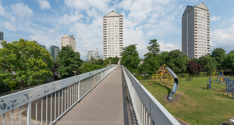
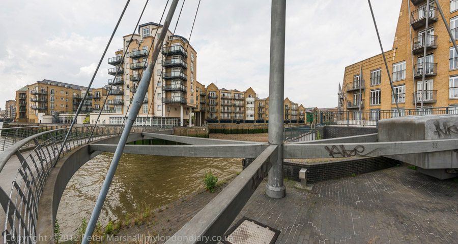
The bridge for the Thames path across Limekiln Dock D800E, 16mm

I wanted a camera that was portable, gave a decent negative size and I could afford. I had no desire to make huge prints, and hated processing 120 film, so those producing longer than usual negatives on 35mm looked good. But the prices didn’t.  Eventually I saved around a month’s salary and bought a Japanese Widelux F8, and began my real work with panoramic images.   Later I replaced this by a cheaper Russian Horizon camera, which apart from a better range of shutter speeds also had a viewfinder (the Widelux just had arrows on top to indicate the angle of view) which incorporated a spirit level, making hand-held use for landscapes a possibility. And later still came the Hasselblad XPan, which, at least with a 30mm lens, gave rectilinear panoramas at around the sensible limit of angle of view.


This bridge was built to connect the council estate to a riverside park across a road then busy with docks traffic D800E, 16mm

When I took up digital photography serious with a Nikon D100 in 2002, it became possible to stitch together images digitally to make panoramas. But it was still much easier to take them on film, with a single press of the shutter release, especially when there were moving objects in the frame. So ten years after going digital, I was still – at least theoretically – using film for panoramas. Except that I wasn’t. Film had become just too much of a hassle. I was simply taking fewer panoramas – and making those from multiple digital images.

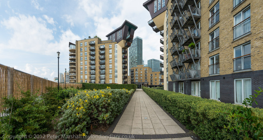
It was the high quality 32Mp files of the D800E that made me rethink and go back to making panoramic images from a single exposure. Using the Nikon 16mm full-frame fisheye I can digitally process the images and end up with panoramas 9706 pixels wide and a 146 degree horizontal angle of view.  The full vertical angle is actually larger than I want, and I crop the images down, usually to around a 1.9: 1 aspect ratio, which gives a little freedom about where to place the horizon – the digital equivalent of a rising/falling front.  The D800E also has built-in level indicators in the viewfinder, which are vital.


Riverside flats D800E, 16mm

Now my main limiting factor in making panoramic images is simply time to do so, with so many other things to photograph – as well as writing about it. And also the weather, as clear blue or evenly grey skies can ruin many pictures. Not to mention my legs, which no longer take long walks and standing around to make pictures without complaint.

Also important is the time spent in post-processing, which is considerably longer than for straightforward images. Adding a minute or two for each image would perhaps not be too vital, but where you can directly assess a normal image with a glance at the preview, for these panoramas you really have to process them to the end result before you can be sure if they work. Processing these images from a single afternoon held up my updating of My London Diary for some days.

Over the years I’ve watched – and occasionally photographed – as the Thames in London has turned from the post-industrial landscape that features in my London’s Industrial Heritage  into living space for the rich, with blocks of luxury flats now lining most of its banks.  In the process the river has lost much but not all of its fascination, and the rest of us have gained much greater access to a riverside that now has much less worth seeing.

The weather for my walk was London’s best – highly changeable. Spells of light rain, impressive clouds, grey skies and blue skies. Even on digital – usually far truer to life than film – it often looked too extreme, and I had to lighten some of the dark clouds. With open views like most of these you do get a lot of weather.


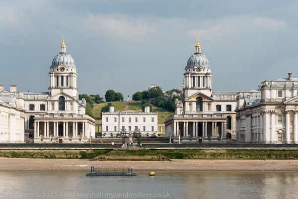
The view from Island Gardens D800E 80mm on 18-105mm

I’ve divided the pictures from the walk into two sections, largely for convenience of reference, with pictures from Limehouse and then from Millwall – Isle of Dogs. At the end of the walk – a pleasant mainly riverside stroll of perhaps 6km which took me two and a half hours with a camera but would have been half that without – I also took a few other pictures of Greenwich from the Isle of Dogs.  Arguably the view from Island Gardens is one of London’s finest, and at that time of day is at its best.
Continue reading More River Panoramas

Capa Under Fire

I’ve never believed the story about Robert Capa‘s D-Day films being ruined by a darkroom technician, but though I’ve certainly expressed my doubts in discussions I can’t find anywhere where I’ve published them clearly in print or on the web.

I don’t believe it because I’ve tried hard to melt film, and it isn’t easy, and when you do so the results don’t look anything like those familiar D-Day images. Back when I was teaching art students, some of them worked hard to distress films in various ways, and found modern emulsions surprisingly resilient. They couldn’t get results like Capa’s using a film dryer or a hair dryer on full heat and ended up using more extreme means – ovens, matches and gas burners – and the results were rather different.

I didn’t believe it also because of the conflicting stories that have come out, but I kept quiet about it. I hadn’t done the research that would be necessary to write what I felt in my bones, though I tried to express a certain degree of scepticism when I wrote about it back in 1999 (and rather more in my lectures on which this was based:)

Both Capa and Rodger covered the D-Day landing in Normandy. Rodger strode ashore at Arromanche and found little happening, while Capa hit Omaha Beach where all hell was breaking loose. He shot three rolls of film on his two Contaxes, during the approach and wading ashore from the landing craft and then while lying flat on the wet sand while bullets raced over his head. Capa’s most quoted remark about photography is ‘If your pictures aren’t good enough, you aren’t close enough’, but here he was closer than he intended. He realised his duty as a photographer was to get the pictures back and rushed himself and his film back on to a landing craft and from there to England.

Only 8 of the 106 frames were fit for use. Apparently the Life darkroom technician was so excited by what he saw that he allowed the film to overheat while drying it, ruining most of the film. Life at first put out a story that the pictures had been ruined by sea water, then, after telling Capa what had really happened, ran the pictures with a caption that enraged Capa, saying he had not focused properly in the heat of the action. Of course this and a certain amount of camera shake would have been pretty excusable in the circumstances. The faults that are present in the existing pictures give them a graphic quality which would have been lacking in properly processed work.

What I was implying in the section emphasized above, though being careful not to be explicit, was that to me these pictures looked just as if they were out of focus and suffering from camera shake and that we needed no other explanation for what we can see.

But while I only implied and failed to research in any detail, J Ross Baughman recently made his views quite clear in two guest posts on Photocritic International, Robert Capa’s Troubles on Omaha Beach (1) and (2).

A D Coleman himself has followed this up with his usual dogged forensic attention to detail with a series of posts Alternate History: Robert Capa on D-Day, currently up to part 7, in which he comes to the conclusion about the ruin in drying “I no longer believe a word of it. I’m embarrassed that I did for so long, and amazed that it’s gone unchallenged for seven decades.”

But he also concludes “But it no longer matters, because whatever caused the complete loss of three of Capa’s rolls of 36-exposure 35mm film and 2/3 of the fourth roll, none of that film — according to the photographer’s own caption notes and the data encoded in the remaining negatives themselves — contained any further images of the landing at Omaha Beach.”

It seems pretty clear that Capa only made 11 exposures on Omaha beach (not the 8 which were said to have survived when I wrote) although the best of those negatives has since gone missing. Another was apparently too poor technically to print. Coleman suggests pretty convincingly that the other exposures on the film were made by Capa before the landing craft reached the beach and were drastically overexposed (as shown on the stills from a recent video.)

Coleman’s account is not quite as clear as it might be in part 4, as his mind has been changed by an exchange with photographer Mike Doukas. The frames shown on the contact sheet appear to be the final ten from a commercially loaded 36 exposure cassette, ending as usual at frame 38 (with 37 the missing negative.) They start with 5 exposures made from the landing craft as troops wade ashore  and end with the final picture Capa took on the beach.

The other films lost or ruined appear not to have been taken on Omaha beach but – according to Capa’s own notes, to have been taken earlier during boarding and the journey across the channel.

It is hard to know what to make of Capa’s claims – discussed by Coleman in part 5 – to have taken more films (or indeed about anything else in his life – Capa was nothing if not a great story teller, and good stories are always at least a little more than the truth), but Coleman’s dismissal of this seems convincing. But he is surely too harsh on Capa in the conclusion that by only taking 11 pictures and then running to get away from the beach that “On this crucial occasion, the opportunity of a lifetime, he failed himself, his picture editor, his publisher, his public, and history itself.”  It is perhaps a conclusion that reflects Coleman’s own anger at having been taken in for so long by the improbable story.

It was arguably a surprising failure not to have reloaded the camera immediately before the craft hit the beach so as to have a full 36 exposures at his disposal, but perhaps there was not enough warning that it was about to happen. But flat on the beach under withering fire he would have known that he only had a few frames left, and probably felt that loading another film would have been too much of a risk to his life. To get a couple of good images, pictures that became icons for whatever reason –  and to keep alive to take them back to England seems to me a success.

You need to read the whole story, starting with  Robert Capa on D-Day which Coleman published on June 10th.

One mystery I think remains. The young lad in the darkroom was long thought to have been the 18 year old Larry Burrows, but later LIFE‘s London picture editor John Morris who was in charge later made clear that he had not been involved, laying blame on the youngest of the darkroom staff,  15-year-old lab assistant Dennis Banks (although according to Capa biographer Richard Whelan, his name was Dennis Sanders.)  15 in 1944, if still alive he would be 85 now, and in any case there must still be many people alive who would have known him, and doubtless he would have told some his story. If he – or anyone who knew him – is reading this we would all like to hear from you, so please get in touch. Or was he simply a fictional character?

Bin British Gas

Back before the Thatcher era the idea of private companies making profits out of supplying gas seemed ridiculous. It was an industry with a single network of pipes across the country. Of course in the distant past we had over a thousand gas companies, each with its own area, some private and some municipal, all merged into the nationalised area ‘gas boards’ under Clement Atlee in the Gas Act 1948, and into the single British Gas in 1972.

It was an industry where nationalisation made sense, and I think delivered a better deal than the privatised British Gas created by the Thatcher government in 1986. For the next 10 years, domestic users had no choice of supplier, and it was only in 1998 that the market was fully open to competition.

It’s hard to see any real benefit for the consumer that privatisation has brought, and after recent price hikes few still believe there was any financial advantage – except to the shareholders of the privatised British Gas and other big energy companies and those who bought shares cheap and sold quickly at a large gain.

In the days of the gas boards things were simple. Anything to do with gas and you knew where to go. There was a ‘gas showroom’ in every town of any size where you could go and look at new gas appliances, and to pay your bill, and if you smelt a leak or needed maintenance or anything else, the board (and from 1972-86 British Gas) was the place to go. Things were simple and they worked pretty well.  Much the same was true of electricity, again nationalised by the Atlee government – by the 1947 Electricity Act, and privatised in 1990.

Most people would prefer a simple national system for energy in the UK again, with a YouGov poll in November 2013 showing over two thirds of people backing the energy companies being brought back into the public sector and only 21% saying they should be private. Even among Conservative party voters over half – 52% – thought they should be re-nationalised. It is a pretty clear indictment of the current system, so it is perhaps surprising that none of the major political parties seems to be even considering renationalisation. I think it says something about how our democracy works -or rather fails, protecting some private interests rather than the public good.

Few of us can be bothered to change our energy suppliers to get a better deal – and many who have done so have found themselves actually paying more with an incredible level of misleading selling. In the 18 years it has been possible to switch suppliers I’ve only done so twice; once to get the small benefit of a ‘dual fuel discount’ from buying gas and electricity from the same supplier, and more recently for ecological reasons to a green energy company, Ecotricity, which has no shareholders but uses all its profits to develop new renewable energy services. As a bonus, it also seems to be saving me a little money.

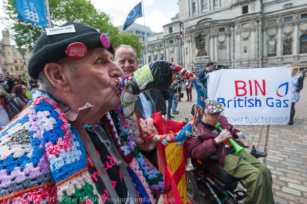
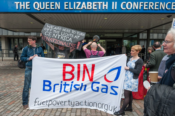
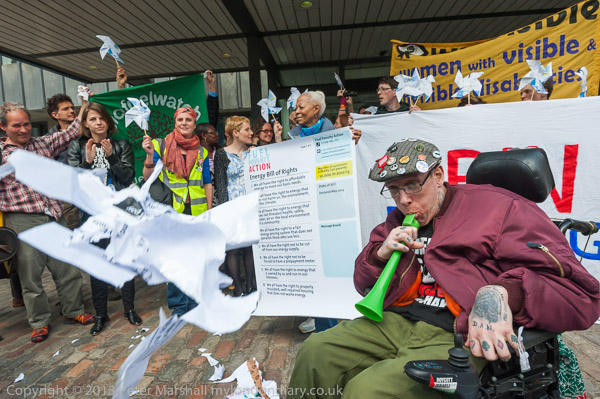
So I was very much in sympathy with the protesters outside the AGM of Centrica, the parent company of British Gas, a protest organised by Fuel Poverty Action, with their slogan ‘Bin British Gas’. You can read more about their aims and the protest, along with many more pictures in Bin British Gas on My London Diary.

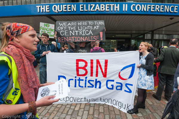
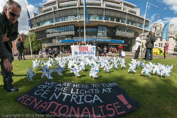
Another picture taken with the same lens, the Nikon 16-35mm f4 from more or less exactly the same position, but at a slightly wider focal length has a big difference. The name of the conference centre is straight on the upper image (at 22mm) but rather definitely curved in the lower 16mm version.

There is more distortion at the wider focal length, but the real reason for the difference in these pictures is that I have used the lens profile in Lightroom to correct the 22mm version. I could have done so for the lower image but chose not to. I have changed my default setting for the profile in Lightroom to use 0% distortion correction, because for most subjects the distortion actually gives a slightly less distorted looking effect at the edges of the pictures, avoiding a little of the problems of rectilinear correction on extreme wide angles. It also gives a slightly wider field of view, with any correction of distortion always resulting in a little loss at the edges.

The distortion is only generally a problem with architectural subjects and other things with obvious straight lines – as in this case. But correcting it would have lost more than I was willing to lose of the hair of the woman at the left of the image.

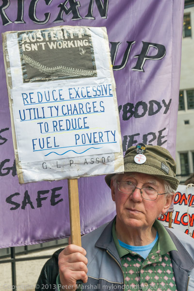
Pensioners are among those hardest hit by high fuel prices – many now find themselves having to chose between keeping warm or eating. I took several pictures of one of them holding a hand-made placard. I think this was the best, though probably it would be improved by a little crop at top and right, but you can see another version on My London Diary. Obviously the face and placard were both important, but less obviously I think his hand gripping the placard adds to the picture. As (almost) always the images are un-posed.

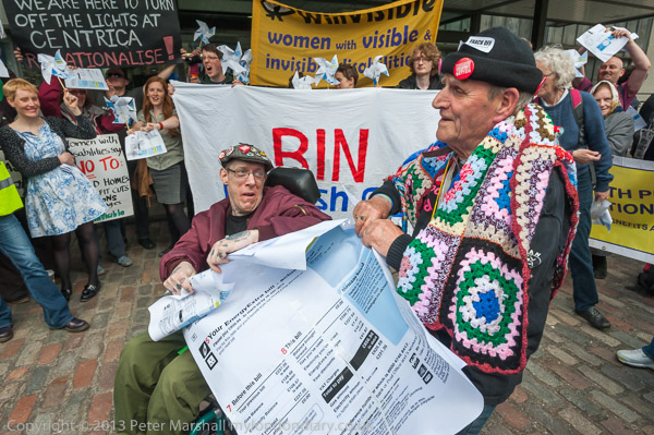
I rather like the picture of a giant gas bill being torn up, though it proved a little difficult for them to tear. I was surrounded by other photographers when taking this and the other pictures and unable to move much, but I’d chosen a fairly good position – thinking in advance what was likely to happen and where and getting there before the others.

They did eventually tear it to pieces and then Terry who was right next to me threw them into the air. It was a picture with no second chances and I would have liked more of the pieces to have been the other way round – ideally to show the British Gas logo.  But you have to take what you can.

The finale of the protest was the planting of windmills made from folded gas bills in the grass in front of the centre. They had been planning to do so on Parliament Square in front of the House of Commons which might have made a better picture, though the ‘Heritage Wardens’ there would certainly have objected.  There were supposed to have been 100 of them, but quite a few didn’t get planted

Along with the other photographers present (and we did get in each other’s way a little) I had a few minutes to think about how to take this, and to try different ideas, with focal lengths from 16mm fisheye to 70-300mm telephoto. There are four different views at Bin British Gas but this is my favourite.

Continue reading Bin British Gas

Adobe Upgrades

Today was I think a good day for photographers so far as Adobe products are concerned. I don’t know if the upgrade to Lightroom 5.5 really changes a great deal, but like most such upgrades, it does feel just a little snappier, which is no bad thing. And I’ve yet to try the updated Bridge and to do anything substantial with  Photoshop CC 2014, though I don’t think any of the enhancements that Julieanne Kost enthuses about will have any great impact on my work – or that of any other real photographer. If I want motion blur etc I’ll take photographs of things that are moving.

Perhaps the improved content-aware fill tool will help improve retouching my scans but most of the other things – like most Photoshop features – are ways to destroy the photographic nature and content of your images rather than tools to enhance. At least 90% of Photoshop should be irrelevant to photographers, but we use it because it does the 10% better than anything else, though it sometimes needs a little help from plugins.

It’s taken a bit of fiddling around to get my favourite plugins working with 64bit Photoshop CC and with Photoshop CC 2014. There are strict instructions to use the plugin providers install software rather than trying to install by hand, but this didn’t work for me for some. Fortunately finding the correct ‘64.8bf’ files and copying them to the plugins directory does work. But having four versions of Photoshop on my system is probably confusing. Perhaps I can cut it down to two now.

But the good news (or at least slightly good news) is that the $9.99 per month photographers package is now a standard one rather than a special offer (with VAT that’s £8.78 in the UK – or you can save 50p a year with a pre-paid annual sub.) It isn’t quite the same, with less cloud storage and no ‘Behance’ portfolio for new subscribers (I haven’t used either) but seems to me to be reasonable value, costing not very much more than the regular upgrades to Lightroom used to. And if, as most photographers seem to nowadays you buy new cameras fairly often, you do need to keep Lightroom up to date. I’d want to in any case, as so far each new full version upgrade – the ones I had to pay for – has added welcome improvements.

It would be even better value if I had an iPad and iPhone now that Lightroom works on these too, something I can see many photographers making use of, though you are only able to work on ‘smart previews’ rather than the actual files.

I’d rather that Adobe had not gone the CC route, but I can see why they have elected to do so. So many photographers I know use somewhat less than legal versions of their software. And I can see why they do as well, given the cost of the old standalone versions – it was really just too expensive for many photographers. Until the announcement yesterday I was a little worried that Adobe had not got the message and might ramp up the price again, but it looks as if they now realise the different market.

Curved Images

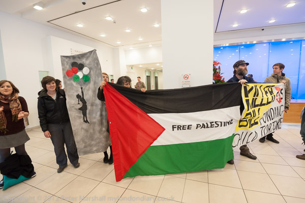
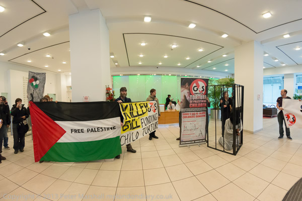
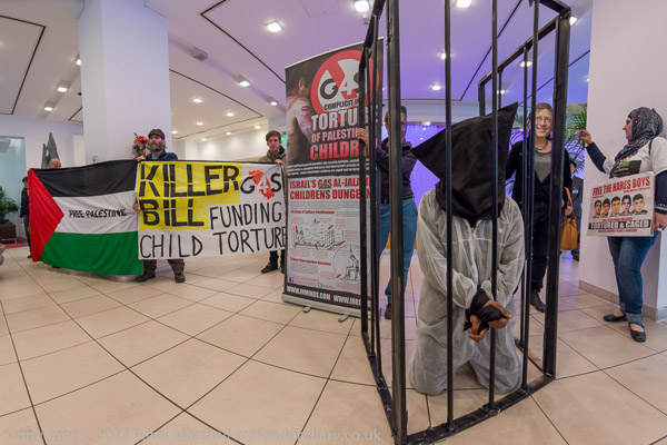
This picture and that below this paragraph were both taken from more or less the same position and more or less the same time. As you can see, I’ve moved just a little to my right in to taken the lower image, hiding the lower part of the Banksy image behind the Palestinian flag.

Both are images take with a lens of focal length 16mm on full-frame sensors. The upper image was made with the 16-35mm on the D700 and the lower with the 16mm Nikon full-frame fisheye. The most obvious difference is the much wider angle of view both horizontally and vertically in the lower image.

The difference in perspective is very marked, particularly in the floor tile and in the ceiling, but much less so in the central strip where the people and the banners are. The differences between the two images would be rather greater if I had not used the Fisheye-Hemi plug-in for Photoshop on the lower image, transforming it to cylindrical perspective. In the original fisheye image those hefty square pillars were curved, but here the verticals remain straight.

The plug-in also makes the centre of the lower image jump out a little less; straight from the camera it would have been more dominant, and objects close to the edges, such as the man on the left such as the figures at either edge would have been noticeably thin and curved. You also lose a little at each corner of the image and have to allow for this in framing our images. Somehow looking though the viewfinder these corner parts that are lost aren’t very important, perhaps because of the their smaller scale and curvature.

I don’t like to use the word ‘distortion’ about them; it isn’t really a distortion, just a different perspective. The fisheye in fact seems to have very little distortion, and the rectilinear lens rather more. Some time back I decided that for the kind of subject matter I more often photograph a little distortion is seldom a problem, and changed the default profile Lightroom uses with images from the 16-35mm so as not to bother to correct it.  It shows up in the upper image, particular in the lines in the floor which have a slight curve. If I had thought about it when I was processing these images in Lightroom I would have corrected this by turning the distortion setting on the profile tab for Lens corrections back to 100% for these rectilinear images. Then those lines would have been truly straight.

Lightroom’s default for the 16mm is also to try and straighten these curves for the lower image, forcing it into rectilinear perspective but this just does not work. The image just gets too stretched and blurred towards the corners – where there just aren’t enough pixels to work with.

You can use this and crop the image to remove the soft edges, but you end up with an image that could have been taken with the 16mm rectilinear lens (or perhaps just a little wider.) If you don’t use very wide angles very often and your widest other lens was something like a 21mm or a 24mm it might be more useful to supplement this with the semi-fisheye 16mm (or its equivalent on the DX format, the 10.5mm) especially if you use a D800 which has plenty of pixels to spare. Then you would have the really extreme (180 degree diagonal angle of view and around 147 degrees horizontal) fisheye or, after cropping the equivalent of something like a 12-20mm digital zoom in a very small and light and relatively cheap package. With 32Mp to play with you can crop quite a lot and still end up with a decent size hi-res image.

The same kind of think is also possible at the long end. At times I leave the 70-300mm at home knowing that in an emergency I can crop  the 16Mp DX image I get from the 18-105mm DX lens and crop the images from that to give myself the equivalent of the 300mm with enough pixels for almost all purposes.

The occasion for a whole series of six truly ultrawide images was when a protest outside the G4S offices in Victoria St against the services they provide for Israeli prisons where Palestinians are locked up, often without charge or trial and many are tortured decided to move inside into the office foyer. Most of the images were made with the 16-35mm, but there is a series of half a dozen starting with the one above that were made with the fish-eye.

Here is another. It’s obvious when you look at it and think about it, but I don’t think most people would notice. And it is the pictures that don’t immediately make you think ‘fisheye’ (or anything else about how they were made) but get you looking at and thinking about the subject matter than I think are successful.

More pictures (and text) at G4S Occupied on Palestinian Prisoners Day.
Continue reading Curved Images

Reclaim Love Returns


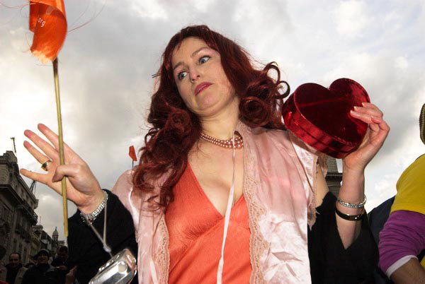
Dancing at Reclaim Love, 2006

I was very pleased to get a message on Facebook on the Friday evening that contrary to expectations there was going to be another Reclaim Love Valentine’s party at Piccadilly Circus the following afternoon.

I should have heard about it a week or so earlier, when messages began to be posted on the Reclaim Love Facebook group, but Facebook is now terribly broken. What used to be a good way of keeping in touch with people now systematically hides most of the messages and updates that your ‘friends’ post (and most of yours from most of your friends) unless you pay to have them promoted – as well as sending you stuff from people you have no connection with who have paid for the distribution.

Facebook has commercialised the ideas of friendship and community, and it was probably inevitable it should do so. I suspect too that it would now be impossible because of copyrights and other intellectual property rights for an open-source competitor to set up a competing service that really worked, as has happened in some other areas of computing such as Linux or Firefox web browser.


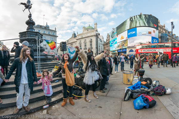
Joining hands at Picadilly Circus for the ‘Celebratory-Collective-Consciousness-Shifting-Love-Circle’

I mention this because Reclaim Love was also set up to oppose commercial degradation, in this case of love into the massive industry of exploitation which reaches its annual peak at St Valentine’s day.

It was started from the inspiration of Irish poet and Love activist, Venus CuMara (quoted in Resurgence in 2010) to “create a balance for all those like me who are disenchanted by the idea that chocolate and flowers could be a greater gift than the gift of love itself” and she persuaded others to join with her in creating a free festival in 2003.

I missed this first event as I was in hospital waiting for an operation, was in Paris for Valentines Day 2004, but was present the next year in Piccadilly Circus, where the party took place around the statue of Eros. (Which of course isn’t Eros, but we all call it that.) And since then I’ve not missed a year – and there are pictures every February on My London Diary – links to them all here in Reclaim Love 10th Anniversary.)


Venus dancing at Reclaim Love, 2014

For Venus, it was also “an experiment to see if we can create a shift in the collective consciousness of our people. If this experiment works we will shift from the common, fear based way of thinking, to a more fearless-generous-sharing-Love-centred way of thinking. In order to do this we need enough people,( a critical mass ) to focus on the same thing at the same time World Wide.”  And at 3.30 pm GMT at various places around the world people joined hands in what she called a Celebratory-Collective-Consciousness-Shifting-Love-Circle and recited together as a mantra her translation of an old Sanscrit prayer:

“MAY ALL THE BEINGS IN ALL THE WORLDS BE HAPPY AND AT PEACE”.

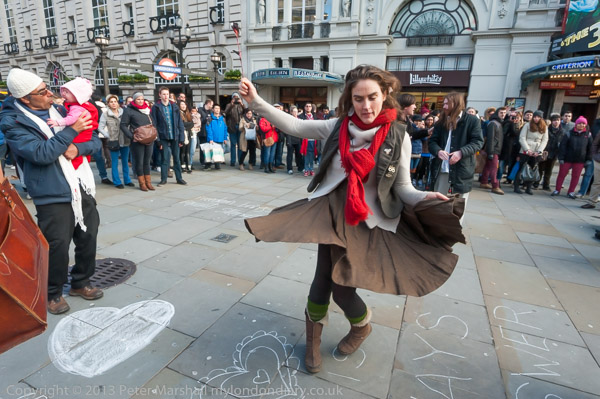
And it really was free, and taking place without any notice or permission to the city authorities or police, just taking over this small area of the streets of London for a party, with music, dancing, giving away free t-shirts and sharing food. And although it might not have a great influence on world peace, it has created a little magic in an otherwise rather dreary area of tourist London for a few hours every year.

Last year was Venus’s 10th Reclaim Love (one year she was out of the country and passed the organisation to others) and she had decided it would be her last.  But as the time of year came close, friends of hers who had taken part in the event decided it had to happen again, and rushed around inviting people bands and poets to come and perform. Venus herself came back from Ireland to come. Perhaps because of the last minute nature (and the perfidy of Facebook) there were fewer people than in previous years, though I’m told that word got around on Twitter during the event and things got rather livelier after I’d left around two hours after it started as the light was fading.

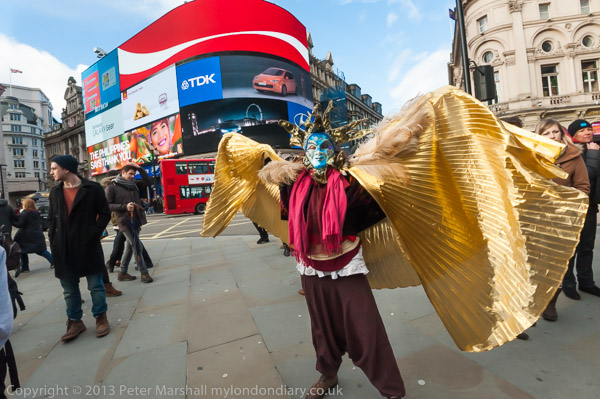
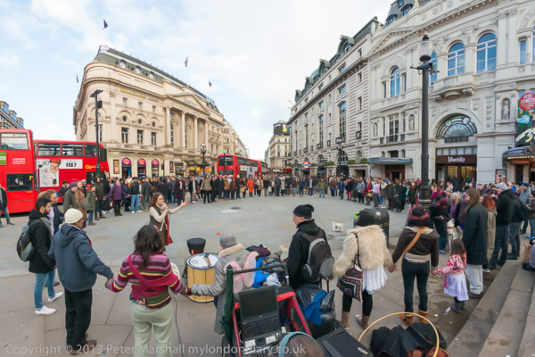
I think I’ve taken better pictures in previous years, though there are some that work quite well. The circle with people holding hands is perhaps difficult to photograph with everyone spread out around the area. The picture taken from the steps around Eros to gain a little height gives some idea of the scene, but doesn’t work as well as those from inside the circle.

Both this and the second picture from the top were taken with the Nikon 16mm full-frame fisheye, a lens I’m really enjoying using, mainly on the D700. It works well on the D800E too which I used for these, but the files really get too huge as to use the Fisheye-Hemi converter I output them as 16 bit Tiff files – which with the 32Mp sensor gives around 200Mb file size. As high quality jpegs they are a rather more manageable 9 or 10 Mb, and at 7360 x 4912 pixels would serve if I ever needed to print at high quality at 300 dpi around 2 foot wide. Of course they could actually be blown up much larger as the files are sharp and detailed. And they would certainly look fine on those illuminated billboards at Piccadilly Circus.

A Wet Valentine

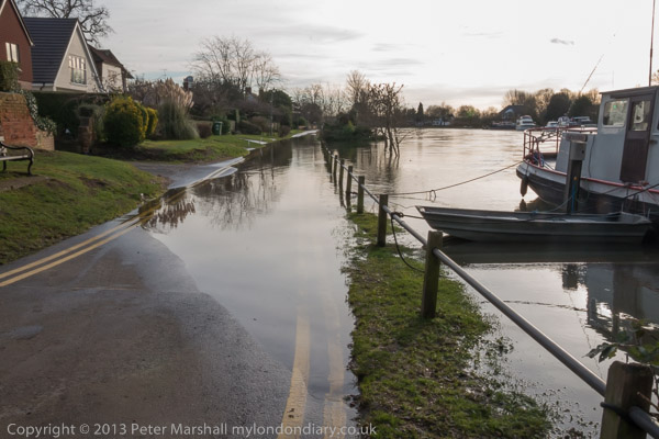
Feb 14th was a busy day for me, and a very wet one, not good news for those of us in Staines, where the Thames was still running very high, with water flowing slowly across the road in front of our house, and the sewage blocked for five days. Though we were fortunate that the ditch on the edge of the garden was still taking the flood water away. (It’s rising again as I write, almost 3 weeks later, despite a few nice dry days – another 8 inches and we will have significant flooding again in the area.)

It was a relief to get onto a train up to London and get away from it all for a few hours working, but I could have done without the rain reminding me of it and adding to my worries.

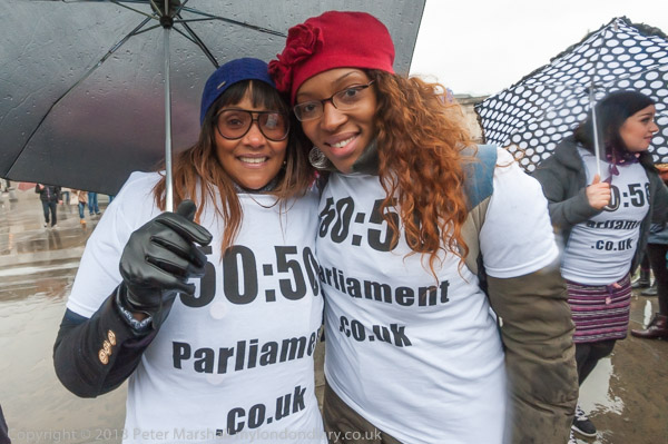
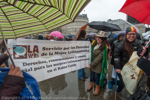
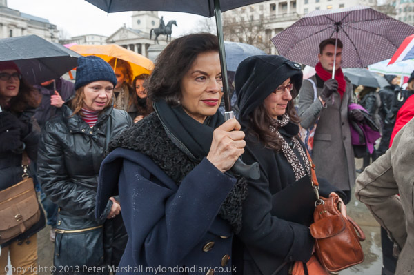
I’d only intended to pay a brief call to ‘One Billion Rising‘ in Trafalgar Square, part of an international day of protest over violence against women. I don’t usually bother with ‘photocalls’, often finding them rather boring, as this one was, but I did enjoy – despite the rain – meeting and photographing some of the women who had come to take part in the event.

It was only raining lightly when I arrived, but was it obvious from the start that umbrellas were going to be a major theme in my images. The only pictures that don’t feature them are a few of the dancers on the stage under cover, though even there, parts of the stage were wet and those dancing in front at ground level were doing so in shallow puddles.

Umbrellas, particularly coloured or patterned ones, do offer some potential to make pictures, but I was concentrating more on the people beneath them.

Also of course concentrating on trying to keep the front filter on my lens free from raindrops. I wasn’t 100% successful, but there were enough pictures were either there were none or they had the impact in the less essential areas of the images. In the top image, there is some slight blur and diffusion in a few areas on the right of the image, still visible at web size, but these don’t detract from the image.

They are less noticeable than when I first saw the image enlarged on my screen in Lightroom thanks to a little post-processing. Using the the local Adjustment Brush tool can reduce the effect. Increasing both the contrast and clarity in the area cuts down the effect of diffusion, and then the highlights and exposure can also be adjusted to bring the diffused area to more closely match its surroundings. The treatment needs a little tweaking for each area you use it on, but it’s convenient to set up a preset as a starting point – and mine has values:

Contrast  +22
Highlights -22
Clarity  +32
with all other settings at zero.

It’s just another reason why I don’t take a notebook computer out with me and send off files from location (or in this case the rather dryer setting of a nearby bar or coffee shop.) I need a good screen and plenty of time to get things at least approximately how they should be.

Of course it would help at least to some extent if I used an umbrella to keep drier while taking pictures. But I just don’t have enough hands and it also restricts mobility – and using a wide angle I just would not have been able to get close enough for some of these pictures holding a brolly. Using a wide angle – especially one with a large glass filter like the 77mm on the Nikon 16-35mm – also greatly increases the rain gathering power, and with wide-angles the lens hoods are of very limited use in protecting them from rain.

I did deliberately photograph one of the celebrities at the event, Bianca Jagger, of course holding an umbrella, and certainly it is a rather different image of her than some. But there were few others that I recognised (or recognised me.)

Story and more pictures at One Billion Rising – End Violence Against Women.

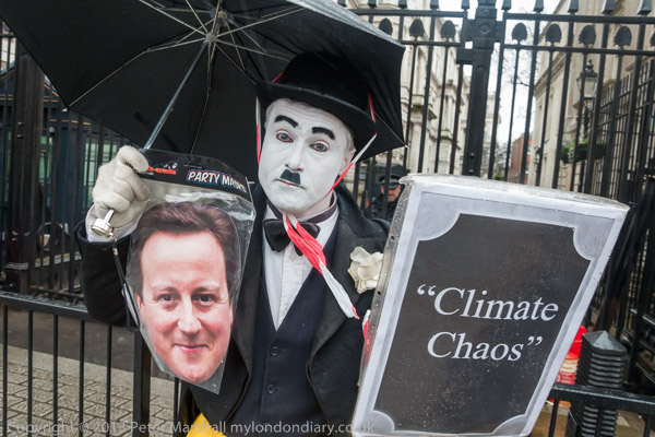
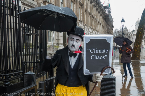
I didn’t really have time to stop and send off pictures in any case, as I needed to be away and doing other things. The first of which was just a few hundred yards down the road at Downing St. I wasn’t there to photography David Cameron, but someone far more famous (or at least Charlie X posing as someone more famous) Charlie Chaplin, who I’ve met and photographed at a few protests.

Charlie Chaplin against Climate Chaos was a one-man performance, and possibly because of the by now heavy rain, I was the only photographer in sight. And it was very much a performance, with Charlie keeping to his character in mime, which made it just a little difficult to communicate with each other.

Of course most photographers also do a little bit of mime, especially useful when abroad when you don’t speak the local language, or when working in noisy situations. I occasionally use gestures to ask if I may photograph someone, but much more often to thank someone whose picture I have taken.

There were really only a couple of pictures that I could think of to take in the situation, and you can see them with a few minor variations on My London Diary.  I would have liked a few more people on the street to use in the background for some images, but apart from the police on the other side of the gates, there were only two other people on the pavement in this part of Whitehall in the five minutes or so I was there (one in red is almost entirely and deliberately behind the Climate Chaos poster) – I’ve never before seen it so empty.

One of these pictures has proved more popular than anything else I too on the day, though I think I was only making the best of a bad job. It certainly was a fine example of Climate Chaos, with a storm lashing London that would normally have hit the north of Scotland, but I don’t think I managed to capture this.

But I was very pleased having taken a few pictures to wave my goodbye and dash across the road for the bus to take me to my next appointment, for which I was already a few minutes late.

Continue reading A Wet Valentine

The Drowned World

The floods got me thinking again about one of our former local celebrities, whose second book (and the first that he later acknowledged) ‘The Drowned World‘, published in 1962 was set in a post-apocalyptic and largely unrecognisable London of 2145, mostly underwater and tropical thanks to the effects of global warming. Back in the 1960s it seemed far-fetched, though now it seems only too likely.

On one sunny afternoon in January as the Thames was beginning to subside, I got on my bike and took a ride, camera around my neck and decided to make a short pilgrimage to the street where he had lived for many years.


It got deeper further on and I turned down a side road away from the river

I wasn’t in a hurry and decided to try the scenic route, along by the riverside most of the way, though I was fairly sure that the road by the Thames would still be closed and I would have to divert – and this turned out to be so. I could perhaps have pushed on a little further through the flooded tow-path at Laleham, but I would have risked getting my feet (and perhaps more) wet if I had to stop or met an underwater pothole.

Its a rather boring but shorter ride on the main road through Shepperton Green to Shepperton, ending with a little climb on the bridge over the motorway, and then down with the traffic lights at the bottom of the hill almost always wasting your momentum, and cars getting in the way in a queue for them.

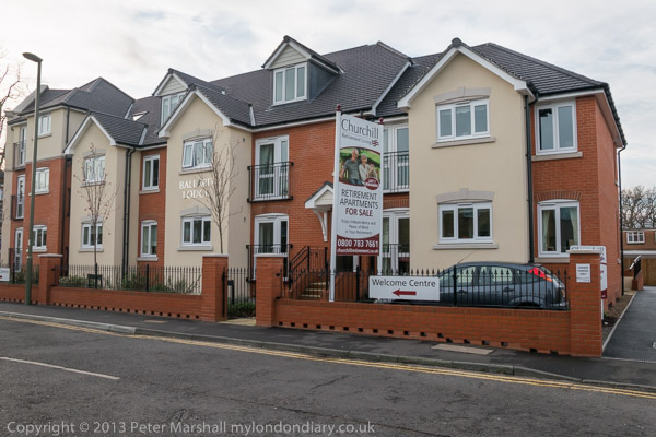
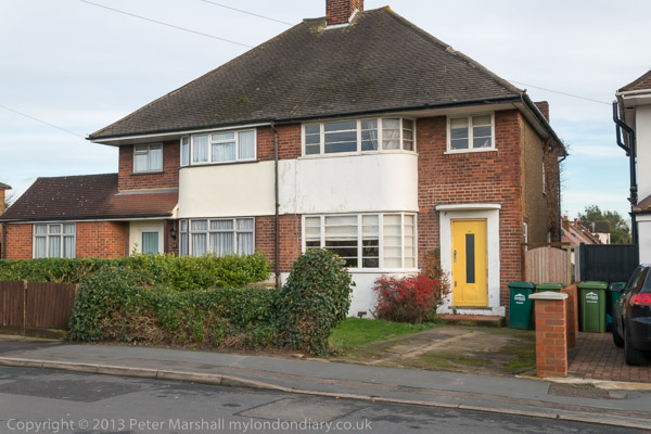
I’m not aware of any blue plaque or other official recognition of J G Ballard in the area, certainly there is nothing on the actual semi-detached house where he lived and which was sold following his death in 2009. But as I moved off from the lights I saw the new and rather ugly new block on the corner, Ballard Lodge retirement apartments.  It would perhaps have amused him slightly, perhaps in a true Ballardian fashion.

I don’t think his house has changed much. Still the 1930s windows and the faintly ridiculous door surround and a dowdy patch of lawn. But I didn’t like to stop and stare too long at what is just an ordinary semi.

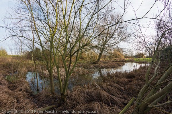
The road now ends short of where it did when he moved there in 1960, but there was still an area of swampy ground where perhaps he sometimes walked and perhaps thought about his work.  The River Ash runs just to one side, quite a small stream, bring water from the Colne at the southern edge of Staines Moor and flowing on into the Thames.

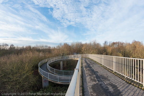
Behind me when I made this picture was the spiral ramp up which he may have sometimes walked, built as the M3 cut across his road, and I pushed my bike up it wondering if he had contemplated the building of the motorway when writing perhaps his best-known work, ‘Crash’. Unlike the film version, much of the book was set in this south-west area of Middlesex, along with some of his other works.

You can see a few more of my images from the area on Shepperton & Ballard, where I also have written a little more about the man who has been described as our most important post-war novelist. Perhaps not, but certainly one worth reading, and one who had some influence on my own project ‘Under the Car’ back in the 1970s.

You can read a little more about that in Under the Car, posted on this site in 2007, based on part of a presentation I gave in Brasilia.

The  ‘The Drowned World‘ is one of a number of Ballard’s novels s that is still available. You can read (and download) the book online.

The pictures from Laleham and Shepperton were taken on the Nikon D800E with either the 18-105mm DX or 16mm Nikon FX fisheye (and with a little help from the Fisheye-Hemi plugin.) The D800E gets a little heavy around the neck when cycling, even though both of the lenses are fairly small and light. The one not on the camera fitted in a jacket pocket.

I’m getting to like the 16mm a lot, perhaps even a better lens than the 10.5mm DX, certainly less chromatic aberration, though Lightroom does a good job of removing that in any case. It’s possibly the only FX lens that is smaller and lighter than its DX equivalent, though there is much in it. It works well on both the D700 and D800E, though I’m more likely to use it on the D700 for most things simply because of the huge files it produces on the D800E. The 32Mp raw files are a not unreasonable 32Mb or so, but to use Fisheye-Hemi, Lightroom has to export a 16 bit Tiff file, and these are around 200Mb a time. With the D700 they are a more reasonable 65Mb or so.

But by the time I got home, even though I’d probably only cycled around ten miles I was beginning to wonder why I hadn’t picked up the Fuji X-Pro1 instead as my neck was beginning to ache. With the 18-55 Fuji X and the 8mm Samyang fisheye the load would have been lighter.

Continue reading The Drowned World

New Panoramas

Sunday 5th January, the day before Epiphany, I was going to the première of the film Epiphany in the middle of the afternoon, and since the sun was out I made myself a pack of sandwiches and set off with my camera bag to test out using the D700 and D800E to make some panoramas.

The film was showing at the Cinema Museum, close to the Elephant, a short bus ride from the Thames at Vauxhall, and I’d planned to walk along the Thames Path from Putney towards there. South West Trains had other ideas with its Sunday engineering works – which often play minor havoc with my plans – and there were no trains via Putney, so I decided to do the walk rather less conveniently in the opposite direction.

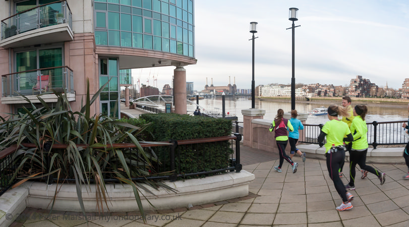
I took my first panorama in rather a hurry, as a group of runners arrived on the Thames path by Vauxhall bridge only seconds after me, and I had the 16mm on the D700 as they came past. The result has a rather tame angle of view of around 95 degrees horizontal, and an aspect ratio of 1.8:1, only a little more than the normal 35mm frame of 1.5:1.

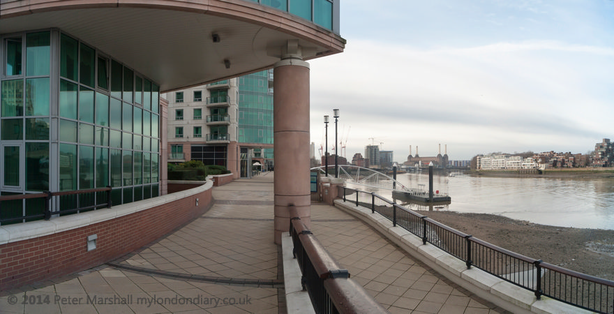
A few yards along I stopped to make the next picture, this time using the 12-24mm Sigma zoom at 12mm, giving a rather wider 112 degree horizontal view. It seemed to be beginning to work as I wanted a panorama to work.

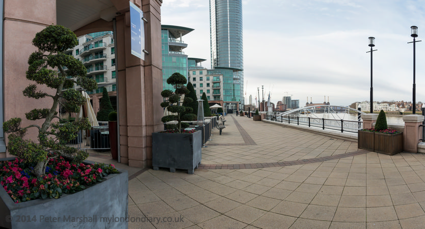
Next I tried the Nikon 16mm full-frame fisheye, and this gave me an view of almost 140 degrees, and was fine, but I wasn’t entirely happy with the aspect ratio. Working with film cameras like the Hasselblad X-Pan or Horizon I’ve got used to working with aspect ratios around 2.4 :1, and this was only 1.85:1.


Image above cropped to 2.3:1 ratio

Perhaps I could regard the image as having been made to allow a virtual rising or falling front, letting me crop to something nearer the ratio I was used to working with.

Cropping has another advantage too, perhaps less obvious in this image than in some others. Although the equirectangular projection that I’ve decided to standardize on (you can’t sensibly use the more photographically normal rectilinear perspective for angles of view much above 90 degrees) keeps verticals upright and avoids the extreme stretching that extreme wide rectilinear views suffer from at the edges, it has the effect of increasing curvature of other straight lines away from the horizon. The curvature is greater as they get further from the centre of the image, and so is less apparent in the cropped version.

In Thames Path Panoramas you can see some further examples of panoramas, mainly with angles of view of around 110 or 140 degrees. I’ve included among them a few pairs of images made with both angles from the same or a very nearly the same viewpoint. But in most cases I preferred the wider view and have used just that. It’s an interesting walk, at least along most of the way, as I think you can see from the pictures I made later, and if the trains are running (they weren’t) you can get one back from Wandsworth Town or walk on to Putney.

The D800E (and D800) has a very useful feature for those who want to make panoramas, with its built-in virtual horizon. Usually my inability to hold a camera level isn’t a great handicap – and easily corrected in Lightroom where necessary, but it becomes much more important in making panoramas.

The travel problems meant I didn’t get quite as far as I hoped – not quite to the area I was actually most interested in revisiting – but in any case the weather was deteriorating, and the bright morning had changed to a wet an sullen afternoon before I saw my bus coming and ran a couple of hundred yards to beat it to the stop, thanks to some traffic lights, and made the film in time.

Continue reading New Panoramas