Black & White Printing Compared

Having spent rather too much time in the last couple of weeks printing from my black and white negs for the the English Carnival show I was interested to see a feature on Tyler Boley‘s ‘Custom Digital‘ blog, B&W print quality which compares some of the best currently available printing systems with conventional silver printing.

Boley’s  feature has its limitations; for one thing it looks at inkjet systems for printing on matte paper (Hahnemuhle Photorag 308g) , although it does include Epson’s ABW which will also work on gloss papers. I actually like matte prints, but their qualities are rather different from those of glossy prints (and matte inkjet prints are rather different and generally tonally superior to matte silver prints) although of course these differences are reduced by framing under glass.

Despite these, the results are really interesting, and clearly show the superiority both of prints produced using the latest rather pricey StudioPrint Rip with a dual quad ink setup and the more “off the shelf” and considerably cheaper QTR (Quad Tone Rip)  used with the Selenium K7 inkset from Jone Cone, which proves to be the ultimate currently available inkjet solution (and there is a special edition for the low-price Epson 1400.)

What is also clear is that a contact print from the silver negative still has a considerable edge over ink when examined at a micro level (on the linked page with larger examples, a 0.24 inch  wide section of the print displays at around 8.5 inches – around 35x magnification). Boley asks if these differences  matter, if we can actually see these differences viewing the actual print and his answer is: “I think you can, given certain images, and viewing conditions, and eyesight.”

Looking at my actual prints on the exhibition wall, where they are shown along with the work of two other photographers printing on silver, my own conclusions based on prints produced by the most primitive of the methods Boley compares, Epson ABW,  is that, for at least the kind of photography we do, the differences are not important. My prints stand comparison – at least in terms of print quality.  Everyone I’ve talked to has been surprised to be told they are inkjet.

Looking at Boley’s results, the most surprising difference to me is actually between the drum scan and the contact print.  As he notes, the scan has more detail but also considerably enhanced local edge-contrast, which he attributes to the highly collimated light source.

The silver print used in the comparison was a contact print, which might make sense for photographers working on 8×10 film, but perhaps not for the rest of us (I have shot only a handful of 8×10’s and none that produced a picture I would ever want to print.)  Typically I’m working with 10-15x linear enlargements from 35mm film (and scans at a slightly higher resolution than Boley used) and I suspect that this makes the difference between inkjet and silver print considerably less – even when looked at highly enlarged.

So, I’ve just taken two prints from the same negative, both 15×10″ prints (I made the inkjet to fit the same overmat) and scanned a small section of both at 4800dpi (the highest optical resolution of my flatbed.)  The prints were not made to be identical in contrast or density – but printed as I felt the negative should be printed roughly 10 years apart. The silver print was on Ilford Multigrade Fibre-Bass glossy and air-dried. The inkjet was printed using an Epson Photo R2400 using the K3 inks and Epson ABW printing on Permajet Fibre Base Gloss.

The differences between the two scans are noticeable when viewed at full size on my screen, equivalent to viewing the full print at billboard size from a couple of feet.  Viewed like this, the inkjet image is slightly dottier and less sharp, but  there is little difference in detail.

Reducing the image to a size so that the whole 32mm height of each scan will fit on the screen, here’s what I saw – remember the contrast and density differences were deliberate:


Detail: Epson ABW print (original 32mm high)


Detail: Silver print (original 32mm high)

There are small differences in detail in favour of silver, but they are relatively small (and on my screen I’m still looking at a 5x linear enlargement of the print) and not visible at actual print size.  Because I had deliberately chosen to reduce the contrast of this area of the print when making the inkjet it’s perhaps hard to decide whether there is any real difference in sharpness, but again I think there is very slight advantage to the silver print.  It’s also difficult to be sure that the slightly smoother appearance of the inkjet is also simply a matter of contrast.

It would have been better to choose an example where I had produced a print that more closely resembled the silver print, but those are mainly up on the gallery wall. But the real point of these two scans is not the minor differences but the close similarity. Without the contrast differences I would have been hard put to decide which was from the silver and which the inkjet print. Viewed at normal size, holding the prints in my hand there are no real quality differences, and I’m not sure which I prefer.

Boley’s is a considerably more careful study than my brief couple of scans, and clearly shows the superiority of the Cone K7 method over the Epson ABW (which seems to be gaining acceptance as some kind of fine-art inkjet standard.) If you want the highest possible quality matte black and white prints, K7 (K6 on six ink printers)  is the current ‘state of the art.’  Cone inks for use on glossy papers are promised but not yet available. Epson ABW may not reach quite the same standard in several respects but produces excellent results and can give great prints on glossy papers as well.
Lightroom Repaired

One of several reasons why I haven’t posted much here in the last couple of weeks is the problems I’ve had with Lightroom 2.0.  Having been preaching for some time that Lightroom was the best thing for photographers since Linda’s unsliced wholemeal bread (I taught her breadmaking shortly after we were married, and who would ever want to eat sliced white again)  I was keen to install Lightroom 2.0 when it came out (even though unlike the original it did cost me real money. But along with a considerable proportion of other adopters, I found that 2.0 turned importing a day’s pictures from being soemthing that happened while you had a quick meal into an overnight job.

I searched the web for answers – and none of the advice I found helped at all, though it probably was a good idea to update my video drivers. Even posted on the Lightroom forum, though only got sympathy rather than answers.

It was frustrating as well as time-consuming. Installing 2.1 seemed to have broken my previous 1.4 installation (despite assuarances it wouldn’t) so reverting to  the older version wasn’t a straightforward option. And once the images had been imported, there were some exciting new tools, especially a great way to dodge and burn selective areas, removing one of the main reasons for needing to export images to Photoshop.

Today I found, downloaded and installed the release candidate for Lightroom 2.1  and I’m pleased to say it seems to have sorted that problem at least. From the release notes it looks as if what was happening was that 2.0 was trying to write to my second monitor, and this computer only has one connected. RC 2.1 does seem to offer a blisteringly fast import of files, although the writing of standard previews that occurs following this is still perhaps a little slower than with 1.4.

So if you’ve also had problems with LR2.0, it’s worthgiving RC 2.1 a try. If 2.0 is working fine already for you it would probably make sense to wait until there is an official 2.1

And if there are any photographers still wondering if Lightroom is worth using, I’d suggest you take a look (Aperture is another possibility for Mac users.)  If you shoot RAW it’s a great piece of software, doing all you need for most pictures from camera to client (there is still the occasional image – now well under 1% – where I need to use Photoshop as well.) If you only shoot jpeg, you should know by now you are missing out on what digital can offer you, although on those few occasions when I have shot jpegs – mainly by accident – – Lightroom has also proved its worth.

It isn’t cheap software, but much more reasonably priced than Photoshop itself – and this in itself may be doing Adobe some good. I’ve yet to meet a photographer with a pirated version of Lightroom, though dodgy versions of Photoshop seem widespread. You can download a trial version of Lightroom, identical to the full version except that it will stop working after 30 days, as well as get more information, from Adobe.

Using ABW on PFBG

Epson’s Advanced Black and White (ABW) printing system on Permajet  Fibre Base Gloss (PFBG)

With any printing system using a computer the aim is to make good prints that correspond to the image that you see on screen. I made my prints using Photoshop, which displays images making use of a print space. Since I was printing black and white images I chose to use a grayscale print space, and for simplicity I chose my default grayscale working space, Gamma 2.2  – although other working spaces should give identical results if applied both to screen and in printing.

I started by reading  the very useful work on simple black and white printing by Clayton Jones and then decided to try an even more straightforward approach! Here, in a more or less logical order are my notes on how I did it.

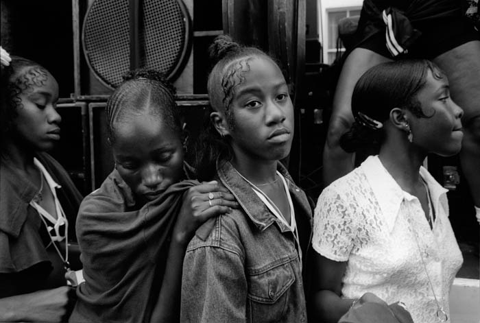
N Hill 1996
Notting Hill Carnival, 1996

 Monitor set up
The monitor was calibrated to the usual D65 (6500K) and Gamma 2.2 that I use to get accurate colour.

 Files
I scanned the negatives at the highest optical resolution my films scanner will give (4800 dpi for 35mm negs.) I use Vuescan as the scanner driver, preferring the results from this to those from either the Minolta software or Silverfast, particularly for negatives on chromogenic films (scanned as colour negative) but it also does a good job on black and white. I use a light amount of Infrared cleaning on chromogenic negatives and no grain reduction. Most automatic cleaning processes increase scan time and destroy detail. The scan at 4800 dpi allows for excellent prints up to around 24×16″ and so long as the negatives (and scans) are sharp you can go larger, with cost being the main limit!

Of course the quality of your prints will depend critically on good scans, and if you have any doubt about this, it may pay you to have scans made commercially on a drum scanner.  Using a Minolta Dimage Scan MultiPro with a Scanhancer diffuser and setting Vuescan to sample the image four times gives similar quality to drum scans – just a pity that scanner is no longer available.

Files are saved as 16 bit grayscale tiffs and with gamma 2.2 – my Adobe Photoshop grayscale working space. You can print from 16 bit tiffs and it is bet8-818-6er to keep this format in case you want to work further on the images.

Photoshop
The first task is to spot the image, working at 100% view. get the image looking exactly how I want it on the monitor, spotting, adjusting contrast and levels, dodging and burning (I find it easier to work most of the time using rough selections with considerable feathering and then to apply either levels or curves rather than either the dodge/burn tools or working with layers and masking etc – it just seems more like I used to do it in the darkroom.) I then save the file, and apply a small amount of mainly edge sharpening with the Focal Blade plugin ready for printing.

Print Settings

It turned out easier than I expected to get the print to be a more or less exact match to the on-screen image, using the following printer settings:

In the print preview window, selecting colour management, select the Document: Gray Gamma 2.2 as the source space, and the print space to “Same as Source“. See below for some comments on the maximum size and margins required. Click on the print button and then make the printer settings.

To print on glossy papers such as PFBG, you need to use the glossy photo black (PB) ink cartridge instead of the matt black used for matt papers.  With this loaded you should  be able to select Epson Premium Glossy as the paper type. Then chose ‘Best Photo‘ for print quality. Check the paper feed (Sheet), paper size settings and orientation are correct. Empty all five boxes under ‘Print Options’ and select ABW.

In the ABW settings, choose ‘Fine Adjustment‘ and ‘Normal‘ and adjust the Horizontal and Vertical settings to give the ink colour you prefer – I found 3v and 3h gave a very slightly warm neutral which I liked. Leave all other settings at 0 or empty  and ‘OK’ the dialogue.

In the paper configuration dialogue I found a Color Density of around +2 gave a slightly better match between screen and print. Finally, on the maintenance tab of the printer properties, checking the ‘thick paper’ box will cut down the paper handling problems (see below) slightly, though you will have to confirm this when you print.

Paper Handling

The main problems I had in making prints on PFBG were in loading the paper and in avoiding catastrophic collisions between paper edge and print head. PFBG – at least after some months of storage  in my dampish house – is never flat, but curls up considerably along the long edges. Possibly this could be corrected by leaving it under heavy objects for a day or two, but a quicker method is to place a pile of several sheets face down on a clean sheet of cheaper paper, then roll the whole pile up from each short end in turn. It’s also worth doing a little rolling against the curl along each long side of the heap.

At first I had great problems in getting the paper to load at all, even after this flattening, although some other papers were loading without problems. The solution was to clean the roller that pulls it into the printer. I borrowed a glass drying cloth from the kitchen, folded it a few times and dampened it, then held the moist (but not dripping!) pad reasonably firmly against the rubber roller while pressing the paper feed button to make it attempt 3 or 4 print load cycles.

After this, I fed a sheet of cheap paper through the printer a few times to remove any moisture or dirt – always a good idea before feeding in your paper that costs a couple of pounds for an A3 sheet.

I soon also found that it was not possible to reliably use the whole print area of the A3 sheet.  Even with the paper flattened as described above, there was still the occasional slight clip of the paper edge by the print head, which wasn’t a great problem while the sheet was held by the rollers, but knocked it askew once the end had emerged from these.  So although A3 paper is 420 mm long, the longest print you can make is around 380mm, with a left margin (assuming a landscape format print) of around 2mm and a right margin approaching 40mm. It annoys me to print off-centre like this, but it’s even more annoying when the print-head catches the paper edge and messes up the print.

While the print is emerging from the printer (its appearance on the paper, gradually building up through multiple passes of the print-head has much of the same magic as the image appearing in the developer tray) it also can help avoid clipping to hold the edges of the paper down slightly as it leaves the front of the printer. But even so, most of the prints I made have slightly messy edges.

You can see the results of my printing session on show in English Carnival at the Shoreditch Gallery at The Juggler, 5 Hoxton Market, London, N1 6HG from 29 Sept- 31 Oct 2008 (Mon-Fri 8am-6pm, Sat 10-4pm, closed Sundays. ) You are welcome to the opening on Thursday  2 Oct, 6.30-8.30pm.  This is one of over a hundred exhibitions and events in London as a part of photomonth 08 (this year’s web site with full details should be on line shortly)  making this the largest photography festival in the UK.

For a more general look at my attempts at getting fine prints from a desktop inkjet printer, see Making Fine Inkjet Prints

Making Fine Inkjet Prints

I’ve just spent a day making black and white prints, printing from black and white negatives I took in the 1990s. Most of them I still have exhibition quality black and white prints I made at the time (vintage prints!) but I’ve decided I want to show new prints that I’d be happy to sell – should anyone wish to buy them.

For some years I’ve been more than happy with the quality of prints I could make on matt paper with a relatively primitive Epson 1160 printer fitted with Cone Peizotone inks – three grays and a black. They had a quality all of their own that was impossible to match on silver gelatine matt papers – very similar indeed to a good platinum print, but with a distinct advantage in terms of cost and convenience.

Good platinum prints are in any case rare beasts, although one or two of those I made might qualify. But relatively few of those being made now can match the quality of work by the old masters such as Frederick Evans and P H Emerson. Nor do all modern platinums seem to have the ‘archival’ qualities that have usually been attributed to the process.

But there is still something that attracts me about the silver print, and in particular those on unglazed glossy surfaces which have a brightness and longer scale than platinum or other matt prints don’t possess. Fortunately you can now get similar results more or less “out of the box” with inkjet printers such as the Epson R2400 on my left as I type.

Epson’s own papers don’t quite come up to the job, although its ‘Premium Glossy‘ gives a reasonable approach to a resin-coated silver print. Fortunately there are now several third-party papers available that can give fine black and whites to more or less match the best darkroom fibre-base papers as well as the rather easier job of making good colour prints.

The paper I’ve been using today is Permajet Fibre Base Gloss (PFBG), which they describe as an acid-free mould made fine art paper with a textured surface. It would actually be useful to have fuller technical information than they care to give which seems largely designed to hide the fact that it is very similar – if not identical – to products available under at least two other brand names. It is an excellent product  which I’m told comes from a British paper mill and is made from alpha cellulose with a titanite rather than a baryta layer and a special microporous gloss coating.

I used the EpsonR2400 printer with its K3 inks, in ABW mode, but it took me a little while to sort out how to get good black and white prints that were more or less a perfect match to my screen image.  The printer has black and two gray inks, and in ABW mode also uses small amounts of coloured inks, enabling a choice of print colour.

The bottom line for most photographers is whether these prints are as good as the black and white prints we used to make in the darkroom.

Comparing these new prints with selenium toned exhibition prints I made over ten years ago, and my answer has to be yes and no. Most of the prints benefit from the more precise control offered on the computer, but a few of the darker and more moody images just have a little extra richness in the older prints. It’s a small difference, and one that I suspect might be bridged with a more sophisticated approach to printing using software such as  Bowhaus’s IJC/OPM (or the shareware Quadtone RIP) when I have more time to experiment, although it may also need a spectrophotometer to get the most out of these.

You can see the results of my printing session on show in English Carnival at the Shoreditch Gallery at The Juggler, 5 Hoxton Market, London, N1 6HG from 29 Sept- 31 Oct 2008 (Mon-Fri 8am-6pm, Sat 10-4pm, closed Sundays. ) You are welcome to the opening on Thursday  2 Oct, 6.30-8.30pm.  This is one of over a hundred exhibitions and events in London as a part of photomonth 08 (this year’s web site with full details should be on line shortly)  making this the largest photography festival in the UK.

A further post, Using ABW on PFBG, looks at Epson ABW printing and the challenges in getting prints using PFBG in detail.

Leica M8 firmware upgrade etc

Any owners of the Leica M8 will possibly be pleased to know that there is now a firmware update 2.000 available for download from Leica  which  adds compatibility with SDHC cards up to 32Gb as well as giving us the Auto-ISO feature as found on the Leica M8.2. This is a free upgrade, but it is apparently impossible to downgrade to previous firmware releases once it is installed, so I’ll perhaps be putting it off for a few days to hear if braver souls have any problems.

From 1 Oct, the chargeable upgrade service promised earlier this year will be available from authorized LEICA M8 Service Centers in the USA, Japan, Hong Kong and Korea and of course Germany. In addition to the improved and quieter shutter and sapphire glass cover, you can also get improved bright line frames. The whole deal does however cost 1320 euros, and given the current exchange rate I think I’ll be leaving that too for a while.

But for richer photographers it does almost make the M8 into an M8.2, though they will still find themselves waiting for the self-timer when they thought they were taking a picture.  So you will still need to tape something onto the top of the camera to restrict the movement – along with the other piece of tape you need to stop the shutter speed dial creeping round when you don’t mean it to.

[Thanks to Sang Tan for telling me about the firmware upgrade – and you can see some fine street documentary on his web site.]

Seeing RED

You’ve probably heard of the RED ONE video camera if you have any interest at all in making movies. It’s a revolutionary modular camera that can shoot 4096 pixel wide (4K) video at up to 30 frames per second in 12 bit RAW. Two new models, one with a larger image size and one smaller are due next year; the 5K EPIC will make shooting movies on film a thing of the past (already studios are turning to RED ONE.) SCARLET – a 3K camera – promises to be significantly more affordable.

Last month, RED camera’s Jim Jannard posted a comment about a new camera, a “DSMC (Digital Still & Motion Camera)” to compete – or rather revolutionise – the DSLR market. Given the example of RED ONE, it will be worth waiting for – and expect to wait until around 2010 (Jannard’s post says “late 2009“.) It is likely to offer higher resolution, faster image writes, better compression codecs than existing high-end DSLRs as well as significantly under-cutting the prices of the top-level models. It is also likely to be a modular system – even to the extent of allowing sensor upgrades. So far there are 39 forum pages of comments (and a wish list page with more)  if you have a day or two spare to read them; Jannard says he won’t make detailed comments until Jan 1, 2009. And there is a wish list and

For some rather more concise but detailed speculation, take a look at Wired, where they set out their wish list for the camera. One of the nicest thoughts they have is that one manifestation of it might be a camera that would “‘out-Leica’ Leica“, giving us “a digital rangefinder camera that actually works.” I do hope so.

Leica are not quite standing still, although their  official Photokina 2008 product announcements on the Leica User Forum  (you will need to register to see the details there, but doubtless they will soon be available everywhere else) don’t fill me with great excitement. Certainly they don’t live up to some of the rumours that were around.

The Leica M8.2 has the new shutter and hard cover glass previously announced as an upgrade for the M8, along with a snapshot mode, quick override settings and a more robust finish. Nothing of great significance – and certainly nothing that will make the camera live up to it’s pedigree.

The snapshot mode usefully includes auto ISO speed, which can also be used on other settings. Leica seem also to have responded to photographer’s complaint over insufficient detent on the main switch (we get fed up of finding we have the camera on self-timer by mistake) and also claim improved bright line frames. Although their accuracy was a feature of some earlier cameras, on the original M8 only the 35mm outline seems to give acceptable accuracy.

Apart from these minor camera improvements there are some new lenses. The 21mm and 24mm f1.4 lenses seem interesting although are likely to be unaffordable when they become available in December 2008. Doubtless they will be superb performers, although I find the statement that “in the 21 mm lens, distortion is only -2,3%, and only -2.2% for the 24 mm lens, and is therefore hardly visible” rather debatable.

Personally I’d find a 21mm f2.8 with a considerably smaller size and cost very much more interesting. What Leica have still to realise is that with digital it’s better to go for a lower noise sensor than to bother  with very wide apertures – and they also have a new Noctilux 50mm f0.95 to prove they’ve yet to get the point.

The 24mm f3.8, equivalent to 32mm on a full-frame camera, is described by Leica as being “moderate cost.” I suspect that means only around a thousand pounds, but I could be seriously underestimating.

So, rather than wait for Leica to bring out the M9 (or even the M11, given how far they have to go) , I think we are now crossing our fingers for the RED M.

Microsoft Fudges up my Fonts

I’ve long advised people to use browsers other than Internet Explorer. In the old days Netscape did a better job, while for some while it’s been Mozilla Firefox that has been setting the standards.  So until a few days ago I hadn’t bothered to upgrade the copy of IE that I only use for testing web pages from IE6 to IE7.

But people – or most of them – had told me that IE7 was better, and then various sources began to warn that IE6 might be a security risk, and in any case I decided I really ought to be testing my sites on the browser that most people use, which is now IE7 (of course I also test on Firefox.)

Well, the good news is that my computer still works after the upgrade.  But the bad news is that IE7 still doesn’t work properly, and, at least on my computer,  that it managed to mess up my fonts.

With Firefox, the index for my monthly pages  is fixed in position when you scroll down the items on the page. IE7 still ignores the style=”position:fixed;” that achieves this, and I still have to use various unnecessary invisible images to fix some of it’s problems with layout.

But even worse, I found it rendered the text on my pages fuzzy and hard to read, whereas in Firefox they are clear and sharp. IE6 hadn’t looked quite as good, but the difference was small.

Normally I don’t mention computer stuff here, but this is something that messes up virtually everything I put on the web, and will also effect you if you have a web site, so I think it’s important to let everyone know the reason and the solution.

The problem is that IE7 by default uses something Microsoft calls ‘ClearType’. For some people, especially users with very cheap and nasty screens, this is probably a good thing. But most photographers especially will have pretty decent screens and it is likely to actually make your fonts look worse.

So the first thing I tried was simply to switch it off in IE7. Tools menu, Internet Options, Advanced and you will find it under Multimedia.  Clear the box, ok things and it should make it better (you may need to exit and restart IE7 – its the kind of thing Microsoft like.)

Doing that I still wasn’t happy with the fonts – they just certainly a lot better, but still noticeably worse than Firefox, with some odd weak areas in letter shapes.

Clear type has been around since XP came out, but many of us have never felt the need to use it. I went to Microsoft to find out more about it, and took advantage of their ‘Clear Type Tuner’ to alter its settings.  The instructions told me how to turn ClearType on for my display (Right click onthe desktop…  Properties, Appearance, Effects and click in the box to use a screen font smoothing method, then choose ClearType – I found my previous setting was Standard.)  Then I could use their tuner to select the best effect.

Of course I also had to switch on using ClearType in IE7 and then it gave almost as good a display of screen fonts as Firefox.  The only thing left was to go back to the desktop and reset the screen font smoothing method to Standard, as even with the tuned ClearType my desktop was rather less readable than before.

Rather a performance, and one that would have been unnecessary if those arrogant b’s in Seattle hadn’t decided to mess up my computer in the first place.

So, if you are finding my fonts here or on My London Diary hard to read, then you probably either need to install Firefox or sort out your ClearType settings. Or you could just need to see an optician.

iona- bokeh

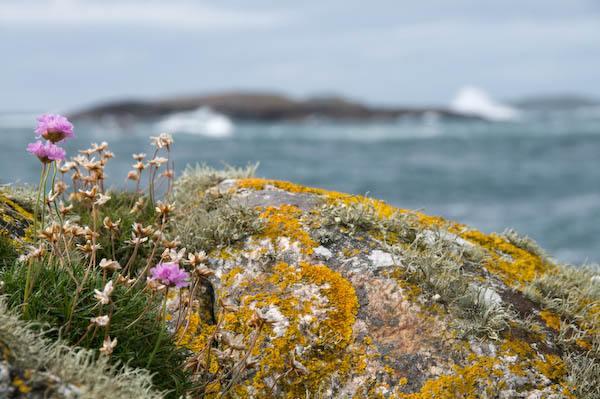
Back to photography, I’ve just updated My London Diary with the rest of my pictures from Scotland, including work from Glasgow, Iona and Staffa. The picture above is from Iona and illustrates something I don’t much like about the Nikon 18-200VR lens I wrote about recently. I find it’s rendering of out of focus areas (sometimes referred to as ‘bokeh‘) just slightly unpleasant. Yet another reason for using wide-angle settings where you can get everything in focus!

The Plot Thickens: Nikkor 18-200mm VR

Having just spent a couple of weeks with this as virtually the only lens on my camera, I’m beginning to sort out my thoughts about it and it may help me (and possibly others) to set them down.

I thought it would be helpful to me to start by analysing which focal lengths I really used – at least for my more successful pictures. These are the images that I have bothered to develop from the original RAW files to save in my personal library as full-size high quality (92% in Lightroom) jpegs. Although I archive most of the RAW NEF files I shoot, these jpegs are my working collection of images.

For this analysis I used a small freeware program written by Paul van Andel, ExposurePlot and set it to examine all the sub-folders in my August 2008 directory, which contain 899 images. Of these, 34 were taken with the 10.5mm fisheye (a small but very important proportion which could not have been made otherwise) and the remaining 865 with the 18-200mm.

Lens use
Too small to read! The left hand bar is the 10.5mm fisheye. Other bars represent the number of images grouped around 30mm, 60mm etc to 300mm.

The results were interesting – and of course could be very different to those of other users. Almost exactly two thirds (66.8%) of the images were taken in the range 18-33mm (equivalent 27-50mm) with  38% with the lens at or very close to its widest setting. Around 10% were in the 70-90 mm equiv range, 8% in the 100-160mm range and around 11% at 180-300 equivalent, of which half were at the 300mm setting. The table (made with a little help from Excel) gives the fuller picture.

August images with Nikon 18-200 VR

Focal length
Actual  35mm Eqv  Frames  Cum Frames  Cum %
18       27        329        329       38%
20       30         84        413       48%
27       40         86        499       58%
33       50         79        578       67%
40       60         14        592       68%
47       70         27        619       72%
53       80         43        662       77%
60       90         19        681       79%
67      100         10        691       80%
73      110         18        709       82%
80      120         13        722       83%
90      140         18        740       86%
107     160         14        754       87%
113     170          4        758       88%
120     180          8        766       89%
133     200         14        780       90%
153     230         13        793       92%
173     260         18        811       94%
200     300         54        865       100%

So with an 18-70 I could have taken 80% of these images, or with an 18-125mm roughly 90%. But the large number of images at the widest setting also suggest that I really would have preferred something a little wider (and yes, I do feel that when shooting – which is why my full kit also includes a 10-20mm.) I also have a suspicion that I wouldn’t really miss some of those that I took at or around the 200mm setting.

If the guys at Nikon  (or Sigma, Tamron etc) are listening, what I’d really like for a super-zoom is something like a 15-100mm lens. Perhaps the closest at the moment are the Sigma 17-70mm f/2.8-4.5 DC Macro / HSM, which is also reasonably small – almost exactly the same size as their 18-125 OS, another contender, along with Nikon’s own 18-70mm and the Tamron 17-50mm f/2.8 SP XR. Nikon also have a classy but big and heavy 17-55mm, a good lens but not for going light.

So what do I think now of the Nikon 18-200 VR? (This isn’t exactly a review – for a rather more balanced view on this and other Nikon lenses I recommend Thom Hogan.)

Its plus points are obviously its size and weight, impressively small for a lens with such a large range, but just a little big and heavy for the holidays. And there is the VR, though I’ve never been that convinced it did anything for most of my pictures (of course it doesn’t help with moving subjects.) I keep it switched on, but I’ve no idea if it helps or not.

It’s also a reasonably sharp lens, usable at full aperture when you have to (though better stopped down – like almost all lenses.) But that’s true of most modern lenses and it generally takes resolution charts rather than typical subjects to show up their weaknesses.

On the down side, it’s big enough to make the flash built in to the camera useless unless you like a big area of shadow at the bottom of every shot, at least around the wide-angle end (slightly better if you remember to remove the lens hood.) Almost every picture needs correction for chromatic aberation for critical use, and again for architectural shots, horizons etc you need to correct for barrel or pincushion distortion. Fortunately Lightroom handles the chromatic stuff easily (the camera can do it automatically for jpegs and the Nikon raw software also handles the job, but I can’t cope with its workflow.) And  ePaperPress’s PTLens is a real bargain and does a great job when those lines need to be straight.

It’s not a perfect lens, but I can live with these problems. But what has caused me considerable pain is autofocus. Perhaps I’ve just been unlucky, or it may be that the build quality of this lens isn’t up to my lack of care with equipment. But too often I’ve half-pressed the shutter to focus and it fails to do so. I took it in for service earlier this year and it improved a bit, but on holiday it was back at it’s old tricks. Yet when writing this article I tried it out and it was perfect.

This kind of intermittent fault is a real pain, both for the user and the repairer. Fortunately for me even when it’s at its worst it still focuses at the extreme ends of the zoom range, just not anywhere in between. As the graph shows I use it most around the ends, and I’ve got into the habit of focussing there and then holding the release half-down while I zoom back to take the picture. But sometimes the delay involved has led to my missing the critical (or even perhaps decisive) moment.

An Increasing List

I don’t know if it’s some kind of medical condition, perhaps a harbinger of oncoming senility, but I’m developing an increasing list.

Not an ever longer chronicle of those who, come the revolution will be lined up against the wall though my weekend stroll though the deepest home counties might well have prompted that.  Nor even a more and more lopsided walk due to the weight of my camera bag on my left shoulder – always my left shoulder as I collapse in pain after a just a few minutes with it on my right. It’s perhaps strange that with the coming of digital its weight has grown considerably from the more carefree past of film, when the heaviest item in the bag was a bottle of water or in winter a flask of coffee. Who would have thought all those electrons could be so heavy?

Somehow in the old days I seldom needed a flash unit or all those large spare batteries and (though I don’t often carry it) a notebook computer. Spare batteries back then were a couple about the size of a 20p piece that I changed every year on my birthday whether they needed it or no.

No, my problem is that none of my pictures are upright any more. Verticals ain’t vertical and rivers and oceans pour out from right or left frame. While a ‘dynamic composition’ may often be appropriate (as we very clearly learnt from Garry Winogrand) for demonstrations and street photography , it doesn’t always look too fine in landscapes and architecture.

One of the few possibly useful features found in the Nikon D3 lacked by the D300 is an ‘virtual horizon‘ or camera level that can be displayed at the right edge of the image in the viewfinder. Possibly it might solve my problem, but only at the expense of the camera’s weight crippling me over a long day’s work.  Of course the recently announced and lighter D700 has it too…

Incidentally, for a rather different set of pictures taken with the D700, take a look at Jim Reed’s gallery – Nikon lent him a pre-production camera early in April and he used it for a hundred days of chasing storms – there is rather scary image of him running towards a tornado holding it on the page where he writes about the camera giving it an excellent rating for durability and weather-resistance. Storm-chasing isn’t an area of photography I’ve ever felt drawn to, but I did find some impressive examples as well as a wealth of excellent advice on both techniques – such as how to photograph lightning – and also some very important safety information when I wrote a feature a few years ago.

What the D300 does have is the ability  (Custom setting d2) to project a rectangular grid on the viewfinder display. This is something I’ve avoided using, finding it too obtrusive as it flashes up in bright red when you autofocus. But now I’ve turned it on – and added it to ‘My Menu‘ so I can quickly turn it off when it gets really up my nose. It really is useful to be able to list just those things you want to access while shooting on that My Menu page so that they are there at the press of the menu button.

For years I walked around with a shift lens on the camera, getting things straight and even largely managing to avoid convergence when I wanted or needed to tilt the camera, though it’s main purpose was to allow me to stand in the right place and get the perspective I wanted. I don’t have one for the digital body, and my work has changed so I seldom miss it. With this lens, my favourite viewfinder screen in all my Olympus bodies (two OM4, OM2 and OM1) was a ruled one, finer and with a better thought-out layout than the Nikon version.  It also worked so well with other lenses that I very seldom bothered to change it. Funnily enough the Olympus one didn’t flash red and you could focus manually and precisely on the screen. Sometimes progress seems to go backwards.

Of course it’s easy enough to correct a list. In the darkroom we came to do it almost without thinking when needed, rotating the easel slightly to make the print straight. For digital it’s just as quick in Lightroom, pressing R to change to the crop/rotate screen, dragging the image as required, then D (or R) to return to develop mode.

If you use Photoshop (at least in version 7) it is a little slower still, but perhaps easier to get absolutely right. Change to the measure tool (it’s an alternative to the eye-dropper) and click to mark two ends of a line that should be either horizontal or vertical; then go to the image menu, choose Rotate Canvas, Arbitrary…, and click on OK. Then crop away all the extra background colour the rotate has added. You can just drag a marquee over the area you want to retain using the crop tool and double click, but I usually prefer to drag guides from the rulers (Ctrl R if they aren’t visible) to mark the 4 edges, then, when I’m happy these are in the correct place, use either the crop tool or the rectangular marquee (with ‘Snap to Guides‘ set in the View menu), finally using View, Clear guides. It is a bit fussier, but that way you know exactly what you are doing, and I find it  is rather easy not to get it quite right with the crop tool.

All this – even in Lightroom – does slow things down, and if like me you usually crop tightly in the viewfinder, presents a problem as the rotation results in a need for further cropping of the image.  So it’s better to get the tilt exactly how you want it in camera. Better still if you don’t need a gadget like the virtual horizon to do so.

More on Metadata

Thanks to a friend for pointing me at the presentations now on-line from the 2nd annual Photo Metadata Conference, held in Malta on 5 June 2008, which included the first public presentation of the refurbished IPTC Core and a new IPTC Extension set of photo metadata.

If you feel you missed out on a jolly trip to Malta (and last year’s event was in Florence) then at least you can console yourself at having missed all of the Powerpoint presentations that are now available for download. Most of them actually seem to be saying more or less the same things and at times it seems as if the main interest during the sessions will have been in the colour of the shirts or dresses worn by the presenters.

Not that this is necessarily a bad thing. If you did get there it meant you could have spent your time in the bar and not missed a lot, and it’s good for all of us that there does seem to be considerable agreement over the necessity of metadata and its future direction.

Actually there are a few points of interest, especially for me in a presentation (download it from the programme page) by David Riecks that shows just the pig’s ear that major stock distributors make of it at the moment.

And that is really the root of the problem at the moment. There isn’t a great deal of point in a campaign to get photographers to put the meta-data in if libraries and others shake it all about and remove all or most of it.

Lightroom (and some other programs – but I use Lightroom) has made it relatively easy for photographers to add some essential metadata as a matter of routine when processing their raw files (or even jpegs if you have to shoot jpeg) although I’d like the process to start even earlier with camera manufacturers getting more into the act.

Every picture we shoot digitally now has EXIF data recorded, including the date and time. No photographer should ever find themselves having to enter this data into software manually (though if – as I’ve done at times – we manage to set the wrong year or the wrong time zone, we need to be able to correct it.) Software can pick it up automatically and rewrite it wherever it’s needed.

My camera also allows me to add some user-input data to every picture. It would only add a few bytes to firmware to allow the entry of some specified fields – such as copyright (what my data always contains), e-mail address and perhaps ‘Headline’ which would then be available to software. Which could then, for example copy the files to an appropriately located and named folder when you upload these to your computer, and perhaps also choose appropriate pre-sets for other purposes.

Several of the presentations address some of the real basics that make metadata useful, such as:

  • data should never need to be entered twice
  • it should be and offence to remove metadata or edit it without permission

(Some copyright lawyers claim removal is already is an offence under copyright law.)

Keywording
Perhaps the discussion that I would have found of most interest was “Keywording versus Controlled Vocabularies” which rather strikes me as a false dichotomy. To make keywording really useful you need a controlled vocabulary, and a controlled vocabulary seems to require some way to use it, which is by keywording. This was a ‘panel discussion’, and what you can download certainly throws little light on the topic.

Perhaps one of the problems is that the same keyword needs to be able to sit in several different hierarchical trees. Yesterday I was adding the keyword ‘Haka’ to some of my images to go in a library (actually I was adding it for a second time, because it was a keyword in the file I was uploading, but the system doesn’t read most of the metadata in the files – so I spend hours and hours re-keying.)

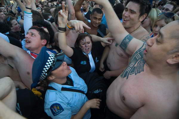
Haka in Parliament Square
Haka in Parliament Square for Waitangi Day

If I was setting up a keywording system using a controlled vocabulary I might want to include Haka in a heirachy part of which would look like this:

>Country>New Zealand>Maori>Culture>Haka

but I might also want to include it in a hierarchy that was cross-cultural and looked at various types of dance and their function, part of which would look like this:

>dance>war dance>Haka

or perhaps we might want to look at it in yet other ways.

How we make such links is important both in keywording and also even more so in developing smart methods of searching – which is really the important end of the process.

PLUS
Something that I think we will hear more about is PLUS, the Picture Licensing Universal System, which will provide a single world-wide system for describing licences and to embed licensing information as metadata in images. It won’t replace IPTC, but provides only licence-related information – including of course address and copyright details. It seems it will be free to use, although I’m not sure whether non-members of PLUS will be included in their seachable creator data-base when this is up and running. Widespread adoption of PLUS would give added protection to image creators and clarify conditions for those wanting to use images.

Of course the success of such a system depends in part on national laws. If the US does decide to do its own coach and horses over so-called “Orphan Rights” (as to some extent it has always done on copyright) it will almost certainly severely weaken the utility of PLUS. But intellectual property rights are increasingly an important part of world trade, and perhaps the age when the US can run the world is coming to an end?