Nikon 16-35mm & Lens Hood Lunacy

If there is one thing that is ever likely to alter my allegiance to Nikon and switch to some other make of camera (and I don’t think it is likely to be Canon, though I’ve nothing against them, but there is just no real advantage) it will be lens hoods.

The 16-35mm f4 Nikon is a fine lens in many respects, and once I find the time to make a profile for it to use with Lightroom (or someone else kindly supplies one) I’ll be happy using it for almost anything. Even at f4 it seems pretty sharp right to the corners across more or less the full range (perhaps just a little less than biting at the 16mm end.)

For many of the pictures I take or people and events the slightly obvious distortion at 16mm doesn’t even show and can actually be a slight improvement, as more often the little bit of vignetting can also be. If it wasn’t there I’d probably want to add it in some images. And the chromatic aberration generally isn’t too noticeable in moderate sized prints either, though I’d like to remove most of it as a matter of course. I’ve seen little or none of the more troublesome blue fringing that besets some lenses, probably on account of the slightly awesome length of this wide-angle. It does get rather confusing when I’ve two cameras hanging around my neck, one with the 16-35mm and the other with a 55-200mm and I have to keep telling myself that the one with the considerably shorter lens is the telephoto.

Doubtless the size and weight of the lens are linked to its optical performance as well as to the presence of the vibration reduction. I’ve yet to detect any real advantage of this when I’ve had it switched on, and I suspect it is actually a problem in fast-moving situations, where I’ve found some frames with an inexplicable lack of sharpness that I can only blame on it.

It’s fast to focus, and I think precise in doing so. It feels pretty well built and although we haven’t really had the weather to test it I suspect will cope with the elements better than my other lenses.

The only real problem I have with it is the lens hood. Of course you don’t expect it to be too effective for a zoom of this type and to some extent it is as always just a convenient rest for your hand which will do the real job of shielding the front element from direct sun without obscuring too much of the picture (since you don’t quite see the frame edge in the viewfinder you may have to crop slightly.) And its main function is of course to cut down the chance of those straying fingers marking the front element, which it does reasonably well.

But almost every day I use this lens I find at some point, sometimes several times that I’m having to reach down to the ground to pick the wretchedly flimsy and poorly fixed plastic ring up. Yesterday I was lucky to be able to retrieve it in once pieces as on one of the three occasions it came off it rolled onto a busy road in front of oncoming cars. Fortunately they swerved to avoid me as I stepped out towards it, thus missing the lens hood also.

I’d glue it in place, but the lens fits much more easily in my bag with the hood reversed. Perhaps I should carry a roll of sticky tape and add a length of this after bayoneting it in position. Although the Nikon HB-23 hood looks and acts as if it should be disposable, this simple plastic moulding that must cost pence to produce actually costs £15 or more to replace.

I’m not sure whether the answer needs simply the use of a better material for the lens hood or it actually needs a redesign of the bayonet fitting. Perhaps a hood with the existing bayonet could somehow be fitted with a more adequate locking system. But guys, it really is a problem and I know I’m not the only photographer who thinks so.

So Nikon make a really good wide angle zoom that costs around £1000. With some slight doubts about the need for the VR it’s a lens that can be highly recommended. So long as you don’t mind occasionally risking your life chasing errant lens hoods.

Battersea & Wandsworth

 © 2010, Peter Marshall

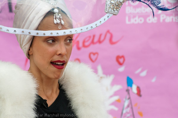
After a fairly quick and not too productive visit to the early Bastille Day celebrations in Battersea Park last Sunday (more pictures) I decided to go for a walk along the Thames. There don’t seem to me to be many ways you can photograph a lively quartet of young women dancing the can-can (and it’s been a long time since I was in any way turned on by frilly red underwear) and I’ve never really understood why anyone would pay to watch the kind of dance spectacle put on by the Bluebell Girls at the Lido de Paris.  It was I suppose moderately diverting for a few minutes at Battersea Park, but I certainly had no desire to watch it again.

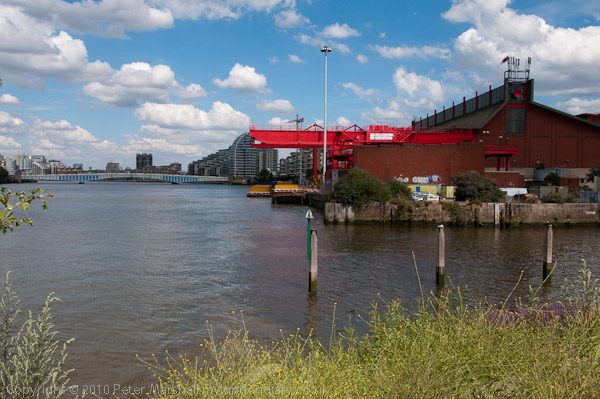
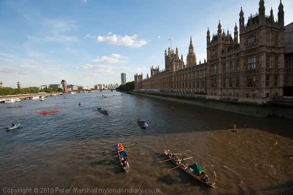
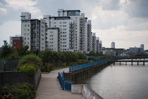
The Thames Path had considerably more visual interest on offer, and a few surprises as you can see from the pictures.

© 2010, Peter Marshall

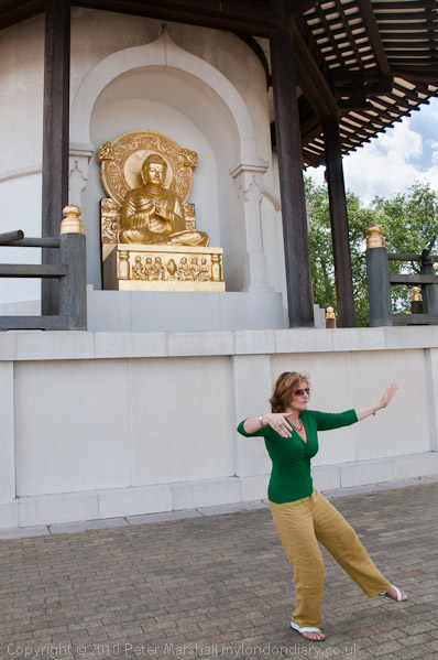
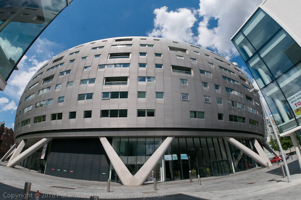
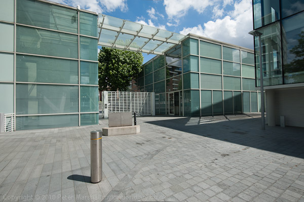
Of course I’ve walked this way before – and was at the Peace Pagoda last month for its 25th anniversary.  I’ve photographed the buildings of Albion Riverside before, some fairly remarkable recent cityscape and probably an improvement over the bus garage they replaced – one of relatively few London riverside residential developments of some architectural interest, along with the neighbouring offices of it’s architects, Foster + Partners.

© 2010, Peter Marshall

© 2010, Peter Marshall

Both provided me with an opportunity to try out the possibilities for image correction of Lightroom 3,  although for Albion Riverside I chose to only slightly reduce the fisheye perspective of the 10.5mm Nikkor, as is fairly obvious in the curvature of the straight-sided buildings at left and right. The lower image of the architects offices has been corrected for the fairly obvious barrel distortion given by the Nikon 16-35mm f4 lens at 17mm, and had I not been in a rush to put work on the web site I could also have corrected the very slight convergence of verticals and rotated the image the very slight amount needed to keep the verticals absolutely vertical.

Although very large amounts of correction do give visibly less sharp or detailed results it is very easy to make small corrections in Lightroom, and produce an image from a relatively quick hand-held exposure into the kind of picture that would once have needed long and careful setting up with a camera on a tripod, and probably only really possible with a camera with movements. Of course not all architectural shots need everything so tightly controlled, but it is good to be able to do so easily if required.

As you can see in the pictures on My London Diary, I walked on around four miles in all, turning back to catch a bus just beyond the mouth of the Wandle. The temporary path there has a fence around 6 foot tall with railings too close together to photograph through with the largish lenses on my Nikons, and on my previous visit there in April I gave up at this point.

This time I decided to photograph over the top of the fence, and held the camera up above my head on the top of the fence, far too high to look through the viewfinder. I always knew there must be a use for ‘Live View’ mode, and this was it. Although the bright sunlight prevented me from seeing the image on the back of the camera with any clarity, I could see enough to tell whether or not I had the camera level.

© 2010, Peter Marshall

I’d have preferred the tide to be lower and will need to go back one day when it is to get some more pictures, but as you can see the image is pretty well level, thanks to just a little tweaking in Lightroom.

More of the pictures from the Thames Path on My London Diary.

Watermarks

I don’t like visible watermarks on photographs. It so often spoils the enjoyment of photographs particularly where they are repeated at intervals across an image or are particularly large. Even where they are added in a reasonably sensitive way – as on the Demotix site which I contribute pictures to – for example this recent story about the Sharia Law related demonstrations in Whitehall or on other commercial sites, they sometimes just interfere too much with appreciating the pictures.

But increasingly I’m finding my work being used without permission or attribution on blogs and web sites, though unfortunately  so far seldom on the kind of site it would be profitable to take legal action against. Usually when I point out the problem I get an apology and a timely and appropriate response – removing the image or adding a link if it is the kind of non-profit acceptable use I’m happy to allow.

Most of the people who misuse images seem to do so out of ignorance. They search on Google Images, come up with a suitable picture and assume that because Google can use it so can they (despite what the site actually says.) We do have a lot of education to do about intellectual property rights.

Until fairly recently we didn’t realise the importance of image metadata and many web sites and web tools for preparing images simply stripped out any present to slim down image files as much as possible. In the days of dial-up connections, it paid to keep your sites clean and mean.  Now it’s long past time to get rid of such systems –  still around on some major sites – and everyone should now realise that removal of such information from files is an offence.

As a photographer I didn’t realise how important metadata was to me until relatively recently – perhaps around five years ago. Naively I assumed it was enough to just put a copyright statement on every web page, and metadata was then pretty obscure technology and time-consuming to add, even if you had software that could handle it.

Things have changed. Lightroom now adds my copyright data automatically from a preset to every digital image I take and import (its also there from the camera, but hard to find software that understands those notes.)  My Epson scanner software currently doesn’t have this capability, which I think is a major failing that they need to address.

The threat of orphan works legislation still looms over us here in the UK, despite the valiant efforts of some photographers (see New Thinking on Copyright) and our problem is that it does not only affect photographers. Some of the other groups with an interest in the matter were quite content with the proposals that were defeated, and I’m at all not convinced that we will get a satisfactory end result.

© 2010, Peter Marshall
The watermark shows up well on the brown river water

So one of the things that I’ve changed as I moved to Lightroom 3 is to update my output settings for files to include a copyright watermark for all images I will put on the web. I’ve made it small, not very noticeable and in the bottom left corner of every picture. Although it isn’t always very readable, I think it is always fairly definitely present and hard to entirely miss.

© 2010, Peter Marshall
But not as well on some lighter images – though it’s still definitely there

It could easily be cropped off, although I think most people would realise they were doing something wrong if they did so. And I hope few of my pictures work quite as well with the bottom missing.

Actually, certainly when looking at a number of amateur sites, there does seem to be some kind of rule which applies, stating that the more prominent the watermarking the less the pictures are worth looking at (or stealing.) So I’m happier than mine are not too intrusive, though it might perhaps be nice to use one that automatically inverts the tone of the surrounding pixels in some way to produce dark print in light areas. I can’t at the moment see how to achieve this in Lightroom – unless someone has produced a plugin for it.

Rathayatra

The annual chariot festival where the Hare Krishna pull their three giant chariots along Piccadilly from Hyde Park and on to Trafalgar Square first came to London in the 1980s, and I’ve photographed it several times. But it has now settled into a rather similar pattern each year and I found it hard to really find anything new this year. This year’s pictures are here.

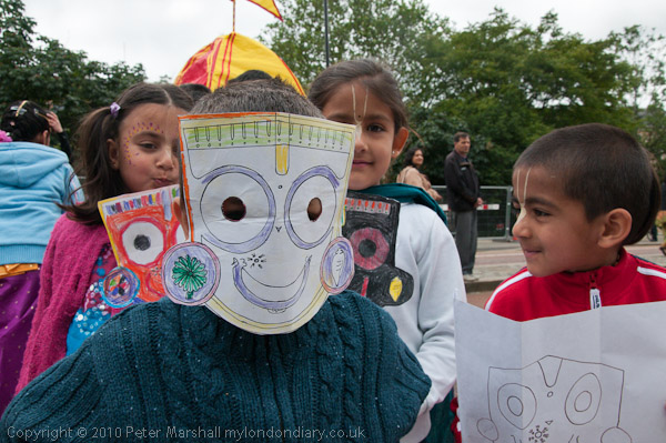
Last year was the 25th procession here, and perhaps attracted a few more people, as the numbers seemed a little smaller this year than in previous years.  The three large chariots, each with a Hindu god or goddess, were much as before, so while I took some pictures of them I tried to concentrate more on the smaller parts of the event and on the people.

© 2010, Peter Marshall

As usual when the sun came out from behind the clouds I used some fill flash, and had some problems with it. The D7oo on the right settings usually works with fill at any shutter speed, though the manual is more than normally opaque about this. However with the SB800  which I was using, with custom setting e1 at 1/320s (Auto FP) when a faster shutter speed is selected in exposure mode P or A “auto FP high speed sync will be activated if the actual shutter speed is higher than 1/320“. Usually this just works, but today it had given up, and only parts of the frame got the flash exposure. Some of them can be be salvaged in processing  with Lightroom’s graduated filter or local adjustment brush, but its a pain to have to do it. I’ll post an example from later in the day in another post.

I probably should have noticed the uneven exposure on the camera screen while taking the pictures, but most of the time the lighting was too bright to see them properly, and I just took a quick glance at the histogram to see if everything was ok – and of course it was.

When I did see the problem on the computer screen later, I wasn’t sure if it was a camera fault or a flash fault and though I knew I needed to sort it out, there were other more urgent things to do.  When I finally got round to doing some tests I started with the same camera, flash and lens and found everything was working perfectly!

Actually whenever I have flash problems and run tests I get the same results – its only in the field that the system sometimes misbehaves. And I think the problem is mainly the photographer, or occasionally a dirty contact. When you fit the flash working in a hurry it is too easy not to slide it fully into place, and although there is a lock, it perhaps isn’t quite as positive as it might be and I do sometimes fail to push it right across. Then looking carefully at the hot shoe it isn’t as clean as it might be, though perhaps putting the flash on again for the test may have cleaned the contacts enough to make a difference.

But it appears to be good news, and I can avoid another expensive repair (the only kind there is for photo gear.)  I’ve taken my glass fibre contact cleaning brush to both flash and hot-shoe to be sure there isn’t a dirt problem and added checking these to the list of occasional tasks to do to keep the gear working, and made a mental note to push the flash on firmly and check I’ve engaged the lock fully in future.

Ligthroom 3 – First Impressions

My upgrade copy of Lightroom 3 arrived yesterday morning – I’d ordered it on CD rather than as a download because I still like to have a box with the serial number on it. So here are my first impressions – and most of the things I mention I’ll post more about later, where helpful with some images to show the differences. Today I’m still trying to get to grips with it while cursing at not being able to get out and take pictures until after the gas engineer gets here to deal with our water heater that gave up on us just as I tried to shower this morning.

Installation

It installed without problems, other than me putting in my old serial number when required to licence the product and wondering why it didn’t work. Of course I needed the new one which was on the plastic container with the CD, and once I had entered that it actually automatically created another set of boxes ready filled in the original serial number. It would have been clearer had it provided both sets of boxes to start with, and labelled one of them ‘original’ and the other ‘upgrade’. It’s the kind of little thing that suggests an inability to think like the user seeing the install program for the first time. They really need to have idiots like me to test it on!

Other than that, there should perhaps be a rather more accurate warning about the time it will take to update your existing catalogue. I think it said it may take a few minutes and it actually took six hours. Yes I do have an over-large catalogue and a slightly ageing computer!

Stability and Speed

So far I’m both impressed and a little depressed with LR3. The promised extra speed and stability doesn’t make itself felt on my system, if anything it sometimes feels a little more sluggish at many operations. I’ve seen the message “an unknown error occurred” perhaps a dozen times today, and it doesn’t inspire confidence. And as with previous versions I’ve found a need to keep an eye on the software slowing down, when to keep working efficiently you need to exit and reload. It doesn’t take a great deal of time but it shouldn’t be necessary, and suggests some poor memory management.

A couple of times today, when I’ve been working through a filmstrip selection filtered to show only images with 2* and greater I’ve suddenly realised that LR3 has reverted to working on the full set of images, and there have been a few other similar glitches. Some of them may have been due to user error – often a problem with new software, but I’m not sure.

High ISO Images

Good news came when I tried the software on a set of images taken last Halloween, some at high ISO, and I think that every image showed at least a slight improvement thanks to the new processing engine, and certainly because of the improved noise reduction. Still perhaps not up to the best of external NR software – such as Noise Ninja, but I think the gap is small. If you are interested in seeing pictures rather than examining them microscopically I think you will find it good enough.

Distortion, CA and Vignetting

The other really big feature LR3 promised for me was the automatic treatment of distortion, chromatic aberration and vignetting. I’ll write more about that with some examples in a later post. It works pretty well and seems very flexible, and if a lens preset doesn’t do the job you can still do more things manually than you could before. But the real problem is that at the moment few of the lenses I use are covered by the software.

Lens profiles

Sigma apparently collaborated with Adobe and profiles are provided for over 50 of their lenses, but unfortunately not the one I most often use. Neither Nikon or Canon appear to have given any help to Adobe, and there are only a little over a dozen Nikon lenses and roughly twice that number of Canon lenses included, along with one or two from other manufacturers.

I think only two of the lenses currently in my active kit have profiles supplied, the Sigma 24-70 f2.8 and the Nikon 10.5mm fisheye.  It also has a profile for a Sigma 10-20 f4-5.6 DC HSM EX lens, but for some reason doesn’t automatically apply this – perhaps my lens is a different version, although it does seem to more or less work.

Adobe do supply a free download with targets to photograph and software to produce profiles for any lens, and when I’ve some spare days I’ll give it a try – but it looks like a fairly long job – with 72 sets of 9 carefully made images needed for a complete lens calibration of a wide-angle zoom. They encourage people to upload the profiles they’ve made and say they intend to make them available. But not so far for LR3 users.

There may actually be profiles available on the Adobe web site, but unless you have a copy of the latest version of Photoshop you cannot access them. I suppose  I  could install a trial copy to check for them and download if present, or find someone who has a copy and ask them to look for me, but I really think I should not have to do so.

Apparently they ran out of time to incorporate the button which would connect and download these additional profiles into LR3 – and so perhaps it will arrive in LR3.1 or soon after, but in the meantime they could avoid an awful lot of illwill from the buyers (or prospective buyers) of Lightroom simply by making them available for manual download. It would only take a minute or two of someone at Adobe’s time to make a zip file available of the whole set and update it every month or so.

But I frankly think we deserve rather better from Adobe. A make your own profile approach is acceptable for almost free software – such as PTLens – we deserve rather more given the cost of Lightroom, and we should be at least provided with profiles for the full current range of lenses from the major manufacturers. Neither the 18-105mm DX Nikkor nor the 16-35mm FX lens have a profile provided as yet.

File Export problems

This isn’t by any means a perfect release, and parts of the file export system have never worked too well. I export jpegs for my web site at 600×600 pixels, and although it’s convenient to do this from Lightroom, I’ve always been able to get both smaller files and higher quality by starting with full size output files from LR and batch processing them down to 600×600 in other software – including an old copy of ACDSee Pro which I mainly use as a file viewer.

Things may even have deteriorated in LR3. One of the files in the batch I tried it out on came out at 455KB, and several others were between 150 and 200KB. Back in the old days when we all connected dial-up I used to think 60KB was a large web file. Nowadays it isn’t quite so important, but 455KB is still over the top.

So I noticed that instead of specifying a percentage for size in the output dialogue you could chose a maximum size. I selected just the one image with the big output file and set the maximum size to 200KB and clicked. This time it came out as 565KB!

Fortunately there is a work around and I’ll have to get used to it – simply by outputting the files via the web module to a temporary web directory, then finding the image files and copying them to the folder in my web site and deleting the rest of the generated junk. That way the problem image came down to just 102KB and actually looks better – and it was no longer the largest file in the set. It looks to me as if files that needed a lot of local adjustment are not being properly handled in the export module. It’s a bit of a paing to have to do the extra steps.

Watermarking

LR3 does however enable you to very easily set up watermark presets, and I’ve decided from now on to include a relatively unobtrusive copyright message at the bottom left of each picture I put on the web. More about this in another post.

Should You Upgrade?

I think for most people the answer is clearly yes, it’s already worthwhile, and like previous Lightroom versions many of the annoyances will in time be removed by free fractional updates. Some which were present in previous versions will probably continue.  It’s perhaps surprising given the long time LR3 was in public beta that there still seems to be quite a lot to do.

But most of the problems are relatively minor, and overall it’s a very impressive program that does everything you need for almost all of your digital images from the point of exposure to the final output with a minimum of fuss and very little duplication of effort or files. Unless you have peculiar needs (and perhaps if speed is the only consideration and you don’t need the features this software offers) then Lightroom will simplify your work and get you better organised.

Like all such Swiss Army knives, other software can do some of the individual tasks it performs slightly better, but mostly the differences are pretty marginal. I’ll still use Photoshop occasionally (though mostly when working with scans rather than digital files) and some other software, but rely on Lightroom for the bulk of my work with images.

Some more detailed posts about LR3, with some image examples will I hope follow when I have time.

Sigma Lenses

Here’s a post I wrote a year ago, but never actually completed!  The pictures were taken on Sun 28 June 2009.

© 2009 Peter Marshall
Less depth of field than I like at f2.8 – I should have stopped down

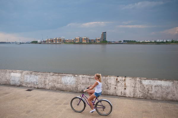
One or two of the pictures here and from the chariot festival earlier in the day don’t quite have enough depth of field for my taste; having just got a new Sigma f2.8 24-70mm I wanted to see what I could do with it, particularly wide open. The shot above was taken at f2.8, and although the cyclist and the wall are sharp, the buildings on the other side of the river are a little soft. In this case it may help the picture, but generally I think I prefer things sharp. The lens does pretty well wide open, but stopping down to f4 or more does just add a little edge on sharpness and also reduces the vignetting you can see in the images above and below, both or which are uncorrected. Of course it’s a simple job to correct this in Lightroom.

© 2009 Peter Marshall
Some noticeable vignetting on  FX with the Sigma DX lens

I was also working with a Sigma 55-200mm f4-5.6 DC lens, one of the lightest lenses I own at around 350g, which I’ve had for several years. I’ve never thoroughly tested this on the D200 and D300 I’ve used it on, but certainly the results seem at least one tad sharper than those from the Nikon 18-210mm, perhaps hardly surprising given its much smaller zoom range.

I tried this lens on the D700, but as it is a DC lens, designed for the smaller FX format I expected to have to switch the D700 to FX format.  To my surprise it seems to give pretty good results on the large FX format too, especially at the longer end. It has now been replaced by the slightly heavier 50-200mm f/4-5.6 DC which I’ve not tried and may or may not have a similar coverage.

Comment added on June 27 2010

I’ve used various Sigma lenses over the years, and particularly those in the EX range seem generally to be excellent performers and most of them have proved pretty robust. The Sigma 12-24mm EX (now replaced by a similar but improved model) is certainly good on the DX format, and the results are ok on FX, except that the 12mm end does really go too far on full-frame 35mm. The occasions where a rectilinear lens with a focal length of less than 16mm really works are few and far between – not a criticism of the lens but it is just a little too extreme.

It’s also a lens with an exposed very curved front element, impossible to use a filter for protection. Mine lasted for around 3 years before it began to have too many little defects to be really usable – giving vaguely soft areas or excessive flare whenever it was used against the light. The good news is that is wasn’t hugely expensive to have the front element replaced with a new one – I think about a fifth of the cost of a new lens, but the slightly bad news was that it took around a couple of months for the new part to arrive here to be fitted.

I’ve written before about the problems that developed with the Sigma 24-70mm.  Eventually I got a replacement lens from Japan and everything seemed ok for a couple of weeks. Then I was taking pictures on a family visit to Richmond Park and the lens jammed again, refusing to zoom past around 30mm. Cursing I packed it up and sent it back to Sigma, getting a phone call a couple of days later asking what the problem was because it seemed to be working perfectly. I think the shaking in the post must have managed to free whatever was jamming it. I told them what it had done and they promised to check it out before sending it back, and I hope the problem is now solved, but although it seems to be working perfectly I’m still keeping my fingers crossed every time I take it out.

One piece of good news is that this is one of the lenses that has a profile that comes with LR3, correcting the distortion (noticeable on some shots at the 24mm end), most of the chromatic aberration (which is pretty typical for a lens of this type) and the vignetting. So there are good reasons to use this lens now.

Would I buy Sigma again? Yes, despite the problems with this one lens. I’ve owned half a dozen or more others that have been good, and either had unique characteristics that appealed to me, or have offered a fairly substantial saving over the Nikon equivalents. And I think all of them have had better lens hoods – I get really fed up with the rather flimsy Nikon lens hoods which seem to fall off at a fairly light touch – they are just not made of a stiff enough plastic.

Ethics and Images

Reuters issue guidance to its photographers and journalists in A Brief Guide to Standards, Photoshop and Captions, which has probably become one of the most misunderstood documents on the web. As might be expected, it includes a great deal of very good sense, but although the principles set out in the document are useful and straightforward enough, most people have misinterpreted the intent of the guidelines.

Unless you work for Reuters (or a similar agency) and have the luxury of leaving working on your pictures to the picture desk, they are really nothing to do with how or how much you should work on your own images.

I don’t have anyone to do my work and I don’t like the idea of leaving others to work on my pictures. Back when I used film I preferred to make almost all my prints myself, regarding my input into that as a part of my work as a photographer. I learnt to be a good printer, and certainly a far better printer than anyone I could ever afford to print my work for me; good enough to be asked quite a few times by other photographers if I would print their work, though I always said no.

The Reuters guidelines are there so that photographers who have not been granted greater “Photoshop privileges” don’t mess up their pictures but leave the real jobs to the trained guys on the desk, who photographers are encouraged to ask to do things like “lighten the face, darken the left side, lift the shadows etc.”  Too many of those who have commented on them or recommended them simply have failed to realise this (and it’s an easy trap I’ve to some extent fallen in in the past.)

It isn’t in any case sensible to try to lay down rules about exactly how much of this or that tool is permissible, not least because many photographers will use different software and hardware. Trying for example to set down limits for sharpening ignores the very different approaches to in-camera sharpening (even of RAW files) adopted by different camera manufacturers. Even using the Nikon D300 and D700 I find different levels of ‘capture sharpening’ appropriate when importing images into Lightroom.

The key to what is or is not acceptable is always intention, both when taking pictures and when processing them.  The three rules that Reuter’s give boil down to respecting the content and journalistic integrity of the image and not doing anything that would mislead the viewer. This is basically all we need to keep in mind and apply.

Photography – at least in the areas of documentary, photojournalism and news – should be about the accuracy and clarity of transmitting information and ideas. Adjustments made to images which are essentially to correct the defects and limitations of lighting conditions, the photographic equipment, photographic skills and process are generally acceptable, while those that seek to alter the scene as perceived by the photographer or to produce graphic derivatives are generally inappropriate for documentary, photo-journalistic or news photography.

Traditionally in black and white photography, printing involved burning and dodging of areas to create an image that expressed more clearly the photographer’s intentions. Some of the best known photographers – Gene Smith being a prime example – at times pushed this perhaps beyond acceptable limits, but it is a degree of control over our work that few photographers would want to relinquish.

One area where it often becomes important is when using direct flash, where the lighting in various areas of a picture can be very unbalanced and some differential correction is often necessary.

What I think might help is to try and lay down some guidelines for photographers, and I’ve made a start on this below by trying to put various things we may do on a kind of spectrum of acceptability – between those things we should always attend to and those that we should never do. Of course there are problems, and sometimes its a matter of degree – almost anything can be taken too far and become unacceptable.

Although some of the vocabulary may be taken from Photoshop, I now see little reason for photographers to use this software other than for one or two very specialised tasks. Lightroom 3 now does more than 99% of what I need that I used to use Photoshop for.

Always appropriate (as necessary)

  • dust removal (scratch etc removal from film)
  • level adjustment
  • colour temperature adjustment
  • exposure adjustment
  • brightness adjustment
  • minor contrast adjustments
  • slight cropping
  • image rotation
  • highlight removal
  • image resizing
  • image sharpening (best done with suitable plugins rather than Photoshop)
  • distortion correction
  • noise reduction (Lightroom 3 probably removes the need for specialist software)
  • Vignetting reduction/removal

Often appropriate

  • Curve adjustment
  • Local dodging
  • Local burning
  • flare removal
  • local contrast adjustment
  • perspective correction

Sometimes appropriate

  • Deliberate blurring/pixellation of detail (eg to hide identity)

Seldom appropriate

  • radical cropping

Never appropriate

  • Content sensitive fill
  • Removal or addition of important image elements

I’m sure there is much I’ve missed out, and this is intended as an initial attempt at a rational discussion of the issues. It does reflect my own practice as a documentary photographer who has worked with both film and digital.

There are some difficult questions to which I have no answer. For example the use of slow shutter speeds to produce blur, sometimes with the addition of flash to produce visually powerful effects has long been accepted as legitimate in these areas of photography, and continues to be so in the digital age. But similar if not identical results can be achieved using suitable software. Personally I find this unacceptable, but find it hard to justify my opinion as to why it matters at which stage of the process this is done.

There are also some – relatively few – special cases where some extreme graphical techniques are appropriate. These generally are so obvious that it is hardly necessary to label them as such.

Where Was I on May 8?

Writing about ‘The New Thinking’ on copyright and the National Photography Symposium reminds me that I’ve not mentioned at all here what I was doing that weekend.  Apart of course from drowning my sorrows after the election results.

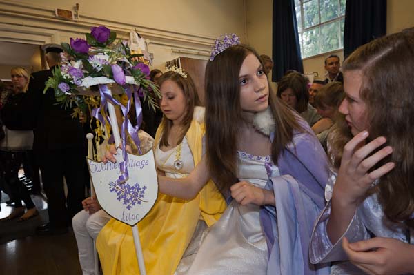
Saturday 8 of May I didn’t get drowned but I did get rather damp, as it poured down on several occasions. I’d hoped to be on Hayes Common, and so had around a thousand other people, for the Merrie England and London May Queen Festival, but it was far too wet for that. The event went ahead, but in a rather smaller format with many fewer people present in the Village Hall.

I’ve been photographing various May Queen events in London, including this, since 2005, and have more than enough material for a book or an exhibition about them. One show already promised was then cancelled apparently on cost grounds, perhaps an early victim of the recession, but I’m hopeful of getting another.  And its definitely one of the things on my short list for a Blurb publication if I can’t find another publisher (although that short list is getting rather long.)

I’d actually not been thinking of going to Hayes this year, as I should have been at a conference (not the NPS but another one) but an e-mail inviting me made me change my mind. We missed you last year it said, and so I changed my mind and decided to go.

Despite my getting soaked on the way there, it turned out to me a good decision, as being packed into a small hall gave the event a different atmosphere and of course a different look.  It’s nicer when the sun is out and everyone is having fun and dancing around – and of course much nicer for the girls and families involved – but the wet weather did give me something new.  Not the best pictures I’ve taken of these events, but something that widens the work.

Photographing events like this does very much involve getting to know people and establishing trust.  Working in the closer atmosphere (in every sense) did I think help me to talk to people and get to know them a little better. There are perhaps a few more things I may want to do in this project and this will make them easier.

I wasn’t sure whether to use flash or rely on a highish ISO inside the hall. The lighting was about as mixed as you could get – overcast grey sky through largish windows and fluorescents and some stage lighting.  In parts of the hall it was bright enough to work at ISO 1600 but there were plenty of darker corners.

I took a few without flash, but the colour on the back of the camera didn’t look too encouraging and I decided to switch the flash on. That way I could reduce the ISO a bit, with the flash as the main light source, but still picking up enough ambient to give reasonably even overall lighting. Most of the pictures were taken on the Nikon 16-35mm at 1/30 f6.3.   I would have been better off at 1/60 as I lost quite a few images through both camera shake and, more often, subject movement, and could well have increased the ISO as I was working with the D700. Though there are a few where I’ve actually panned a little with the moving subject thanks to the slow shutter speed that I quite like.

© 2010, Peter Marshall

If I’d known before I left that I would be working inside, I would also have taken the Sigma 24-70 f2.8, which I’d got back a few days earlier (a new lens as replacement for one that Sigma had been unable to fix)  but I’d left it at home.  I’d also have brought a second SB800 flash which I could have used on the D300 body; I had the Nikon 18-200mm on that but didn’t take many pictures with it.

The hall was too high for bounce, so I was using direct flash for all the pictures.  So long as there is plenty of ambient fill I usually find the results quite acceptable.  In the hot shoe, the SB800 puts the flash about six inches above the centre of the lens. Usually I use the built-in diffuser screen with wide-angles to get more even light distribution, though sometimes I like the little bit of vignetting you can get without it.

© 2010, Peter Marshall

One little thing I find helpful when there is someone very close to the camera on one side of the image is to twist the flash head away from them. Otherwise it can be hard to burn them down to an acceptable level in processing.

© 2010, Peter Marshall

And processing is something that can greatly improve flash images, often allowing  you to make the lighting rather more event when parts of the subject are at different distances from the camera.  People often don’t realise that I’ve used flash, and photographers sometimes ask why the lighting in my pictures is usually more even than theirs. I sometimes tell them that I prayed to the great god Ansel and was granted a special derogation from the inverse square law.

Of course there are many more pictures on My London Diary. It’s one of those events where it’s deliberately a very loose edit, because during the event I handed my card to many of the mothers and the people taking part all want to see pictures of themselves and their friends.

Olympic Panoramas

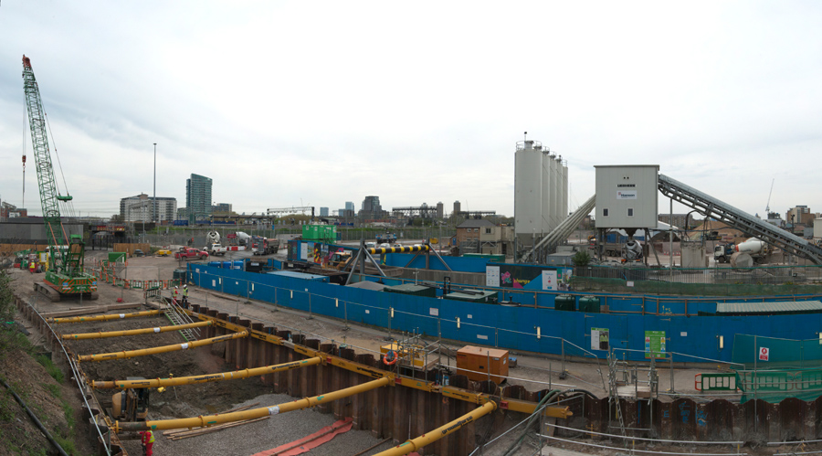
After photographing the ceremony for Workers Memorial Day in Stratford, I strolled back to the View Tube on the elevated Greenway above the Northern Outfall Sewer that goes through the centre of the site and took a few pictures to show the progress on the site, as I try to do at roughly monthly intervals.

I’d come out to cover the WMD event, and had not brought a couple of the things that help to make good panoramas, but it’s still generally possible.  I very seldom carry a tripod, but a monopod does a decent job and makes it much easier to take a series of pictures from the same place, but I’d left that at home.

Somewhere too, I have a short bar with a thread to screw onto the monopod, with a bolt that slides along a groove and lets you fix the camera at an offset from the centre tripod thread. Theoretically when rotating the camera to make a series of images for a panorama you should rotate the camera around the rear nodal point of the lens.  You can (at least theoretically) find this by trial and error. I start at a point  roughly the focal length in front of the film plane.  You get your assistant to hold an object such as a pencil in front of the lens so it lines up with a distance object, and then swing the camera around. If you are rotating the camera around that nodal point the two objects will stay lined up.

It’s best to do this before you go out to take pictures, and somehow make a mark or keep a record of the distance for use on location.  But since I hadn’t got it or the tripod I couldn’t do it anyway. But usually – if you avoid any close objects in the overlapped areas – you will get away without worrying about it.

Exposure is a little tricky, because as you swing the camera around the exposure reading will change – skies particularly get rather brighter near the sun on sunny days!  Overcast days make panoramas easier. You also need to avoid changeable lighting. Generally its best to set the camera to manual exposure and keep it constant through the series of pictures you want to join up.  On digital that means you need to start with test exposures with the camera pointing in the brightest direction and select the exposure which just avoids highlight clipping by inspecting the histogram.

The third thing I hadn’t brought was the fixed lens I like to make panoramas with. It is important not to change image scale when taking a series of exposures, and that is only too easy with most zooms. Its best to turn off autofocus too, and rely on manual focus, and the easiest way to do this is with a lens with a depth of field scale. Zoom lenses either don’t have these or they are useless.

I find the 20mm F2.8 Nikkor is a decent lens for panoramas. Used in landscape format (which is easier) it gives a decent vertical field of view on full frame. Prime lenses also generally have less distortion than zooms, which makes stitching frames easier. The DOF scale tells me that when set at 2m, everything from around 1m almost to infinity will be sharp at f5.6. Of course I don’t believe it, as DOF scales are always calculated for rather small prints, but stop down to f8 and things should be ok.

Anyway, these pans were made with the Nikon 16-35mm set to 24mm and typical exposures of  1/25 fll. All were handheld, and almost all worked pretty well.  Here I can only show them very small, and even on My London Diary they are only 900 pixels wide, while the originals are mainly 7-14,000 pixels wide.

© 2010, Peter Marshall
360 degrees on the Greenway. Original ca 14,000 pixels wide

Of course the lighting was a little changeable, which led to a few frames with clipped highlights, and in one set of images I’d moved the camera just too much from its original position – so the images almost but not quite join.

© 2010, Peter Marshall

Most were made with the camera in vertical (portrait) format, and were joined using PTGui and use the equirectangular projection.  The one above was made from three overlapping vertical images.

You can see seven more (including the one that doesn’t quite join up properly) as well as some single images I took on my walk – which took me along the Greenway, then through Three Mills to to the Limehouse Cut and Langdon Park DLR station on My London Diary.

Digital Myths?

I’m not quite sure why the panel discussion at last Saturday’s ‘The Invisible City‘ got on to a discussion about the relative merits of digital and film. But for whatever reason, it did seem to me that various people were talking nonsense about the subject, and it would appear that rather a lot of students are being indoctrinated with it on their courses.

I think there are still quite a few photographers – particularly in academic circles – who have failed to come to terms with digital as a part of a more general antagonism and lack of knowledge about computing. I worked for some years as an IT co-ordinator and network manager in a college and learnt a great deal about the kind of resistance some have to computers and IT in general.

There are still some particular niches of photography where I would prefer to use film, although it often isn’t practicable to do so.  These are mainly areas which require the use of specialist equipment which simply isn’t available – or not at any reasonable cost – as digital.  Quite where that cost barrier lies will depend on how wealthy you are, and some may consider the Leica M9 a viable alternative to a M-series film camera, while I can’t bring myself to spend the cash.

However it is very hard to find a good reason to use a film SLR in preference to a digital version – with excellent cameras available for relatively small sums – the cost of a few months film for a serious student.

Though I’m not sure how many are serious students – in the old days  to be serious you shot a 100 foot can of bulk Tri-X a month, which I think worked out at 19 x 36 exposure films (and if you were really keen you learnt to load them from a daylight bulk loader but in the dark so as to avoid any fogging on the end of the film. A little under 700 exposures – less than I  now take on digital on a busy day.

Which perhaps leads us to

Myth No 1:

Digital makes you work in a different way, being less critical when you are working because  you are limited in how many exposures you can make.

It isn’t true, and I know photographers who shoot just they way they used to on film. I think they are missing out on things, because digital does open up new possibilities. It gives you the choice of working in a different way, but you don’t have to if you really don’t want to.

Looking through my contact sheets and comparing them with my digital exposures, I don’t think I’m less critical. I am rather more prepared to take risks, but overall I think digital has rather improved the quality of my work, both technically and in terms of being able to achieve various things that just were not possible on film. It provides a much more reliable system than film ever did, in almost every respect.

Digital actually provides a much greater opportunity to be critical while you are actually working, although I’m not a great “chimper“, as I find it disrupts my attention to the subject.  But being able to review your work immediately afterwards is a great advance, and with some kinds of subject it is possible to evaluate and retake pictures on the spot.

There are even some particular subjects where I take less images using digital, especially portraits. On film you could never be sure whether you had actually captured that fleeting gesture or if your subject had managed to blink in the critical fraction of a second. If I could, I kept shooting until I was fairly sure I had got the picture; with digital you can check and stop shooting when you know you have what you want.

Working with digital I simply end up with more good pictures. For a typical event where film might have given me half a dozen decent frames from which to select, with digital I may end up with 50 from which to choose.   Probably these would include the pictures I would have got on film, but they no longer stand out in quite the same way as the dross gets deleted.

Myth No 2:

Film gives you better quality than digital

I almost choked when I heard this. I often need to scan older work and have one of the best systems available for scanning 35mm film to give 80Mb scans, which  can really squeeze the last ounce out of film.  Quality is a rather subjective concept, but given an image from the D700 taken at a similar ISO, I would expect greater resolution, greater sharpness and less noise from the digital image.

So far as colour quality goes, there is just no comparison – digital colour is so much cleaner and more accurate than film ever managed (so long as you don’t allow camera or computer to mess it up.)  You may of course prefer the rather more limited and less real palette of film – and can if you wish use software to emulate it on your digital images. If your idea of quality is a retro look, then you might prefer film.

Black and white film normally does have a greater dynamic range than current digital sensors, although the difference is less pronounced once you have learnt to make use of raw images. And since digital is then able to cope with most subjects (and makes the use of fill flash even easier than on film with modern cameras) this is seldom a vital matter.

The only films that approach the quality of digital sensors of the same format are those extremely slow black and white films that were largely not designed for pictorial use – such as the no longer available Kodak Technical Pan, which I did use quite extensively. It wasn’t an easy film to use and required exposure at rather silly ISOs – from ISO8 to ISO64 depending on developer for pictorial negatives.

Kodachrome with its own peculiar colours was also available as an ISO 25 film, and could possibly compete with results from digital at 3 or 4 stops faster speeds were it still available, although – like Technical Pan – it could not match their dynamic range.

Of course film is available in different formats, and the kind of quality that I currently get at moderate ISOs from the D700 certainly seems to me to compare well with that I got from the Mamiya 6×7 I used to use.  With the great advantage that I can continue to get similar quality at much higher ISOs than with film.

Myth No 3

Film is better for storage than digital

Both film and digital present some problems for storage. But unless you happen to own a deep mine digital is probably the better bet. Digital storage can theoretically keep your images perfect forever – but only if you set up systems with suitable redundancy and regeneration of files. Film storage is more clearly time-limited, but low-tech to give decent short and medium term safety.

My perspective on this problem is perhaps slightly coloured by the rows of slowly deteriorating negative files behind me as I type.  But perhaps the most interesting and authoritative comment on this was made by Mike Seaborne from his position as a museum curator who obviously surprised some of the audience when he said that the best long-term storage is as pigment inkjet prints on well-made paper, fortunately something we can do for both film and digital images.

Myth No 4:

You need to shoot film if you want to work in black and white

Much of the best black and white work I’ve seen published in recent years has been shot on digital.  Although personally I decided to shoot entirely in colour with digital in 2002 when I bought my first DSLR, I know plenty of other photographers who have gone digital with the intention of shooting black and white.

Apart from all the usual advantages of digital, one important one for working in black and white is the ability to actually see your images on the back of the camera in black and white, although the conversion in camera is relatively crude.

Over the years I used quite a few different black and white films, including of course FP4 and Tri-X, but also many less popular films, most no longer available. In later years I worked mainly with chromogenic films – XP1 and 2 and TCN400 largely because it was easier to process them with my colour film. Each of these films had its own particular ‘look’, largely a matter of different sensitivity to different light wavelengths.  But with software such as Lightroom, not only do you have the possibility of emulating these different responses, but also you can vary the sensitivity in a much wider and complex way should you wish.  As in most respects, digital offers greater flexibility.

What might at some point attract me is however the ability to get decent quality results in light levels where film would have needed excessive “pushing” with the accompanying grain and loss of subtlety.  Even a relatively crude digital camera like the Leica M8  can produce pretty good black and white at ISO 1250, while the D700 is rather better at ISO6400.

Myth No 5

Inkjet prints can’t match the quality of darkroom prints

I haven’t made a print in my darkroom for several years.  But there is a certain undercurrent of truth in ‘Myth No 5’, and there are many bad inkjet prints made. But there are also many bad darkroom prints.

But you cannot buy a darkroom paper that is not capable of producing a halfway decent print, when only too many people are happy to print pictures on inkjet with materials that were not produced and are certainly not fit for that purpose.

Good inkjet prints need good paper and good inks. I first started making them using Cone Piezography black and white inks on Hahnemühle papers ten years ago – and the latest Piezography K7 inks (which I haven’t used)  are the best available solution for matte prints.  The prints I made were so good I abandoned for good any ideas of going back to make platinum prints.

Replacing ‘glossy’ prints took longer, but the Epson ABW system using Epson Ultrachrome K3 pigment inks on papers such as Ilford Gold Fibre Silk or PermaJet Classic Fine Art gives results that for 9 prints out of 10 are better than my old darkroom prints.  The only ones that are really hard to beat were made on a paper that is no longer available, the old cadmium-rich Record Rapid, which had a greater depth than modern papers. Some of these new fibre base glossy papers have a very similar ‘baryta’ coating to silver halide papers. 

Printing digitally actually needs the same basic skill as darkroom printing – deciding how a picture should look. But on the computer it is rather easier to achieve, and ‘dodging’ and ‘burning’ can be carried out with more control and precision.  Most images too need a certain amount of corrective retouching to correct defects such as dust and scratches on negatives or dust on the sensor. Increasingly my film images also need retouching to repair the ravages of time, and digital printing becomes the only option.

Of course inkjet printers and materials will be improved, but already they can hold their own against the darkroom, both for colour (which is where most of the printer manufacturers’ efforts are directed) and also – especially with the aid of third-party inks and papers – for black and white.

Further Thoughts

Were I still teaching photography, I would be concentrating on the use of digital photography. Not only because I think it in almost every respect improves on film and is the future of our medium, but because I think it is a very much better teaching tool, because of the more or less immediate feedback it can give.

Years ago, when still teaching darkroom printing, I found it worth teaching students the basics of working with digital images with Photoshop before getting them to make prints in the darkroom.  Before you can print well, you have to learn what good prints look like, and get some idea of what can be done with the various controls that we have – exposure, contrast, burning, dodging – and it is easier, faster and considerably cheaper to get learners to appreciate these in the darkroom once they have experienced them on a computer.  Now of course there is no need for the darkroom, although they can still learn on screen before wasting ink and paper on the print.

Alternative Processes

Silver based photography is fast becoming another alternative process – like making collodion negatives (in some ways the apex of photography) and cyanotypes or gum bichromate prints. Of course there will be students who want to learn and practice these things (and I’ve tried most of them), but they are neither necessary or generally useful for photographers, although they do help in the appreciation of the history and traditions of photography.