Trident Rally


Photographers sometimes complain that Jeremy Corbyn always closes his eyes when speaking. Well, not all the time

After the scarf and the short march (see ) came the rally in a fairly crowded Old Palace Yard opposite Parliament, and again CND had organised things fairly well for the press, with a reasonably uncrowded area between the crowd  and the fairly low stage. It was possible to move fairly freely around – although limited by the presence of other photographers and videographers.

It is mainly videographers that cause a problem for photographers, and on this occasion one that had set up a little way back and perhaps on too low a tripod and was then objecting to any photographers standing in line closer to the stage.  I suspect my bald patch appears in some parts of his video, though I tried hard not to obstruct his view of the speakers – and he could have avoided me by zooming more tightly. Mostly I think it is people who aren’t used to working in crowded areas like this who cause such problems.

In general still photographers cooperate well with each other; most of us try hard not to get in the way of those who get there before us, and work over their shoulder or to one side. One more recent problem is with those who now use backpacks and are often just not aware when these are rudely pushing against others. Shoulder bags can get in the way, but it’s more obvious as they tend to come off your shoulder.

There is a definite advantage to being tall and able to work over the heads of others – and often press photographers will bring step ladders with them. I’ve never bothered with carrying one around, though I have sometimes thought about using a folding stool which would give me a few more inches. There are some very light ones that wouldn’t be a great burden to carry.


Heather Wakefield, Unison’s Head of Local Government, Police and Justice

On this occasion, apart from that one videographer who was something of a pain, (and perhaps he will learn from the number of photographers who walked across his video)  it was fairly easy to move around and to get in something like the right place for photographing most of the speakers.

For me there are two main aspects to finding the right place, the placement and use of the microphone and the background. There isn’t one right place, as different speakers approach the microphone differently, some almost swallowing it, and others standing back. Usually I prefer to see a face unobstructed by the microphone, or, failing that, to see clearly most or all of the mouth. And eyes are often vital. Some people stand like statues as they speak, while others move and look around. Faces differ, and an angle that works with one speaker will not for others. Taking all your pictures from the same place would in any case be rather boringly repetitive – an easy trap to fall into.


CND veteran Bruce Kent

Backgrounds are often a problem, and this had a rather ugly roof over the stage which features in most of the images as I was working roughly from the level of the speakers feet. Mostly this is a little subdued by being out of focus, working at fairly wide apertures with fairly long lenses (mainly 100-300 mm, with the Nikon 18-105mm DX on the D800E and the Nikon 70-300 FX on the D700.) At the longer end it becomes hard to get enough depth of field on faces, and all too easy to autofocus by mistake on the microphone rather than the eyes. Sometime, when speakers make interesting gestures, you have a choice of whether the focus is on the hand or the eyes, and it’s one that the camera may make for you as you rapidly catch the moment. Some cameras have ‘face detection’ which might help – unless you want the hand sharp.


Julie Ward, Labour MEP for the North West of England

Mostly getting good images is about watching and being prepared to catch the moment. It’s only too easy to get the moment after, perhaps when the speaker’s eyes have closed or the pointing hand dropped half out of frame. Digital makes things easier by letting you know what you have taken – and this is one of the few times I actually sometimes look at the previews when I’m working – and sometimes delete images. The good thing is that most speakers repeat themselves, if not in what they say in what they do. If you fail to catch that glance up the first time you can be ready to do so later.


Lindsey German, Stop the War, waiting to speak

It’s also good to keep an eye on what else is happening on the platform. Sometimes the best pictures come before or after people speak – and on this occasion this was important for the background as well, enabling me to get away from that roof.  The picture of Lindsey German waiting to speak with a clear graphic behind her is far better than any I managed while she was speaking.

And of course the rally is more than the speakers (though pictures of well-known names are more likely to be used) but the audience may well be more interesting.

You can see some of my other attempts to photograph these and other speakers and people in the audience at CND Scrap Trident rally at Parliament.

Continue reading Trident Rally

Wrapping up the MoD


The start of the scarf passes in front of the MoD, held by Heather Wakefield of UNISON, Rebecca Johnson and CND Chair Kate Hudson

I don’t much like photographing the ‘big’ protests which attract a lot of media interest because things often get too crowded and too organised by stewards and police to make it possible to work as I like to do, and I was pleased to find that although CND’s ‘Scrap Trident’ protest was a decent size, it wasn’t like that at all. True, there were a lot of photographers present, but there weren’t any of the media scrums that make life unpleasant, and the stewards were helpful, doing their job and not getting in the way. Groups like ‘Stop the War‘ could learn a lot!

There were perhaps a couple of thousand protesters, though it wasn’t easy to count, as much of the time they were rather spread out, so it was a decent size for a protest. Perhaps surprising there were not more, since there are few people who aren’t politicians or have shares in companies who might benefit from spending huge amounts on weapons systems that will never be use who don’t feel that the huge sums of money involved in replacing the UK’s Trident missiles is a waste of money – that, as the placards at the protest said, would be better spent on Education, the NHS or, well, almost anything.

Our independent nuclear deterrent has for many years been fictional, a very minor part of the US nuclear deterrent; we maintain the fiction to keep the place in some interenational bodies as a ‘nuclear power’. Other countries which have nuclear weapons – like Israel – prefer to keep quiet about them, so haven’t got invited, and North Korea didn’t get an invite after testing one (perhaps because our intelligence services know it was one of three designed in Israel, assembled in South Africa, shipped to Oman in a covert UK goverment operation supervised by Dr David Kelly and then stolen by a Zimbabwean arms dealer who sold it on the black market – or am I just reading too many conspiracy theories?) Perhaps we should just spread some stories around about Trident having been given a new lease of life and use the money for something useful.


A woman with a vintage ‘No More Hiroshimas’ placard that her mother had carried to Aldermaston on the first march in 1958

Back to real life, the protest did raise some problems. How does one photograph a scarf wrapping around four sides of the block containing the Ministry of Defence, around 0.7 miles in length? The answer has to be in rather small lengths, as otherwise it just gets too small to see. But you also need a longer view to show it really is a long piece of knitting.

I’d previously photographed a much longer length of this knitted peace scarf, around ten times as long, stretched out between the UK’s two atomic bomb factories in the Berkshire countryside, Aldermaston and Burghfield. I’d gone on a bicycle and ridden along the length and back, taking pictures of the scarf being put into place, and then after it was joined up, run along beside part of it taking picutres for the 15 or 20 minutes that people held it up – and it had worked out quite well.

But this was different, with the scarf being carried around by the protesters walking around the block. I started by photographing people as they gathered for the protest, including a faith group who started from a service at St Martin’s in the Fields before marching down Whitehall with a shorter length of scarf to join the rest of the protesters. It wasn’t quite clear what time they would be leaving, so I’d asked my wife who was with them to phone me when they were coming out of the church. She did, but it was fairly noisy where I was photographing and I missed her call, but decided I would go up and take a look and arrived in time for a few pictures before they started off.

For the wrapping of the block, I started with the leaders at the front of the scarf, who walked together with several banners, setting off at a rate that the people joining up lengths of scarf behind them couldn’t catch up. Working at first fairly close to them so that I could show their faces and read the messages in the piece of knitting they had chosen to lead the event, as they passed the Ministry of Defence in Whitehall I drew back a little to get a more general view of the banners in front of the building.

I stayed there to take more pictures as others went past, though it proved impossible to get a good clear view from a distance to show a really long line, as there were so many tourists and others walking along the pavement in front of the scarf. It wasn’t entirely satisfactory as you can see my shadow in every image. Then I ran in the direction the scarf was going, hoping to get some pictures including the Houses of Parliament – and particularly Big Ben – in the background.  There were two problems here. Firstly because of the direction the scarf was being carried around, coming up Bridge St if I could see Big Ben I was looking at the backs of the heads of the protesters, which seldom makes for good pictures.

In the past I’ve sometimes managed to photograph people walking in this direction in front of Big Ben by working close to the corner where they turn into Victoria Embankment, working close to them and with a very wide angle. That didn’t work very well either, partly because most of the marchers were walking between me and the scarf and the scarf wasn’t very visible, partly because of the many tourists in a rather small space with the marchers, but mainly because the sun was shining directly into the camera lens.

I tried working in the realatively small area of shadow thrown by the tower of Big Ben, but still couldnt get what I wanted. I did manage to take a few pictures on or close to the corner with my back towards the Houses of Parliament, but by the time I’d moved a little down the street to where the Houses of Parliament were visible behind the scarf the sun was shining in my lens again.

I rushed on to photograph a part of the long line of marchers going past the long frontage of the Ministry of Defence on this site, managing to find a length of scarf with a decent number of people carrying placards as well as the scarf. When the scarf came to the Ministry it had turned around in the gardens in front and then gone back along the fence at the back of the gardens, just a few feet from the wall of the building so another long row, but less interesting and again the light was causing a little of a problem. Cloudy days often make life easier for photographers.

The front of the scarf had stopped where it started, just past the main entrance to the Ministry, and there was then a period of waiting for all those around the block to make their way around and come together again, and for most of the knitting to be rolled up again.  Finally it was time to set up for the short march down Whitehall and past the front of the House of Commons to end up at Old Palace Yard for a rally.

I did get a  picture as they walked past Parliament with Big Ben to show it, though it wasn’t one of my better examples.  You can see more pictures at ‘Wrap Up Trident’ surrounds Defence Ministry and Christian CND against Trident Replacement
Continue reading Wrapping up the MoD

Salted Paper Prints


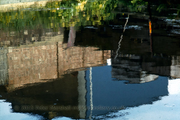
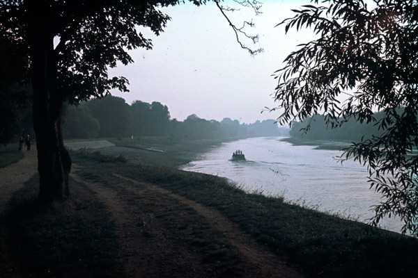
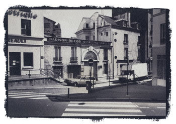
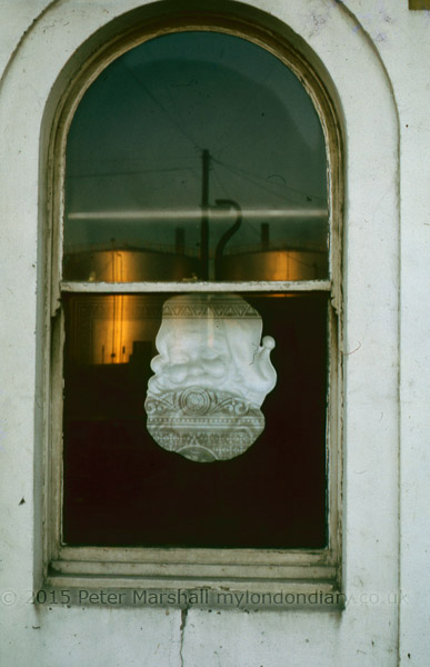
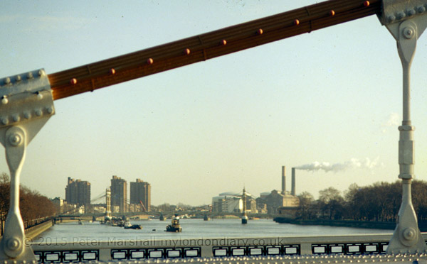
Paris Xe, 1988 Salt Print – Peter Marshall

To coincide with the opening of Salt and Silver: Early Photography 1840 – 1860  at Tate Britain, here is a slightly updated version of a piece I wrote some years ago on salt prints, including step-by-step instructions on making them and four examples of my own efforts from the late 1980s.

Key Facts

  • ‘Photogenic drawing’ used ordinary paper which had been given a coating of silver chloride or similar light-sensitive silver salt.
  • Prints were made by placing objects on this paper and exposing to light. In the 20th century this way of working was named as a ‘photogram’.
  • Photogenic drawing was a printing out process – the image actually appeared during the exposure to light.
  • Photogenic drawing can also be used as a method for contact printing from negatives – prints made in this way are known as salted paper prints or salt prints.
  • Contact printing requires the negative to be held in close contact with the printing paper, usually in a special printing frame, while being exposed to light through the negative.
  • Exposure times in salt printing vary from around 10 minutes to 8 hours depending on the strength of the light source and how transparent (or translucent) the negative material is.
  • As with all contact processes, the print is obviously the same size as the negative.
  • Talbot fixed his images by using strong salt (sodium chloride) solution, or a weak potassium iodide solution. Neither was totally effective.
  • Later, Herschel’s suggestion of hypo (sodium thiosulphate) as fixer was adopted. This was fast and totally effective.
  • By repeating the sensitising process several times, Talbot found he could increase the speed of the salted paper sufficiently to use in a camera obscura.
  • Typical exposure times in the ‘camera obscura’ were around 30 minutes, with apertures probably around f8 in modern terms.
  • The paper negatives were fixed and then often made translucent by treatment with wax or oil before being placed on top of a fresh sheet of sensitised paper and contact printed using sunlight as the light source. Typical printing times would be around 30 minutes to an hour.
  • Although rapidly superseded for use in the camera by the Calotype process, the basic salted paper print was the normal process for photographic prints on paper until replaced by the albumen print around 1850.
  • After 1855, salted paper remained in use mainly as a proofing medium and by a few who preferred its matte image. It saw a revival in the 1980s and 1990s as a part of a growing interest in historical and alternative processes

Talbot’s method

  1. Talbot started with a sheet of best quality writing paper ‘with a good firm quality and smooth surface’.
  2. This was dipped it into a weak solution of common salt and then wiped dry
  3. The sheet was then coated on one side with a weak solution of silver nitrate (a saturated solution diluted with six to eight times the amount of water) and dried in front of a fire.

The paper was then ready for use for making photogenic drawings or as Talbot more poetically wrote ‘nothing can be more perfect than the images it gives of leaves and flowers, especially with a summer sun : the light passing through the leaves delineates every ramification of their nerves.’

A more modern version of this procedure is still used by those photographers today who wish to make salted paper prints – also known as salt prints – see below for directions.

For use in the camera, the speed of the material needed to be increased. Talbot found he could do this basically by repeating the treatment. He first washed the prepared paper with a saturated solution of salt, and dried it. Tested at this stage it was more or less insensitive to light, but if re-brushed with ‘a liberal quantity of the solution of silver’, it became more sensitive than before.

By repeating the coating several times, it would become fast enough for use in the camera (though his exposures might be 30 minutes.) Talbot obviously found the process rather unpredictable, noting that sometimes the paper would begin to darken without any exposure to light, showing the process had been taken too far.

After each coating with silver, he clipped a small part from each of the sheets he was working with, numbering them carefully to correspond to the sheet, and ‘placed (them) side by side in a very weak diffused light for about a quarter of an hour.’ If one of them darkened considerably, the corresponding sheet was ready to be exposed in the camera obscura. It was a crude but effective system of control for a process where there were too many variables to guarantee success by simply following a given procedure.

Talbot’s results

Looking at Talbot’s early results from the camera – or rather at reproductions of them – it is not surprising that they were generally not regarded highly compared to the splendidly sharp and detailed daguerreotypes. In some cases it is hard to see any image at all, others are more weak splodges than detailed pictures. His first existing negative shows a window made of small panes, and on the back he notes that it was possible to count them all when it was first made. Presumably it was no longer possible when he made the note. The image is certainly not now highly detailed and the shadows in particular are completely empty.

Although the photogenic drawings – made as what we now call ‘photograms’, by placing objects such as leaves and lace on the paper – have considerable elegance and are finely delineated, his early camera attempts can only be seen as suggestions that it might be possible to get the process to work rather than as a successful solution. It was a problem that Talbot was to solve himself in the following years with the Calotype process.

The major problem was of inadequate sensitivity to light. These first photographic materials relied entirely on the printing out of the image, which is slow. In the Calotype, Talbot made use of what became to be called a developer to amplify the effect of the light, bringing out the ‘latent image’ from the apparently unchanged paper. It was this discovery that was really to lead to the domination of the next 160 years of photography by silver based materials.

Another aspect of the problem that Talbot faced was inadequate fixation. After exposure he either washed the paper with a dilute solution of potassium iodide or a strong solution of common salt before ‘wiping off the superfluous moisture, and drying it.’ The potassium iodide solution formed silver iodide that was largely insensitive to light, but too strong a solution would dissolve parts of the image. As he had found in his repeated coating, using a large excess of salt solution produces a very low light sensitivity. However images fixed in these ways still faded in light – and certainly the bright sun needed to expose through the paper negative will have also caused fading of the negative.

When Talbot visited Herschel at Slough on 1 February 1839, he received a solution to the problem. Herschel’s wife, Margaret, noted in a letter to a friend that ‘when something was said about the difficulty of fixing the pictures, Herschel said “Let me have this one for a few minutes” and after a short time he returned and gave the picture to Mr Fox Talbot saying “I think you’ll find that fixed” – this was the beginning of the hyposulphite plan of fixing.’

It was also Herschel who provided a clue – in the shape of gallic acid – that was to be the key to Talbot’s discovery of the latent image and development in the Calotype. There are many of us who have made prints using salted paper and even a handful of photographers currently using the Calotype process – some have used actors to recreate Talbot’s later pictures at Lacock Abbey. The recreation of images in camera obscura using his methods, and making prints from these again following his directions would perhaps be an interesting project. It is the only way any of us can possibly see these kind of images in the same condition as when Talbot made them.

Make your own Salt Prints


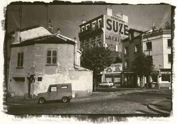
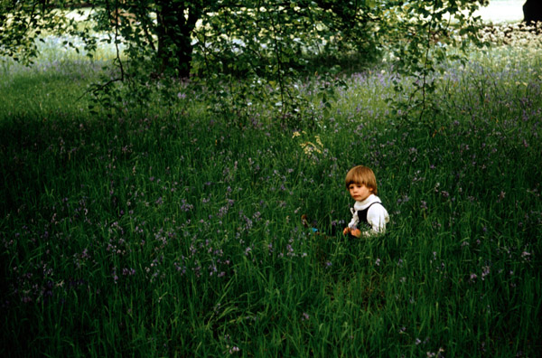
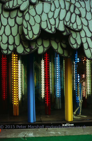
Montreuil, Paris, 1988 © Peter Marshall, 1988.
Gold toned salt print on Georgian Watercolor Paper.

Ordinary writing paper is now factory produced and no longer of suitable quality for any of the alternative processes. Machine made papers generally have shorter fibres and fall to pieces readily when wet, and you need to use a suitable hand or mould-made paper, usually sold for use in watercolour painting.

Silver nitrate needs to be handled with care – you should use gloves and wear safety glasses. When handling any finely ground chemical powder a mask should be worn. Silver nitrate is a poison that can build up in the body and it can both burn and stain skin. It produces stains and marks that are often very difficult to remove from some surfaces.

Like all chemicals, both solid and solutions should be kept in a secure place, locked away from possible reach of children. Silver nitrate solutions are sensitive to light and are normally stored in brown bottles, but it also helps to keep them in a cupboard.

Procedures normally give precise quantities required for solutions measured in grams. However, there is seldom any real need for great accuracy, and many people have made salt prints without using any weighing equipment. Chemicals such as silver nitrate will generally be bought in fairly small quantities and you can make up the full amount into an appropriate solution.

  • You can use ordinary table salt or sea salt, making up a solution of roughly 1-2 ounces (25-50g) per litre of water.

Other salts, which some people prefer, include ammonium chloride, potassium citrate, potassium tartrate and potassium bromide. You will often get small differences in image colour and paper speed using the different salts or mixtures of them.

  • The silver nitrate solution is generally around 10-12% by weight – so you can dissolve 7g (1/4 oz) in around 60ml of water.

I’ve used a range of watercolour papers, including Waterford Hot Pressed which was possibly my favourite, along with Rowney’s Georgian. Some other papers give better results if coated with a dilute gelatin solution and left to dry before use – this is called ‘sizing’ – but Waterford works well without. Most watercolour papers are already sized when you buy them, and extra sizing is often not needed. You will get good results with most papers.

You also need a brush to coat the paper with – a wide, thin brush is best. Japanese hake brushes which do not have metal ferrules are probably the best, as the silver solution corrodes metal.

Salt printing is a contact printing process and you need a negative the same size as your print is to be. Unless you have a large format camera you may like to follow Talbot’s examples and start work with photograms, using materials such as leaves or lace etc. If you do have a large format camera, take a picture specially and try doubling your normal development time as you need a much higher maximum density than normal for salt prints. You can also work by printing large negatives with an inkjet printer, preferably on to acetate film designed for inkjet use. Prints on paper do work – better on thin paper – but exposure times are much longer. You can also work with negative prints made on photographic paper.

Talbot used the sun for his exposures, which meant the times he could work in England were limited. Unless you are blessed with a sunnier climate you may want to find another light source. You need something which is strong in ultraviolet, such as a tanning bed – or you can buy or make special light sources using mercury lamps or UV fluorescent tubes similar to those in sunbeds.

A printing frame is needed to hold the negative in contact with the paper. You can buy or make these, but a sheet of plate glass and a card or ply backing board with some rubber bands round will do (for large prints the weight of the glass is enough to ensure contact.) These were once cheap photo accessories, and small sizes (such as 5″x4″) can still be found cheap in junk shops. I had a good look at an expensive hand-made version, particularly the price-tag, took out a pencil and designed my own, which took about an hour to make. Precision freaks will want a vacuum frame!


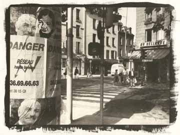
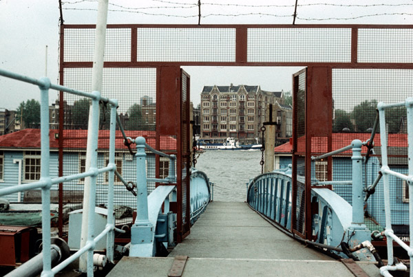
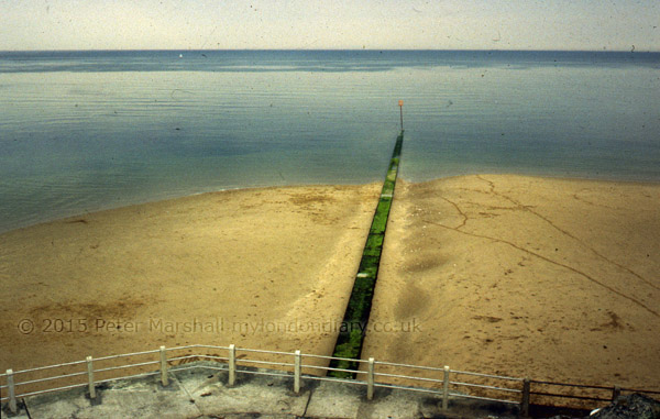
St Denis, 1988, © Peter Marshall, 1988. Gold toned salted paper print.

Step by Step Instructions

Making a salt print

      1. Tear or cut the sheets of paper to the size required – you need at least a one-inch margin around your negative. Mark the top side of the paper on each piece.
      2. Make up the salt solution, soak the paper in it for 2-3 minutes at room temperature or slightly above, gently brushing each side while under the solution to remove any air bubbles. Lift out, drain and hang to dry, putting down newspaper if necessary to catch the drips. Paper treated in this way can be used as soon as it has stopped dripping or dried and used weeks or months later.
      3. Tape the salted paper top side up to a board. Put the negative on top and mark the position of its corners lightly with pencil.
      4. In dim room lighting (away from sun and fluorescent lights), pour a few ml of silver nitrate into a small beaker or dish. Dip the tip of the brush in, and spread left to right across the paper making sure to cover the marked area. Keep the brush wet. Repeat using a series of top to bottom strokes. Try to get the surface of the paper evenly wet all over, but without any pools of solution. Don’t return any excess the solution to the bottle; add a little more to it to coat the next sheet. Leave horizontal until any liquid on the surface has been absorbed, then hang to dry in a dark place. Use gentle heat from a hair-dryer if you are in a hurry to get on.
      5. Put your negative on top of the dry prepared paper, matching its corners to your pencil marks. Unless you have a proper hinged-back printing frame, secure it to the paper down one edge using crystal clear transparent tape, making sure this does not go over any of the image area. Check you have the negative the correct way up. Put under the glass or in your printing frame.
      6. Typical exposure time needed is 10 minutes in bright sun, but you can remove it from the light and peel back the negative slightly to inspect the image. Take care not to move the negative – this is where a proper hinged-back printing frame is a great advantage. Expose until the highlight detail is slightly darker than you want it – the shadow areas will normally seem too dark, but will lose some density on processing. Paper negatives may take several hours, particularly in winter.
      7. In dim light, remove the paper from the printing frame and put into a tray of water – preferably use distilled or purified water for the first rinse. Use gloves and be careful how you dispose of this first rinse in particular as it will contain most of the silver nitrate. If possible it should be added to your normal waste fixer for recycling. Later rinses will have much lower silver content. Agitate for about a minute before pouring off, and repeat several times (using tap water for these later rinses.)


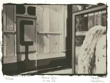
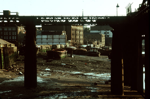
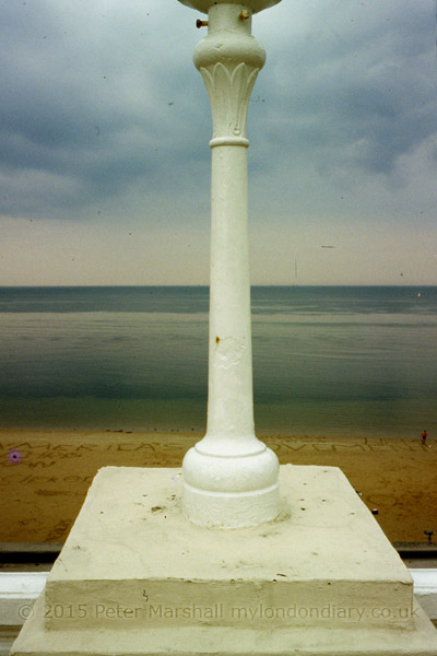
Paris XIIe, © Peter Marshall, 1988. Gold toned salt print.

      1. If your image is successful, you may wish to gold tone at this stage. Prints with developed edges are often trimmed to avoid waste of gold toner. You will find instructions for gold toning in books dealing with alternative photographic processes. As you may expect, it adds considerable expense. Gold toning was a later development not use by Talbot. I’d suggest you leave it until you have gained some experience in the process. Gold toning changes the image colour (not always for the better) and improves image stability.
      2. For prints that can be displayed and last, you should fix using hypo.If you are interested in following Talbot’s methods, you will find his instructions in various sources, including Beaumont Newhall’s ‘Photography: Essays and Images‘. Talbot does not appear to have washed his early prints either before or after ‘fixing’. For prints that will last longer, fix using a solution of 25 gm (1 ounce) of hypo crystals in 500ml of water with a pinch of soda (sodium carbonate) added. You can also use normal print fixer, diluted perhaps twice as much as usual, but this will alter image colour more and also remove more of the highlights. Fix for up to 5 minutes, keeping a careful watch on the highlights and remove the print and wash immediately if these start to disappear.
      3. Wash for around an hour in occasional changes of water and then hang to dry.

Resources

Various books have been written with methods for making salted paper prints in the more than one hundred and sixty years since they were introduced.

Henry H. Snelling‘s 1849 volume ‘The History And Practice Of The Art Of Photography‘ is subtitled ‘The Production Of Pictures Through The Agency Of Light’ and claims to contain ‘all the instructions necessary for the complete practice of the Daguerrean and Photogenic Art, both on metalic, plates and on paper’ (sic), and is well worth downloading from the web if you want to experiment further. Snelling more or less copies the details given by Talbot for making salted paper, but does add a number of further details.

The year after this was published saw the publication by Louis Desire Blanquart-Evrard of his work using albumen. This was an idea first proposed by an anonymous contributor to ‘The Athenaeum’ in May 1839 but Blanquart-Evrard was the first to put forward a practical method that contained the chlorides in the albumen. Albumen rapidly replaced salt printing as the normal photographic print because of its greater brilliance and depth of tone, and remained the dominant print medium until 1895 (finally going out of production in 1929.)

All paper prints in the first ten years of photography were salted paper prints, but after around 1855 it was probably mainly used for proofing. However, modern salted paper prints that I have made are a good match in terms of colour and tonal range to many matte prints from the 1850s (and later) identified in collections as ‘albumen prints’ and although it is possible to make matte albumen prints I suspect these are relatively scarce. If a print is matte, made before 1885, and does not have yellowed highlights it is highly probably that it is a salted paper print, whatever the curator’s label.

Many later photographic books also had instructions for salt printing and other early printing methods, but they were dropped out of most photographic textbooks by the 1930s. One of the best known from this period, ‘Photography, Theory and Practice‘ the English edition of ‘La Technique Photographique’ by L P Clerc, contains details of this and other by then obsolete processes such as albumen printing.

If you are interested in older processes and practices, you will find books such as the 1911 ‘Cassell’s Cyclopaedia of Photography‘ enthralling. I find it a useful source of information particularly for its many line drawings and learn something new every time I pick it up. However the older chemical nomenclature and weights and measures do make life a little trying at times, and there are some procedures suggested which bear no relation to common sense let alone health and safety procedures. Almost every page deserves a health warning. It lists salted paper under one of its alternative names, Plain Paper.

The best modern source of information on the whole area is ‘The Albumen & Salted Paper Book’ by James M Reilly mentioned above. First published in 1979 and long out of print it is now available in full on line – a generous gesture from the author. It really tells you everything you could wish to know.

The same year saw the publication of William Morgan’s ‘The Keepers of Light’, which remains a key text for those interested in older processes and is available secondhand. Since then a number of other books have also appeared which cover alternative processes in detail. Although some of these have excellent articles and illustrations on salt printing, there is nothing essential in them that is not available in the earlier works.

There are also a number of on-line resources, including the alternative processes mailing list and a number of fine web sites – too many for me to list or spend the time reviewing – just search on Google.

Materials for the processes can be hard to come by in but can be found online at specialist dealers, including Bostick & Sullivan and Photographers Formulary in the USA and Silverprint in the UK. Many articles on alternative processes have appeared over the years in various photographic magazines, and there have been independently produced magazines dedicated to alternative processes in both the UK (now defunct) and the USA.

January 2015


Green MP Caroline Lucas speaking at ‘No Fracking Anywhere!’ rally on Jan 26

It was a New Year’s resolution. Among other things, I was going to keep up to date with My London Diary. And it lasted all of two weeks, probably longer than average for such things.

It might well have lasted longer if my computer system hadn’t decided to take a long rest in mid-January, leaving me working from my notebook. Even after I got it back working there was still a lot of catching up to do. So it isn’t surprising that I finished the month 20 days late.

It isn’t the only thing I’m behind on. I needed just another couple of days to finish my next book, and now its over a month since I did any work on that. Quite a few other little jobs too that haven’t got done yet. But at least now January is over.

Jan 2015

March for Homes: After the Rally
March for Homes: City Hall Rally


March for Homes: Poor Doors
March for Homes: Shoreditch to City Hall
March for Homes: Shoreditch Rally
‘Tin Pan Alley’ 12 Bar club faces eviction
SOAS Cleaners demand Dignity & Respect
Cleaners protest at Royal College of Surgeons
No Fracking Anywhere!
Gambians protest brutal repression


Occupy defy GLA ban on Democracy


CND Scrap Trident rally at Parliament
‘Wrap Up Trident’ surrounds Defence Ministry
Christian CND against Trident Replacement


West Hendon march for Social Housing
Class War visit ‘Rich London’
City Island – Lower Lea Crossing


Stop Arming Israel picket HP at BETT
What Are You Afraid of Boys?
Irish Famine is no laughing matter
Carnival March to End Taiji Dolphin Massacre
Solidarity with German anti-Pegida


‘Je Suis Charlie’ rally
13th Year of Guantanamo Shame
Free Shawki Ahmed Omar
Cirque du Soleil – Say No To Apartheid!
Oh! Mother Against Knife Crime


Pay John Lewis Cleaners a Living Wage
Vigil for Leelah Alcorn
New Year’s Day Walk Continue reading January 2015

March for Social Housing

Back in January I had a very busy Thursday, starting with an event on the other side of London to where I live, Stop Arming Israel picket HP at BETT, a picket by a group I’ve now photographed on quite a number of occasions. Most of their protests against Hewlett Packard’s support of the Israeli war machine have been outside HP’s offices in the middle of the City of London, but this was at ExCel on one of London’s former docks, well to the east of the centre. It’s an area I first photographed in the 1980s – with a few images you can see in my book ‘The Deserted Royals‘, though fortunately now much easier and faster to get to.

I spent an hour or so there taking pictures, then took a walk across the Lower Lea Crossing, from where I took the picture above of Bow Creek. It was a fine day for January, and decent weather for panoramas, though I would have liked rather more interesting clouds. Thanks to my recent computer problems I’ve not had the opportunity yet to process the panoramic images I made – so I’ll hopefully write about them later. Though I’m always rather loath to put a message on line “<small”>more pictures coming shortly” as I think there are still some such gaps waiting for me to fill as far back as October 2002. Really I will one day!

Next was a trip up west, to the Ritz and Mayfair, where I had expected to meet rather more members of Class War than the three who turned up for Class War visit ‘Rich London’.  It was all just a little tamer than I had hoped for.

But it did make me late for what was the largest event of the day, the West Hendon march for Social Housing, in one of London’s north-west suburbs. It took just a little finding too, and had me cursing my smartphone as it showed me a black area instead of the map I’d told it to load. Paper maps have the advantage of not needing a signal. I was annoyed to have arrived just a minute or two too late for the photographs outside the community centre where the protesters had been holding a meeting, seeing them dispersing as I rounded the corner a hundred yards or more away.

Fortunately the best was yet to come, though there was around an hour of waiting around with relatively little to photograph. A few groups stood around outside the community centre talking, some with placards and banners, while others sensibly kept in the warm inside. I took a few pictures inside, had a free cup of the hot soup and talked to some of the protesters, many of whom I knew from other events. Finally it was time for the next part of the protest, the promised giant banner drop.

As you can read in West Hendon march for Social Housing there was then a rather long memorial event for a local war hero, the only female Sapper of WW1, who locals are hoping to commemorate in the area.  It was an interesting story, and one which I did a little more Googling on before writing my piece for My London Diary, but I wandered off shortly before the end to take a few pictures of the various posters I’d seen on some of the flats.

It was getting steadily darker and darker, and I was trying out a new toy, a Neewer CN-216 LED light, which has 12 rows of 18 LEDs (which explains the 216 in its name.)  Its a slightly chunky box, about  5.5 inches wide, 3.75″ tall and2.25″ deep with a reasonably sturdy fitting on the bottom to attach it and angle it up and down a bit on a hot shoe. Fitted with 6 AA batteries it weighs in at a smidgeon over a pound (458 grams.)

It doesn’t really produce a great deal of light, though noticeably more than the earlier and cheaper LED lights I’ve tried. Enough to make a difference when fairly close to you subject, but not really an alternative to flash at more than a few metres away, even when working at ISO 3200. When it got really dark I was working with it at 1/30th f2.8 ISO 3200.

In the image above, as the march turned off from the Edgware Rd, the CN-216 provided useful fill on the closer figures, while streetlights gave reasonable overall illumination. When a little later we got to darker streets and the CN-216 became the main light source it was less useful.


D700 16mm 1/15 f4 CN-216 ISO 3200


D800 18mm (27mm equiv), 1/60 f8 ISO 3200

The two pictures above were taken within a few seconds of each other, both in a dark area with inadequate street lighting. Both have had considerable burning and dodging to partly equalise the lighting across the image. The CN-216 is a rather larger light source than the flash, but still the normal inverse square law more or less applies, doubling the distance from the light giving only a quarter of the illumination.

I’d chosen 1/60th for the flash exposure to reduce or eliminate any motion blur and the kind of double image that often results from slow shutter speeds. There is a four stop difference between the two images (two stops in aperture and the same effect as two stops in the different shutter speeds) and it’s this that makes the main difference between the two images.

Another image taken with the aid of the CN-216, this time with the 16mm fisheye at 1/30 f2.8 close to the end of the march. Hendon seems to have some pretty dark roads. The LED light doesn’t of course cover the full 180 degree diagonal, and you can see some fall-off in the banner at upper left.  This was an advantage for the figure at the right, as he needed less burning – and was so close that with an even light spread would probably have been to far burnt out.  The girl at the centre, although a little further away was almost at the limit of the highlights.

The lens comes with a pair of diffusers, one plain the other an orange to convert the light from daylight to roughly tungsten. So far I’ve always used it with the daylight diffuser in place. Vignetting is noticeable with any wide-angle lens, but can be corrected with Lightroom, so isn’t a huge problem.

The CN-216 is just about powerful enough to be useful for this kind of work, and working with portraits at close distances you might sometimes even want to use the control wheel which dims the light rather than work as I did always on full.

Ideally I’d like a light with at least twice the output, especially since I have no really fast lenses for the Nikon. Usually the f4 16-35mm is fast enough, but rather limiting for this use. The two faster lenses I have are the 16mm f2.8 fisheye, a 20mm f2.8 and a60mm f2.8  Micro Nikkor.  The CN-216 would be more useful with the Fuji XT-1 where I have a 35mm f1.4, 18mm f2.0 and 14mm f2.8 (52mm, 27mm and 21mm equivalents) as well as a f2.8 fisheye.

And the best thing about the CN-216? The price. If I believe the specifications, the light output is much the same as that from other models costing well over £100. Without batteries it cost me a little under £30 including postage from eBay.

The link for the story and more pictures again: West Hendon march for Social Housing
Continue reading March for Social Housing

Dolphins on the March

I’d like to make it entirely clear. I am against cruelty to animals. And the annual slaughter of dolphins at Taiji cove in Japan is repugnant. It should stop. Along with other barbaric activities like those than are integral to fur farming – cruelty for profit – and fox hunting – cruelty for fun, which seems particularly abhorrent. And while in principle I’m not against all farming of animals, I’d want it to always be done in an ethical and humane manner – which of course is so often not the case.

And I’m certainly unhappy about capturing and keeping dolphins in restricted spaces, training them to do tricks to entertain the public and would like them to live instead unhindered in the oceans.  But while I have a basic sympathy with these protesters and their protest I also have some reservations.

I do sometimes feel that the issues about human rights and their abuse are event more important, and wish that all these people would also be as enthusiastic about them, coming out on the streets to protest. Of course some do (and I recognised a few from other events), but I think they are relatively few. And it worries me.

We are – at least in some respects – a nation of animal lovers. A society where animal welfare charities get massive support, both in donations and in the adulation of the media, who at the same time are demonising human beings who need support as scroungers.

It’s a strange world in which we humanise animals to make them into appealing stories for children – most of whom will never actually meet these or other real animals. Real bears don’t eat marmalade sandwiches and nature is often red in tooth and claw. And if dolphins aren’t cuddly it is perhaps a strange paradox that it is largely through their performances in dolphinariums around the world that they have acquired the kind of public image which is now exploited in the imagery of the protesters who are so desperate to save them.

Yesterday while waiting for my train I watched a rat scurrying around on a patch of waste ground. From a distance it looked quite cuddly, but this was vermin. Most people would happily shoot or poison it. The squirrels in our garden are more appealing, with their acrobatic skills and fluffy tails, but until 1957 you could get a bounty (begun as 6d, it had risen by then to a florin or perhaps half a crown) for taking their tails to a police station – it was only abandoned when it was decided poisoning was more effective than shooting. There are still plans for a huge cull, seen as the only way to save our native red squirrels, and opposed by animal charities.  I’m not sure where I stand on that one, but given the way the pigeons eat the crops in our garden I might well favour a cull of them.

More pictures at  Carnival March to End Taiji Dolphin Massacre

Continue reading Dolphins on the March

JPEG or RAW

While I was having computer problems recently I had to work in ‘Raw+Jpeg’ mode, and I chose the highest possible jpeg quality from the Nikon, ‘Fine’.  And they are certainly pretty good files. But I was also having problems working with them on an uncalibrated screen and using Photoshop rather than Lightroom.

I tried to calibrate the screen visually, using one of the sites on the web that offers suitable graphics, but it wasn’t very satisfactory. I decided that my best approach was to rely mainly on Photoshop to make the judgements, keeping my own tweaks down to a minimum.

This also speeded up processing. I suppose I could have automated the process, but soon a set series of keystrokes became wired into my brain. ‘Alt+E, V, Enter’ to change from Adobe RGB to sRGB, then ‘Alt+I, A, U’ on the outdated version of Photoshop on the laptop for Auto-contrast. Next came Ctrl+M, which took me into the curves dialogue, where I used the mid-tone dropper to set the colour balance on a neutral in the image. Though it isn’t always possible to find a neutral, and sometimes it was a matter of trying a few different patches of the image until the result looked about right. And a little tweak of the curve produced a result with what looked like appropriate brightness and contrast.

Having OK’d this, then came the rather riskier business of trying to guess whether I’d got things about right, and sometimes fiddling a little with Brightness and Contrast, adjustments I normally try to avoid. It was hard not to try and alter the colour balance a little, and although I knew I wasn’t seeing it correctly. But I also know that having things a little on the warm side is always more acceptable than the opposite.

Here’s one of the results:
20150119_DSC6786

It isn’t too bad, though it does have something of a colour cast – I obviously added a little too much yellow. Perhaps most obvious in the sunlight grass.

It was a difficult day for lighting, photographing the Green Party Photocall What Are You Afraid of Boys? in a shady corner of College Green, next to the Houses of Parliament, sunlit in the background at right. And at the left, the building has completely lost detail in the jpeg.

I’ve now been able to process the raw file, and to make it a little easier to compare I’ve adjusted it to a similar colour balance, though I would normally have left it more neutral.

20150119-d104s600Overall the image from Raw is a little less contrasty and less saturated colour, and the shadow areas are lighter, but part of the difference is also because I’ve made some use of the Lightroom local adjustment brush.   That could have improved the jpeg too, but would not have restored the missing detail in the blown-out highlights.

Looking at the full-size images, there does seem to be just a little more detail in the raw file. Although I think the jpeg version of the jacket that Green Party leader Natalie Bennett  is wearing actually looks better for being a little darker, I think the raw version is probably more accurate.

As I stood there taking a whole series of photographs of her, I was hoping that she would make the same expression as her portrait on the poster behind her, but she didn’t quite do so, keeping her head more upright. But I was worried by that picture of her, as it didn’t quite look like her. What it lacks is the determination that I think shows in her jaw when she talks.

I stood there taking pictures wondering whether it was digital retouching or just careful lighting and choice of view that had caused the difference and made her and Caroline Lucas look rather more like a toothpaste advert than real people. But somehow it was a look that shouted PR and advertising and didn’t at all fit with my vision of the Green Party. More like the old politics we need to get away from.
Continue reading JPEG or RAW

My 1980 Colour (Part 2)

The pictures I’ve selected from my colour work in 1980 are probably a fairly random cross-section of those I took, simply the pictures that I’ve scanned for some reason or other in the dozen or so years that I’ve owned a colour scanner.

It’s easy to forget that being able to easily put colour images on the web is something fairly recent. The main reason I bought my first digital camera in 1999 was to enable me to do so. I probably still have it in a drawer somewhere, a Fujifilm MX2700 which was a 2.2Mp camera, one of the leading non-professional models of the time, which gave reasonable results for web use (and with great difficulty and lengthy retouching a 6″x9″ print which was the only digital print in a large group photography show a few months later.)

Before then, I could get colour files by taking a print or slide into work and using the large flatbed scanner I had specified for the art department. It was a tricky beast to work, and while it did a reasonable job with prints, it pretty well failed with slides. I seldom bothered, and mostly used my home scanner – black and white only – to scan colour prints. Later I bought film scanners. The first, an early Canon, was pretty hopeless, but later I had a Microtek and a Minolta Multipro that gave high quality scans – but took a long time over each one.

You could of course also get high quality scans made commercially, but this was and is an expensive business. The Minolta could be coaxed to produce ‘drum scan’ quality at a file size one of London’s leading pro labs now charges £55 or more a time. Though cheaper and possibly better services are available elsewhere.

The My London Diary web site largely came about because of my switch to digital, although the early years have mainly scanned black and white images. But from the end of 2002 I had begun to work with a Nikon D100 alongside film, although it took another couple of years before I stopped using film and everything could easily be posted on my diary.

Here then is a small gallery from those colour transparencies that I have scanned from 1980 (or at least I think they are from 1980.) I think most or all of these were taken on Group 6 outings, though what was probably the only one I arranged that year was unusual in that I was the only person to turn up! My lone walk took me around Battersea and Wandsworth, including a number of views of the Thames and to the ‘Royal Laundry’. I’ve done just a little correction and removing dust etc on the scans, but most could be improved by more work – or by making new scans, but some of the originals may have deteriorated beyond redemption.


80-slide051srgb600
London, 1980

80-slide056srgb600
Wandsworth, 1980

80-slide057srgb600
Wandsworth, 1980

80-slide058srgb600
Battersea, London, 1980

80-slide050srgb600
Margate, 1980

80-slide059srgb600
Margate 1980

80-slide060srgb600
Margate, 1980

80-slide062srgb600
Wandsworth Rail Bridge and Fulham B Power Station, London, 1980

80-slide069srgb600
From Chelsea Bridge, London, 1980

80-slide073srgb600
Royal Laundry, Battersea, London, 1980

Continue reading My 1980 Colour (Part 2)

My 1980 Colour (part 1)

80-slide032srgb600
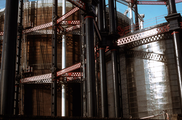
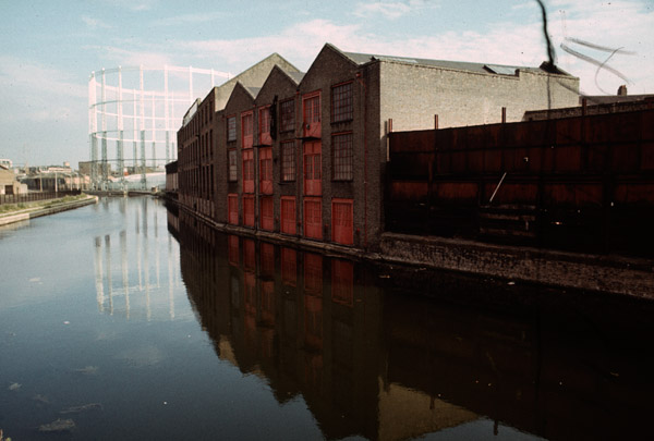
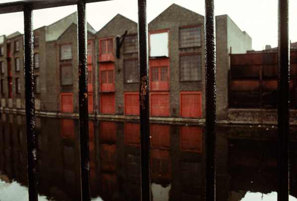
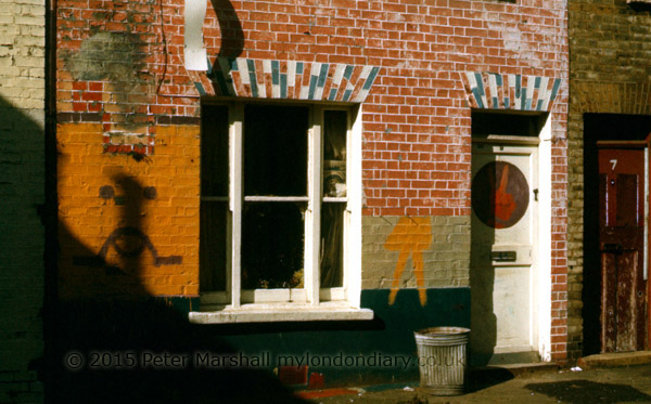
Clapham, London. 1980

In 1980 I was usually carrying two cameras when I went out to take photographs, one loaded with black and white film, usually ASA 125 Plus X Pan in the Leica M2. In my jacket pocket, even when I wasn’t going out to take pictures I always had a small camera, a Minox 35EL with a fixed 35mm lens, one of the smallest 35mm full frame cameras. I had both 50mm f2.8 and a 35mm f1.4 for the Leica. In the middle of the year I switched to Ilford FP4, probably only because I found a cheaper source of film.

But in November there was a significant changes. Ilford had brought out the first black and white chromogenic film, XP1-400. According to Wikipedia it went on sale in January 1981, but the first roll of it I took has a few pictures of our Guy Fawkes night celebrations on November 5th, 1980 (and Christmas 1980 comes a couple of rolls later.) I had a Leicameter MR4 on my Leica M2, and it was usually good enough for conventional black and white film, but exposure became (at least for me) more critical with XP1, and I soon switched most of my black and white work to the much more accurate metering of the Olympus OM1.

80-slide047srgb600
London, 1980

I’d started off using the OM1 for colour transparencies, where exposure was always very critical, and had kept the camera when I upgraded to the Olympus OM2, which had an even better metering system. I think all of the colour slides from 1980 will have been taken with the OM2.

80-slide027srgb600
Brick Lane, London, 1980

I’d bought the OM1 with the standard 50mm f1.8 lens (there were two faster alternatives, but it didn’t seem worth paying a lot more for a bulkier and heavier lens with only a relatively small speed advantage.) I’d started too with the latest thing in lenses, one of the first popular zoom lenses, a rather bulky 70-210mm or thereabouts. It wasn’t a bad lens, but after a year or two I sold it and bought a much smaller, lighter and faster 105mm Tamron.

80-slide020srgb600
East End, London. 1980

Later I found a Zuiko 35mm f2.8 shift lens secondhand at a sensible price in Hull – around a hundred pounds less than in London – and added that to my kit, and later still I found a 28mm f2.8 bargain. I had to buy the 21mm f3.5 new, but the 200mm lenses (eventually both the f4 and f5 – I could never decide which I liked best) also came secondhand. But I think all of the pictures in 1980 will have been made with the 50mm or 105mm.

80-slide029srgb600
London, 1980

80-slide030srgb600
Canal, London. 1980. This may have been from a Group Six walk

In 1980 I was working in three different ways. When at home I was making regular trips to London and walking around various areas, mainly taking pictures in black and white, some of which are in my book http://www.blurb.co.uk/b/4048897-london-derives?class=book-title London Derives. One Sunday a month I would go out with a bunch of other photographers -usually between 4 and ten our us – on a photographic outing. We were enfants terrible in a photographic club who refused to take the club restrictions and conventions seriously – or perhaps we were just serious about photography in ways the club didn’t understand. At first we were a group of the club (the sixth group formed, which had, for want of a better idea called itself Group Six, though by the time I joined there were only four others.) We took it in turns to organise where to go, and these often took me to places I wouldn’t otherwise visit, including rural Wiltshire and Margate in the pictures here. Some of those along the Thames may also be from one of these outings. Any I suggested tended to be in London, while most others preferred more obviously picturesque locations.

80-slide021srgb600
A rather wet Wiltshire on a Group Six trip

80-slide023srgb600
Terry King on a Group Six outing in Pewsey, Wiltshire. 1980

The final area of my work was in Hull, where we went several times a year to stay with my parents-in-law. Much of the black and white work from there is in my book Still Occupied, but my show there also included roughly 40 colour images as well as the around 100 black and white works.

I’ve done some rough corrections on the scans that I found, some made a few years ago, but haven’t removed every blemish. It’s hard to know exactly what colour some of them should be, and I still am having to use an uncalibrated screen. Where possible I’ve tried to balance on a neutral gray with Photoshop.

My Seventies Colour

I took quite a lot of colour images in the 1970s, though relatively little of it is of much interest to me now. I’d taken some in the 1960s too, before I became a photographer, though I had some aspirations, if no idea about how to do it. A girl friend when I was sweet seventeen and had no idea much about anything was beginning a career as a model and I took most of a 36 exposure Agfa transparency film of her in one on the cherry trees in my back garden. It wasn’t the reason why our relationship went nowhere – our tastes were very different and she was attracted to older men with money.

I couldn’t afford film and processing then (or girl friends) and mostly I took just a few pictures on a holiday. Things changed when I began teaching when I was around 26, as not only did I have a little money, but I’d also got a largish flat in a New Town, but had learnt the rudiments of black and white processing and could take over the kitchen after dinner to process films and make prints.

79kew01-600
‘Photography’ at Kew

With my first few months salary I’d bought a Russian SLR camera, a Zenith B, to replace the old Japanese Halina that had never really worked since I’d dropped it in the lake at Versailles five or six years earlier, and some black plastic sheeting to cover the windows and the other basic requirements – three trays, a developing tank, measures, thermometer etc. Getting equipped was made easier by mail order, and the previous year living in Leicester I’d got to know the small photographic Aladdin’s cave of Jessops, with the catalogue on a large sheet of very small type – they sold a 10p magnifier with it. Another mail order company was Polysales of Goldalming, with a catalogue which had some useful advice in it as well as the goods.

79thamesatkew-600
River Thames near Kew

Colour became a sideline, and of course most professional work was then in black and white. My first work was for a local theatre company, and the pictures they wanted were b/w also. Colour was still something largely for family pictures and holiday snaps.

79samatkew-600
Sam in bluebells at Kew

Soon after I entered a competition in one of the amateur photographic magazines, and as a prize won 20 rolls of Kodachrome to make an entry into a tape-slide contest. I decided to base my entry on a cycle tour along the Loire Valley, and some of the pictures weren’t bad, but I had no experience and pretty poor equipment to make the sound-track. That was a competition I didn’t win.

But I did begin to use colour as well as black and white film, carrying two Olympus OM bodies (or a Leica and an OM) one with b/w and the other with colour slide film. I soon switched to E4 and then E6 films and cut costs dramatically by processing those myself. But black and white remained the serious side of photography, with colour only being a minor side of my work.

79cherrygdnpier01-600
Cherry Gardens Pier and view to Wapping

79rotherhithe01-600
Rotherhithe

79-stpancrasgas01-600
Gas Holders at Kings Cross

79broadwaymkt01-600
Bethnal Green

79broadwaymkt02-600

I studied colour too, both with the Bauhaus book ‘The Art of Colour‘ by Johannes Itten and also works by photographers including Andreas Feininger, though I found these less interesting. Much of my colour photograph was just about colour, with the subject matter being immaterial, and most of this I now find of little interest.

Colour really only began to work for me when I began to use it for documentary subjects, at first along with black and white in my work on Hull, Germany and the Royal Docks. It was really only when I changed from colour transparency to colour negative in the mid 1980s that I started on projects that were only in colour; before then I’d found the technical deficiencies of colour transparency too limiting.

The images here were I think all taken in 1979, and these reproductions are all from scans made in 2002 which I came across on an old hard disk from a computer  I’d getting ready to throw out as it will no longer start up, probably because of damage caused by overheating when a fan got blocked by dust. But the hard disks are still readable and I’ve removed those on to my backup shelf.

The slides had aged a bit when I scanned them, and some were rather dirty. I’ve tidied them up a little and adjusted contrast and colour balance roughly before posting.
Continue reading My Seventies Colour