Country Doctor

Gene Smith‘s ‘Country Doctor’ was instantly recognised as a major achievement when first published in 1948 in Life, though had he been alive and working now he would have been lucky to have got more than 3 or 4 pictures in print. The Life Classic feature shows the 28 that made up this essay, and elsewhere another 11 that didn’t make the cut.

It’s certainly good to be able to look back at one of the great classic photo-essays on line, though perhaps a pity that they don’t show the page spreads as they were published.

Thanks to NPR for pointing me to this feature from their own Revisiting ‘Country Doctor,’ A 1948 Photo Essay though I’m surprised that they decided to put their own set of a few images from it in the article rather than linking to the full (and better quality) set at Life.

Yesterday I visited the  MA Photojournalism and Documentary Photography Final Show 2011 at the London College of Communication at the Elephant and Castle, entitled ‘Neither Snake Nor Lizard‘ which is supposedly open until Saturday, although unfortunately a few bits have already disappeared.

Probably the most impressive parts I could see were some of the books that the photographers had produced (using Blurb etc), along with one or two on-screen presentations. Other than those (and the videos may be on line) you are better off viewing the web sites of photographers that are linked from the show site. And certainly some student’s work did look better on screen than in the prints on the wall. This is perhaps as it should be, because if there is any outlet at all for documentary work it is probably either as books or as on-screen presentations. And photographic books as I read somewhere earlier today (and can’t remember where or the exact quote) are more of an “organised hobby” than a career option.

The work that I felt was strongest was almost entirely that which was more obviously documentary, whereas despite the course title some of what I saw seemed to lack the kind of purpose and clarity which is at the essence of the genre (and arguably of the medium as a whole.)  I did begin to wonder at times whether the course had been designed to divert photographers from documentary rather than nurture them in it, and certainly some looked more like commercial or fine art photographers (which will make it easier for them to earn a living!)  Fortunately they seem to have failed at least with some of the students and there was some work which showed the kind of dedication to the subject which might have gladdened Smith’s heart.

Eggleston – Early Colour

The unseen chromes of legendary American photographer William Eggleston gives an interesting second view of his early work. Eggleston took 375 transparencies to show John Szarkowski at MoMA which he selected from a collection of around 5000. Szarkowski cut the number back to 75 for the  seminal 1976 ‘William Eggleston’s Guide’ and reduced that number still further to 48 for the exhibition catalogue.

Thomas Weski has gone back to the roughly 5000 Kodachromes (there were a few Ektachromes and Agfachromes in among them) which Eggleston made between 1969 and 1974 and together with the photographer selected a further 364 images which have now been published by Steidl in a 3 volume collection aimed at wealthy collectors (UK £220.00, US $345.00, EC €248.00), Chromes – you can see around 14 pictures on the Steidl site and rather more here.

Mark Holborn wrote an introduction for Eggleston’s book ‘Ancient And Modern‘ which mentions perhaps his most famous image, Red Ceiling, which most will be familiar with. The final image of the slideshow on ‘Wallpaper’ linked above, the blue volume of the three, came as something of a surprise.

RIP Kodak?

Load the BBC World service ‘Newshour‘ for  05/01/2012(2100GMT), click on ‘Listen now‘ to load the player and  then drag the slider to 49.07 and you can hear a short piece with Graham Harrison (look at the 10 pictures on Kodachrome 64 pushed one stop) talking about the history and demise of Kodak.

The gist of what Graham says in this short interview is in his blog post ‘Kodak’s Last Frame?‘ in which he comments on the likely end to the few remaining Kodak films with the Kodak Corporation being expected to file for Chapter 11 bankruptcy protection some time in the next few days. It’s major assets which it is trying hard to sell, are now a number of patents on digital technologies.

Graham’s conclusion in the programme was that “Kodak was too big, not fast enough to adapt to digital” although I think that its problems go back rather further. Having invented photography for the masses and the great slogan “You press the button, we do the rest“, they retained throughout their history the complacent assumption that they really knew how to do the rest better than anyone else. Photography was after all their baby. *

And, as Graham went on to say, they did produce some great films which gave fabulous looks – particularly Tri-X, Kodachrome and, his own particular favourite, Ektachrome 64. On the blog he writes they “gave photographers a wonderful but limited pallet within which to express themselves” which gave me a very strange image involving fork lift trucks – I’m sure it was down to  the spell checker. What he said and meant made more sense, that they had “a limited palette, but within that palette you could be very creative.”

Digital he went on to say is without the limitations of film, but that makes it harder to find ways to be creative with it, and he suggested it hasn’t happened yet.

While I’m very much in agreement with what he says about it being pointless to try and re-create a film look, I’m not sure that I agree with his suggestion that you “have to grasp the new medium and produce something new with it.” To me the great thing about digital is the purity, the naturalness of digital colour, and what really annoys me is when people Photoshop that to absurdity rather than accepting its own neutrality and working with it to make pictures. Colour has become in a way transparent, something we don’t need to worry about in the way we used to with film. It is now after all more or less how we see things. It’s perhaps too why I seldom now feel the urge to work in black and white.

For thirty years I did work mainly in black and white, with colour really being a little extra on the side. In the early years Tri-X was my favourite film, though I also liked the rather smoother look of Ilford’s FP4 and flirted with the almost grain-free detail of slow document films like Kodak Technical Pan, exposed at silly two-figure ISOs and developed in special soups for pictorial contrast.  Then along came chromogenic films, introduced by Ilford, which gave low grain and smooth tones at ISO 400 and made that splendid Tri-X grit a special effect rather than a necessity.

Kodak were slow to respond, though eventually they emulated Ilford’s lead. In printing papers too, Kodak had largely exited the specialist market,  discontinuing all their specialist materials leaving only rather ordinary products for the mass market; those of us interested in fine prints made them on Agfa paper, with Ilford’s Galerie and Multigrade later providing an alternative.

In colour, Kodachrome was king when I started, but in the mid-80s I jumped ship to the much more neutral colours and wider latitude of Fuji’s colour neg films. It wasn’t just the film, but also the Fuji colour paper, again with its cleaner colours and almost zero colour shift on burning or dodging.  Fuji had done its homework on print life too, and produced considerably more permanent prints (as previously had Ilford for printing from transparencies with the very different Cibachrome) than the Kodak papers with their guaranteed fading and browning.

Perhaps it was the efforts that Kodak had to make to catch up with the superior films and papers from other manufacturers – and in the end they more or less did so – that made them take their eye off digital. But I think it was more that they were always essentially a materials company, and with digital the lead went to the camera makers – you didn’t need film any more.

Kodak had got an early start with digital, but really needed to buy in modern camera expertise and that didn’t seem to fit the way the company worked. They ended up making some very good sensors and selling them to people who knew cameras – including Leica, Nikon, Canon, Hasselblad etc. It was a true measure of the company’s desperate state when that successful part of the business was sold to Platinum Equity in November.

There are still people working with film. I’ve got old cameras I still would like to use sometimes – like the Hasselblad Xpan (and its 30mm lens), but somehow I never get round to it. Silverprint still list black and white films from 10 manufacturers, so the loss of one is perhaps not a great problem, but with colour it is now more or less down to Kodak and Fuji. But since Kodachrome ended with Dwayne Steinle processing his pictures of “his house, his family and downtown Parsons” on 29 Dec 2010, Kodak have hardly been a player.

_________________________________________________________
*Perhaps I should declare an interest. Kodak failed to offer me a job when I went to Harrow for an interview in 1966 as a research chemist because they felt I didn’t have a serious interest in photography as I didn’t belong to a camera club.

Eve Arnold 1912-2012

Eve Arnold joined Magnum 60 years ago and became a full member in 1957. She was just around a hundred days short of a hundred years when she died on Wednesday, though I read she had not taken any pictures for five years or so, but certainly hers was a remarkable career.

There are 50 pictures in her Magnum portfolio, and perhaps the one I like best is an image of Marlene Dietrich taken in 1952. Somehow I find much of her later work a little disappointing, though perhaps I should warm to a photographer who could make Margaret Thatcher look so ill at ease. But that is a picture that for me at least just does not work. There are also several books on the Magnum site, and for me the best is Flashback! the Fifties. Of course she was a very good photographer, but I don’t feel she really lived up to the promise of this early work, becoming an excellent and dependable but rather corporate Magnum photographer, losing the excitement.

Arnold was best known for her pictures of Marilyn Monroe, and looking through these 62 images at Magnum there are indeed some fine pictures, but also others that seem rather ordinary. Some pictures show a great intimacy and give us some insight into the life and person of the star, but others seem more typical Hollywood publicity.

It is perhaps appropriate that the Monroe Gallery in Santa Fe, New Mexico, despite being named after its owners and not the star, should be collating a list of links to tributes to Eve Arnold , all of which I imagine will be rather more fulsome than mine. The Monroe gallery site, currently showing an exhibition of work, mainly portraits, by John Loengard is also worth a look, and I note that the Dietrich picture is one of three of Arnold’s works on it.

Pie & Mash

A part of real London that I’ve never appreciated in terms of taste is pie and mash, though I’ve occasionally photographed the exteriors and interiors of the establishments that serve it, usually when empty. Back in the 1980s and early 1990s I did a fairly extensive survey of shop-fronts and some interiors across London, a few of which (but no pie shops) emerged as a book dummy and later a web project with the improbable title “Café Ideal, Cool Blondes & Paradise.”

So I was pleased to see today some fine images of London’s surviving pie and mash shops posted by Stuart Freedman on his Umbra Sumus blog in The Englishman and the eel. These are some of the unused pictures from a feature that was published in the German magazine Effilee, a magazine for eating and living which you can see in a tear sheet Stuart links to.  It’s a good example of how some of the best pictures somehow get missed by editors.  I’m still waiting for him to post his 5,500 word text on his blog in English.

_______________________________________________________

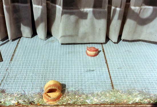
Although none of my pictures of pie shops made it to ‘Café  Ideal… there is a rather nice pair of teeth from Tooting:

© 1990, Peter Marshall

More at  Café Ideal, Cool Blondes & Paradise. And this is another project which, with some revisions, I hope will become a print on demand book some time this year.

30 UNDER 30

This is the third year of ‘30 UNDER 30 Women Photographers‘, and as in the previous years it includes some interesting work. For me the highlight was the work by Paula Gortázar*, a Spanish photographer based in London. After taking a law degree and a graduate diploma in business administration in Madrid she completed post-graduate studies at the Central St Martins before going on to an MA at the University of Westminster .

There are others whose work I find of less interest, with rather a lot of work that might be described as ‘art school attractive’ with an almost complete lack of documentary or photo-journalistic content. Although it is pleasant to look through and does include some interesting imagery it does seem a rather one-dimensional selection of work by women, and one that might be seen as reinforcing stereotypes about women’s photography. This is not of course in any way to criticise the work presented, but merely to point out that women photographers cover a much wider range of practice than is displayed here, indeed across the whole of photography.

As well as whole areas of practice, there is also a distinct lack of information on the site, and clicking the INFO link is am almost complete disappointment.  All it tells us is that the site is an ongoing project of the Artbox, “a Design + Communications Studio based in New York + Paris specialising in Interactive Media & Web Site creation” which has worked with “agencies on big brand campaigns as well as with individual artists to create compelling portfolio based web sites” and that its creative director is Mathew Hong, but says nothing about the criteria or selection of the 30 women for the site. Are the photographers simply chosen from those for whom the Artbox has designed web sites or is it a more open event? It would be nice to know, and the absence of any information makes us suspect the worst.

The information about many of the photographers is also very limited in some cases (and non-existent for one of them) and entirely lacks what is surely the essential piece of information – a link to their web sites – a rather surprising lack from a web design studio.

30 UNDER 30 is obviously based on the long established PDN 30, their prestigious annual “Choice of New And Emerging Photographers to Watch” which received nominations from roughly 70 named leading professionals in the business around the world, quite a few of whose opinions on photography even I would respect (though a few I think are firmly in the land of the Emperor’s new clothes.)  I couldn’t download the PDN gallery when I tried this morning, but you may have more luck with PDN’s flash site, which I did look at carefully earlier in the year (and it was working again this afternoon.)

But you can also find a list of all the 30 photographers (including a dozen or so women none of whom I think caught Mr Hong’s eye), with links to their web sites which was posted by A Photo Editor last March when the list was published, and which I mentioned at the time. The comments on that site are also of interest.

___________________________________________

*Some of Paula Gortazar’s work was included in a show by recent alumni of Central St Martins shown at the Protein Gallery as a part of the 2011 Photomonth in East London – her image on the Photomonth Gallery mosaic is from her ‘Common Spaces’ series. You can see more of her work including a documentary section from which a few pictures do appear on ‘30 Under 30‘ at her own web site.

Soth on Adams

One of several posts I’ve been reading that have severely delayed me getting down to my own work this morning was Moving forward, looking back by Alec Soth on his Little Brown Mushroom blog. In it he takes a look at the book which most changed him as an artist in the past year.

His choice is ‘Prairie’ by Robert Adams, a small volume that came out in 1978 and was reissued with a different cover as “a new expanded edition” in 2011, with an essay by Eric Paddock and around a dozen extra pictures. At $35 it perhaps seems expensive for such a slim paperback volume, but it is described as “a future collector’s item.” The tritone reproductions are probably superior to the original clear and precise Rapaport printing, and although I can’t remember how much this cost me in 1978, the cheapest secondhand copy I found in a short online search was now $230.

If you don’t own the original, I’d certainly recommend buying the new, though as a volume that may expand your own horizons rather than an investment opportunity.

Soth homes on on the way that Adams uses repetition – and the three examples he gives are also in the original work, produced in conjunction with an exhibition at Denver Art Museum, although in the third pair the two images have changed places. Soth talks about “use of repetition to quietly investigate time and perception“, though I think in the third it is perhaps more about viewpoint.

‘Prairie’ was I think the third Adams books I bought back in the 70s, after the weightier ‘The New West‘ and ‘Denver‘ and I think in some ways one of my favourites. It’s smaller size and fewer pictures make it easier to get to know. But all were good investments, both in terms of my own work and their current value.

Hetherington’s Last Post

Another superb Duckrabbit post Tim Hetherington’s last photos and their presentation on the Guardian, which together with some interesting and informed comments explores pretty fully the kind of rather unformed misgivings I’ve had about this and several other features on war photography over the past year or so.

It’s worth too taking the time to watch the almost 15 minutes of video on the page, made by Tim Hetherington and Sebastian Junger, where Staff Sergeant Sal Giunta of the 173rd Airborne tells his own story of the events in  Afghanistan’s Korengal Valley which led to him being the first living Medal of Honor recipient since the Vietnam War.  There are also more clips about their movie ‘Restrepo‘ on YouTube.

Restrepo was shot entirely in the Korengal Valley, focussing on a 15-man outpost which gives the film it’s name -and which was named after a medic killed in action there at what was considered one of the most dangerous military postings. Hetherington and Junger’s statement on the front page of the movie site includes this:

Our intention was to capture the experience of combat,  boredom and fear through the eyes of the soldiers themselves… Their experiences are important to understand, regardless of one’s political beliefs. Beliefs are a way to avoid looking at reality. This is reality.”

Scopophilia

I was impressed by Nan Goldin‘s work when her The Ballad of Sexual Dependency was published in book form here around 1989 (the well-thumbed copy is still on my shelf), but it was really seeing the slide show on which the book was based in 2002 that truly made me appreciate her work, and to write about her at some length in Nan Goldin’s Mirror on Life.  (The previous post is a shorter piece, Nan Goldin – Police swoop about one of the sillier reactions to her work which led to me re-writing and posting the earlier piece here.)

I’ve  not seen her most recent show, Scopophilia, (there is an installation video too) which closed in New York just before Christmas, but it was interesting to see some of the reviews of this show which “pairs her own autobiographical images with new photographs of paintings and sculpture from the Louvre’s collection.”

Joerg Colberg noted that this statement from the press release gave him a queasy feeling, and I read it too, thinking things like ‘Oh Dear!’ and ‘pretentious crap’ and there was more to follow.

But then James Danziger on his The Year in Pictures blog praised it as “The one exhibition not to miss before Christmas“though he did go on to say that his favourite part of the exhibit was one of Goldin’s “trademark slide shows.” Certainly for anyone not familiar with these, that would have made a visit worthwhile, and for those of us who have already experienced them (and I watched all at the Whitechapel through at least twice in 2002) a pleasant reminder.

But presumably Colberg took that as read, and his review concentrates on the work photographing the artworks at the Louvre which were shown paired with some of Goldin’s earlier ‘autobiographical’ images. It’s worth reading what he has to say about the exercise, which he concluded made “an incredibly pedestrian exhibition.” I have a strong feeling I would have been in complete agreement.

The Year in Pictures

It’s that time of year when every publication is pushing out it’s version of the year in pictures (and while last year one of my pictures featured in at least one of them, I don’t anticipate it happening again.) But looking at one of the better examples of such reviews my mind went back to a picture taken on 12 May 1937 by Henri Cartier-Bresson.

Judging from the New York Times, the ‘milestone’ of the year in Britain in 2011 was a royal wedding (though they also have a fine picture by Facundo Arrizabalaga of the riot police in Croydon) , and the wedding image, while well-timed and perfectly exposed is frankly rather boring and anodyne – just like almost all the rest that the press used from the event. Cartier-Bresson was photographing a coronation rather than a wedding, but a very similar royal event, and managed to make a picture that has a great deal more to say.

I tried hard not to photograph this year’s wedding, but literally had to step over the people camping out in Westminster as I went to photograph a protest on International Workers Memorial Day, so I did take a few pictures of them which you can see in Waiting For Will & Kate.

© 2011, Peter Marshall

On the day itself I kept well away, though I did take a few pictures at Republic’s Not the Royal Wedding Party and just one or two on my way home through Soho, where the event was certainly seen as a good excuse for a party.

© 2011, Peter Marshall
Of course you can see my own record of the year at great length on My London Diary, although so far it only goes more or less to the end of November (which I’ll say more about when I’ve given it a final check.)

It is of course events in London not shown in the New York Times or My London Diary or elsewhere in photographs that are having a great effect on the world economy, but people clicking mice or working on a keyboard generally make for boring stock rather than news photos. If you want to understand more about how banks and financial organisations working in the City of London, largely unregulated since the Thatcher-inspired Big Bang (and, yes it was them and not Gordon Brown, David Cameron, George Osborne or us spending recklessly on credit cards or even dodgy mortgages) have destroyed the UK economy and threatened the world, there is a graph of G10 Debt Distribution which deserves to be featured in every review of the year, produced by  Morgan Stanley. It shows the UK’s financial sector with a debt of over 600% of our GDP, dwarfing the relatively small government and household debt.

There is a section in the NYT year about the Occupy movement, which has raised many of the issues (or, as the politicians and press like to say, doesn’t seem to know what it wants), but good as some of the photography is, it is also an illustration that it is the moments of conflict and drama that attract us as visual people, while for me the Cartier-Bresson image with which my thoughts started perhaps leads us to think more deeply about the issues. But I doubt if it would make the papers today.