Let Truth be the Prejudice

AFP photographer Hazem Bader photographed a Palestinian construction worker screaming in agony as an Israeli army driver drove a trailer over his legs on a construction site on 25 Jan. The Israeli army had turned up to seize the tractor and trailer as the Palestinians were building on land that they owned in an occupied zone where Israel has forbidden them to build.  The picture – and it is a striking image – was widely published in the USA and the Israeli embassy in Washington wrote to the US newspapers alleging that the vehicle shown was stationary, that the worker was not injured and suggesting the picture was staged, and asking the newspapers to issue a correction,  and to “to consider ceasing to publish the photographs of Hazem Bader“.

AFP have now issued a statement which includes a translation of the medical certificate confirming the injuries sustained by the worker and an interview where he describes what happened. Their press release, which includes the picture concludes:

In the light of these inquiries and based on the trust we have in our photojournalist, AFP Management does not believes that this event could ever have been staged.

Given the ferocity of the attacks against the AFP Photo service, we have decided to release this statement in order to set the record straight. We will not make any further comment.

The Committee for Accuracy in Middle East Reporting in America  continues to dispute the veracity of this image, although some of the points it raises appear to be minor quibbles, for example when they state that the confiscation operation would be a “civil administration mission where soldiers provide security rather than an army operation and so any driver would not have been a soldier.  You can also read similar comments on the CiF Watch site, which also attacks Bader for the contents of his web site, which they say “quite consistently portray Palestinians as victims of Israeli villainy (something of a specialty for Bader), and further demonstrates an egregious pro-Palestinian bias decidedly at odds with any pretense of objective photo-journalism.”

I can’t tell you for sure about the exact circumstances of the particular image, I wasn’t there when it happened, though I have an opinion on it, but I can say something about photo-journalism. Having looked through a considerable number of the pictures on Bader’s site – with some difficulty as it is an exemplar of poor web design – I think his work as a whole seems very much in the fine traditions of the genre.

I thought of the work of one of the great heroes of the genre, Gene Smith. Would CiF Watch find his work at Minimata unacceptable because of his concentration on the tragic effects of mercury poisoning on the inhabitants of that fishing village?

The photo-journalist is a witness, one who tells the story that he or she sees; in Smith’s phrase “Let Truth be the Prejudice.”  At its heart is subjectivity. It isn’t the same as bias or distortion. And there is fortunately no such thing as objective photo-journalism – which would be a real pretence.

But perhaps for me the the most important part of the story is not about the detail of a particular picture but about laws and ways of thinking that make it seem normal and acceptable that when people start building on land that they own, soldiers should come that their equipment should be confiscated at gunpoint and the building destroyed.

Oomska!

Ten days ago, in Ponytail Pontifications, I wrote a little about an old friend of mine, Derek Ridgers, who had just been invited to give his thoughts on the ‘future of photography’ on the Oomska blog, the fourth photographer in what was then a five-part series.  I commented there that the responses to the questions “tell you rather more about the people questioned than casting much light on the future of photography.”

As a result I got invited to give my answers to those same questions, and I suspect the same is true about me – and you can judge for yourself in what is now part 10 of the series, with Carlein van der Beek, Tamara Bogolasky, Emma Jay and  Nick Turpin also having had their say. Comments are of course welcome, both at Oomska and here.

What I found a real problem was not answering the questions but deciding which two pictures I should send to be published with them, and, perhaps even harder, finding a picture of myself to send with them.

John Carvill who runs Oomska had actually asked me for a ‘self-portrait’ though I think he meant a picture of me. I have taken some in the past, but probably it is thirty years since I made anything but a mug-shot for ID purposes. Some of those were pretty poor by any standards, and I wince every time I pull out my press card, with a picture of me taken perhaps 15 years ago which shows me as a desperate criminal. It really isn’t even at all recognisable now and I have tried to change it by supplying a more recent (and more flattering) image on renewing the card, but the system doesn’t seem to allow for this.

Over the years other photographers have taken a number of pictures of me, some in more compromising situations than others, but there are just a few that I’ve used on line. One that I use on Facebook was taken in a rather nice London pub just after I’d got a new digital camera and several friends were passing it around and took pictures on it. But the one I chose was from the only proper portrait session I’ve sat for (I don’t count those where I sat in as a teaching aid for my students.) A friend of mine, Tony Mayne, decided around ten years ago to take a series of portraits of photographers, and brought his lights along to my house for a session.  Photographing photographers is probably always difficult, but I think he did it admirably, although some of his other sitters were undoubtedly more photogenic. And being the generous person that he was, as well as supplying me a set of proofs from the session he also gave me permission to make use of the pictures as I liked, though of course I’ve always credited the image to him, unfortunately now posthumously.

You can see that picture, and the two that I selected to go with my thoughts on Oomska.

Going back to Derek Ridgers, yesterday I went to the exhibition at the Saatchi Gallery where the Sunday Times is celebrating 50 years of their magazine. I’ll possibly write about it at greater length shortly, but if you are around there before 19 Feb it is worth a visit (though it is closed Feb 11-14.) There is a special anniversary issue of the magazine on Sunday 5 Feb, though I think it looks rather disappointing, and it and the show reminds me why I gave up buying the paper. But certainly in its early years and at times since it has used some fine photography, particularly in the early years by Don McCullin. But of a number of portraits on display as large backlit images, one for me was head and shoulders (sorry!) above the rest, Derek’s fine image of Keith Richards.

Ansel Adams on Film

Ansel Adams is not one of my real favourite photographers, perhaps because his view is both very American and also from an earlier era*; it’s fine to admire what he did (and in many ways I do) but it has inspired too many to try and do the same, and the results are almost always uninspiring and insipid.

I did learn a lot from him, and his ‘Basic Photo‘ series in particular, teaching myself to print from an old copy of one of the volumes that I came across by accident in our local library when I moved to a new home in 1974. I ended up buying my own copy of ‘The Print’ and the other volumes in the series. But Ansel taught me how to print, and it was then a true master-class, though later editions of the work did get somewhat dumbed down.

I sat down at the computer today to write about something completely different, then spent the best part of 80 minutes (I did fast-forward a little) watching  the PBS documentary on Adams that I found on the Peta-Pixel site. As it says, “an elegant, moving, and lyrical portrait” though perhaps sometimes lacking in critical bite about his photography.

After watching it, I went to take another look at some of his photographs, which he also deserves to be remembered for and are too often forgotten, on the Library of Congress site, Ansel Adams’s Photographs of Japanese-American Internment at Manzanar.

Ten years ago, at the time of the centenary show of his work, I wrote about Ansel Adams at some length as well as reviewing the show, but those features are no longer available. Written at the same time and published in The Atlantic Monthly was a long piece by Kenneth Brower, still available on-line and worth reading.   Among many other things he tells how MoMA in New York censored the show of his Manzanar work, insisting on the removal of a panel by Nancy Newhall referring to a letter written by Lincoln and including the words:

As a nation we began by declaring that “all men are created equal.” We now practically read it as “all men are created equal except Negroes.” 

MoMA insisted on the removal of this panel and that the original title of the show be changed from “Born Free and Equal” to “Manzanar: Photographs by Ansel Adams of Loyal Japanese American Relocation Center.

_____________________________________________

*But that doesn’t stop me liking Walker Evans.  I think there is a line between creating creative landscape images and pretty pictures that just sometimes Ansel Adams got the wrong side of. Or perhaps I just prefer the classical to the romantic. Or think it wrong that there were people who failed to realise that Edward Weston was so much a better photographer!

Ponytail Pontifications

Derek Ridgers was recently interviewed by Oomska on the future of photography, the fourth in (so far) a five part series so far includes Ed Swinden,, George Plemper, Steve Gullick and Philip Greenspun.  Derek, who I’ve known for years is always interesting to talk to, and clicking on the fine portrait of Willie Dixon at the head of his piece will take you to his web site.

When I taught photography it was always a great pleasure when Derek came to talk to the students, who recognised far more of the people in his portraits than I did. But even if my knowledge of the pop scene from the 70s on was abysmal I could see the quality of his work. Too many portraits get published simply because the person in them is well-known, even though the pictures may be poor (and the walls of our National Portrait Gallery have more than their share of such work) but Derek’s work stands out.

Even if you have little interest in such music, there are still some interesting stories on Derek’s blog,  The Ponytail Pontifications,  where among other things you can find why both he and one of his photographic heroes Garry Winogrand “both had deadbolts on the inside of our darkrooms”.

Derek used to come to Framework, one of the photographer’s groups I was involved with in the 1980s and showed work in a number of the shows we organised. We all used to bring work along and discuss it with the group, and he was in some respects our most useful member; when we often wasted too much time in trying to find redeeming features in some of the more vacuous work that some people brought, his comments were generally rather more forthright.  And usually spot on.

The answers to the set of questions posed by  Oomska, “a new, UK-based online arts and pop culture magazine” which began in 2010 tell you rather more about the people questioned than casting much light on the future of photography. Photographically, apart from Derek, the most interesting work they led me to was by George Plemper, who in the late 70s was (like me) teaching as Head of Chemistry in a large comprehensive school. While I took a few pictures (and started a photographic course) he produced a very much larger body of work both inside the school and in the local community which you can see on Flickr. Perhaps the most interesting set I investigated is One moment in time: England 1975-1982.

Yurian Quintanas Nobel: Transfiguration Day

You may have to wait a day or two to access the web site of Yurian Quintanas Nobel which is currently getting rather a lot of traffic doubtless thanks to his essay Grabarka: Transfiguration Day which appeared on Burn on Friday. Burn “is an evolving journal for emerging photographers… curated by magnum photographer david alan harvey”  (and like My London Diary in its early days has a shortage of captial letters, although not it its articles) which publishes a great deal of good new work.

One of the things that drew my attention to Nobel’s feature was that it was in black and white, but also it was taken in Poland, a country I have fond memories of, and also looks at a religious event of which I have covered a few. It is a nicely structured set of 17 images, presented at high quality, almost good enough to be worth viewing at full screen on my largish display (most web displays aren’t, and look better small.)

Looking through the pictures, there are certainly some where black and white works well, particularly in making light coloured crosses stand out against a dark background. But there were a few others where I longed to see the picture in colour. Looking at it, the quality of some of the images in low light suggests to me it was actually taken on digital and then transfigured into colour.

But the use of black and white is appropriate for several reasons, not least that it fits with the ideas about darkness and light and the living and the dead that are at the heart of this mystical and spiritual location and the events there.

But – whether or not it would be appropriate here – I think that many photographic essays might benefit if photographers were to break what appears to be a taboo and mix colour and black and white images. It used to happen often somewhat randomly in the old days of magazines when only certain pages of publications were printed in colour, although too often it was the images that really needed colour were printed in black and white and vice-versa.

_______________________________________________

It still occasionally happens, though now it is largely a matter of designer whim as most printing is 4 colour, and there are several examples in my work in the Stop the War book.

© 2007, Peter Marshall

I obviously took this picture in colour, and for reasons best known to the editors it was used in the book as a black and white image. Not quite as well-converted as my black and white below, rather darker and duller, and of course cropped.

© 2007, Peter Marshall

In the black and white version, the placard at the bottom of the image pulls the eye far more strongly (perhaps why they printed it all darker) whereas in colour the focus is very much more on the warmly-lit faces of the two women clapping, and I think it works very much better.  I think I might have framed it rather differently if I had been thinking in black and white when I took the picture, although without being there it’s hard to decide. Obviously I was interested in the two prominent CND symbols as well as the group of people clapping.

It is only one of several pictures on a page, printed fairly small, and some of the others are in colour. It certainly doesn’t help the picture to be in black and white and I don’t think it makes for a better page either.

Everyday People & A Nightmare

Imagine going back to your parked car and finding someone had broken into it, stealing not just your camera and lens, but also your laptop and two external hard drives containing the raw files from your last six months of work. It must be one of the worst nightmares for a photographer (though mine is slightly different as I don’t have a car.)

It was Theron Humphrey‘s New Year present when he returned to his pick-up parked in Jackson, Mississippi, where he was half-way through a Kickstarter crowd-sourced project travelling across the USA making portraits of ordinary people, as Pete Brook recounts on his Rawfile blog.

Humphrey had got backers to put up over $15,000 for his project, promising them postcards, signed prints t-shirts and more depending on the amount they contributed, and at the higher end you could camp with him, nominate a person to be photographed as a part of the project or he would tattoo your name on his leg!

While he travels across the USA – and is able to continue with the project thanks to some more generous support when people heard about his loss, with loans from friends and $4000 from a donations page – his web developer Chris Barnes is putting up the work on his web site. There are certainly some interesting portraits in his cross-section of everyday Americans on This Wild Idea.

It’s also a reminder to us never to rely on a single backup of our raw files. Unlike negatives you can easily make a copy, and by storing it in a different location, keep your work safe against catastrophe.  Humphrey is now using cloud storage for his files as well as presumably still saving them to hard drives.

History Recoloured

It has always been accepted wisdom in writing about photography that black and white was somehow more gritty, more realistic, more serious in presenting news and reality, and I’ve never been entirely convinced. With almost all the news appearing in colour for some years now, it has long been clear that this particular cultural conditioning is losing, perhaps has completely lost it’s grip on us.

A week ago, Swedish artist Sanna Dullaway posted a message (as MyGrapeFruit) on Reddit  “For my second cakeday I thought I’d show my best colourizations and some restorations that I’ve been doing for fun. Hope you enjoy!” which linked (and still does) to a photo album on photo-sharing site Imgur, although since then her pairs of vintage black and white images – including such truly iconic photographs such as Dorothea Lange’s Migrant Mother and Timothy O’Sullivan’s Harvest of Death, as well as others clearly still copyright – have been copied to more blogs than I knew existed.

On her web site and her DeviantArt page you can read a statement from her about the copyright problems involved in some of the pictures. In part she says

“Ignorance is not an excuse and I (now) know some of the photos are not public domain but copyrighted. Please note I do not take credit for the iconic photos I colourized, only the actual colouring.”

Later she makes clear:

‘I did not want to “improve” nor “replace” the photos I DID colourize as some of you may think. I just wanted to show you a new perspective of the black & white old world, it used to be in colour, too. I thought famous photos would touch most hearts. Focus on the photos, not me.’

Of course copyright is important, and I try carefully to respect it here both for words and pictures. Her ignorance is not unusual for internet users or bloggers, but perhaps surprising for someone who is setting up in business as a restorer and colouriser of black and white images. That she is using other people’s copyright images and gaining publicity for a business she is setting up makes her offence more serious.  I don’t agree with those who suggest it is “sacrilege” to colour photographs such as Eddie Adams’s 1968 Saigon Execution picture, but it does certainly offend against his moral rights and copyright.  As Adams himself died in 2004 we can’t know what he would have thought of it.

Personally I think it is sensitively done and don’t find it offensive, but it isn’t my picture. But on several occasions artists have asked  to use my images in various ways as a basis for their work. The vital difference is of course that they asked – and paid.

What do I think about them? Some perhaps don’t quite ring true; that Migrant Mother for example perhaps looks just a little too healthy and well-fed in colour, but many I think are improvements on the black and white original.  Of course we can’t know how true they were to the actual scene that was photographed, and one problem with working with colour is that there are often very distracting elements in a scene.

Margaret Bourke-White’s 1937 ‘The American Way’ (see it at Life too, where it is shown more dramatically)  completely changes its dynamics. In the original, the dark and sombre line of flood victims  dominate the light greys of the background billboard, reality against dream, while in the coloured version the bright tones of the poster overpower the dull line. And in reality, someone might just have been wearing a bright red jacket or tie, which would have rather changed the picture.

Now we have colour, and most of the time it makes sense to use it. But a few things perhaps still look better in black and white, and it can certainly simplify some images.  What I find rather silly and sometimes very annoying are some photographers who have never learnt to use black and white who shoot in colour and then routinely (and usually poorly) convert the pictures to black and white thinking that it makes their work more serious as photojournalism.

Homai Vyarawalla

I have to admit not knowing the name Homai Vyarawalla before I read today of her death at the age of 98.  She  had the distinction of being India’s first woman photojournalist, though most of her pictures were published under the name “Dalda 13”, according to Wikipedia chosen because she was born in 1913, married at the age of 13  and her first card had the number plate ‘DLD 13.

However in an interview for the Indian Frontline magazine she says that she first met her husband,  Manekshaw Vyarawalla, when she was 13, but they were not married until 15 years later (There is another good interview with her in The Hindu.) He was interested in photography, and she studied painting but became interested in the pictures he was taking and sending to the press. She began working with him, both in taking pictures and in the darkroom, and  when she was 25 or 26 took some pictures of the girls from her art school on an outing which were the first pictures taken on her own that were published. But many of her early pictures were taken when out with her husband when he was working on his stories, and she would grab his Rolleiflex to take pictures, which were then published under his name.

She became well known as a photographer during the war years, when both she and her husband worked in Delhi for the Far Eastern Bureau of the British Information Service and were also allowed to freelance for magazines. 

She took her last photograph – of Indira Ghandi – in 1970, around a year after her husband’s death. She left the profession partly because of the changing attitudes of photographers, who she felt no longer behaved with dignity and followed the rules, but also because of the increasing security that was making it difficult for photographers to work freely in the way she had been used to.

Not only was she the first woman to work in this field in India, she seems for many years to have been the only woman to do so, and it was only in the 1980s, a decade after Vyarawalla had laid down her camera, that a second generation of Indian woman photojournalists emerged.

A retrospective of her work was shown in 2010 , curated by Sabeena Gadihoke, and there have been numerous articles following her death, including in City Journal, The Hindu, and The Times of India.  You can watch a lengthy documentary about in which this remarkable woman talks at length, but is perhaps rather disappointing in showing little of her actual work.  Perhaps the best way to get a good idea of this is Google’s Image Search, where most of the black and white images on the first few pages are by her.

Time in Turkey

Thanks to Ami Vitale for posting on Facebook about ‘Time in Turkey‘, which includes work by some of the finest photojournalist from around the world who were invited to celebrate 25 years of publication by the daily newspaper Zaman by telling “stories in photos that reflect life and issues unique to Turkey from their particular points of view.”

The work is being put on site photographer by photographer, and at the moment Rena Effendi, Steve McCurry, Anders Petersen, Anthony Suau, Reza and Ami Vitale have their sets of pictures on line, so we  still have work by a very long list – Jane Evelyn Atwood, Bruno Barbey, Samuel Bollendorff, Eric Bouvet, Kathryn Cook, Claudine Doury, Carolyn Drake, Nikos Economopoulos, George Georgiou, Harry Gruyaert, Guillaume Herbaut, Ed Kashi, Massimo Mastrorillo, Davide Monteleone, Christopher Morris, Paolo Pellegrin, Gaël Turine, Michel Vanden Eeckhoudt and Vanessa Winship to look forward to.

The pictures from the project are also being published in the newspaper and displayed in shows around Turkey, and you can see some of the spreads and pictures of the shows on the news page of the site.

Ami’s pictures as always appeal to me for their clarity and warmth, and along with some rather amazing landscapes it is her pictures of people that I find move me most. I still have very fond memories of meeting her and hearing her talk in Poland some years ago, not to mention sharing pizzas at Alcatraz in Bielsko with her, Eikoh Hosoe and a few more photographers.

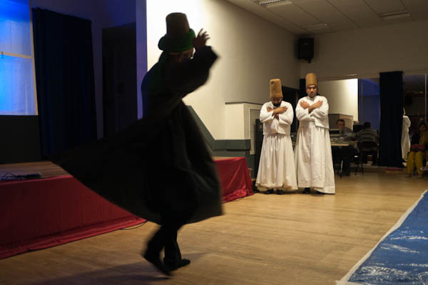
I also very much liked the set of pictures by Anders Petersen, perhaps a little more tender than some of his work. Rena Effendi has some nice pictures of people on the street and dancing, while Steve McCurry tackles whirling dervishes (a subject I’ve photographed a couple of times in Tooting!*) Anthony Suaa’s work I find more difficult to feel much empathy with, perhaps because of the kind of people and life he has photographed, dealing largely with the rich and successful, and I find it hard to see what he is saying about them although I admire some of the pictures. Reza’s long exposure blurs are perhaps just not my cup of tea, although sometimes it can be effective.

_______________________________________________________

*
© 2009 Peter Marshall
Whirling Dervishes from Lancashire perform in Tooting – Peter Marshall, 2009

________________________________________________________

My London Diary : Buildings of London : River Lea/Lee Valley : London’s Industrial Heritage

All photographs on this and my other sites, unless otherwise stated are by Peter Marshall and are available for reproduction or can be bought as prints.

To order prints or reproduce images

________________________________________________________

Bhopal & The Olympics

© 2012, Peter Marshall

The story was about the Olympics and the campaign to get Dow Chemicals dropped as a sponsor for it because of their environmental record, and in particular for their refusal to take responsibility for the continuing poisoning of groundwater in Bhopal after the Union Carbide plant their was abandoned following the largest ever environmental disaster yet.

The Labour Friends of India had organised a ‘photo-opportunity’ to take place in Trafalgar Square in front of the Olympic clock exactly 200 days before the start of the London Olympics, with a banner reading ‘200 days to drop Dow’ in a passable pastiche of the Olympic logo and a bottle allegedly containing water from Bhopal with a rather nicely designed spoof mineral water label as ‘B’eau Pal’ water.

Holding this was Labour MP Barry Gardiner, and also present was a woman who had been in Bhopal at the time of the massive poison gas escape that killed thousands, including her aunt.  Also present, by the time things got underway were around 3o photographers and videographers, ensuring that there was something of a scrum, as well as several of the ‘Heritage Wardens’, the Mayor of London’s security staff who hadn’t known this was going to happen and were not too happy with it.

It was tricky to get anything just a little different in such a situation and I didn’t really manage it. A straightforward picture or two of the banner and people in front of the clock – perhaps this was the best:

© 2012, Peter Marshall

and several pictures of the MP with the bottle – here’s another

© 2012, Peter Marshall

as well as several of Bhopal survivor Farah Edwards, including some of her reading her speech

© 2012, Peter Marshall

were the best I could do in the circumstances. Perhaps I might have arranged something with a little more interest, but I don’t like to arrange things. I’ve not seen any of the pictures the other photographers got, but I doubt if they were very different.

Demotix were obviously very worried about running the story, perhaps because of the draconian legislation around the Olympics here, and their claims to own as trademarks things like London, 2012 and Olympics. I twice posted a comment to the story, but all that appeared was a message saying my comment was awaiting moderation. Two days later it still hasn’t appeared. I’ve never known comments being moderated before on the site, usually they have appeared immediately.

What I posted in the comment was simple history about  Dow Chemicals and their involvement in Vietnam, both producing napalm for use by US forces (and they continued to produce it after the other companies in the business had been persuaded to halt production) and as one of the companies producing Agent Orange, a dioxin contaminated herbicide which as well as killing the crops on which the rural population depended as an intended part of the military strategy also has resulted, according to the Vietnamese, in 400,000 people being killed or seriously maimed and half a million children born deformed because of its use.

Photographer Philip Jones Griffiths heard about the effects of Agent Orange, and returned to Vietnam to take pictures. He met with a great deal of cover-up – as he wrote in an introduction to his work on the Digital Journalist site:

In almost all cases I was denied access, usually by polite smiling nuns. At the risk of sounding paranoid I became convinced they had been told to keep the press away…  I left Vietnam in the summer of 1971 without ever seeing a victim.

After the war had ended he returned – and saw and photographed the full horror of the situation. The gallery of images on-line doesn’t make easy viewing and it is a history that for me makes Dow a totally unsuitable company to sponsor either the Olympics or the Paralympic Games.

________________________________________________________

My London Diary : Buildings of London : River Lea/Lee Valley : London’s Industrial Heritage

All photographs on this and my other sites, unless otherwise stated are by Peter Marshall and are available for reproduction or can be bought as prints.

To order prints or licence to reproduce images

________________________________________________________