Watermarks & Copyright

What if The Masters of Photography Used Horrendous Watermarks? by Kip Praslowicz, a photographer from Minnesota, had the ‘idle thought … it seems like many amateur photographs spend more time putting elaborate watermarks on their images than they do making images worth stealing.‘ So he took some famous pictures and put over them the kind of watermarks he was thinking about, and you can see the results.

As you can see on his page, it generally makes something of a mess of them, although I think I prefer his version of the Gursky, certainly it seems somehow more honest to have the image covered with dollar signs.

His post also links to a few other amusing posts on other sites which also amused me at least slightly.  But I wasn’t entirely convinced with the premise behind his post, as there are plenty of examples of professional photographers and agencies which have covered their images with obtrusive watermarks (though perhaps quite at the level of his made-up examples.)

Paranoia about the use of images from the web doesn’t only affect amateurs, although it’s good to see that many photographers are getting over it, and at least one major agency that used to splatter it’s name over everything on-line has now abandoned that practice.

But visible watermarking remains quite a good idea, so long as it isn’t obtrusive, particularly with the kind of copyright legislation the UK government is trying to stealthily push through – read more about it in The Copyright Fight on the BPPA site and on Stop43.org.

© 2013, Peter Marshall
Alevi Protest Discrimination in Turkey & UK

I got a little fed up with the rather frequent unauthorised use of my images from the web a few years ago and decided to add a fairly discrete copyright message to every new image I put on the web. It’s very easy to set this up in a Lightroom preset – though I see I haven’t yet got around to changing the year to 2013!

© 2013, Peter Marshall
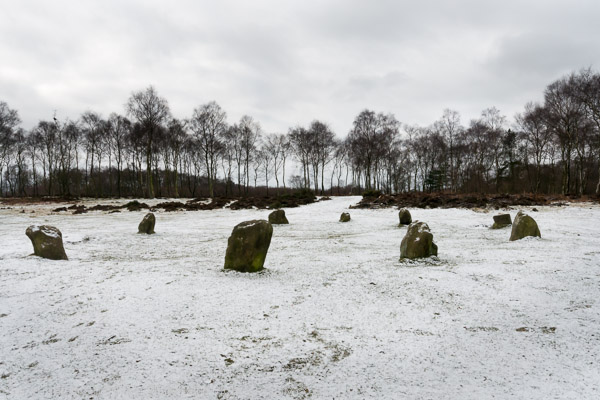
Nine Ladies, Stanton Moor, Derbyshire.  Feb 2013

Lightroom watermarking isn’t perfect – and the example on this snow image from Sunday is virtually invisible – but it actually now reads ‘Copyright © 2013 Peter Marshall mylondondiary.co.uk’.

It took me around 30 seconds to produce a new watermark file to get the year correct, selecting File, Export and my web export preset (it’s called Diary – for My London Diary), scrolling down and clicking on the name of the old watermark preset – pm2012 – and then choosing Edit Watermarks, changing the 2012 into 2013, clicking on the old name at the top left of the Watermark editor, selecting ‘Save Current Settings as new Preset’ and naming it pm2013.

I don’t take many pictures in the snow, so choosing a light grey for the watermark and a fairly high opacity makes it reasonably legible on most of my images. Of course the images on the web also have my name, contact details and copyright information in the metadata. My camera is set to add it automatically into the EXIF data as I take pictures, and the import preset which brings the images from the card into Lightroom adds it to the IPTC. But often these are routinely stripped from images. The watermark takes a little more effort to lose.

________________________________________________________

My London Diary : Buildings of London : River Lea/Lee Valley : London’s Industrial Heritage

All photographs on this and my other sites, unless otherwise stated are by Peter Marshall and are available for reproduction or can be bought as prints.

To order prints or reproduce images

________________________________________________________

More on World Press Photo

Rather than write in detail about this again, let me just direct you to a piece on PDN Pulse by David Walker, World Press Hits Pellegrin with Wet Noodle (And Other Contest Scandals) which gives details of the complete failure to take any action over the recent problems with work by Pellegrin and others I mentioned in the recent post Magnum Failure.

As the title of his post suggests, WPP are basically trying to say it doesn’t really matter that a photographer wilfully misrepresents the subject. The PDN piece also links to another good post by  photographer Kenneth Jarecke on his Mostly True blog, which discusses the case and also Pellegrin’s reaction to it.

There is a lot of discussion on Mostly True, and again much of it worth reading, but in the end I think the issues are simple.  What Pellegrin did simply was not acceptable for a documentary project; he should not have misrepresented it as documentary work.

I hope that both WPP and POYi will reconsider. Magnum will lose what respect it has among photographers – and the informed public – unless it puts pressure on both Pellegrin and the organisations to get the project withdrawn from the contests. At the moment they are all just trying to defend their backs rather than to correct the error.

And it was an error, and Pellegrin needs to admit it rather than blustering against everyone involved in bringing out the true story. It certainly isn’t enough to say “Looking at the presentation on the World Press Photo and POYi sites, I do regret the formulation, ‘where these pictures were taken’ in the background text in relation to Shane’s picture.” Of course there is nothing wrong with taking portraits in a documentary context, but this was a picture that was out of context in the actual story he was attempting to cover. Pellegrin attempts to plead innocence but his response pleads ignorance, which isn’t a defence. If he didn’t know it was because he didn’t ask the right questions, and having a good picture certainly doesn’t absolve you from this essential part of the job.

And I’ve just come across another post worth reading – Is it Lying? by Samuel Corum.

Direct Action Network Roadblock

© 2013, Peter Marshall
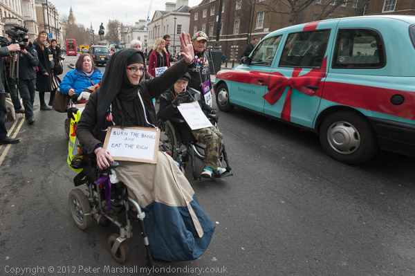
The protesters move away from the rally and on to the road

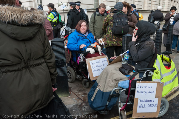
This isn’t the greatest picture I’ve ever taken, but it shows an interesting moment in the protest by the  Disabled Peoples Direct Action Network at the end of the Fuel Poverty Action rally in Whitehall. The text about both actions is at Fuel Poverty Rally & DAN Roadblock.

Earlier in the day I’d missed an attack on a photographer by a group of those marching with the South-East Alliance,  but this time I was wide awake when others had failed to notice the start of the move by protesters to block Whitehall, as the small group of wheelchair protesters had moved quietly a few yards along the road and the woman closest to me had just eased two wheels of her chair onto the road.

At the back of the picture are the police, seemingly quite oblivious to what is happening, with a Forward Intelligence Unit looking rather backward. Closer to the action, but in a small group talking to each other rather than alert to what was happening are three photographers – and there were others around mainly equally oblivious.

Had the other photographers been close enough for me to reach out and touch to alert them to what was happening I would have done so, but it was important to me not to do anything that would interfere with the action that was proceeding – my job was to report it.
© 2013, Peter Marshall
Disabled protesters move out into the road and stop the traffic

I moved in front of the protesters as they moved out into the road and stopped the traffic, keeping  slightly out of the way so that it really was them stopping the traffic and not me.

We had all been given a hint in advance that some kind of direct action would be taking place, but hadn’t known exactly what, where or when. I’d been watching carefully for hints, clues or signals and had spotted and read them more or less correctly and was in the right place at the right time. There are times – and this is one – where you need to try and read situations rather than simply respond to them, though at times I have read them in a disastrously wrong way.
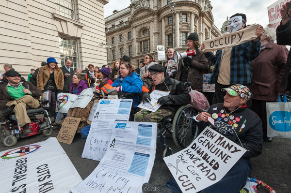
© 2013, Peter Marshall
Wheelchair users and pensioners block Whitehall in protest against cuts and fuel poverty

Where there is a choice I seldom want to work with groups or speakers head on.  It’s usually better to be a little to one side, particularly if people are using microphones. So when the road was blocked, I moved a little to one side, while the main crush of photographers was directly in front.

Looking from the side concentrates your view on those closest to you, while a head on view leaves everyone at the same distance and thus scale. Later I went further to the side and was then able to move in close without blocking the view of other photographers when an officer came to talk to two people he had identified as leaders of the protest – one was holding a megaphone.
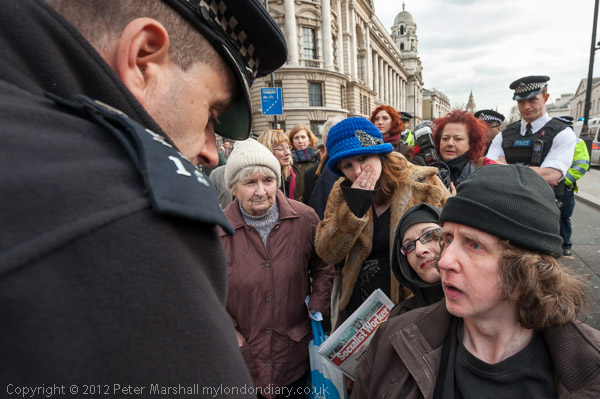
© 2013, Peter Marshall
An officer tries to persuade the protesters to move
Even when I moved around to the other side to get a better view of the exchange it was the officer rather than me who was blocking the other photographers.
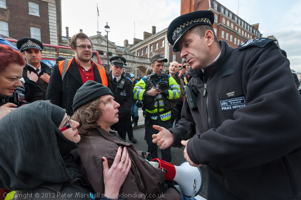
© 2013, Peter Marshall
Protesters argue with police

But then I had to move back to allow another wheelchair user came up to join in the conversation. After taking a few more pictures the officer moved and I then felt that I was perhaps getting a little in the way of others. I went down on my knees top take a few pictures from a low angle and be less in the way before moving back a little. Once I’d got the pictures I wanted it gave others a chance to get theirs.
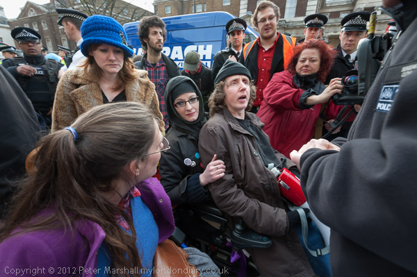
© 2013, Peter Marshall
Protesters discuss whether it is time to move

Of course we all get in each other’s way from time to time, and, like the photographer in the image above, we get in each other’s pictures. It’s inevitable when more than one or two photographers are covering an event.

But most of us realise the problem and try to work in cooperation with other photographers. It’s mainly the amateurs, often using their phones who walk in front of other photographers, though a special place in hell is reserved for those few video crews who think they are more important than the rest of us because they work for one of the big media companies.

More pictures at Fuel Poverty Rally & DAN Roadblock.

________________________________________________________

My London Diary : Buildings of London : River Lea/Lee Valley : London’s Industrial Heritage

All photographs on this and my other sites, unless otherwise stated are by Peter Marshall and are available for reproduction or can be bought as prints.

To order prints or reproduce images

________________________________________________________
Magnum Failure

I’ve written several times over the years admiring the powerful black and white images of Magnum’s Paolo Pellegrin, and wasn’t surprised to find one of his stories, on an area called ‘The Crescent‘ in Rochester, USA awarded second prize in the recently announced 2013 World Press Photo.  So it came as a shock to read in EPUK News that one of the images included in this was not quite what the photographer had alleged it to be, and that a large section of the text of the story had been taken almost without alteration from a New York Times story published ten years earlier.

EPUK News linked to a feature When Reality Isn’t Dramatic Enough: Misrepresentation in a World Press and Picture of the Year Winning Photo by Michael Shaw, the publisher of the BagNews Notes web site, which gives full details of how and where the picture was made and the various errors in the caption and use of the image – including some comments by the subject of the photograph, Shane Keller.

Briefly, the picture was taken after Pellegrin had asked a student who was assisting him during the Magnum project in Rochester if he could find someone to be photographed holding a gun. It wasn’t taken in the Crescent area, and the man holding the gun was a student with no connection with violence or drug-dealing in the area. Nor, as the caption asserted, had Keller been a Marine Corps sniper – and the gun in the picture is not – as stated – a rifle!

And although the man in the picture offered the photographer his details for captioning, the photographer wasn’t interested – which would appear to imply that he had already decided that the picture was going to be used in a way that did not reflect what it actually showed. The title of the BagNews Notes article suggests that it was the pressure to make stories more dramatic – particularly for the prize contests – which led him to decide he needed a picture that went beyond what reality provided and to set this up.

The article publishes the material from the New York Times together with  that submitted by Pellegrin, and the two are essentially identical. It seems a clear case of copyright infringement let alone plagiarism, and taken with the misuse of the image, it makes clear that what otherwise might have been arguably (if hard to believe) simply a matter of a careless approach to facts and journalistic ethics was a matter of deliberate pre-meditated deception. Not only is it a serious offence by the photographer concerned but it casts doubt on the whole integrity of the Magnum Agency.

Most surprisingly, the same story also won a second place in the Pictures of the Year International Awards, with the particular picture concerned winning first place in the Freelance/Agency category, but the controversy over it did not come into the open following this.

The case seems clear, and certainly demands investigation by Magnum, World Press Photo and POYi. Unless they take appropriate action they too will be sullied by the photographer’s failure, and public confidence in photojournalism and documentary photography will be further eroded.

I’ve never been a great believer in ‘awards’ whether in  photography or other areas. It’s always seemed to me that the real award for making a fine image or a great film is intrinsic in the thing itself, and certainly the kind of awards ceremonies for the Oscars and similar events are both embarrassing in the extreme and actually demean all those involved – whether they win or not. Few of the greatest films have done well at the Oscars, and if the satisfaction of making great works isn’t in itself enough, you probably are not making great works.

Nour Kelze

We Brits (though I don’t think we ever think of ourselves as Brits) often like to pride ourselves on our BBC, in some ways the best broadcasting company in the world, and sometimes I think there is some truth in this, also increasingly I find myself turning to other news services to find what is really happening in – for example – the Middle East, and deploring the BBC for its inaccuracy in reporting some UK events which I’ve attended, and its tendency to pitch for the status quo. Often accused of political bias by Tories, its real and utterly consistent bias is to the established order, even if a few of its journalists sometimes try hard to overcome this.

But one thing it’s never done well is photography. It’s too soaked in a logocentric culture to have any real idea about an essentially visual medium, but really it doesn’t try too hard since it just isn’t regarded as of any importance.

Much more often I find myself looking at and listening to features about photography at another public service broadcaster, the USA’s NPR. The latest is a report about Syrian teacher Noor Kelz, an English teacher from Aleppo who has become a war photographer. She started taking pictures on her mobile, but her career was transformed last Autumn by a meeting with Reuter’s photographer Goran Tomasovic.

He “spotted Noor shooting pictures with her cellphone. He trained her for a week on how to use a professional camera, then gave her a few of his cameras to keep. She’s been sending pictures to the agency ever since.

Noor (or Nour) Kelze was wounded in Aleppo a couple of weeks ago, suffering  a broken leg and shrapnel wounds when a tank shell exploded near her and is being treated in hospital in Turkey, but she hopes to be back at the front lines shortly. There are two pictures of her, one with her leg in plaster, on the PetaPixel post about the NPR show.

She appears in a film ‘Not Anymore, A Story Of Revolution – Nour Kilze – Noor Kelze‘ made by Matthew VanDyke who she worked with to raise funds for the Free Syrian Army which is due for release shortly – all I can find at the moment is a short CNN feature on it.

You can see Goran’s work on a blog on the Reuter’s site, where there is also a fine  slideshow of his work from Syria.

WPP Time

It’s the time of year for the usual criticisms of the winning images in World Press Photo. if you’ve not already done so, rather than wade through the whole lot on the official site you might like to look at a slide show of the 18 top winners on Lensculture. And of course you can learn something more about some of them on PDN and the British Journal of Photography site with a stories about Paul Hansen‘s winning image from Gaza City and Spanish photographer Bernat Armangué‘s series of images also from Gaza as well as several other stories.

Paul Hansen was also the winner of  the 2012 Newspaper Photographer of the year in the 70th Pictures of the Year International (POYi), with a portfolio that as well as Gaza covered the mass murders on the Norwegian island of Utoya in July 2011.

I usually go to the the WPP show when it comes to London, but always with a heavy dose of deja-vu, though usually there are pictures that stand out for some reason or other, though often not the major winners. But most of the main themes that produce the most shocking or startling images repeat themselves event if the massacres, famines, floods and earthquakes happen in different parts of the globe, so it’s perhaps not surprising that the images are often similar.

Duckrabbit quotes a Gary Knight ( Chair of  2013 World Press Photo Contest – before he stepped down) quote from ‘A Photo Editor’  and a comment from that site by Mike Moss in a post entitled Cliché on cliché?  But what I found more interesting is the comment made on duckrabbit by Tobias Key on the lighting in the winning image.

As he suggests there is something that seems over-produced about it, as if it was lit by a large soft-box fired by a radio-trigger on the camera. It would have been a powerful picture without the added drama of the lighting, because of the subject matter and viewpoint, but to me the lighting makes it into a film set, or a hyper realistic painting, and for me it weakens the raw impact of the image. I have a suspicion that the effect is partly or mainly from post-processing rather than lighting. Perhaps there is a clever Lightroom pre-set you can buy to do this to your images?

Don’t get me wrong. I admire the photograph and the undoubted courage and skill of Hansen and others who make such images. It’s something I could never do. But perhaps this – and others – work would be better if they turned down the techniques a little and let the subject speak for itself. Of course that way they would almost certainly not win prizes.

Gabriele Basilico (1944-2013)

Italian photographer Gabriele Basilico who died on Wednesday in Milan where he was born was not as well-known in the UK as he should have been, perhaps because the area in which he worked, the urban landscape is not generally highly regarded in this country. Although I went to several exhibitions of his work in Paris (for example Vertical Moscow), I can’t recall having seen one in the UK.

There is a good introduction to his work at Studio La Città, which also has a list of his solo and group shows around the world since 2000 – and none have been in the UK. His pictures from Palermo were shown in Cardiff in 1998 and work from a war-torn Beirut at a private gallery in London the previous year, but seem not to have featured in any of our major London galleries. It’s a shame that we’ve never really had a major space in London devoted to photography – and in particular that the Photographers’ Gallery which gets so much of the photography funding that crumbs down from the opera-dominated Arts Coucil has failed to step up to the mark in this and many other areas of photography.

You can see more of his work online at the Amador Gallery (New York). Although best known for his black and white work, there is an interesting colour series, Roma, on the Galerie VU website, which presents a rather different view of the city. There is a fine collection of his work at the Galerie Anne Barrault, which includes one of my favourite of his images in the 1984 series bord de la mer.

Basilico trained as an architect and had his first important photographic show in and on Milan in 1983. The following year he was the only Italian of the 36 photographers commissioned by the French government for their major DATAR project to ph0tograph the natural and built environment of France. Among the other photographers involved were Lewis Baltz, Raymond Depardon and Robert Doisneau. (A full list is in the French Wikipedia article, and there is a history of the project, La France vue du sol, by Vincent Guigueno published in 2006 in études photographiques and available online – if your French is up to it.)

Several if not most of those photographers whose work is featured on the urban landscapes web site I run with Mike Seaborne were impressed and to some extent inspired by the work of Basilico, and by his success. We would have loved to have featured his work on that site, but never quite got around to contacting him, overawed by his reputation.

Sirkka-Liisa Konttinen

I last wrote about the work of Sirkka-Liisa Konttinen a couple of years ago, when the BBC had just broadcast a radio programme about her work. I bought her book ‘Byker‘ when it came out in 1983, and even the rather dull reproduction (standards really have improved greatly) couldn’t hide the power of her work on this area on the edge of Newcastle in a period when it was being completely redeveloped.

It was a subject that appealed to me as well as fine photography. The redevelopment of Byker in the 1970s showed how planners had learnt at least from some of the mistakes of the earlier decade that had taken me into political activism on the streets of Manchester before I became a photographer.

Born in Finland, Konttinen had come to London to study film at the Regent Street Polytechnic and there with like-minded fellow students had formed a collective to make documentary films. Amber Films had a commitment to documenting working-class life, and though they had started in London soon found that the capital was too expensive to live and work and moved to Newcastle, a city 300 miles to the north, where the older industries which it had depended on were in severe decline. She fell in love with Byker, moved in and lived there for 11 years, getting to know the people. Being a foreigner and being a young woman was almost certainly an advantage as she went round getting to know people and taking pictures, and as she writes “The first night I sat alone in the ‘Hare and Hounds’ I was taken under the collective wing.” And over the years she really did become a part of the community she was photographing and she goes on to write of her neighbour pointing “out proudly: ‘When she first came in our street, she couldn’t tell hello from tarra, and now she speaks Finnish with a Geordie accent.'”

I mention her again because her work  is featured on the New York Times Lens blog  Byker in Black and White and again today in Bringing Color to Newcastle The mention comes with a show in New York at the L. Parker Stephenson Gallery from 15 Feb until 18 May 2013 and a lecture by Konttinen at the International Center for Photography on Feb 13 which should be streamed live (and at some point make its way into their archive on the same page.)

Although the BBC programme linked on my page no longer has the audio available, the text does perhaps give a slightly different view (as too do my comments), and the other links on my page still seem to work, taking you among other places to Konttinen’s page on Amber Online, where as well as work from ‘Byker’ and ‘Byker Revisited‘ you can also see pictures from eight of her other projects.

On the Side Gallery page of the Amber website there is some more about her trip to New York, including a link to a short film on making her ‘spacehopper’ print.

Paris 1914

The Autochrome process was patented by the Lumière brothers in France in 1903 and sold from 1907. It was an ‘additive’ colour process, mixing light of the three primary colours like the image on a computer screen, rather than the later subtractive processes developed in the 1930s, including Kodachrome and Agfacolor. A tri-colour screen was incorporated onto the glass plate by squashing a single layer of a random mixture of dyed potato starch grains onto an adhesive coating, the gaps between the grains were blocked with lampblack and the screen varnished to preserve it, before being coated with a panchromatic black and white emulsion.

Public Domain image
Public domain image of a highly magnified autochrome screen – Wikimedia Commons

For practical reasons, probably due to the limitations of available dyes, the Lumières used orange-red, blue violet and green dyes rather than the conventional red, blue, green (RGB) set. As gaps between the starch grains were blocked by black lampblack, and the coloured starch grains also absorbed light, far less light reached the film than when making a black and white image. A strongly coloured orange filter was needed on the lens, partly to cut out all the UV, but also to correct for the higher sensitivity of the emulsion to the blue end of the spectrum – as panchromatic films of the era were still not very sensitive to red. They were also slow by modern standards, so exposures were length, made with the camera on a tripod – and avoiding subject movement.

The plate was developed in a normal developer to give a negative silver image. This was then chemically removed leaving the unexposed silver halide on the plate which could then be exposed overall to light and the plate developed a second time to give a positive image. These images were very dark but the colour could be extremely good. Particularly when enlarged, the results show a brightly ‘pointillist’ effect which can sometimes be annoying but often adds to their attraction.

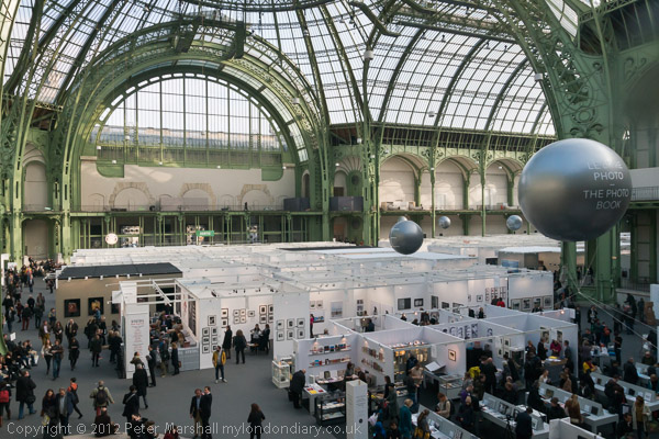
On the Paris1914 site there are a good selection of coloured images of Paris taken between the introduction of the process and 1939, including some taken by  Léon Gimpel (1878-1948),  a well-known amateur photographer of the era whose work was celebrated in a show at the Musée d’Orsay in 2008. One of his pictures is of an exhibition in the Grand Palais in 1909, which perhaps looks a little more interesting than Paris Photo at the same location 103 years later.

© 2012, Peter Marshall
The Grand Palais in 2012 – with smaller balloons

The quality of the results is quite variable – one of my favourite images, ‘Une famille, rue du Pot-de-Fer, Paris, 24 juin 1914′ by Stéphane Passet, could almost have been taken using modern materials, while some of the others are extremely crude.

You can see more about the Albert Kahn collection – which included these among around 70,000 autochromes – in a presentation about La Mongolie, entre deux ères, 1912-1913, about the current show (until 31 march 2013) at the musée Albert-Kahn in Boulogne-Billancourt on the edge of Paris.

You can also see a more varied selection of work on an official French government site, Autochromes Lumière, a superbly detailed site full of historical information and of course images. I really can’t imagine anything similar being produced here. There is also more about Gimpel and other photographers who used the process on this site.

Perhaps if the UK had a real Arts Council rather than a Opera Council with crumbs for the rest we might get sites like this dealing with aspects of photography?

Murder & Masterclass

I’m sometimes a little sceptical about ‘masterclasses’ and workshops, not least because I’ve myself taught a few over the years. While many seem worthwhile and some seem to offer very good value for money, others seem to be merely money-making exercises, charging high fees for the privilege of being taught by someone who has little idea how to teach and only a fairly basic grasp of the subject in which they are supposedly a master.

I’ve attended a few over the years too and they have varied immensely in quality, from disappointing to highly inspiring. I’m sure I wouldn’t be writing this now if in the 1970s I hadn’t made a trip to Derbyshire for a workshop with Paul Hill and Raymond Moore, something I’ve written about on various occasions, including in Darbis Murmury. It was so good I went back several times for more.

One that I’m sure was very worthwhile – and you can read about it from the point of view of a blogger who attended it – was last weekend’s Guardian Masterclass run by Antonio Olmos. At the bottom of sarasiobhan’s short piece is a list of ten ‘top things she learnt‘ at the class, which she is very complimentary about.  Apart from the ‘(use a 50mm fixed lens)’ they are all good sense – really a 50mm makes it hard to get in close enough, and a 28mm or a 35mm is better. Since sarasiobhan already uses a Leica X1 – with a fixed 35mm equivalent lens – it seems in any case redundant advice so far as she is concerned.

I wrote about Olmos before when he gave a talk to Photo-Forum in 2010, and he has produced some great work you can see on his web site, as well as regularly in  The Guardian where you can also read his advice on street photography.

I’ve been meaning for some time to mention his ongoing series The Landscape of Murder and the features on his blog (subtitled with typical self-depreciation ‘Ramblings of a mad visual mind’) are always worth reading. He has a separate blog devoted to his Landscape of Murder project which is perhaps the best way to approach this work.

In my post on his 2010 talk I wrote:

Olmos also passed on a great bit of advice he himself received, that if you find yourself surrounded by photographers when taking pictures, you are almost certainly in the wrong place.

and a week or so later I thought of his comment again when I was taking this picture:

© 2010, Peter Marshall
US Flag, photo of pastor Terry Jones, lighter fuel, US Embassy & Press, Peter Marshall

and wrote about it in another post, Flag Burning, Photography & Politics. It’s something we very much agree on (and readers may notice that I have often passed on this advice), and his work is distinguished by his thinking about his subjects and finding different ways to approach them.