Are photographs ever portraits?


John McDonnell MP, Shadow Chancellor of the Exchequer speaking at yesterday’s ‘Grants Not Debts’ protest

I take a lot of pictures of people, some of which I share here and rather more on My London Diary. I’ve also photographed many others, including members of my own family and friends I know well. Quite a few of those are framed and hanging on people’s walls, while those I’ve taken of public figures have featured in various magazines and newspapers. Some are better than others but most are pretty routine, like yesterday’s picture of Shadow Chancellor John McDonnell, a man I know and have photographed on many occasions over the years.  It’s not a great image, but you can find worse of him every day in the newspapers.

But I’ve never thought of myself as a portrait photographer. And always rather questioned the whole idea of a photographic portrait. I think there are valid examples – for instance Alfred Stieglitz‘s truly intimate work on Georgia O’Keefe springs to mind, but there I’m thinking not of a single image, but of a whole set of images,beautifully presented in the 1978 Metropolitan Museum of Art publication ‘Georgia O’Keefe – A Portrait by Alfred Stieglitz’ which on the front dust-jacket flap states ‘His idea of a portrait was not just one photograph but a series of photographs that would be a portrait of the many aspects of a person.’ (The book is still available from book dealers at a ridiculously cheap price for such a well-produced and important work.)

There are many other pictures of people that I like, many of them good or even great photographs but few which really reach into the depths of a person in they way the best painted portraits do. Though its also very clear if you take a walk around inside – for example – the London National Portrait Gallery that there are many bad painted portraits as well as many poor photographic portraits both in the permanent collection and in their annual prize shows for photography and painting.

But even among photographers whose work I admire greatly, their ‘portraits’ are often the weakest work. Even with a master like Cartier-Bresson there are images which without the name of the famous sitter would probably never have been printed. (Some of his better portraits  along with some images that certainly are not portraits and one or two that perhaps fail to display his master touch and were clichés even before he made them are linked in the Portraits selection on his Magnum page.) And newspapers and magazines are full of poor or indifferent if sometimes technically competent images of people.

What got me thinking about this was a video created by The Lab in conjunction with Canon Australia in which they set up six portrait photographers to photograph the same man, giving each a very different story about him. Looking at what you can see of their results on the video published in the story by Shutterbug, each produced a very proficient image based on the story they were given, particularly as they were given only ten minutes (though often photographers have to do with considerably less, while painters often have months rather than minutes.) But I don’t think any of them was really a portrait of the person, rather an illustration for the story they were told.
Continue reading Are photographs ever portraits?

Harrodsburg

A remarkable set of pictures by ‘Glasweegee’ Dougie Wallace of the wealthy on the streets around Harrods and other shops selling ridiculously priced bling have apparently caused quite a stir in Qatar (where many of those he photographed have their homes) according the the British Journal of Photography, in an article Qatar responds to Dougie Wallace’s photographs of Britain’s wealth tourism.  The BJP also claim responsibility for having given him the idea, when they erroneously reported last December that he could be found working outside Harrods. It seemed to him to complement work he was doing in  one of the poorest areas of Glasgow, close to where he grew up.

You can see more of his work from ‘Harrodsburg‘ at The Story Institute, which also has some text worth reading on his work and the motives behind it. The area in which he worked – not just around Harrods, but down to Sloane Square and around the Ritz, once the home of many over-wealthy British, is now largely in the hands of “the various tribes of the global super-rich buying up London homes like they are gold bars, as assets to appreciate rather than as homes in which to live.”

More interesting than the BJP story is the article it links to in The Doha News, published in August.  It’s also worth reading the comments. (To save you worrying as I did, the hashtag  #دوغي_والاس  is simply #Doga_walas.)

Wallace’s images remind me of things that I’ve seen walking around some of those same streets, but have never photographed. Perhaps I should say, have never had the bottle to photograph.  Though rather that I’ve never had a very good reason to want to photograph. They are streets too that I dislike, only going through them when I have to, usually on my way to some embassy or other to photograph a protest. But his work is impressive – even if it doesn’t go down too well in Qatar. At the moment we can photograph freely on the street – a liberty I value that we may well lose unless we defend it.

Ooredoo (formerly Qtel Group) which provides most of the internet in Qatar (and probably other internet providers there) was quickly forced by the authorities to block the web site with the images, probably because as well as causing the ultra-rich embarrassment they also show their hypocrisy, particularly in wealthy visitors to London abandoning the strict rules of dress they forcibly impose on others in Qatar.
Pictures from ‘Harrodsburg‘ have been on show in London at the Printspace on Kingsland Rd, but the show, part of the East London Photomonth, was due to close today – or tomorrow or Wednesday – all three dates are in the links.

You can also visit Dougie Wallace’s web site, and buy his books Shoreditch Wildlife and Stags, Hens & Bunnies. The Shoreditch book is I think much better than the presentation on the web, and I hope that Harrodsburg will become available in print before too long.


The Palaces of Memory

If you’ve not yet got a copy of Stuart Freedman‘s The Palaces of Memory, pictures from the Indian Coffee Houses, I suggest you do now. It’s one of the most charming publications I’ve seen for a while, and I was pleased I decided to support the Kickstarter campaign – one of the 157 backers who together pledged the £10,496 that made it possible.

You can see 44 images from the Indian Coffee House project at Panos Pictures, and there are also pictures on the BBC web site and elsewhere. I was fortunate to see the photographer talking about and showing this work around six months ago to a crowded meeting of Photo-forum in London, and it was also featured on Lensculture.

Google will now find you a long list of reviews, articles and interviews about the work, but I’ll pick out just a few: Roads and Kingdoms has a nice interview with Freedman talking to their Director of Photography Pauline Eiferman; Slate’s Photo Blog Behold has a well-illustrated feature, and of course Freedman has his own web site including a blog, Umbra sumus – ‘we are but shadows’…, where his occasional posts are always worth reading.

But perhaps the nicest article I’ve so far found is  on The Delhi Walla; City Moment – People of the Book, Indian Coffee House by Mayank Austen Soofi who took Freedman’s book  to the Indian Coffee House in Connaught Place to the obvious delight of the workers whose pictures and those of their customers appear in it.

Tendance Floue at 25

Today’s e-mail from L’Oeil de la Photographie (available here on the web) is devoted to Tendance Floue, currently celebrating its 25 anniversary. As usual there are links to other features about the photographers on L’Oeil as well as the group and show web sites.

You may never have heard of Tendance Floue, particularly if you are not French, as English media in general seem seldom to pay any great attention to photography in France, or at least photography in France by a post-Magnum generation. With a few exceptions it hasn’t really been taken up by the US dealers and museums that tend to dominate the ‘Anglo-Saxon’ photography world.

Tendance Floue is a collective which has had a remarkably stable membership over the years since they were founded in 1991 by Patrick Tourneboeuf and Mat Jacob. Born in or around the 1960s, all of the twelve photographers involved when I first came across them in 2006 are in the 25th anniversary show, and there is just one addition, Alain Willaume, who rejoined them in 2010; Caty Jan is still featured although she had to give up photography after a stroke in 2003. The Paris show continues until October 17, 2015.

When I wrote about their 20th anniversary shows five years ago, I failed to find the earlier piece I had written about them, and got at least one of my facts from memory wrong. I first met them and their work when I went to an opening which was part of the 2006 Mois de la Photo, and wrote the following short note around 4 months later.

Tendance Floue
One of the shows I visited last November during the ‘Mois de la Photo’ in Paris was that of Tendance Floue (site in French*), a French photographers’ co-operative. Literally ‘Fuzzy Tendancy”, the group, founded in 1991, now has 12 members, Pascal Aimar, Thierry Ardouin, Denis Bourges, Gilles Coulon, Olivier Culmann, Mat Jacob, Caty Jan, Philippe Lopparelli, Bertrand Meunier, Meyer, Flore-Aël Surun and Patrick Tournebœuf. Their 2006 book, Sommes-Nous? has been awarded the 2007 Infinity Award for Publications.

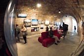
The Paris show was held in one of the more atmospheric venues of the month, former storage cellars in the arched space under a road close to the new Bibliothèque National, in the yard of ‘Les Frigos’, where I also saw the impressive nudes of Chilean Photographer Paz Errazuriz. As well as the images on the wall, there was also a projection, allowing the work to be seen at a large scale. Some of the pictures are indeed rather unsharp, and the group as a whole obviously sets more store on producing powerfully personal statements than on technical correctness. In a group such as this there is bound to be work by some photographers that I found more interesting than others, but it is certainly worth looking at them all on the web site. My installation view was shot handheld in the darkened space and gives some idea of the way the work was hung on the curved brick vault.

*I’m pleased to find that their web site now has a full English version.

I’ve spent some time looking for the original of that installation view – and a few other pictures I took in the show, but with no success (though it is probably still on the old CDs I keep in the loft.) The thumbnail above was with the original post, where it was ‘used by permission’ of the group. But I did come across some of my more interesting pictures from that week in Paris, which perhaps I’ll come back to in another post.

But it came to me as a reminder of how photography has moved on. Without the file I can’t exactly recall the exposure but I do know the lighting was something of a challenge for the Nikon D200 I took it on by available light. I think it would have been rather easier with the D810 at higher ISO and with a greater dynamic range. Black cats in coal cellars are now hardly a problem.

Yet More on Capa

Those few images that Robert Capa managed to take on Omaha Beach in the morning of D-Day continue to attract attention from researchers, with a second guest post in the series on Photocritic International by amateur military historian Charles Herrick (in two parts, Part 1 and Part 2.)

From careful examination of the ten images that we now know were all that Capa took, Herrick shows exactly where on the mile long beach he landed, and is able to pinpoint his position as “just a few yards east of the Roman ruins on Easy Red.” The posts also contain much detail about the military operations which I’m content to leave to military historians, but clearly seems researched in depth.

This was a critical area of the landing, at what Herrick describes as “a seam” in the German defences which enabled the US troops to make rapid advances at this very point. By the time Capa arrived with the second wave of landings they had made considerable progress and the area was only under “light” fire, enabling the engineers that Herrick earlier identified in Capa’s pictures to get on with the work of destroying the beach obstacles.

As Herrick, with the benefit of his 26 years in the US army followed by a career as a defence contractor comments, ‘“Light” is a relative term when describing fire, especially if you are on the receiving end.’ And he goes on to comment “Perhaps we can partially excuse Capa for his elaborations; Omaha was his first opposed assault landing” and states:

Omaha Beach must have come as a shock. In the grip of that shock, he undoubtedly registered false impressions, impressions that easily morphed into the further exaggerations of Slightly Out of Focus.”

Capa’s first reported account of his landing on D-Day morning was an interview three days later which was published in a book rushed out by September 1944 was quoted in an earlier post in the series by A D Coleman and he began it by stating ““It was very unpleasant there [on Omaha Beach] and, having nothing else to do, I start shooting pictures. I shoot for an hour and a half and then my film is all used up.

Herrick comments that by the time Capa brought out his own book , Slightly Out of Focus in 1947, the story had become “far, far bloodier“:

“Capa apparently lifted the carnage that occurred elsewhere on Omaha Beach and superimposed it on his own much less deadly experiences. One only has to take a fresh, unbiased look at his photos for proof.”

To look at them at least with the trained military eye of Herrick, and also in the light of what the research by Coleman and his colleagues in the Robert Capa D-Day Project has revealed.

Capa was a photographer and not a soldier, and clearly and as Herrick says, understandably, he panicked, reacting to his false impressions of what was happening, and he took the first opportunity to get out, even though he knew he had only taken a few pictures – ten frames. Herrick tells the story of the military surgeon who landed with Capa and had a similar reaction; he was shortly given orders by the regimental commander to follow him up the beach. But as a photographer, Capa was on his own on the shore, with no one to tell him what to do.

Herrick also mentions and links to the similar detective work of another military historian who by studying the pictures has come to similar but not identical conclusions about Capa on D-Day. Coleman also notes that Herrick’s account differs in details about the timings on the day from that advanced previously in the series by him and  J. Ross Baughman, but that all of them conclude that Capa only spent “15-30 minutes at most photographing on Omaha Beach; and made only the ten surviving 35mm negatives while there.”

Although there is still room for minor differences between accounts (and Herrick’s researches throw yet more doubt on the identification of “The Face in the Surf” as Private Huston Riley), the overall picture now appears very clear.

Though not apparently to some French commentators working for Le Monde and Télérama who are apparently still to firmly under the influence of the myth to believe the evidence. It’s perhaps a matter of national pride; although Capa was not French he was adopted by them, spending a great deal of his life in Paris, and Magnum very much is.

Harder to explain is the Wikipedia article on Capa, and the separate wildly inaccurate article on his D-Day images, The Magnificent Eleven, which after recounting the myth as gospel does mention that perhaps there were never more than eleven exposures, managing to give the credit for this suggestion to John Morris, the man who invented the whole now discredited fiction in the first place.

Hine and the Empire State

A short note in L’Oeil de la Photographie (The Eye of Photography), one of series by former LIFE picture editor and photographer John Loengard, based on his 1994 book and current touring show Celebrating the Negative, set me thinking about the life and work of Lewis Hine, and in particular his images of steelworkers made during the building in 1931 of New York’s Empire State Building.

At the bottom of the piece in L’Oeil there are links to several other posts in the series by Loengard, on negatives of celebrated images that he photographed by Henri Cartier-Bresson, Wynn Bullock, Edward Weston, Joe Rosenthal, Robert Capa, Man Ray and Richard Avedon.  (It should be noted that the short quote on Capa rather perpetuates the myth around his D-Day images that has been so effectively researched and demolished by A D Coleman and his collaborators in the Robert Capa D-Day Project, though of course their in-depth research does nothing to diminish the power of  Capa’s images.)

Loengard in his note on Hine states that that the new art director of Survey magazine which had used his work over the previous 20 years “found his pictures old-fashioned“, wanting more graphic images.

You can see more of Hine’s work on the Empire State in various collections, including that of George Eastman House. There appears to be more on their older web site than in their new image licensing website (search for Empire State.) There is another good collection online at the New York Public Library.

You can read more about Hine on various sites. I’ve written only fairly briefly about him in various places, including in a longer essay on the New York Photo League, which inherited some of his work as well as his being influenced by his work. This piece, written in 2001, is still available (though slow to load) from the web archive, and includes this paragraph:

Hine occupied a special place in this pantheon of the League. His campaigning work from around the turn of the century, fighting for protection for children in the workplace (and the enforcement of existing laws designed to protect them) was the epitome of the type of photography the League existed to promote.

It goes on to state that “When Hine died in 1940, his collection of pictures and negatives was presented to the League” and gives some further information. You can learn more about what happened to his work in an earlier article by Vicki Goldberg in the New York Times about a show at the Brooklyn Museum of Art. In it, Goldberg writes of Hine’s “daring and daringly designed images of men and steel and sky” which seems to match better what I see in the work than the opinion of the Survey art editor.

Goldberg goes on to write “Hine’s work sharply poses one of the crucial questions about photography: how much does esthetics count in documentary?” It remains a crucial question though my answer has been that aesthetics must be the means rather than the end. It was a conclusion that decisively altered my own work 35 years ago.

And Hine’s own end also perhaps has lessons. Goldberg writes that in his last years no one wanted his work; “he lost his house, stopped photographing and applied for welfare. He died as destitute as anyone who ever sat for his lens” and later in the piece, “Hine could scarcely sell a photograph at any price.”

Apparently at his death, “the Museum of Modern Art was offered his pictures but did not want them; George Eastman House in Rochester did.” Hine’s work wasn’t entirely lost from sight, and I first met him in the pages of the two early popular histories of photography, by the Gernsheims and by Beaumont Newhall, but the attitude of MoMA is still reflected in the art world today.

We saw it recently in the Arts Council England’s treatment of Side Gallery here in the UK, which lost its entire ACE funding in 2011, and Photofusion which lost funding in 2015. Side, like the Brooklyn Museum of Art which Goldberg states “put Hine squarely in the spotlight with a retrospective in 1977 after a nearly 40-year hiatus“, also exhibited his work in 1977.

Gibson’s Political Abstractions

A post in the L’Oeil de la Photographie sent me looking again at the work of Ralph Gibson,  who has a show which opened a few days ago at the Mary Boone Gallery in New York, Political Abstractions. The show, which continues until Oct 31, 2015 consists of diptychs, pairs of images sometimes in colour and sometimes black and white. I’ve read the text in L’Oeil and in the gallery press release without getting a great deal of enlightenment, but you may do better than me.

One of the things that inkjet printing makes easier it printing a black and white and a colour image on the same sheet of paper, and most of the images on-line pair colour and black and white, though some use two black and whites, and I think one – on Gibson’s own site – has two rather similar colour images. But mostly the pairs seem fairly unrelated, with a few showing a similar line or shape (or pattern or shadow, according to the press release, which also has nice summary of Gibson’s signature “everyday objects isolated, strongly shadowed, and cropped so that they become potent and mysterious.”)

I fail to understand why Gibson terms these works ‘Political’, though the release states: “The subject of the work
becomes not the individual images, or their juxtaposition, but the act of looking” which may be behind the use of the term.

Early in my time as a photographer I became something of a fan of Gibson, and certainly made a few images that (for me at least) recalled some of his in the early 1970s, and my copies of his Lustrum trilogy, The somnambulist (1970), Deja-Vu (1973) and Days at Sea (1974) are dog-eared and falling to pieces. Though I’ve also been impressed at more recent shows and publications it sometimes feels that there is little new in his work. There is perhaps only a short divide between a style and a rut and sometimes I’m unsure which side of that distinction the newer work lies. But there are still images that Gibson produces that have a powerful resonance. Whether or not that is increased by pairing them I leave – like Gibson – to the viewer.


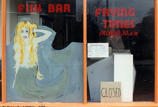
Kensal Green, 1988. Peter Marshall, from Café Ideal, Cool Blondes & Paradise

Ralph Gibson certainly encouraged my photography through his publications (including the other books from Lustrum as well as his) and also in person on the one occasion I showed my work to him, I think in 1988 when he had a London exhibition at the Photographers’ Gallery. Not just to him but at a public criticism to a crowded space in the gallery where I took up my portfolio with some trepidation, after he had been fairly tough on the work of a previous photographer. I’d taken colour prints – from the body of work that produced (among other things) my ‘Café Ideal, Cool Blondes & Paradise‘ and he spent some time looking through the book as I stood there shaking.


Shoreditch, 1986. Peter Marshall, from Café Ideal, Cool Blondes & Paradise

His comments and questions were fortunately both perceptive and positive and it was a great encouragement to me to continue that work.

Poplar, 1988. Peter Marshall, from Café Ideal, Cool Blondes & Paradise

Continue reading Gibson’s Political Abstractions

The New East

Somewhere I picked up a link to an article in the Calvert Journal from July this year, In focus: 29 women photographers picturing the new east written by Anastasiia Fedorova who states:

With cameras in hand, women are leading the way in defining the visual identity of the new east. Reclaiming their gaze from a conservative, male-dominated society, they are exploring gender roles and sexuality, myths and archetypes, the body, landscape and the urban environment. Here’s our pick of the female photographers at the head of the pack in picturing the new east.

Its an interesting selection, with much worth looking at. Quite a few of the photographers are now working mainly in the old west so some names may well be familiar to you.

I wondered about the Calvert Journal, which I’d not come across before and find it is published by the Calvert 22 Foundation, “a non-profit UK registered charity created in 2009 by Russian-born, London-based economist Nonna Materkova” which describes itself as providing: “A guide to the contemporary culture of the new east: the post-Soviet world, the Balkans and the former socialist states of central and eastern Europe” and as well as publishing the on-line Calvert journal established the Calvert 22 Gallery, (currently closed for refurbishment) dedicated to the contemporary art of Russia and Eastern Europe, in two floors of a converted warehouse on Calvert Avenue in Shoreditch, East London.


Arnold Circus, Bethnal Green (C) Peter Marshall, 1986

Calvert Avenue is a street I’ve often walked down, leading to Arnold Circus, at the centre of the Boundary Estate which has a good claim to be the oldest council housing in the world, built starting in 1890 by the Metropolitan Board of Works and completed by the then new London County Council. (That body’s successor, the Greater London Council, was the victim of one of Thatcher’s most malicious and senseless acts, from which London still suffers, with a ridiculous, divided and unsuitable system of government for a major city.)

It was a slum clearance scheme, replacing part of London’s most notorious slum, the ‘Old Nichol’. You can read a little more about it in my post Bethnal Green Blues, and much more about the area as a whole and its people in Cathy Ross’s ‘The Romance of Bethnal Green’ which that post is partly about.

The gallery and other recent developments in Calvert Avenue are a part of the gentrification of the area. One blogger described it in this way: “Just a few years ago it was semi derelict save for the launderette and newsagent, but now the street is a buzzy destination for the style-savvy supporters of the independent retailer revolution.” That semi-derelict street was of course the home to many who now find themselves priced out of the area as it gets taken over by oddly-bearded ‘hipsters’.

One of the events I missed photographing in July was a street party in neighbouring Camden; its event page on Facebook included the following:

The heart of Camden is being ripped out, pubs are being converted to luxury flats no one can afford, venues are under threat, the market is flogged off to be a casino (and yet more unaffordable flats) Rents are rising….fast.

Soon this community will be an unrecognisable, bland, yuppie infested wasteland with no room for normal (and not so normal) people.

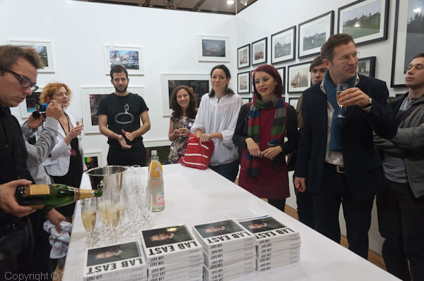
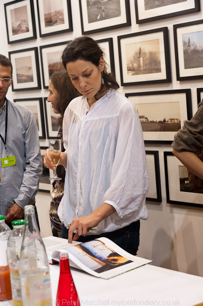
Back in 2010 at Paris Photo I went to the launch of the book ‘Lab East’, featuring 30 young photographers from Central and Eastern Europe, writing about it on this site.

I don’t think any of the women from this book are included in the Calvert Journal feature. Partly this reflects the great number of interesting photographers emerging from Central and Eastern Europe, but also I think that ‘Lab East’ seems to be more at a grass roots level, while the more recent feature is more about those who have already made it in the west.

Brian Griffin: Himmelstrasse

I don’t think I’ll be able to make the book launch of Himmelstrasse by Brian Griffin at the Photographers’ Gallery tonight, though the book with its images of the railway tracks in Poland which took around three million people to the death camps seems a powerful and impressive personal response to the Holocaust. And any opportunity to meet Brian is always rewarding.

I’ve twice been to the area of Poland close to Auschwitz, and never felt able to make the visit there, always telling myself “perhaps next time.” It would have been difficult to fit in to a busy schedule, but I think this was just an excuse.

The images of the rails, all single track, running through areas of forest have a desolation, seem all to be made in winter, a few with snow on the ground. Some are a little overgrown, but most seem still to be in use, with occasional track-side signs and still shining rails. The 15 images on Brian’s own web site are half in black and white and half in colour (as well as the Nazi-style design book cover with its title in ‘black type’ and simple graphic design in red and white.)

Although most publicity for the book seems to have chosen the black and white images – and particularly one with two sofas and a chair neatly at the side of the line – I think the colour images are perhaps more straightforwardly emotional, with their sombre browns and dull winter greens, with sometimes sparse patches of snow. A couple also have the blue sky of ‘Himmel‘ in the cynical Nazi joke which gives the book its title.

The single track in most images is an appropriate metaphor for what was for almost all a one way journey, although the death trains must of course have returned empty on the same rails before their next journey. Much of Poland’s rail system that I saw ten years ago seemed to be single track like these with only very occasional trains making their way slowly along them.

I’ve not seen a copy of the actual book, which looks excellently produced by Browns Editions, though the colour in the nine double page spreads  reproduced on their web site seems rather garish compared with that on the photographer’s own site.  At £50 it’s perhaps too expensive to add to my already rather large collection, though I’m tempted to do so.

The book will have a second launch at the New York Art Book Fair 2015.

Himmelstrasse
Brian Griffin
Published 2015
Designed by Browns
297mm x 232mm
Hardback
120 pages
69 black and white images
33 colour images
Edition of 500 hand numbered.
ISBN 9780992819415

Magnum’s Future?

2015 Magnum Nominees : The Future of Photojournalism is the title of a post by Laurence Cornet yesterday on L’Oeil de la Photographie (The Eye of Photography) which looks at the six new Magnum nominees for 2015, Max Pinckers, Lorenzo MeloniNewsha Tavakolian, Richard Mosse, Carolyn Drake and Matt Black.

It reminds me that I failed to mention the announcement by Magnum when I first read it at the end of June on PDN News. and PetaPixel.

There was a time when becoming part of Magnum was every young photographer’s dream, and though perhaps that has now passed, it remains a significant achievement.

It has been some years since Magnum was really about photojournalism, although it still has many fine photojournalists on its books, past and present. And certainly some of the current crop have proved themselves fir to join that elite. There are links to earlier features about four of them on L’Oeil  and I mention the other two below.  Some have work already on the Magnum site, and there are more links in the PDN and Petapixel articles.

My browser doesn’t seem able or willing to run the javascript on  Lorenzo Meloni’s own web site, but you may be luckier. All I see is a single image, but there are plenty of his images elsewhere, such as the 20 images in A Dark Descent: The Streets of Yemen at Night on Time Lightbox from 2011.

Richard Mosse also has a web site where my browser appears to be unable to find more than a single image.  You can watch the film Richard Mosse: The Impossible Image and read more on his Wikipedia entry, which describes him as “an Irish conceptual documentary photographer.”  I’ve never been able to feel any interest in this work, perhaps because in the past I played with infra-red film and it failed to arouse much interest in me. Far from showing the ‘future of photojournalism‘ it seems to me a rather trivial and annoying dead end, but others obviously see something in it which I don’t.