The good news came today that photographer Marc Vallée, injured by police while photographing the ‘Sack Parliament’ event in Parliament Square, London on 9 October 2006, has accepted an apology and out-of-court settlement from the Metropolitan Police. You can also read some comments about the case on the NUJ site.
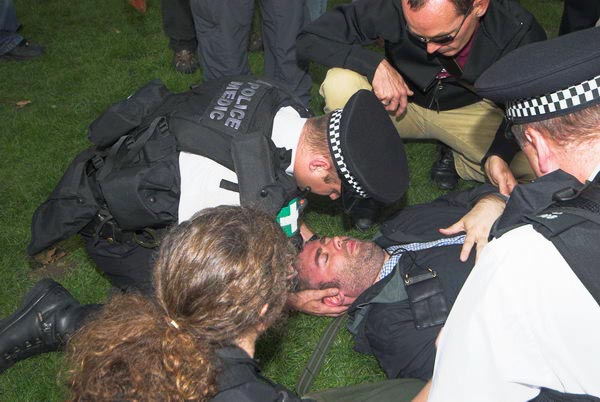
Police medics treat Marc after he was assaulted by police
The incident happened after a stand-off between demonstrators and police on the edge of the square facing the Houses of Parliament. This involved around 20 demonstrators who made an attempt to push through a police line, while perhaps a hundred more watched, together with a large number of media. Marc was assaulted despite very obviously being a photographer rather than a demonstrator, holding a camera, carrying a camera bag and with his NUJ press card clearly visible. Like the rest of the press present he had already been asked to show his press card, and is in any case well known to many of the police – as are the others of us who photograph such events. The attack on him was clearly an attack on a member of the press, and could have happened to any of us.
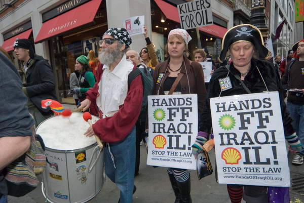
The policing on the day was entirely an over-reaction to a threat of no consequence posed by a small number of anarchists, mainly students, whose actions are largely symbolic and at most threaten minor damage to property. They might well graffiti a wall or even throw an egg or custard pie a politician, but they are in no way a serious threat.
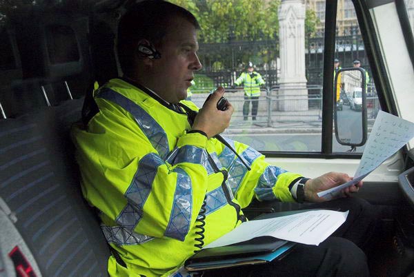
I was stunned on arriving in Westminster that day to find more police than I’ve ever seen before (or since unless you count their plain-clothes demonstration for more pay.) I don’t know the official number, but my estimate was around a thousand.
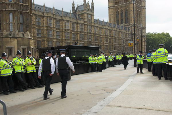
As well as forming a line along the front of the Houses of Parliament there were more in Parliament Square and in the other streets around, who apparently stopped many of those intending to come to the demonstration, threatening them with detention under an Act brought in to prevent terrorism.
Of course I’m against terrorism. But I am opposed to the use of law to prevent the normal freedom of movement and of political protest. As too are many individual police I’ve talked to at demonstrations.
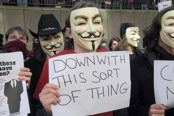
It was inevitable that a small group of demonstrators would confront the police. Their aim wasn’t to blow up Parliament but simply to block traffic by sitting down in the road in the front of the buildings.
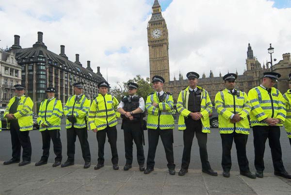
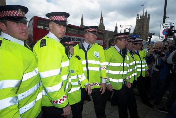
Police line up to face demonstrators
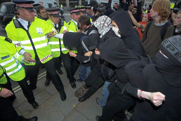
A ritual scrum attempts to push through the police line
But the line holds
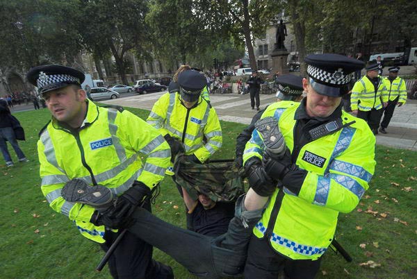
A few minutes later, the police charged the demonstrators and surrounded them, along with a large number of people who had done nothing more than stand in the square and watch. I left more or less straight away, but some other press who stayed inside were apparently not allowed to leave, being treated exactly as the demonstrators. The demonstrators were then held for several hours, with the police making occasional violent raids inside their cordon to grab individuals and take them to the waiting police vans, the others were only allowed to leave after giving police their details.
Various others around the square were also set on by police and taken inside the cordon, or in a few cases put directly into police vans. Most protested they were simply bystanders and had taken no part in the demonstration.
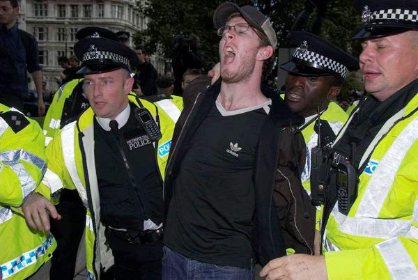
An incident later in the day involving gratuitous violence on a man protesting his innocence but making no attempt to resist his arrest.
Despite my press card, I was also threatened with arrest and issued a warning that I might be committing an offence under SOCPA.
The officer in charge reads the announcement that those present are being detained
Among those bundled into a police van was one man attending the event as a ‘legal observer’ in a high visibility jacket. A woman walking her bicycle across the square against the flow of traffic in the one-way system was also manhandled by police briefly before other officers rescued her.
It was a day the seriously eroded my respect for the police force. They got the intelligence severely wrong, totally misunderstanding the nature of the event. They showed a lack of control, acting with totally uncalled for violence on a number of occasions. They threatened the media – and injured one of them. You can see more of what happened in my account and pictures on My London Diary.
In any other job, those responsible would have been severely reprimanded, but I was later to hear a senior officer defending the actions of the day. It is rare to get an apology from the police, but I think almost all of us who were there deserve one, and I’m very pleased to see that Marc has received not only an apology but also a settlement.