Cornell Capa, 1918-2008

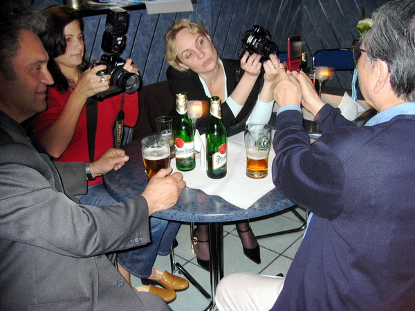
Cornell Capa, one of the last remaining of the classic generation of photojournalists who came out of Europe in the 1930s died in New York last Friday, May 23, 2008, aged 90.

Cornell was perhaps always overshadowed by his more flamboyant brother Andre, who re-invented himself in Paris in the mid 1930s as the ‘famous American photographer Robert Capa‘. When Cornell joined his brother in Paris in 1936, hoping to study medicine, he started working as a printer for Robert, and also for two of his brother’s friends, Henri Cartier-Bresson and David Seymour (Chim).

In 1937 Cornell moved to New York, and Robert helped him find a job in the darkroom of the Pix agency, and, in the following year, in the darkroom at Life magazine. He also had started taking pictures, and his first picture story was published in Picture Post in 1938. During the war he worked for the USAF in photographic intelligence and in 1946 joined Life as a junior photographer.

Cornell Capa joined Magnum in 1954, shortly after his elder brother was killed in Vietnam (another early Magnum member, Werner Bischof died on more or less the same day) remaining a member until his death and serving as president for four years.

After his brother’s died, Cornell was determined to keep the memory of his work alive and to continue to promote the kind of photography he had stood for, which valued human feelings and was dedicated to improving the human situation. He set up the International Fund for Concerned Photography, Inc.

The book and exhibition ‘The Concerned Photographer‘ which he edited in 1968 for the fund included work by Robert Capa and Werner Bischof, as well as Chim, Andre Kertesz, Leonard Freed, as well as by Dan Weiner who had been killed in a plane crash in 1959.

In 1974, Cornell foiunded the International Center of Photography in New York as a permanent home for the International Fund for Concerned Photography.

You can hear the voice of Cornell Capa in a short interview on NPR with Jacki Lyden, recorded in 1994. Much of his contribution to the interview is transcribed on the web page, but there is just a little extra about hearing it in his own voice.

You can also find an obituary in the New York Times and on the Magnum blog.

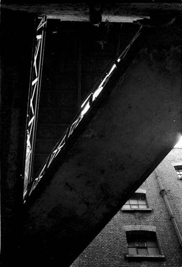
Because of the fame of his brother, it’s perhaps easy to overlook the fact that Cornell was himself a very fine photographer. While Robert Capa was certainly one of the best war photographers of his era, with iconic images such as that of the falling soldier from the Spanish Civil War and his grainy and distressed work on the beach on D-Day, a living testimony to his dictum “if you pictures aren’t good enough, you’re not close enough“, his younger sibling had a true gift for finding a different way to view things, something that stood out from the obvious.

Journey to Justice

Sunday I was a demonstrator with a camera rather than a reporter, going with a coachload of others from a church a few miles away to Birmingham. Ten years ago I’d made a similar journey to form a human chain around the conference centre where heads of government from around the world were meeting; I think the 70,000 of us were the first major demonstration at a G8 meeting, and we put Debt Relief very firmly on the political agenda.


Methodists from Worcester caught in the chains of debt, Birmingham, 2008

Digital showed its strength again, when we went into the rally in the same conference centre that the G8 had used. The lighting in the hall wasn’t bright, but I was still able to take some nice sharp images with the 20mm from my seat, although it was a pity that the 18-200mm VR lens had jammed the previous day. The picture below, taken without VR, was at 1/125th on a Sigma 55-200mm lens at 200mm (300mm equiv) full aperture, ISO 1600, and is sharp and relatively noise-free.


Ann Pettifor (Advocacy International and Operation Noah, previously of Jubilee 2000)

It was a long day – but interesting, although the final demonstration proved a bit of a challenge – a human pie chart to illustrate that 20% of debt has been dropped but 80% still remains. Here’s my best effort.

Pratt’s Bottom

It’s hard to resist a name like Pratt’s Bottom and I have to confess I didn’t try hard, and as soon as I heard the details it was etched in my diary. Pratt’s Bottom (or rather Pratts Bottom, as I notice they like to omit the apostrophe these days) is a village on the south-east outskirts of London, and notable particularly for its annual village fete held each year in May.

Pratts Bottom May Queen
Last year’s May Queen crowns the Pratt’s Bottom May Queen for 2008
Part of the reason for its continuing vitality as a village is the Village Hall, where you can act, sing opera, play short mat bowls, train your dog, play badminton or with model trains as well as be a Brownie or join the WI, though if you get your nights mixed up the results could be surreal. It also has a very nice pub, the Bull’s Head, its very own village school with 47 pupils (a pre-school group also meets in the Village Hall) and – the real reason for my visit (although the pint of Theakstons was very welcome) its own May Queen.

There are some drawbacks. Pratt’s Bottom is a longish journey from where I live and the nearest station only gets one train in each direction per hour. Due to a misunderstanding about the times I arrived rather late to find the procession had already left and found myself running over half a mile up a hill to catch up with it, getting to the village green where the fete was taking place more or less as it arrived.

It was also raining. Not particularly heavily, but steadily. Enough to sneak the odd drop onto the filter I’d just wiped and spoil the picture, though I’d tried hard to keep a cloth over it when not in use.

So when I’d taken the pictures of the May Queen crowning, had a walk round all the stalls, had a couple of goes on Pratt’s Bottom’s Human Fruit machine and taken a look inside the Village Hall at the drive-it-yourself model railway (I resisted) there really wasn’t a lot to do other than join the Morris Men having a bit of a sing-song in the pub.

Bull Head

It is, after all, traditional.

Better Digital 1

The first in a short series on getting the most out of digital images

I went to a photographers meeting a couple of weeks ago where pictures taken by around 20 different photographers (including myself) were all projected. Virtually all of them were good pictures – and most of the photographers were managing to make a living from photography, but technically I felt a number were letting the people who took them down in various fairly simple ways.

Back in the darkroom age, most photographers either learnt to make at least halfway decent black and whites or, more often once they started to make some money, had their work printed for them by a decent printer. With colour, for publication we largely shot on slide film and accepted the results from the lab on our Ektachrome or whatever, handing the trannies in for publication.

Now, most publications will no longer accept prints or slides and expect digital, but there are still quite a few photographers who haven’t yet really learnt how to get the most of of what they shoot on digital.

In most respects, digital has had the result of increasing technical standards compared to film. Certainly in low light we can produce pictures with a technical quality that is way better than film. But where we used to rely on labs to get things right, we now have to do it ourselves. So here is the first part in a series with some simple advice for photographers.

Monitor

Probably you’ve stood at some time in an electrical shop looking at the same programme displayed on a whole range of different TV screens and noticed the differences in colour, brightness and contrast between them. All of them are getting the same input signal, but may produce very different pictures. Computer screens are not a lot different (especially as we move to digital TV) and your image file may display very differently on your own screen to than when viewed by an editor or projected onto a screen. Those pictures with a nasty yellow cast may have looked perfect on someone’s notebook screen.

If you work with images it is worth buying a good screen to display your pictures. Unfortunately few if any notebooks come with particularly good screens – and a really decent screen for editing your pictures can easily cost as much as a notebook.

At home I use an Eizo monitor. It cost about as much as the large box by my feet that sends it a signal, but was worth every penny. Away from home I use an Acer notebook, and the images don’t quite look the same.

Hardware Calibration

Although the notebook screen hasn’t got anything like the picture quality of the expensive Eizo (or the remarkably good ancient but fairly massive Iiyama cathode ray screen I still also use) my pictures display in a reasonably similar fashion on all three screens. And I can be confident that any editor etc who knows what they are doing will also see something pretty similar. My confidence comes from regular calibration with a suitable hardware device, in my case a Pantone (GretagMacbeth) eye-one (i1), now replaced by an improved model.
You can get by without such a device – just as you can get by on a laptop screen – and your results may well be ok, but they will not be optimum. Particularly if you want to make your own prints, the better monitor will make it easier to get predictable results.

If you can’t afford a hardware calibration device, there are some web sites that have useful pages to make a rough check on some aspects of your monitor, and you may well be able to set up your monitor roughly using these and the controls on your monitor. Usually you should set the colour temperature to 6500K and use Gamma 2.2 (both on Mac and PC.)

Camera

If you are serious about photography then you will normally be shooting on a DSLR camera with at least a “4/3” sensor, more probably one roughly half the size of a normal 35mm film frame or roughly the same size. Compact cameras (except the latest Sigma DP1) have smaller sensors, usually smaller than a fingernail. Although some of these perform near miracles, they still cannot compare for resolution and image quality with the larger sensors, and at higher ISO the noise becomes excessive.

RAW vs Jpeg

As well as a decent camera – and of course a decent lens – you also need to learn how to use it. Test after test has shown that every camera that has both RAW and Jpeg modes can produce better images when shooting RAW. Almost always there is greater dynamic range but even more important is the flexibility to alter and enhance images that RAW processing provides. The difference is in some ways similar to the difference between using colour neg and tranny, where the printing process gives you a degree of control over how your images look, while the slide you just accept and put on the light box. You can do some post-processing with jpeg, but it is sometimes at the expense of visible image degradation, while RAW allows much great control without any quality sacrifice.

Sometimes of course speed is essential, and the ability to use jpeg files straight out of the camera is vital. If possible it is a good idea to shoot both RAW – to get the best out of when you have time – and jpeg for immediate use.

Colour Depth

Digital cameras transform the minute analogue electrical signals recorded by sensor cells into digital signals. Most cameras work using 12 or 14 bits for each cell to store the value, enabling them to distinguish either roughly 4,000 or 16,000 levels. In most cameras, each cell is behind a colour filter and these are levels of either red, green or blue light, depending on the filter.

The jpeg format only allows 8 bits for each colour – 256 levels, and when your camera writes a jpeg file it has to decide how to scale the data down to fit into this smaller number of levels. Exactly how it does this will depend on various camera settings for the colour space, contrast, colour temperature etc. Once this process has been carried out, and data discarded it cannot be retrieved. The 8 bits in each of the red, green and blue channels of the image make this ’24 bit colour’, also sometimes called ‘Truecolor’

RAW files – or at least most of them – actually contain a jpeg file. In the Nikon NEF format it is a jpeg using ‘basic’ compression, and some software will quickly extract these for you. The jpg is used for the image you see on the screen on the back of the camera. The file also contains the full 12 or 14 bits of data corresponding the the sensor cells, along with information about the camera settings, including the white balance etc. One difference between different software for processing RAW files is sometimes in how much of this information is used automatically, with the camera maker’s own software sometimes understanding more than other software.

You may also have the option of outputting 16 bit TIFF files, particularly from RAW processing software. These files can essentially contain all of the image data from the raw file, but are padded out to occupy greater space. However unlike RAW files they are understood as image files by a wide range of display software.

Colour Spaces

Cameras can only record a fairly limited part of the visual range, with many colours being out of gamut. Different sensors have their own characteristics, producing different electrical values from the cells from the same scene.

The values for pixels need to be connected in some way to actual colours and two ways of doing this are in common use for camera images, sRGB and AdobeRGB (1998) ICC colour profiles, each covering a different range of the visible colours.

AdobeRGB covers a wider range of colours, and is thus usually the better choice for camera images, but the sRGB range is actually a better match to the colours that most monitors can display, and is thus the normal choice for compact cameras.

· sRGB for web use and on-screen presentations
· AdobeRGB for reproduction

It is generally more sensible to set AdobeRGB as your camera profile and to make this the basis of your workflow, converting files to sRGB if you need these for screen use. The Adobe RGB space has a wider colour range.

When supplying files for any purpose always ensure they are tagged appropriately. Unfortunately much software – including almost all web browsers – doesn’t understand ICC colour profiles and will display Adobe RGB files wrongly.

Print services for amateur use always expect sRGB. For professional printing you should consult the lab, which should also be able to supply you a printer profile you can use for ‘soft-proofing’ your images on screen in Photoshop.

Continued in ‘Better Imaging 2″

New York in London

There is of course a sense in which a show like ‘The New York School‘, currently at the Michael Hoppen Gallery in London’s Chelsea, is bound to disappoint, and it is one that is heightened by the hype in the listings which describe it as “An overview of a period of intense photographic creativity from the Big Apple featuring the likes of Diane Arbus, Robert Frank and William Klein” (BJP)

It certainly isn’t an overview. Michael Hoppen is a commercial gallery and the contents of their show is determined by what can be found currently on the market and so offered for sale – only a couple of the works were without prices. It would be impossible to mount a real overview without the collaboration of various museums and collectors in lending work, and would require a considerably larger space. London saw a much better overview as the first half of the major Barbican show ‘American Images‘ in 1985 – and that just isn’t the kind of thing a commercial gallery can hope to match.

We can perhaps take “the likes of Diane Arbus, Robert Frank and William Klein” simply as sloppy journalism, in that the very point about these photographers was that they stood out as each having a particular view. There is a decent print of one of Klein’s better pictures in the show, but Frank and Arbus are poorly served by the couple of examples on offer, at least one of which should clearly have gone direct into the darkroom waste bin.

I went to the gallery not expecting a great deal, and in that respect I wasn’t really disappointed. There were however at least a couple of prints that interested, even moved me, including a fine photogravure of four men from the mid 1950s by Roy DeCarava (surprisingly not included in his fine volume ‘the sound I saw‘ although his second picture in the show, to me less interesting image of dancers is – and I think looks better in the book.) Unfortunately the lighting in the gallery gave maddening reflections – if you want to see the richly stygian ‘Four Men‘ at its best you should take a large black card along with you. I could only really make out two of them in the show.

One of a few Leon Levinstein pictures also caught my attention, although it perhaps lacked the kind of shock of his best work it did have a little of his characteristic directness.

Overall, by the time I’d been round the show – which does include some other pictures, particularly by Weegee and Louis Faurer, of at least some interest – I was beginning to think a more accurate title might have been ‘New York on a Bad Day’. Most of the photographers in it are deservedly well-known, but not on the basis of what was on show here. (I’ve never quite understood why people rate Ted Croner (1922–2005), an early Brodovitch student who he sent to photograph the city at night, and certainly what I saw here didn’t help.)

But as an overview, it simply omitted so many photographers whose work seems so central to the creative ferment stirred up by the New York Photo League and by Brodovitch in the period around and after the war. It was also perhaps rather defocussed by the inclusion of work from the city by two visiting British photographers, David Bailey and Neil Libbert.

Perhaps the good prints from the ‘New York School’ are all elsewhere, in galleries on on people’s walls, or, hideous thought, stashed in vaults by ‘investors’. Fortunately we are talking photography, and it is often best seen in books. One of the best overviews of what this show purports is still the catalogue of the Barbican show, ‘American Images‘ still readily available secondhand at a very reasonable price (ranging from 74p from one US bookseller, up to £65 elsewhere.)

Dumbo Brooklyn?

I didn’t get to New York for the New York Photo Festival , although rather a lot of others seem to have done. Held in Dumbo, Brooklyn and billed by its organisers as “the future of contemporary photography” the event on May 14-18 attracted many visitors, though not all were entirely complimentary about what they found.

You can view some videos about it on PDN Online and read a rather short note in the New York Times. The future would appear to be dominated by curators rather than photographers, with Kathy Ryan of the NY Times, Martin Parr of Magnum, Lesley A Martin of Aperture and Tim Barber of Vice curating the four major shows.

But to get a real feeling of what it was like from someone who was in the thick of it, take a look at photographer Andrew Hetherington’s ‘Whats the Jackanory‘ blog reports from New York, perhaps starting with ‘Lets Get the Party Started‘ on May 9 and then going on to the You know it’s a really good photo festival: 1 and following the ‘newer post’ link at the bottom to read the rest. He was also one of the contributors to Foto8’s coverage of the event, and you can read more there from him and other contributors.

In case anyone is still wondering, Dumbo is Down Under the Manhattan Bridge Overpass.

Taken to the Cleaners

London Cleaners at AON

It’s hard not to sympathise with the cleaners when you compare the rates they get paid for cleaning the London offices of some of the richest companies in the world with the ridiculous amounts paid to some of those who work there. They certainly deserve enough to live on – and the current minimum wage isn’t enough to survive on in London. Their demand is for a living wage – currently set at £7.20 an hour – as well as some basic rights as workers.

Their campaign aims to shame the companies by making a fuss, with demonstrations that are highly visible and audible. It was one event where I was glad I had a set of ear plugs in my pocket as they blew their whistles pretty mightily. The red t-shirts and flags make them stand out, particularly in the financial area where dull suits abound.

I’d like my pictures to be as powerful as possible, but it was hard to produce anything really dramatic – and even harder to get anyone interested in publishing them. More pictures and more about the campaign on My London Diary.

Changing Spaces at Photofusion

I usually like going to exhibition openings at Photofusion, though more often it’s the people I meet there that make it interesting than the pictures on the wall. Photofusion is very much a photographers gallery and most of the people at openings have a real interest in the medium. Its also a much more friendly place that most galleries, one where you can talk to strangers and meet new people, as well as bumping into old friends and acquaintances.

If anyone doesn’t know, Photofusion is London’s largest independent photography resource centre with a full range of facilities and services for pros, amateurs and students. Members can work in a well-equipped digital suite (or for the retro, darkrooms) hire a studio attend courses and events at reasonable rates, and Photofusion’s picture agency represents the work of many photographers whose work deals with social and environmental issues – including some of my own.

It’s also very handily placed in Brixton, 2 minutes walk from both the Victoria line tube and Overground station. When I did a project on people on buses Brixton was one of my favourite places to work, because there were just so many buses and people. I dropped in to Photofusion last night on my way back from photographing in the centre of London, a fifteen minute journey by tube.

The current exhibition, Changing Spaces, (until 21 June, 2008) has work by five photographers, Laura Braun, Mandy Lee Jandrell, Isidro Ramirez, Simon Rowe, Gregor Stephan and is a part of the Urban Encounters programme, a collaboration between Photofusion and the Centre for Urban and Community Research at Goldsmiths (part of the University of London, based at New Cross.) Curated by Paul Halliday and Catherine Williams, this also includes a conference, talks and workshops.

The show aimed to present different approaches by photographers to urban spaces, and is one of the more interesting currently on view in London, although I find some of the writing about it more than opaque. Here’s a short chunk:

Laura Braun’s move towards sub-urbanisation in the mid 1900s, show social and public spaces devoid of the photographs of Downtown Los Angeles, the once glamourous heart of the city, side-lined and in decline since the pressure of people however with the traces of their passing intact.

This certainly isn’t English as we know it, and must surely be the output of some deranged computer programme that strings together random phrases in an attempt to demonstrate artificial intelligence. But doubtless it will be clear to speakers of Acadamese.

Two projects of the five appealed particularly strongly. One was by Isidro Ramirez who gained a BA on the Editorial Photography course at the University of Brighton in 1998 and an MA in Photography and Urban Cultures at Goldsmiths in 2006. His pictures in the project What We Don’t See are of spaces in which blind and visually impaired people live and work, and show a fine sense of both space and light. I think they reveal considerably more about how the photographer sees than about how those who inhabit the spaces perceive them. Keeping spaces relatively open and uncluttered is of course essential when vision is limited, as we found when my late father-in-law used to stay in our untidy home.

Simon Rowe worked with Francesca Sanlorenzo and Ben Gidley of Goldsmiths on the 2004 Pepys Portrait Project. His work on show is “part of a larger project about the Pepys estate, present a portrait of a South East London housing estate as it moves into a new era. The project reflects a sense of the multiplicity of human and social relationships against a background of social change and regeneration.” Both this text and his pictures are models of clarity and show a real feeling for the people and place.


Some of the people in Simon Rowe’s pictures were at Photofusion for the opening

The Pepys estate in Deptford was built by the GLC, (Chief Architect Ted Hollamby,) in the 1960s on a prime 45 acre site next to the Thames to provide over 1,300 homes. Opened by Lord Mountbatten of Burma in July 1966, it was lauded at the time as a landmark in social housing, and gained a Civic Trust award.

Pepys Estate (C) Peter Marshall
Pepys Estate, 1982 (C) Peter Marshall.

By the 1980s, when the estate was handed over to Lewisham Council, the buildings had deteriorated through poor upkeep and the estate had become known for crime, vandalism and drugs. Problems were confounded by those of language, with many asylum seekers being housed there.

Regeneration started in the early 1990s, mainly refurbishing existing buildings, but came to a halt in 1998, with six blocks on the prime riverside sites not completed. Lewisham engaged in complex and highly doubtful moves, against considerable opposition from Pepys tenants, finally resulting in Aragon tower being refurbished as a private block by Berkley Homes (handy yuppy flats for over-paid workers at Canary Wharf) and the five low rise blocks being replaced by 250 new homes by Hyde Housing Association.

Robert Rauschenberg: Photographs

Suffering today from the annual and unwelcome reminder of ageing (though the presents are nice) I got to thinking about Robert Rauschenberg, who died two days ago on May 12, aged 82.

As the New York Times obit by Michael Kimmelman says

“A painter, photographer, printmaker, choreographer, onstage performer, set designer and, in later years, even a composer, Mr. Rauschenberg defied the traditional idea that an artist stick to one medium or style. He pushed, prodded and sometimes reconceived all the mediums in which he worked.”

Although I have a book of his photographs (Robert Rauschenberg Photographs, Thames & Hudson, 1981, ISBN 0 500 54075 6) it seems to me that photography is the one medium about which this isn’t true, although of course he made considerable use of photographs in various mixed media works, both using his own pictures and solvent transfer prints from magazine images.

In the book Rauschenberg comments that he first took up photography as a young man, it was a “social shield“, covering up the perosnal conflict he felt “between curiousity and shyness“. In the interview published in the book with Alain Sayag, Rauschenberg says that while studying with Josef Albers (who he elsewhere said “was my best teacher, and I was his worst student“) at Black Mountain College in 1949 he became aware that he had to make a choice “I was serious enough or dedicated enough to know that I could not have at that point two primary professions“. Since at that point his photographic project “was to photograph the entire U.S.A., inch by inch” it’s perhaps good that he chose painting (later, in 1980-1, in his project ‘In + Out City Limits’, he did try to photograph at least parts of the country.)

Had Rauschenberg been as excited by other teachers at Black Mountain – perhaps Aaron Siskind or Harry Callahan, the history of art and photography would have been different.

Rauschenberg’s early photography was good enough for Edward Steichen to buy two of his prints – one a portrait of his friend Cy Twombly – for MoMA‘s photography collection – his first sale to a public collection.

The first group of pictures in the book are from the period when he had given up photography, and are perhaps the strongest, uncropped square format images with a strongly emotional content, although the often square-on approach to the subject and sensitivity to lighting carry suggestions of Walker Evans. His later work when he returned to photography (I think, from the evidence of the images with a 35mm SLR) in 1979-80 are more related to formal concerns and less personal, although many are still very interesting, concentrating largely on urban details. Many of them were from the project In + Out City Limits (1980-81) mentioned above, which was followed by other photographic projects, including Photems (1981/1991), and Chinese Summerhall (1982-83.)

Rauschenberg comments that for him photography is “a kind of achaeology in time only, forcing one to see whatever the light of the darkness touches and care” and goes on to state: “Photography is the most direct communication in non-violent contacts.”

Sayag asks him why he never crops, and gets this response:

Photography is like diamond cutting. If you miss you miss… You wait until life is in the frame, then you have the permission to click. I like the adventure of waiting until the whole frame is full.”

Rauschenberg was certainly a great artist, and had he devoted himself to the medium could also have become a great photographer.

Unfortunately very little of his photographic work seems to be available to view on the web.

Here is an example Untitled, ca 1952 though it is not in my opinion one of his more interesting images. There are also one or two fairly poor reproductions from In + Out City Limits: Baltimore, Los Angeles and a rather better exhibition poster for Los Angeles.

Anyone for Morris?

I’m never quite sure that I want to photograph Morris Dancing. Partly I think because it seems to be such a popular subject with amateur photographers – the kind of event that gets listed under ‘photo opportunities‘ in the amateur magazines. Fortunately I don’t think these have got onto May Queens yet. But it does seem to be a general rule that whenever something is listed whether on a press release or elsewhere as a ‘photo-op’ it is almost certain to be boring. You, along with 27 other photographers are presented with someone else’s idea (almost always a word person’s idea) of what would make a good photograph, typically some posed group, and its always hard work – if not impossible – to make a different and more interesting picture.

Of course Morris isn’t like that, but it does come with lots of wacky coloured clothes, stripy waistcoats, flowery hats and knee-bells that make it ‘photogenic‘ – another of my least favourite words, committed as I am to the proposition that it’s photographers who make photographs. Photogenic just means more clichés to struggle against, and all too often my doggy paddle can’t breast the stream.

Not that I’m against Morris at all. It’s a great tradition and guys like Cecil Sharp and the others who recorded and resuscitated its dying embers at the turn of the nineteenth century did a great job. If I didn’t have a life and two left feet I’d happily join up and spend more time with them studying real ale. I’m even on record as saying that the stupidest, most arrogant and wrong-headed decision the English Arts Council ever made was not to fund Morris Dancers; “Over my dead body” on of its more illustrious leaders was reported to have said in a rare pause from shovelling money into the bottomless pit of London’s Royal Opera House.

sword and wheel
Sword dancers at Embankment Steps, Westminster, London

The Westminster Day of Dance is rather a splendid event, organised by the “world famous Westminster Morris Men” who dress in tabards with a portcullis motif which makes me think of council employees (perhaps why I seem to have edited them completely out of the pictures I’ve put on line) though they do have a rather fine unicorn.

There were four locations where groups of dancers were putting in an early morning session before coming together in Trafalgar Square, and I decided that the River Thames would make for a more interesting London background, so started off at Embankment steps, with the view across the river, including the London Eye – see above. Shortly before the session ended I rushed down to Victoria Gardens, where I hoped that the Houses of Parliament and Rodin’s Burghers of Calais might form suitable backgrounds, though I didn’t really get either to work.

After a brief and pointless journey on the tube to photograph another event (on arrival I found it wasn’t starting until three hours after the time I’d found on the web) I went to see the Morris Men (and I think they were all men, although there are women Morris Dancers, following in the footsteps of the suffragette Esperance Working Girls Club of 1906) in Trafalgar Square, where they were competing rather successfully for the attention of tourists with Falun Dafa, celebrating its 16th anniversary and protesters against the slaughter of seals. The dancing continued at various sites around Westminster after lunch, but by then I was with the May Queens in rural suburbia.

There is a tendency for us to look back and see the interest in and revival of folk traditions – including both Morris and the May Queens around the end of the Victorian era as a conservative movement in political terms. There were actually strong links with the radical movements of the day both in the arts – the Arts and Craft movement – and in politics, including both socialism and the emancipation of women.